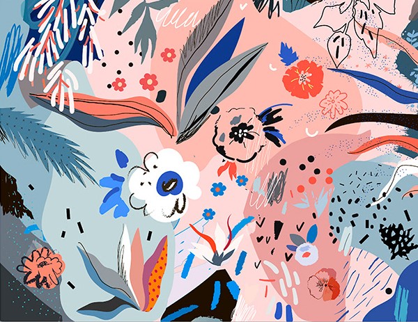
I wanted to find an illustrator that worked with pleasing colours and textures. Although this isn’t related to the future of the body directly, I like the way Efremova uses colours and space in her work.
In terms of context, her work is sold as high quality digital files, cards, posters etc. So, visually pleasing illustrations to be placed in the home.
I was thinking I could apply it to my work in terms of experimenting with different media in my sketchbook. I want to focus on generating textures so I can have a base collection of bright colours and techniques to use as backgrounds in illustrative work.
I want to take direct inspiration from the kind of shapes and colours she uses. E.g. the collections of stippling-esque dots, or the leaf with a dot grid on the far left that’s been roughly cut.I like the busy collections of objects and shapes against the dark, basic background. The colour scheme is mostly desaturated blues, with a few very light blues and pinks as a complimentary highlight colour. Efremova works a lot with pale pink and blue, but that combination is very trendy at the moment.
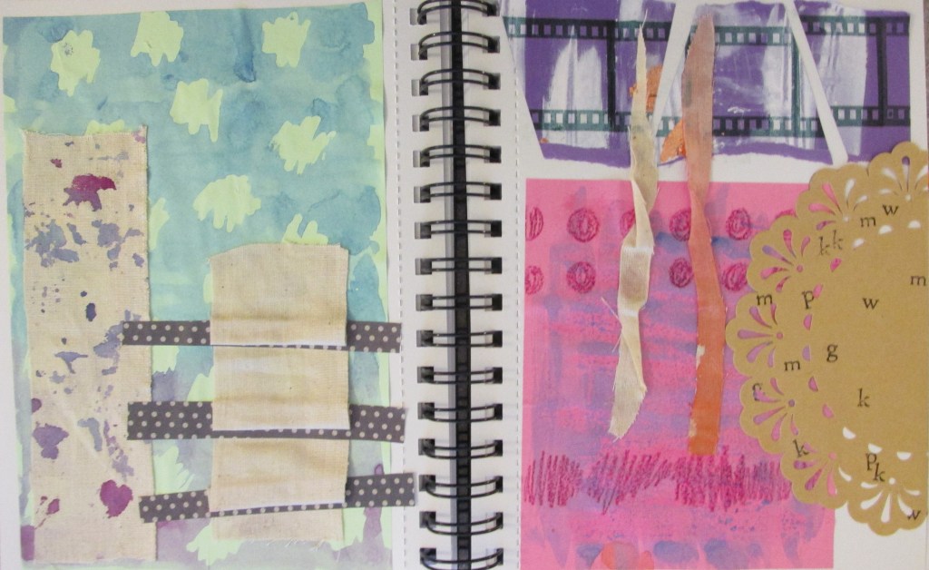
I made some textures and experimented while looking at her work. You can tell from the colours and some of the shapes. I also just wanted to suspend judgement and try out whatever I could in case something cool happened.
I like the brown doily with lettering stamped onto it. I also really like the blue and purple spattered calico fabric. The blue and pink posca pens were more successful than I’d hoped.
We spent about an hour completing peer review before returning to our own work and self-assessing. I found three students whose work I was particularly drawn to.
Alice
Her work was full of strengths, and it was lovely flipping through her sketchbook to feel all the textures and experiments. She’s successfully developed her own creative practice and used lots and lots of different media in her work.
The only thing she was weaker on was contextualising her textiles work in the professional environment it would exist in. While there was historical research, there was a lack of named working artists or work relating it to the current fashion and textiles industry.
An example of media experimentation.An example of historical research in fashion.
Letty
Letty’s main piece of work was her little A6 sketchbook, absolutely packed with things: textures, experiments, printed photos and a ton of annotations. Her strengths lay in experimentation, evaluation and research into contemporary artists – thus contextualising her work as well. You can see how she’s followed through on ideas page by page.
Her main weakness was that outside of the sketchbook, there weren’t many finished presentation sheets at all – I think I counted four, each with a few photographs on them. This might just be how she works, but it leaves her body of work very informal and possibly a bit incoherent.
Carys (I do hope I’ve remembered her name right!)
Carys’ body of work was one of the largest and most broad in terms of content I saw the whole day. It wasn’t really relevant to my work, but I really enjoyed looking through it. Personal research was a huge strength, with her documenting certain information about herself to manipulate into graphs etc. over multiple days. Her photographs were very high quality and clearly printed somewhere professionally. I also like the textures she creates through experimentation, e.g. creating a stencil for lettering on top of a painted background.
I can’t say I saw written personal reflection, but there’s a good chance it’s either on her blog (which I had no access to) or I simply missed it.
Here’s all of the graphs she created using data she collected about herself.
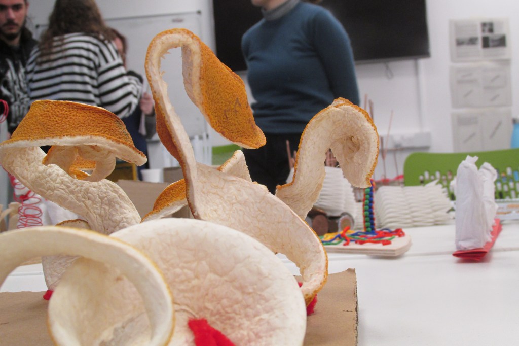
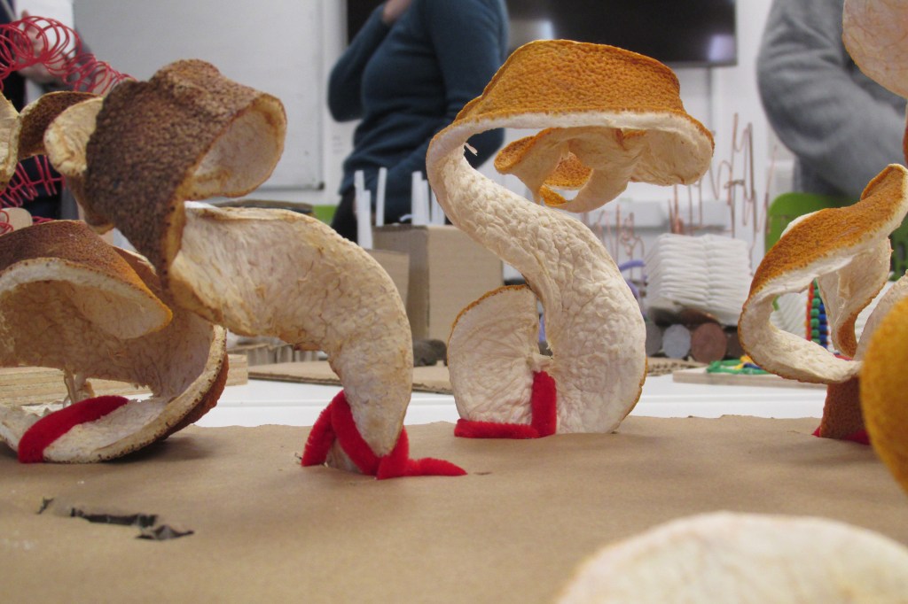
Finally, as I left I had to photograph Marco’s work because I kept seeing illustration ideas in his hardened orange peel sculptures.
Here, I see two dragons or snakes’ necks and heads rearing back.Here, including the red pipecleaners, I see a pair of really mental, curly thigh-high boots.
Self-assessment
When I returned to my desk I saw some comments people had written about my work, and have since added my own.
Strengths:
Bright colour and confidence
Experimentation of media
Good development from 2D to 3D work
Contextualised in the world of illustration
“Good, stylised use of penmanship”
Weaknesses:
Could include more little models (considering I only just moved to 3D experiments)
BETTER QUALITY PHOTOS. These will finally be possible since over Christmas, I have bought a small Canon camera that is vastly better than my mobile camera.
Generate more textures in my work – I like having fun, bright backgrounds and I want to see if I can push materials to make new combinations and patterns.
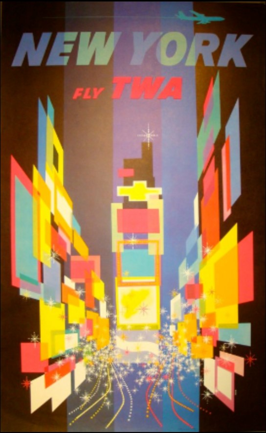
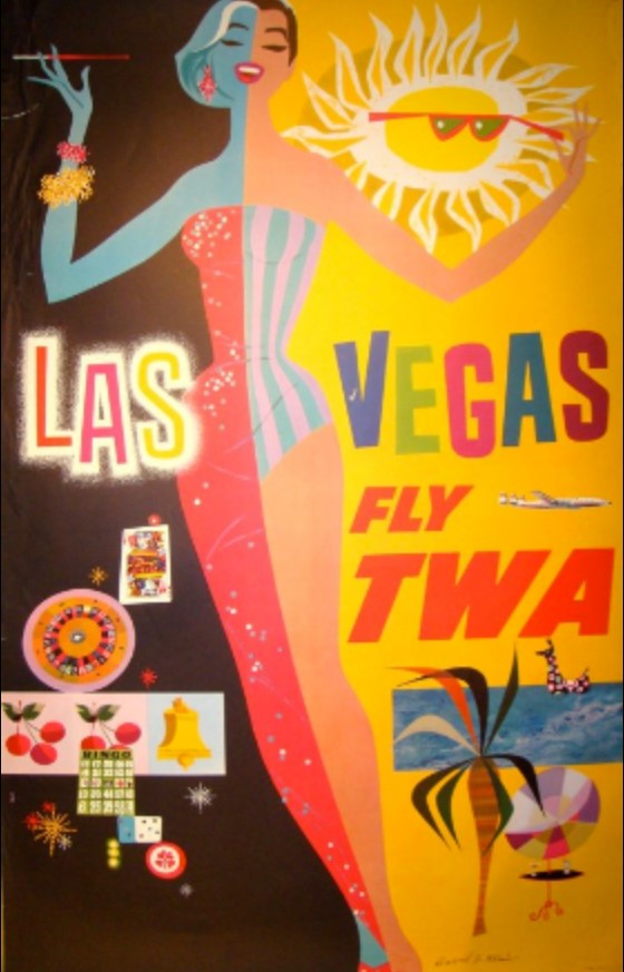
David Klein is an artist that worked from the 1930s through his life to the end of the 20th Century. He was an illustrator that worked widely and across multiple media, but his hallmark work was for TWA travel agency in the 50’s and 60’s.
His abstract, brightly coloured representations of places and landmarks set the tone for a lot of poster art at the time. I’ve included a couple of my favourite images here.
Here’s a sneak peek at my thought process: after a long Christmas of thought, I’ve slowly gravitated towards the idea of futuristic advertisements – and more specifically, products from the future and adverts for them. These products, I want them to be mental and fun. I’ve been brainstorming with some boys in my life who play a lot of video games set in alternate futures, or like sci-fi.
This came from reading a book I got for Christmas about Pop Art and the history of Pop Art. I really like the kind of enthusiastic, hyperbolic and miracle-selling tone that 50’s and 60’s advertisements get across. I want to apply those conventions and feelings in my futuristic art.
Thus, I’ve started taking a lazy look at some of the famous advertisement artists of that time, to get inspiration for colours, compositions and feelings. David Klein’s work appeals to me a lot! The pieces make me feel good.
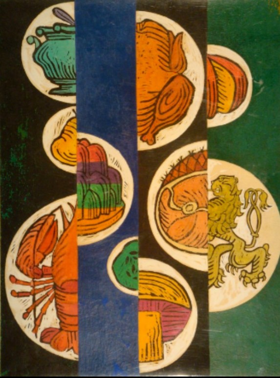
The reds, oranges and yellows in this piece are really vibrant. I like the repeated image of the birds and the triangles that create the sun. The way the bells are drawn is also quite freehand, like my own style. I might use the simple triangle and diamond shapes in my own work.The brightness of the colours here is lovely. Using squares and rectangles to create perspective and a sense of depth is very clever, and something I might use in a background of a piece.I can’t resist art of pretty ladies. Her long legs make me happy! I want to be including pretty women in my product ads, to emanate that “50’s housewife glam” feeling of vintage ads. This is one of Klein’s other illustrations. I like the bright colours and textures; almost feels like crayon or wax resist. Bright colours and bright, simple shapes. I’ve been thinking about some kind of instant food – a powder, probably, that has “just add water” to make it a full and complete meal! So maybe I’ll use this composition as inspiration for that. These look like lino cuts. I never considered lino cutting for this project…. interesting….
Today has been the last day of our illustration project; I’ve created a final outcome and finished it!
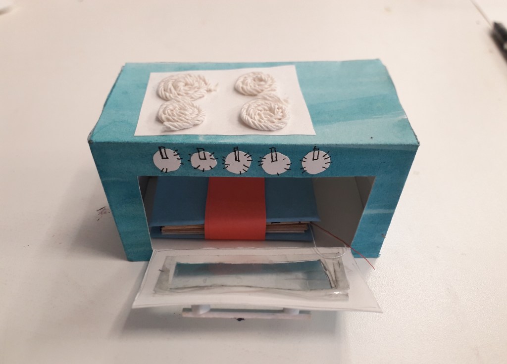
I’ve taken the little oven and its notebook counterpart from day four and finished the notebook up. This meant cutting out a rubber stamp of an oven, and I created a rectangle block stamp to act as a block colour background to make it a two-part image.
I printed this a number of times and in a number of different ways throughout my hand-bound notebook, completing the book.
This image is an ideal close-up of the oven stamp. You can see it printed over creases, vertically, horizontally, off-the-edge and in a variety of colours too.
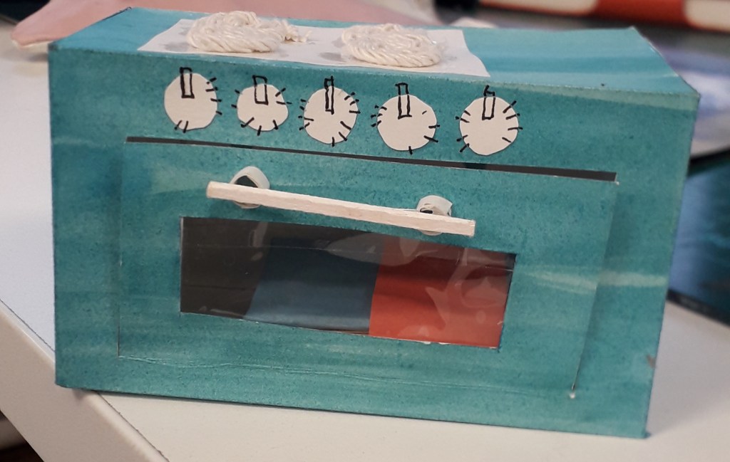
I took a higher quality image of the notebook in the oven for the sake of the final worksheet as well.
What do I feel was successful in the project?
I have to say I’m incredibly pleased with the way this project took me. I like the whole of the final notebook, with its eclectic colours and torn newsprint making it busy but aesthetically pleasing. The fact that some of the pages were sewn through gives the viewer another material to interact with and I feel it lends it a homier feeling. I like the look of the oven, with the string hobs inspired by my media experimentation in week two. I like the colour of it and the watercolour surface makes it interesting.
What do I feel was less successful?
The inside of the oven wasn’t particularly developed. You can still see pencil outlines for the net shape, and the bottom panel has “BOTTOM” in pencil across it (me trying to orient myself when I was still at net-stage). It was also quite flimsy, a problem I’ve already identified. If I’d settled on making the oven, I should have invested in a sheet of cardstock rather than wrestling with layers of damp watercoloured paper!
Did I develop my ideas thoroughly? Why or why not?
Interestingly, I feel as though I developed my initial ideas quite a lot. The process’ movement from a flat illustration through to a 3-D, interactive piece was one of considerable experimentation and research.
Of course, there will always be other ways I could have developed my ideas. I could have worked with other media, e.g. wool, food, metal, etc. Some of this is bordering unrealistic considering the time and material limitations, but in an ideal situation I could have gone on and on with experimentation.
I could have done more research into colour. My work always just fell into blues and turquoise during this project, because to me it felt bright and also reminiscent of a kitchen. I had a little colour inspiration (see Simon Costin’s studio work) but it never made its way into the spotlight of consideration.
This was the last week of the graphic design project, and I got to finish it!
I printed off the book jacket at the correct scale. (Side note: with every single Mac refusing to print my InDesign document in any format, it took me over an hour to get this single thing done. Macs exhaust me and I don’t care for them.)
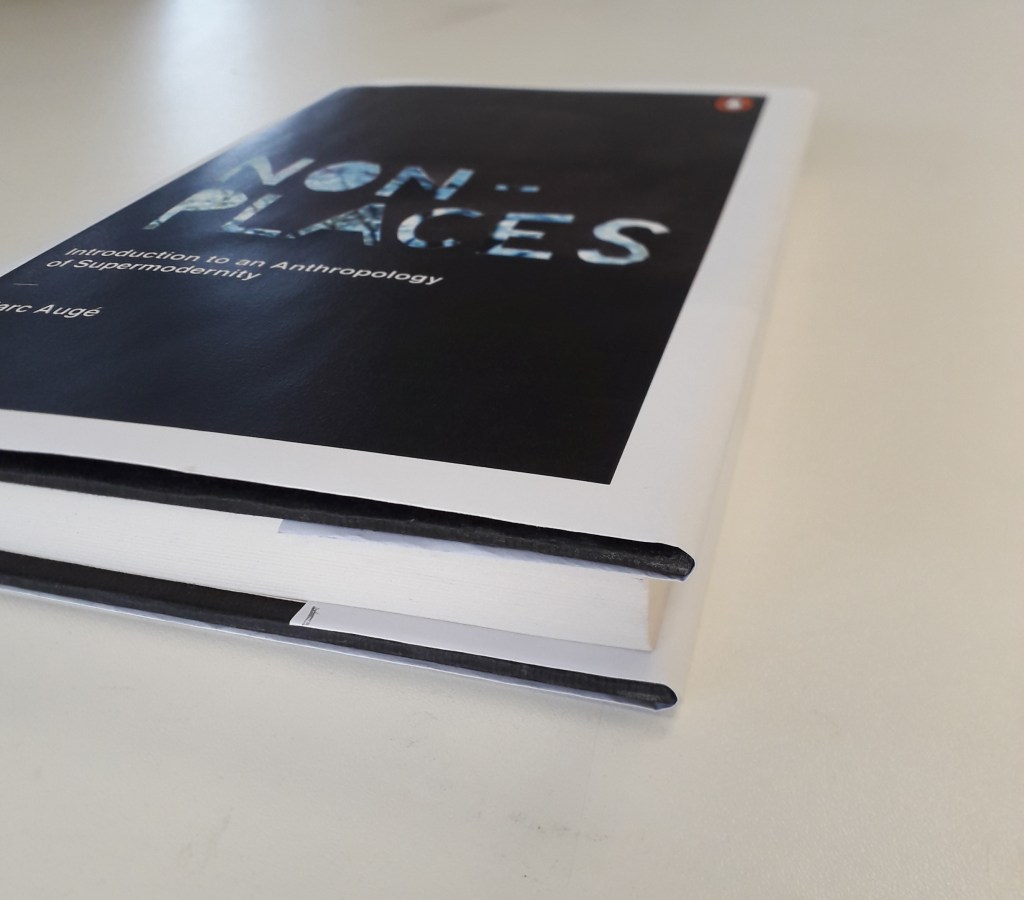
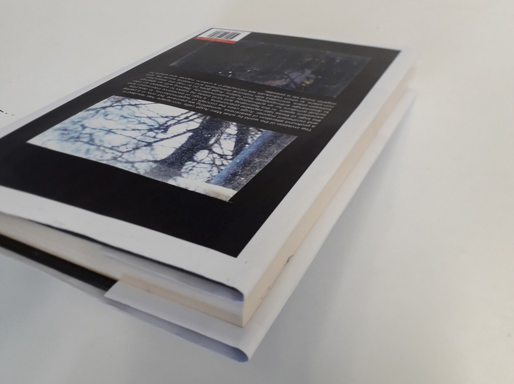
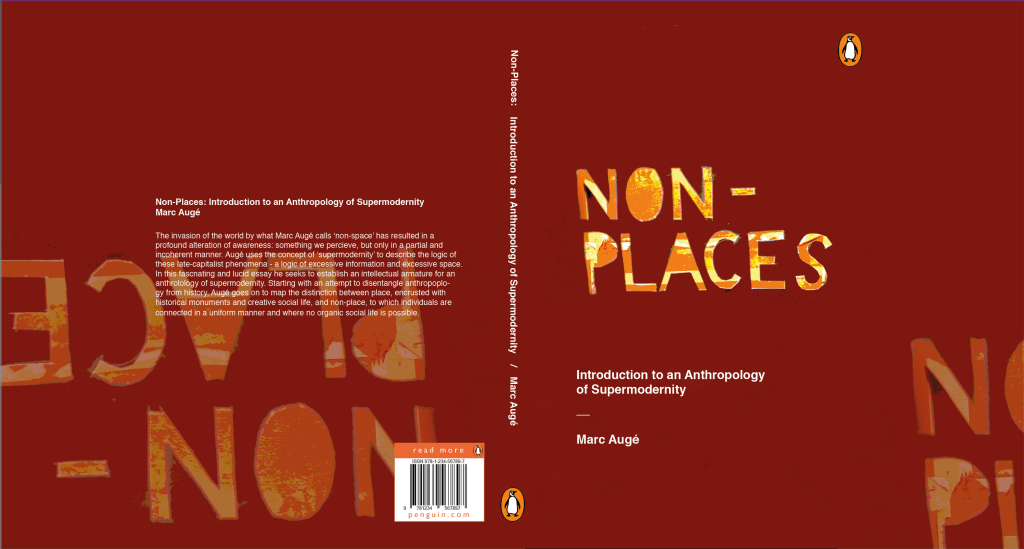
I measured and wrapped it round the book, to provide photographic evidence of it in an applied situation for my final worksheet.
What do I think went well with this project?
I am happy with the overall look of the book. The image for the front cover, touched up in PhotoShop, was very successful. I’m glad I went for the cooler colour scheme in the end because I feel it communicates the concept of “non-places” better: cold, connoting isolation, loneliness and a lack of emotion. I suppose the fact that the trees are bare against a cold sky is appropriate as it shows a place where life can’t be sustained, just as Auge states that life can’t be sustained in non-places.
What do I think didn’t go well?
I feel like despite all of the time that went into it, this final cover looks a little primitive. This might be because of the white edges: although I made that decision carefully in relation to Penguin’s brand identity, the block photographs on white coming out of a normal printer made it look a little thrown-together. To solve this problem, the cover being printed on glossy paper may have given it the professional look it needs.
In addition, I feel like the positioning of the blurb in relation to the image looks a little unfinished. It’s legible and the front and back cover images tie in together, but just as a block of text it sits strangely against the black paper cutout. If I’d had more time, I could have experimented both with the text and the back cover image entirely.
How did I develop my ideas and how could I have developed them differently?
After a session so heavily focused on hand-lettering, I felt almost pushed to create something that was centred on the lettering. That’s the main reason why my research and experimentation drew me towards the stencil-cut type.
I would have liked to have experimented a little further with my collage ideas, maybe: the images I had collated were all quite interesting and it seems a shame my process meant they didn’t make it into the final piece.
Were the media and techniques I explored successful?
I think a downfall with my collage pieces was that I tried to recreate them on PhotoShop from the start. It just doesn’t have the same feeling as the truly torn and cut work I had on one of my worksheets. A limitation of working with collage at any kind of scale is that I literally don’t have the money to be printing sheets and sheets of coloured images to experiment with – as much as I’d like to. This meant that my collage work was quite small, which would have been difficult to scale up at any sort of quality.
A way to solve this problem might have been working digitally from the start (so as not to lose anything in translation between traditional and digital). Alternatively, I could have created a series of pencil thumbnails with possible collage ideas and compositions on them, so when I did come to printing and collaging I had something in mind. This does take away from the freeform experimental approach, though.
Hey, maybe I could have printed off all of the work and cut it up but just photographed compositions I liked rather than sticking them down. That would mean I could still play around a lot, but would mean I could reuse images I liked rather than having to print a ton of duplicates.
Inspired by a number of artists, my research and work is bringing the illustration project near to a close.
Before the day, my research into papercraft and pop-up work led me to work for a few hours and create a few 3D experimental media iterations.
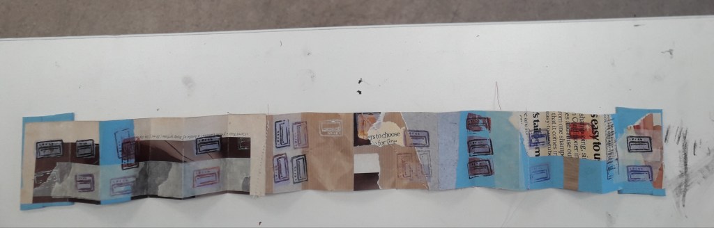
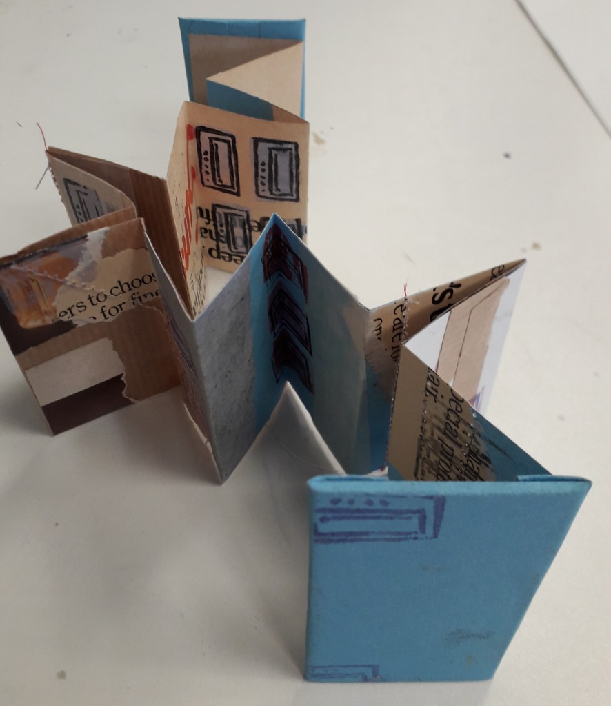
Above are three iterations of possible interactive oven doors based on various drawings from my initial ideas or media experimentation sheets. Note the zigzag texture was inspired from Samuel Shumway, my researched papercraft illustrator!After a conversation with Louise, I was determined to create a little notebook that would fit inside the final coloured 3D oven. I have decided it’s a complete little experience for the viewer: getting to take something out of the oven after opening its door, and then getting to open that again and look inside! The notebook is concertina folded with paper-covered mounting board I took from small offcut board scraps. The inside is mixed media_ brown paper, magazine, masking tape and coloured paper all glued together in ragged strips to create interest. After taking this image, I actually ran it through a sewing machine a few times to add stitch as further interest.An image of the final 3D oven with its precious little clear window, perfectly sized to house my book.beep beep beep! Notebook’s ready! Maybe you need tiny finger-sized oven mitts to take it out safely.
What was successful and why? In this section, I was proud of how the oven doors came out. I especially liked the zigzag texture, clear oven window and little wooden handle. In terms of the book, I’m proud of how textured the inner pages are, and also quite pleased with how straight I ended up getting the pages and mounting boards despite assembling it from so many separate pieces.
What was less successful and why? The final oven’s construction was needlessly laborious. This was a material limitation: all I had to hand was paper or cardboard, no cardstock which would have been an appropriate midpoint. I was also fuelled up on so much inspiration and so little money that I could neither have waited for nor bought the materials I wanted. I worked around it by reinforcing four of the six net panels with another layer of thick paper, meaning it’s quite structurally sound now.
Where will I take this? After Stephen Fowler’s work inspired me in terms of small-scale bookbinding and stamping, all I have left to do is find myself a rubber or two to carve some stamps into! I’d like to populate my little notebook with relevant stamps of ovens or grills. After that, Christmas is so close I doubt I’ll be continuing further.
I hope once completely finished with the project to create one more blog post of critical reflection on the project as a whole.
Stephen Fowler came to the university to give a talk on illustration this Wednesday. He was a really unique, interesting person!
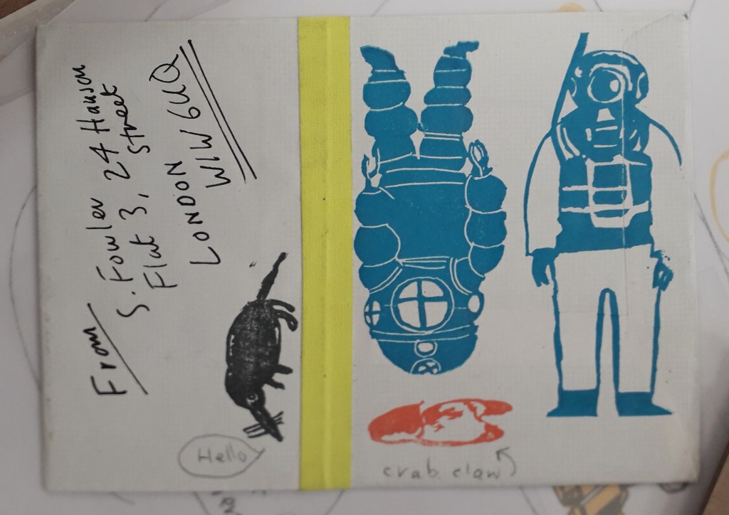
The work of his that interested me the most was his experience in rubber stamps. He has a book published on rubber stamping, and the talk he gave really inspired me. I like the idea of basically a small-scale, informal lino cut printing. It sounds like it was personally made for me.
This was some of my favourite work. I don’t actually think it’s Fowler’s but it’s still a good example. The block colour underneath some form of detail really interests me, like a two-step process. I also love that it’s bound into a book.
The concept of using rubber stamps in small hand-bound books really appeals to me. Critically, the research has already come in useful because I’m making something similar to this for my Utensia illustration project.
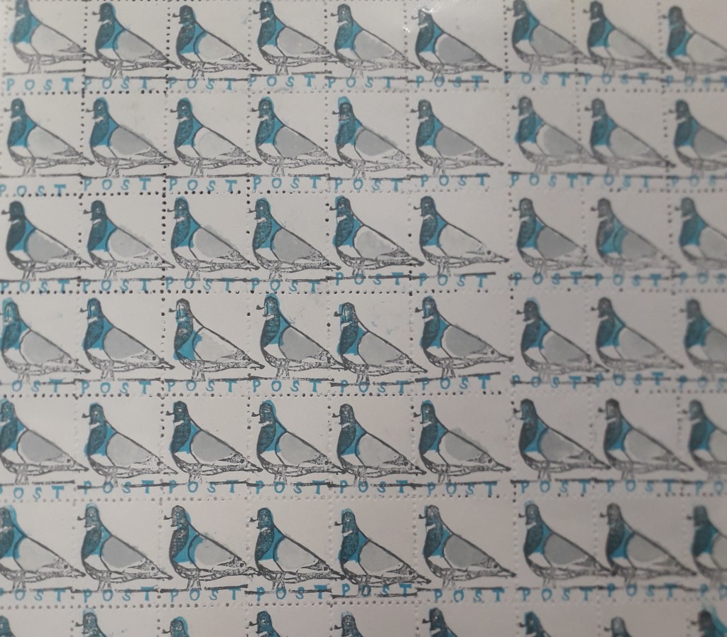
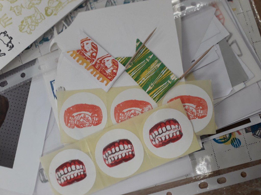
Printing on all sorts of things to personalise them makes me smile inside and out.The colours used for these pigeons and the small scale it’s on made me fall in love with this sheet of stamps instantly. If I stamped something similar and used an unthreaded sewing machine to perforate the stamps, perhaps…Some more examples, including on stickers which again really appeals to me.
Interactive illustration in general seems to be where I gravitate, be it on stickers, stamps or in books. Even my recent papercraft in the Utensia project has been inspired by the idea of my little ovens having interactive doors.
Where can I take this research? I’ve already started making work inspired by Fowler’s talk, but I can see it taking centre stage in a self-directed project. Any subject might suit stickers or stamps… after quite a few years of being pushed hard to work bigh because “scale shows confidence”, Louise supporting small scale illustration feels awesome!
On Monday, it was the fourth day of the graphic design project. I realised that I was quite behind in terms of producing hand-lettering or typography work, despite my sheet full of artist research.
To respond to the brief, I created a stencil out of which I cut the title “NON-PLACES”, and held it up against potential relevant backgrounds.
This is an example of an unedited picture with the stencil.
A problem the stencil presented me with was that the glue used to stick it to the cardboard backing wrinkled the paper quite severely. To solve this problem, I later edited the images with the clone stamp tool in Photoshop. (After taking a tutorial on it!)
I then adjusted the images I liked the most a little in different experimental ways before placing them into InDesign and fitting them as jacket covers.
This is a saturated and posterised version of the stencil. I placed it as the cover, then colour-picked the background and repeated the design at lower opacity on the back cover and inside flaps.
I really liked this design, but I feel it falls a little short on the overall atmosphere of non-places. The warm browns and reds almost feel like a cosy fireplace, whereas the colour scheme of non-places would be less saturated and cooler in tone. That’s why this was a useful, yet not final, draft.
I preferred this cover in terms of actually meeting the brief. The dusty window and grey-heavy colour palette give off quite a sad, isolated feeling. It distances the viewer from reality by placing the reader behind a literal window.
Was this research useful? Yes! After a day’s worth experimenting heavily with the stencil, I feel quite confident that it will feature on my final draft (whichever I choose it to be at the end). I feel like the sudden inspiration to work with hand-cut lettering came from reading Hand Job, a catalog of hand lettering I took out of the library. The introduction of the book highlighted the importance of unique lettering, and this use of paper stencil gives a really interesting, handmade feeling to the type.
Where will I take this now? The project comes to an end next Monday. If the printers decide to come back into action (god, please… I have so much work I can’t even do right now because the whole printing system is down…), I will print off the final design at the correct size. I will photograph it around the book and create a final presentation sheet to show the culmination of the process in the final result.
Last Wednesday, I signed up to a monoprinting workshop with Caroline.
We were taught how to use the huge press to create prints and how to use newsprint to create interesting stencils to ink up. After that, we were pretty much left to experiment!
The key to using the press safely and correctly is to ensure the print has newsprint paper on both sides, to protect the blankets and press from any ink as it rolls through. Wet paper prints best for the first run through (but after that, you can’t wet it again as the ink runs!). Place the blankets over the print flat, and turn the wheel to run your print through the roller once forwards and back.
This is an example of a stencil I used in my printing. I experimented with crumpled paper, because ink would roll heavily onto some areas and miss others to create an interesting texture. I liked the idea of juxtaposing sharp cut squares against the organic crumpled folds.
This wasn’t put through the press, but here’s an example of using a stencil (a question mark) and inking around it. I monoprinted with some leaves, but in my experimenting I found I actually liked the pink and yellow leaves more than the prints they produced! I’ve since put them through the photocopier to preserve how they look forever.
These last two images were things I thought were just too pretty to lose.
How has this research helped me? The main advantage I’ve gained from taking this workshop is that now I can book in with Caroline and use the resources freely when I need them. Monoprinting is useful for creating basic textures and interesting, unique backgrounds. If I monoprint onto newsprint, I could collage with it and know that what I was creating was wonderfully unique.
I realised suddenly that I’d not made a post summarising the second day of the illustration project! Although it’s out of order, I think it was an important enough day to include.
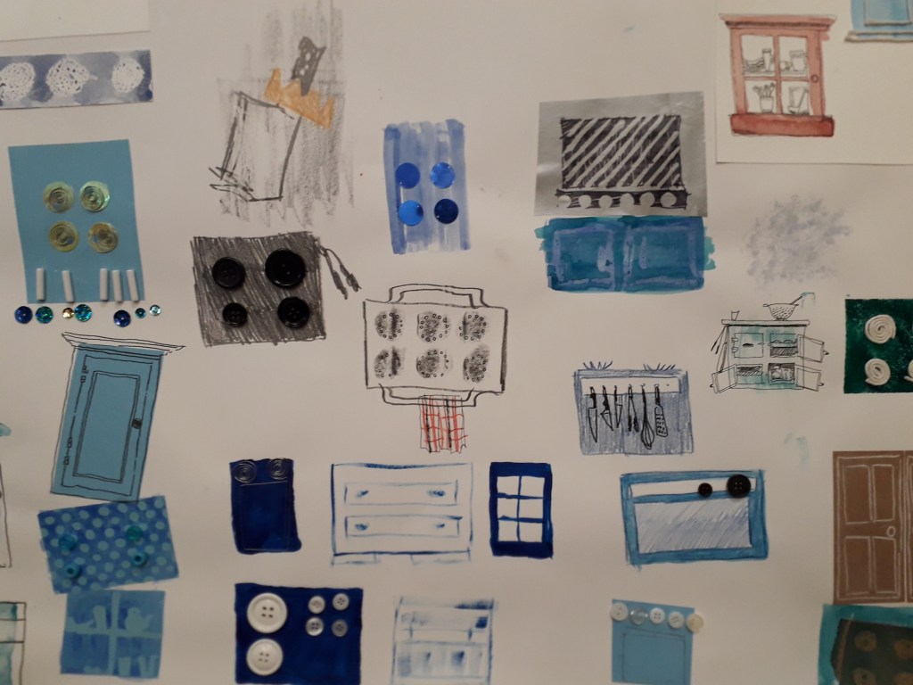
The second day focused entirely on media experimentation. As a class, we made a list of lots of possible media we could use – anything from paints and pens to food and rubbish – all of the extremes that could be experimented with in illustration.
I broke out of my usual style completely and got really stuck into the experimentation. Louise was pleased to see that I’d not clung to my old ways.
This is a portion of the worksheet I created. You can see examples of wire, buttons, coloured pencils, string, watercolour, acrylic, cut paper, beads, sequins, pencil, crayon, candle, pen, white charcoal pencil, etc.
What did I get out of the day? The day really freed up my mind, and I created totally non-judgementally. I was really proud of how it turned out just because I worked so freely! It’s a feeling and an ability I want to keep. Armed with new research from the past week, I’m hopeful that I can take the experimenting spirit and work in such a varied way again.
















You must be logged in to post a comment.