Photobooth: Experimentation and Evaluation

Photobooth: Experimentation and Evaluation

I was about to start writing up some new research, but I realised I’ve been putting off writing up my first experimental piece of finished work in FMP.

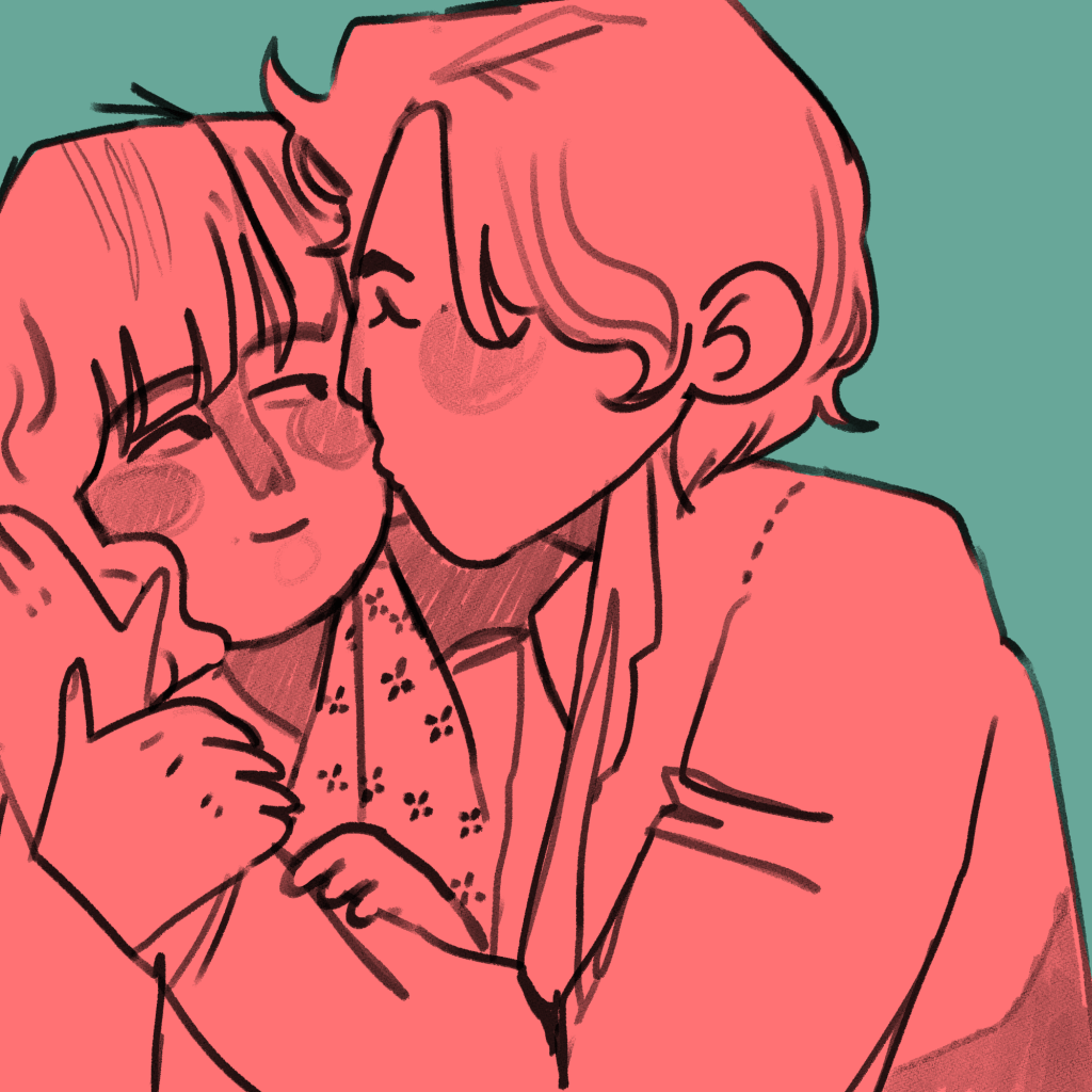
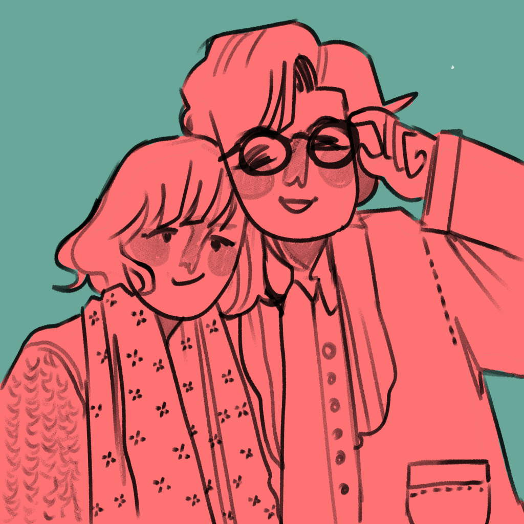
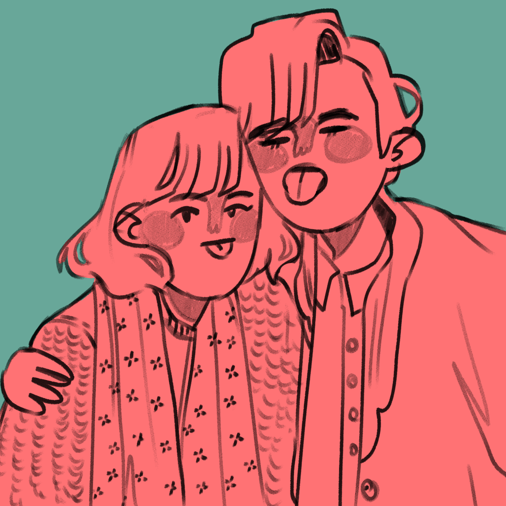
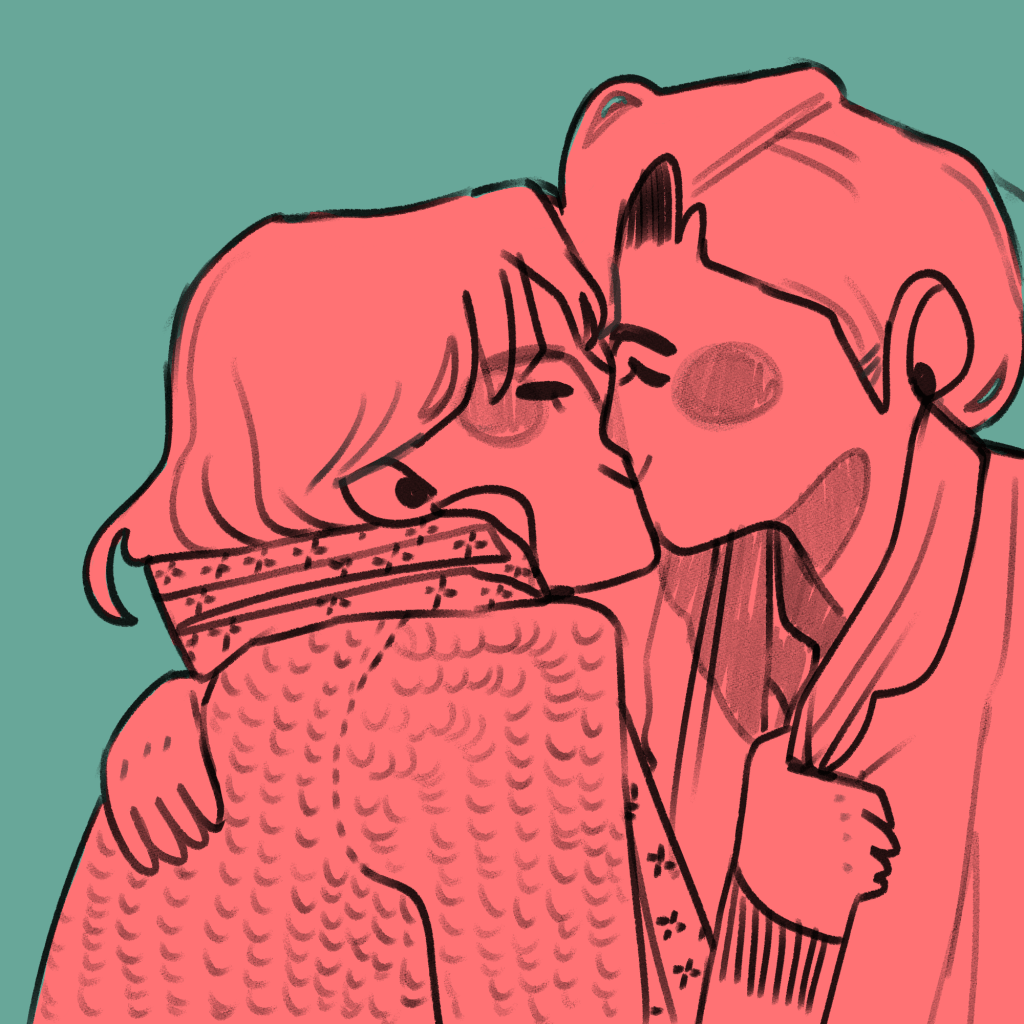
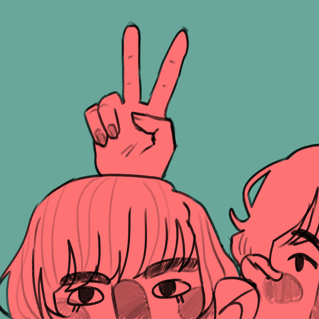
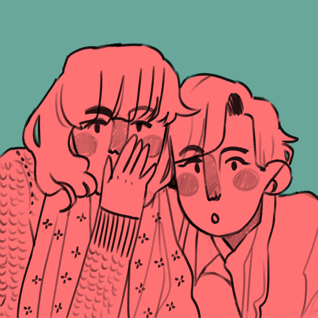
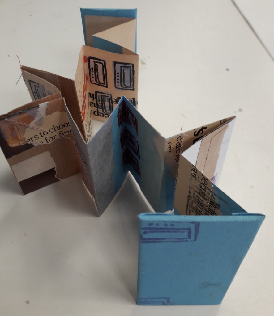
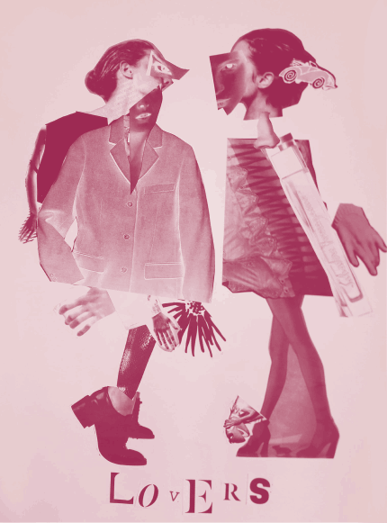
I am using illustration to explore the concepts of friendships, relationships and closeness. In doing this, I illustrated an everyday encounter between Antonia and Mitzi – mucking around in a photobooth. I had the intention to bind it into a mini-zine, an instant book I’d found out how to make in my research.

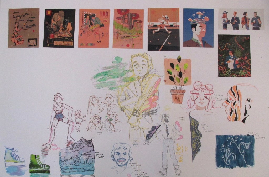
The illustrations I created came from a variety of different pieces of research. These were all mentioned in my Pecha Kucha, but overall I think they were a huge success.

This is the final result. You can see I experimented with different inks and paper types, including black and white versions. (This is because traditionally, instant zines were printed cheaply in B&W on office photocopiers to be shared and I like the historical aspect of that!).

Evaluation

Was my research purposeful? I would say so! All of the research I do affects my work somehow, because it sticks in my brain like velcro. In this case, though, studying artists like early manga artists and artists that inspire me allowed me to work comfortably in a style I like but to work in a more self aware way, and I think it’s improved the look overall as a result of the research.

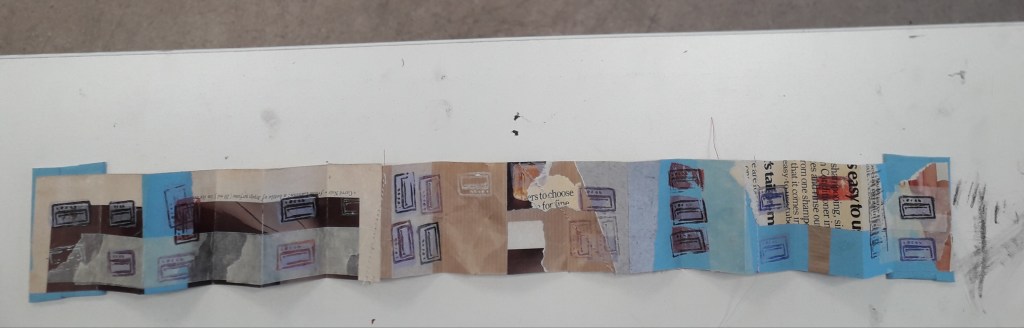
Did I develop my ideas thoroughly? The short answer to this is no. Because it was just a response to research and was very experimental, I consider this successful nevertheless. Interestingly, I could focus on the form of the book I bind reflecting the content within the book in future projects. E.g. I could have had these images in a concertina style strip, similar to an actual photostrip that might come from a photobooth.

Where am I going to take this? I’d like to work in the area of “meetings” for a bit – I’ll probably chose one specific meeting and illustrate it in a couple of different ways. I need an experimental week, and to do that I need an image or scene I can experiment with. My thinkinig is circling around Drake meeting Mitzi, Ludwig and Techo. In terms of importance to the entire narrative, I have to say honestly I think this is the most important happenstance in all of the character’s development.

Future of the Body: Week Two

Future of the Body: Week Two

I started a worksheet for week two. I’d been very excited about working in my sketchbook, but I thought that for experimentation’s sake, I’d work larger.

I had a one-to-one chat with Emma. She said her favourite work of mine was the drawing-heavy women with bio-luminescent body alterations. She also suggested that I continue drawing and brainstorming products for a future sci-fi type audience, since I’d done plenty enough research and context.

Wahoo! I couldn’t have asked for a more affirming conversation, since that’s what I really enjoyed doing. I had recently found some other inspiring illustrators, so I began drawing.

You can see media used ranges from watercolour to collage and marker.

Where am I going to take this next?

I’m going to fill the space up with drawings and keep my judgement suspended until then. After that, I’ll either complete another whole experimental sheet or run some self evaluation before I complete any more work. Once I’ve identified what I like a lot, it will allow me to refine the ideas and create more sophisticated work.

I feel I should mention that because Brighton have required an e-portfolio from me on next Tuesday, this project will run slowly until then. After that, I have an interview and will need to design a portfolio for that too. I’m juggling my time and this isn’t my priority right now!

Utensia: Day Five – Critical Reflection

Utensia: Day Five – Critical Reflection

Today has been the last day of our illustration project; I’ve created a final outcome and finished it!

I’ve taken the little oven and its notebook counterpart from day four and finished the notebook up. This meant cutting out a rubber stamp of an oven, and I created a rectangle block stamp to act as a block colour background to make it a two-part image.

I printed this a number of times and in a number of different ways throughout my hand-bound notebook, completing the book.

This image is an ideal close-up of the oven stamp. You can see it printed over creases, vertically, horizontally, off-the-edge and in a variety of colours too.

I took a higher quality image of the notebook in the oven for the sake of the final worksheet as well.

What do I feel was successful in the project?

I have to say I’m incredibly pleased with the way this project took me. I like the whole of the final notebook, with its eclectic colours and torn newsprint making it busy but aesthetically pleasing. The fact that some of the pages were sewn through gives the viewer another material to interact with and I feel it lends it a homier feeling. I like the look of the oven, with the string hobs inspired by my media experimentation in week two. I like the colour of it and the watercolour surface makes it interesting.

What do I feel was less successful?

The inside of the oven wasn’t particularly developed. You can still see pencil outlines for the net shape, and the bottom panel has “BOTTOM” in pencil across it (me trying to orient myself when I was still at net-stage). It was also quite flimsy, a problem I’ve already identified. If I’d settled on making the oven, I should have invested in a sheet of cardstock rather than wrestling with layers of damp watercoloured paper!

Did I develop my ideas thoroughly? Why or why not?

Interestingly, I feel as though I developed my initial ideas quite a lot. The process’ movement from a flat illustration through to a 3-D, interactive piece was one of considerable experimentation and research.

Of course, there will always be other ways I could have developed my ideas. I could have worked with other media, e.g. wool, food, metal, etc. Some of this is bordering unrealistic considering the time and material limitations, but in an ideal situation I could have gone on and on with experimentation.

I could have done more research into colour. My work always just fell into blues and turquoise during this project, because to me it felt bright and also reminiscent of a kitchen. I had a little colour inspiration (see Simon Costin’s studio work) but it never made its way into the spotlight of consideration.

Non-Places: Day Four

Non-Places: Day Four

On Monday, it was the fourth day of the graphic design project. I realised that I was quite behind in terms of producing hand-lettering or typography work, despite my sheet full of artist research.

To respond to the brief, I created a stencil out of which I cut the title “NON-PLACES”, and held it up against potential relevant backgrounds.

This is an example of an unedited picture with the stencil.

A problem the stencil presented me with was that the glue used to stick it to the cardboard backing wrinkled the paper quite severely. To solve this problem, I later edited the images with the clone stamp tool in Photoshop. (After taking a tutorial on it!)

I then adjusted the images I liked the most a little in different experimental ways before placing them into InDesign and fitting them as jacket covers.

This is a saturated and posterised version of the stencil. I placed it as the cover, then colour-picked the background and repeated the design at lower opacity on the back cover and inside flaps.

I really liked this design, but I feel it falls a little short on the overall atmosphere of non-places. The warm browns and reds almost feel like a cosy fireplace, whereas the colour scheme of non-places would be less saturated and cooler in tone. That’s why this was a useful, yet not final, draft.

I preferred this cover in terms of actually meeting the brief. The dusty window and grey-heavy colour palette give off quite a sad, isolated feeling. It distances the viewer from reality by placing the reader behind a literal window.

Was this research useful? Yes! After a day’s worth experimenting heavily with the stencil, I feel quite confident that it will feature on my final draft (whichever I choose it to be at the end). I feel like the sudden inspiration to work with hand-cut lettering came from reading Hand Job, a catalog of hand lettering I took out of the library. The introduction of the book highlighted the importance of unique lettering, and this use of paper stencil gives a really interesting, handmade feeling to the type.

Where will I take this now? The project comes to an end next Monday. If the printers decide to come back into action (god, please… I have so much work I can’t even do right now because the whole printing system is down…), I will print off the final design at the correct size. I will photograph it around the book and create a final presentation sheet to show the culmination of the process in the final result.

Utensia: Day Two

Utensia: Day Two

I realised suddenly that I’d not made a post summarising the second day of the illustration project! Although it’s out of order, I think it was an important enough day to include.

The second day focused entirely on media experimentation. As a class, we made a list of lots of possible media we could use – anything from paints and pens to food and rubbish – all of the extremes that could be experimented with in illustration.

I broke out of my usual style completely and got really stuck into the experimentation. Louise was pleased to see that I’d not clung to my old ways.

This is a portion of the worksheet I created. You can see examples of wire, buttons, coloured pencils, string, watercolour, acrylic, cut paper, beads, sequins, pencil, crayon, candle, pen, white charcoal pencil, etc.

What did I get out of the day? The day really freed up my mind, and I created totally non-judgementally. I was really proud of how it turned out just because I worked so freely! It’s a feeling and an ability I want to keep. Armed with new research from the past week, I’m hopeful that I can take the experimenting spirit and work in such a varied way again.

Textiles Retrospective

Textiles Retrospective

The aim of the workshop was to take inspiration from architecture to create our own textiles. Examples of architects we took inspiration from included Zaha Hadid, Frank Gehry and Santiago Calatrava.

The morning focused on creating samples of textiles and learning basic techniques.

This is a zigzag pencil pleated fabric. It is created by folding two sheets of paper into this shape and sandwiching fabric between as a type of mould. Applying heat sets the fabric to the same shape.
This is the process to create a box pleat. We offset the other side’s pleats to create a twisted box pleat. The final result can be seen in the photo of my completed work.
This is a twisted pencil pleat. The samples were finished that afternoon by sewing a straight line across the pins on a sewing machine.
I created this myself. I quite like how organic it is; it reminds me of a beehive or maybe holes that decay causes in wood.
The finished work.

In terms of what I enjoyed or found useful, being taught how to use the department’s sewing machines will be invaluable. Since I enjoy embroidery, I could use the sewing machine to create bags or pockets from the material I embroider on – or to work on garments that already exist, like shirts.

The day of the workshop, I was in a very bad headspace. My heart wasn’t entirely in the second half of the day, so I could have made more of the time I was given.

In taking this further, I will probably focus on applied textiles rather than constructed textiles. It resonates more closely with my illustration-based art.

Lovers’ Experiments

Lovers’ Experiments

I took the best quality image I could of the Lovers, the final product of the Exquisite Corpse workshop. I uploaded it into Clip Studio Paint and messed around with layer effects and learned the basic animation timeline feature by creating a gif showcasing some of the effects.

Above were all experiments with the Darken layer effect. In only affecting the background, I can create bright images that still allow for the contrast of the black figures.
This was the saturation layer. It’s the crudest filter, but I really liked the colour skew in the worst affected areas like Kermit.
This is the exported .gif file. Here I’ve experimented with darken, lighten, soft and hard light – but my favourite layer to play with was Exclusion. Exclusion actually reversed what was dark, so in the original workshop when I printed off inverted sheets you catch a glimpse of the original values.

The main thing I learned was the animation timeline, and how to export as a .gif. I already knew about all of the layer effects, but having the freedom to showcase them all meant I discovered Exclusion.

Video Workshop Reflective

Video Workshop Reflective

Yesterday was the first technical workshop of the block – video with Kate. We were required in groups to shoot and edit a short video featuring “matching graphical cuts”, e.g. the circular part of an eye fading out to a moon in a sky. The shape, form or colour matches between shots and creates a tangible link between otherwise unrelated scenes.

A short storyboard.

One of the biggest difficulties was space and technology. Due to booking issues, we were in a very small edit suite with macs (my burning hatred for apple macs is stoked every single time I sit down at one of their shiny emotionless screens). Our mac was so confused we ended up working on Kate’s laptop.

If I were to take this further on my own, I can rest easy in the knowledge that I might have room to edit properly once there’s not a whole workshop in the room.

Here is the finished video. I have made this private, but just ask me if you’d really like to see it.

What was I pleased with? The group work went smoothly on this one. We had a good time, and everyone got their respective shots onto Google Drive and shared them with me. Importing the shots was probably the hardest thing because it needed so much collating.

I’m happy with this video as a whole. The shot passing the notebook across the table was edited very smoothly.; I feel like we hit the brief exactly with it. Kate seemed over the moon too!

What would I improve? In terms of the video, I’d ideally shorten the length of time the screen is entirely white (between the paper and the sky). It gets a little arduous watching that, and loses some of its energy.

Where can I take this? If I’d had a little more time in the edit suite alone, I could have played with PremierPro for quite a long time. I’ll need to think of a small project or something, just so I have something to edit.

I could talk to Kate or Louise about the possibility of animating over a video on some kind of transparent layer. Think Who Framed Roger Rabbit. I’m not sure whether I’d be using Adobe Animate or Premier Pro or what there.

Chance and Sequence Reflective

Chance and Sequence Reflective

This project was all about creating fine and abstract art based on the laws of chance. We took part in four activities. I’ve detailed exactly what we did in my reflective journal, so I’ll just upload pictures and critically reflect here.

String drop felt like quite a silly activity. In reality, I like what I created with it a lot.

How could I take this further? I could use the activity of “dropping” paper shapes onto magazine images to select images and shapes to collage with. This would force me to randomly select textures rather than carefully cutting out images I found appealing. I thought that if I coloured in the spaces in blocks, it could create quite an appealing background to another illustration or drawing. I could simply repeat the exercise with grass, straw, leaves or other natural material.

This was geometric randomness. I don’t really like this as a piece of art on its own.

How could I take it further? I thought I could do this with more limited colours, e.g. blue, purple and pink, to create a random piece of art that was slightly more aesthetically pleasing.

This was the collaborative, instructional drawing. I had a blast actually doing this exercise. I’m getting to quite like letting go of control in collaborative exercises. (And I never thought I’d hear myself saying that!) Things happen that would never have happened if I’d worked on my own.

How can I take this further? I could collaborate again with friends – e-mailing or swapping drawings to work on for each other.

The conceptual emotional drawing was fun again, because I jump at any opportunity to introspect and write about what I’m feeling. I like the composition of this a lot, and the stricter colour scheme made me feel better from the earlier drawings.

How could I take this further? Well, I actually made Jamie complete an identical exercise that night. I have his art and I might turn it into a larger piece, so that they could exist in a series.

Finally, I created some random poems using dice and newspaper clippings which you can see in my sketchbook. These really were nonsensical at times… I don’t know why, but I suppose I thought I’d create something super edgy and deep! They were still fun. I might create a few for my reflective journal or put a twist on them for something fun to do.

I do hope I’ll do some more work related to chance, even if just a small aspect of something else. It’s nice to leave the thinking to the laws of physics and probability!