Future of the Body: Week Four

Future of the Body: Week Four

The group crit from last week left me in a good position. Since then, I’ve been creating illustrated packaging for Spaceoline.

The illustrations are a massive mixture of all of my research up to this point and a lot of new picture references, which I have saved to my drive. I’ll collage them in my sketchbook when I get the time… which it looks like won’t be for a little while. Yikes.

This is the finished jacket for a small pill pot. The limited colour scheme is inspired by one of my favourite images by Bruno Mangyoku. The textures within it are pretty directly inspired by my texture and experimental work from the previous worksheets.

What do I feel was successful? I was really happy with this pot. I feel like the checked effect worked well, as well as the automaton hand. The limited colour scheme worked very well too – so I took it into the next piece of packaging.

This is the front cover of the Spaceoline pill packet net in production.

I had to do some pretty intense problem solving here, so I thought I’d mention it. When I started to add the black watercolour in, when I was painting crisp lines next to previously coloured spaces it bled into the watercolour pigment. This was ugly and a huge issue because I was working so small. See the top image: I realised quickly that I couldn’t continue to paint,

I thought about it, and ended up using a black fineliner to outline any coloured work to create a barrier between the colours. This worked pretty well, and staved off disaster! I used the knowledge with the back side of the pill packet, which came out far more crisply in terms of rendering the design.

What do I feel was successful? I reused the check design, coming out of a rocket just like in one of my early worksheets. I love the font I ended up deciding on for the word Spaceoline, and the phrase “When in doubt, Space out!”

You can see here that it’s a far clearer piece of work than the front, simply because I bought all of the knowledge and problem solving through with me to create this piece.

Here, I really liked the space hostess. I based her outfit pretty directly from the ones in PanAm: a show I haven’t watched and an airline I don’t know much about, but do like the glamorous, vintage hostess feeling. Like the ladies from Fifth Element on the cruise ship to Floston Paradise.

Where am I going to take this?

I plan to scan these pill packet nets in to keep the design safe and high quality. Then I’ll use the scanned designs to make up some actual packets, which I’m looking forward to!

The project is actually finishing this week, and assessment is next week. Furthermore, I have a terribly busy week with two interviews to prepare for just before the assessment.

Pulled Receipts: Bookbinding Project

Pulled Receipts: Bookbinding Project

Over the past few weeks, I’ve had a personal project in mind. I’ve always been interested in bookbinding – especially the idea that I could bind loose items into a notebook that wouldn’t usually be pages, e.g. small paper pockets or envelopes, or different types of paper.

I wanted something quite simple to bind that wouldn’t overshadow the focus on binding itself. In the last half of October, I collected most of the receipts I encountered from myself, friends and family to mount and bind into a book.

I bought all the paper and materials at Broad Canvas in Oxford. Here is a progress picture of the stitching I learned from a YouTube video by SeaLemon.
Here is a final image of the stitching. The lower two stitches are far neater because I realised halfway through that my looping method was slightly wrong. You live and you learn!
This is the front cover. I created a card stencil to sponge paint through which reoccurs throughout the book on pages without receipts.
This envelope was collected. It’s actually bound in upside-down, which was a mistake, but I don’t mind.

Below are a few more example pages I feel are interesting.

Overall, there were a lot of decisions to be made in terms of colour scheme, paper size, what to include, etc. I’m really happy with how the experimental book turned out. It feels nice to hold and turn the pages of, and the envelopes full of offcuts make it a little interactive and interesting.

The idea behind collecting receipts from a certain period of time makes this book almost like a diary. I have dated and captioned every receipt in the book. The main events that this covers is visiting my granddad and a week I spent in Reading with Jamie and his housemates.

What would I do differently / what did I learn? I made a few mistakes, considering it was my first bookbind. Some of the stitching was slightly too loose and some slightly too tight, meaning I had to do some serious page wiggling to make certain pages lay flat. I missed one stitch on an envelope by accident (but tied a thread round the hole to make it look like I didn’t!) That and my mistake in the first stitches, but I fixed that with the last stitches.

How will I take this further? I could take the idea of receipts further, in terms of illustration. I could work with coloured paper and illustrate some conceptual receipts – maybe a diary of my day with items on the receipt corresponding with events. I also thought about lino cutting a shop title, like Sainsbury’s, and creating a small series of receipts – or creating a clay tile receipt and stamping it with the lino cut to create an indented title.

Sadly these are all conceptual for now, along with the next bookbinding project; tomorrow I start my three-day projects which will be completely different briefs. I’d like to place my focus in those so I don’t stretch myself too thin, but you may see me coming back to these ideas yet!

Illustration Paperwork Reflective

Illustration Paperwork Reflective

Today, Louise led an illustration workshop working heavily with coloured paper. We had to make some geometric cut paper work and some torn work as well as a little (merciful) drawing. We had to create 12 variations of the same concept: I chose “chaos and order”.

Below are the 10 illustrations I made in class, ordered chronologically as I made them.

A4, torn.
30×10.5cm Landscape, torn.
A5, cut.
A6 square, cut.
A6 square, torn.

I feel inclined to give you a break here… there’s an awful lot of pictures. Allow me to insert a hastily googled one liner joke to entertain you.

I recently decided to sell my vacuum cleaner … all it was doing was gathering dust. (peak comedy.) Continue scrolling if you please.

A6 square, torn.
A6 square, cut.
A6 square, cut. I liked this one a lot. It was made once Louise said I could make the “order” more ordered, and the “chaos” even more chaotic. This looks like an album cover!
A5, drawn. This is Antonia sleeping soundly and straight, and Mitzi (a legally certified Mess) spread-eagled over the whole bed. I don’t think this is actually how they’d sleep most nights, but I do like how tolerant Antonia seems of Mitzi’s absolute tosspottery.
A5, drawn. This is Techo’s desk opposed to Mitzi’s desk. It makes me happy… I got to think about what Mitzi would have on her desk properly! It bought her back to life for me a little.

Was my exploration purposeful? Yes! Although it wasn’t my dream workshop (which would have been drawing-centric), I understand the point of it. Working to one concept so many times really pushed me… artistically and emotionally. It helped me look at new ways of doing the same thing and forced different thoughts into my head.

Were the media and techniques I explored successful? I would say so, simply because they were a new way of working. I’m keeping some of the ideas from today in my illustration extension (see below), because some of the colouring ideas will likely be very blocky (a la paper underneath drawing look).

The restrictions of the rules Louise set were frustrating. I hear other groups were far heavier on the drawing side, and I feel I would have enjoyed that more. I might actually have gotten more out of this workshop though, considering all I ever bleeding do is draw!

How am I going to take this further? I’m going to open my drawn illustrations in Clip Studio Paint and line them. I want to line them a couple of ways and colour them a few different ways as well. E.g. with my normal pencil tool and style, or with slightly offset colours, or more abstracted blocks of colour behind the lines highlighting the most important shapes. I’ll cut these out and make a full design sheet. Stay tuned for a second edition of this bloggie!

3D Workshop Reflective

3D Workshop Reflective

In the 3D workshop, we were inducted first into ceramics and then into resistant materials (that’s wood, metal, acrylic – anything you need a terrifying moving blade to cut).

In ceramics we were given a chunk of clay. We cut it into a square tile and created an abstract take on our cardboard sculpture from the first 3D workshop.

This is the clay after de-moulding. I’ve lost some of the features, but they show in the plaster cast below.

Next, we created clay walls and poured plaster in to take a mould.

Things to remember about the method in ceramics and plaster moulding:

  • Use a cloth underneath your clay, lest it basically fuse with the plastic table.
  • Use a wooden block when creating clay walls for your tile.
  • When mixing plaster, use the green flexible rubber containers.
  • Fill about a third full with water and try to saturate it with plaster until it’s like thick single cream.
  • Mix with your hand and try to work out any lumps for about five minutes.

Was the research purposeful? Getting inducted into ceramics is incredibly useful. I hope I’ll head back in soon and make some of my own work. I like the idea of making small, sweet things. Maybe I should research some ceramic jewellery makers.

How could I have developed ideas differently? I feel like I did all I could this session because of time limitations, but I certainly could have developed further. I could have tried some more textures. If I did this again, I would have tried more textures pressed into the clay, so the plaster cast had more bumps rather than dents.

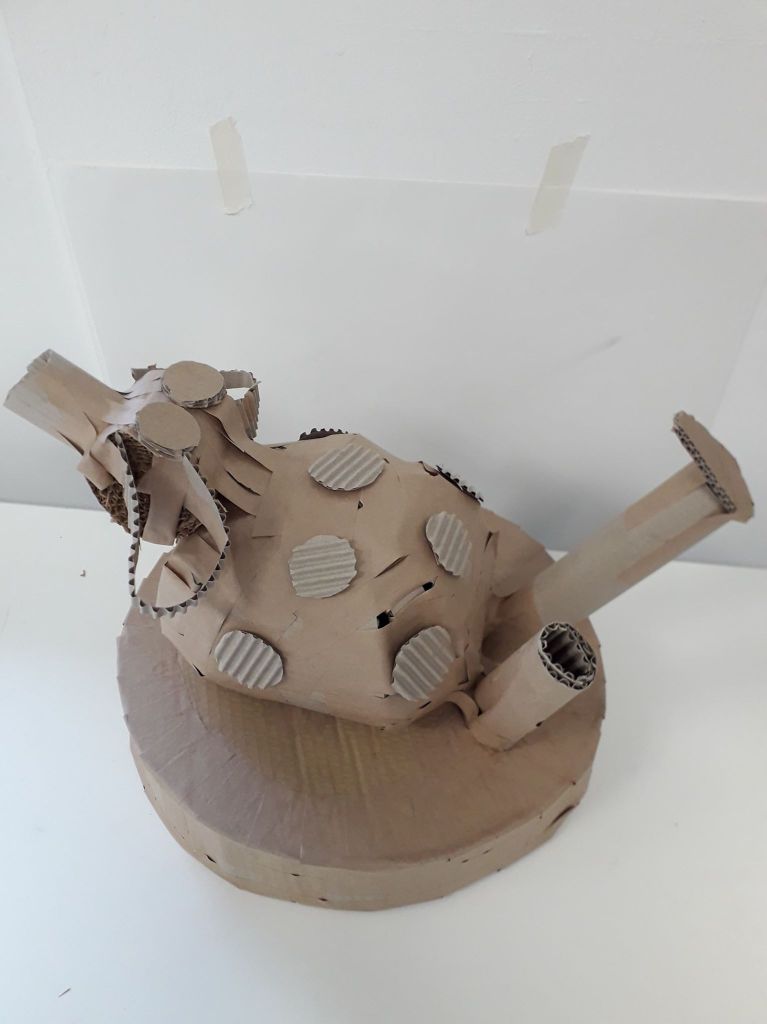
This is the result of the resistant materials session. I wanted a kind of dome shape, like Willie’s middle. That got expressed with the dome-like side of this sculpture. I wanted lots of thin strips to show the corrugated cardboard texture, but they ended up getting nailed on in an interesting shape all around the base.

Things to remember about the resistant materials space:

  • The big scary blade is called the band saw (I think). Turn on the dust extractors first. Use the push sticks if your hands are even THINKING about getting near to that blade. If you can see the teeth of the blade, it’s not moving and is safe. If you can’t – it’s moving.
  • The smaller blade is easier to work with. Don’t go past 1cm thickness wood when you use it. The blade is known to snap, but if you don’t turn too tightly you should be okay.
  • Turn on the dust extractor for the sanding machine before using it. Always sand on an area moving downwards.

How can I use what I learned? While woodwork isn’t really my forte, I like to think I’ll use the resource while I have it. Maybe making something to fortify an illustration… or if I ever learn bookmaking, I could cut a very thin slice of wood to be an actual functioning page in it!

Did I develop my ideas thoroughly? I was limited again by time and resources. The smaller saw was pretty much constantly in use. I really like the idea of using free scraps of material to make something pretty, though. I could make something that hangs with the kind of elegance of the smaller wooden sticks.

What didn’t work? I originally had a grand old plan to cut multiple semicircles of wood and somehow sand them into a 3D object. It just wasn’t practical, so those scraps got abandoned. I moved onto something slightly different which formed the final work.

Textiles Retrospective

Textiles Retrospective

The aim of the workshop was to take inspiration from architecture to create our own textiles. Examples of architects we took inspiration from included Zaha Hadid, Frank Gehry and Santiago Calatrava.

The morning focused on creating samples of textiles and learning basic techniques.

This is a zigzag pencil pleated fabric. It is created by folding two sheets of paper into this shape and sandwiching fabric between as a type of mould. Applying heat sets the fabric to the same shape.
This is the process to create a box pleat. We offset the other side’s pleats to create a twisted box pleat. The final result can be seen in the photo of my completed work.
This is a twisted pencil pleat. The samples were finished that afternoon by sewing a straight line across the pins on a sewing machine.
I created this myself. I quite like how organic it is; it reminds me of a beehive or maybe holes that decay causes in wood.
The finished work.

In terms of what I enjoyed or found useful, being taught how to use the department’s sewing machines will be invaluable. Since I enjoy embroidery, I could use the sewing machine to create bags or pockets from the material I embroider on – or to work on garments that already exist, like shirts.

The day of the workshop, I was in a very bad headspace. My heart wasn’t entirely in the second half of the day, so I could have made more of the time I was given.

In taking this further, I will probably focus on applied textiles rather than constructed textiles. It resonates more closely with my illustration-based art.

Chance and Sequence Reflective

Chance and Sequence Reflective

This project was all about creating fine and abstract art based on the laws of chance. We took part in four activities. I’ve detailed exactly what we did in my reflective journal, so I’ll just upload pictures and critically reflect here.

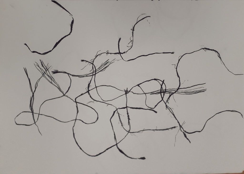
String drop felt like quite a silly activity. In reality, I like what I created with it a lot.

How could I take this further? I could use the activity of “dropping” paper shapes onto magazine images to select images and shapes to collage with. This would force me to randomly select textures rather than carefully cutting out images I found appealing. I thought that if I coloured in the spaces in blocks, it could create quite an appealing background to another illustration or drawing. I could simply repeat the exercise with grass, straw, leaves or other natural material.

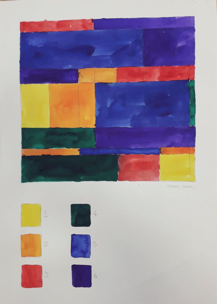
This was geometric randomness. I don’t really like this as a piece of art on its own.

How could I take it further? I thought I could do this with more limited colours, e.g. blue, purple and pink, to create a random piece of art that was slightly more aesthetically pleasing.

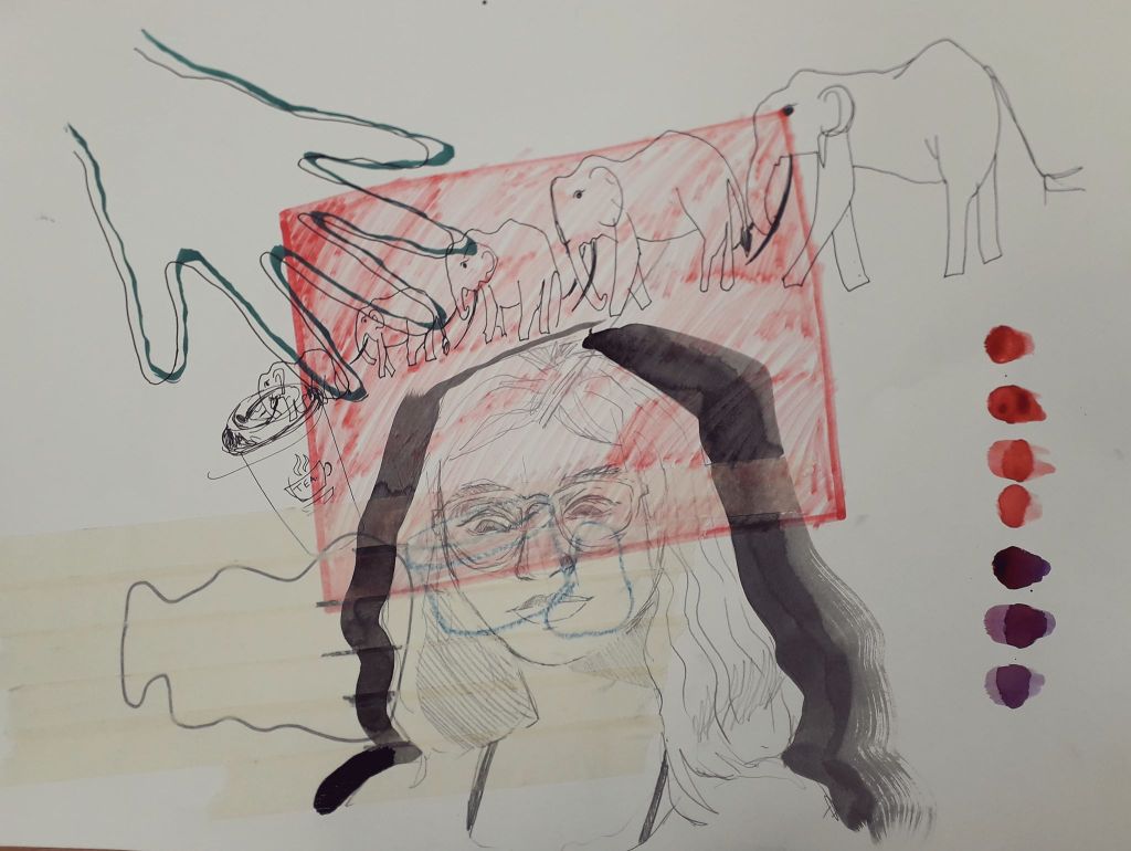
This was the collaborative, instructional drawing. I had a blast actually doing this exercise. I’m getting to quite like letting go of control in collaborative exercises. (And I never thought I’d hear myself saying that!) Things happen that would never have happened if I’d worked on my own.

How can I take this further? I could collaborate again with friends – e-mailing or swapping drawings to work on for each other.

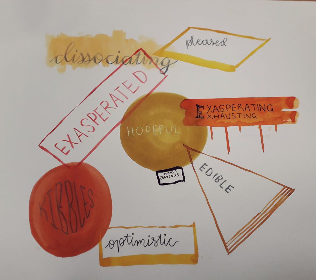
The conceptual emotional drawing was fun again, because I jump at any opportunity to introspect and write about what I’m feeling. I like the composition of this a lot, and the stricter colour scheme made me feel better from the earlier drawings.

How could I take this further? Well, I actually made Jamie complete an identical exercise that night. I have his art and I might turn it into a larger piece, so that they could exist in a series.

Finally, I created some random poems using dice and newspaper clippings which you can see in my sketchbook. These really were nonsensical at times… I don’t know why, but I suppose I thought I’d create something super edgy and deep! They were still fun. I might create a few for my reflective journal or put a twist on them for something fun to do.

I do hope I’ll do some more work related to chance, even if just a small aspect of something else. It’s nice to leave the thinking to the laws of physics and probability!

Gained in Translation Reflective

Gained in Translation Reflective

Gained in Translation was about how we interpreted description in drawing, and then interpreting drawing in a 3D model made of cardboard. The art and personal element came in the gaps of interpretation between words and paper, and 2D drawing and 3D model.

I enjoyed drawing from Said’s description. I was lucky that the object he described seemed to have a face, as I have a habit of anthropomorphising – and then becoming attached to – things.

I know Willie is a rude name, but I can’t get it out of my head for the little guy.

Below is what I found out the description was actually of, right at the end of the day.

A chipmunk type thing… this item doesn’t have a formal use. I’m told it was a ceramic student’s old work.

I translated this into a 3D model as best I could.

I thought that by chance, this cardboard model has a lot of personality. Far more so than the original (rather creepy) drawing.

Methods:

For the base, I used two circular pieces of durable cardboard and cut one length of flexible (one-side-corrugated) cardboard for the middle piece. I would secure an area a few inches wide with gummed tape, then work through the area with more individual pieces of tape until it was completely secure and uniform. I did this right the way around both sides.

For the (relatively) spherical body, I created a kind of guideline using two hoops of flexible cardboard arranged like two interlocking bangles. I then worked around it with long eye-shaped pieces, similar to how they stick maps on globes.

What could have been improved? I feel like this session went very well overall, actually. A little longer to work might have been nice – but I understand that the time constraints were kind of part of the project. I managed to finish him. Similarly, other materials like paper or tape might have been useful, but the fact that we were only allowed gummed tape was part of the project too.

Where can I take this? Well, funny I should ask that – I’ve already taken it a little further with a couple of character design exercises. I might make a separate blog about it when I finish it, but what I’m doing with the model is using it as a starting point to design a sweet little character. I feel like I’d be doing him dirty if I just forgot about him. He wants to come to life!

For that, I’ve drawn the model a couple of times quickly to get a feel of it before printing off a couple of pictures for inspiration. I’ve also painted some ink silhouettes that I’ll line a few iterations of his character onto.

I might well be tempted to using cardboard to generate ideas again. Considering that I have some issues with varying body shapes in my art, something that forces me to make shapes like this might help kick start that process.

The Unconventional Body Reflective

The Unconventional Body Reflective

The first half of the morning – dressing the mannequin – I have to admit I really didn’t enjoy.

Despite the fact that we took essentially a whole day out to gather materials, Martha and I didn’t have anything to create really striking shapes. Martha ended up constructing cool shoulder-pad things out of cardboard, but I just couldn’t get myself passionate about it.

Our finished mannequin. I liked the tape, but the morning was too stressful to really enjoy.
Some of our other collected objects.
There was a smaller mannequin I might well have enjoyed working on. I didn’t really get the chance to experiment for myself because of course it was a teamwork project.
The fold-out sketchbook I’ve since compiled in my normal sketchbook. The quality isn’t great, but it’s all in my sketchbook so I feel the reflective doesn’t suffer too much.

The drawing element during the second half of the day lifted my mood considerably. I finally got a real look inside my Artway box (I go NUTS over new art supplies!). I really enjoy fast-paced drawing because I know it’s good for me, even though I rarely practice it on my own. I feel like the course making me do drawing exercises is the equivalent to my mum forcing me to eat vegetables just to get something nutritious in me.

What could I have improved? I could have bought something huge to create an initial shape on my mannequin. It would have saved time and energy. It was bad luck that we live in halls and were the first group doing it, as every other group had free use of all our bought materials as well.

I feel like I didn’t work particularly well with Martha. We were both in a weird headspace that day and neither of us were talkative, but I felt like neither of us were confident enough with our own ideas to really make a statement on the final mannequin. There wasn’t any bad vibes, just a stressful and uninspired morning.

How will I take it further? I probably won’t work on full size mannequins again. I will use the drawing techniques to work quickly, and the paper collaging element – especially on the human body – helps me produce ideas in a freer sense.

Performing Chance Reflective

Performing Chance Reflective

Yesterday we completed the Performing Chance workshop with Kate. I wasn’t particularly looking forward to or resenting this one, because I really had no idea what was going to happen.

The initial lecture consisted of a brief history of chance being used to influence art. This included Dada, Surrealism, Abstract Expressionism and Fluxus (which is still running to the present).

The first task after the lecture was a lot of fun. Everyone went into the studio for 30 seconds and could do whatever they wanted to a table full of objects. This was filmed and played back afterwards. I flipped the whole table over. I liked it; I liked doing something radical that nobody had thought of up to that point.

I’ll try to find a screenshot or two from moodle, but so far it doesn’t look like it’s been uploaded.

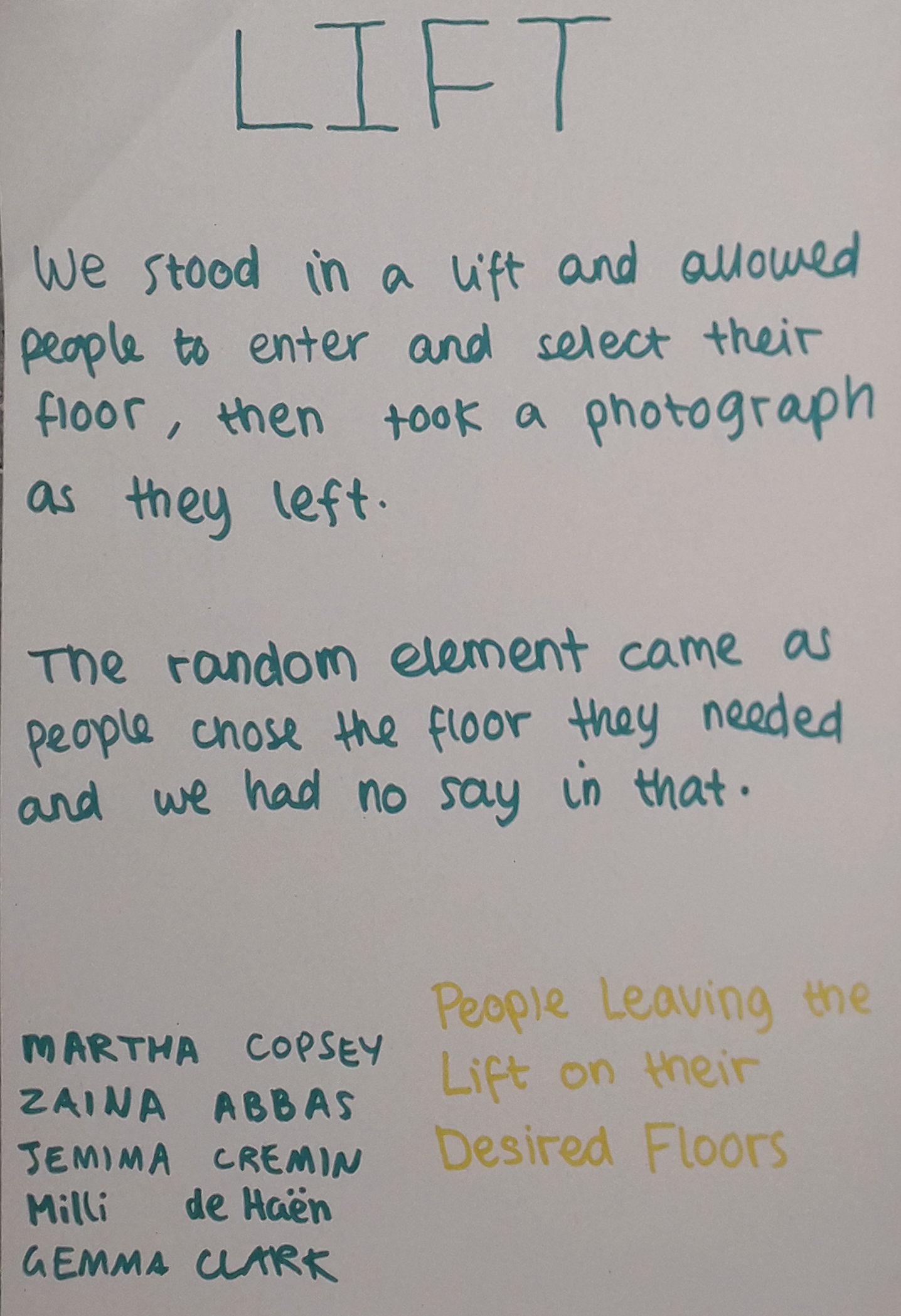
The conceptual photography element was fun. The workshop being based around random chance, we had to create a framework as artists and allow for chance to alter the final work.

Our group projects.

I might use this kind of conceptual photography in my work. It can portray an idea in a way that makes you focus on the idea, not the art.

If I could have improved anything, the photos would have been completely candid, with no knowledge they were being taken as the person left the lift. Of course this wasn’t possible. Maybe in a way, there will be an uncertainty in the gestures of the people leaving knowing we were taking a picture of them.

One thing I thought was good about the work I made was the human element. The pictures aren’t just pictures – they capture a decision made by each individual person.

Mind mapping as a team of five was fun, but I know I’m not very good at group work. The nature of the ideas forced us apart for the afternoon in a pair and a trio. I did make some concessions and they turned out really well in Martha’s side of the project!

I learned that it takes a lot of thought to carry out this kind of photography, even if pressing the shutter itself doesn’t take much effort. It was a new way of working.
Mapping Ox Brookes

Mapping Ox Brookes

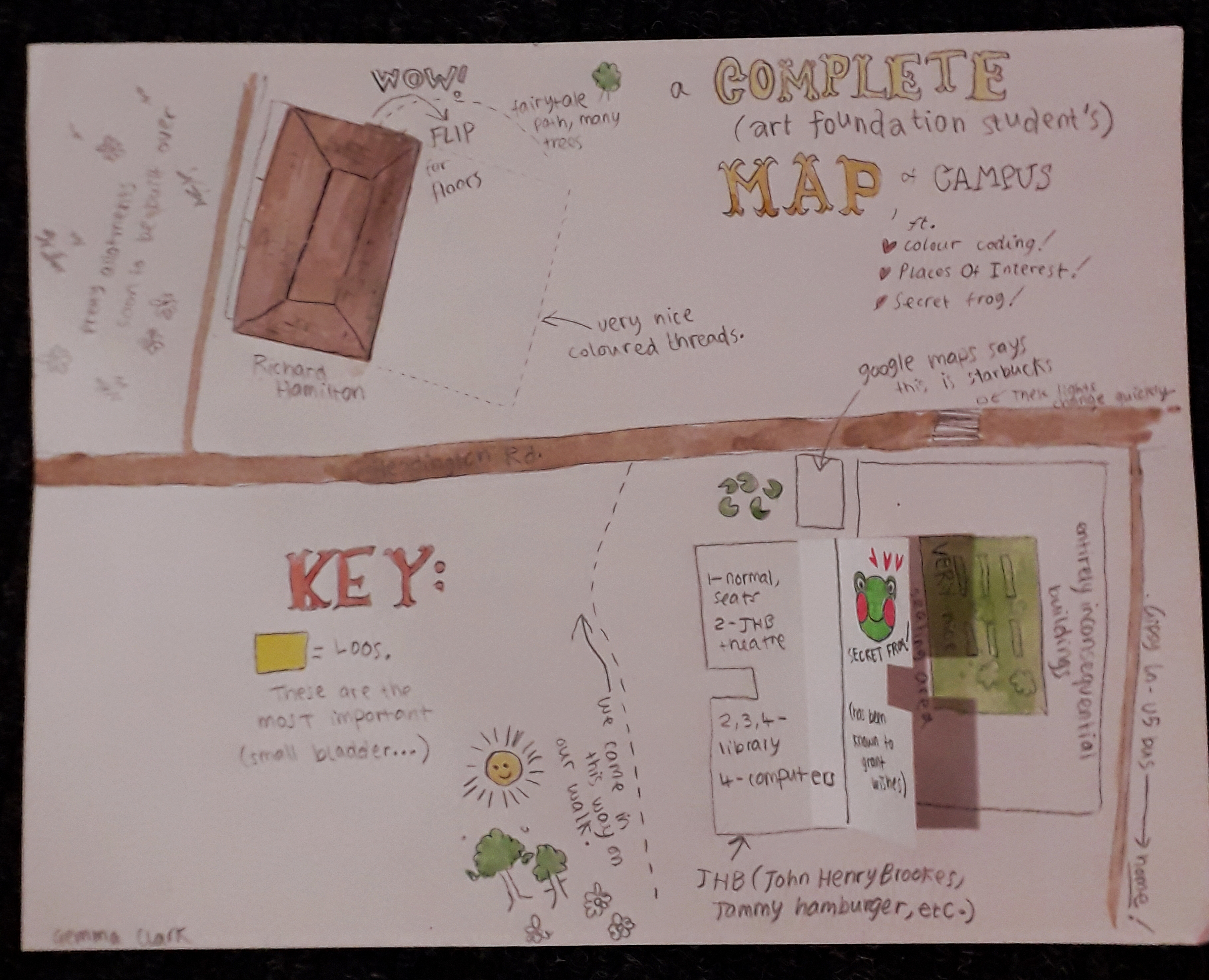
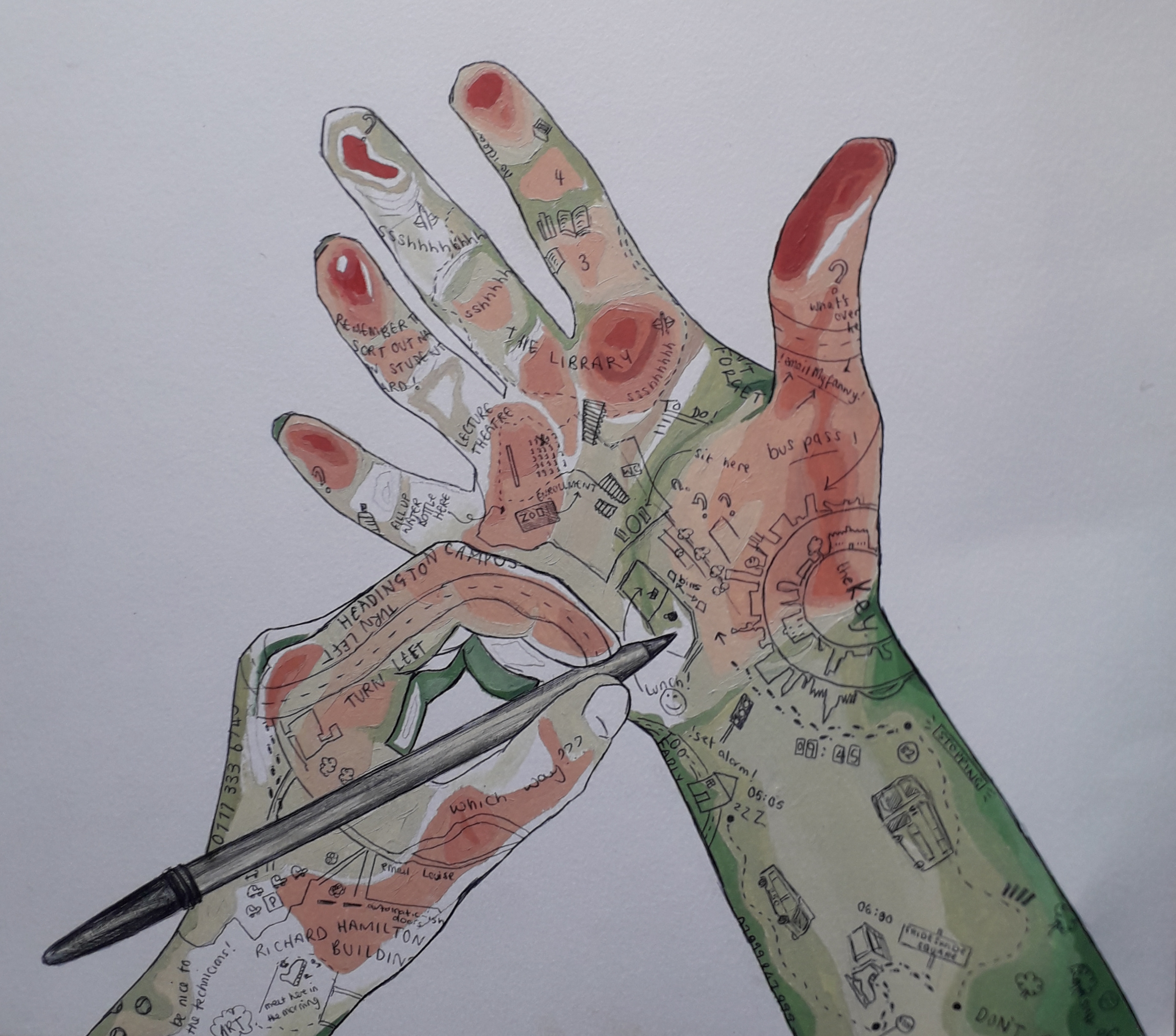
Everybody got a small brief to create a personal map of the area around them (i.e., ox brookes), to orientate themselves and to show a personal style. I’ve taken pictures of a few maps that really spoke to me, but I have to start with my own.

This one is my map. Just smaller than A4.

My map was illustratory and maybe childish in nature; I wrote it excitedly and mapped on things I’d thought at the time of seeing them. I view the area slightly differently now, but I like this because it really is archetypal of my style and brain and it’s documented my first impressions quite sweetly.

The flaps were the main interactive element (secret frog admittedly being a flash of enlightened creativity). The other thing I think was different from most other maps is that mine was bloody wordy – a real stream of consciousness. Other students gave a very personal insight in other ways, which really struck me.

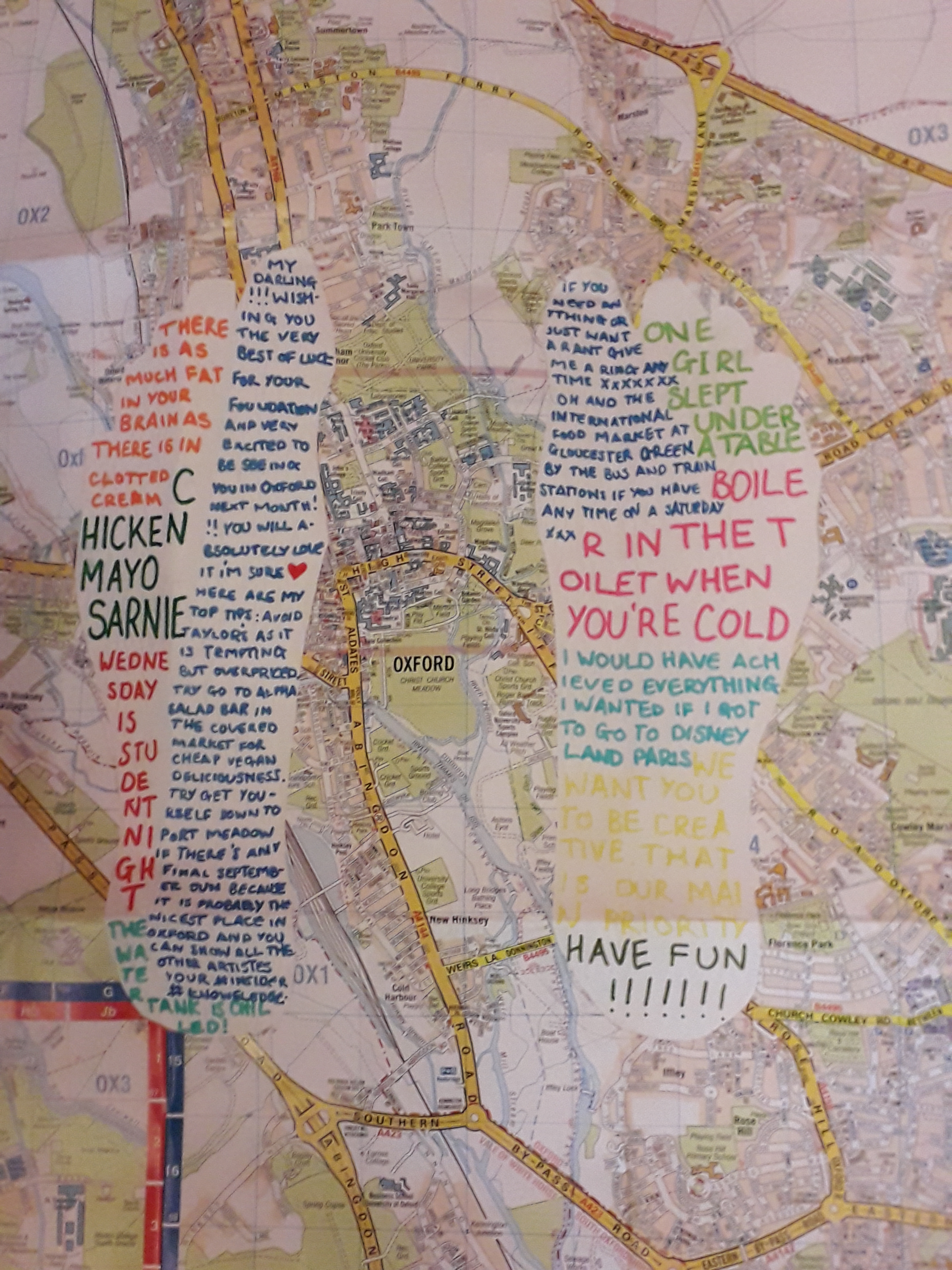
This was an OS map that has been altered.

The OS map with white feet cut into them contained snippets of conversation, presumably from the past week. I recognised a couple from lectures. This is probably my favourite… in seeing what the student has remembered, you see into their mind but totally indirectly. I can’t really overstate how much I like this one – it’s the one that felt the most personal to me.

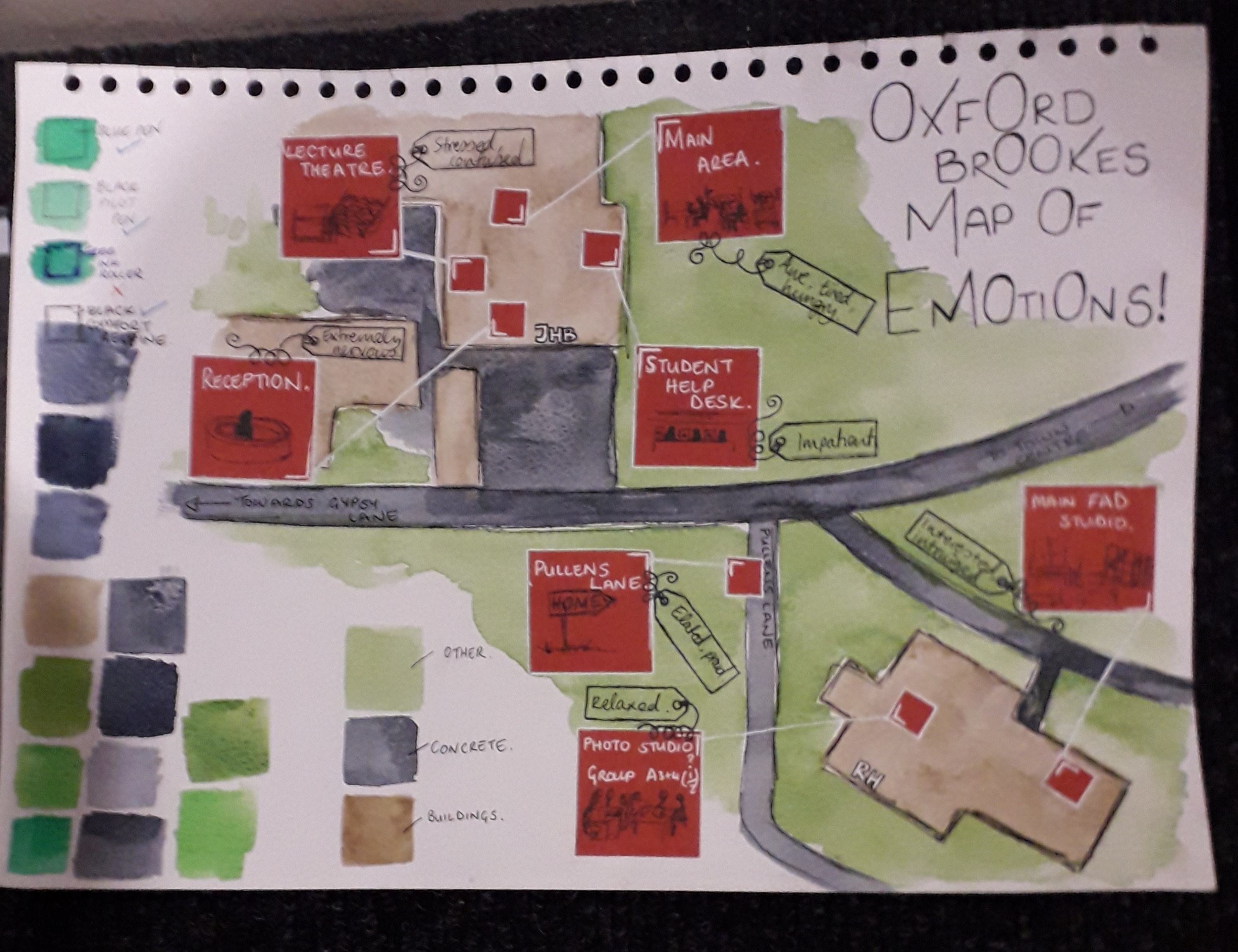
A map – but with emotions. I liked the colour swatching, too.

The map of emotions also hit quite close to my own heart because I remembered feeling most of these things too. It’s maps that are revealing of someone’s inner thoughts that it looks like I’ve gravitated towards. The colours and shapes are pleasant and well thought out as well, with close-ups of red areas filling negative space.

This image speaks for itself – the quality is incredibly high. The artist managed to show depth as if it were a contour map, and I have respect for the cleanliness and detail as well as composition. Not to mention the fact that this artist also included little idiosyncratic quotes theyd remembered.

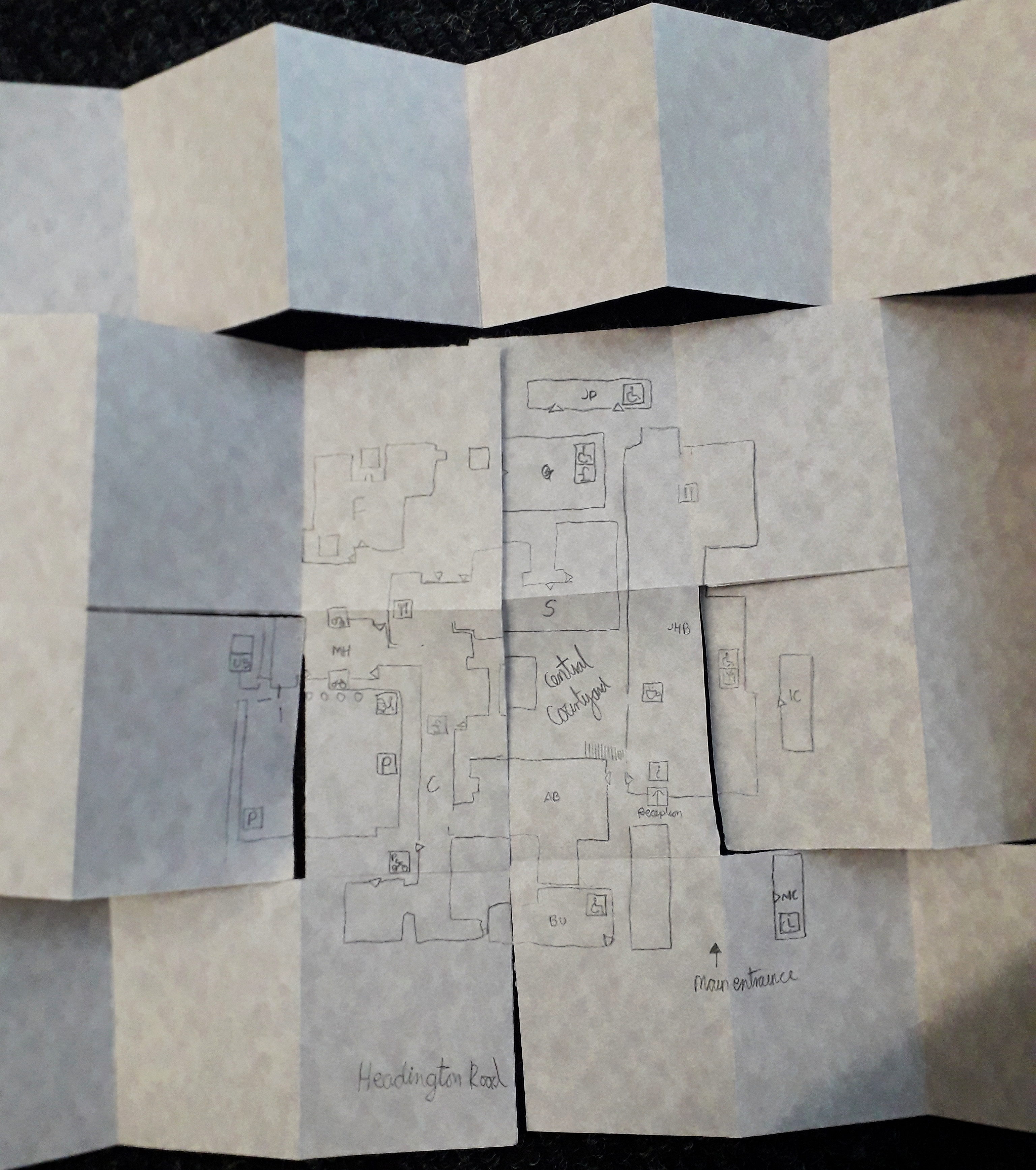
This map has to be included because it took me so to figure it out. It was presented as a folded mess, and I had to smooth it out flat. I like to think that that was intended to be interactive, and not just a lazy student dropping it onto the floor(!).

This was many pages long. I know Maeve was the artist of this!

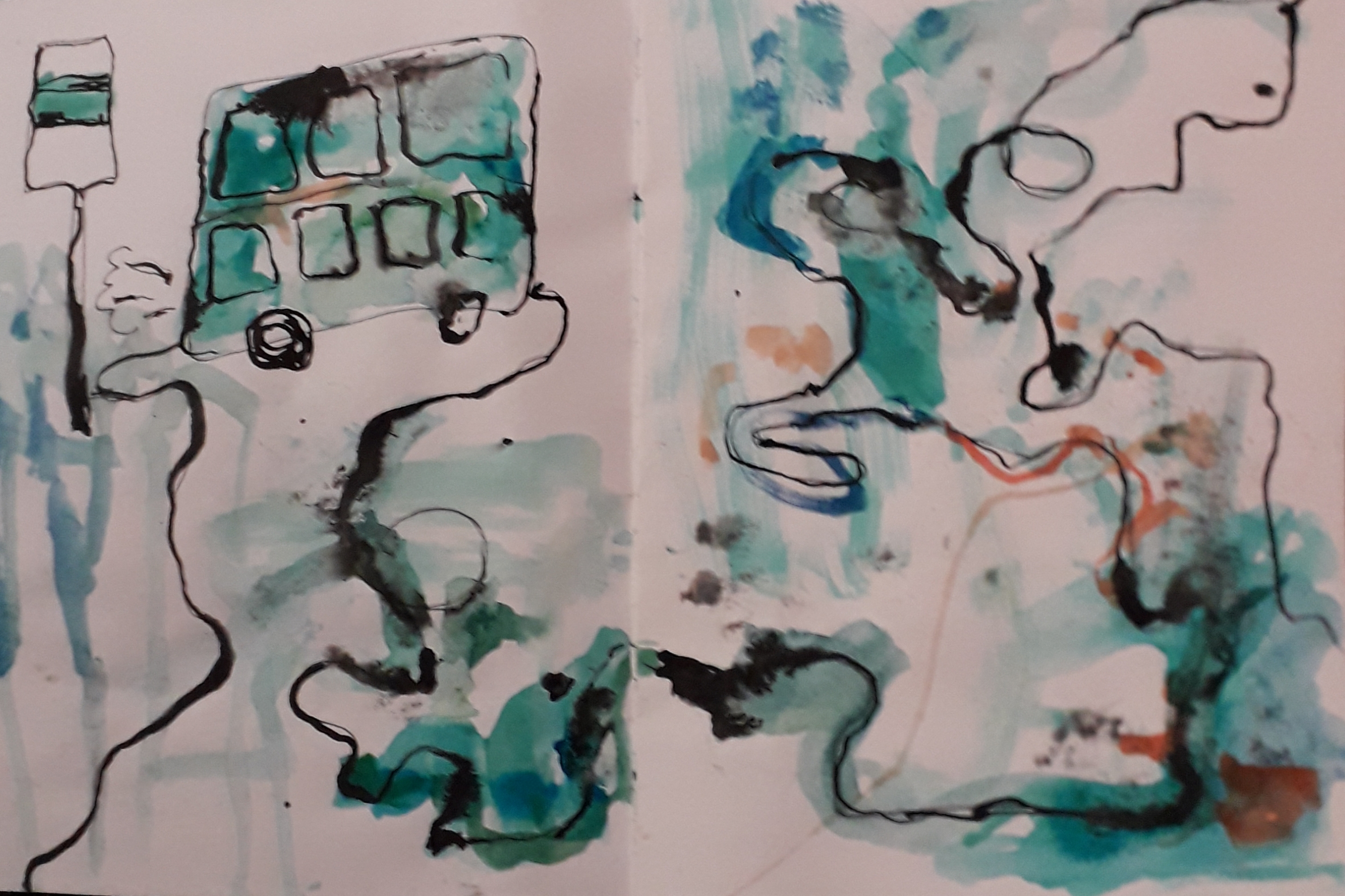
Honourable mention to this beautiful watercolour and ink abstract map. The colours took me, and it was unlike any of the other maps. This felt a lot more emotional, although I understood it slightly less than worded maps.