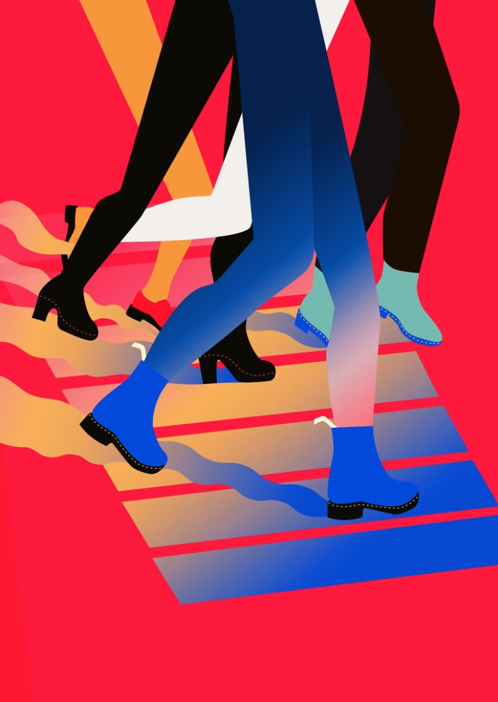
Shawna X is the name of a successful contemporary illustrator. She works digitally, but her designs are often realised as paintings or prints on a very large scale for commissioners e.g. Adidas, Doc Martens, Dropbox etc.
Conventions of her working style include heavy use of gradients and very bright colours. I am inspired by the blockiness of her work and the colour schemes.
This piece really interested me: I love painting on objects I find or own. Here, the surfboards reflect the beach-centric content. In a scene that takes place at Brighton, I might paint on beach rocks, a piece of driftwood, or even fish and chip packaging! It’s a shame that social distancing is keeping me from visiting…
I’ve actually used Jamie as help to create a big list of things we associate with the beach. Any form reflecting these items would be a big help in creating a cohesive illustration about the beach.
BALL
SURFBOARD
PARASOL
SUNCREAM
WAVE
SAND
SPADE
HAT
TOWEL
DECKCHAIR
SUNBED
ICE CREAM
FISH AND CHIPS
ROCKS
STONES AND PEBBLES
SWIMSUIT
BEACH BAG
CRAB
FISH
SHARK
CORAL
SHELLS
SEAWEED
BARNACLE
WOOD
SHIP
SAIL
COCONUT
NET
FISHING ROD
CLIFF
The 60’s inspired graphic design here is exciting to look at. The colour scheme is looking pretty tasty for stealing, too.I just really like the way this image has been edited. The colours make me happy. It’s a photograph, but the blocks of colour make the scene almost abstract and take it out of any recognisable place.This was a commission from Doc Martens. The feeling it creates is pretty cool. I hope to work with block colours a little.
I was lucky enough to find Bataille’s famous pop-up book “AB3D” in our own bookbinding studio, and in reading Paper Enginnering: Fold, Pull, Pop and Turn I ran into the book once again. Actually turning the pages is something really special.
I was considering using a little bit of pop-up in my illustrations. I’m just experimenting, but this is the artist I’m inspired by nonetheless.
This is an example of one of her few pop-up books.
The way she makes things move gives me the same pleasure as if a cartoon character came to life in the real world, because you can actually touch the moving paper. I think it would be lovely to work three dimensions into my illustrations in this exciting new way… but I’d need a lot of practice.
I was about to start writing up some new research, but I realised I’ve been putting off writing up my first experimental piece of finished work in FMP.
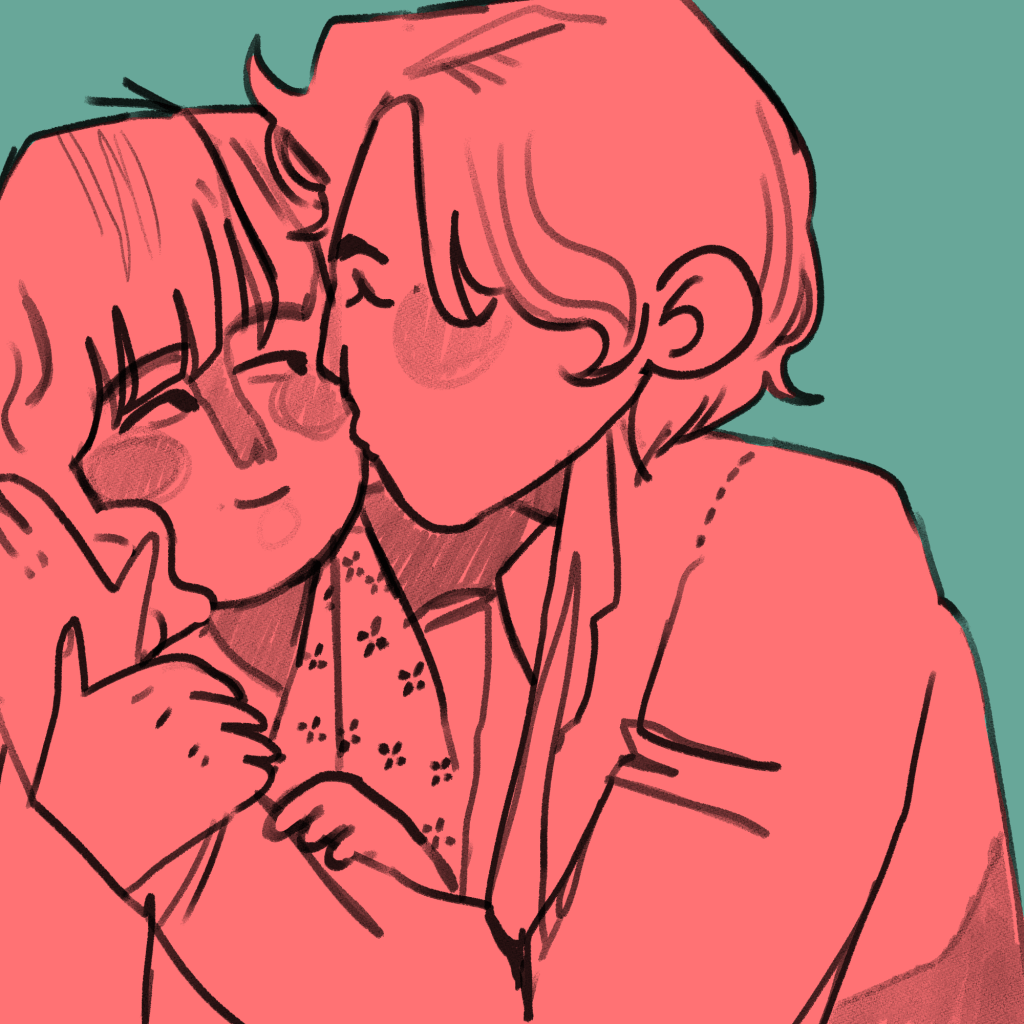
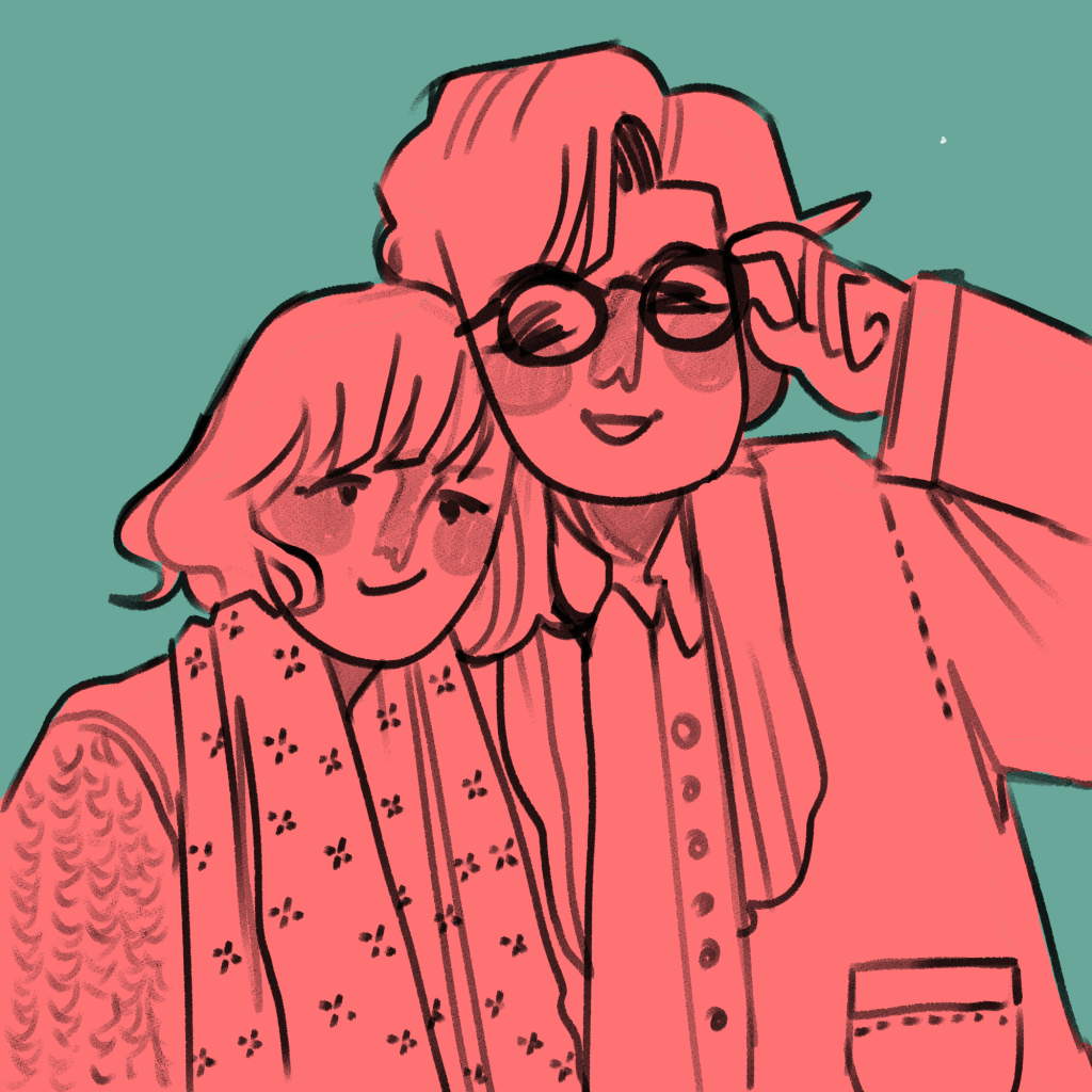
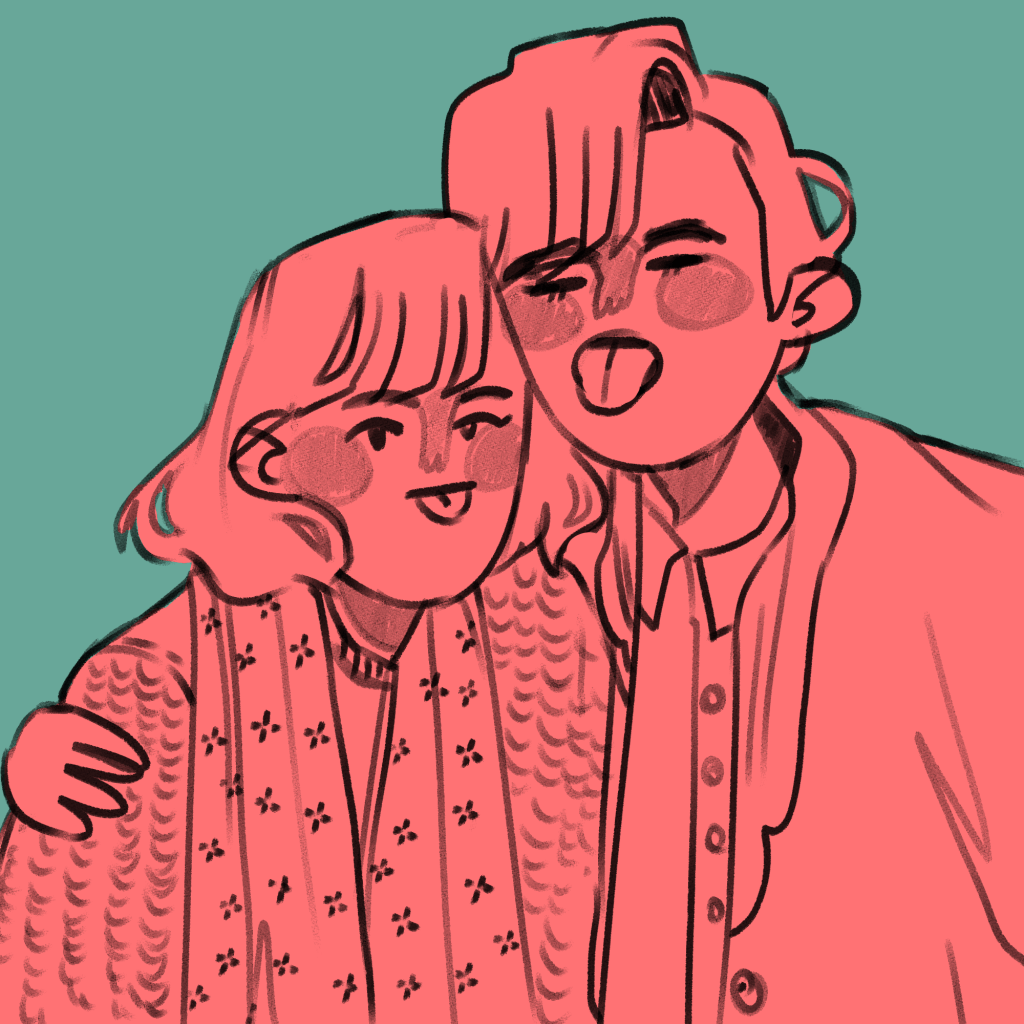
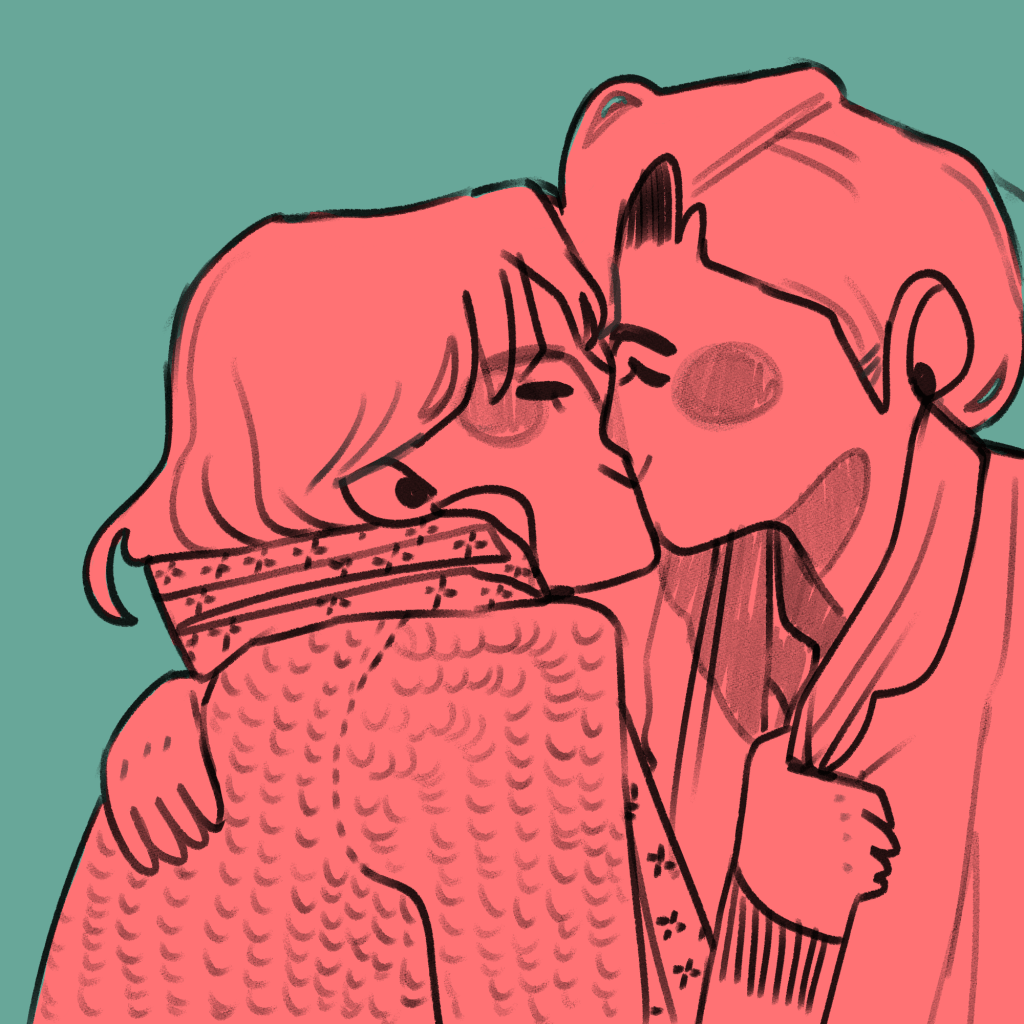
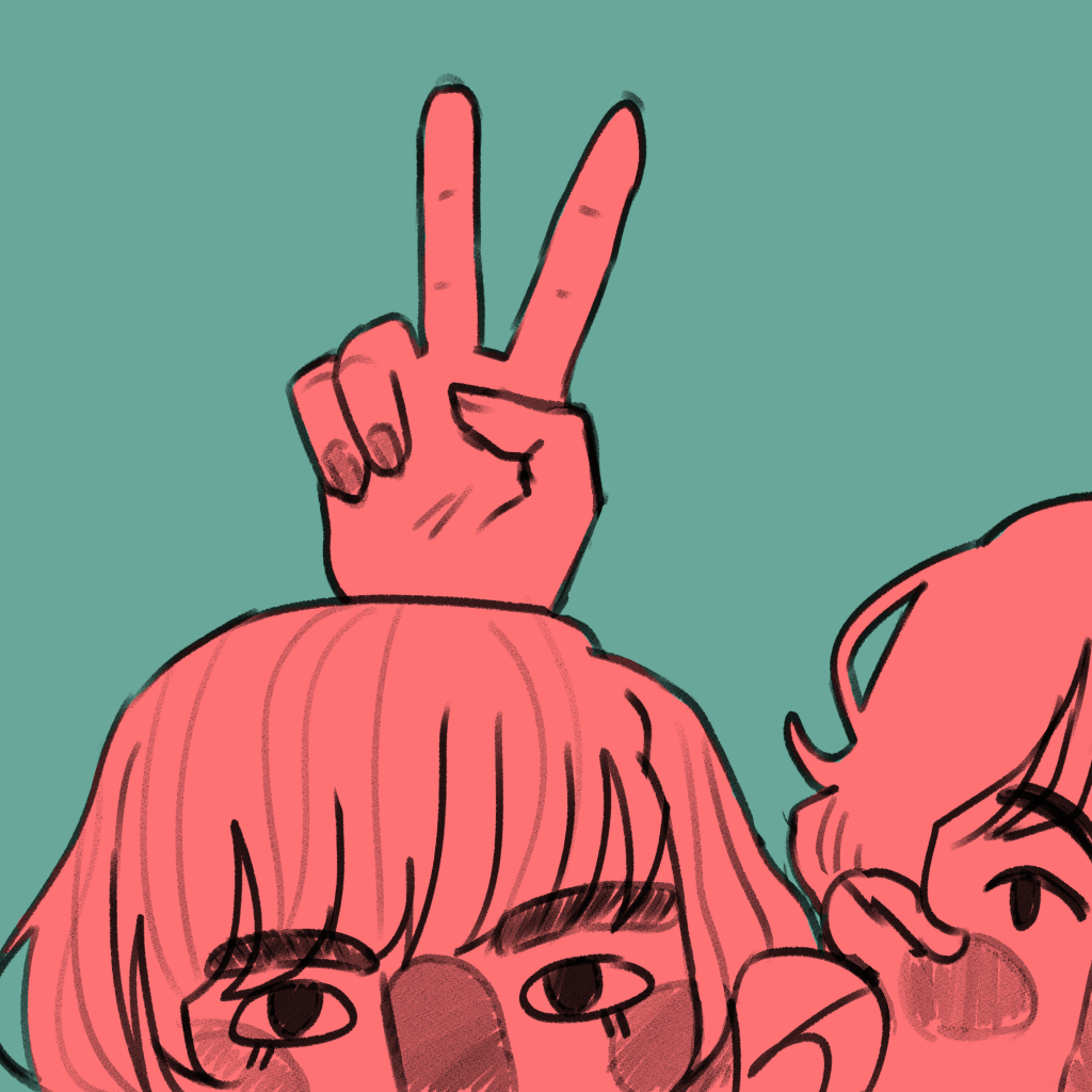
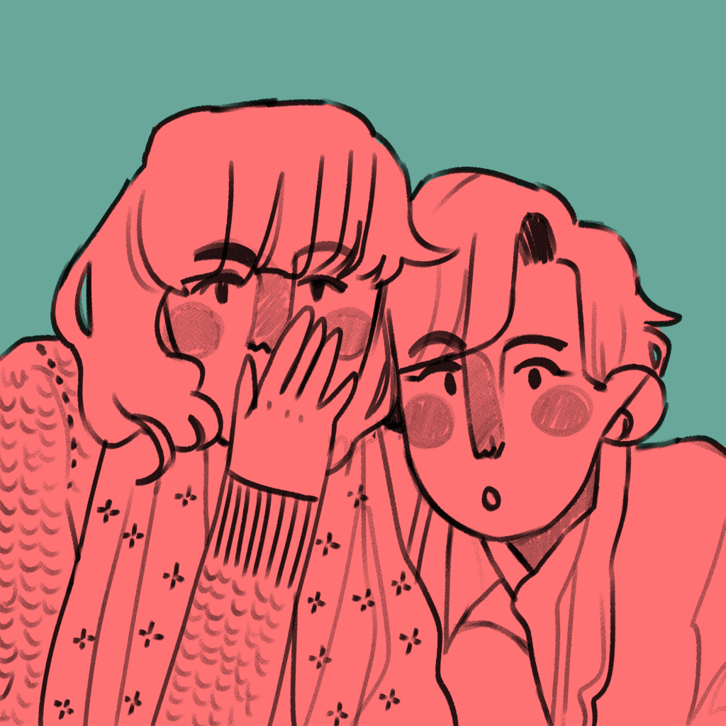
I am using illustration to explore the concepts of friendships, relationships and closeness. In doing this, I illustrated an everyday encounter between Antonia and Mitzi – mucking around in a photobooth. I had the intention to bind it into a mini-zine, an instant book I’d found out how to make in my research.
The illustrations I created came from a variety of different pieces of research. These were all mentioned in my Pecha Kucha, but overall I think they were a huge success.
This is the final result. You can see I experimented with different inks and paper types, including black and white versions. (This is because traditionally, instant zines were printed cheaply in B&W on office photocopiers to be shared and I like the historical aspect of that!).
Evaluation
Was my research purposeful? I would say so! All of the research I do affects my work somehow, because it sticks in my brain like velcro. In this case, though, studying artists like early manga artists and artists that inspire me allowed me to work comfortably in a style I like but to work in a more self aware way, and I think it’s improved the look overall as a result of the research.
Did I develop my ideas thoroughly? The short answer to this is no. Because it was just a response to research and was very experimental, I consider this successful nevertheless. Interestingly, I could focus on the form of the book I bind reflecting the content within the book in future projects. E.g. I could have had these images in a concertina style strip, similar to an actual photostrip that might come from a photobooth.
Where am I going to take this? I’d like to work in the area of “meetings” for a bit – I’ll probably chose one specific meeting and illustrate it in a couple of different ways. I need an experimental week, and to do that I need an image or scene I can experiment with. My thinkinig is circling around Drake meeting Mitzi, Ludwig and Techo. In terms of importance to the entire narrative, I have to say honestly I think this is the most important happenstance in all of the character’s development.
I’m starting another blog post, because what was meant to be a bit of light research turned into me obsessing over a Swedish family from the 17th Century and their habits of exchanging flowers. Time for a second attempt at relevant information for the FMP project proposal.
Friendship in young adulthood has been said to help with finding a career path and looking for mentors. I like this: I could have some work showing what each character individually gets out of the relationships with the others. They all learn a lot: Drake would teach Antonia a lot of musical skills, and Drake learns a lot about the LGBT community after being properly exposed to it for the first time. Etc, Etc.
Friendship also helps us interact with anyone else. Friends give us a basis for meeting new acquaintances. I like to think that Ludwig, who was basically incapable of meeting others, gained a more solid grounding for interaction after meeting Drake and Antonia. Antonia would surely have given him a view of the extremes of personality!
‘Last year (2008), researchers studied 34 students at the University of Virginia, taking them to the base of a steep hill and fitting them with a weighted backpack. They were then asked to estimate the steepness of the hill. Some participants stood next to friends during the exercise, while others were alone. The students who stood with friends gave lower estimates of the steepness of the hill. And the longer the friends had known each other, the less steep the hill appeared. “People with stronger friendship networks feel like there is someone they can turn to,” said Karen A. Roberto, director of the center for gerontology at Virginia Tech.’ – I like this. It’s a really visual example of how important friendships are.
“People tend to amplify their perception of negatively-arousing objects and situations (Easterbrook, 1959). For example, spiders are seen as looming closer by spider phobics (Riskind, Moore, & Bowley, 1995), time passes more slowly for newly-abstinent smokers (Klein, Corwin, & Stine, 2003), physical pain increases with pain-related anxiety (Rhudy & Meager, 2000), and disturbing objects appear physically closer than do non-disturbing objects (Matthews & Mackintosh, 2004).” – Tell me that isn’t some of the most mental trivia you’ve heard today. This is day-changing stuff. If I see a spider across a room, it might as well be crawling on my eyeballs for how terrified it makes me.
I want my Final Major project to be something I want to draw more than anything else. Being passionate about it means I’ll make some of my best work. In preparation for the project proposal, I’m doing a little research on interpersonal relationships so I can take a better and more thoughtful approach to illustrating my characters interacting.
All of the sources can be found in the bibliography for my FMP.
Connection/kəˈnɛkʃ(ə)n noun
1.a relationship in which a person or thing is linked or associated with something else.
relationship/rɪˈleɪʃ(ə)nʃɪp noun
the way in which two or more people or things are connected, or the state of being connected.
love/lʌv noun
an intense feeling of deep affection.
“Material objects determined how people related to one another by providing a key means of conceptualising and processing their emotions. They also played a vital role in preserving the identity of the giver, acting as an important site of memory for the recipient.”
Things like coins, ribbons, swatches of fabric and flowers were all given to mark important moments in relationships. This was in the 18th and 19th Century.
“These aspects were in their turn all related to what has been termed the 18th-century ‘culture of sensibility’, denoting a period where emotional responsiveness and expression of sympathy were highly valued aspects of social life.
The ‘cult of friendship’ was in its turn characterized by a marked idealization of friendship, which was viewed as the noblest and most virtuous form of social relation. These friendships took on an increasingly emotionally intense guise during the end of the century, the language of friendship becoming increasingly difficult to distinguish from the language of romantic love.”
“This aesthetic preference mirroerd his emotional response to nature, according to which spending time outdoors was not viewed as a source of powerful, dramatic emotion, but as a means of achieving happiness and bliss.” – Maybe take this as a chance to explore an area that makes me feel this way, or an area that would make my characters feel this way?
“Within this vast collection the object of inquiry for this article can still be found: pressed flowers carefully enclosed in tiny paper packages.” – I can’t believe that this article I’ve chanced across perfectly merges my two recent interests… pressing flowers and relationships… if there could be a scholarly article on the importance of baking cupcakes on relationships now I’d be on cloud nine!
“The concept of sensibility did not encourage all form of emotional expression, but rather established a nuanced code of emotional behaviour that could be mastered by the individual.[17] In the Gjörwell family, the emotional expressiveness connected to ideals of sensibility was centred on affection for family and friends, sympathy with the plight of others and happiness.”
“Sally Holloway emphasizes that in the case of courting relationships objects ‘facilitated the development of intimacy by encouraging lovers to think deeply about a relationship, imagine their beloved’s physical qualities, conjure the joy of being with them, and renew their romantic promises’.[19] Although not necessarily used in conjunction with courting relationships, similar functions could be served by flowers in maintaining a level of intimacy and emotional connection over distance in the Gjörwell family. This also includes the physical aspects of intimacy. The practice of sending flowers per letter often includes a description of how these were kissed before being sent off, followed by a description from the recipient of how the flower had been kissed when received, in effect constituting a sort of transporting of physical touch through the object.”
“See here a little flower, it carries a little tender kiss, it has been pressed to my lips. Therefore you will do the same, and never forget your little Stafva, who with all her heart and soul is your little friend and wife.” – Tell me this isn’t lovely. This is making my day.
“After gently reproaching her for not granting him the pleasure of seeing his child after a long time apart, Gjörwell tries to put the incident behind them by sending his wife flowers picked at a local health spa, Vårby:
At Vårby we drank to your health for the first time, and I picked the flowers here enclosed by the clear, salubrious and refreshing brim of the spring. [We] have all kissed them, why I also ask, that they be kept as memory of the feeling that enliven us all for you.”
“His procedure of keeping flowers is intricate and clearly draws on themes from pastoral literature wherein flowers are used to make sacrifices to the Gods.[40] These practices were common in Roman and Greek antiquity, both in religious and civil contexts, and are often depicted in Greek poetry.”
“There is thus a distinctly ritualistic character to the way in which Gjörwell views and keeps flowers, serving a function to repeatedly mobilize positive emotions. After extensively viewing the flowers he has received or picked himself they are kept in what Gjörwell terms a ‘friendship herbarium’. Herbaria are collections of pressed plants usually mounted on paper sheets or placed in convolutes on which the species’ scientific name is added, often along with other information such as date and location of collection.”
White daisy = “as of yet unseduced” but only from man to man specifically.
It seems to me as though the exact type of flower mattered less at the time than the intentions behind it: if you happened across a carnation, you might pick it just because it looked nice and you were thinking of a friend rather than because carnations have a specific coded meaning.
Jamie Green is an illustrator I have been inspired by for months after I found her on Instagram. She is a freelance illustrator and designer, and she works mainly traditionally, e.g. with gouache, coloured pencils, watercolours etc.
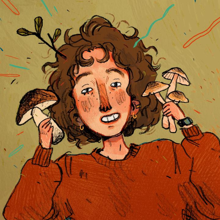
Fanart of an indie band. I really like how they draw figures. The jagged, slightly disproportionate limbs are something I want to work into my own style because they make me feel happy looking at them. The colour scheme: pastel pink and blues – exactly my style. And the way she draws faces is pleasing. I like the linework of the noses and the eyes and eyebrows. I want to work like this. The technique used in this sketchbook scan is colouring under full opacity on a multiply later. It allows the lines from a scanned image to stay dark while you colour. I’m realising as I pick out my favourite work from Green’s website that the bright, complimentary colours are some of my favourite aspects of their work. The hand lettering is another similarity between our styles. This is typical of her cosier style. She loves mushrooms and so do I… it’s admittedly part of why I love her work so much. I made breakfast with too many mushrooms for the first time in ages today… I was disappointed at myself. I’ve hit a mushroom limit. Anyway. I really like the “scribbled” texture that comes from working traditionally.
I’ve been influenced, however directly or indirectly, by Japanese comics in a big way in my personal artistic style. I’m researching the context for it, to see the historical and social connections to my current style.
In terms of my personal style, artists I had access to while developing my style were heavily influenced by contemporary manga and anime. This was because of shows like Pokemon, Sailor Moon etc. that many people, including Western / American artists, were exposed to from childhood. The stylised, lineart heavy cartoons I enjoyed on social media growing up were all tied back to Japanese animations and comics.
Hokusai is a famous 19th Century painter from Japan. He’s most known for his woodblock prints and natural paintings, but he created a lot of “playful sketches” (manga) work for his students as well. This is some of the earliest modern manga.
“After Commodore Perry opened up Japan to the West in 1853, an influx of foreigners followed along with the introduction of European and American-style comics. In 1857, Charles Wirgman, a British journalist, published The Japan Punch, a magazine modeled after a popular British humor publication. George Bigot, a French art teacher, started Toba-e magazine in 1887.
While both publications were originally intended for the non-Japanese expatriates living in Japan, the humor and artwork in the pages of The Japan Punch and Toba-e caught the attention of native Japanese readers and artists. Ponchi-e or “Punch-style pictures” began to appear as Japanese artists were inspired by Western-style comics and began the evolution toward the uniquely east-west style that is modern manga.”
At the dawn of the 20th Century, Japanese artists took inspiration from Western comics and applied Japanese ideas to them.
Kitazawa Rakuten (1876 – 1955) is considered the father of modern manga. He was inspired by American artists like Outcault, who created the comic strip The Yellow Kid. He was the first to start a school specialising in caricature and comics.
He drew humorously. The figures are all fun, drawn semi-realistically with a black ink pen.
Machiko Hasegawa was one of the first female manga artists. Following World War II, Japan was occupied by the US. The US had bought in comic and animated characters of their own, e.g. Betty Boop and Mickey Mouse. This was inspiration for a lot of Japanese artists.
I think this is adorable. My characters have an incredible amount of similarity to this work! It’s been so interesting finding out where my style leads back to in its origins.
An example of Hasegawa’s most famous comic strip, Sazae-San.
A really influential early manga artist was Osamu Tezuka. He created Astro Boy, a figure who is now an icon recognisable by almost anyone today.
Tezuka was the first to draw eyes so disproportionately large. Almost every anime and manga in recent decades uses a similar style, so this was revolutionary in terms of the style’s conventions.
I just went onto the Tezuka Osamu website. It turns out that he put the word for insect into his pen name, simply because he loves insects so much… and when you scroll down, you can click a little picture of astro boy shooting up to go back to the top of the page. I actually wept a bit at how sweet it was.
In one of the books I’ve been reading called Greetings From – Retro Design, I carried out some research on Art Noveau as a movement.
It was an artistic response to the rapid technological increases in the 1800’s, for example advancements in electricity and machinery. Artists showed the aesthetically pleasing elements of living in a city around this time. It was a holistic art movement in that the ideology could be applied to almost anything: architecture, furniture, advertisements, etc.
It is defined in the illustrations I’ve researched by a few specific conventions. These are:
Flat, densely detailed illustration
A central female figure – often lewd, or suggestive
Natural and organic detail filling up as much negative space as possible.
Pastel, muted colour pallettes.
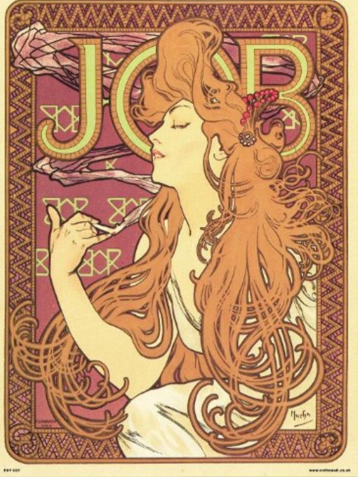
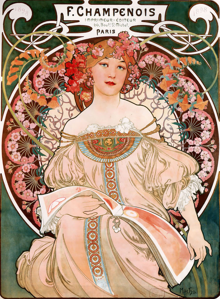
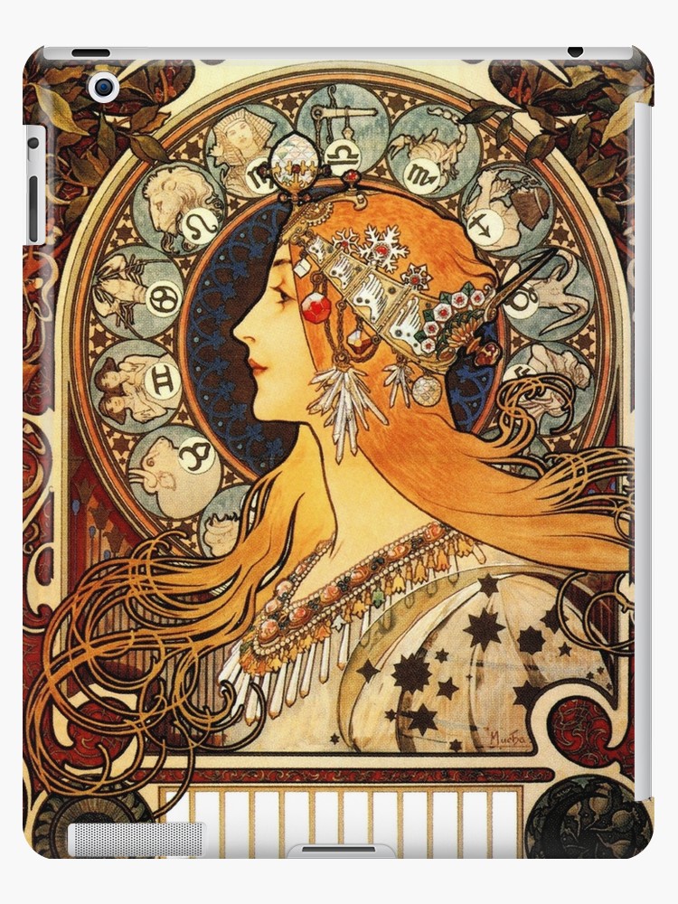
Alphonse Mucha is typical of this art movement. His works are some of the most famous of the time.
I’m inspired by Mucha because of how beautiful his illustrations are. I’m really attracted to the shapes he creates in the images – the circles, the loops and natural curves and how they interact.
I will likely take inspiration from Mucha in terms of my colour schemes. The pale pinks, light browns and beiges are all colours I enjoy wokring with.
I like the way the hair is drawn and how it crosses over itself in a hundred intersections. The fact that it’s in block colour and only the outsides are lined attracts me.
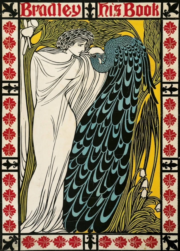
Another artist famous in Art Noveau is Will H. Bradley.
You can see similarities in Bradley’s work, but his work was slightly more progressive in that there’s more negative space than traditional art noveau illustrations. There are larger expanses of flat colour here. Bradley was also famous for designing the covers of Chap Book, a publication that ran through the time of Art Noveau.
I’ve made some work in response to Mucha and Bradley and their working styles.
I couldn’t help but notice that an artist I’ve been inspired by for a long time, KomunHorangi, is clearly influenced by the flowing style of Art Noveau. You can see similarities to Mucha’s work in the way she draws hair.
Although you can clearly tell that she’s been influenced by Japanese manga and animation style (see the huge eyes and facial proportions), you can also see an obvious stylistic similarity in the way the hair is drawn.
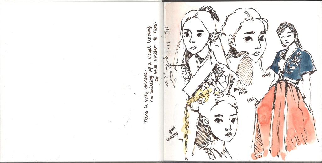
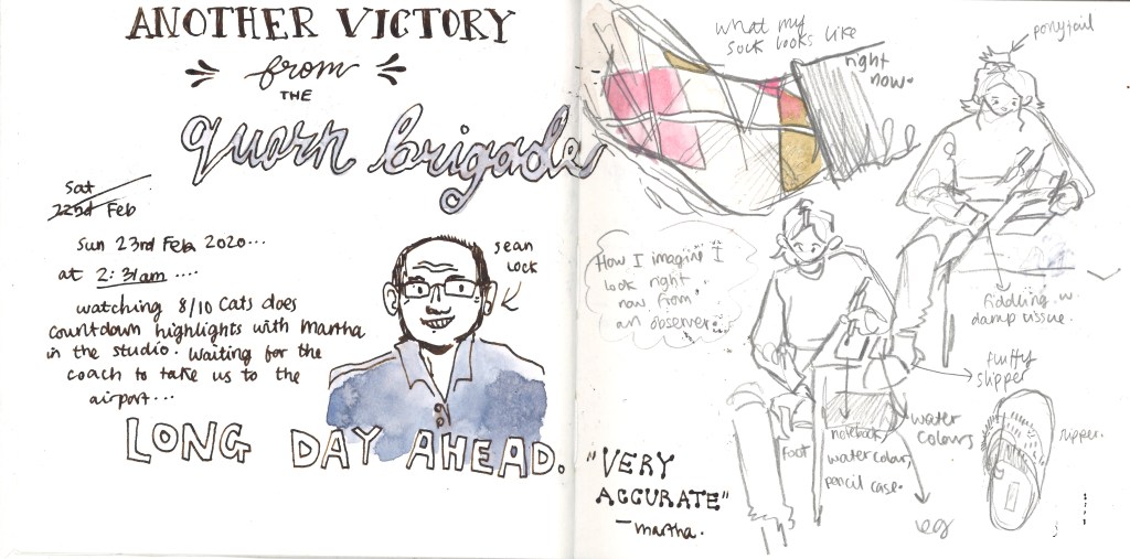
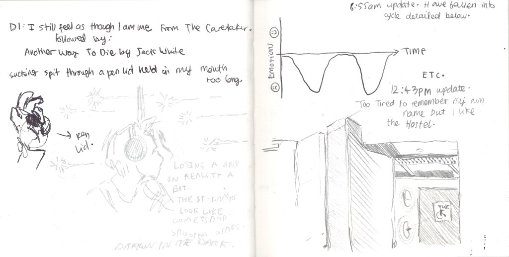
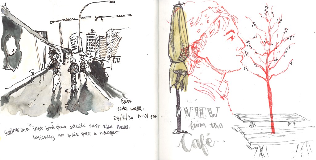
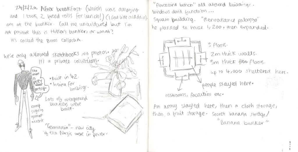
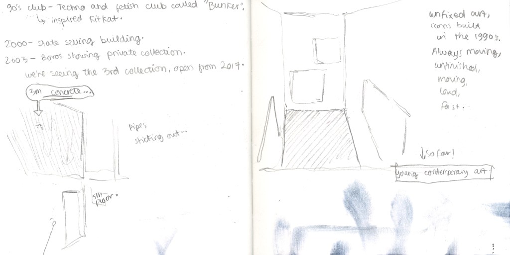
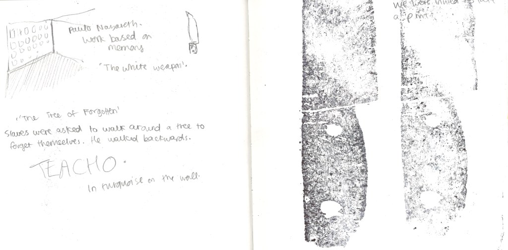
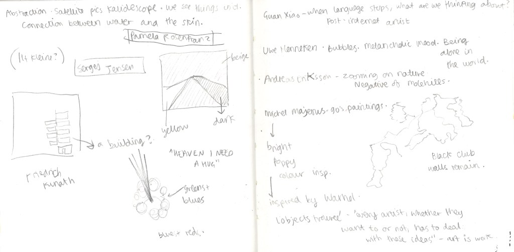
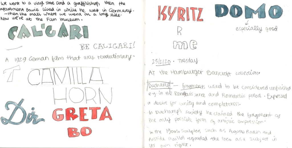
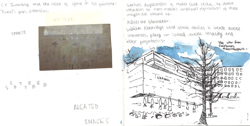
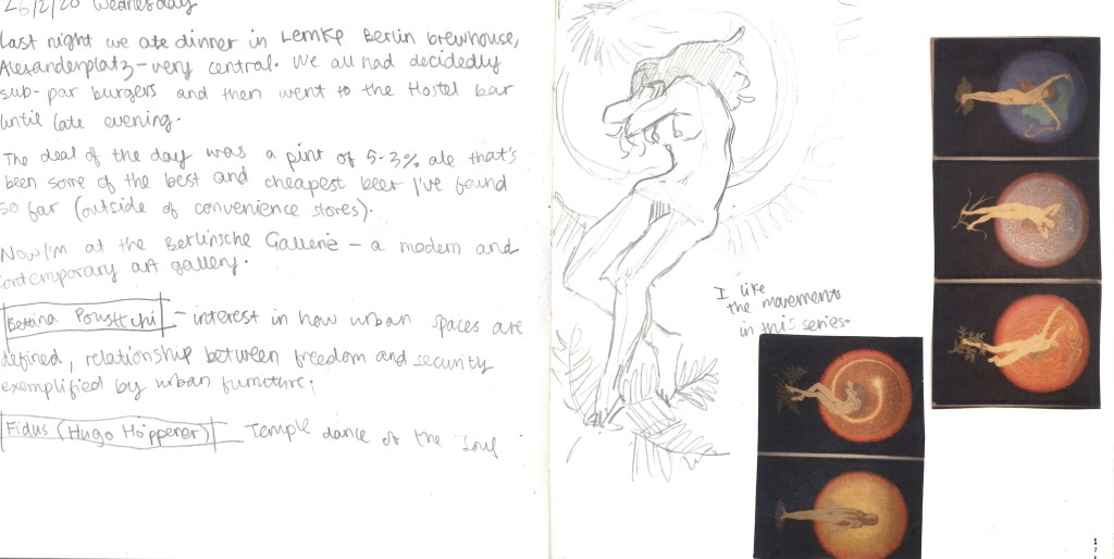
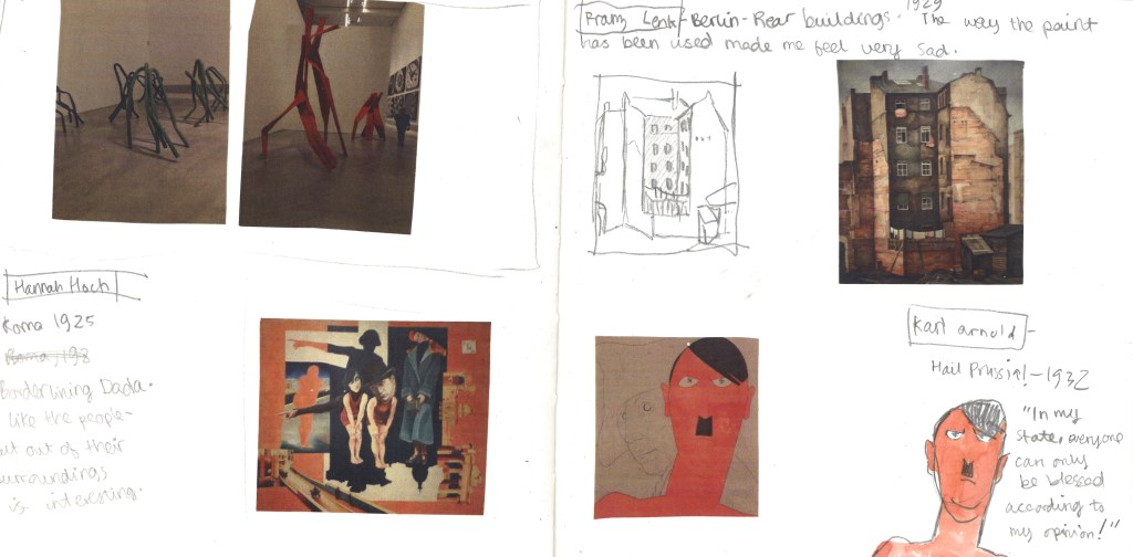
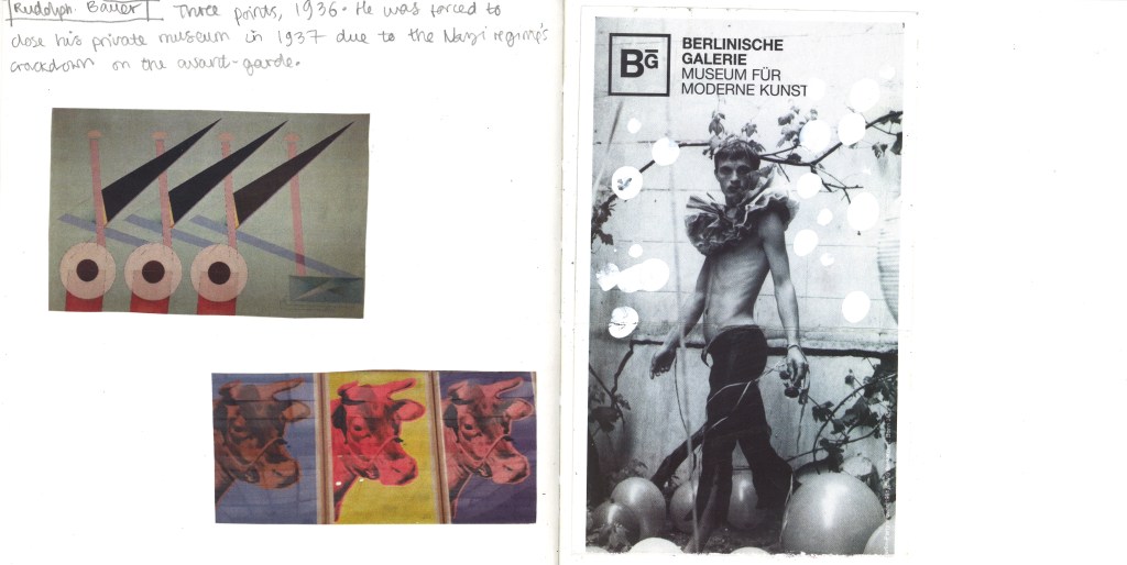
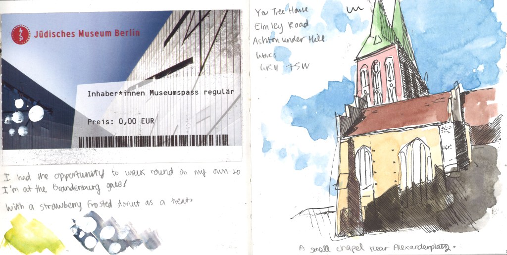
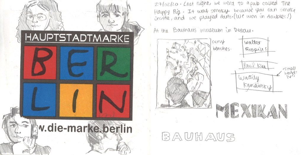
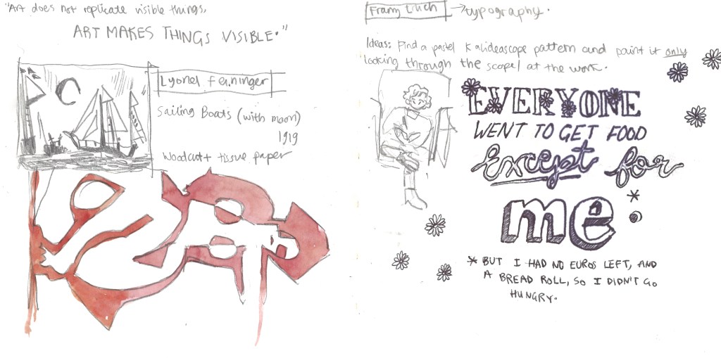
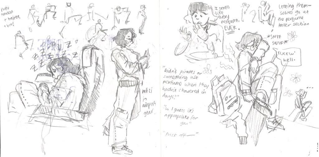
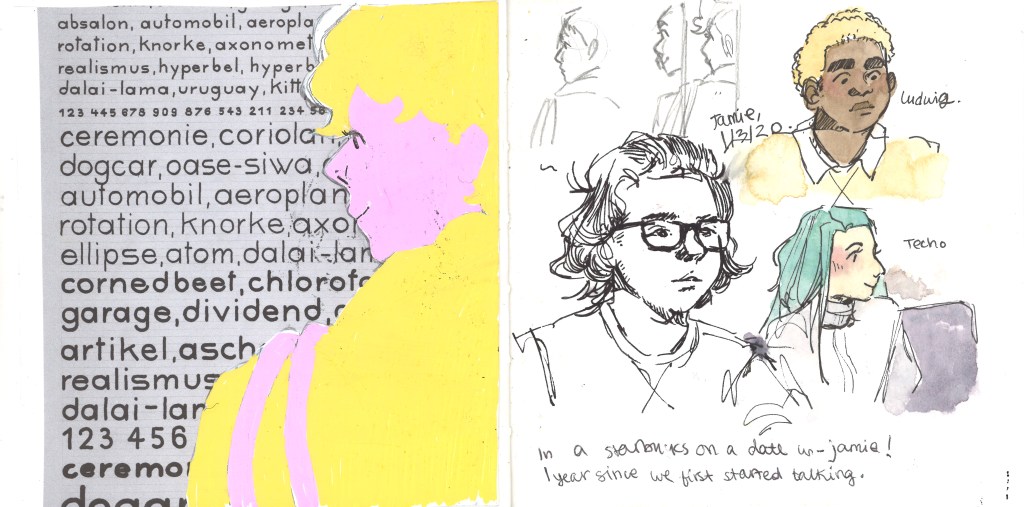
Below are 22 double-page spreads that I created during the Berlin trip. I endeavoured to use the sketchbook as a diary too, and document whatever I could of the trip so I can look back and remember properly.
The final sheet! Ft. one fully made, three-dimensional pill box.
I have evaluated the whole of Unit Two against the seven criteria I know I will be assessed on.
Evaluation
Context
I feel as though I’ve tried hard to ensure there was context to Unit Two. Throughout Utensia, I was finding examples of contemporary artists and taking note of where their work sits in the professional field. When I took inspiration from them and made my own work, you could tell that my work would sit in a similar context to, say, Samuel Shumway. His papercraft sculptures work on their own as illustrations and have helped him establish an identity in the industry.
My futures project also referenced context with illustrators like Jonny Hannah. His early work in illustration has led to him creating a book which he’s become well known for. My Spaceoline brand packaging is very similar in tone to his illustrations, and would establish my “look” to potential clients or commissioners.
Research
My research has come in two forms: researching artists’ visual styles and taking reference for my own work, and research into the actual content of the project to get ideas for my illustrations.
An example of the former is my research into Bruno Mangyoku and Toma Vagner’s illustrations. Of my two Spaceoline final designs, the wraparound pot’s colour scheme was directly taken from one of Mangyoku’s illustrations, and the pill box from one of Vagner’s.
An example of the latter is my research from Futures into body modification, e.g. the A.Human fashion show and research into bioluminescent animals for potential aesthetic future surgeries. There is also research into Asimov’s science fiction worlds via reading some of his fiction and then research into the ingredients of pills (paracetamol, opioids, etc) in designing an illustrative “ingredients” sheet.
Development of Creative Practice
There is evidence of experimentation with media throughout my sketchbooks, and notably in my Utensia media worksheet and my Futures initial ideas sheet. There is examples of collage, acrylic, watercolour, collage, buttons, wires etc. and 3D work.
In using my command of watercolour and control over the media, I feel I have created a polished final work in making the two Spaceoline packaging designs.
Problem Solving
One example of a problem I have had to solve was in creating the Utensia oven. The paper I had chosen to use was too flimsy to maintain structural integrity, especially because I had made it wet once with watercolour and warped it slightly.
I solved this problem by reinforcing each panel with dry, sturdier paperstock. This allowed the thin, elegant visual design I’d hoped for (rather than having used bulky cardboard) while still creating a sturdy final outcome.
Another example of a problem was in colouring the black space between designs on the Spaceoline pill box. The watercolour bled into the coloured designs and was ugly, which I hadn’t seen in retrospect because my practice had all been with lighter colours and painting the outlines before coloured work.
I solved this problem on the go by outlining the words in black fineliner, which bled far less seriously, before going on to paint the rest of the design. This created a barrier between the colours that reduced the bleeding considerably.
Planning, Progress and Production
I have had the chance to create aims and act against them continuously through the project: both Utensia and Futures. This can be seen in weekly numbered blog posts. At the end of each week, I take a step back and create aims for the following week. I also reflect critically on whether I have achieved what I hoped to in the past week. This process has allowed me to stay on top of my work and have something concrete to work towards rather than becoming confused or off-track.
Evaluation and Reflection
In consistent blog posts, I have reflected critically on my own work both positively and negatively. I use a list of questions given to me in Unit 1 to ensure I evaluate effectively. I’m also evaluating right now!
Communicating and Presenting a Creative Practice
I started my work in a sketchbook because the idea of working on A1 sheets made me feel a little ill at the beginning of Futures. However, having the choice suddenly made me realise the value of working on A1 sheets. I just had to come to that conclusion myself!
Since that point, I have presented my work for Futures across multiple platforms. Written research and scratchy ideas are in my sketchbook because I have that to hand most often. Visual development was more successful on A1 worksheets, so I have three sheets of picture reference, drawn images and experimentation that an audience can see a clear line of thought between. My blog has been useful for critical reflection and more in-depth research, e.g. documenting relevant illustrators and documenting the basis of my sci-fi ideas.
Retrospectively, what would I have done differently to improve?
In an ideal world, I would have created another A1 sheet for Futures with more research and initial ideas. There’s easily enough work to fill a sheet in my sketchbook, but my tendency to work small and feel daunted by such a big sheet held me back this time from creating a more completed and professional piece of work.
Now I’ve had the chance to try out so much experimentation in units 1 and 2, I’m getting a better feeling for what I actually enjoy creating. In the Final Major, I feel excited about it because wherever it takes me I can still put my own happy spin on it and enjoy creating the work.










 Gemma's Art
You must be logged in to post a comment.