Future of the Body: Week Four

Future of the Body: Week Four

The group crit from last week left me in a good position. Since then, I’ve been creating illustrated packaging for Spaceoline.

The illustrations are a massive mixture of all of my research up to this point and a lot of new picture references, which I have saved to my drive. I’ll collage them in my sketchbook when I get the time… which it looks like won’t be for a little while. Yikes.

This is the finished jacket for a small pill pot. The limited colour scheme is inspired by one of my favourite images by Bruno Mangyoku. The textures within it are pretty directly inspired by my texture and experimental work from the previous worksheets.

What do I feel was successful? I was really happy with this pot. I feel like the checked effect worked well, as well as the automaton hand. The limited colour scheme worked very well too – so I took it into the next piece of packaging.

This is the front cover of the Spaceoline pill packet net in production.

I had to do some pretty intense problem solving here, so I thought I’d mention it. When I started to add the black watercolour in, when I was painting crisp lines next to previously coloured spaces it bled into the watercolour pigment. This was ugly and a huge issue because I was working so small. See the top image: I realised quickly that I couldn’t continue to paint,

I thought about it, and ended up using a black fineliner to outline any coloured work to create a barrier between the colours. This worked pretty well, and staved off disaster! I used the knowledge with the back side of the pill packet, which came out far more crisply in terms of rendering the design.

What do I feel was successful? I reused the check design, coming out of a rocket just like in one of my early worksheets. I love the font I ended up deciding on for the word Spaceoline, and the phrase “When in doubt, Space out!”

You can see here that it’s a far clearer piece of work than the front, simply because I bought all of the knowledge and problem solving through with me to create this piece.

Here, I really liked the space hostess. I based her outfit pretty directly from the ones in PanAm: a show I haven’t watched and an airline I don’t know much about, but do like the glamorous, vintage hostess feeling. Like the ladies from Fifth Element on the cruise ship to Floston Paradise.

Where am I going to take this?

I plan to scan these pill packet nets in to keep the design safe and high quality. Then I’ll use the scanned designs to make up some actual packets, which I’m looking forward to!

The project is actually finishing this week, and assessment is next week. Furthermore, I have a terribly busy week with two interviews to prepare for just before the assessment.

Future Of the Body: Context: Asimov

Future Of the Body: Context: Asimov

For the sake of keeping recent context in one place, I will copy in a few excerpts that I’m drawing inspiration from at this stage in the project. These all come from Asimov’s short story I’m In Marsport Without Hilda. I’ve put anything I particularly like in bold, because chances are you’ll see it come up in my work.

“He had thrown me. I knew what Spaceoline was. If you’ve been on a space-hop you know, too. And in case you’re Earth-bound yourself the bare fact is that everyone needs it on the first space-trip; almost everybody needs it for the first dozen trips; lots need it every trip. Without it, there is vertigo associated with free fall, screaming terrors, semi-permanent psychoses. With it, there is nothing; no one minds a thing. And it isn’t habit-forming; it has no adverse side-effects. Spaceoline is ideal, essential, unsubstitutable. When in doubt, take Spaceoline.”

“Big industrialists don’t go space-hopping much; they use trans-video reception. When they do go to some ultra-high interstellar conference, as these three were probably going, they take Spaceoline. For one thing, they don’t have enough hops under their belt to risk doing without. For another, Spaceoline is the expensive way of doing it and industrialists do things the expensive way.”

“The one who carried contraband, however, couldn’t risk Spaceoline—even to prevent space-sickness. Under Spaceoline influence, he could throw the drug away; or give it away; or talk gibberish about it. He would have to stay in control of himself.”

“He said, in a dreamy voice, “Surrealismus of Panamy hearts in three-quarter time for a cup of coffeedom of speech.”

That was Spaceoline all the way. The buttons in the human mind were set free-swing. Each syllable suggests the next in free association.”

“One of them must be faking. It wasn’t hard to fake the thing. Comedians on sub-etheric had a Spaceoline skit regularly. You’ve heard them.”

Future of the Body: Week Three

Future of the Body: Week Three

This week I had the chance to get more work done on my Futures project, having successfully uploaded my e-portfolio and sent it to Brighton.

I finished off the worksheet with all of the photo references I’d been saving along the way. You can see where I’ve used them in generating initial ideas here.

I re-read a couple of Asimov’s short stories and stumbled across a drug called Spaceoline. It makes space hops easier – which are usually associated with feelings of free-fall and terror, and can be quite traumatic mentally.

Here I experimented with the product’s branding and form. I looked at American gas station logos and Americanised product branding. Then, I speculated on what form the drugs would actually take – but I’m pretty settled on powder pressed into pills.
This was a hastily concieved idea of a Spaceoline jar, for the purpose of experimenting with all sorts of media. I have become enamoured with this piece, even though it’s just a concept sheet. Shown above is: Embroidery, collage, pen, pencil, marker, concertina paper, rings of paper glued on and weaving through the paper.

What has been successful this week? I particularly like the row of pill bottles with collaged insides on the first worksheet. The pill bottle made of concertina paper was actually an accident, but I’m really pleased I kept it: the shape is pleasing and I like that it stands off the page.

The woven paper in the second sheet became the trail for a rocket launching, which I LOVE. I might have to use it again, or use the texture as inspiration. I was told that the blue watercolour puddle was successful as well, so might incorporate that in further work.

Where am I going to take this?

The next steps for the project have been worked out through a group crit we had on Monday, which is a blessing as it makes me confident in where I’m going. I’m going to design and make some brand packaging for Spaceoline. Since it’s a fantasy world and not an actual graphic design project, I can go absolutely goofy with it and have all the fun designing this in the world. Into week four!

Artist Research: Jonny Hannah

Artist Research: Jonny Hannah

A particularly groovy illustrator I found in an Illustrator Journal from 2003 is Jonny Hannah. I’m hoping to make some work inspired by him in my Futures project as I continue it.

Jonny’s illustrations are excitingly busy; the longer you look at them, the more detail you see. He also has a passion for hand typography, which you may know I’m quite passionate about. His work is blocky and stylised and he uses a mix of drawing and printing in creating his works. I like that he had a long phase of liking 1950’s paraphernalia and style: this lends itself well to my retrofuturistic work in Futures of 50’s American advertising.

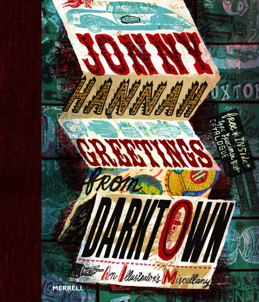
He released a book called Greetings from Darktown in 2014. Inside he has created his own world. In this image, I love the composition of the folded up sheet. It reminds me of bookbinding.

I’ve just had a thought… I know I’m going to be creating some brand packaging for Spaceoline. What if I also made a wonderful fold-out instruction / information leaflet like you get inside some medicine boxes? I know usually they’re just packed with boring text, but I could make this one beautiful.

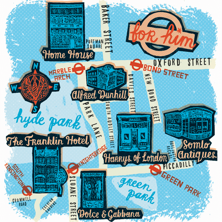
I have been drawn like a moth to a flame by this limited colour pallette. You can see that this is partially printed, with lino cut shop fronts. Maps really interest me – especially ones that use creative license. I also really like the handwriting here, and might have to magpie it, as my primary school teachers might have said.
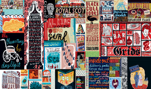
This is just a mental hodge-podge of images and typography. I love stuff like this. Ideas upon ideas upon ideas.
Artist Research: Toma Vagner

Artist Research: Toma Vagner

Toma Vagner is an illustrator that grew up on a Russian island within easy sailing distance of Japan. Her father was a sailor that often bought back Japanese toys and trinkets, which went on to inspire her work.

The art style of the time went on to inspire her as well- e.g. Hokusai and his compositions and style. You can see this in the flat coloured areas and bold line art of her works.

Here, I love the grainy dark background and the pastel interiors of the piece. Random objects floating about give me an almost abstract, uneasy feeling – but I love it. I want to create this feeling in my work. I have already taken inspiration from the flowers growing behind the hand in one of my Future worksheets.
I am a sucker for pastel pink work. Here, I like the female figure and her cool jacket. I also really like the repeated images throughout the piece, e.g. lipstick, the colour swatch circles and the lights on her mirror. The fact that most of the composition isn’t defined is interesting: it means the flat colour dominates the piece and I really like that.
I like the grey background against the pink. Vagner tends to colour her lineart quite brightly, with pinks and reds. I’ve seen a lot of artists doing this and I think it adds a lot of interest. It gives the eye more to process than just red or just black.

Artist Research: Bruno Mangyoku

Artist Research: Bruno Mangyoku

An illustrator I am very inspired by is Bruno Mangyoku. He is trained as an animator but works as an illustrator, and has picked up commissions from large companies such as Wired, Red Bull and Monocle.

He describes his work as “character driven” – because he “can’t envision a piece without focusing first on the characters.” I really like this, because it reflects my own interests. I love drawing people and giving them personalities.

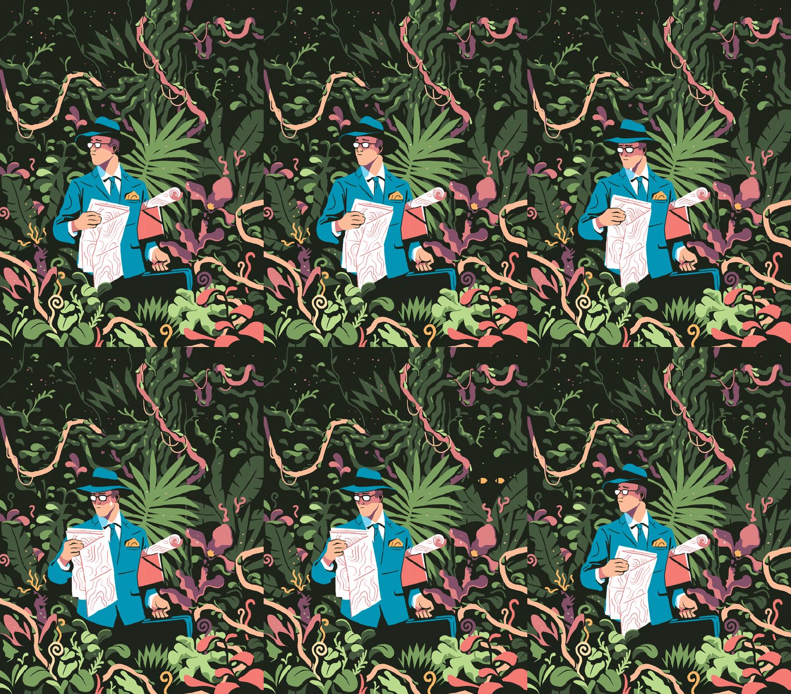
My favourite thing about this piece is the colour scheme, followed closely by the man’s face and posture. I think I’ll have to borrow this colour scheme for one of my Futures illustration pieces. Don’t let me forget! It’s very limited, but that’s what makes it lovely. It’s got an almost vintage feeling about it.
I love nature, so I’m tempted to steal the shapes and colours of some of the fauna here. Bless this guy… Looks like he made a really bad wrong turn somewhere.
Another good example of a successful limited colour pallette. It reminds me of a scren print or a lino print, where you’re keeping it simple with limited colours. The composition is even, e.g. the tan coat being reflected in the leftmost woman’s ginger hair. It’s cut-out, sharp shading makes it feel very graphic, which I like.

Although his work is digital, I will try to recreate the feeling traditionally. I love working digitally, but right now it always pushes me into the same routine and style, which isn’t what I need. I like to manipulate media physically at the moment.

Future of the Body: Week Two

Future of the Body: Week Two

I started a worksheet for week two. I’d been very excited about working in my sketchbook, but I thought that for experimentation’s sake, I’d work larger.

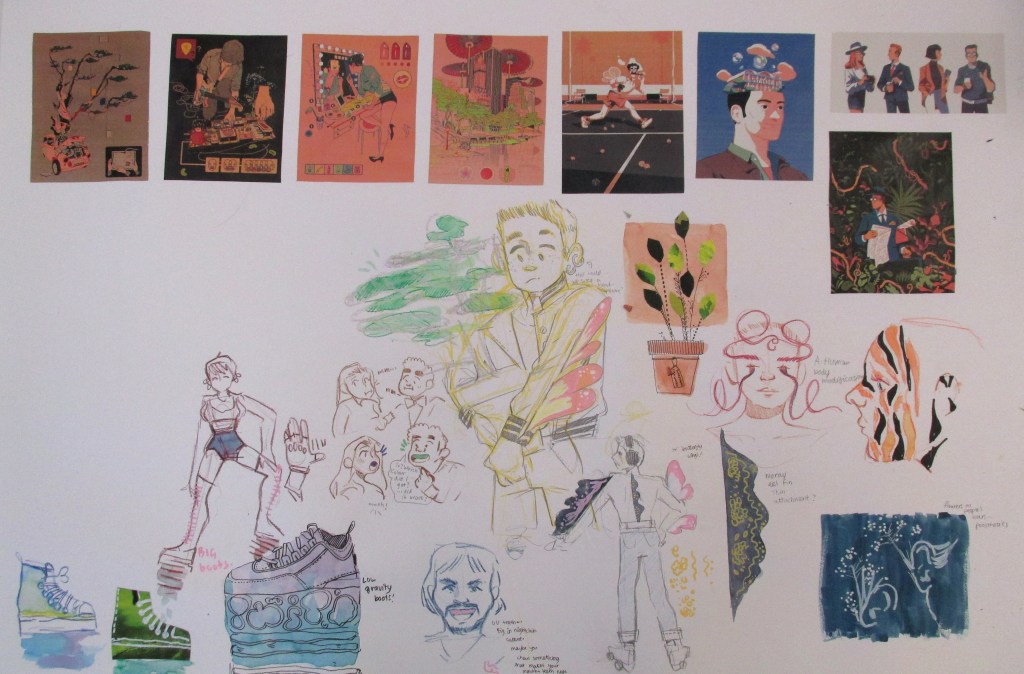
I had a one-to-one chat with Emma. She said her favourite work of mine was the drawing-heavy women with bio-luminescent body alterations. She also suggested that I continue drawing and brainstorming products for a future sci-fi type audience, since I’d done plenty enough research and context.

Wahoo! I couldn’t have asked for a more affirming conversation, since that’s what I really enjoyed doing. I had recently found some other inspiring illustrators, so I began drawing.

You can see media used ranges from watercolour to collage and marker.

Where am I going to take this next?

I’m going to fill the space up with drawings and keep my judgement suspended until then. After that, I’ll either complete another whole experimental sheet or run some self evaluation before I complete any more work. Once I’ve identified what I like a lot, it will allow me to refine the ideas and create more sophisticated work.

I feel I should mention that because Brighton have required an e-portfolio from me on next Tuesday, this project will run slowly until then. After that, I have an interview and will need to design a portfolio for that too. I’m juggling my time and this isn’t my priority right now!

Artist Research: Tabares 核の冬: Future

Artist Research: Tabares 核の冬: Future

My research and context takes two forms: research into original source material, e.g. sci-fi novels, video games, etc. and into artists creating similar work to draw inspiration from and to place my own work contextually in the world of illustration.

Tabares is a freelance illustrator, also collaborating with merchandise brands who feature their art. (I have tried and failed to find an English version of their full name – only their social media handle, nuclear_winter__ – and their name stated on all other sites is Tabares 核の冬. I will refer to them as Tabares.)

Conventions of their work and style include:

  • Usually female portraits
  • Cyborg, or robotic parts. They tend to create robotic neck muscles or hands and arms.
  • Saturated neon colours and lighting – e.g. bright magentas, greens and blues.

Tabares’ work inspires mine colour-wise. I like bright colours. My research has also been into futuristic body modification, with my project description being “Future of the Body”. This means the subject of the work is also relevant to my current project.

This is a still from a very short animation in which a mask covers the girl’s face mechanically. I might consider a short animation.

Contextually, if I were to create work similar to this, it might sit in the freelance illustration category. Tabares is creating visually pleasing work that people want to buy, and from this they are also receiving lots of commissions for people who want personal art in their style.

Future of the Body: Week One

Future of the Body: Week One

This project is the first one in which we are really given free reign over what we do. I’ve been drawn to sci-fi and futuristic, creative body alterations or modifications.

All of my scribbled ideas and pathways are in my sketchbook, in mind maps or where I can find space – but what I’m documenting is the ideas I’ve taken a little further – to thumbnailing and experimenting visually.

This was an idea for bioluminescent body alterations, a new beauty standard that exists in the future. I saw an interesting article about futuristic body modification in a fashion show called A.Human, which inspired a lot of these images. I collected a range of bioluminescent animal photo references in order to be inspired here.

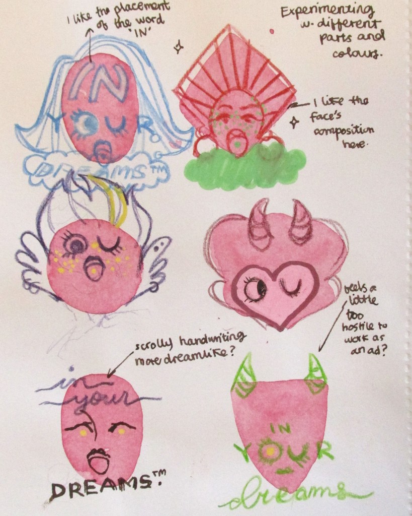
You can see the beginning of an idea here. The concept is a pill that you can take which contains a script for a dream that has been pre-recorded. When the user falls asleep, they will experience that pleasant dream. I imagine they’d range from adventures to friendships to romantic and sexual exploits. You can see I play with words for possible brand names – find In Your Dreams – and then immediately thumbnail a possible logo.

This concept was directly inspired by one of Issac Asimov’s short stories, in which a corporation sells dreams and employs creative thinkers to imagine and “record” for them.

On this page you can see I develop the logo so that it has a graphic elegance – an eye winking. I moved away from the realism I’d been sketching before to experiment with bright colours. I continually evaluate the designs with notes to the side.

This page was a fun one to do. I started by laying down the basic watercolor shapes to force myself to include variation. I was happy I did this, because the top right design really spoke to me – so I took it further.

This is where I am currently with this train of thought. You can see some possible brand poster thumbnails – but I’m also considering actually creating the brand packaging for the pills too.

What do I need to do next?

I’m aware that I’ve gone quite specific quite early with this train of thought. I actually plan to do some collage work, create another mind map and widen all of my thinking back out again. With all of my research into sci-fi and notes I’ve taken, I’ll find another path of interest to liaise with for the next week.

Artist Research: Lera Efremova: Future

Artist Research: Lera Efremova: Future

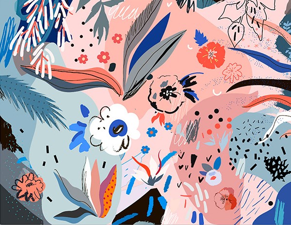
I wanted to find an illustrator that worked with pleasing colours and textures. Although this isn’t related to the future of the body directly, I like the way Efremova uses colours and space in her work.

In terms of context, her work is sold as high quality digital files, cards, posters etc. So, visually pleasing illustrations to be placed in the home.

I was thinking I could apply it to my work in terms of experimenting with different media in my sketchbook. I want to focus on generating textures so I can have a base collection of bright colours and techniques to use as backgrounds in illustrative work.

I want to take direct inspiration from the kind of shapes and colours she uses. E.g. the collections of stippling-esque dots, or the leaf with a dot grid on the far left that’s been roughly cut.
I like the busy collections of objects and shapes against the dark, basic background. The colour scheme is mostly desaturated blues, with a few very light blues and pinks as a complimentary highlight colour. Efremova works a lot with pale pink and blue, but that combination is very trendy at the moment.

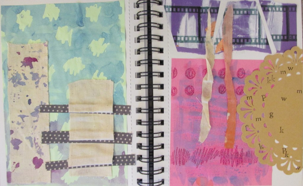
I made some textures and experimented while looking at her work. You can tell from the colours and some of the shapes. I also just wanted to suspend judgement and try out whatever I could in case something cool happened.

I like the brown doily with lettering stamped onto it. I also really like the blue and purple spattered calico fabric.
The blue and pink posca pens were more successful than I’d hoped.