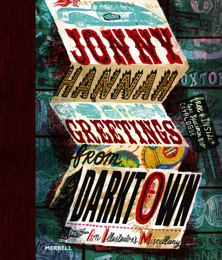
A particularly groovy illustrator I found in an Illustrator Journal from 2003 is Jonny Hannah. I’m hoping to make some work inspired by him in my Futures project as I continue it.
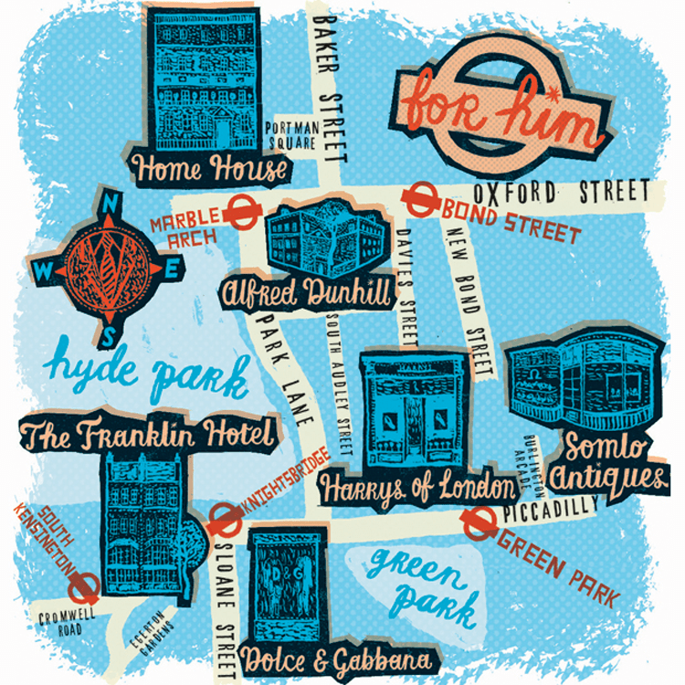
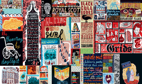
Jonny’s illustrations are excitingly busy; the longer you look at them, the more detail you see. He also has a passion for hand typography, which you may know I’m quite passionate about. His work is blocky and stylised and he uses a mix of drawing and printing in creating his works. I like that he had a long phase of liking 1950’s paraphernalia and style: this lends itself well to my retrofuturistic work in Futures of 50’s American advertising.
I’ve just had a thought… I know I’m going to be creating some brand packaging for Spaceoline. What if I also made a wonderful fold-out instruction / information leaflet like you get inside some medicine boxes? I know usually they’re just packed with boring text, but I could make this one beautiful.
 Gemma's Art