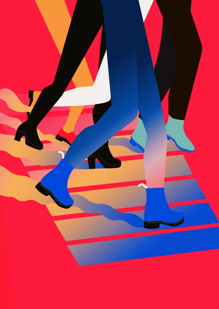
Shawna X is the name of a successful contemporary illustrator. She works digitally, but her designs are often realised as paintings or prints on a very large scale for commissioners e.g. Adidas, Doc Martens, Dropbox etc.
Conventions of her working style include heavy use of gradients and very bright colours. I am inspired by the blockiness of her work and the colour schemes.
This piece really interested me: I love painting on objects I find or own. Here, the surfboards reflect the beach-centric content. In a scene that takes place at Brighton, I might paint on beach rocks, a piece of driftwood, or even fish and chip packaging! It’s a shame that social distancing is keeping me from visiting…
I’ve actually used Jamie as help to create a big list of things we associate with the beach. Any form reflecting these items would be a big help in creating a cohesive illustration about the beach.
BALL
SURFBOARD
PARASOL
SUNCREAM
WAVE
SAND
SPADE
HAT
TOWEL
DECKCHAIR
SUNBED
ICE CREAM
FISH AND CHIPS
ROCKS
STONES AND PEBBLES
SWIMSUIT
BEACH BAG
CRAB
FISH
SHARK
CORAL
SHELLS
SEAWEED
BARNACLE
WOOD
SHIP
SAIL
COCONUT
NET
FISHING ROD
CLIFF
The 60’s inspired graphic design here is exciting to look at. The colour scheme is looking pretty tasty for stealing, too.I just really like the way this image has been edited. The colours make me happy. It’s a photograph, but the blocks of colour make the scene almost abstract and take it out of any recognisable place.This was a commission from Doc Martens. The feeling it creates is pretty cool. I hope to work with block colours a little.
I was about to start writing up some new research, but I realised I’ve been putting off writing up my first experimental piece of finished work in FMP.
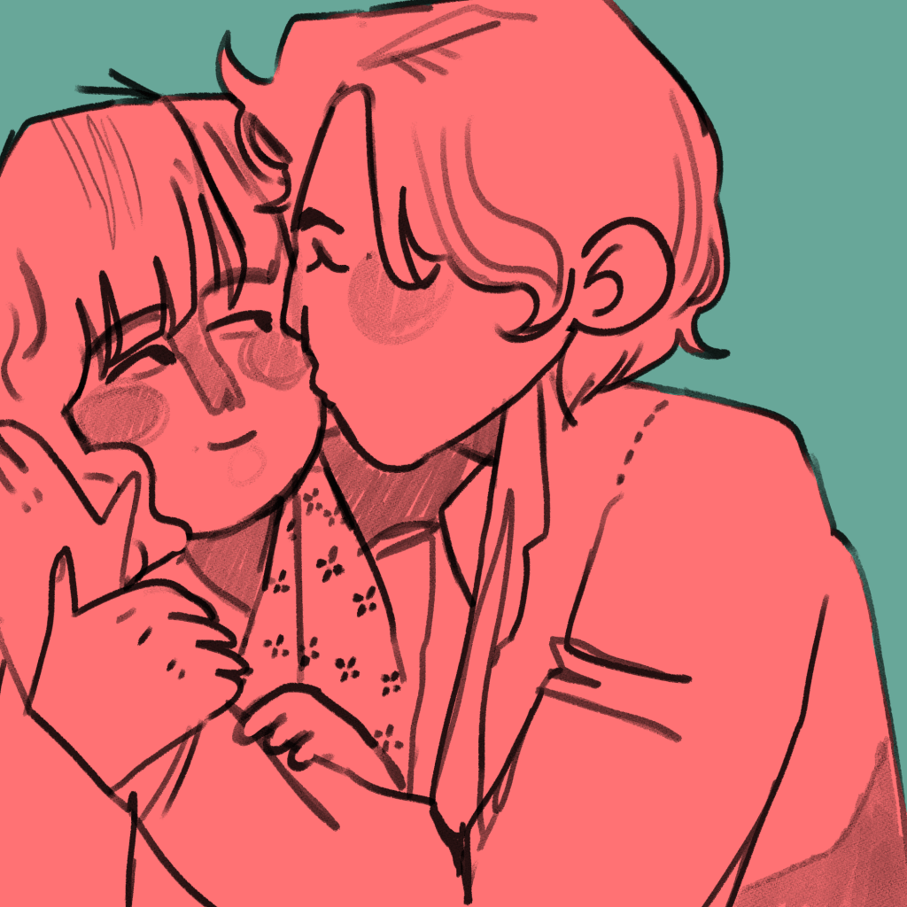
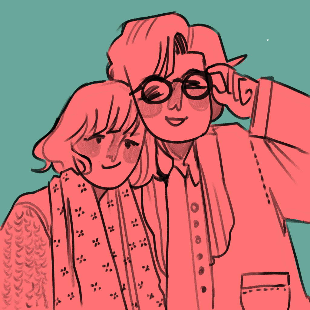
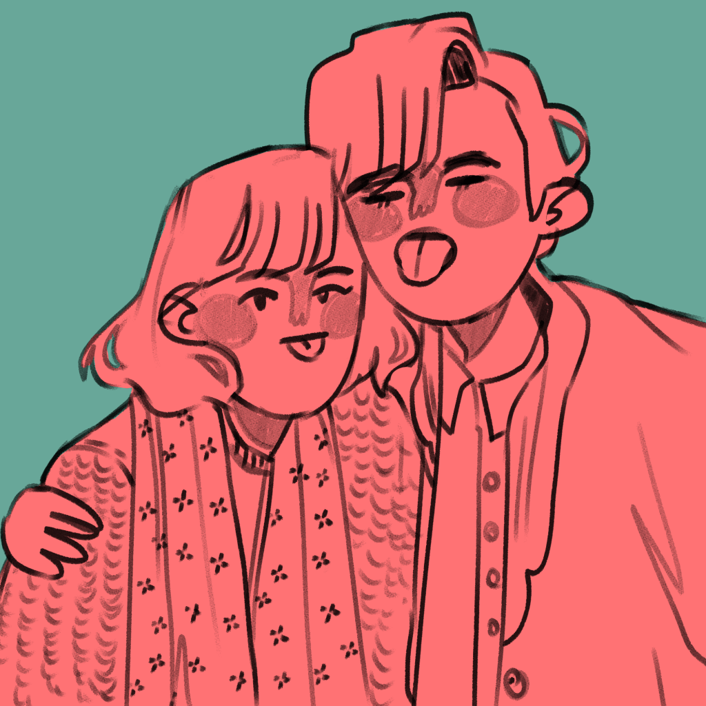
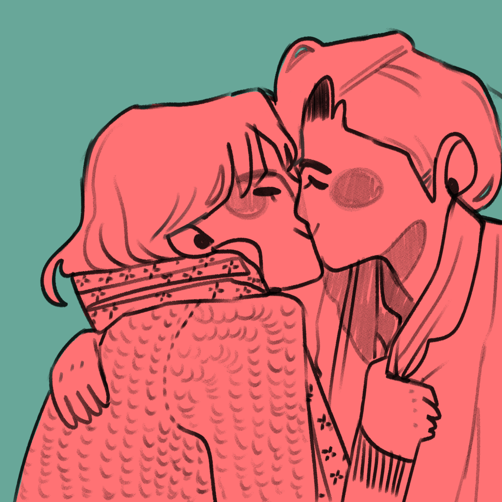
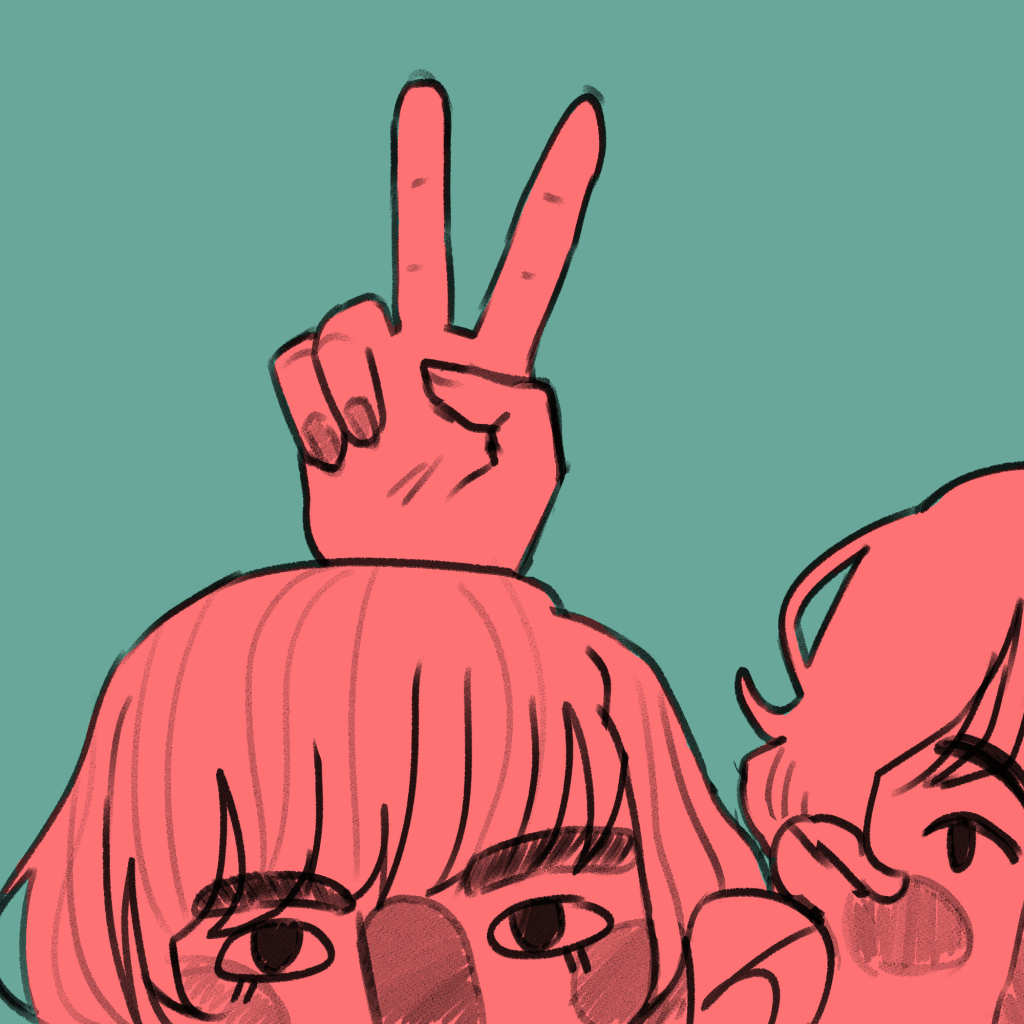
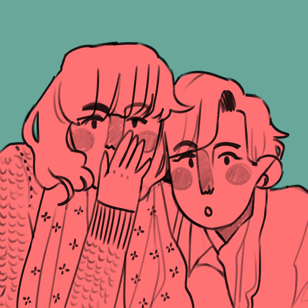
I am using illustration to explore the concepts of friendships, relationships and closeness. In doing this, I illustrated an everyday encounter between Antonia and Mitzi – mucking around in a photobooth. I had the intention to bind it into a mini-zine, an instant book I’d found out how to make in my research.
The illustrations I created came from a variety of different pieces of research. These were all mentioned in my Pecha Kucha, but overall I think they were a huge success.
This is the final result. You can see I experimented with different inks and paper types, including black and white versions. (This is because traditionally, instant zines were printed cheaply in B&W on office photocopiers to be shared and I like the historical aspect of that!).
Evaluation
Was my research purposeful? I would say so! All of the research I do affects my work somehow, because it sticks in my brain like velcro. In this case, though, studying artists like early manga artists and artists that inspire me allowed me to work comfortably in a style I like but to work in a more self aware way, and I think it’s improved the look overall as a result of the research.
Did I develop my ideas thoroughly? The short answer to this is no. Because it was just a response to research and was very experimental, I consider this successful nevertheless. Interestingly, I could focus on the form of the book I bind reflecting the content within the book in future projects. E.g. I could have had these images in a concertina style strip, similar to an actual photostrip that might come from a photobooth.
Where am I going to take this? I’d like to work in the area of “meetings” for a bit – I’ll probably chose one specific meeting and illustrate it in a couple of different ways. I need an experimental week, and to do that I need an image or scene I can experiment with. My thinkinig is circling around Drake meeting Mitzi, Ludwig and Techo. In terms of importance to the entire narrative, I have to say honestly I think this is the most important happenstance in all of the character’s development.
Jamie Green is an illustrator I have been inspired by for months after I found her on Instagram. She is a freelance illustrator and designer, and she works mainly traditionally, e.g. with gouache, coloured pencils, watercolours etc.
Fanart of an indie band. I really like how they draw figures. The jagged, slightly disproportionate limbs are something I want to work into my own style because they make me feel happy looking at them. The colour scheme: pastel pink and blues – exactly my style. And the way she draws faces is pleasing. I like the linework of the noses and the eyes and eyebrows. I want to work like this. The technique used in this sketchbook scan is colouring under full opacity on a multiply later. It allows the lines from a scanned image to stay dark while you colour. I’m realising as I pick out my favourite work from Green’s website that the bright, complimentary colours are some of my favourite aspects of their work. The hand lettering is another similarity between our styles. This is typical of her cosier style. She loves mushrooms and so do I… it’s admittedly part of why I love her work so much. I made breakfast with too many mushrooms for the first time in ages today… I was disappointed at myself. I’ve hit a mushroom limit. Anyway. I really like the “scribbled” texture that comes from working traditionally.
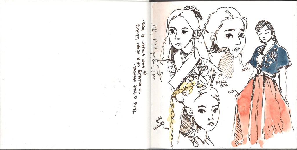
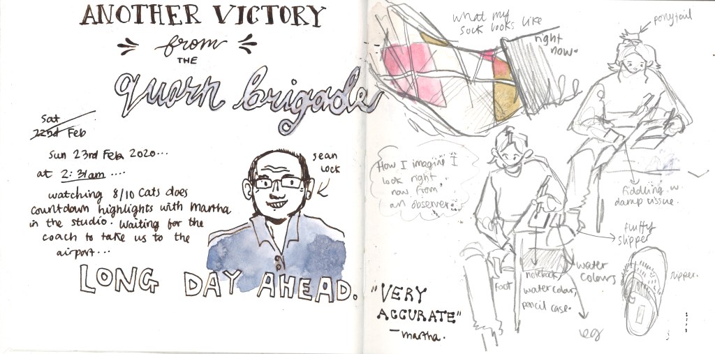
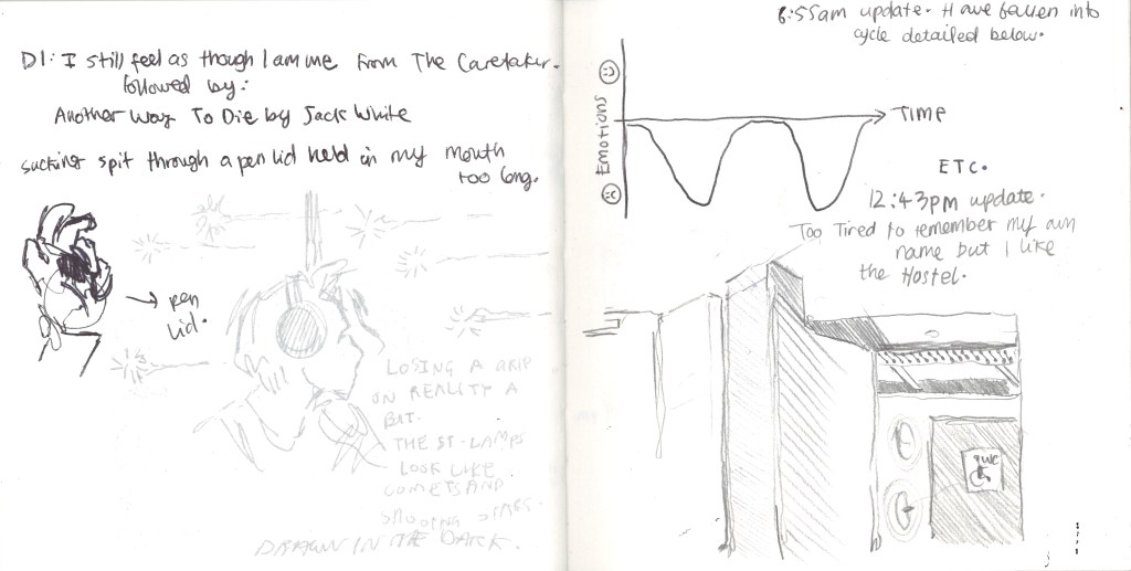
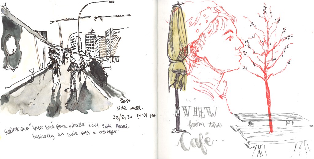
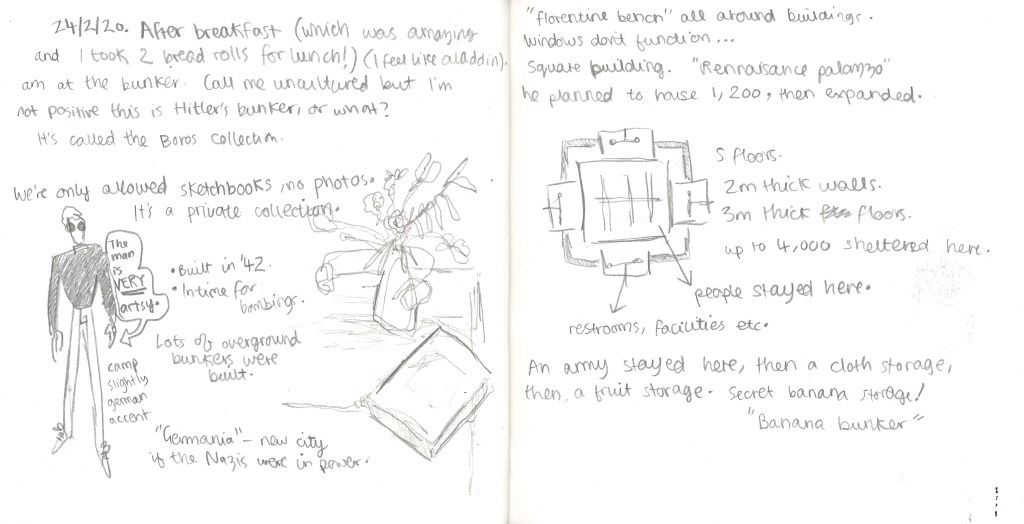
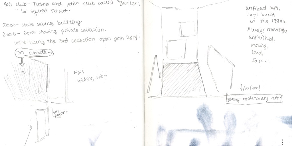
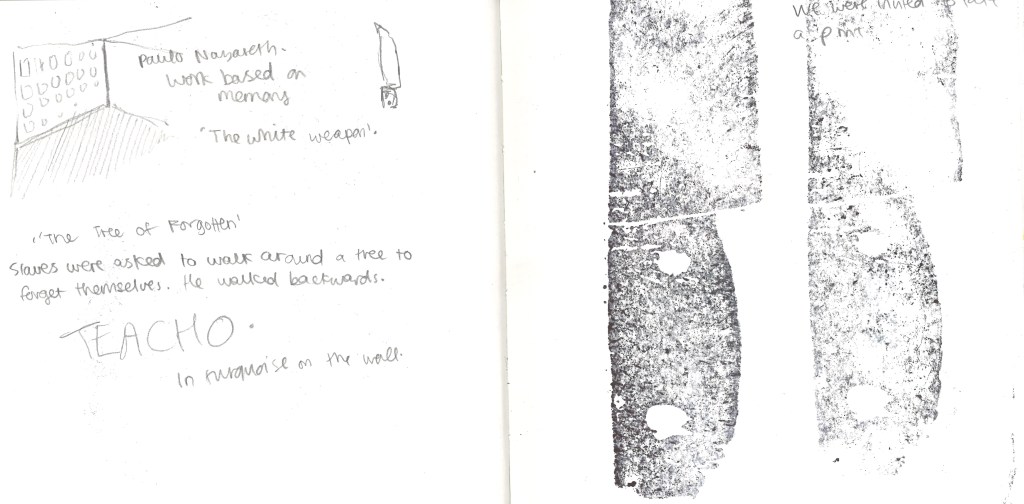
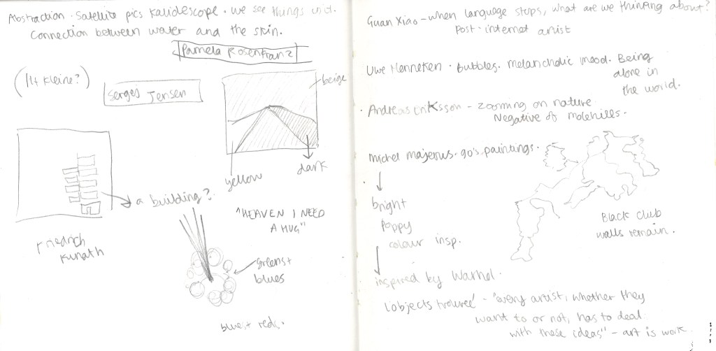
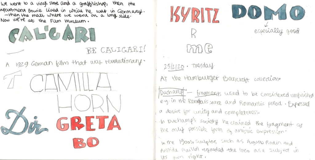
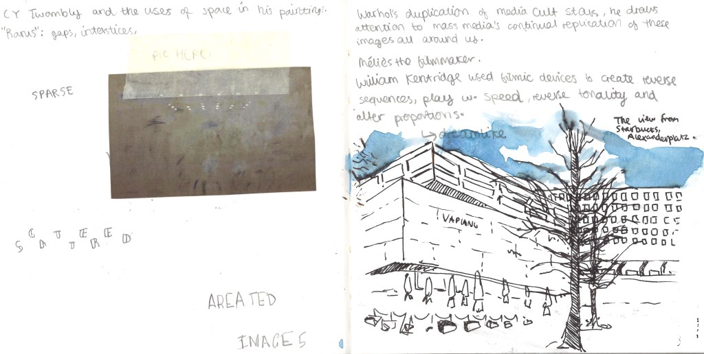
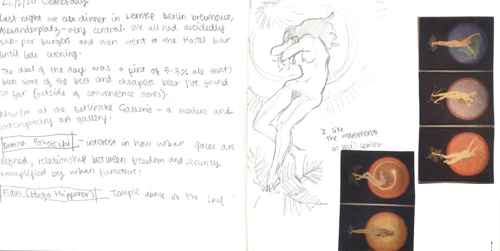
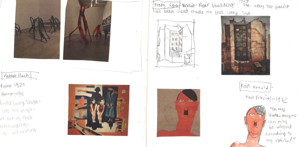
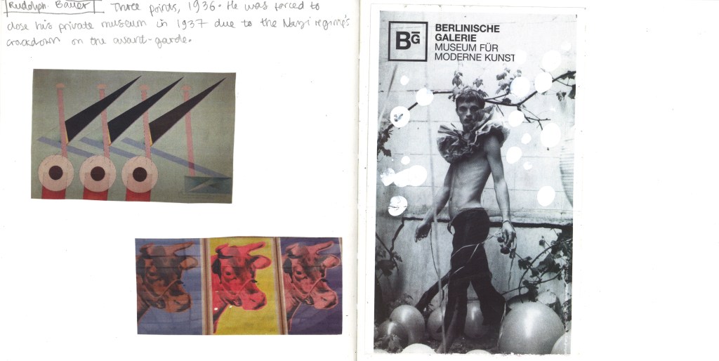
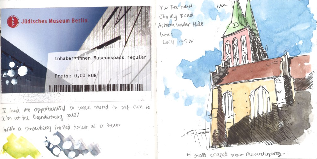
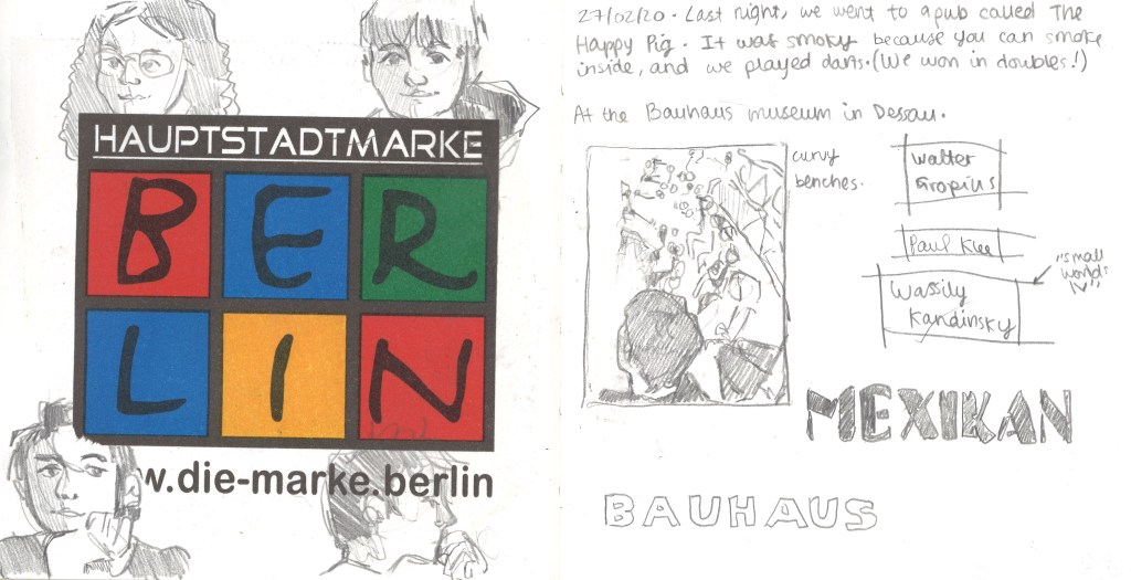
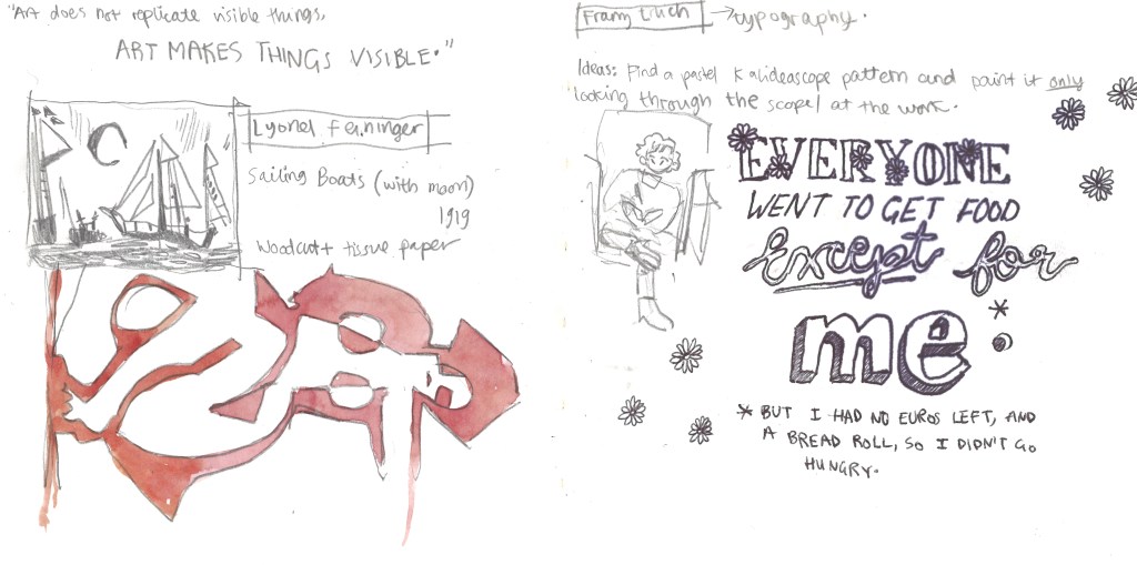
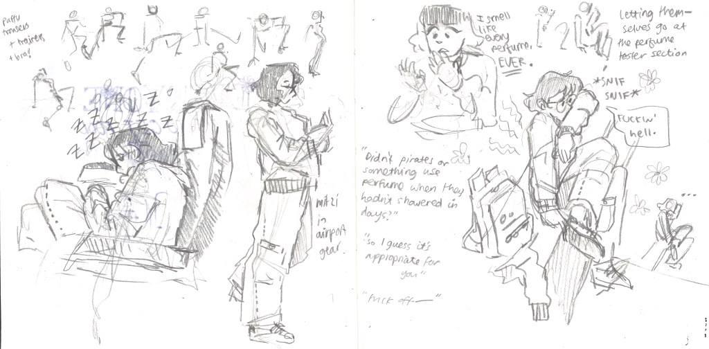
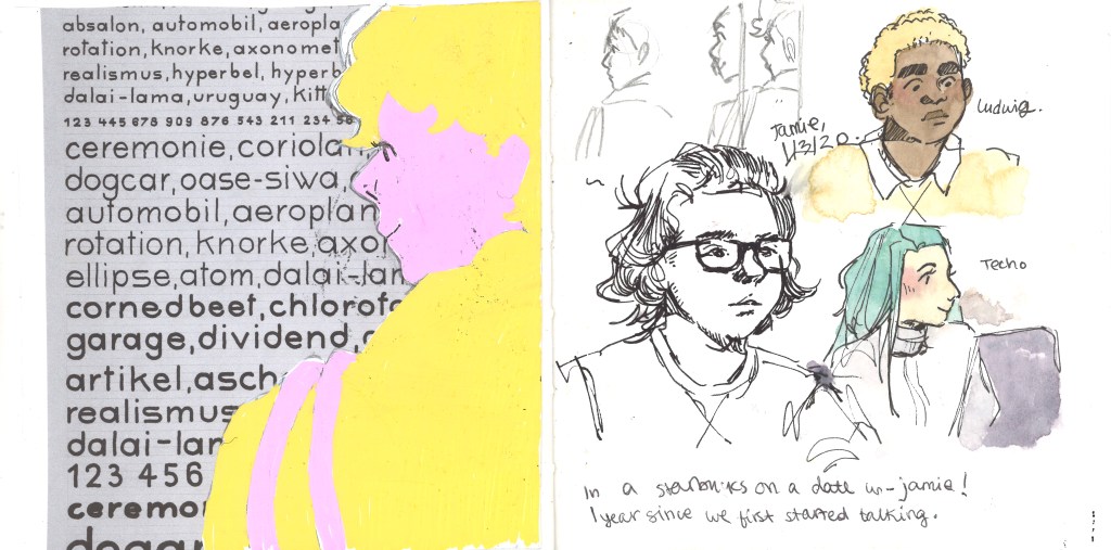
Below are 22 double-page spreads that I created during the Berlin trip. I endeavoured to use the sketchbook as a diary too, and document whatever I could of the trip so I can look back and remember properly.
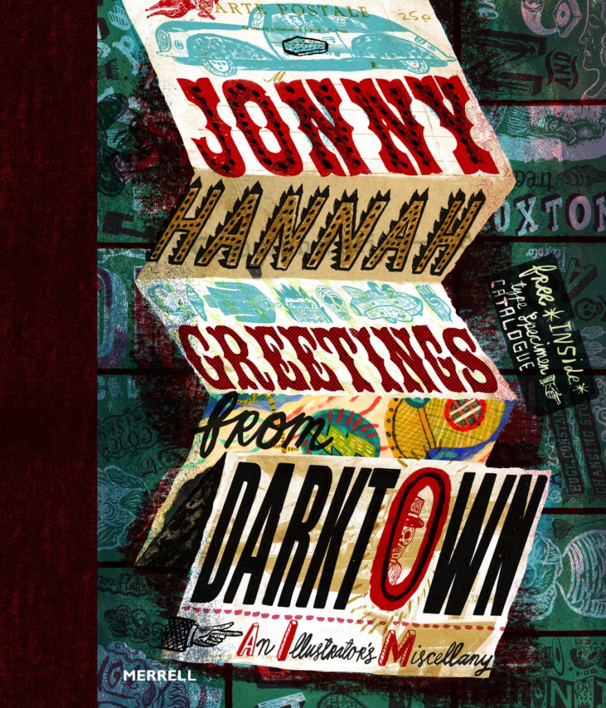
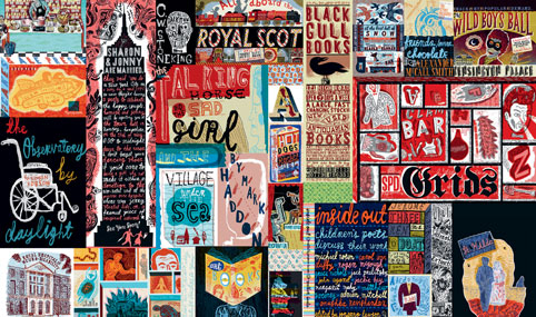
A particularly groovy illustrator I found in an Illustrator Journal from 2003 is Jonny Hannah. I’m hoping to make some work inspired by him in my Futures project as I continue it.
Jonny’s illustrations are excitingly busy; the longer you look at them, the more detail you see. He also has a passion for hand typography, which you may know I’m quite passionate about. His work is blocky and stylised and he uses a mix of drawing and printing in creating his works. I like that he had a long phase of liking 1950’s paraphernalia and style: this lends itself well to my retrofuturistic work in Futures of 50’s American advertising.
He released a book called Greetings from Darktown in 2014. Inside he has created his own world. In this image, I love the composition of the folded up sheet. It reminds me of bookbinding.
I’ve just had a thought… I know I’m going to be creating some brand packaging for Spaceoline. What if I also made a wonderful fold-out instruction / information leaflet like you get inside some medicine boxes? I know usually they’re just packed with boring text, but I could make this one beautiful.
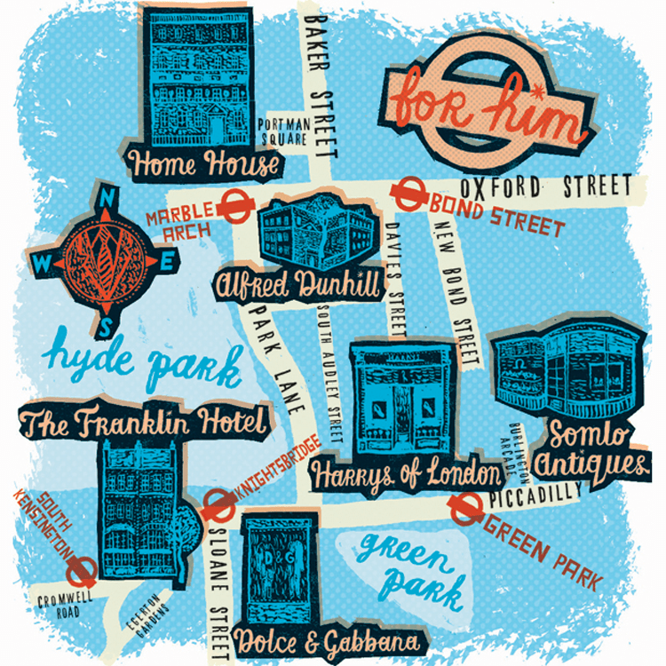
I have been drawn like a moth to a flame by this limited colour pallette. You can see that this is partially printed, with lino cut shop fronts. Maps really interest me – especially ones that use creative license. I also really like the handwriting here, and might have to magpie it, as my primary school teachers might have said.
This is just a mental hodge-podge of images and typography. I love stuff like this. Ideas upon ideas upon ideas.
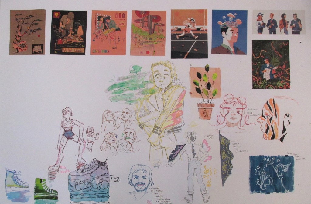
I started a worksheet for week two. I’d been very excited about working in my sketchbook, but I thought that for experimentation’s sake, I’d work larger.
I had a one-to-one chat with Emma. She said her favourite work of mine was the drawing-heavy women with bio-luminescent body alterations. She also suggested that I continue drawing and brainstorming products for a future sci-fi type audience, since I’d done plenty enough research and context.
Wahoo! I couldn’t have asked for a more affirming conversation, since that’s what I really enjoyed doing. I had recently found some other inspiring illustrators, so I began drawing.
You can see media used ranges from watercolour to collage and marker.
Where am I going to take this next?
I’m going to fill the space up with drawings and keep my judgement suspended until then. After that, I’ll either complete another whole experimental sheet or run some self evaluation before I complete any more work. Once I’ve identified what I like a lot, it will allow me to refine the ideas and create more sophisticated work.
I feel I should mention that because Brighton have required an e-portfolio from me on next Tuesday, this project will run slowly until then. After that, I have an interview and will need to design a portfolio for that too. I’m juggling my time and this isn’t my priority right now!
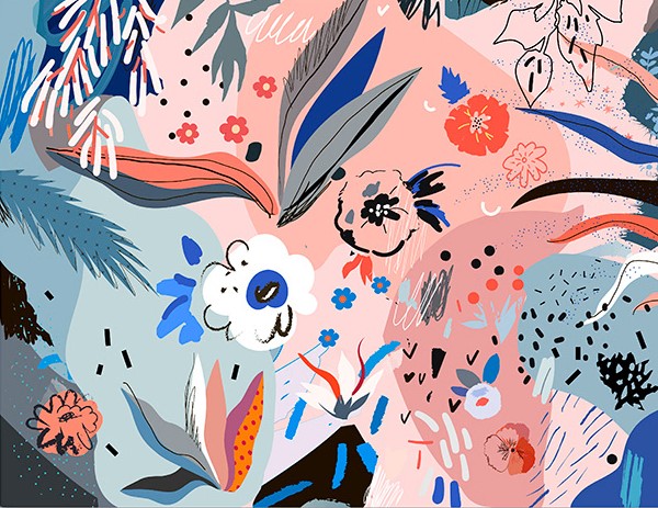
I wanted to find an illustrator that worked with pleasing colours and textures. Although this isn’t related to the future of the body directly, I like the way Efremova uses colours and space in her work.
In terms of context, her work is sold as high quality digital files, cards, posters etc. So, visually pleasing illustrations to be placed in the home.
I was thinking I could apply it to my work in terms of experimenting with different media in my sketchbook. I want to focus on generating textures so I can have a base collection of bright colours and techniques to use as backgrounds in illustrative work.
I want to take direct inspiration from the kind of shapes and colours she uses. E.g. the collections of stippling-esque dots, or the leaf with a dot grid on the far left that’s been roughly cut.I like the busy collections of objects and shapes against the dark, basic background. The colour scheme is mostly desaturated blues, with a few very light blues and pinks as a complimentary highlight colour. Efremova works a lot with pale pink and blue, but that combination is very trendy at the moment.
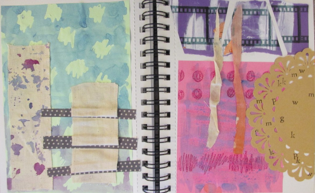
I made some textures and experimented while looking at her work. You can tell from the colours and some of the shapes. I also just wanted to suspend judgement and try out whatever I could in case something cool happened.
I like the brown doily with lettering stamped onto it. I also really like the blue and purple spattered calico fabric. The blue and pink posca pens were more successful than I’d hoped.
Emma Green is a part-time illustrator who did a degree and master’s at Bournemouth University. She currently works at Oxford Brookes and acts as a sort of teaching assistant to some of the classes. I’d never really seen her until recently, and today she gave us a short lecture on her education and current profession.
This is the piece of her work that really attracted me. I talked to her after the lecture and found out that it’s some of her older work, and that it was created on Photoshop.
I liked the colour scheme a lot, and the cut-and-stick feel of the buildings really attracted me. It turns out she uploaded the sketch into Photoshop, then used the polygonal lasso tool to fill in the buildings with colour.
Colour wise, you can see layers of red, then of blue, then red again. She’s interspersed blue details into red buildings, e.g. the windows at the very front, and vice versa. This makes the piece feel bustling and natural.
Texture wise, I like the white crayon-pencil brush she’s used to add details. E.g. the curls and lines on the bottom left blue building, or the bumps that look a little like bunting or terracing running along walls. Using a mixture of details lighter than the surroundings and darker than the surroundings balances out the piece.
How has this impacted my work? This piece has a similar feel to the busyness I’d like to portray in Utensia. I might use blocks of painted colour to try and mimic the aesthetic Emma has created. I may also use a white detailing pen alongside a dark one like Emma has here, to create a little more interest.
I carried out some research on Quentin Blake, a very popular artist famous for illustrating for Roald Dahl. All the images here are credited to him.
I chose three images, because I have something to say about each of them.
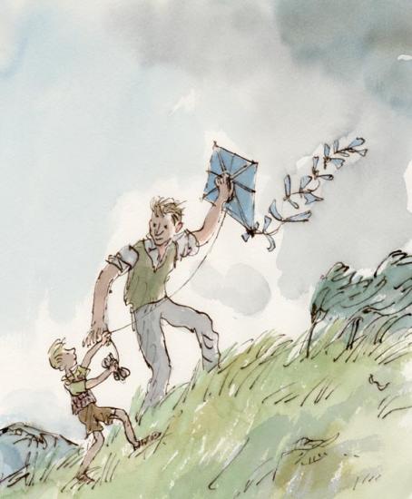
This image is a full coloured illustration. It is unlike a lot of Blake’s work because the subjects are in a defined context (the grassy hill and the grey sky). The colours are also less saturated than Blake’s other work.
This is from the children’s story Danny, the Champion of the World by Roald Dahl. Although it’s a children’s book, Dahl based it on an adult’s book he had written called Champion of the World.
The plot is quite dark for a Dahl book (although young children might not notice or mind). The significance of this is that in my opinion, the illustrations arguably match the tone of the book. Look at the quick, sketchy marks used to create the grass. The whole diagonal composition leads upwards; these show how hard the wind is blowing. The grey sky is quite sad too.
The illustration pictures a happy moment against quite a bleak background. In relation to the plot (Danny and his father making the most of a very poor situation), I think this illustration is very poignant.
That being said, it is a children’s book. All I can say in criticism of the illustration is that perhaps its bleakness and lonely feeling might put a young child off or scare them. Danny’s dad has so much kindness in his eyes, though, that it’s unlikely.
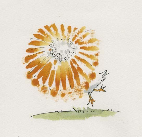
Here, I love the way motion has been pictured by drawing a sketchy beak in a whole circle.
In Quentin Blake’s Drawing book, Drawing for the Artistically Undiscovered, Blake puts a lot of emphasis on pace in illustrating. He states that if you want to draw something fast (e.g. a running horse or a pelican spinning), often literally drawing it fast will add to that effect.
I like this a lot, having read it as a young child and remembered it for many years. I’ve seen it time and again in my own art when I realise I’ve been labouring an illustration without any need, and start again with a far more dynamic result.
Look at the colours here! Anyone who’s seen my Willy Wonka painting will know I have a soft spot for this story. He’s described on Blake’s site as “the most wondrous inventor in the world”.
This is a very exciting moment in the book. I think it’s Charlie first meeting Wonka (but there’s a chance it’s right at the end of the story as he wins the chocolate factory). Everyone has heard Wonka talked about, and we all feel like Charlie does here as Wonka exceeds all of our expectations as a wonderful character.
Looking at the semiotics: the yellow surrounding Charlie in his clothes and ticket ring out happiness. The green and purple and blues of Wonka are all saturated and let us know exactly how eccentric he is. Finally, the yellow and purple key colours might make someone think of Cadbury’s, an existing chocolate brand, or of a Wonka bar (which is purple, white and yellow). Everything screams sweet wrappers. I feel like I could take a bite out of this illustration and it would taste like chocolate.
All these colours might have hurt or become confusing if there were too much background, so I think Blake was right in leaving white and only including the barest mise-en-scene to let us know we are talking to the candy man himself.
All this makes me want to go and watch Willy Wonka and the Chocolate Factory.
Sources: (You’ll have to excuse this, but it’s a crude attempt at Harvard referencing. I heard we’d have to use it at some point, and I am nothing if not a swot).
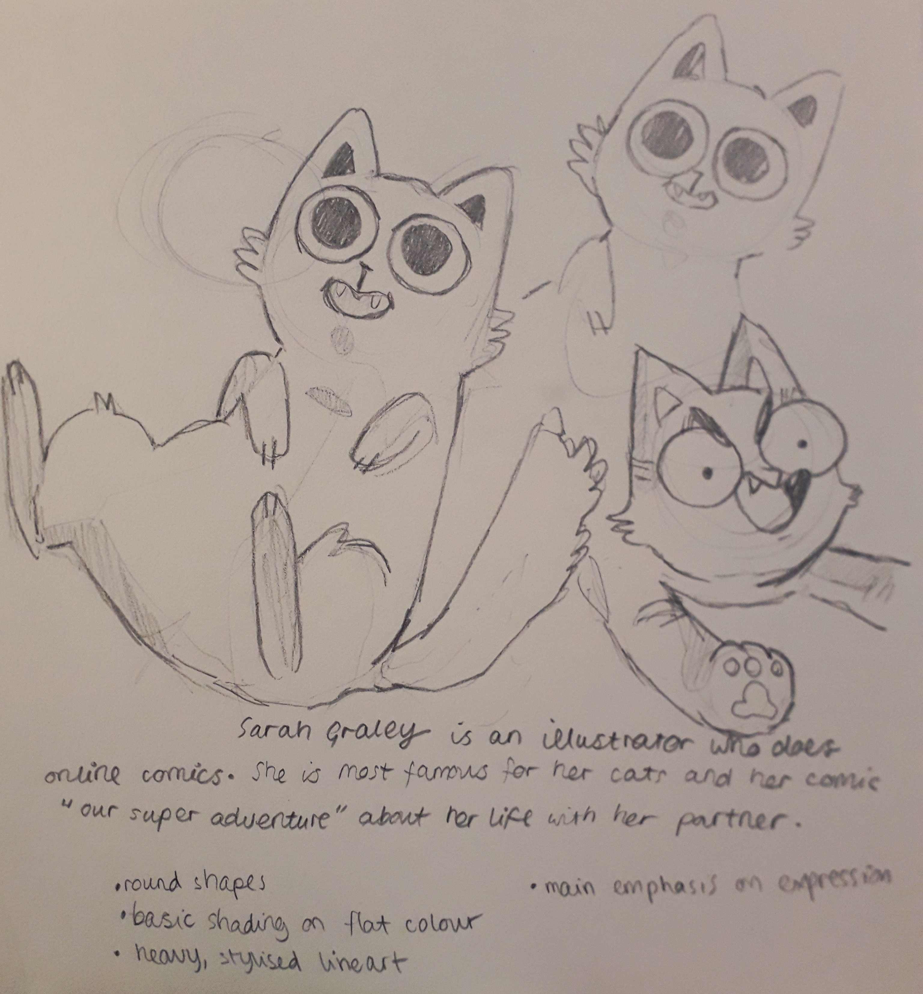
For a long time, I’ve been inspired by Sarah Graley, who is an illustrator and comic artist.
Her art is sweet and heavily stylised. She uses round shapes and exaggerated expressions to draw about her life and partner, as well as having multiple side comics. Below is an example of her work, taken from instagram:
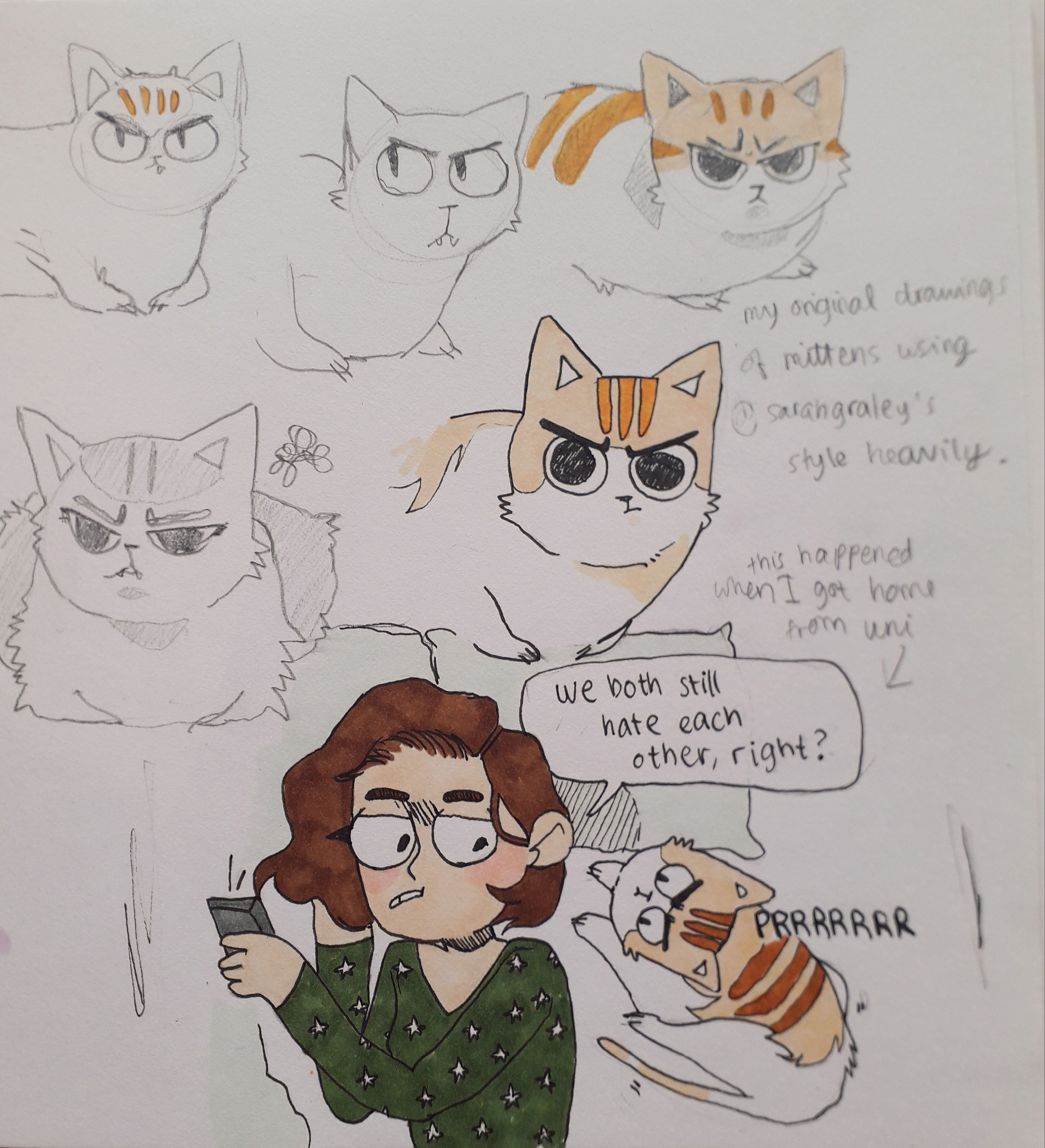
I copied the lineart of a couple of her cats because I was taken by them.
These are pretty much direct copies of cats Sarah has drawn.
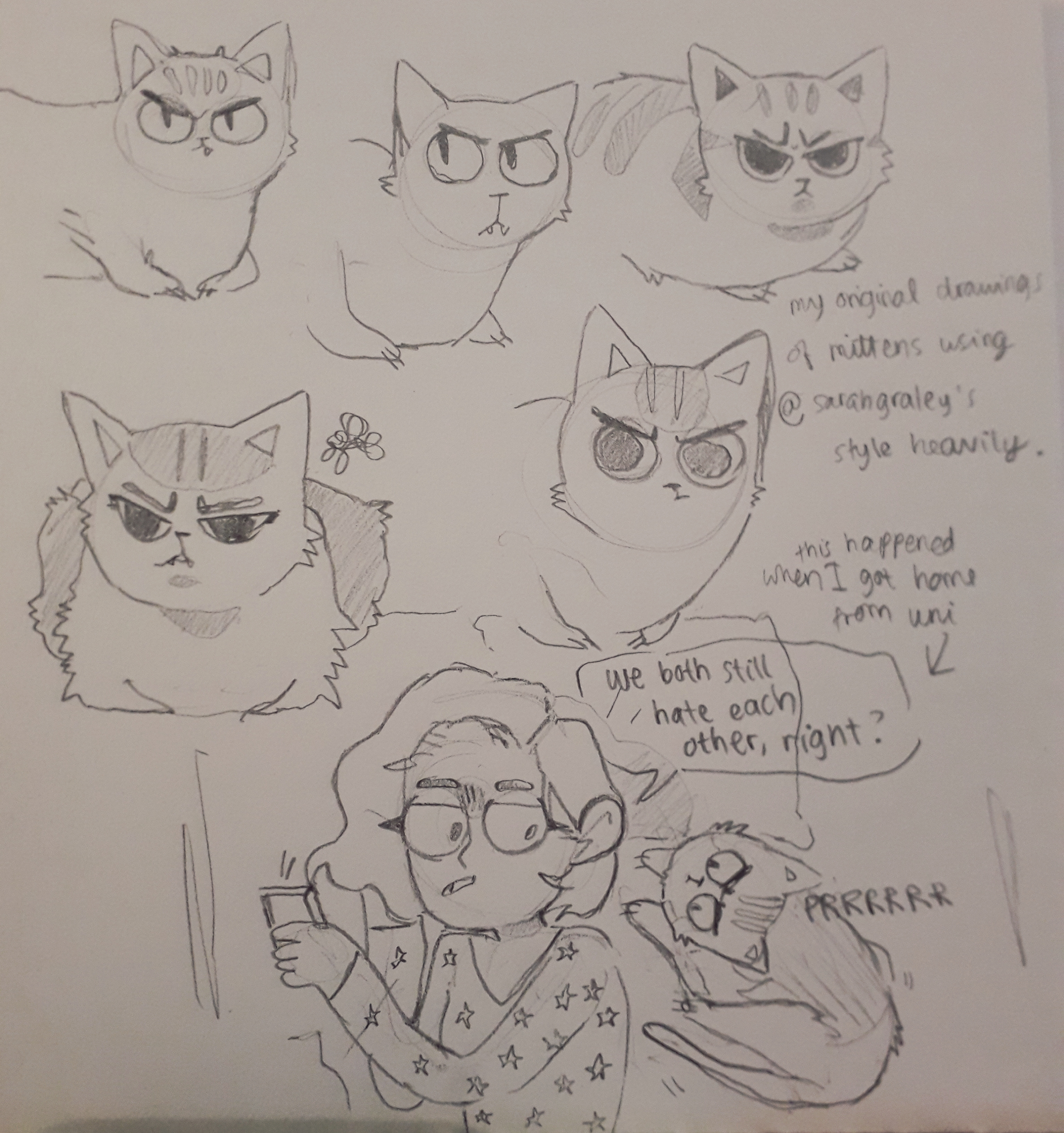
I then used the proportions and shapes from Graley’s art to make some of my own art. My cat is called Mittens and she always looks like she’s cross, even though she’s really very sweet.
An image before I added any lines or colour.The completed page, with me creating 6 iterations of Mittens.
Each iteration experimented with placement of facial features, colour and her proportions or gestures.
Graley focuses more on the feeling and message of the comics than making them perfect.
What am I going to take away from this? I like Graley’s expressions a lot. The shape of the eyes might find it’s way into my own work. The relaxed anatomy appeals to me, e.g. lack of real wrist or arm anatomy in some cases even though the joints are clearly suggested. I continually seesaw back and forth between pedantism and relaxation in terms of how realistic my proportions are, but I know that’s just a case of finding a style.
There’s also less literal advice I could take from her. As an illustrator, her online presence is consistent and so is her style and content (Our Super Adventure, her main comic, has been continuing for years). She regularly attends cons (I met her other half Stef at ComicCon this may!) and tables there selling prints and comics. Her side projects will also bring her exposure and widen her portfolio.
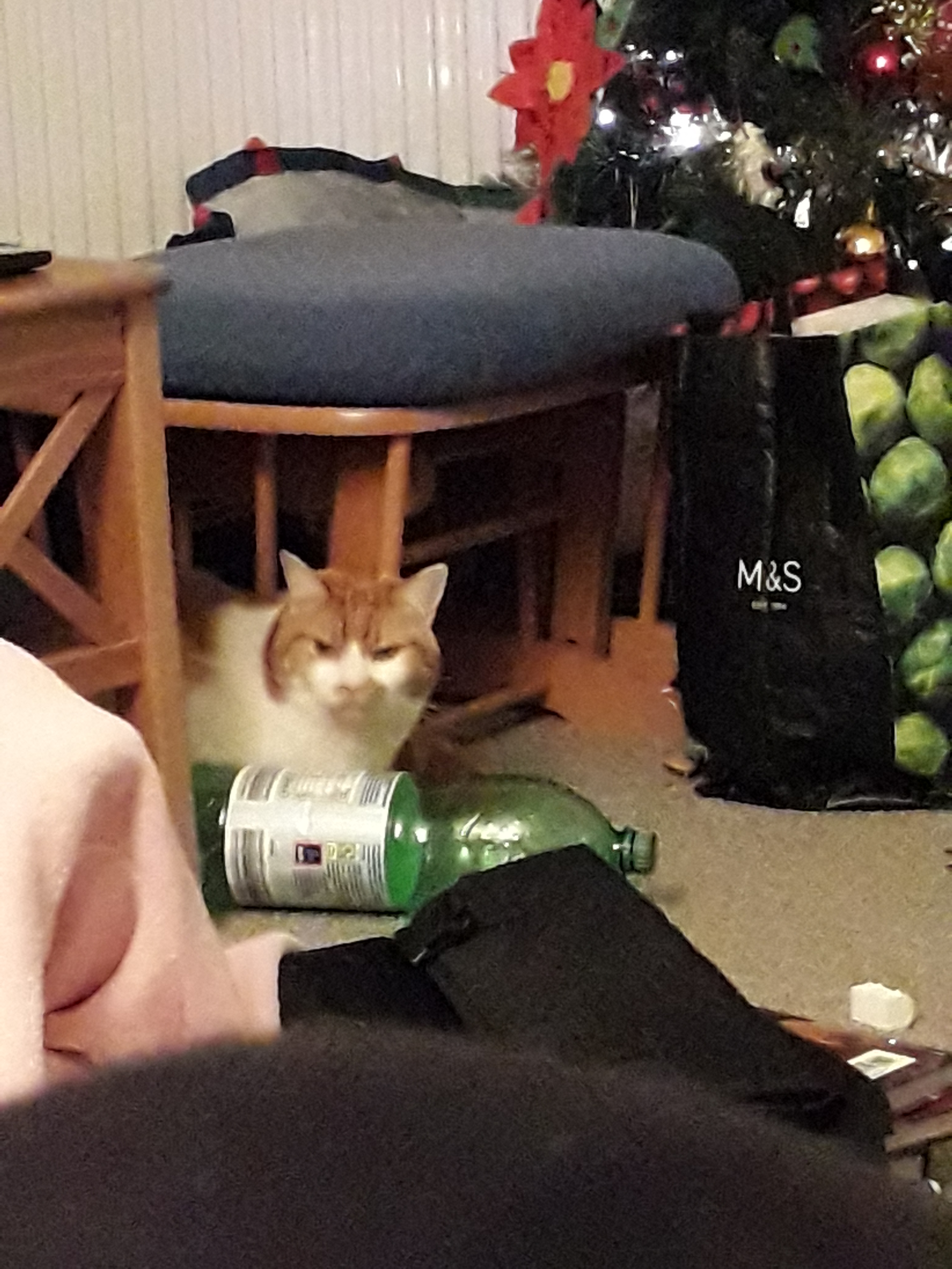
Finally, I feel obliged to attach a picture of Mittens for you all to enjoy. I know the perfect one.











You must be logged in to post a comment.