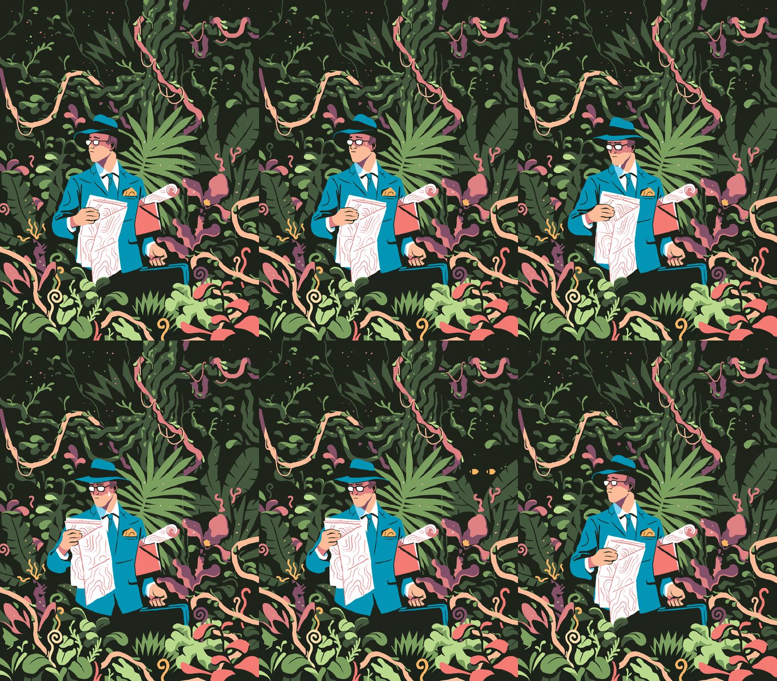
An illustrator I am very inspired by is Bruno Mangyoku. He is trained as an animator but works as an illustrator, and has picked up commissions from large companies such as Wired, Red Bull and Monocle.
He describes his work as “character driven” – because he “can’t envision a piece without focusing first on the characters.” I really like this, because it reflects my own interests. I love drawing people and giving them personalities.
My favourite thing about this piece is the colour scheme, followed closely by the man’s face and posture. I think I’ll have to borrow this colour scheme for one of my Futures illustration pieces. Don’t let me forget! It’s very limited, but that’s what makes it lovely. It’s got an almost vintage feeling about it.I love nature, so I’m tempted to steal the shapes and colours of some of the fauna here. Bless this guy… Looks like he made a really bad wrong turn somewhere. Another good example of a successful limited colour pallette. It reminds me of a scren print or a lino print, where you’re keeping it simple with limited colours. The composition is even, e.g. the tan coat being reflected in the leftmost woman’s ginger hair. It’s cut-out, sharp shading makes it feel very graphic, which I like.
Although his work is digital, I will try to recreate the feeling traditionally. I love working digitally, but right now it always pushes me into the same routine and style, which isn’t what I need. I like to manipulate media physically at the moment.
For a long time, I’ve been inspired by Sarah Graley, who is an illustrator and comic artist.
Her art is sweet and heavily stylised. She uses round shapes and exaggerated expressions to draw about her life and partner, as well as having multiple side comics. Below is an example of her work, taken from instagram:
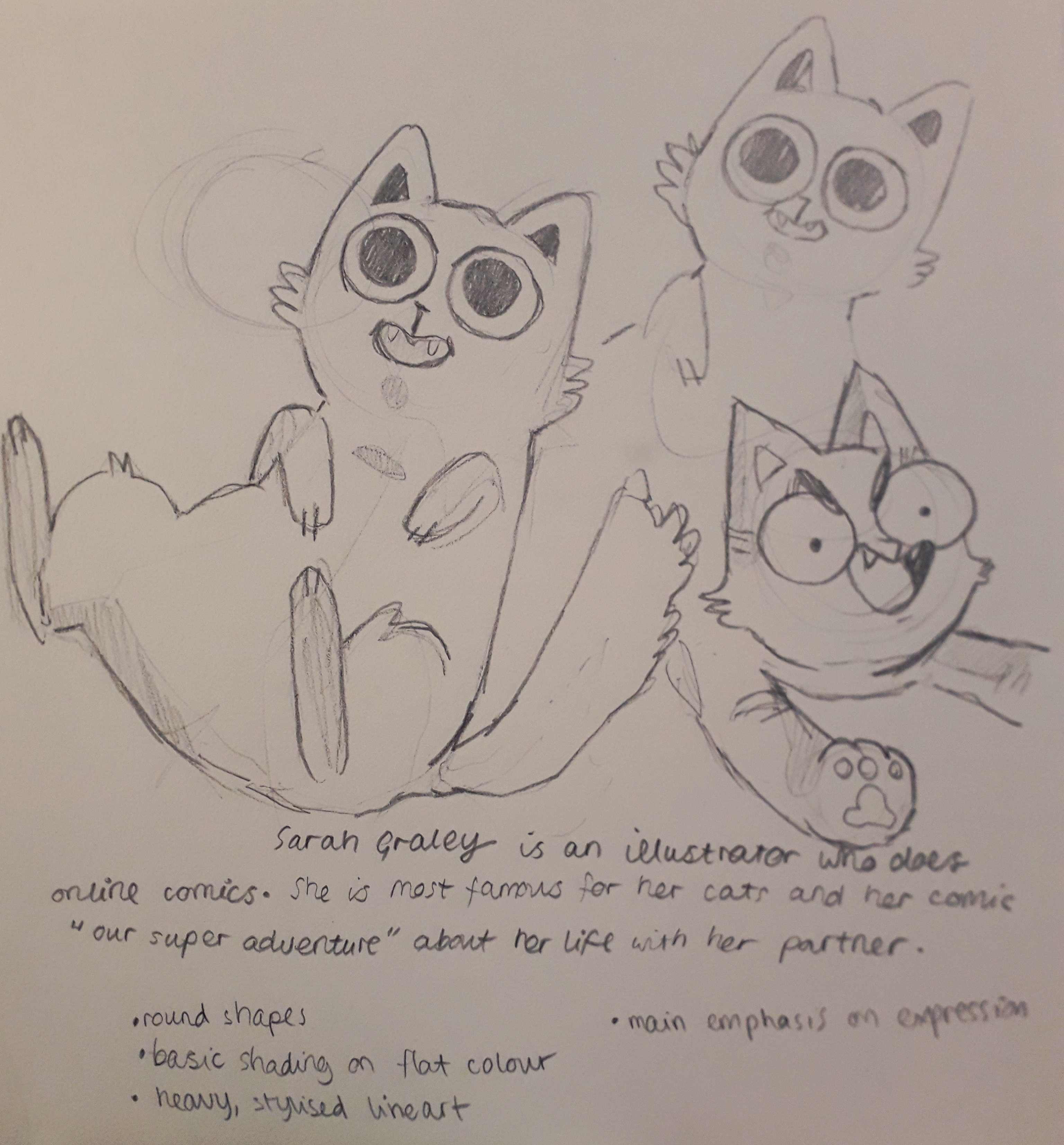
I copied the lineart of a couple of her cats because I was taken by them.
These are pretty much direct copies of cats Sarah has drawn.
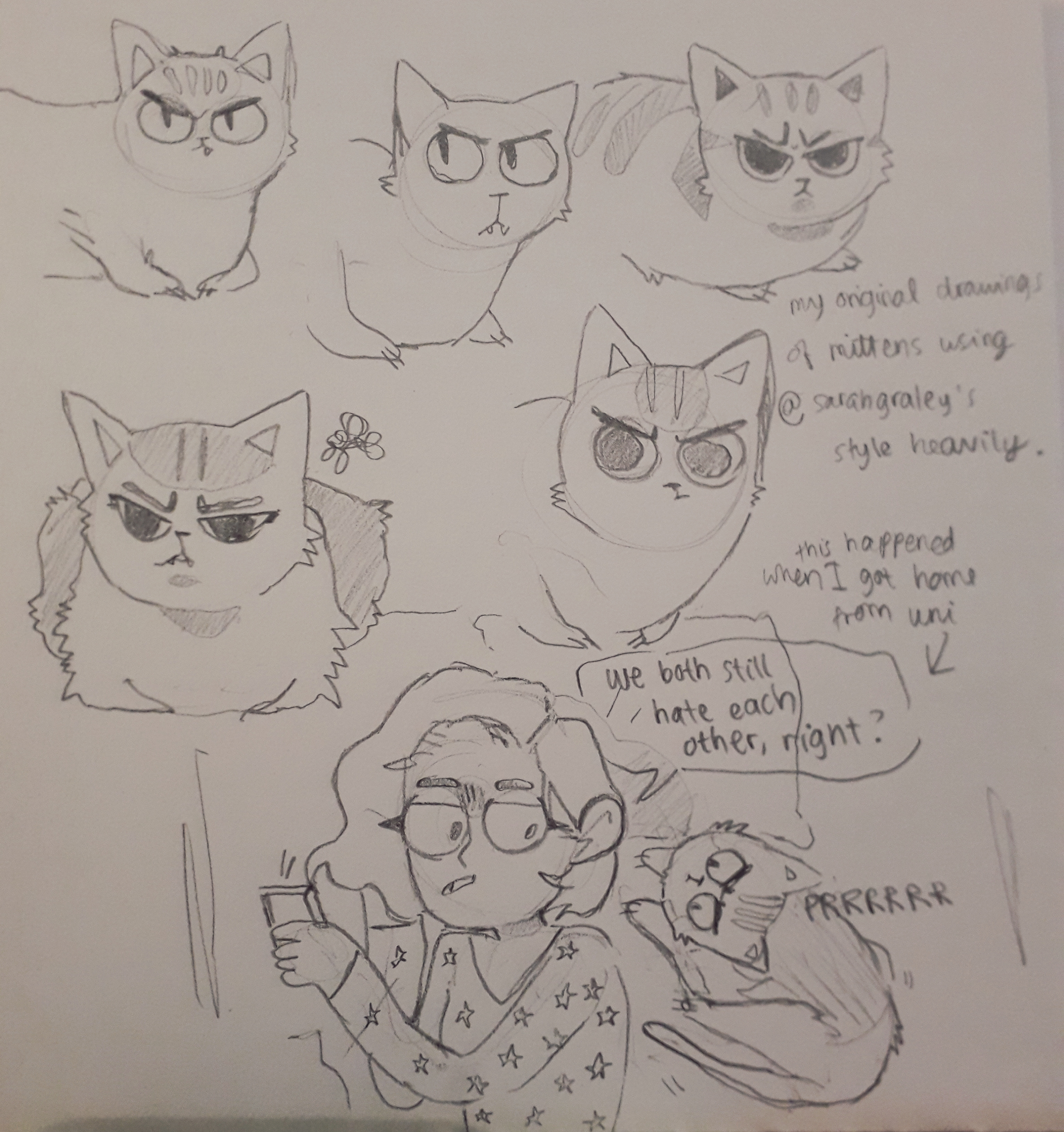
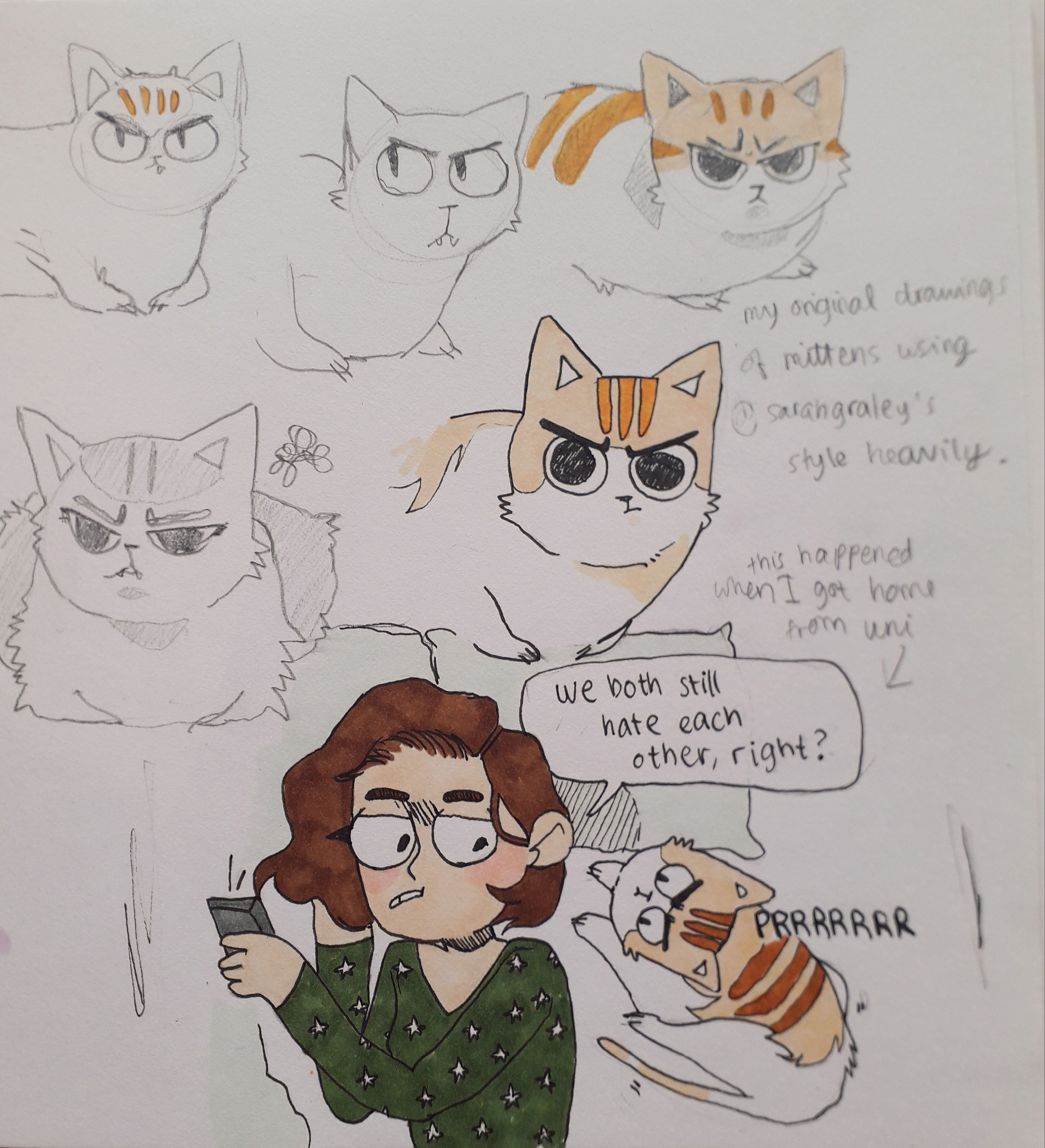
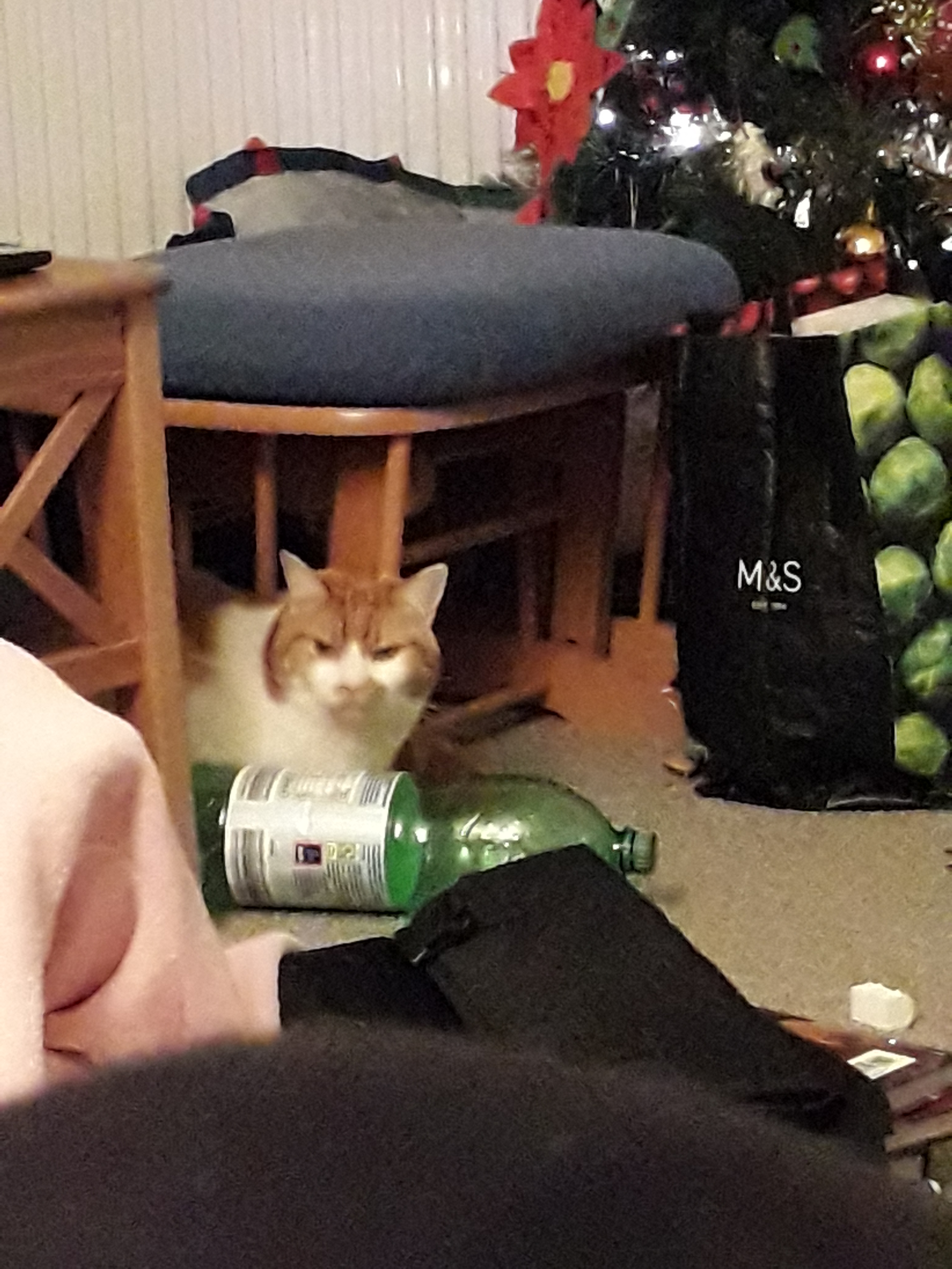
I then used the proportions and shapes from Graley’s art to make some of my own art. My cat is called Mittens and she always looks like she’s cross, even though she’s really very sweet.
An image before I added any lines or colour.The completed page, with me creating 6 iterations of Mittens.
Each iteration experimented with placement of facial features, colour and her proportions or gestures.
Graley focuses more on the feeling and message of the comics than making them perfect.
What am I going to take away from this? I like Graley’s expressions a lot. The shape of the eyes might find it’s way into my own work. The relaxed anatomy appeals to me, e.g. lack of real wrist or arm anatomy in some cases even though the joints are clearly suggested. I continually seesaw back and forth between pedantism and relaxation in terms of how realistic my proportions are, but I know that’s just a case of finding a style.
There’s also less literal advice I could take from her. As an illustrator, her online presence is consistent and so is her style and content (Our Super Adventure, her main comic, has been continuing for years). She regularly attends cons (I met her other half Stef at ComicCon this may!) and tables there selling prints and comics. Her side projects will also bring her exposure and widen her portfolio.
Finally, I feel obliged to attach a picture of Mittens for you all to enjoy. I know the perfect one.





You must be logged in to post a comment.