An illustrator I am very inspired by is Bruno Mangyoku. He is trained as an animator but works as an illustrator, and has picked up commissions from large companies such as Wired, Red Bull and Monocle.
He describes his work as “character driven” – because he “can’t envision a piece without focusing first on the characters.” I really like this, because it reflects my own interests. I love drawing people and giving them personalities.
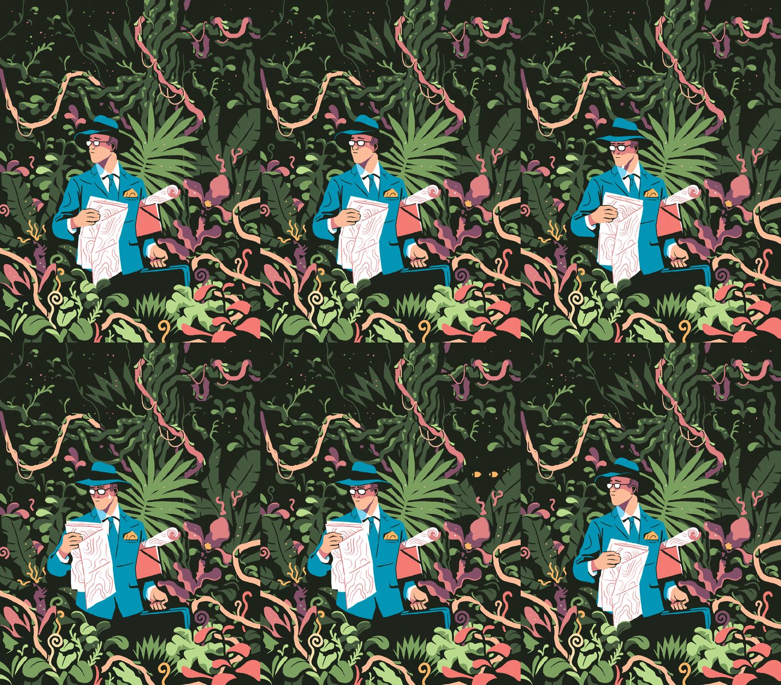
My favourite thing about this piece is the colour scheme, followed closely by the man’s face and posture. I think I’ll have to borrow this colour scheme for one of my Futures illustration pieces. Don’t let me forget! It’s very limited, but that’s what makes it lovely. It’s got an almost vintage feeling about it.I love nature, so I’m tempted to steal the shapes and colours of some of the fauna here. Bless this guy… Looks like he made a really bad wrong turn somewhere. Another good example of a successful limited colour pallette. It reminds me of a scren print or a lino print, where you’re keeping it simple with limited colours. The composition is even, e.g. the tan coat being reflected in the leftmost woman’s ginger hair. It’s cut-out, sharp shading makes it feel very graphic, which I like.
Although his work is digital, I will try to recreate the feeling traditionally. I love working digitally, but right now it always pushes me into the same routine and style, which isn’t what I need. I like to manipulate media physically at the moment.


 Gemma's Art