Photobooth: Experimentation and Evaluation

Photobooth: Experimentation and Evaluation

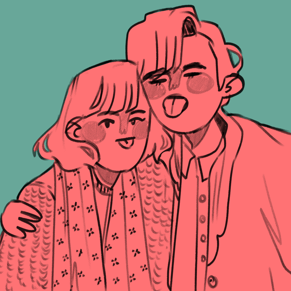
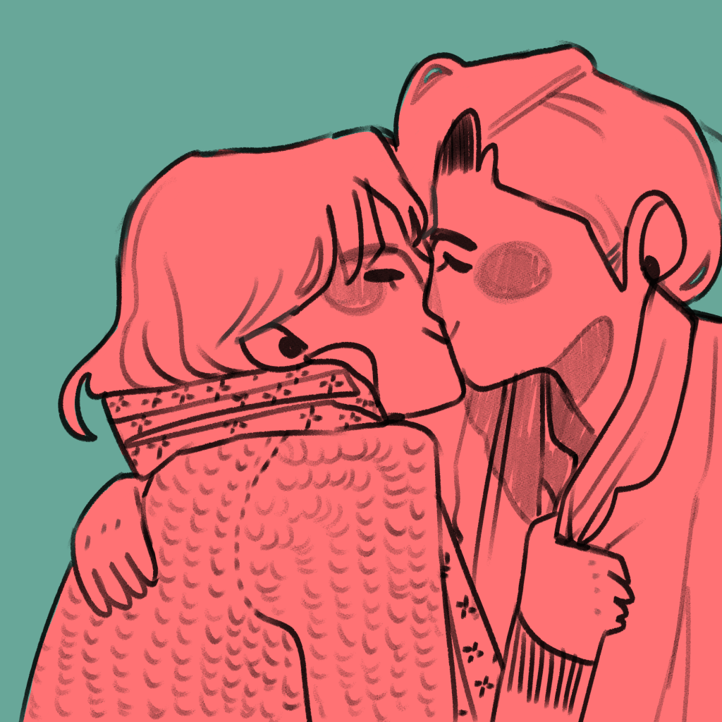
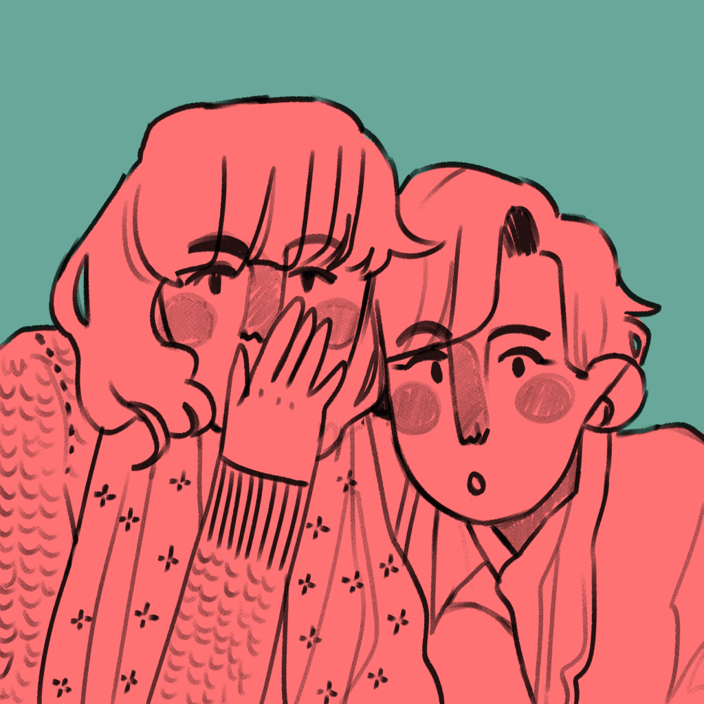
I was about to start writing up some new research, but I realised I’ve been putting off writing up my first experimental piece of finished work in FMP.

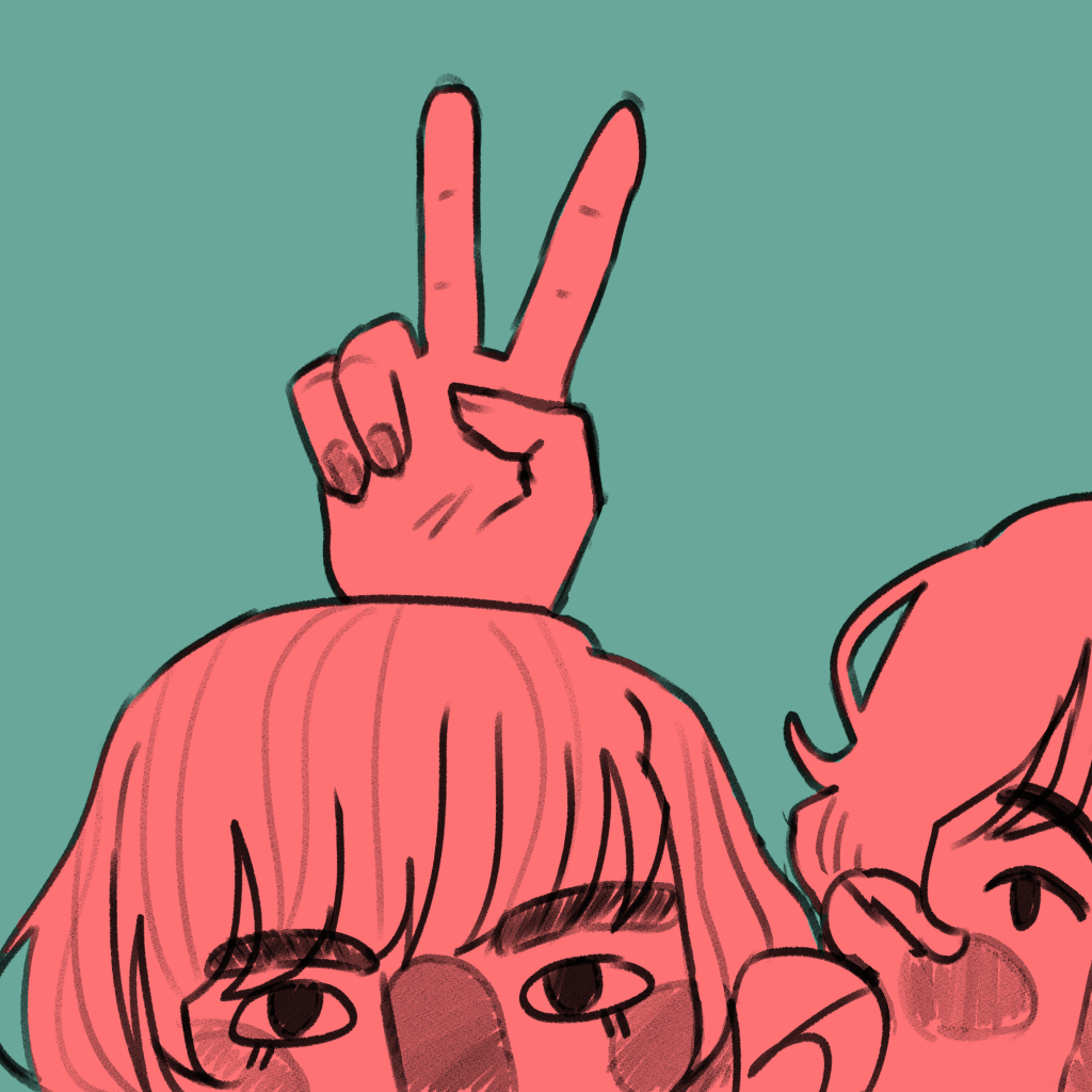
I am using illustration to explore the concepts of friendships, relationships and closeness. In doing this, I illustrated an everyday encounter between Antonia and Mitzi – mucking around in a photobooth. I had the intention to bind it into a mini-zine, an instant book I’d found out how to make in my research.
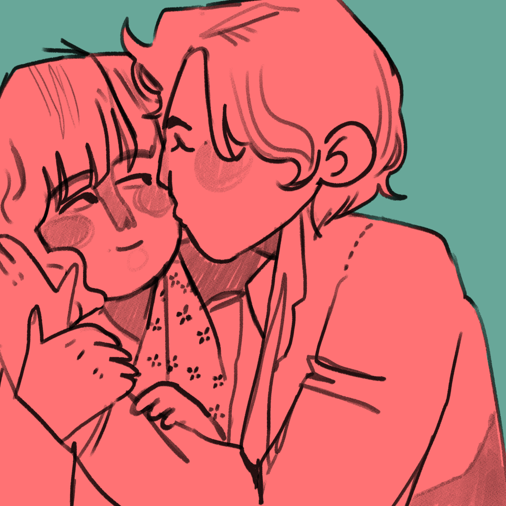
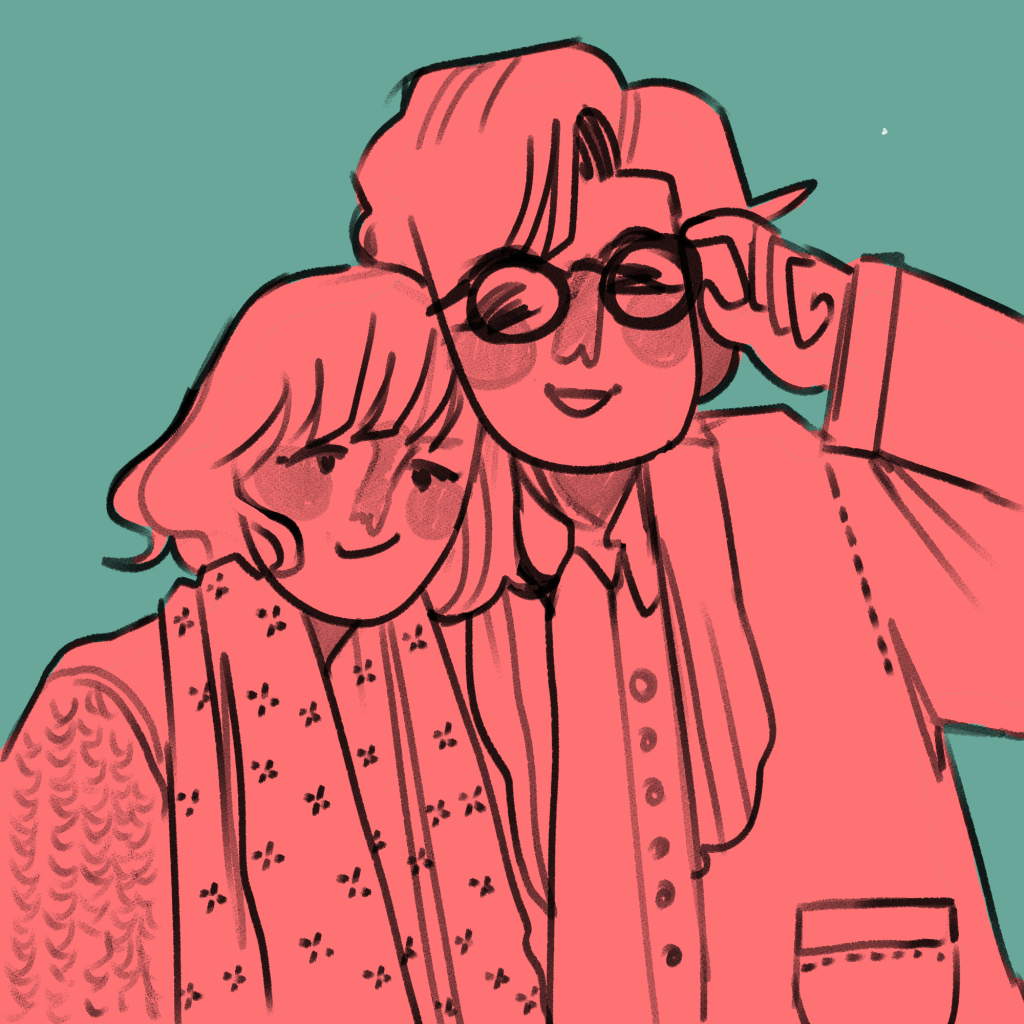
The illustrations I created came from a variety of different pieces of research. These were all mentioned in my Pecha Kucha, but overall I think they were a huge success.

This is the final result. You can see I experimented with different inks and paper types, including black and white versions. (This is because traditionally, instant zines were printed cheaply in B&W on office photocopiers to be shared and I like the historical aspect of that!).

Evaluation

Was my research purposeful? I would say so! All of the research I do affects my work somehow, because it sticks in my brain like velcro. In this case, though, studying artists like early manga artists and artists that inspire me allowed me to work comfortably in a style I like but to work in a more self aware way, and I think it’s improved the look overall as a result of the research.

Did I develop my ideas thoroughly? The short answer to this is no. Because it was just a response to research and was very experimental, I consider this successful nevertheless. Interestingly, I could focus on the form of the book I bind reflecting the content within the book in future projects. E.g. I could have had these images in a concertina style strip, similar to an actual photostrip that might come from a photobooth.

Where am I going to take this? I’d like to work in the area of “meetings” for a bit – I’ll probably chose one specific meeting and illustrate it in a couple of different ways. I need an experimental week, and to do that I need an image or scene I can experiment with. My thinkinig is circling around Drake meeting Mitzi, Ludwig and Techo. In terms of importance to the entire narrative, I have to say honestly I think this is the most important happenstance in all of the character’s development.

Artist Research: Jamie Green

Artist Research: Jamie Green

Jamie Green is an illustrator I have been inspired by for months after I found her on Instagram. She is a freelance illustrator and designer, and she works mainly traditionally, e.g. with gouache, coloured pencils, watercolours etc.

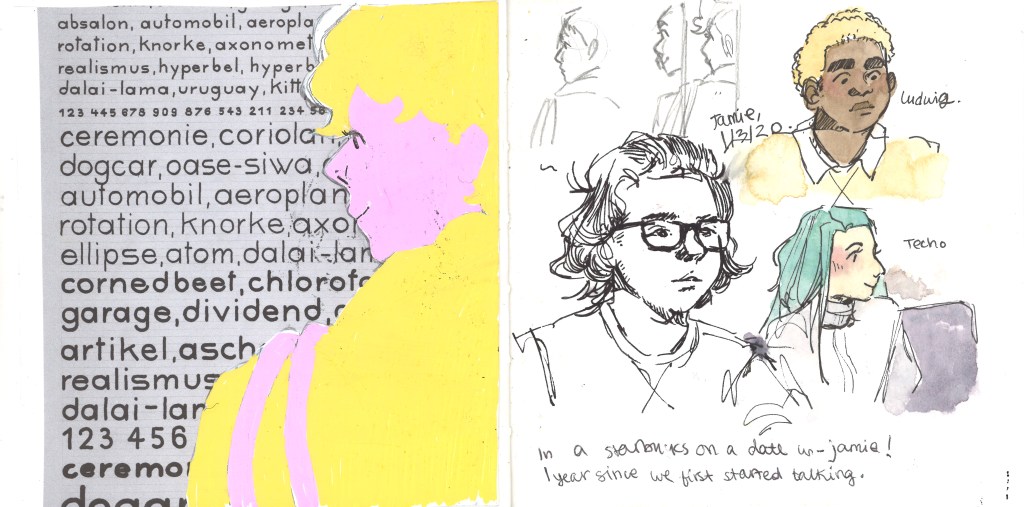
Fanart of an indie band. I really like how they draw figures. The jagged, slightly disproportionate limbs are something I want to work into my own style because they make me feel happy looking at them. The colour scheme: pastel pink and blues – exactly my style. And the way she draws faces is pleasing. I like the linework of the noses and the eyes and eyebrows. I want to work like this.
The technique used in this sketchbook scan is colouring under full opacity on a multiply later. It allows the lines from a scanned image to stay dark while you colour.
I’m realising as I pick out my favourite work from Green’s website that the bright, complimentary colours are some of my favourite aspects of their work. The hand lettering is another similarity between our styles.
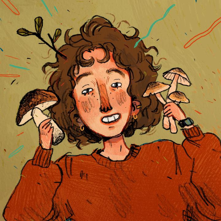
This is typical of her cosier style. She loves mushrooms and so do I… it’s admittedly part of why I love her work so much. I made breakfast with too many mushrooms for the first time in ages today… I was disappointed at myself. I’ve hit a mushroom limit. Anyway. I really like the “scribbled” texture that comes from working traditionally.
Artist Research: Bruno Mangyoku

Artist Research: Bruno Mangyoku

An illustrator I am very inspired by is Bruno Mangyoku. He is trained as an animator but works as an illustrator, and has picked up commissions from large companies such as Wired, Red Bull and Monocle.

He describes his work as “character driven” – because he “can’t envision a piece without focusing first on the characters.” I really like this, because it reflects my own interests. I love drawing people and giving them personalities.

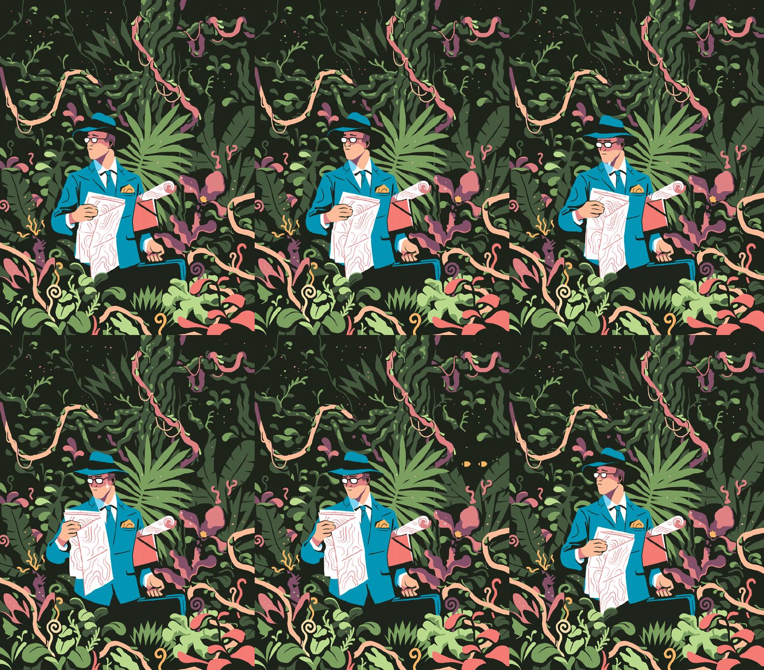
My favourite thing about this piece is the colour scheme, followed closely by the man’s face and posture. I think I’ll have to borrow this colour scheme for one of my Futures illustration pieces. Don’t let me forget! It’s very limited, but that’s what makes it lovely. It’s got an almost vintage feeling about it.
I love nature, so I’m tempted to steal the shapes and colours of some of the fauna here. Bless this guy… Looks like he made a really bad wrong turn somewhere.
Another good example of a successful limited colour pallette. It reminds me of a scren print or a lino print, where you’re keeping it simple with limited colours. The composition is even, e.g. the tan coat being reflected in the leftmost woman’s ginger hair. It’s cut-out, sharp shading makes it feel very graphic, which I like.

Although his work is digital, I will try to recreate the feeling traditionally. I love working digitally, but right now it always pushes me into the same routine and style, which isn’t what I need. I like to manipulate media physically at the moment.
Artist Research: Stephen Fowler and Rubber Stamping

Artist Research: Stephen Fowler and Rubber Stamping

Stephen Fowler came to the university to give a talk on illustration this Wednesday. He was a really unique, interesting person!

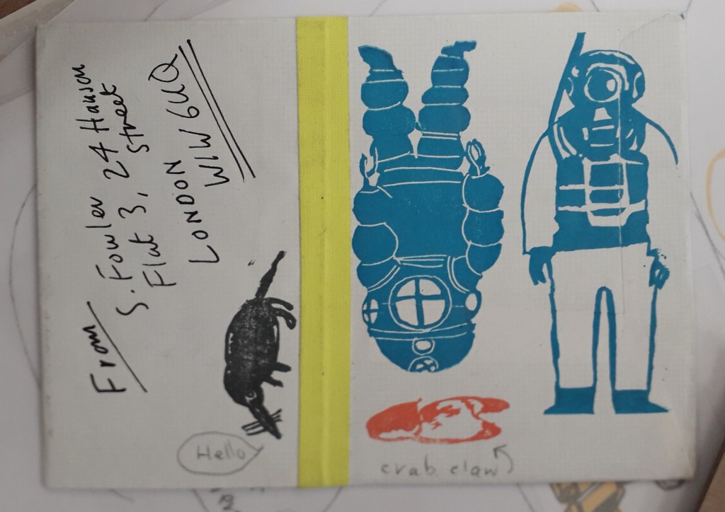
The work of his that interested me the most was his experience in rubber stamps. He has a book published on rubber stamping, and the talk he gave really inspired me. I like the idea of basically a small-scale, informal lino cut printing. It sounds like it was personally made for me.

This was some of my favourite work. I don’t actually think it’s Fowler’s but it’s still a good example. The block colour underneath some form of detail really interests me, like a two-step process. I also love that it’s bound into a book.

The concept of using rubber stamps in small hand-bound books really appeals to me. Critically, the research has already come in useful because I’m making something similar to this for my Utensia illustration project.

Printing on all sorts of things to personalise them makes me smile inside and out.
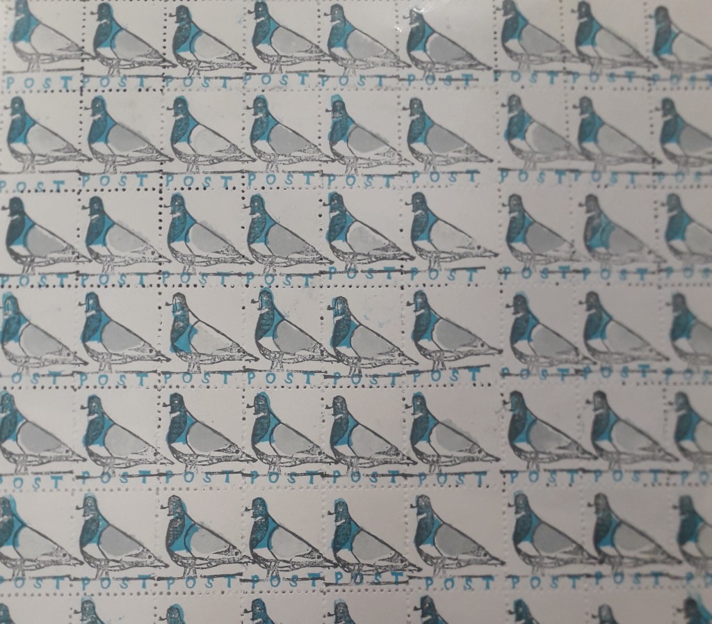
The colours used for these pigeons and the small scale it’s on made me fall in love with this sheet of stamps instantly. If I stamped something similar and used an unthreaded sewing machine to perforate the stamps, perhaps…
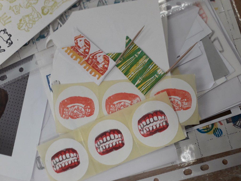
Some more examples, including on stickers which again really appeals to me.

Interactive illustration in general seems to be where I gravitate, be it on stickers, stamps or in books. Even my recent papercraft in the Utensia project has been inspired by the idea of my little ovens having interactive doors.

Where can I take this research? I’ve already started making work inspired by Fowler’s talk, but I can see it taking centre stage in a self-directed project. Any subject might suit stickers or stamps… after quite a few years of being pushed hard to work bigh because “scale shows confidence”, Louise supporting small scale illustration feels awesome!

Artist Research: Quentin Blake

Artist Research: Quentin Blake

I carried out some research on Quentin Blake, a very popular artist famous for illustrating for Roald Dahl. All the images here are credited to him.

I chose three images, because I have something to say about each of them.

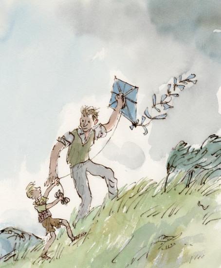
This image is a full coloured illustration. It is unlike a lot of Blake’s work because the subjects are in a defined context (the grassy hill and the grey sky). The colours are also less saturated than Blake’s other work.

This is from the children’s story Danny, the Champion of the World by Roald Dahl. Although it’s a children’s book, Dahl based it on an adult’s book he had written called Champion of the World.

The plot is quite dark for a Dahl book (although young children might not notice or mind). The significance of this is that in my opinion, the illustrations arguably match the tone of the book. Look at the quick, sketchy marks used to create the grass. The whole diagonal composition leads upwards; these show how hard the wind is blowing. The grey sky is quite sad too.

The illustration pictures a happy moment against quite a bleak background. In relation to the plot (Danny and his father making the most of a very poor situation), I think this illustration is very poignant.

That being said, it is a children’s book. All I can say in criticism of the illustration is that perhaps its bleakness and lonely feeling might put a young child off or scare them. Danny’s dad has so much kindness in his eyes, though, that it’s unlikely.

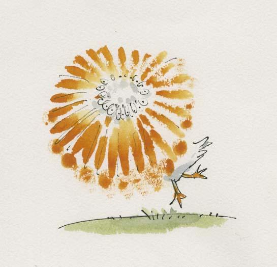
Here, I love the way motion has been pictured by drawing a sketchy beak in a whole circle.

In Quentin Blake’s Drawing book, Drawing for the Artistically Undiscovered, Blake puts a lot of emphasis on pace in illustrating. He states that if you want to draw something fast (e.g. a running horse or a pelican spinning), often literally drawing it fast will add to that effect.
I like this a lot, having read it as a young child and remembered it for many years. I’ve seen it time and again in my own art when I realise I’ve been labouring an illustration without any need, and start again with a far more dynamic result.
Look at the colours here! Anyone who’s seen my Willy Wonka painting will know I have a soft spot for this story. He’s described on Blake’s site as “the most wondrous inventor in the world”.

This is a very exciting moment in the book. I think it’s Charlie first meeting Wonka (but there’s a chance it’s right at the end of the story as he wins the chocolate factory). Everyone has heard Wonka talked about, and we all feel like Charlie does here as Wonka exceeds all of our expectations as a wonderful character.

Looking at the semiotics: the yellow surrounding Charlie in his clothes and ticket ring out happiness. The green and purple and blues of Wonka are all saturated and let us know exactly how eccentric he is. Finally, the yellow and purple key colours might make someone think of Cadbury’s, an existing chocolate brand, or of a Wonka bar (which is purple, white and yellow). Everything screams sweet wrappers. I feel like I could take a bite out of this illustration and it would taste like chocolate.

All these colours might have hurt or become confusing if there were too much background, so I think Blake was right in leaving white and only including the barest mise-en-scene to let us know we are talking to the candy man himself.

All this makes me want to go and watch Willy Wonka and the Chocolate Factory.

Sources: (You’ll have to excuse this, but it’s a crude attempt at Harvard referencing. I heard we’d have to use it at some point, and I am nothing if not a swot).

Quentin Blake 2016, Gallery: Illustration, Quentin Blake, viewed 4 November 2019, <https://www.quentinblake.com/gallery?f[]=field_gallery_category:169>

Blake, Q 1999, Drawing for the Artistically Undiscovered, Klutz

Wider Research: Sarah Graley

Wider Research: Sarah Graley

For a long time, I’ve been inspired by Sarah Graley, who is an illustrator and comic artist.

Her art is sweet and heavily stylised. She uses round shapes and exaggerated expressions to draw about her life and partner, as well as having multiple side comics. Below is an example of her work, taken from instagram:

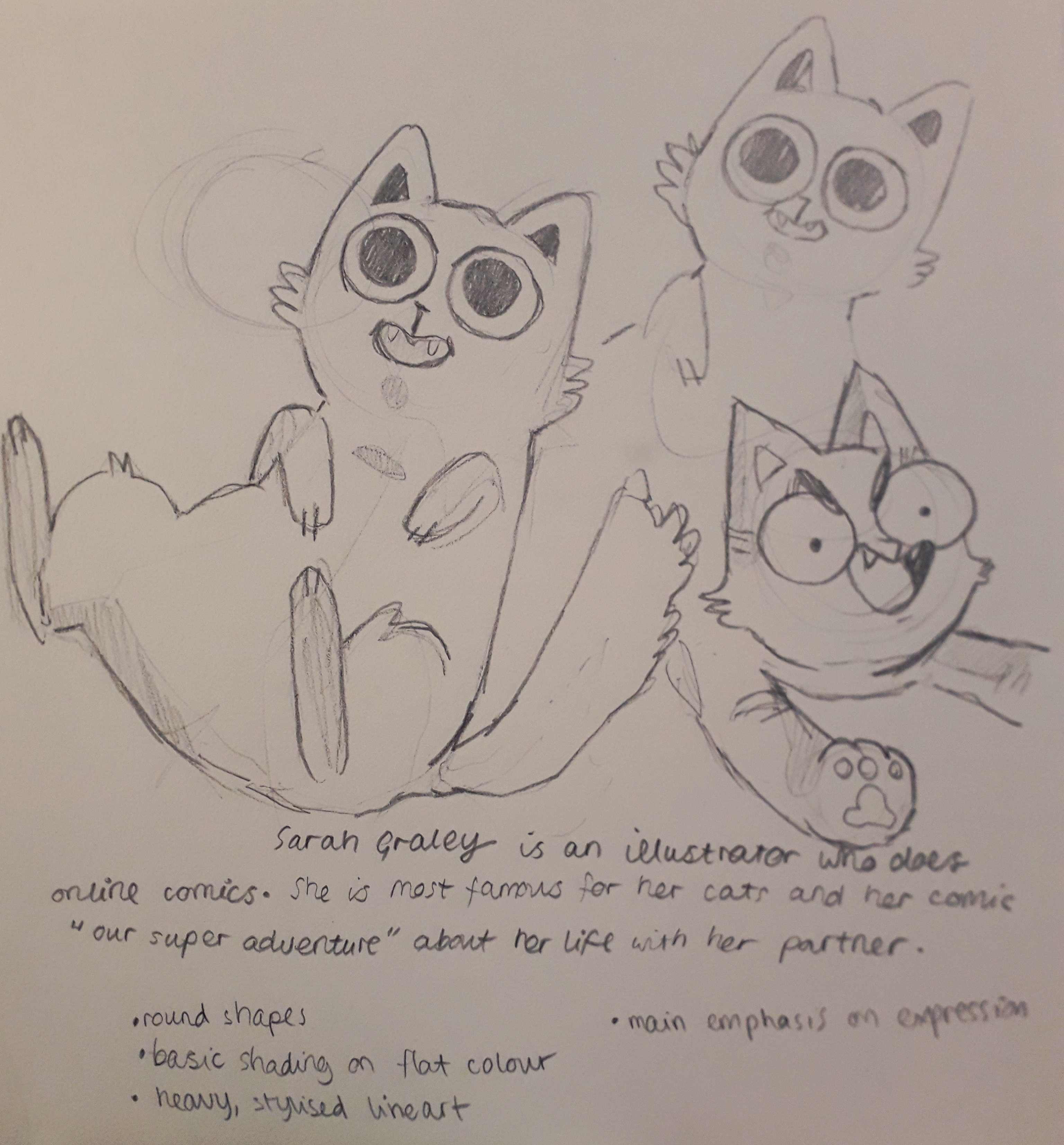
I copied the lineart of a couple of her cats because I was taken by them.

These are pretty much direct copies of cats Sarah has drawn.

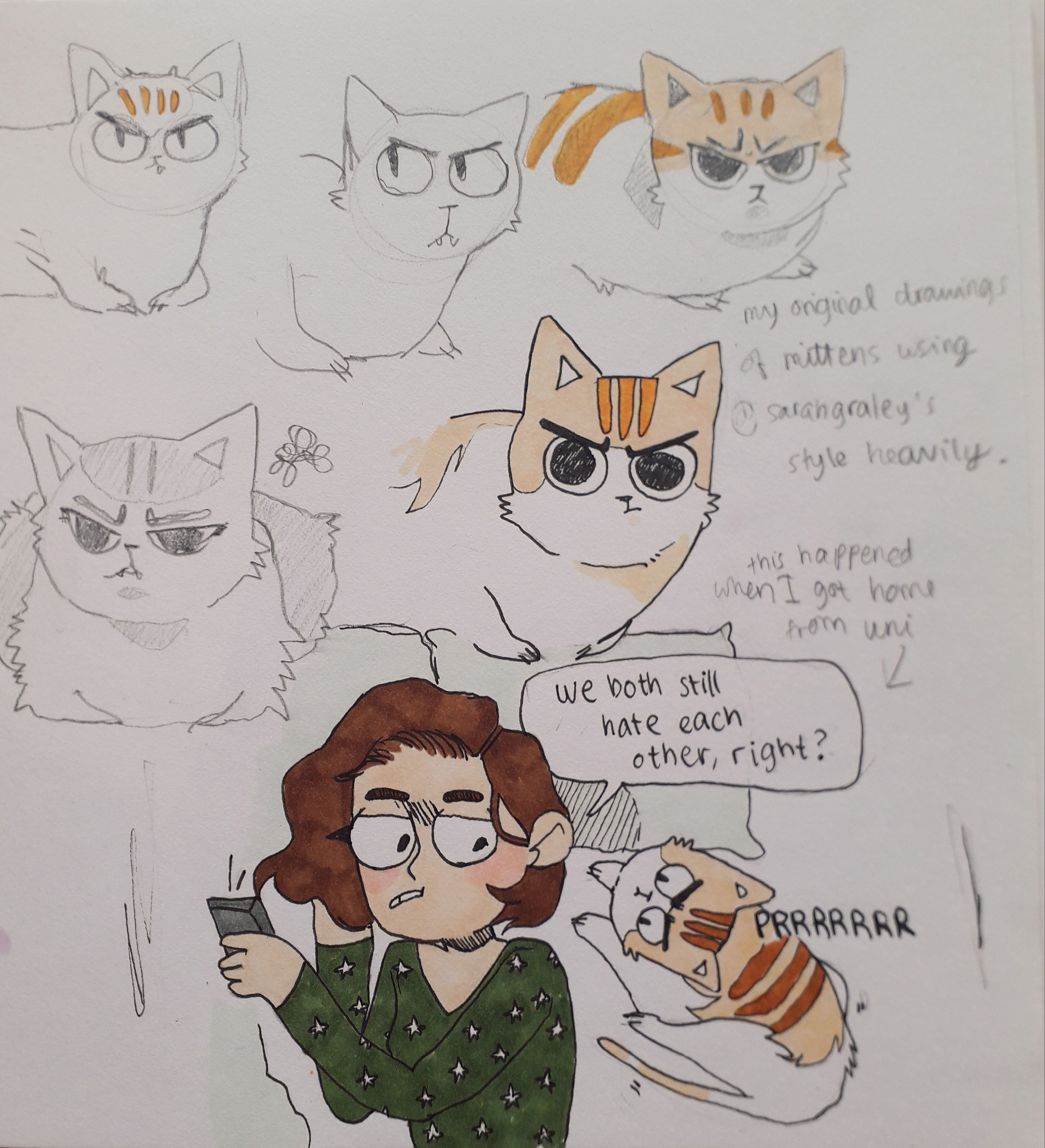
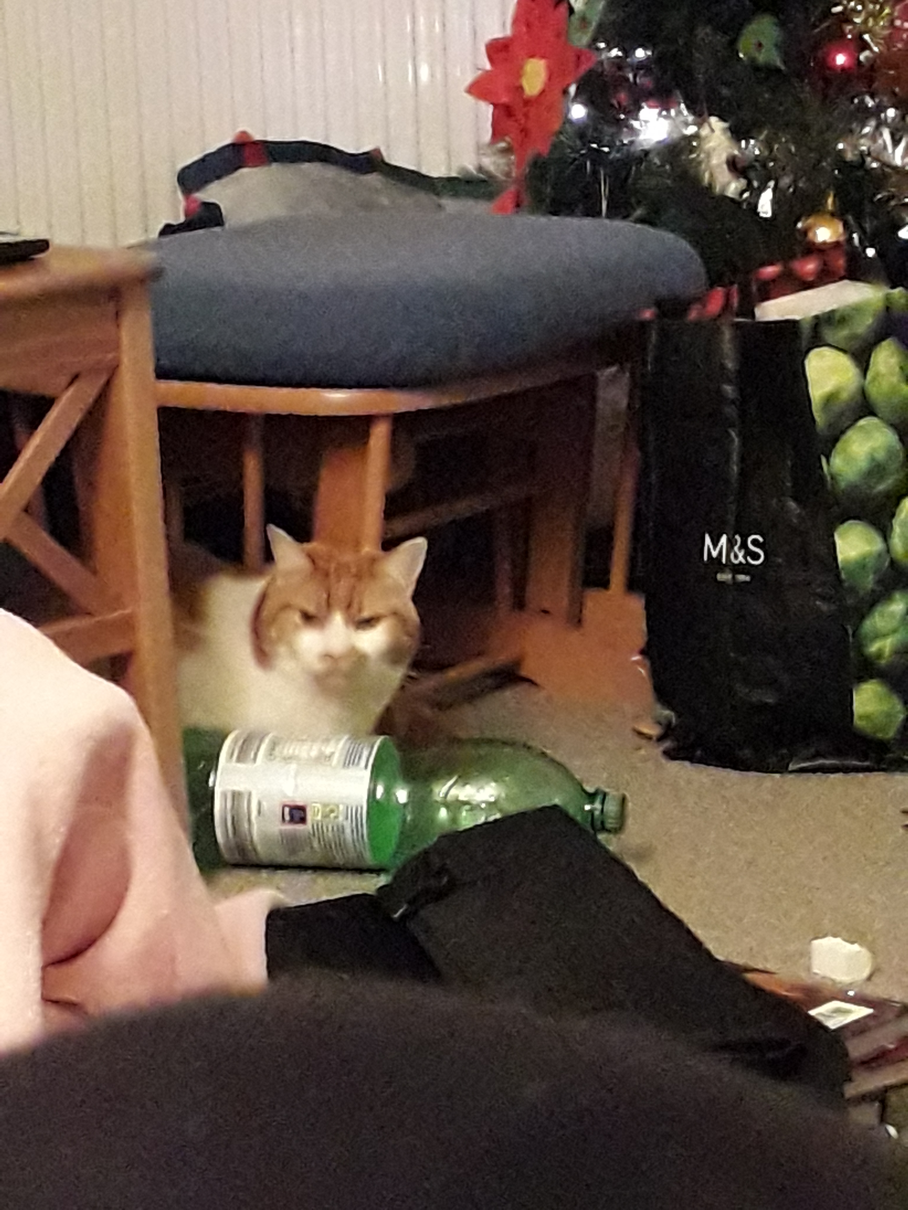
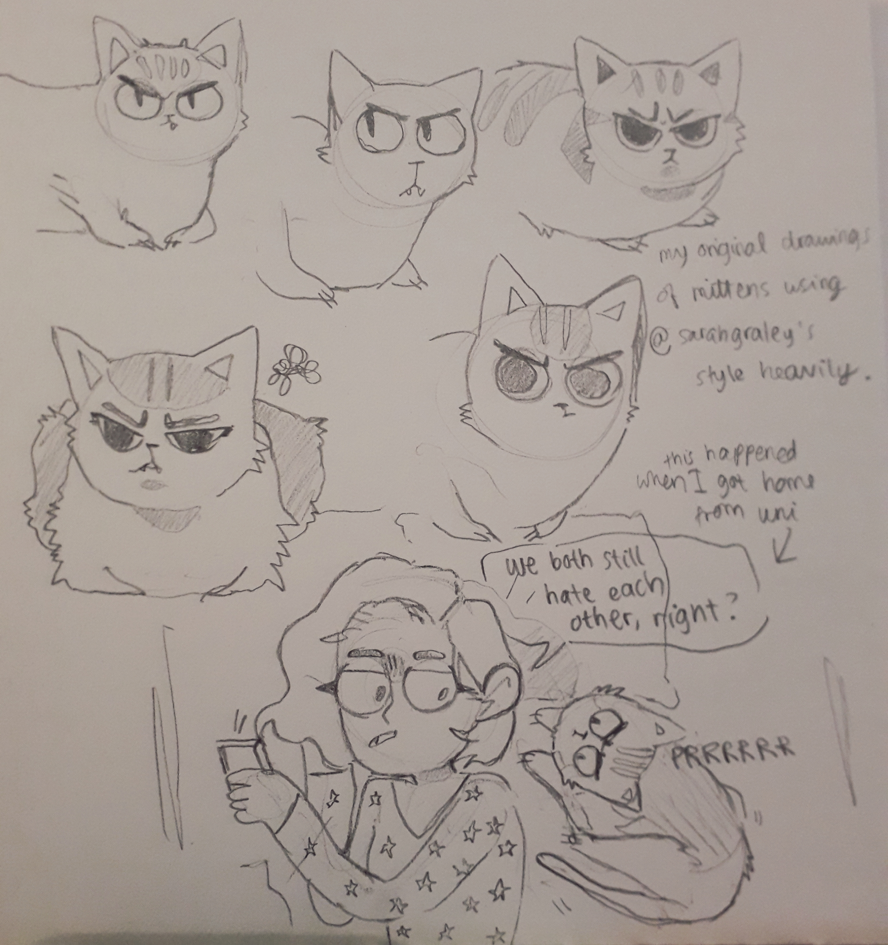
I then used the proportions and shapes from Graley’s art to make some of my own art. My cat is called Mittens and she always looks like she’s cross, even though she’s really very sweet.

An image before I added any lines or colour.
The completed page, with me creating 6 iterations of Mittens.

Each iteration experimented with placement of facial features, colour and her proportions or gestures.

Graley focuses more on the feeling and message of the comics than making them perfect.

What am I going to take away from this? I like Graley’s expressions a lot. The shape of the eyes might find it’s way into my own work. The relaxed anatomy appeals to me, e.g. lack of real wrist or arm anatomy in some cases even though the joints are clearly suggested. I continually seesaw back and forth between pedantism and relaxation in terms of how realistic my proportions are, but I know that’s just a case of finding a style.

There’s also less literal advice I could take from her. As an illustrator, her online presence is consistent and so is her style and content (Our Super Adventure, her main comic, has been continuing for years). She regularly attends cons (I met her other half Stef at ComicCon this may!) and tables there selling prints and comics. Her side projects will also bring her exposure and widen her portfolio.

Finally, I feel obliged to attach a picture of Mittens for you all to enjoy. I know the perfect one.

God’s finest creation.