A particularly groovy illustrator I found in an Illustrator Journal from 2003 is Jonny Hannah. I’m hoping to make some work inspired by him in my Futures project as I continue it.
Jonny’s illustrations are excitingly busy; the longer you look at them, the more detail you see. He also has a passion for hand typography, which you may know I’m quite passionate about. His work is blocky and stylised and he uses a mix of drawing and printing in creating his works. I like that he had a long phase of liking 1950’s paraphernalia and style: this lends itself well to my retrofuturistic work in Futures of 50’s American advertising.
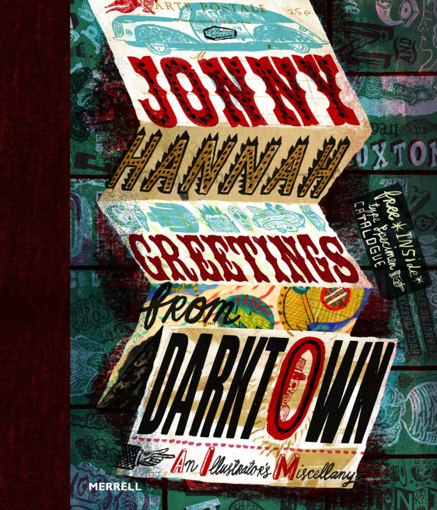
He released a book called Greetings from Darktown in 2014. Inside he has created his own world. In this image, I love the composition of the folded up sheet. It reminds me of bookbinding.
I’ve just had a thought… I know I’m going to be creating some brand packaging for Spaceoline. What if I also made a wonderful fold-out instruction / information leaflet like you get inside some medicine boxes? I know usually they’re just packed with boring text, but I could make this one beautiful.
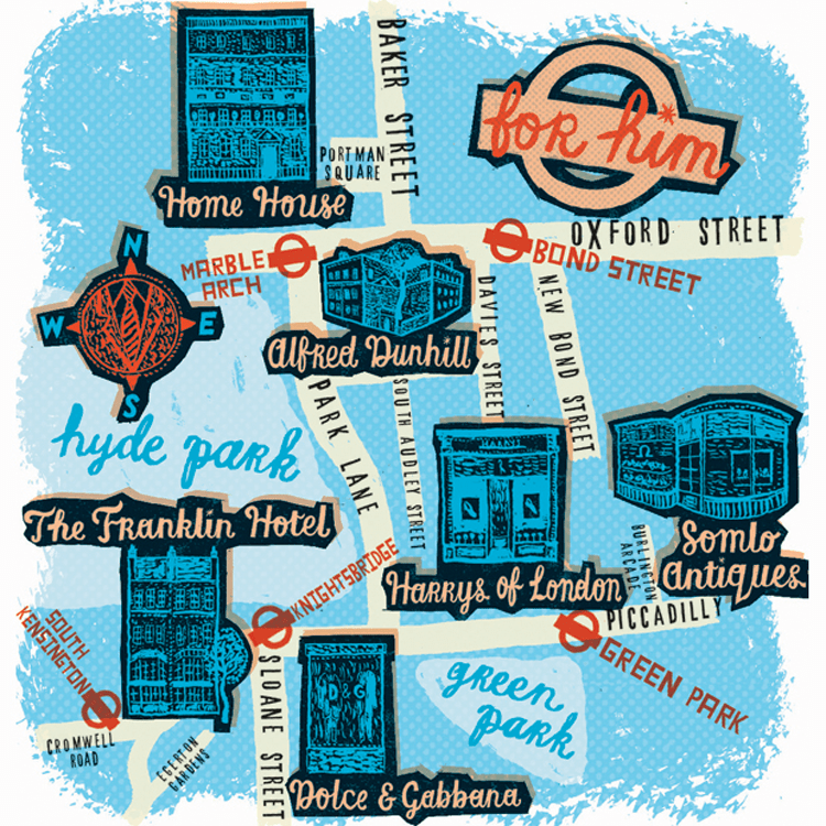
I have been drawn like a moth to a flame by this limited colour pallette. You can see that this is partially printed, with lino cut shop fronts. Maps really interest me – especially ones that use creative license. I also really like the handwriting here, and might have to magpie it, as my primary school teachers might have said.
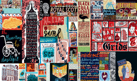
This is just a mental hodge-podge of images and typography. I love stuff like this. Ideas upon ideas upon ideas.
My research and context takes two forms: research into original source material, e.g. sci-fi novels, video games, etc. and into artists creating similar work to draw inspiration from and to place my own work contextually in the world of illustration.
Tabares is a freelance illustrator, also collaborating with merchandise brands who feature their art. (I have tried and failed to find an English version of their full name – only their social media handle, nuclear_winter__ – and their name stated on all other sites is Tabares 核の冬. I will refer to them as Tabares.)
Conventions of their work and style include:
Usually female portraits
Cyborg, or robotic parts. They tend to create robotic neck muscles or hands and arms.
Saturated neon colours and lighting – e.g. bright magentas, greens and blues.
Tabares’ work inspires mine colour-wise. I like bright colours. My research has also been into futuristic body modification, with my project description being “Future of the Body”. This means the subject of the work is also relevant to my current project.
This is a still from a very short animation in which a mask covers the girl’s face mechanically. I might consider a short animation.
Contextually, if I were to create work similar to this, it might sit in the freelance illustration category. Tabares is creating visually pleasing work that people want to buy, and from this they are also receiving lots of commissions for people who want personal art in their style.
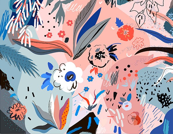
I wanted to find an illustrator that worked with pleasing colours and textures. Although this isn’t related to the future of the body directly, I like the way Efremova uses colours and space in her work.
In terms of context, her work is sold as high quality digital files, cards, posters etc. So, visually pleasing illustrations to be placed in the home.
I was thinking I could apply it to my work in terms of experimenting with different media in my sketchbook. I want to focus on generating textures so I can have a base collection of bright colours and techniques to use as backgrounds in illustrative work.
I want to take direct inspiration from the kind of shapes and colours she uses. E.g. the collections of stippling-esque dots, or the leaf with a dot grid on the far left that’s been roughly cut.I like the busy collections of objects and shapes against the dark, basic background. The colour scheme is mostly desaturated blues, with a few very light blues and pinks as a complimentary highlight colour. Efremova works a lot with pale pink and blue, but that combination is very trendy at the moment.
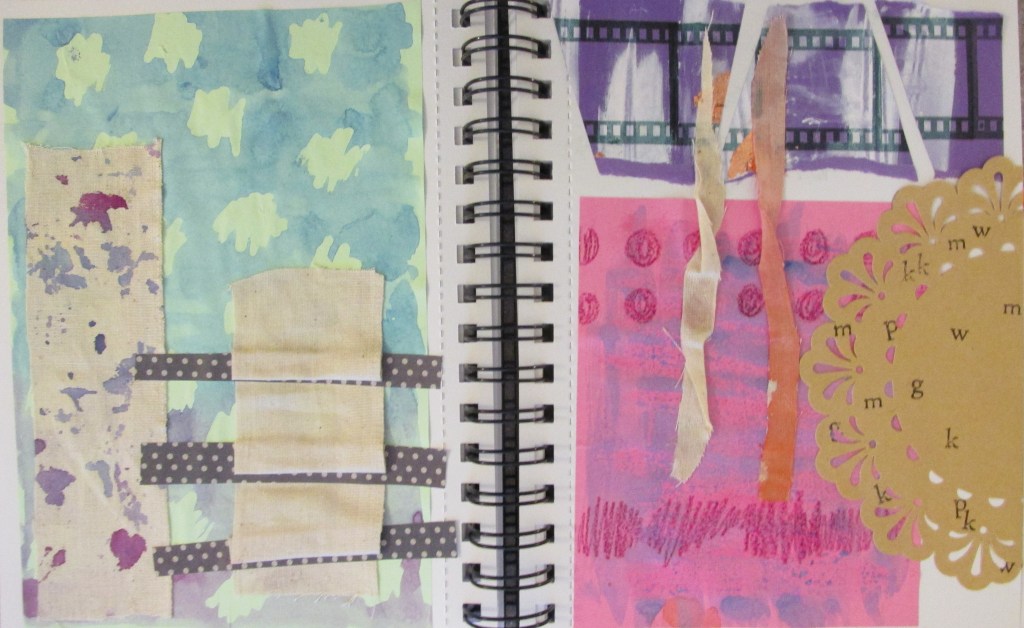
I made some textures and experimented while looking at her work. You can tell from the colours and some of the shapes. I also just wanted to suspend judgement and try out whatever I could in case something cool happened.
I like the brown doily with lettering stamped onto it. I also really like the blue and purple spattered calico fabric. The blue and pink posca pens were more successful than I’d hoped.
In the morning, Louise held a group evaluation in which we put out all our work and, in pairs, appraised each other’s work so far. I worked with Will and took notes on what he said after taking a look at my work.
What we decided I needed to work on was:
Filling up the white spaces on my media experimentation worksheet. Hopefully, I will create a papercraft oven and some of this exploration will fill up the rest of the sheet.
Researching more deeply into where my work is going. In the time since last Thursday, I have completed some research and will finish this blog post with it.
Louise mentioned my experimentation sheet was very door-heavy. This was things like cupboard doors, ovens and hobs, kitchen cabinets etc. She suggested that maybe I look into doors more closely, and their deeper meaning. I looked around online for a while and compiled a list along with images of famous doors in pop culture history – that is, books and film. Those will be collaged in my sketchbook over some pages as visual inspiration.
I also collected a few images relating to the papercraft route I might potentially take. I really like the idea of having a small interactive oven, with little doors that open. My research took me to an illustrator that really interested me – Samuel Shumway.
Shumway is a stop motion animator and prop designer as well as illustrator. The works that interested me were his small papercraft creations.
I like the bright colours and the uplifting feeling of his work and the way he photographs it. The square feeling of this lasagne is what I’ll hopefully go for with my little oven, but a but simpler…
My research into Shumway helped me get an idea of the overall feeling I’d like my work to communicate. The use of paper and his way of working is one I’d like to try out in my project.
My research also took me to another artist: Simon Costin.
Costin is a set designer, but his work is so varied that he’s incredibly hard to define. I found some of his work from the Museum of London interesting.
You can see the busyness of this layout, and how Costin has created a three-dimentional scene with an incredibly illustrative feeling to it.Photographing in different lighting is something I’ll have to keep in mind. His artwork kind of reminds me of the illustrations by Chris Riddell, e.g. Ottoline and the Yellow Cat.These lino cuts are totally different to the work shown above. I like these for the brightness of colour and how they make me feel. The blues and greens are saturated and uplifting, and the print itself is bold. I might try a colour scheme like this when creating my little paper oven.
Critically, Costin’s work has helped me think about where to take the project practically. He’s given me ideas in terms of colour pallette, and I might take inspiration for texture and shape in this or future projects. E.g. the lines of wooden buildings or the brick textures, or the wooden paneling of the tudor-esque houses.
I carried out some research on Quentin Blake, a very popular artist famous for illustrating for Roald Dahl. All the images here are credited to him.
I chose three images, because I have something to say about each of them.
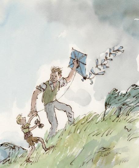
This image is a full coloured illustration. It is unlike a lot of Blake’s work because the subjects are in a defined context (the grassy hill and the grey sky). The colours are also less saturated than Blake’s other work.
This is from the children’s story Danny, the Champion of the World by Roald Dahl. Although it’s a children’s book, Dahl based it on an adult’s book he had written called Champion of the World.
The plot is quite dark for a Dahl book (although young children might not notice or mind). The significance of this is that in my opinion, the illustrations arguably match the tone of the book. Look at the quick, sketchy marks used to create the grass. The whole diagonal composition leads upwards; these show how hard the wind is blowing. The grey sky is quite sad too.
The illustration pictures a happy moment against quite a bleak background. In relation to the plot (Danny and his father making the most of a very poor situation), I think this illustration is very poignant.
That being said, it is a children’s book. All I can say in criticism of the illustration is that perhaps its bleakness and lonely feeling might put a young child off or scare them. Danny’s dad has so much kindness in his eyes, though, that it’s unlikely.
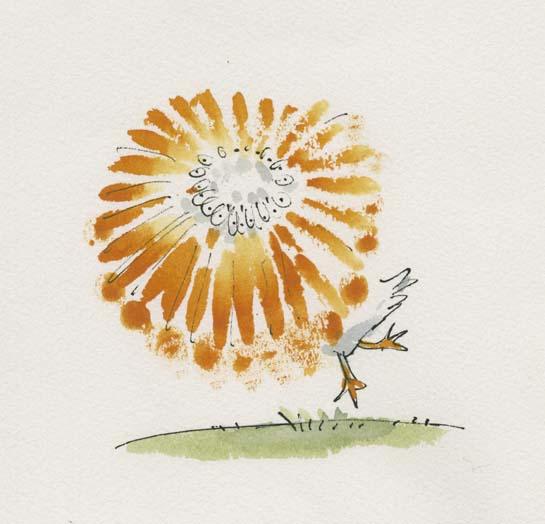
Here, I love the way motion has been pictured by drawing a sketchy beak in a whole circle.
In Quentin Blake’s Drawing book, Drawing for the Artistically Undiscovered, Blake puts a lot of emphasis on pace in illustrating. He states that if you want to draw something fast (e.g. a running horse or a pelican spinning), often literally drawing it fast will add to that effect.
I like this a lot, having read it as a young child and remembered it for many years. I’ve seen it time and again in my own art when I realise I’ve been labouring an illustration without any need, and start again with a far more dynamic result.
Look at the colours here! Anyone who’s seen my Willy Wonka painting will know I have a soft spot for this story. He’s described on Blake’s site as “the most wondrous inventor in the world”.
This is a very exciting moment in the book. I think it’s Charlie first meeting Wonka (but there’s a chance it’s right at the end of the story as he wins the chocolate factory). Everyone has heard Wonka talked about, and we all feel like Charlie does here as Wonka exceeds all of our expectations as a wonderful character.
Looking at the semiotics: the yellow surrounding Charlie in his clothes and ticket ring out happiness. The green and purple and blues of Wonka are all saturated and let us know exactly how eccentric he is. Finally, the yellow and purple key colours might make someone think of Cadbury’s, an existing chocolate brand, or of a Wonka bar (which is purple, white and yellow). Everything screams sweet wrappers. I feel like I could take a bite out of this illustration and it would taste like chocolate.
All these colours might have hurt or become confusing if there were too much background, so I think Blake was right in leaving white and only including the barest mise-en-scene to let us know we are talking to the candy man himself.
All this makes me want to go and watch Willy Wonka and the Chocolate Factory.
Sources: (You’ll have to excuse this, but it’s a crude attempt at Harvard referencing. I heard we’d have to use it at some point, and I am nothing if not a swot).







You must be logged in to post a comment.