I carried out some research on Quentin Blake, a very popular artist famous for illustrating for Roald Dahl. All the images here are credited to him.
I chose three images, because I have something to say about each of them.
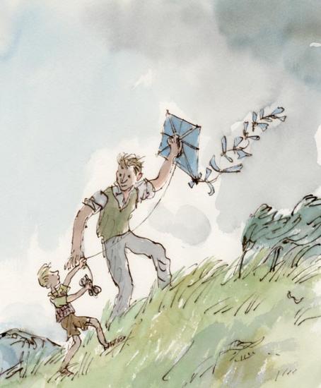
This is from the children’s story Danny, the Champion of the World by Roald Dahl. Although it’s a children’s book, Dahl based it on an adult’s book he had written called Champion of the World.
The plot is quite dark for a Dahl book (although young children might not notice or mind). The significance of this is that in my opinion, the illustrations arguably match the tone of the book. Look at the quick, sketchy marks used to create the grass. The whole diagonal composition leads upwards; these show how hard the wind is blowing. The grey sky is quite sad too.
The illustration pictures a happy moment against quite a bleak background. In relation to the plot (Danny and his father making the most of a very poor situation), I think this illustration is very poignant.
That being said, it is a children’s book. All I can say in criticism of the illustration is that perhaps its bleakness and lonely feeling might put a young child off or scare them. Danny’s dad has so much kindness in his eyes, though, that it’s unlikely.
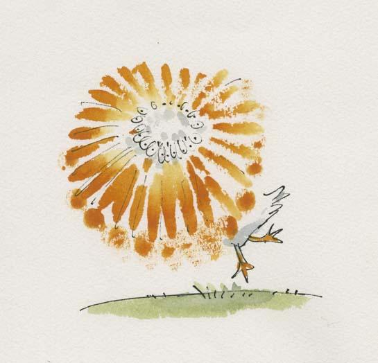
In Quentin Blake’s Drawing book, Drawing for the Artistically Undiscovered, Blake puts a lot of emphasis on pace in illustrating. He states that if you want to draw something fast (e.g. a running horse or a pelican spinning), often literally drawing it fast will add to that effect.
I like this a lot, having read it as a young child and remembered it for many years. I’ve seen it time and again in my own art when I realise I’ve been labouring an illustration without any need, and start again with a far more dynamic result.

Look at the colours here! Anyone who’s seen my Willy Wonka painting will know I have a soft spot for this story. He’s described on Blake’s site as “the most wondrous inventor in the world”.
This is a very exciting moment in the book. I think it’s Charlie first meeting Wonka (but there’s a chance it’s right at the end of the story as he wins the chocolate factory). Everyone has heard Wonka talked about, and we all feel like Charlie does here as Wonka exceeds all of our expectations as a wonderful character.
Looking at the semiotics: the yellow surrounding Charlie in his clothes and ticket ring out happiness. The green and purple and blues of Wonka are all saturated and let us know exactly how eccentric he is. Finally, the yellow and purple key colours might make someone think of Cadbury’s, an existing chocolate brand, or of a Wonka bar (which is purple, white and yellow). Everything screams sweet wrappers. I feel like I could take a bite out of this illustration and it would taste like chocolate.
All these colours might have hurt or become confusing if there were too much background, so I think Blake was right in leaving white and only including the barest mise-en-scene to let us know we are talking to the candy man himself.
All this makes me want to go and watch Willy Wonka and the Chocolate Factory.
Sources: (You’ll have to excuse this, but it’s a crude attempt at Harvard referencing. I heard we’d have to use it at some point, and I am nothing if not a swot).
Quentin Blake 2016, Gallery: Illustration, Quentin Blake, viewed 4 November 2019, <https://www.quentinblake.com/gallery?f[]=field_gallery_category:169>
Blake, Q 1999, Drawing for the Artistically Undiscovered, Klutz
 Gemma's Art