I really liked one of the sketches I’d created during the illustration workshop with Louise. I uploaded the sketch onto Clip Studio Paint and lined it digitally.
I then went online and did a little snoop around some colour palettes. I found one I liked that was quite muted and cool; this attracted me because I sit quite comfortably in warm colour palettes for illustration. I copied it in and used the five colours (and slight shades) to colour the illustration.
Other minor changes I made after that was to place a texture over the colour layers, change it to an orange and set the layer effect to multiply, then reduce the opacity a lot. I like a little bit of texture over my art.
I also took the whole (merged) colour layer and moved it very slightly to the left, then corrected any shaky lines. The slight skew appeals to me. I think this is a little inspired by Quentin Blake, who colours messily to a successful end.

I then experimented with layer effects to create some other versions of the illustration. This step is always fun for me!
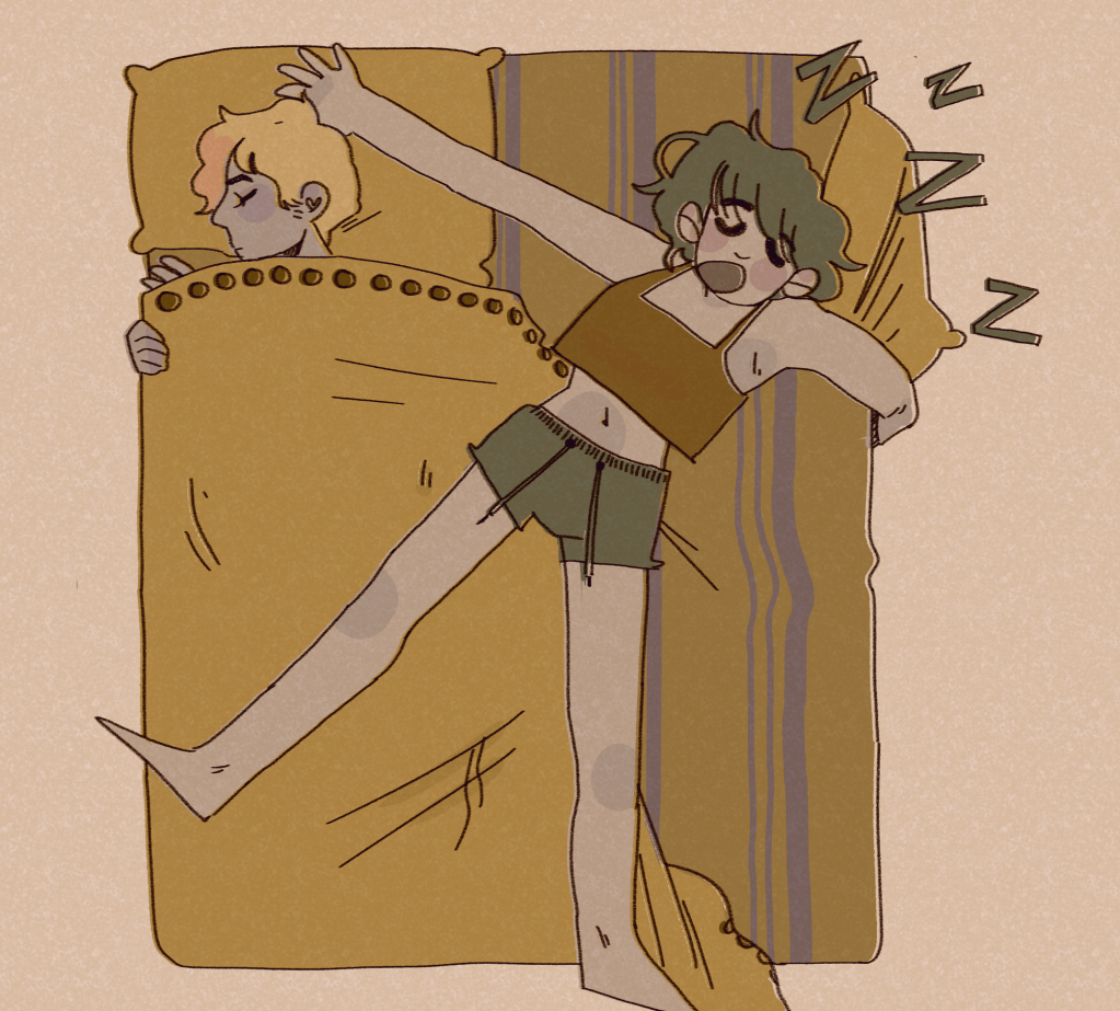

Overall, I’m happy with the illustration. The final one I would personally present is the orange one; the definition is clear and it gives off some cool vibes.
I’ve been having a think about what could push my style. I think I need more background work, or a larger basis of reference for backgrounds. I practice drawing backgrounds when I can in my sketchbook. I also need more practice drawing different body types. Some bodies, no matter how well drawn, are less aesthetically pleasing than others in terms of curves and how dynamic I can make them. I’m working to rectify that.
