Illustration Extension: Order and Chaos

Illustration Extension: Order and Chaos

I really liked one of the sketches I’d created during the illustration workshop with Louise. I uploaded the sketch onto Clip Studio Paint and lined it digitally.

I then went online and did a little snoop around some colour palettes. I found one I liked that was quite muted and cool; this attracted me because I sit quite comfortably in warm colour palettes for illustration. I copied it in and used the five colours (and slight shades) to colour the illustration.

Other minor changes I made after that was to place a texture over the colour layers, change it to an orange and set the layer effect to multiply, then reduce the opacity a lot. I like a little bit of texture over my art.

I also took the whole (merged) colour layer and moved it very slightly to the left, then corrected any shaky lines. The slight skew appeals to me. I think this is a little inspired by Quentin Blake, who colours messily to a successful end.

This was the original.

I then experimented with layer effects to create some other versions of the illustration. This step is always fun for me!
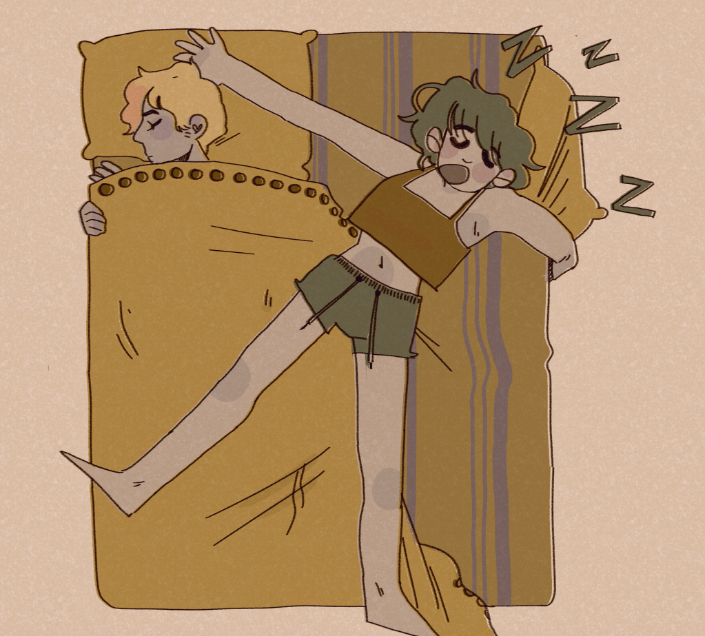
This is with a Difference layer effect over the whole illustration. I can’t remember what colour I used to get this warmer palette, but I admit this version is my favourite. The other illustration just feels a little lifeless. Ines said she thinks this one feels like an early morning!
This is with the Exclusion layer effect. This one is great, because it makes me feel like it’s actually night time. I like that dark patches appear light and vice versa.

Overall, I’m happy with the illustration. The final one I would personally present is the orange one; the definition is clear and it gives off some cool vibes.

I’ve been having a think about what could push my style. I think I need more background work, or a larger basis of reference for backgrounds. I practice drawing backgrounds when I can in my sketchbook. I also need more practice drawing different body types. Some bodies, no matter how well drawn, are less aesthetically pleasing than others in terms of curves and how dynamic I can make them. I’m working to rectify that.
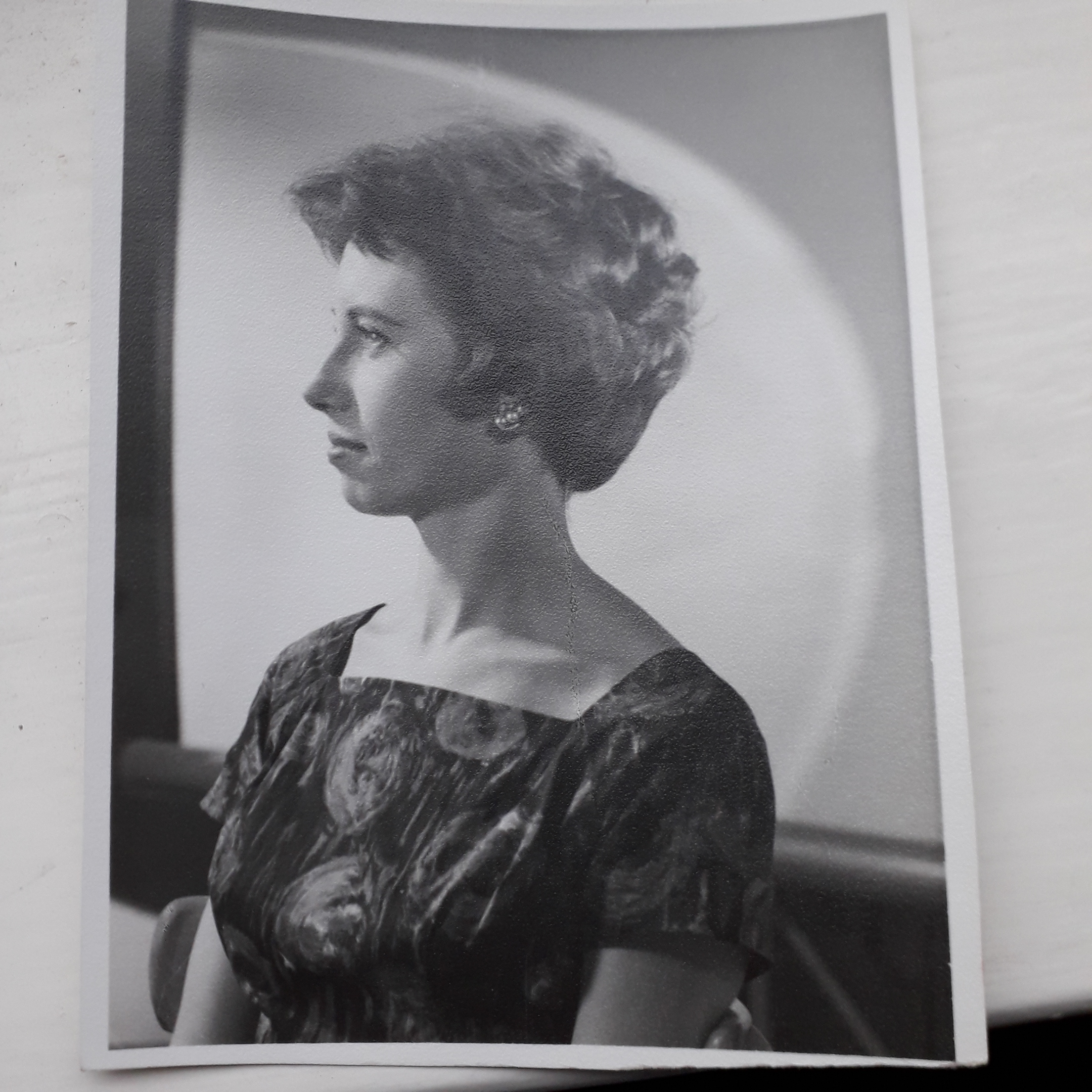
Ideas: my Grandmother

Ideas: my Grandmother

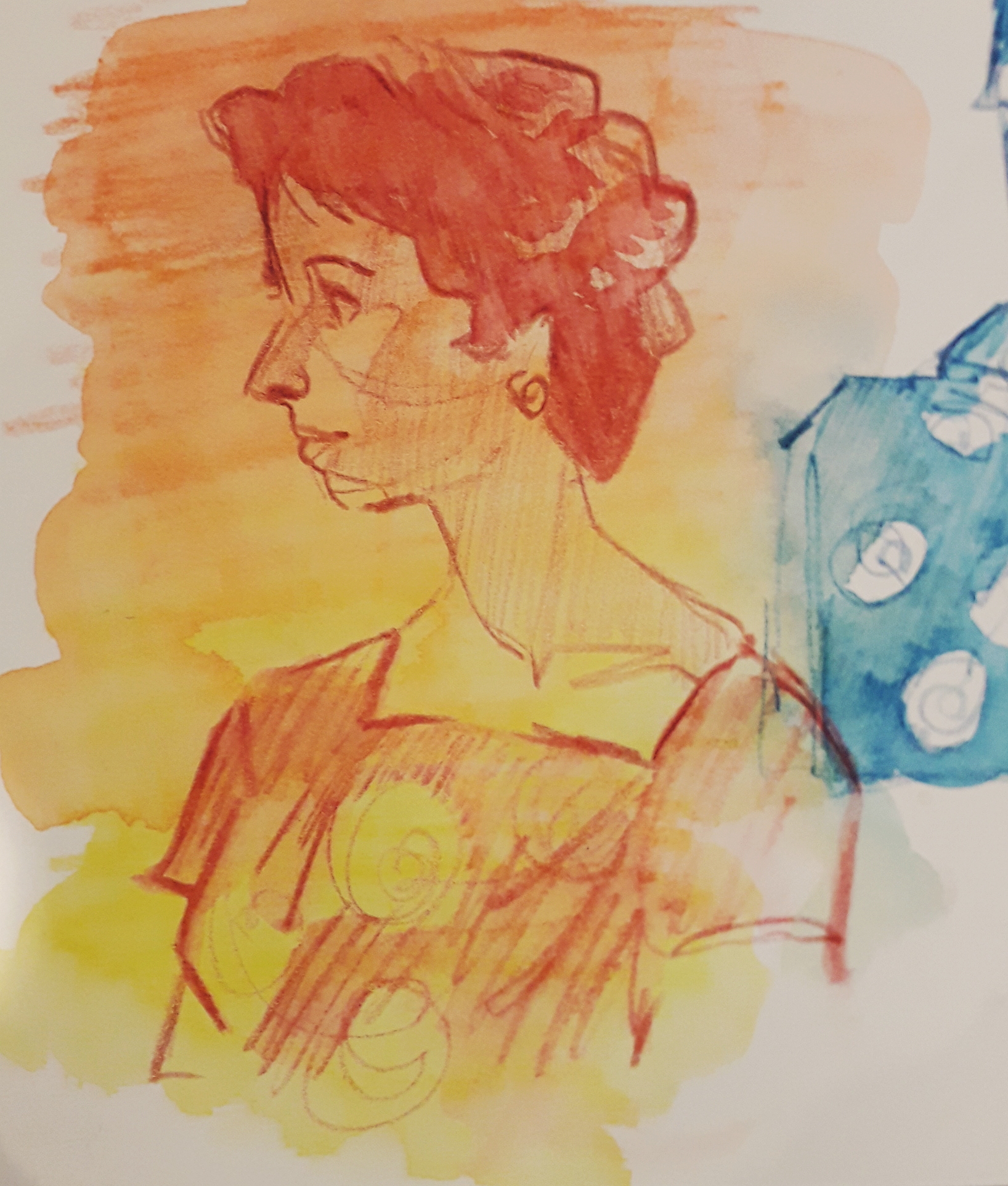
Last Saturday, my mum and I visited my granddad on the way back from an open day. I never see him or my gran; they live very far away and one lives in hospital while my granddad is sad and in pain most of the time.

I chatted to him a bit, though, and it was nice to see him again even though I felt like I was talking to him through thick glass.

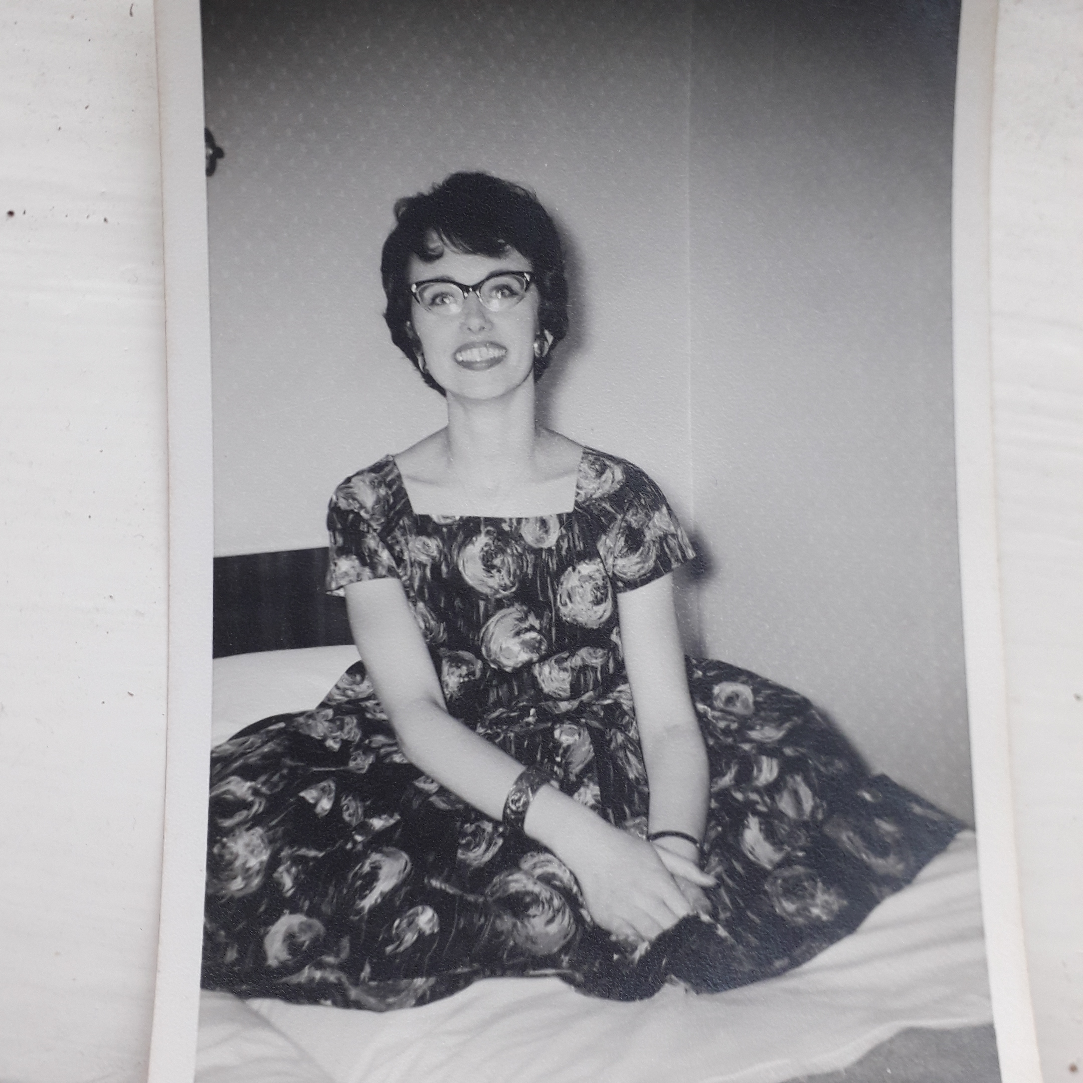
I came across some pictures of my gran when she was in her 20s – she was very pretty. It made me think about all the stuff she’s lost because of her Alzheimer’s.

I wanted to draw her, because it puts a new perspective on the same pictures, especially from someone who barely knew her. I see her more through what Mum’s told me about her.

Even though the pictures are black and white, my granddad saw me looking and told me what colour her dress was. That really took me …. I wanted to put colour into the photos.
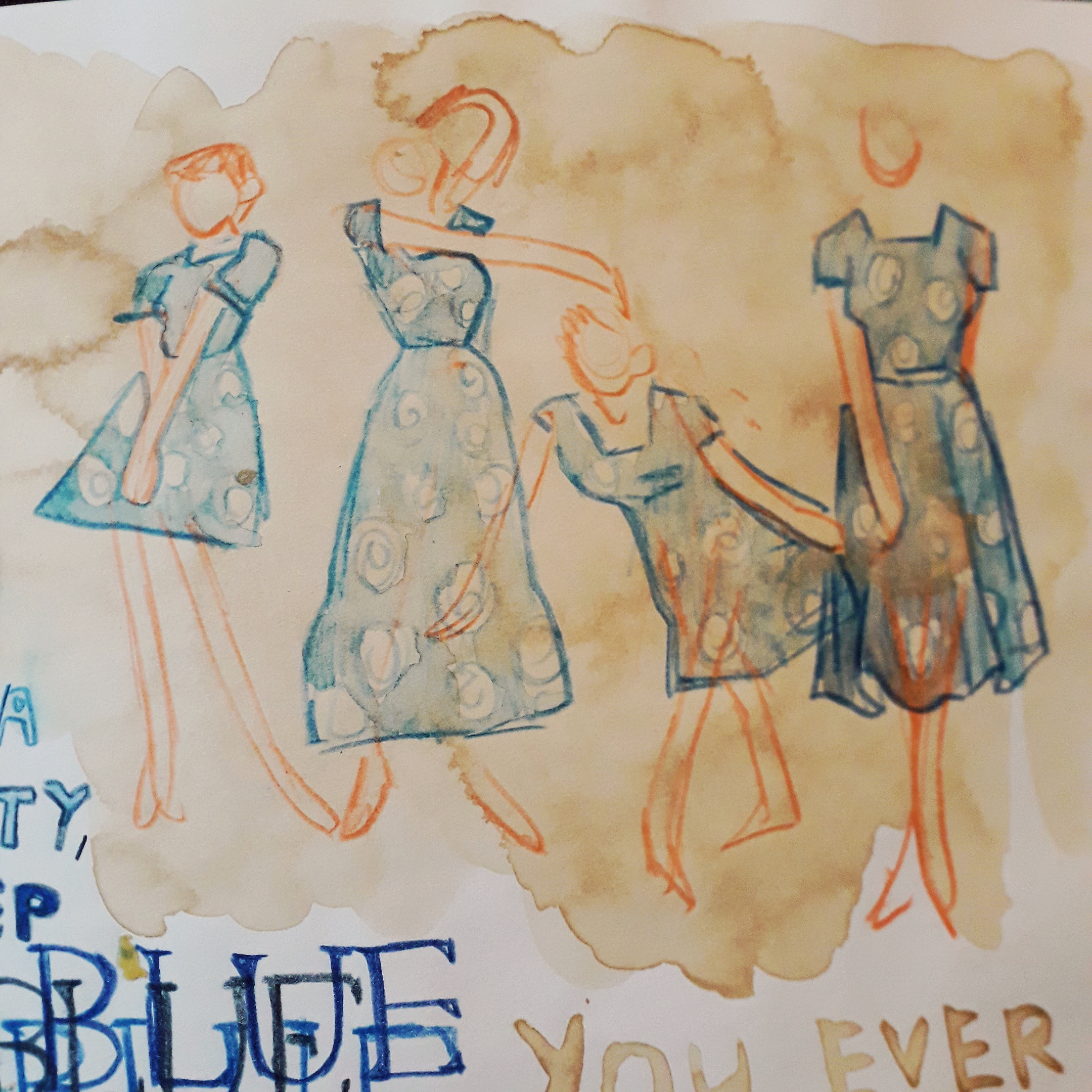
This was some further work. I took a slightly fashion-esque view and drew a quick lineup of some dresses with the same pattern. My grandmother made all her own clothes at the time, I hear.

I’ve done quite a bit of personal work in my sketchbook. I’ve been staying at Jamie’s for the week so I’ve not had the resources to make big finished work – so I’m focusing on drawing skills and developing ideas.

This all made me think about forgetting a lot. It’s quite distressing that strong-minded 20-something year olds can get completely lost in old age.

Artistically, how has this helped? Working with coloured pencils is growing on me. Sketches have a bit more life, and because they’re slightly harder to rub out it forces me to accept my drawings as they are.

How might I take this further? I could do a little work on my Gram and Gramps on my Dad’s side, who have both passed away but I knew very very well. It doesn’t make sense that I’d draw my grandmother I barely know … maybe I could work up to drawing the others. It’d be nice to keep them alive!

Illustration Paperwork Reflective

Illustration Paperwork Reflective

Today, Louise led an illustration workshop working heavily with coloured paper. We had to make some geometric cut paper work and some torn work as well as a little (merciful) drawing. We had to create 12 variations of the same concept: I chose “chaos and order”.

Below are the 10 illustrations I made in class, ordered chronologically as I made them.

A4, torn.
30×10.5cm Landscape, torn.
A5, cut.
A6 square, cut.
A6 square, torn.

I feel inclined to give you a break here… there’s an awful lot of pictures. Allow me to insert a hastily googled one liner joke to entertain you.

I recently decided to sell my vacuum cleaner … all it was doing was gathering dust. (peak comedy.) Continue scrolling if you please.

A6 square, torn.
A6 square, cut.
A6 square, cut. I liked this one a lot. It was made once Louise said I could make the “order” more ordered, and the “chaos” even more chaotic. This looks like an album cover!
A5, drawn. This is Antonia sleeping soundly and straight, and Mitzi (a legally certified Mess) spread-eagled over the whole bed. I don’t think this is actually how they’d sleep most nights, but I do like how tolerant Antonia seems of Mitzi’s absolute tosspottery.
A5, drawn. This is Techo’s desk opposed to Mitzi’s desk. It makes me happy… I got to think about what Mitzi would have on her desk properly! It bought her back to life for me a little.

Was my exploration purposeful? Yes! Although it wasn’t my dream workshop (which would have been drawing-centric), I understand the point of it. Working to one concept so many times really pushed me… artistically and emotionally. It helped me look at new ways of doing the same thing and forced different thoughts into my head.

Were the media and techniques I explored successful? I would say so, simply because they were a new way of working. I’m keeping some of the ideas from today in my illustration extension (see below), because some of the colouring ideas will likely be very blocky (a la paper underneath drawing look).

The restrictions of the rules Louise set were frustrating. I hear other groups were far heavier on the drawing side, and I feel I would have enjoyed that more. I might actually have gotten more out of this workshop though, considering all I ever bleeding do is draw!

How am I going to take this further? I’m going to open my drawn illustrations in Clip Studio Paint and line them. I want to line them a couple of ways and colour them a few different ways as well. E.g. with my normal pencil tool and style, or with slightly offset colours, or more abstracted blocks of colour behind the lines highlighting the most important shapes. I’ll cut these out and make a full design sheet. Stay tuned for a second edition of this bloggie!