I was lucky enough to find Bataille’s famous pop-up book “AB3D” in our own bookbinding studio, and in reading Paper Enginnering: Fold, Pull, Pop and Turn I ran into the book once again. Actually turning the pages is something really special.
I was considering using a little bit of pop-up in my illustrations. I’m just experimenting, but this is the artist I’m inspired by nonetheless.
This is an example of one of her few pop-up books.
The way she makes things move gives me the same pleasure as if a cartoon character came to life in the real world, because you can actually touch the moving paper. I think it would be lovely to work three dimensions into my illustrations in this exciting new way… but I’d need a lot of practice.
Inspired by a number of artists, my research and work is bringing the illustration project near to a close.
Before the day, my research into papercraft and pop-up work led me to work for a few hours and create a few 3D experimental media iterations.
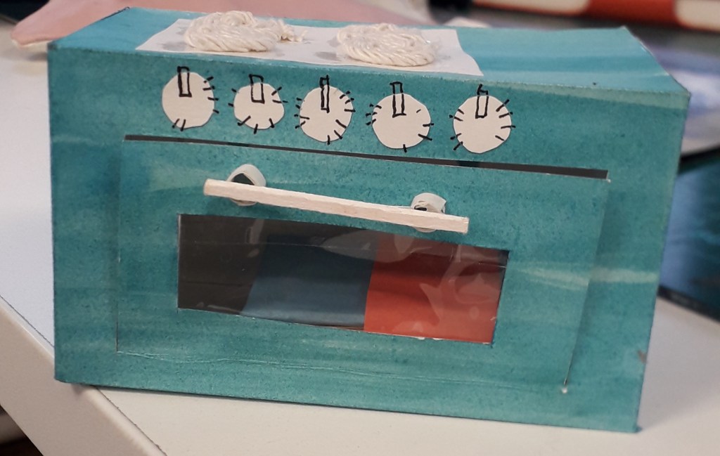
Above are three iterations of possible interactive oven doors based on various drawings from my initial ideas or media experimentation sheets. Note the zigzag texture was inspired from Samuel Shumway, my researched papercraft illustrator!After a conversation with Louise, I was determined to create a little notebook that would fit inside the final coloured 3D oven. I have decided it’s a complete little experience for the viewer: getting to take something out of the oven after opening its door, and then getting to open that again and look inside! The notebook is concertina folded with paper-covered mounting board I took from small offcut board scraps. The inside is mixed media_ brown paper, magazine, masking tape and coloured paper all glued together in ragged strips to create interest. After taking this image, I actually ran it through a sewing machine a few times to add stitch as further interest.An image of the final 3D oven with its precious little clear window, perfectly sized to house my book.beep beep beep! Notebook’s ready! Maybe you need tiny finger-sized oven mitts to take it out safely.
What was successful and why? In this section, I was proud of how the oven doors came out. I especially liked the zigzag texture, clear oven window and little wooden handle. In terms of the book, I’m proud of how textured the inner pages are, and also quite pleased with how straight I ended up getting the pages and mounting boards despite assembling it from so many separate pieces.
What was less successful and why? The final oven’s construction was needlessly laborious. This was a material limitation: all I had to hand was paper or cardboard, no cardstock which would have been an appropriate midpoint. I was also fuelled up on so much inspiration and so little money that I could neither have waited for nor bought the materials I wanted. I worked around it by reinforcing four of the six net panels with another layer of thick paper, meaning it’s quite structurally sound now.
Where will I take this? After Stephen Fowler’s work inspired me in terms of small-scale bookbinding and stamping, all I have left to do is find myself a rubber or two to carve some stamps into! I’d like to populate my little notebook with relevant stamps of ovens or grills. After that, Christmas is so close I doubt I’ll be continuing further.
I hope once completely finished with the project to create one more blog post of critical reflection on the project as a whole.
Over the past few weeks, I’ve had a personal project in mind. I’ve always been interested in bookbinding – especially the idea that I could bind loose items into a notebook that wouldn’t usually be pages, e.g. small paper pockets or envelopes, or different types of paper.
I wanted something quite simple to bind that wouldn’t overshadow the focus on binding itself. In the last half of October, I collected most of the receipts I encountered from myself, friends and family to mount and bind into a book.
I bought all the paper and materials at Broad Canvas in Oxford. Here is a progress picture of the stitching I learned from a YouTube video by SeaLemon.Here is a final image of the stitching. The lower two stitches are far neater because I realised halfway through that my looping method was slightly wrong. You live and you learn! This is the front cover. I created a card stencil to sponge paint through which reoccurs throughout the book on pages without receipts. This envelope was collected. It’s actually bound in upside-down, which was a mistake, but I don’t mind.
Below are a few more example pages I feel are interesting.
Overall, there were a lot of decisions to be made in terms of colour scheme, paper size, what to include, etc. I’m really happy with how the experimental book turned out. It feels nice to hold and turn the pages of, and the envelopes full of offcuts make it a little interactive and interesting.
The idea behind collecting receipts from a certain period of time makes this book almost like a diary. I have dated and captioned every receipt in the book. The main events that this covers is visiting my granddad and a week I spent in Reading with Jamie and his housemates.
What would I do differently / what did I learn? I made a few mistakes, considering it was my first bookbind. Some of the stitching was slightly too loose and some slightly too tight, meaning I had to do some serious page wiggling to make certain pages lay flat. I missed one stitch on an envelope by accident (but tied a thread round the hole to make it look like I didn’t!) That and my mistake in the first stitches, but I fixed that with the last stitches.
How will I take this further? I could take the idea of receipts further, in terms of illustration. I could work with coloured paper and illustrate some conceptual receipts – maybe a diary of my day with items on the receipt corresponding with events. I also thought about lino cutting a shop title, like Sainsbury’s, and creating a small series of receipts – or creating a clay tile receipt and stamping it with the lino cut to create an indented title.
Sadly these are all conceptual for now, along with the next bookbinding project; tomorrow I start my three-day projects which will be completely different briefs. I’d like to place my focus in those so I don’t stretch myself too thin, but you may see me coming back to these ideas yet!
Today, Louise led an illustration workshop working heavily with coloured paper. We had to make some geometric cut paper work and some torn work as well as a little (merciful) drawing. We had to create 12 variations of the same concept: I chose “chaos and order”.
Below are the 10 illustrations I made in class, ordered chronologically as I made them.
I feel inclined to give you a break here… there’s an awful lot of pictures. Allow me to insert a hastily googled one liner joke to entertain you.
I recently decided to sell my vacuum cleaner … all it was doing was gathering dust. (peak comedy.) Continue scrolling if you please.
A6 square, torn.A6 square, cut.A6 square, cut. I liked this one a lot. It was made once Louise said I could make the “order” more ordered, and the “chaos” even more chaotic. This looks like an album cover! A5, drawn. This is Antonia sleeping soundly and straight, and Mitzi (a legally certified Mess) spread-eagled over the whole bed. I don’t think this is actually how they’d sleep most nights, but I do like how tolerant Antonia seems of Mitzi’s absolute tosspottery. A5, drawn. This is Techo’s desk opposed to Mitzi’s desk. It makes me happy… I got to think about what Mitzi would have on her desk properly! It bought her back to life for me a little.
Was my exploration purposeful? Yes! Although it wasn’t my dream workshop (which would have been drawing-centric), I understand the point of it. Working to one concept so many times really pushed me… artistically and emotionally. It helped me look at new ways of doing the same thing and forced different thoughts into my head.
Were the media and techniques I explored successful? I would say so, simply because they were a new way of working. I’m keeping some of the ideas from today in my illustration extension (see below), because some of the colouring ideas will likely be very blocky (a la paper underneath drawing look).
The restrictions of the rules Louise set were frustrating. I hear other groups were far heavier on the drawing side, and I feel I would have enjoyed that more. I might actually have gotten more out of this workshop though, considering all I ever bleeding do is draw!
How am I going to take this further? I’m going to open my drawn illustrations in Clip Studio Paint and line them. I want to line them a couple of ways and colour them a few different ways as well. E.g. with my normal pencil tool and style, or with slightly offset colours, or more abstracted blocks of colour behind the lines highlighting the most important shapes. I’ll cut these out and make a full design sheet. Stay tuned for a second edition of this bloggie!
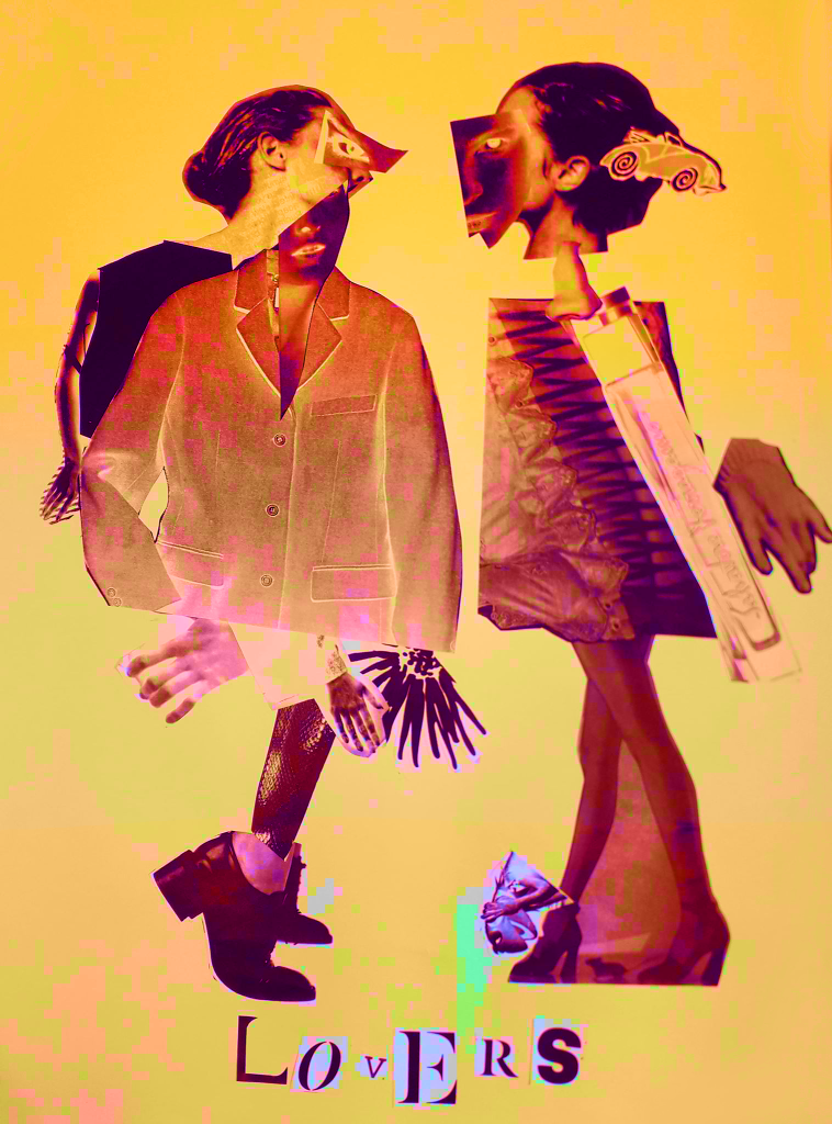
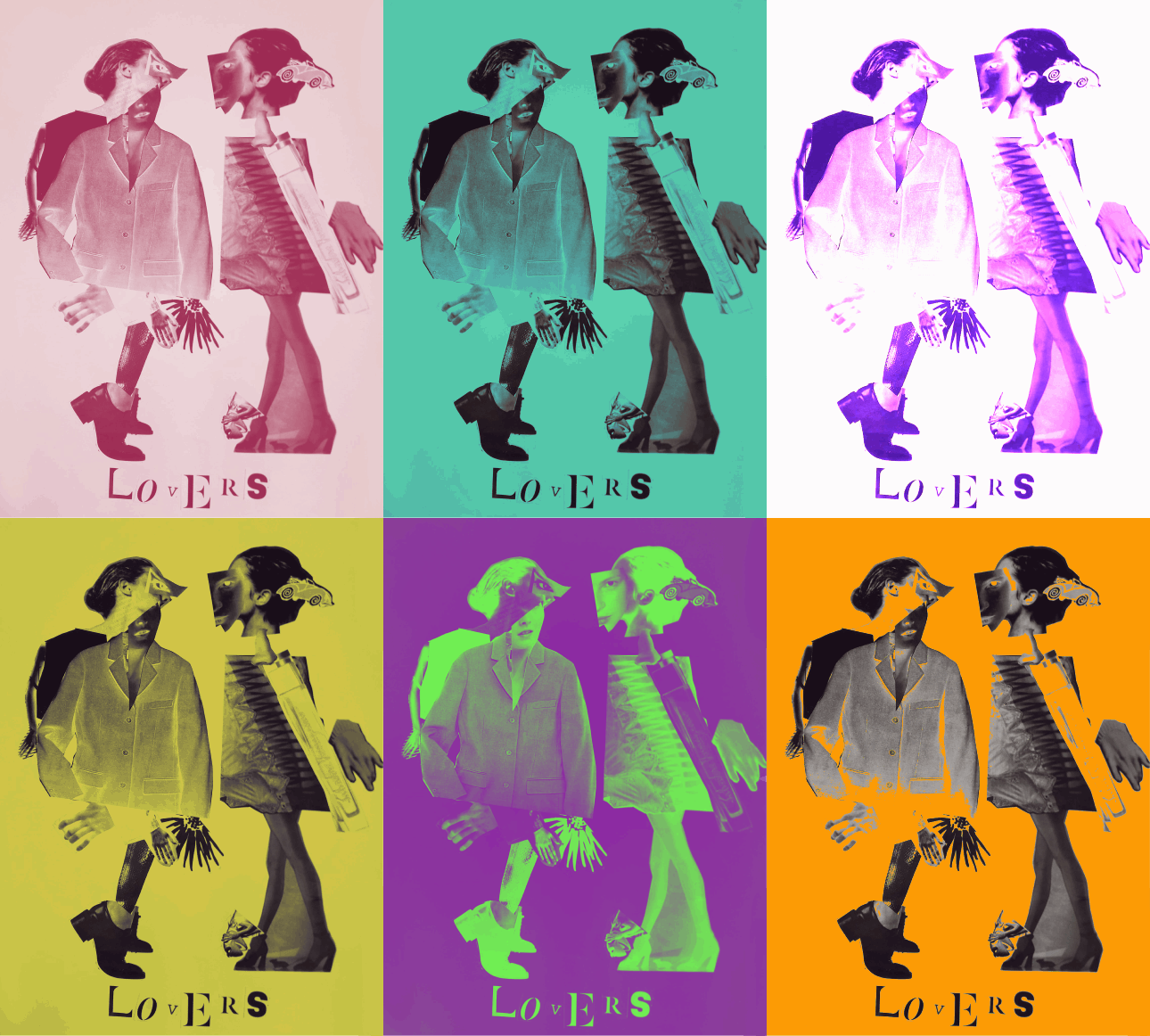
I took the best quality image I could of the Lovers, the final product of the Exquisite Corpse workshop. I uploaded it into Clip Studio Paint and messed around with layer effects and learned the basic animation timeline feature by creating a gif showcasing some of the effects.
Above were all experiments with the Darken layer effect. In only affecting the background, I can create bright images that still allow for the contrast of the black figures. This was the saturation layer. It’s the crudest filter, but I really liked the colour skew in the worst affected areas like Kermit.
This is the exported .gif file. Here I’ve experimented with darken, lighten, soft and hard light – but my favourite layer to play with was Exclusion. Exclusion actually reversed what was dark, so in the original workshop when I printed off inverted sheets you catch a glimpse of the original values.
The main thing I learned was the animation timeline, and how to export as a .gif. I already knew about all of the layer effects, but having the freedom to showcase them all meant I discovered Exclusion.






You must be logged in to post a comment.