Jamie Green is an illustrator I have been inspired by for months after I found her on Instagram. She is a freelance illustrator and designer, and she works mainly traditionally, e.g. with gouache, coloured pencils, watercolours etc.


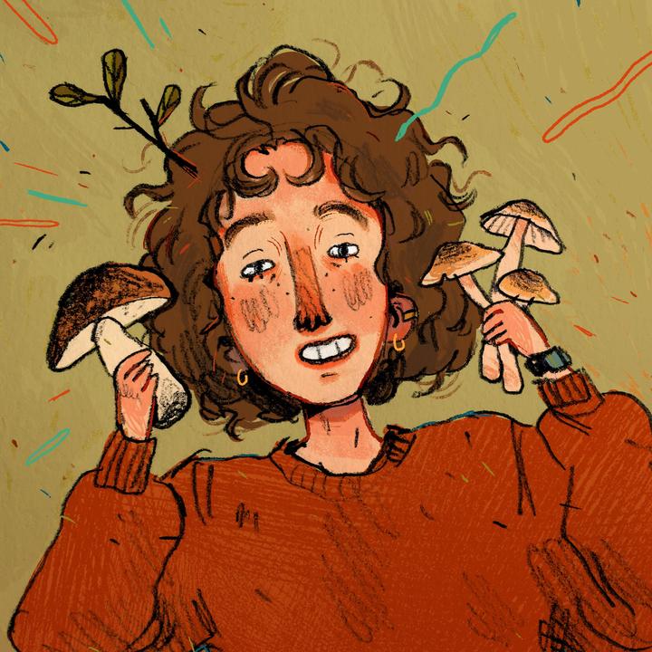
Jamie Green is an illustrator I have been inspired by for months after I found her on Instagram. She is a freelance illustrator and designer, and she works mainly traditionally, e.g. with gouache, coloured pencils, watercolours etc.
I’ve been influenced, however directly or indirectly, by Japanese comics in a big way in my personal artistic style. I’m researching the context for it, to see the historical and social connections to my current style.
In terms of my personal style, artists I had access to while developing my style were heavily influenced by contemporary manga and anime.
This was because of shows like Pokemon, Sailor Moon etc. that many people, including Western / American artists, were exposed to from childhood. The stylised, lineart heavy cartoons I enjoyed on social media growing up were all tied back to Japanese animations and comics.

“After Commodore Perry opened up Japan to the West in 1853, an influx of foreigners followed along with the introduction of European and American-style comics. In 1857, Charles Wirgman, a British journalist, published The Japan Punch, a magazine modeled after a popular British humor publication. George Bigot, a French art teacher, started Toba-e magazine in 1887.
While both publications were originally intended for the non-Japanese expatriates living in Japan, the humor and artwork in the pages of The Japan Punch and Toba-e caught the attention of native Japanese readers and artists. Ponchi-e or “Punch-style pictures” began to appear as Japanese artists were inspired by Western-style comics and began the evolution toward the uniquely east-west style that is modern manga.”
At the dawn of the 20th Century, Japanese artists took inspiration from Western comics and applied Japanese ideas to them.
Kitazawa Rakuten (1876 – 1955) is considered the father of modern manga. He was inspired by American artists like Outcault, who created the comic strip The Yellow Kid. He was the first to start a school specialising in caricature and comics.


Machiko Hasegawa was one of the first female manga artists. Following World War II, Japan was occupied by the US. The US had bought in comic and animated characters of their own, e.g. Betty Boop and Mickey Mouse. This was inspiration for a lot of Japanese artists.


A really influential early manga artist was Osamu Tezuka. He created Astro Boy, a figure who is now an icon recognisable by almost anyone today.


I just went onto the Tezuka Osamu website. It turns out that he put the word for insect into his pen name, simply because he loves insects so much… and when you scroll down, you can click a little picture of astro boy shooting up to go back to the top of the page. I actually wept a bit at how sweet it was.

I have evaluated the whole of Unit Two against the seven criteria I know I will be assessed on.
Evaluation
Context
I feel as though I’ve tried hard to ensure there was context to Unit Two. Throughout Utensia, I was finding examples of contemporary artists and taking note of where their work sits in the professional field. When I took inspiration from them and made my own work, you could tell that my work would sit in a similar context to, say, Samuel Shumway. His papercraft sculptures work on their own as illustrations and have helped him establish an identity in the industry.
My futures project also referenced context with illustrators like Jonny Hannah. His early work in illustration has led to him creating a book which he’s become well known for. My Spaceoline brand packaging is very similar in tone to his illustrations, and would establish my “look” to potential clients or commissioners.
Research
My research has come in two forms: researching artists’ visual styles and taking reference for my own work, and research into the actual content of the project to get ideas for my illustrations.
An example of the former is my research into Bruno Mangyoku and Toma Vagner’s illustrations. Of my two Spaceoline final designs, the wraparound pot’s colour scheme was directly taken from one of Mangyoku’s illustrations, and the pill box from one of Vagner’s.
An example of the latter is my research from Futures into body modification, e.g. the A.Human fashion show and research into bioluminescent animals for potential aesthetic future surgeries. There is also research into Asimov’s science fiction worlds via reading some of his fiction and then research into the ingredients of pills (paracetamol, opioids, etc) in designing an illustrative “ingredients” sheet.
Development of Creative Practice
There is evidence of experimentation with media throughout my sketchbooks, and notably in my Utensia media worksheet and my Futures initial ideas sheet. There is examples of collage, acrylic, watercolour, collage, buttons, wires etc. and 3D work.
In using my command of watercolour and control over the media, I feel I have created a polished final work in making the two Spaceoline packaging designs.
Problem Solving
One example of a problem I have had to solve was in creating the Utensia oven. The paper I had chosen to use was too flimsy to maintain structural integrity, especially because I had made it wet once with watercolour and warped it slightly.
I solved this problem by reinforcing each panel with dry, sturdier paperstock. This allowed the thin, elegant visual design I’d hoped for (rather than having used bulky cardboard) while still creating a sturdy final outcome.
Another example of a problem was in colouring the black space between designs on the Spaceoline pill box. The watercolour bled into the coloured designs and was ugly, which I hadn’t seen in retrospect because my practice had all been with lighter colours and painting the outlines before coloured work.
I solved this problem on the go by outlining the words in black fineliner, which bled far less seriously, before going on to paint the rest of the design. This created a barrier between the colours that reduced the bleeding considerably.
Planning, Progress and Production
I have had the chance to create aims and act against them continuously through the project: both Utensia and Futures. This can be seen in weekly numbered blog posts. At the end of each week, I take a step back and create aims for the following week. I also reflect critically on whether I have achieved what I hoped to in the past week. This process has allowed me to stay on top of my work and have something concrete to work towards rather than becoming confused or off-track.
Evaluation and Reflection
In consistent blog posts, I have reflected critically on my own work both positively and negatively. I use a list of questions given to me in Unit 1 to ensure I evaluate effectively. I’m also evaluating right now!
Communicating and Presenting a Creative Practice
I started my work in a sketchbook because the idea of working on A1 sheets made me feel a little ill at the beginning of Futures. However, having the choice suddenly made me realise the value of working on A1 sheets. I just had to come to that conclusion myself!
Since that point, I have presented my work for Futures across multiple platforms. Written research and scratchy ideas are in my sketchbook because I have that to hand most often. Visual development was more successful on A1 worksheets, so I have three sheets of picture reference, drawn images and experimentation that an audience can see a clear line of thought between. My blog has been useful for critical reflection and more in-depth research, e.g. documenting relevant illustrators and documenting the basis of my sci-fi ideas.
Retrospectively, what would I have done differently to improve?
In an ideal world, I would have created another A1 sheet for Futures with more research and initial ideas. There’s easily enough work to fill a sheet in my sketchbook, but my tendency to work small and feel daunted by such a big sheet held me back this time from creating a more completed and professional piece of work.
Now I’ve had the chance to try out so much experimentation in units 1 and 2, I’m getting a better feeling for what I actually enjoy creating. In the Final Major, I feel excited about it because wherever it takes me I can still put my own happy spin on it and enjoy creating the work.
The group crit from last week left me in a good position. Since then, I’ve been creating illustrated packaging for Spaceoline.
The illustrations are a massive mixture of all of my research up to this point and a lot of new picture references, which I have saved to my drive. I’ll collage them in my sketchbook when I get the time… which it looks like won’t be for a little while. Yikes.


What do I feel was successful? I was really happy with this pot. I feel like the checked effect worked well, as well as the automaton hand. The limited colour scheme worked very well too – so I took it into the next piece of packaging.


I had to do some pretty intense problem solving here, so I thought I’d mention it. When I started to add the black watercolour in, when I was painting crisp lines next to previously coloured spaces it bled into the watercolour pigment. This was ugly and a huge issue because I was working so small. See the top image: I realised quickly that I couldn’t continue to paint,
I thought about it, and ended up using a black fineliner to outline any coloured work to create a barrier between the colours. This worked pretty well, and staved off disaster! I used the knowledge with the back side of the pill packet, which came out far more crisply in terms of rendering the design.
What do I feel was successful? I reused the check design, coming out of a rocket just like in one of my early worksheets. I love the font I ended up deciding on for the word Spaceoline, and the phrase “When in doubt, Space out!”


Here, I really liked the space hostess. I based her outfit pretty directly from the ones in PanAm: a show I haven’t watched and an airline I don’t know much about, but do like the glamorous, vintage hostess feeling. Like the ladies from Fifth Element on the cruise ship to Floston Paradise.
Where am I going to take this?
I plan to scan these pill packet nets in to keep the design safe and high quality. Then I’ll use the scanned designs to make up some actual packets, which I’m looking forward to!
The project is actually finishing this week, and assessment is next week. Furthermore, I have a terribly busy week with two interviews to prepare for just before the assessment.
For the sake of keeping recent context in one place, I will copy in a few excerpts that I’m drawing inspiration from at this stage in the project. These all come from Asimov’s short story I’m In Marsport Without Hilda. I’ve put anything I particularly like in bold, because chances are you’ll see it come up in my work.
“He had thrown me. I knew what Spaceoline was. If you’ve been on a space-hop you know, too. And in case you’re Earth-bound yourself the bare fact is that everyone needs it on the first space-trip; almost everybody needs it for the first dozen trips; lots need it every trip. Without it, there is vertigo associated with free fall, screaming terrors, semi-permanent psychoses. With it, there is nothing; no one minds a thing. And it isn’t habit-forming; it has no adverse side-effects. Spaceoline is ideal, essential, unsubstitutable. When in doubt, take Spaceoline.”
“Big industrialists don’t go space-hopping much; they use trans-video reception. When they do go to some ultra-high interstellar conference, as these three were probably going, they take Spaceoline. For one thing, they don’t have enough hops under their belt to risk doing without. For another, Spaceoline is the expensive way of doing it and industrialists do things the expensive way.”
“The one who carried contraband, however, couldn’t risk Spaceoline—even to prevent space-sickness. Under Spaceoline influence, he could throw the drug away; or give it away; or talk gibberish about it. He would have to stay in control of himself.”
“He said, in a dreamy voice, “Surrealismus of Panamy hearts in three-quarter time for a cup of coffeedom of speech.”
That was Spaceoline all the way. The buttons in the human mind were set free-swing. Each syllable suggests the next in free association.”
“One of them must be faking. It wasn’t hard to fake the thing. Comedians on sub-etheric had a Spaceoline skit regularly. You’ve heard them.”
Toma Vagner is an illustrator that grew up on a Russian island within easy sailing distance of Japan. Her father was a sailor that often bought back Japanese toys and trinkets, which went on to inspire her work.
The art style of the time went on to inspire her as well- e.g. Hokusai and his compositions and style. You can see this in the flat coloured areas and bold line art of her works.


This project is the first one in which we are really given free reign over what we do. I’ve been drawn to sci-fi and futuristic, creative body alterations or modifications.
All of my scribbled ideas and pathways are in my sketchbook, in mind maps or where I can find space – but what I’m documenting is the ideas I’ve taken a little further – to thumbnailing and experimenting visually.

This was an idea for bioluminescent body alterations, a new beauty standard that exists in the future. I saw an interesting article about futuristic body modification in a fashion show called A.Human, which inspired a lot of these images. I collected a range of bioluminescent animal photo references in order to be inspired here.

You can see the beginning of an idea here. The concept is a pill that you can take which contains a script for a dream that has been pre-recorded. When the user falls asleep, they will experience that pleasant dream. I imagine they’d range from adventures to friendships to romantic and sexual exploits. You can see I play with words for possible brand names – find In Your Dreams – and then immediately thumbnail a possible logo.
This concept was directly inspired by one of Issac Asimov’s short stories, in which a corporation sells dreams and employs creative thinkers to imagine and “record” for them.

On this page you can see I develop the logo so that it has a graphic elegance – an eye winking. I moved away from the realism I’d been sketching before to experiment with bright colours. I continually evaluate the designs with notes to the side.
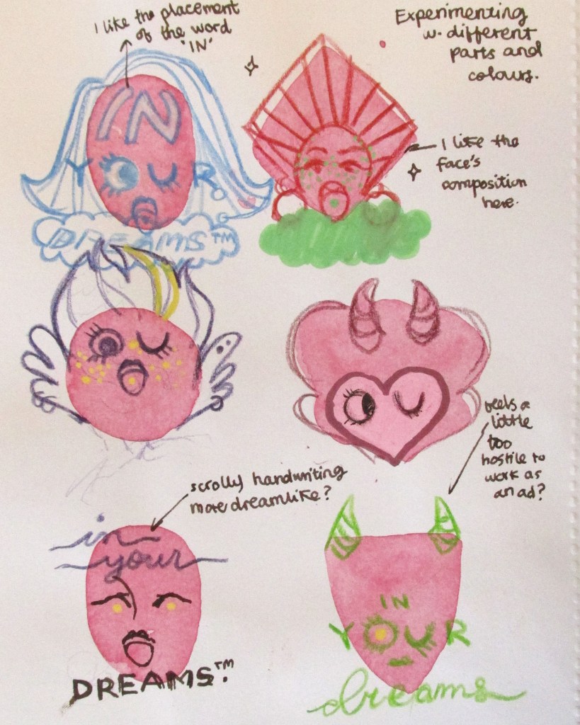
This page was a fun one to do. I started by laying down the basic watercolor shapes to force myself to include variation. I was happy I did this, because the top right design really spoke to me – so I took it further.

This is where I am currently with this train of thought. You can see some possible brand poster thumbnails – but I’m also considering actually creating the brand packaging for the pills too.
What do I need to do next?
I’m aware that I’ve gone quite specific quite early with this train of thought. I actually plan to do some collage work, create another mind map and widen all of my thinking back out again. With all of my research into sci-fi and notes I’ve taken, I’ll find another path of interest to liaise with for the next week.
I wanted to find an illustrator that worked with pleasing colours and textures. Although this isn’t related to the future of the body directly, I like the way Efremova uses colours and space in her work.
In terms of context, her work is sold as high quality digital files, cards, posters etc. So, visually pleasing illustrations to be placed in the home.
I was thinking I could apply it to my work in terms of experimenting with different media in my sketchbook. I want to focus on generating textures so I can have a base collection of bright colours and techniques to use as backgrounds in illustrative work.
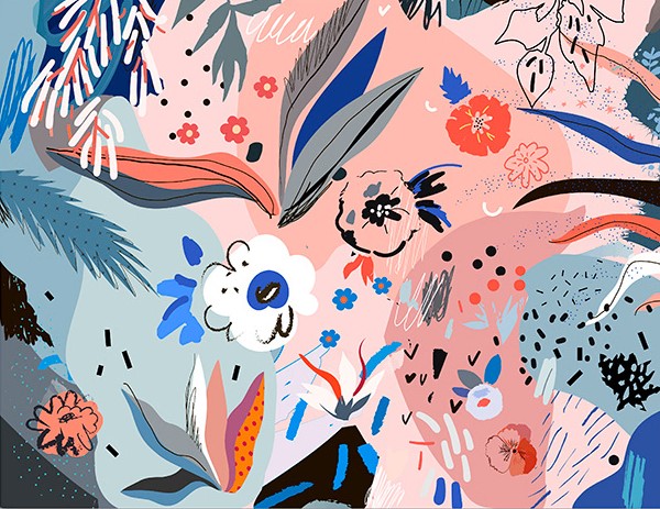

I made some textures and experimented while looking at her work. You can tell from the colours and some of the shapes. I also just wanted to suspend judgement and try out whatever I could in case something cool happened.
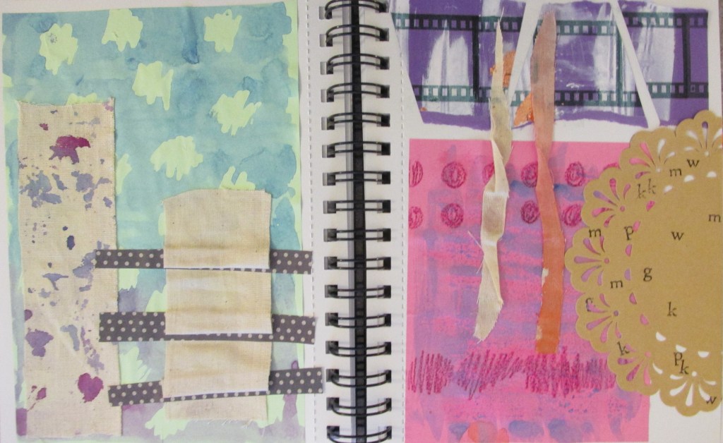

We spent about an hour completing peer review before returning to our own work and self-assessing. I found three students whose work I was particularly drawn to.
Alice
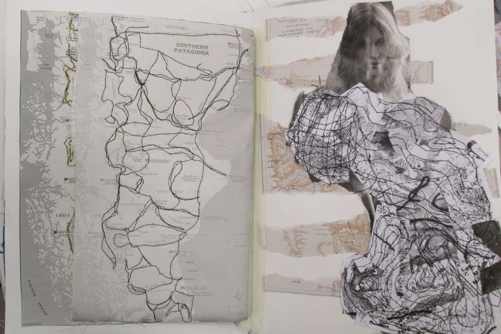
Her work was full of strengths, and it was lovely flipping through her sketchbook to feel all the textures and experiments. She’s successfully developed her own creative practice and used lots and lots of different media in her work.
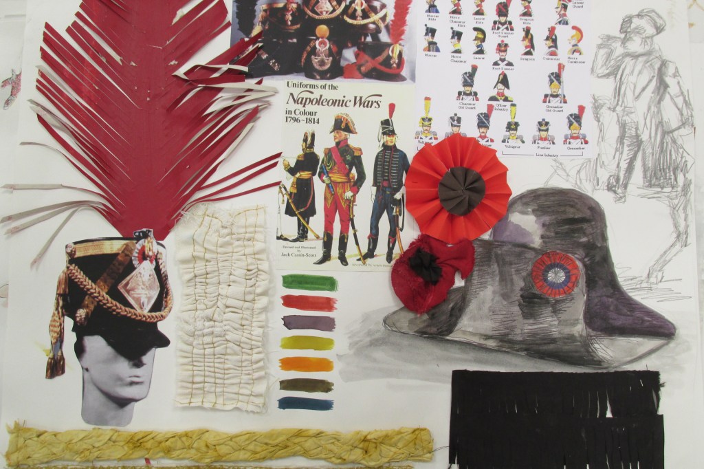
The only thing she was weaker on was contextualising her textiles work in the professional environment it would exist in. While there was historical research, there was a lack of named working artists or work relating it to the current fashion and textiles industry.
Letty
Letty’s main piece of work was her little A6 sketchbook, absolutely packed with things: textures, experiments, printed photos and a ton of annotations. Her strengths lay in experimentation, evaluation and research into contemporary artists – thus contextualising her work as well. You can see how she’s followed through on ideas page by page.
Her main weakness was that outside of the sketchbook, there weren’t many finished presentation sheets at all – I think I counted four, each with a few photographs on them. This might just be how she works, but it leaves her body of work very informal and possibly a bit incoherent.


Carys (I do hope I’ve remembered her name right!)
Carys’ body of work was one of the largest and most broad in terms of content I saw the whole day. It wasn’t really relevant to my work, but I really enjoyed looking through it. Personal research was a huge strength, with her documenting certain information about herself to manipulate into graphs etc. over multiple days. Her photographs were very high quality and clearly printed somewhere professionally. I also like the textures she creates through experimentation, e.g. creating a stencil for lettering on top of a painted background.
I can’t say I saw written personal reflection, but there’s a good chance it’s either on her blog (which I had no access to) or I simply missed it.
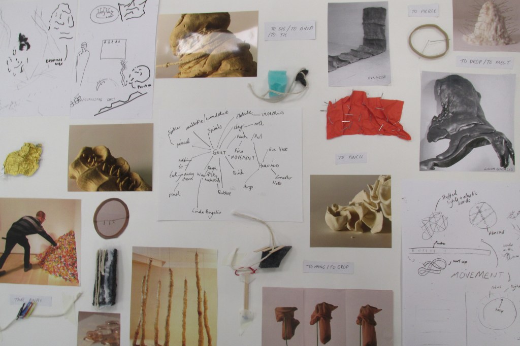
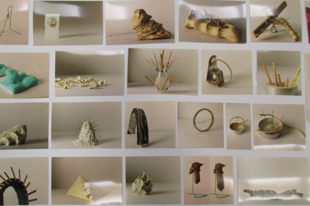

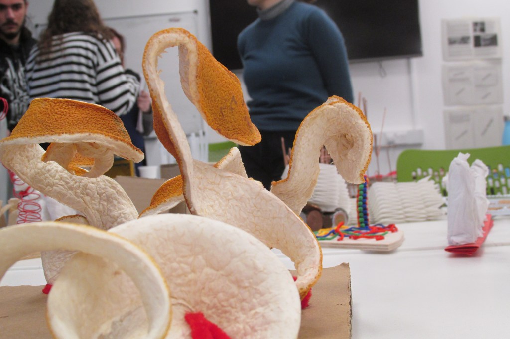
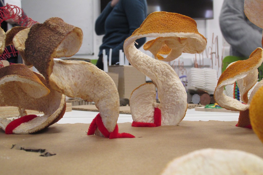
Finally, as I left I had to photograph Marco’s work because I kept seeing illustration ideas in his hardened orange peel sculptures.
Self-assessment
When I returned to my desk I saw some comments people had written about my work, and have since added my own.
Strengths:
Weaknesses:
David Klein is an artist that worked from the 1930s through his life to the end of the 20th Century. He was an illustrator that worked widely and across multiple media, but his hallmark work was for TWA travel agency in the 50’s and 60’s.
His abstract, brightly coloured representations of places and landmarks set the tone for a lot of poster art at the time. I’ve included a couple of my favourite images here.
Here’s a sneak peek at my thought process: after a long Christmas of thought, I’ve slowly gravitated towards the idea of futuristic advertisements – and more specifically, products from the future and adverts for them. These products, I want them to be mental and fun. I’ve been brainstorming with some boys in my life who play a lot of video games set in alternate futures, or like sci-fi.
This came from reading a book I got for Christmas about Pop Art and the history of Pop Art. I really like the kind of enthusiastic, hyperbolic and miracle-selling tone that 50’s and 60’s advertisements get across. I want to apply those conventions and feelings in my futuristic art.
Thus, I’ve started taking a lazy look at some of the famous advertisement artists of that time, to get inspiration for colours, compositions and feelings. David Klein’s work appeals to me a lot! The pieces make me feel good.

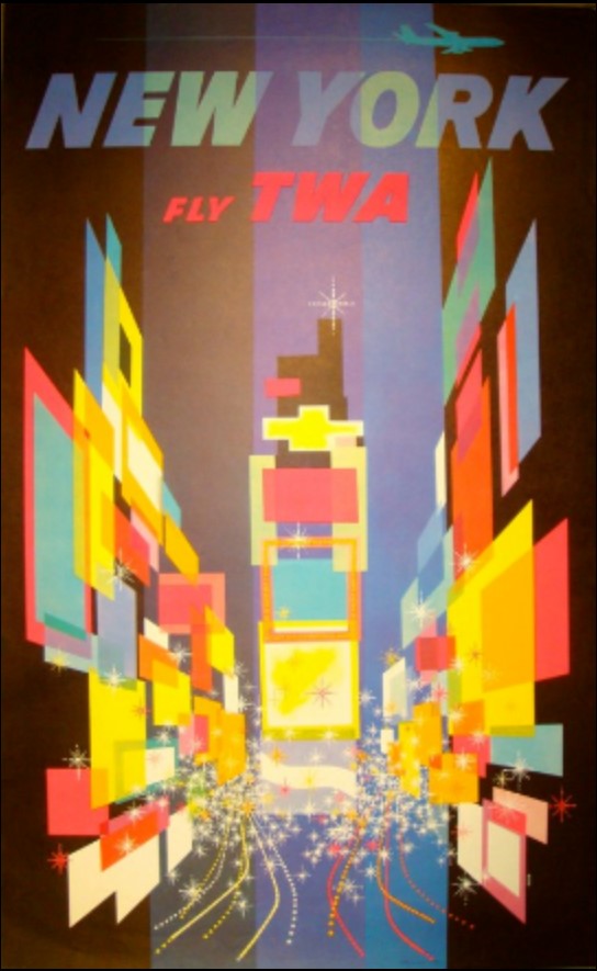
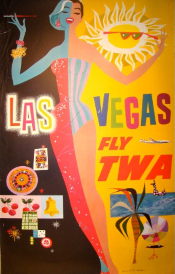

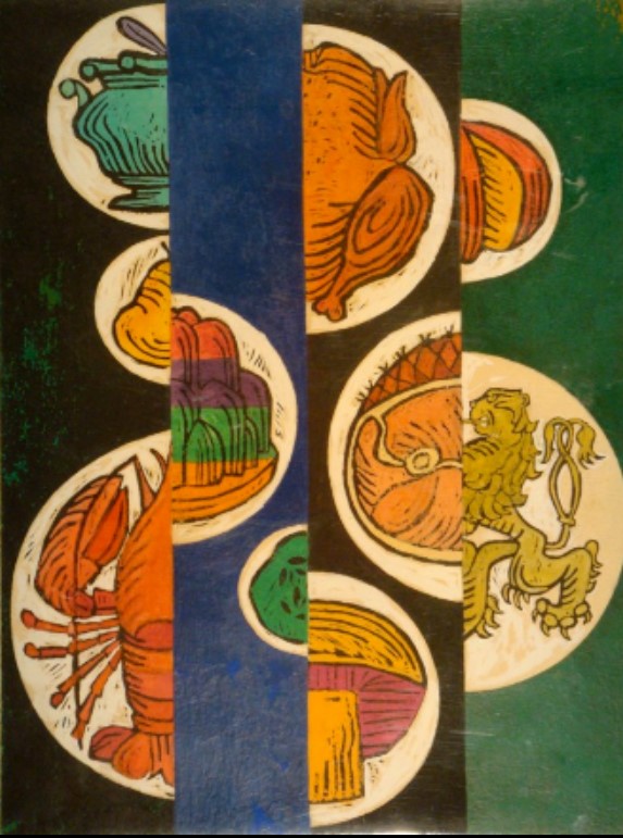
Source: David Klein, Illustrator, viewed 05/01/2020, http://www.davidkleinart.com/Home.html


You must be logged in to post a comment.