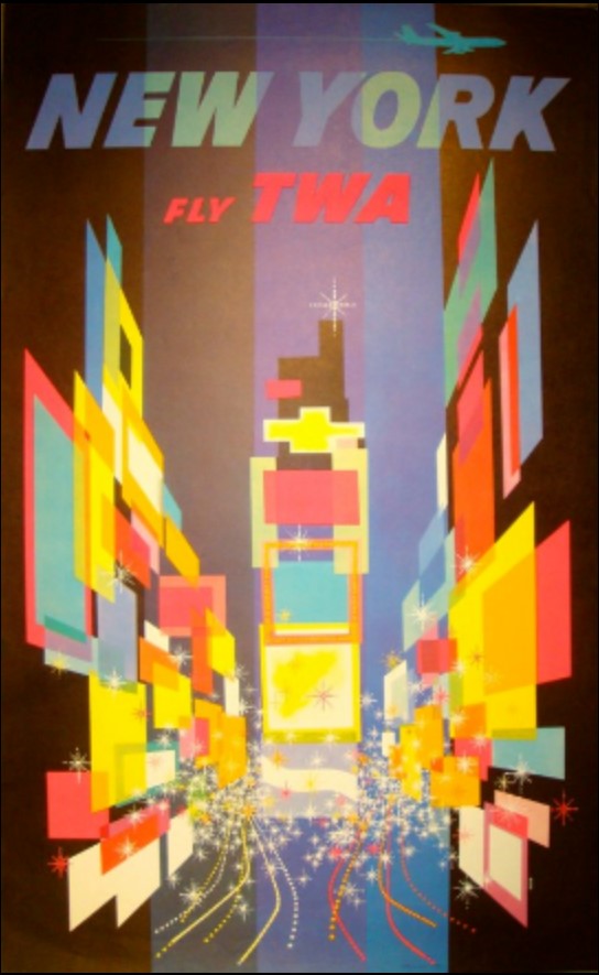
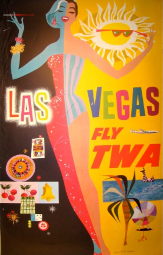
David Klein is an artist that worked from the 1930s through his life to the end of the 20th Century. He was an illustrator that worked widely and across multiple media, but his hallmark work was for TWA travel agency in the 50’s and 60’s.
His abstract, brightly coloured representations of places and landmarks set the tone for a lot of poster art at the time. I’ve included a couple of my favourite images here.
Here’s a sneak peek at my thought process: after a long Christmas of thought, I’ve slowly gravitated towards the idea of futuristic advertisements – and more specifically, products from the future and adverts for them. These products, I want them to be mental and fun. I’ve been brainstorming with some boys in my life who play a lot of video games set in alternate futures, or like sci-fi.
This came from reading a book I got for Christmas about Pop Art and the history of Pop Art. I really like the kind of enthusiastic, hyperbolic and miracle-selling tone that 50’s and 60’s advertisements get across. I want to apply those conventions and feelings in my futuristic art.
Thus, I’ve started taking a lazy look at some of the famous advertisement artists of that time, to get inspiration for colours, compositions and feelings. David Klein’s work appeals to me a lot! The pieces make me feel good.


Source: David Klein, Illustrator, viewed 05/01/2020, http://www.davidkleinart.com/Home.html

You must be logged in to post a comment.