Artist Research: Shawna X

Artist Research: Shawna X

Shawna X is the name of a successful contemporary illustrator. She works digitally, but her designs are often realised as paintings or prints on a very large scale for commissioners e.g. Adidas, Doc Martens, Dropbox etc.

Conventions of her working style include heavy use of gradients and very bright colours. I am inspired by the blockiness of her work and the colour schemes.

This piece really interested me: I love painting on objects I find or own. Here, the surfboards reflect the beach-centric content. In a scene that takes place at Brighton, I might paint on beach rocks, a piece of driftwood, or even fish and chip packaging! It’s a shame that social distancing is keeping me from visiting…

I’ve actually used Jamie as help to create a big list of things we associate with the beach. Any form reflecting these items would be a big help in creating a cohesive illustration about the beach.

  • BALL
  • SURFBOARD
  • PARASOL
  • SUNCREAM
  • WAVE
  • SAND
  • SPADE
  • HAT
  • TOWEL
  • DECKCHAIR
  • SUNBED
  • ICE CREAM
  • FISH AND CHIPS
  • ROCKS
  • STONES AND PEBBLES
  • SWIMSUIT
  • BEACH BAG
  • CRAB
  • FISH
  • SHARK
  • CORAL
  • SHELLS
  • SEAWEED
  • BARNACLE
  • WOOD
  • SHIP
  • SAIL
  • COCONUT
  • NET
  • FISHING ROD
  • CLIFF
The 60’s inspired graphic design here is exciting to look at. The colour scheme is looking pretty tasty for stealing, too.
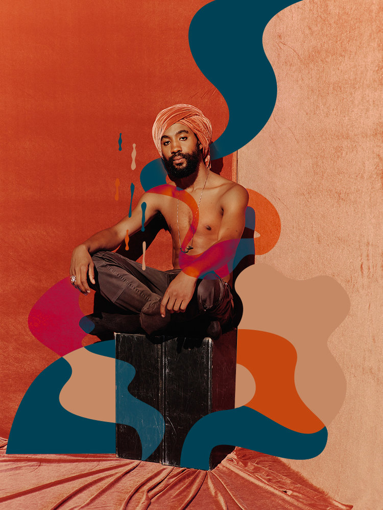
I just really like the way this image has been edited. The colours make me happy. It’s a photograph, but the blocks of colour make the scene almost abstract and take it out of any recognisable place.
This was a commission from Doc Martens. The feeling it creates is pretty cool. I hope to work with block colours a little.
Context: Connections Between People: Flowers and Objects

Context: Connections Between People: Flowers and Objects

I want my Final Major project to be something I want to draw more than anything else. Being passionate about it means I’ll make some of my best work. In preparation for the project proposal, I’m doing a little research on interpersonal relationships so I can take a better and more thoughtful approach to illustrating my characters interacting.

All of the sources can be found in the bibliography for my FMP.

Connection/kəˈnɛkʃ(ə)n noun

  1. 1.a relationship in which a person or thing is linked or associated with something else.

relationship/rɪˈleɪʃ(ə)nʃɪp noun

  1. the way in which two or more people or things are connected, or the state of being connected.

love/lʌv noun

  1. an intense feeling of deep affection.

“Material objects determined how people related to one another by providing a key means of conceptualising and processing their emotions. They also played a vital role in preserving the identity of the giver, acting as an important site of memory for the recipient.”

Things like coins, ribbons, swatches of fabric and flowers were all given to mark important moments in relationships. This was in the 18th and 19th Century.

“These aspects were in their turn all related to what has been termed the 18th-century ‘culture of sensibility’, denoting a period where emotional responsiveness and expression of sympathy were highly valued aspects of social life.

The ‘cult of friendship’ was in its turn characterized by a marked idealization of friendship, which was viewed as the noblest and most virtuous form of social relation. These friendships took on an increasingly emotionally intense guise during the end of the century, the language of friendship becoming increasingly difficult to distinguish from the language of romantic love.”

This aesthetic preference mirroerd his emotional response to nature, according to which spending time outdoors was not viewed as a source of powerful, dramatic emotion, but as a means of achieving happiness and bliss.” – Maybe take this as a chance to explore an area that makes me feel this way, or an area that would make my characters feel this way?

“Within this vast collection the object of inquiry for this article can still be found: pressed flowers carefully enclosed in tiny paper packages.” – I can’t believe that this article I’ve chanced across perfectly merges my two recent interests… pressing flowers and relationships… if there could be a scholarly article on the importance of baking cupcakes on relationships now I’d be on cloud nine!

“The concept of sensibility did not encourage all form of emotional expression, but rather established a nuanced code of emotional behaviour that could be mastered by the individual.[17] In the Gjörwell family, the emotional expressiveness connected to ideals of sensibility was centred on affection for family and friends, sympathy with the plight of others and happiness.”

“Sally Holloway emphasizes that in the case of courting relationships objects ‘facilitated the development of intimacy by encouraging lovers to think deeply about a relationship, imagine their beloved’s physical qualities, conjure the joy of being with them, and renew their romantic promises’.[19] Although not necessarily used in conjunction with courting relationships, similar functions could be served by flowers in maintaining a level of intimacy and emotional connection over distance in the Gjörwell family. This also includes the physical aspects of intimacy. The practice of sending flowers per letter often includes a description of how these were kissed before being sent off, followed by a description from the recipient of how the flower had been kissed when received, in effect constituting a sort of transporting of physical touch through the object.”

See here a little flower, it carries a little tender kiss, it has been pressed to my lips. Therefore you will do the same, and never forget your little Stafva, who with all her heart and soul is your little friend and wife.” – Tell me this isn’t lovely. This is making my day.

“After gently reproaching her for not granting him the pleasure of seeing his child after a long time apart, Gjörwell tries to put the incident behind them by sending his wife flowers picked at a local health spa, Vårby:

At Vårby we drank to your health for the first time, and I picked the flowers here enclosed by the clear, salubrious and refreshing brim of the spring. [We] have all kissed them, why I also ask, that they be kept as memory of the feeling that enliven us all for you.”

“His procedure of keeping flowers is intricate and clearly draws on themes from pastoral literature wherein flowers are used to make sacrifices to the Gods.[40] These practices were common in Roman and Greek antiquity, both in religious and civil contexts, and are often depicted in Greek poetry.”

“There is thus a distinctly ritualistic character to the way in which Gjörwell views and keeps flowers, serving a function to repeatedly mobilize positive emotions. After extensively viewing the flowers he has received or picked himself they are kept in what Gjörwell terms a ‘friendship herbarium’. Herbaria are collections of pressed plants usually mounted on paper sheets or placed in convolutes on which the species’ scientific name is added, often along with other information such as date and location of collection.”

White daisy = “as of yet unseduced” but only from man to man specifically.

It seems to me as though the exact type of flower mattered less at the time than the intentions behind it: if you happened across a carnation, you might pick it just because it looked nice and you were thinking of a friend rather than because carnations have a specific coded meaning.

Artist Research: Jamie Green

Artist Research: Jamie Green

Jamie Green is an illustrator I have been inspired by for months after I found her on Instagram. She is a freelance illustrator and designer, and she works mainly traditionally, e.g. with gouache, coloured pencils, watercolours etc.

Fanart of an indie band. I really like how they draw figures. The jagged, slightly disproportionate limbs are something I want to work into my own style because they make me feel happy looking at them. The colour scheme: pastel pink and blues – exactly my style. And the way she draws faces is pleasing. I like the linework of the noses and the eyes and eyebrows. I want to work like this.
The technique used in this sketchbook scan is colouring under full opacity on a multiply later. It allows the lines from a scanned image to stay dark while you colour.
I’m realising as I pick out my favourite work from Green’s website that the bright, complimentary colours are some of my favourite aspects of their work. The hand lettering is another similarity between our styles.
This is typical of her cosier style. She loves mushrooms and so do I… it’s admittedly part of why I love her work so much. I made breakfast with too many mushrooms for the first time in ages today… I was disappointed at myself. I’ve hit a mushroom limit. Anyway. I really like the “scribbled” texture that comes from working traditionally.
Research: Origins of Japanese Comic Art

Research: Origins of Japanese Comic Art

I’ve been influenced, however directly or indirectly, by Japanese comics in a big way in my personal artistic style. I’m researching the context for it, to see the historical and social connections to my current style.

In terms of my personal style, artists I had access to while developing my style were heavily influenced by contemporary manga and anime.
This was because of shows like Pokemon, Sailor Moon etc. that many people, including Western / American artists, were exposed to from childhood. The stylised, lineart heavy cartoons I enjoyed on social media growing up were all tied back to Japanese animations and comics.

Hokusai is a famous 19th Century painter from Japan. He’s most known for his woodblock prints and natural paintings, but he created a lot of “playful sketches” (manga) work for his students as well. This is some of the earliest modern manga.

After Commodore Perry opened up Japan to the West in 1853, an influx of foreigners followed along with the introduction of European and American-style comics. In 1857, Charles Wirgman, a British journalist, published The Japan Punch, a magazine modeled after a popular British humor publication. George Bigot, a French art teacher, started Toba-e magazine in 1887.

While both publications were originally intended for the non-Japanese expatriates living in Japan, the humor and artwork in the pages of The Japan Punch and Toba-e caught the attention of native Japanese readers and artists. Ponchi-e or “Punch-style pictures” began to appear as Japanese artists were inspired by Western-style comics and began the evolution toward the uniquely east-west style that is modern manga.”

At the dawn of the 20th Century, Japanese artists took inspiration from Western comics and applied Japanese ideas to them.

Kitazawa Rakuten (1876 – 1955) is considered the father of modern manga. He was inspired by American artists like Outcault, who created the comic strip The Yellow Kid. He was the first to start a school specialising in caricature and comics.

He drew humorously. The figures are all fun, drawn semi-realistically with a black ink pen.

Machiko Hasegawa was one of the first female manga artists. Following World War II, Japan was occupied by the US. The US had bought in comic and animated characters of their own, e.g. Betty Boop and Mickey Mouse. This was inspiration for a lot of Japanese artists.

I think this is adorable. My characters have an incredible amount of similarity to this work! It’s been so interesting finding out where my style leads back to in its origins.
An example of Hasegawa’s most famous comic strip, Sazae-San.

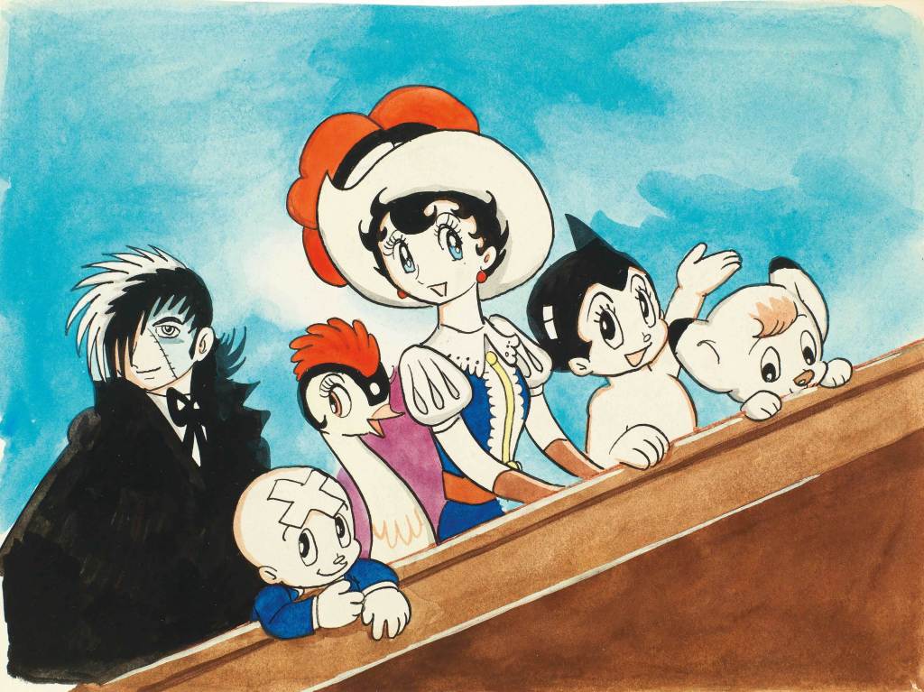
A really influential early manga artist was Osamu Tezuka. He created Astro Boy, a figure who is now an icon recognisable by almost anyone today.

Tezuka was the first to draw eyes so disproportionately large. Almost every anime and manga in recent decades uses a similar style, so this was revolutionary in terms of the style’s conventions.

I just went onto the Tezuka Osamu website. It turns out that he put the word for insect into his pen name, simply because he loves insects so much… and when you scroll down, you can click a little picture of astro boy shooting up to go back to the top of the page. I actually wept a bit at how sweet it was.

Research: Art Noveau – Alphonse Mucha and Will H. Bradley

Research: Art Noveau – Alphonse Mucha and Will H. Bradley

In one of the books I’ve been reading called Greetings From – Retro Design, I carried out some research on Art Noveau as a movement.

It was an artistic response to the rapid technological increases in the 1800’s, for example advancements in electricity and machinery. Artists showed the aesthetically pleasing elements of living in a city around this time. It was a holistic art movement in that the ideology could be applied to almost anything: architecture, furniture, advertisements, etc.

It is defined in the illustrations I’ve researched by a few specific conventions. These are:

  • Flat, densely detailed illustration
  • A central female figure – often lewd, or suggestive
  • Natural and organic detail filling up as much negative space as possible.
  • Pastel, muted colour pallettes.

Alphonse Mucha is typical of this art movement. His works are some of the most famous of the time.

I’m inspired by Mucha because of how beautiful his illustrations are. I’m really attracted to the shapes he creates in the images – the circles, the loops and natural curves and how they interact.

I will likely take inspiration from Mucha in terms of my colour schemes. The pale pinks, light browns and beiges are all colours I enjoy wokring with.

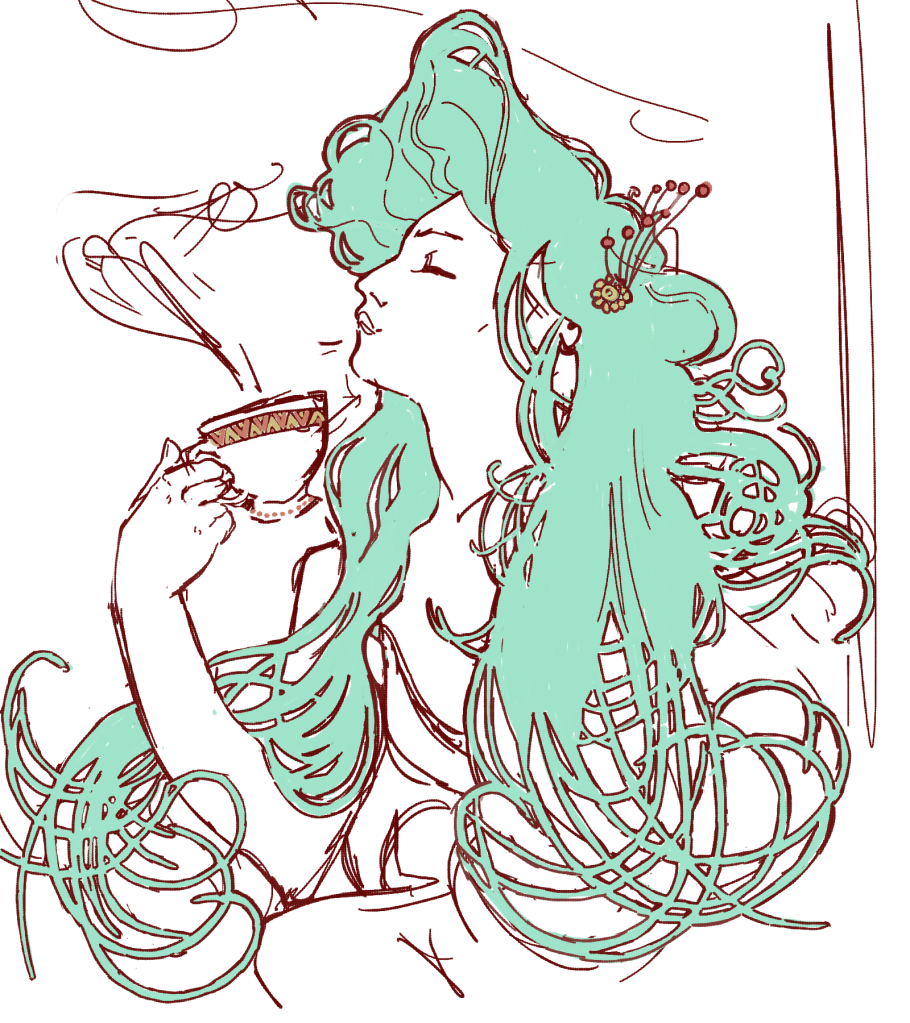
I like the way the hair is drawn and how it crosses over itself in a hundred intersections. The fact that it’s in block colour and only the outsides are lined attracts me.

Another artist famous in Art Noveau is Will H. Bradley.

You can see similarities in Bradley’s work, but his work was slightly more progressive in that there’s more negative space than traditional art noveau illustrations. There are larger expanses of flat colour here. Bradley was also famous for designing the covers of Chap Book, a publication that ran through the time of Art Noveau.

I’ve made some work in response to Mucha and Bradley and their working styles.

I couldn’t help but notice that an artist I’ve been inspired by for a long time, KomunHorangi, is clearly influenced by the flowing style of Art Noveau. You can see similarities to Mucha’s work in the way she draws hair.

Although you can clearly tell that she’s been influenced by Japanese manga and animation style (see the huge eyes and facial proportions), you can also see an obvious stylistic similarity in the way the hair is drawn.
Artist Research: Jonny Hannah

Artist Research: Jonny Hannah

A particularly groovy illustrator I found in an Illustrator Journal from 2003 is Jonny Hannah. I’m hoping to make some work inspired by him in my Futures project as I continue it.

Jonny’s illustrations are excitingly busy; the longer you look at them, the more detail you see. He also has a passion for hand typography, which you may know I’m quite passionate about. His work is blocky and stylised and he uses a mix of drawing and printing in creating his works. I like that he had a long phase of liking 1950’s paraphernalia and style: this lends itself well to my retrofuturistic work in Futures of 50’s American advertising.

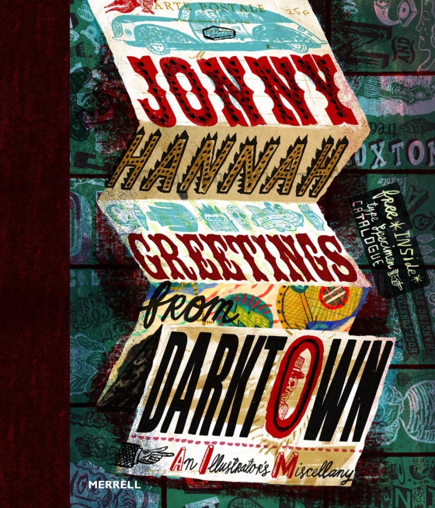
He released a book called Greetings from Darktown in 2014. Inside he has created his own world. In this image, I love the composition of the folded up sheet. It reminds me of bookbinding.

I’ve just had a thought… I know I’m going to be creating some brand packaging for Spaceoline. What if I also made a wonderful fold-out instruction / information leaflet like you get inside some medicine boxes? I know usually they’re just packed with boring text, but I could make this one beautiful.

I have been drawn like a moth to a flame by this limited colour pallette. You can see that this is partially printed, with lino cut shop fronts. Maps really interest me – especially ones that use creative license. I also really like the handwriting here, and might have to magpie it, as my primary school teachers might have said.
This is just a mental hodge-podge of images and typography. I love stuff like this. Ideas upon ideas upon ideas.
Artist Research: Toma Vagner

Artist Research: Toma Vagner

Toma Vagner is an illustrator that grew up on a Russian island within easy sailing distance of Japan. Her father was a sailor that often bought back Japanese toys and trinkets, which went on to inspire her work.

The art style of the time went on to inspire her as well- e.g. Hokusai and his compositions and style. You can see this in the flat coloured areas and bold line art of her works.

Here, I love the grainy dark background and the pastel interiors of the piece. Random objects floating about give me an almost abstract, uneasy feeling – but I love it. I want to create this feeling in my work. I have already taken inspiration from the flowers growing behind the hand in one of my Future worksheets.
I am a sucker for pastel pink work. Here, I like the female figure and her cool jacket. I also really like the repeated images throughout the piece, e.g. lipstick, the colour swatch circles and the lights on her mirror. The fact that most of the composition isn’t defined is interesting: it means the flat colour dominates the piece and I really like that.
I like the grey background against the pink. Vagner tends to colour her lineart quite brightly, with pinks and reds. I’ve seen a lot of artists doing this and I think it adds a lot of interest. It gives the eye more to process than just red or just black.

Artist Research: Bruno Mangyoku

Artist Research: Bruno Mangyoku

An illustrator I am very inspired by is Bruno Mangyoku. He is trained as an animator but works as an illustrator, and has picked up commissions from large companies such as Wired, Red Bull and Monocle.

He describes his work as “character driven” – because he “can’t envision a piece without focusing first on the characters.” I really like this, because it reflects my own interests. I love drawing people and giving them personalities.

My favourite thing about this piece is the colour scheme, followed closely by the man’s face and posture. I think I’ll have to borrow this colour scheme for one of my Futures illustration pieces. Don’t let me forget! It’s very limited, but that’s what makes it lovely. It’s got an almost vintage feeling about it.
I love nature, so I’m tempted to steal the shapes and colours of some of the fauna here. Bless this guy… Looks like he made a really bad wrong turn somewhere.
Another good example of a successful limited colour pallette. It reminds me of a scren print or a lino print, where you’re keeping it simple with limited colours. The composition is even, e.g. the tan coat being reflected in the leftmost woman’s ginger hair. It’s cut-out, sharp shading makes it feel very graphic, which I like.

Although his work is digital, I will try to recreate the feeling traditionally. I love working digitally, but right now it always pushes me into the same routine and style, which isn’t what I need. I like to manipulate media physically at the moment.

Future of the Body: Week Two

Future of the Body: Week Two

I started a worksheet for week two. I’d been very excited about working in my sketchbook, but I thought that for experimentation’s sake, I’d work larger.

I had a one-to-one chat with Emma. She said her favourite work of mine was the drawing-heavy women with bio-luminescent body alterations. She also suggested that I continue drawing and brainstorming products for a future sci-fi type audience, since I’d done plenty enough research and context.

Wahoo! I couldn’t have asked for a more affirming conversation, since that’s what I really enjoyed doing. I had recently found some other inspiring illustrators, so I began drawing.

You can see media used ranges from watercolour to collage and marker.

Where am I going to take this next?

I’m going to fill the space up with drawings and keep my judgement suspended until then. After that, I’ll either complete another whole experimental sheet or run some self evaluation before I complete any more work. Once I’ve identified what I like a lot, it will allow me to refine the ideas and create more sophisticated work.

I feel I should mention that because Brighton have required an e-portfolio from me on next Tuesday, this project will run slowly until then. After that, I have an interview and will need to design a portfolio for that too. I’m juggling my time and this isn’t my priority right now!

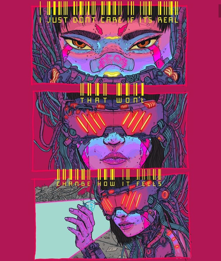
Artist Research: Tabares 核の冬: Future

Artist Research: Tabares 核の冬: Future

My research and context takes two forms: research into original source material, e.g. sci-fi novels, video games, etc. and into artists creating similar work to draw inspiration from and to place my own work contextually in the world of illustration.

Tabares is a freelance illustrator, also collaborating with merchandise brands who feature their art. (I have tried and failed to find an English version of their full name – only their social media handle, nuclear_winter__ – and their name stated on all other sites is Tabares 核の冬. I will refer to them as Tabares.)

Conventions of their work and style include:

  • Usually female portraits
  • Cyborg, or robotic parts. They tend to create robotic neck muscles or hands and arms.
  • Saturated neon colours and lighting – e.g. bright magentas, greens and blues.

Tabares’ work inspires mine colour-wise. I like bright colours. My research has also been into futuristic body modification, with my project description being “Future of the Body”. This means the subject of the work is also relevant to my current project.

This is a still from a very short animation in which a mask covers the girl’s face mechanically. I might consider a short animation.

Contextually, if I were to create work similar to this, it might sit in the freelance illustration category. Tabares is creating visually pleasing work that people want to buy, and from this they are also receiving lots of commissions for people who want personal art in their style.