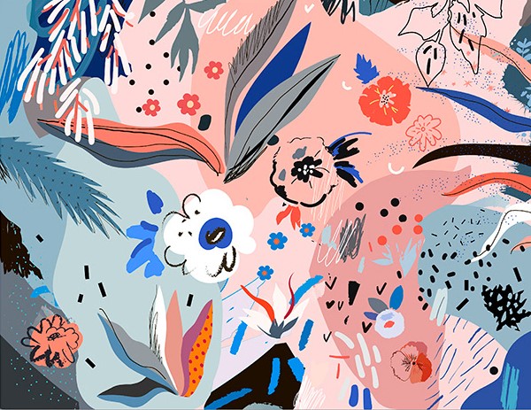
I wanted to find an illustrator that worked with pleasing colours and textures. Although this isn’t related to the future of the body directly, I like the way Efremova uses colours and space in her work.
In terms of context, her work is sold as high quality digital files, cards, posters etc. So, visually pleasing illustrations to be placed in the home.
I was thinking I could apply it to my work in terms of experimenting with different media in my sketchbook. I want to focus on generating textures so I can have a base collection of bright colours and techniques to use as backgrounds in illustrative work.
I want to take direct inspiration from the kind of shapes and colours she uses. E.g. the collections of stippling-esque dots, or the leaf with a dot grid on the far left that’s been roughly cut.I like the busy collections of objects and shapes against the dark, basic background. The colour scheme is mostly desaturated blues, with a few very light blues and pinks as a complimentary highlight colour. Efremova works a lot with pale pink and blue, but that combination is very trendy at the moment.
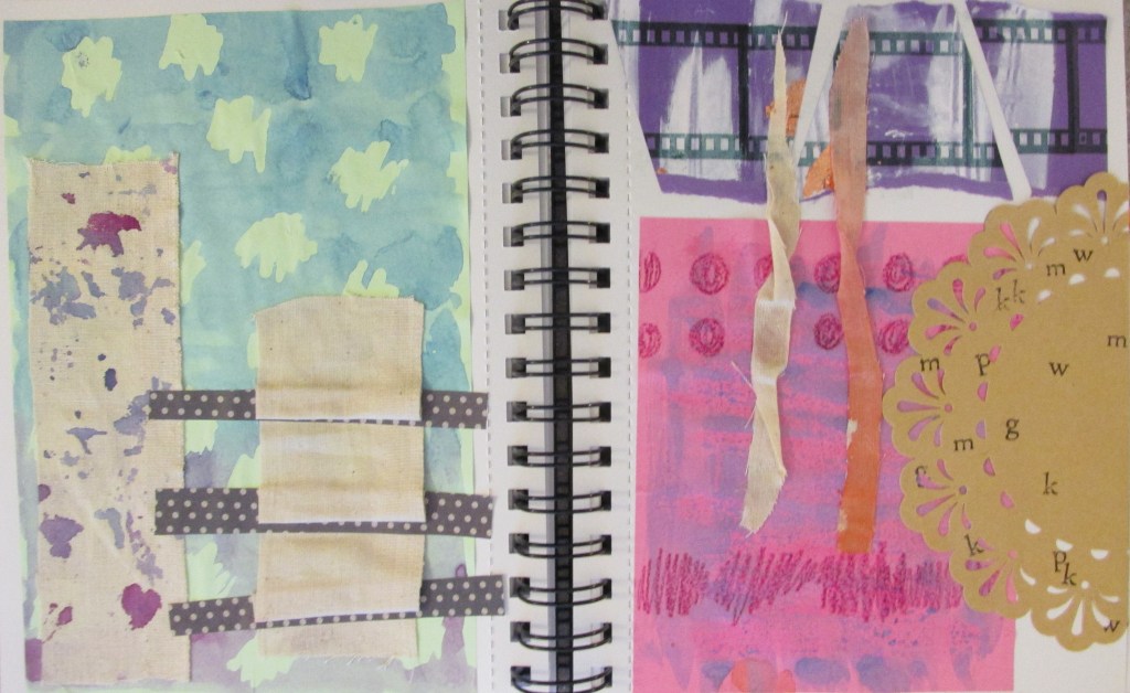
I made some textures and experimented while looking at her work. You can tell from the colours and some of the shapes. I also just wanted to suspend judgement and try out whatever I could in case something cool happened.
I like the brown doily with lettering stamped onto it. I also really like the blue and purple spattered calico fabric. The blue and pink posca pens were more successful than I’d hoped.
David Klein is an artist that worked from the 1930s through his life to the end of the 20th Century. He was an illustrator that worked widely and across multiple media, but his hallmark work was for TWA travel agency in the 50’s and 60’s.
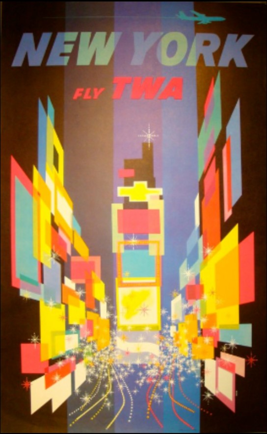
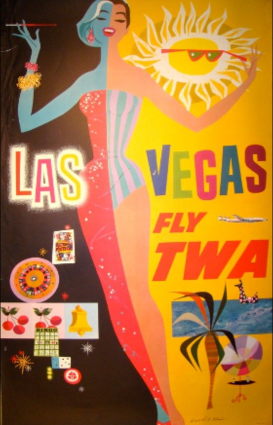
His abstract, brightly coloured representations of places and landmarks set the tone for a lot of poster art at the time. I’ve included a couple of my favourite images here.
Here’s a sneak peek at my thought process: after a long Christmas of thought, I’ve slowly gravitated towards the idea of futuristic advertisements – and more specifically, products from the future and adverts for them. These products, I want them to be mental and fun. I’ve been brainstorming with some boys in my life who play a lot of video games set in alternate futures, or like sci-fi.
This came from reading a book I got for Christmas about Pop Art and the history of Pop Art. I really like the kind of enthusiastic, hyperbolic and miracle-selling tone that 50’s and 60’s advertisements get across. I want to apply those conventions and feelings in my futuristic art.
Thus, I’ve started taking a lazy look at some of the famous advertisement artists of that time, to get inspiration for colours, compositions and feelings. David Klein’s work appeals to me a lot! The pieces make me feel good.
The reds, oranges and yellows in this piece are really vibrant. I like the repeated image of the birds and the triangles that create the sun. The way the bells are drawn is also quite freehand, like my own style. I might use the simple triangle and diamond shapes in my own work.The brightness of the colours here is lovely. Using squares and rectangles to create perspective and a sense of depth is very clever, and something I might use in a background of a piece.I can’t resist art of pretty ladies. Her long legs make me happy! I want to be including pretty women in my product ads, to emanate that “50’s housewife glam” feeling of vintage ads. This is one of Klein’s other illustrations. I like the bright colours and textures; almost feels like crayon or wax resist. Bright colours and bright, simple shapes. I’ve been thinking about some kind of instant food – a powder, probably, that has “just add water” to make it a full and complete meal! So maybe I’ll use this composition as inspiration for that. These look like lino cuts. I never considered lino cutting for this project…. interesting….
Stephen Fowler came to the university to give a talk on illustration this Wednesday. He was a really unique, interesting person!
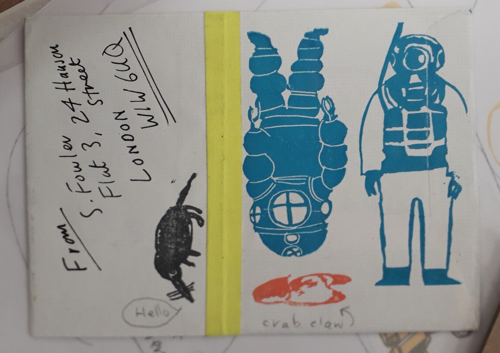
The work of his that interested me the most was his experience in rubber stamps. He has a book published on rubber stamping, and the talk he gave really inspired me. I like the idea of basically a small-scale, informal lino cut printing. It sounds like it was personally made for me.
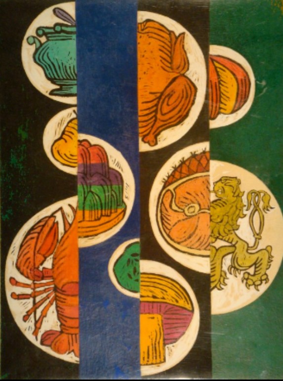
This was some of my favourite work. I don’t actually think it’s Fowler’s but it’s still a good example. The block colour underneath some form of detail really interests me, like a two-step process. I also love that it’s bound into a book.
The concept of using rubber stamps in small hand-bound books really appeals to me. Critically, the research has already come in useful because I’m making something similar to this for my Utensia illustration project.
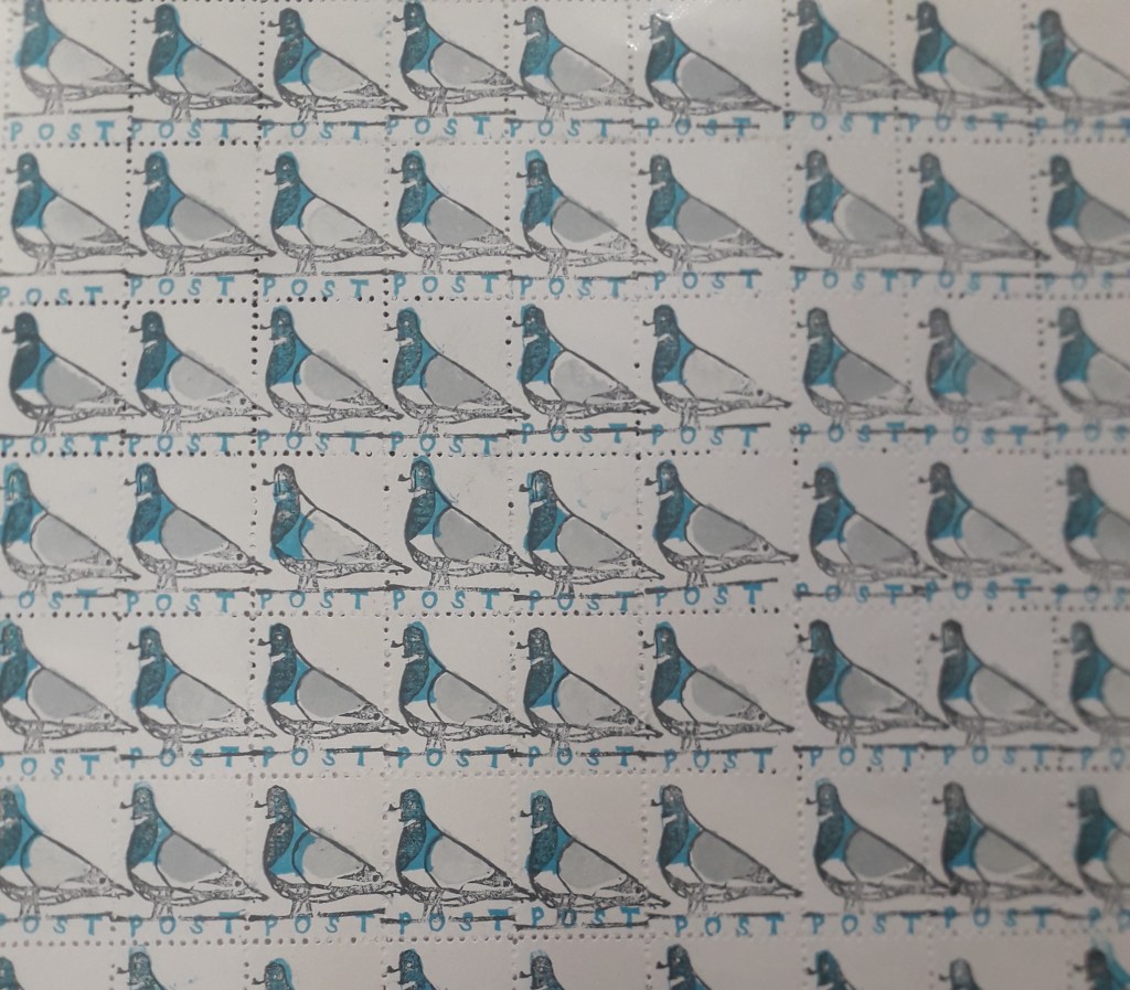
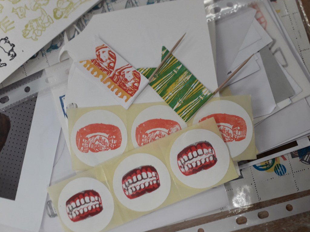
Printing on all sorts of things to personalise them makes me smile inside and out.The colours used for these pigeons and the small scale it’s on made me fall in love with this sheet of stamps instantly. If I stamped something similar and used an unthreaded sewing machine to perforate the stamps, perhaps…Some more examples, including on stickers which again really appeals to me.
Interactive illustration in general seems to be where I gravitate, be it on stickers, stamps or in books. Even my recent papercraft in the Utensia project has been inspired by the idea of my little ovens having interactive doors.
Where can I take this research? I’ve already started making work inspired by Fowler’s talk, but I can see it taking centre stage in a self-directed project. Any subject might suit stickers or stamps… after quite a few years of being pushed hard to work bigh because “scale shows confidence”, Louise supporting small scale illustration feels awesome!
In the morning, Louise held a group evaluation in which we put out all our work and, in pairs, appraised each other’s work so far. I worked with Will and took notes on what he said after taking a look at my work.
What we decided I needed to work on was:
Filling up the white spaces on my media experimentation worksheet. Hopefully, I will create a papercraft oven and some of this exploration will fill up the rest of the sheet.
Researching more deeply into where my work is going. In the time since last Thursday, I have completed some research and will finish this blog post with it.
Louise mentioned my experimentation sheet was very door-heavy. This was things like cupboard doors, ovens and hobs, kitchen cabinets etc. She suggested that maybe I look into doors more closely, and their deeper meaning. I looked around online for a while and compiled a list along with images of famous doors in pop culture history – that is, books and film. Those will be collaged in my sketchbook over some pages as visual inspiration.
I also collected a few images relating to the papercraft route I might potentially take. I really like the idea of having a small interactive oven, with little doors that open. My research took me to an illustrator that really interested me – Samuel Shumway.
Shumway is a stop motion animator and prop designer as well as illustrator. The works that interested me were his small papercraft creations.
I like the bright colours and the uplifting feeling of his work and the way he photographs it. The square feeling of this lasagne is what I’ll hopefully go for with my little oven, but a but simpler…
My research into Shumway helped me get an idea of the overall feeling I’d like my work to communicate. The use of paper and his way of working is one I’d like to try out in my project.
My research also took me to another artist: Simon Costin.
Costin is a set designer, but his work is so varied that he’s incredibly hard to define. I found some of his work from the Museum of London interesting.
You can see the busyness of this layout, and how Costin has created a three-dimentional scene with an incredibly illustrative feeling to it.Photographing in different lighting is something I’ll have to keep in mind. His artwork kind of reminds me of the illustrations by Chris Riddell, e.g. Ottoline and the Yellow Cat.These lino cuts are totally different to the work shown above. I like these for the brightness of colour and how they make me feel. The blues and greens are saturated and uplifting, and the print itself is bold. I might try a colour scheme like this when creating my little paper oven.
Critically, Costin’s work has helped me think about where to take the project practically. He’s given me ideas in terms of colour pallette, and I might take inspiration for texture and shape in this or future projects. E.g. the lines of wooden buildings or the brick textures, or the wooden paneling of the tudor-esque houses.
Emma Green is a part-time illustrator who did a degree and master’s at Bournemouth University. She currently works at Oxford Brookes and acts as a sort of teaching assistant to some of the classes. I’d never really seen her until recently, and today she gave us a short lecture on her education and current profession.
This is the piece of her work that really attracted me. I talked to her after the lecture and found out that it’s some of her older work, and that it was created on Photoshop.
I liked the colour scheme a lot, and the cut-and-stick feel of the buildings really attracted me. It turns out she uploaded the sketch into Photoshop, then used the polygonal lasso tool to fill in the buildings with colour.
Colour wise, you can see layers of red, then of blue, then red again. She’s interspersed blue details into red buildings, e.g. the windows at the very front, and vice versa. This makes the piece feel bustling and natural.
Texture wise, I like the white crayon-pencil brush she’s used to add details. E.g. the curls and lines on the bottom left blue building, or the bumps that look a little like bunting or terracing running along walls. Using a mixture of details lighter than the surroundings and darker than the surroundings balances out the piece.
How has this impacted my work? This piece has a similar feel to the busyness I’d like to portray in Utensia. I might use blocks of painted colour to try and mimic the aesthetic Emma has created. I may also use a white detailing pen alongside a dark one like Emma has here, to create a little more interest.
I’ve been reading Type & Typography by Phil Baines and Andrew Haslam for about a week now. It’s dense, but already I think it’s changing the way I look at typography.
I can’t remember or make notes on everything I’ve read, so I’ll just include a couple of highlights (if anything to prove I’ve actually read the book!).
“Lexicographers record these patterns of change, continually collecting words, cataloguing them and preserving them in dictionaries, glossaries and thesauruses.”
“If writing were architecture, then books would be buildings, pages floors, paragraphs rooms, sentences walls, words furniture, letterforms bricks, phonemes clay and grammar mortar.”
In reference to Grammar
I learned that the origin of the idiom “a square meal” is actually from the Navy, where for some reason they had square plates.
I also learned that the Phoenicians were one of the very first cultures to create an alphabet, and that theirs had 22 letters. E.g. “Aleph”, meaning Ox, was similar to a small pictogram of a bull with horns.
The Greeks took many of the Phoenicians’ letters and changed them to suit their own culture. Aleph was flipped so the “horns” of the ox faced downwards, and was renamed “Alpha” – or, of course, “A”. It really interested me that the evolution of language is that traceable!
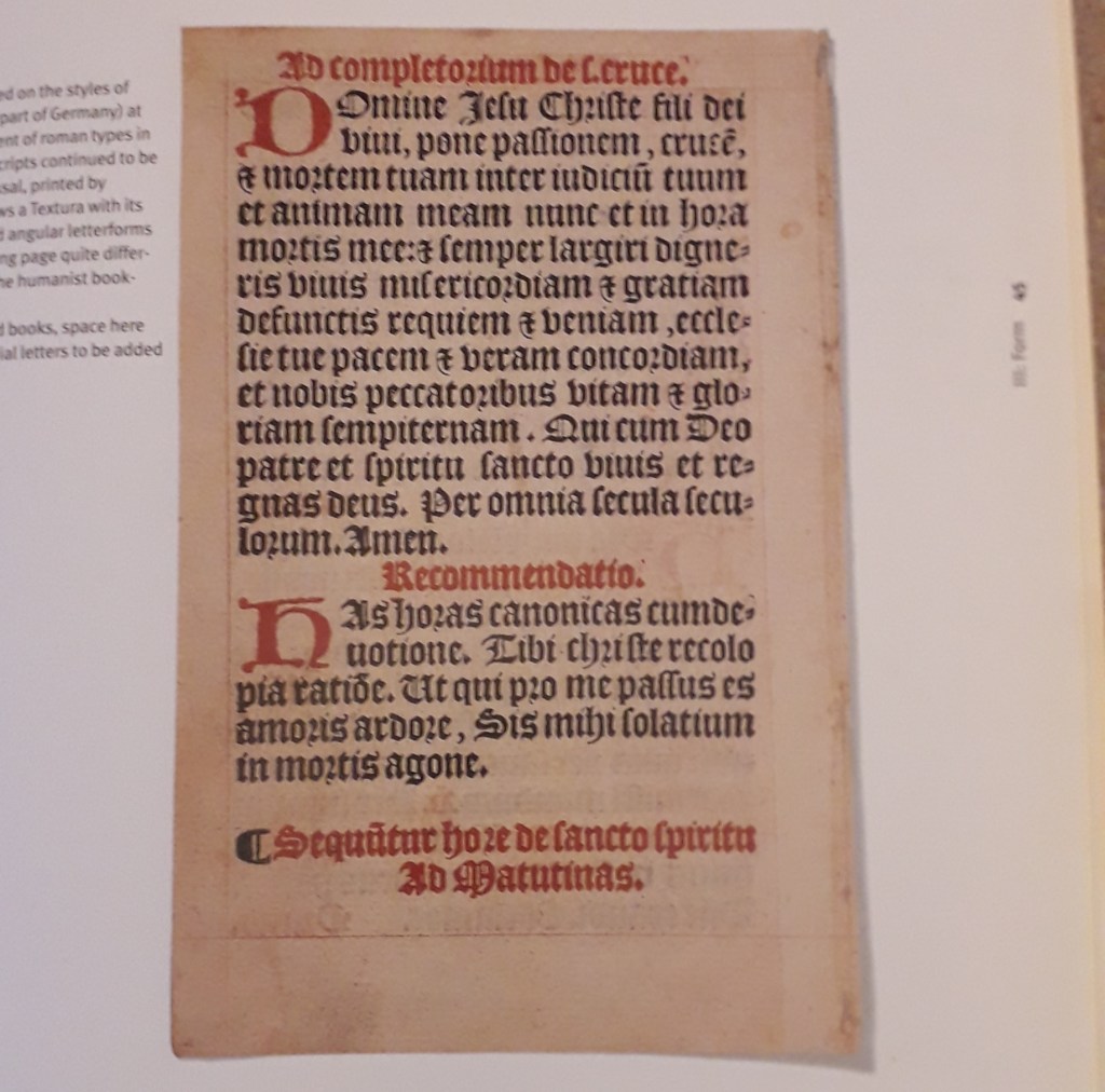
I’ve learned about the evolution of printing from its very origin in the fifteenth Century when the fist type was printed. I’ve also learned of many examples where the circumstances dictate the style and source of certain typefaces. For example, “Broken Script” or Textura (you might know it as Gothic), was amongst the first typefaces to be printed but in order to be accepted as an invention it closely mimicked handwriting at the time.
Many typefaces, in fact, mimic handwriting either implicitly or explicitly. E.g. Copperplate fonts mimic brushstrokes made by a calligrapher’s pen.
The move from metal cut letterpress printing and typesetting to Phototypesetters was revolutionary, and then again to typewriters. Each new invention speeds up – and reduces the cost of – reproducing type for mass production.
“The Intertype Fotosetter was the first Photosetting machine to prove its worth in a commercial environment.”
I had a little spare time the other day, and looked at Peepshow.org.uk for some successful illustration projects in the professional world for inspiration.
It wasn’t in my style, but I thought that that was exactly why it would be good to try and fulfil the brief in a similar way.
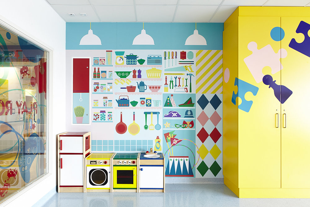
This is an example of some of the work in the hospital.
I established visual motifs in the art across all of the walls. This included things like:
Bright colours (hues, primary, secondary colours)
Blocky, print-like designs
Themes that children might relate to
Basic, bold shapes and silhouettes
This is the page of my reflective journal that illustrates my thinking process.
I created an illustration in Clip Studio Paint that attempted to fulfil the brief.
This was designed to fit a jutting piece of wall, e.g. one hiding pipeworks or something similar.
What do I believe was successful? I like the darker green wave over the green hill. It’s like stylised shading I stumbled across while experimenting. I also love the pink cactus-like plant in the background, and the white flowers on it.
What didn’t work, and how might I improve in another attempt? I feel like the teal and the purple just didn’t sit right together. I was married to those colours, and should have tried more out instead of being stubborn. It’s just a bit too much of a wacky colour scheme for how simple the image is: imagine it were more complex, I could have a purple creature in the top corner that tied in with the low purple hill and created a better composition. As it stands, it’s a bit naive and jarring.
If I’d had more time, I’d have created multiple illustrations exploring different aspects of the brief. But there’s a bit of a limitation on my time now I’m doing uni-set briefs; I just thought I’d include a post about this so it doesn’t get lost.
Klimowski’s parents were Polish emigres. Klimowski studied at St. Martin’s School of Art, but unexpectedly returned to Poland in 1973-80. “There he specialised in poster design and made films in a political climate where graphic communication was not merely oil for the wheels of capitalism, but a way of maintaining hope of a better future than Communism could provide.”
He had success creating book jackets for writer Milan Kundera, whose work was supporessed after the Russian invasion of Czechoslovakia in 1968. His collages are surreally inspired, often featuring bodies with the head obscured. This has relevance to the suppression of intelligence under an oppressive regime.
A quick google search on this book suggests that the Author set out to make the point that neither love nor art offer an escape from political background and conflict. The burning fire might suggest the intrusion of politics into the love stories within the book. I like the inclusion of both photography and enlarged sections of engravings here. I’d like to make some sort of surrealist-inspired work, and this jacket really appeals to me. The starkest tonal difference is in the hand holding the puppet-strings, and therefore draws the eye there. The composition is balanced, with darkest patches in the upper left and lower right.
How is this relevant to my current practice? The graphic design brief specifies that our book jacket will be a photographic collage, and Klimowski’s works are just that. They have a “cut-and stick” feel to them that corresponds to the workshop’s activity of physically creating a collage.
Source:
Powers, A. (2001) Front Cover – Great Cover and Book Jacket Design, Mitchell Beazley, UK.
Among other recommended reading I checked out of the library, one book was Front Cover- Great Cover and Book Jacket Design by A. Powers. I spent a few hours reading it and taking notes to help me with my own book jacket design.
Book jackets first started appearing in the late nineteenth century. Before this, books tended to be bound plainly (with the logic that the content did not need to be “packaged” in order to be sold). One example of the earliest book jackets is The Yellow Book, an Illustrated Quarterly. It’s yellow and sweet, with affiliations to Oscar Wilde that damaged its reputation at the time (because he went to prison!)
After the First World War, there was a considerable growth in publishers and competition to sell books. The jacket was a natural evolution in marketing to appeal to potential consumers, whereas before the extra marketing wasn’t necessary. Publishers could commission artists to paint or create covers for them. “The cover sells the book” became the new ideology.
This is just a side – because I remember reading it and thought it was cool. While many artists created paintings for covers, it was difficult to convert these into block prints for mass book-jacket production. It was artists that had a better idea of the process of mass production that could manipulate it for the best effect.
See also Angus Hyland, a designer I kept running into throughout the book and need to save. His style was simplistic, and was monotone photography coupled with simple yet effective typography. He designed for both Canon publisher (“repackaging the bible” for 20th century readers) and Rebel Inc. publishers.
Penguin Books
Allen Lane released Penguin books in 1935. This was almost as revolutionary in the book selling industry as was the invention of the printing press. Penguin books released books in huge quantities and very cheaply, within a strict brand identity and tight cost restraint. It forced other publishers to keep up.
“The structure of the Penguin list still reflects series divisions which were established in the immediate post-war period, such as Penguin Classics and Penguin Modern Classics.”
Penguin’s brand identity has kept their brand afloat since 1935. An example of this is the formula of using modern or old master paintings in colour, combined with a simple title, first introduced by Germano Facetti in the 1970s. It provides a valuable piece of authentic visual context to accompany the text, as well as broadening the visual education of readers.
Practical Jacket-designing information
“The design of book covers helps to make a book something more than mere “information”, something that, even though it may have many thousands of identical siblings, still demands a relationship, something that when given, defines the values of the giver and recipient. The best book covers possess a form of hidden eroticism, connecting with some undefended part of the personality in order to say “take me, I am yours”.”
This quote really got me thinking. How are we, conscious individuals, supposed to guess at what will tap into the subconscious and what it wants? I know I’ve found myself becoming incredibly attached to certain book jackets, or pieces of art in general, but replicating that on purpose sounds impossible. I think that’s why Powers also states that designing book jackets is famously flaky and fluke-y, regardless of how professional or experienced designers are.
“Book designers, however, now have a new challenge: jacket legibility in a thumbnail icon on a website is almost as much a requirement as legibility across a crowded shop.”
This certainly wasn’t on our brief, but let’s think about it. Non-Places is an academic essay at a very advanced level. I wouldn’t be surprised, reading its summary, if its main audience were students at MA level or academics. They may well be searching for this book online with other academic texts. I think there’s something really sexy about the term “non-places”; I know I want to make these words the most important copy on the front cover (and probably even spine). The rest of the title is confounding and potentially drowns out the poignancy of Non-Places. I want people to register “non-places” subconsciously, as a vague and intriguing concept, before seeing any other information.
Relevant examples of successful book jacket designing
“A good example of Pentagram (the designer)’s style of visual synechdoche, in which a detail stands for the whole atmosphere of the story.” (And I’m not going to pretend I didn’t have to google synechdoche.)As far as my memory takes me, I believe this book is actually about the chance meeting of two gamblers. I chose it because it’s relevant to the cut-and-stick theme of the brief, and to me it’s effective. I like the darkness of the face and the white illustration on top. I might consider having a block colour in the background. I believe this book took a dystopian view on machines taking over our lives. I love the retro, screen-printed feeling of the main image and the brightness that reminds me almost of a pulp fiction book cover from the 60’s. (This was from the 90’s or thereabouts). Again, it’s a photographic collage. I include this simply because I like the distressed lettering. I know we’re going to be experimenting with distressed hand lettering in-class next week, so I thought I’d collect this as a reference.
What have I actually learned, in summary?
I’ve given myself a pretty quick history of the book-jacket: when and how it started, why it caught on, and some of the physical processes of printing when it first emerged as an art.
I’ve read into the histories and origins of a few different publishers, e.g. Faber and Faber, Penguin books (detail included here because my assigned book is a Penguin book), Canon publisher, Rebel Inc., etc.
I’ve learned the importance of a house style in establishing a brand, and how understated simplicity can be.
I’ve analysed a few different examples of Photographic Collage book jackets in the hopes that the knowledge will help me in completing my own brief.
I carried out some research on Quentin Blake, a very popular artist famous for illustrating for Roald Dahl. All the images here are credited to him.
I chose three images, because I have something to say about each of them.
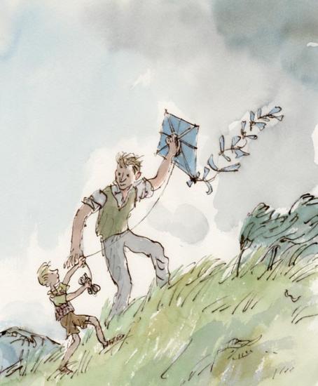
This image is a full coloured illustration. It is unlike a lot of Blake’s work because the subjects are in a defined context (the grassy hill and the grey sky). The colours are also less saturated than Blake’s other work.
This is from the children’s story Danny, the Champion of the World by Roald Dahl. Although it’s a children’s book, Dahl based it on an adult’s book he had written called Champion of the World.
The plot is quite dark for a Dahl book (although young children might not notice or mind). The significance of this is that in my opinion, the illustrations arguably match the tone of the book. Look at the quick, sketchy marks used to create the grass. The whole diagonal composition leads upwards; these show how hard the wind is blowing. The grey sky is quite sad too.
The illustration pictures a happy moment against quite a bleak background. In relation to the plot (Danny and his father making the most of a very poor situation), I think this illustration is very poignant.
That being said, it is a children’s book. All I can say in criticism of the illustration is that perhaps its bleakness and lonely feeling might put a young child off or scare them. Danny’s dad has so much kindness in his eyes, though, that it’s unlikely.
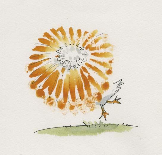
Here, I love the way motion has been pictured by drawing a sketchy beak in a whole circle.
In Quentin Blake’s Drawing book, Drawing for the Artistically Undiscovered, Blake puts a lot of emphasis on pace in illustrating. He states that if you want to draw something fast (e.g. a running horse or a pelican spinning), often literally drawing it fast will add to that effect.
I like this a lot, having read it as a young child and remembered it for many years. I’ve seen it time and again in my own art when I realise I’ve been labouring an illustration without any need, and start again with a far more dynamic result.
Look at the colours here! Anyone who’s seen my Willy Wonka painting will know I have a soft spot for this story. He’s described on Blake’s site as “the most wondrous inventor in the world”.
This is a very exciting moment in the book. I think it’s Charlie first meeting Wonka (but there’s a chance it’s right at the end of the story as he wins the chocolate factory). Everyone has heard Wonka talked about, and we all feel like Charlie does here as Wonka exceeds all of our expectations as a wonderful character.
Looking at the semiotics: the yellow surrounding Charlie in his clothes and ticket ring out happiness. The green and purple and blues of Wonka are all saturated and let us know exactly how eccentric he is. Finally, the yellow and purple key colours might make someone think of Cadbury’s, an existing chocolate brand, or of a Wonka bar (which is purple, white and yellow). Everything screams sweet wrappers. I feel like I could take a bite out of this illustration and it would taste like chocolate.
All these colours might have hurt or become confusing if there were too much background, so I think Blake was right in leaving white and only including the barest mise-en-scene to let us know we are talking to the candy man himself.
All this makes me want to go and watch Willy Wonka and the Chocolate Factory.
Sources: (You’ll have to excuse this, but it’s a crude attempt at Harvard referencing. I heard we’d have to use it at some point, and I am nothing if not a swot).











 Gemma's Art
You must be logged in to post a comment.