On Monday, it was the fourth day of the graphic design project. I realised that I was quite behind in terms of producing hand-lettering or typography work, despite my sheet full of artist research.
To respond to the brief, I created a stencil out of which I cut the title “NON-PLACES”, and held it up against potential relevant backgrounds.

A problem the stencil presented me with was that the glue used to stick it to the cardboard backing wrinkled the paper quite severely. To solve this problem, I later edited the images with the clone stamp tool in Photoshop. (After taking a tutorial on it!)
I then adjusted the images I liked the most a little in different experimental ways before placing them into InDesign and fitting them as jacket covers.
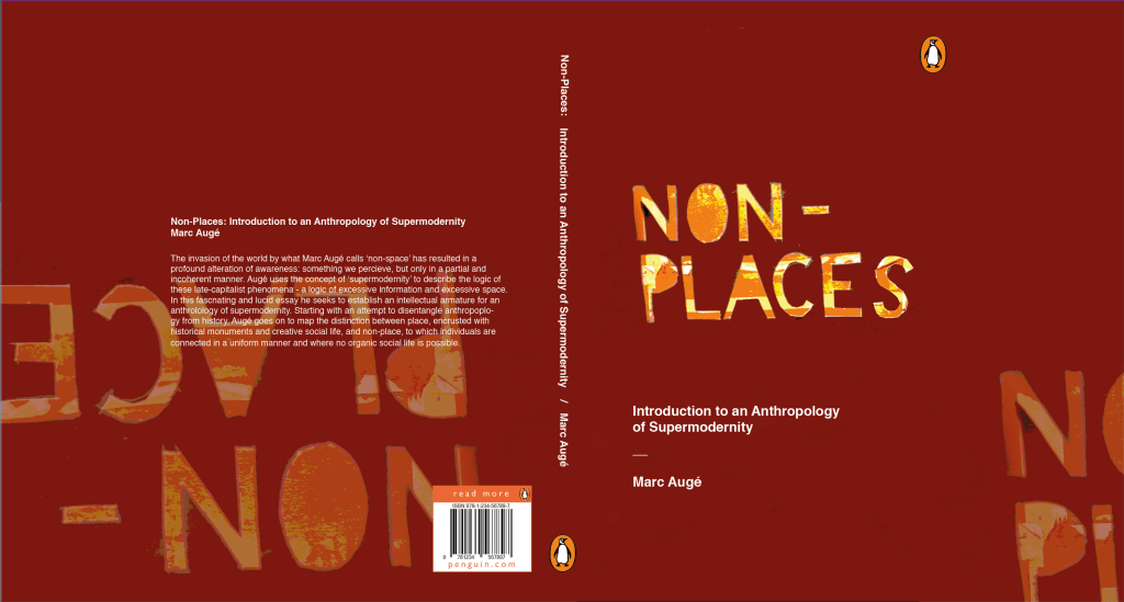
I really liked this design, but I feel it falls a little short on the overall atmosphere of non-places. The warm browns and reds almost feel like a cosy fireplace, whereas the colour scheme of non-places would be less saturated and cooler in tone. That’s why this was a useful, yet not final, draft.

Was this research useful? Yes! After a day’s worth experimenting heavily with the stencil, I feel quite confident that it will feature on my final draft (whichever I choose it to be at the end). I feel like the sudden inspiration to work with hand-cut lettering came from reading Hand Job, a catalog of hand lettering I took out of the library. The introduction of the book highlighted the importance of unique lettering, and this use of paper stencil gives a really interesting, handmade feeling to the type.
Where will I take this now? The project comes to an end next Monday. If the printers decide to come back into action (god, please… I have so much work I can’t even do right now because the whole printing system is down…), I will print off the final design at the correct size. I will photograph it around the book and create a final presentation sheet to show the culmination of the process in the final result.




You must be logged in to post a comment.