Non-Places: Day Five and Critical Reflection

Non-Places: Day Five and Critical Reflection

This was the last week of the graphic design project, and I got to finish it!

I printed off the book jacket at the correct scale. (Side note: with every single Mac refusing to print my InDesign document in any format, it took me over an hour to get this single thing done. Macs exhaust me and I don’t care for them.)

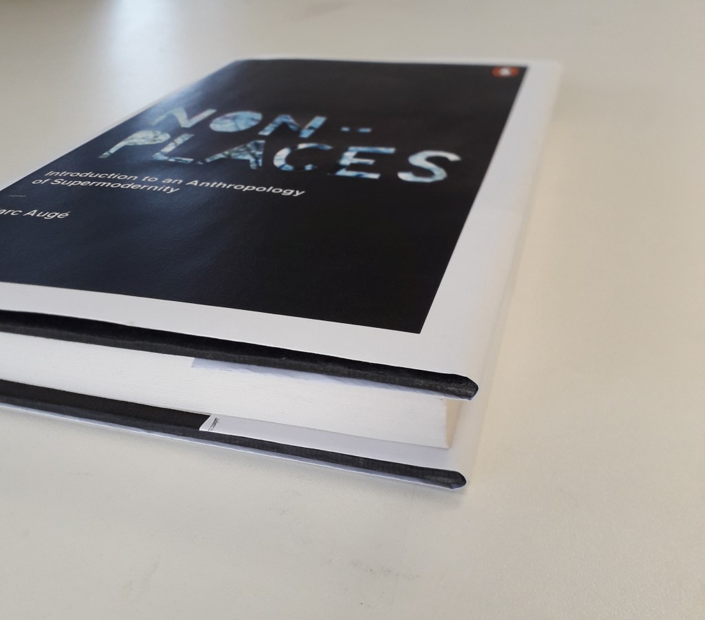
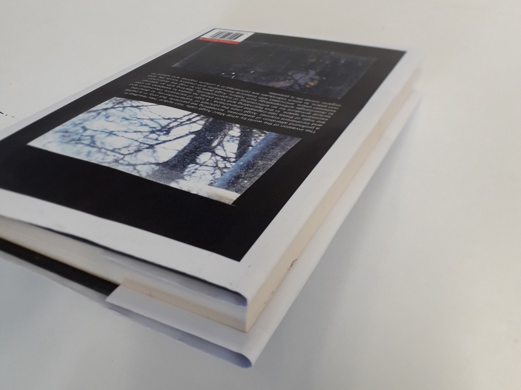
I measured and wrapped it round the book, to provide photographic evidence of it in an applied situation for my final worksheet.
What do I think went well with this project?

I am happy with the overall look of the book. The image for the front cover, touched up in PhotoShop, was very successful. I’m glad I went for the cooler colour scheme in the end because I feel it communicates the concept of “non-places” better: cold, connoting isolation, loneliness and a lack of emotion. I suppose the fact that the trees are bare against a cold sky is appropriate as it shows a place where life can’t be sustained, just as Auge states that life can’t be sustained in non-places.

What do I think didn’t go well?

I feel like despite all of the time that went into it, this final cover looks a little primitive. This might be because of the white edges: although I made that decision carefully in relation to Penguin’s brand identity, the block photographs on white coming out of a normal printer made it look a little thrown-together. To solve this problem, the cover being printed on glossy paper may have given it the professional look it needs.

In addition, I feel like the positioning of the blurb in relation to the image looks a little unfinished. It’s legible and the front and back cover images tie in together, but just as a block of text it sits strangely against the black paper cutout. If I’d had more time, I could have experimented both with the text and the back cover image entirely.

How did I develop my ideas and how could I have developed them differently?

After a session so heavily focused on hand-lettering, I felt almost pushed to create something that was centred on the lettering. That’s the main reason why my research and experimentation drew me towards the stencil-cut type.

I would have liked to have experimented a little further with my collage ideas, maybe: the images I had collated were all quite interesting and it seems a shame my process meant they didn’t make it into the final piece.

Were the media and techniques I explored successful?

I think a downfall with my collage pieces was that I tried to recreate them on PhotoShop from the start. It just doesn’t have the same feeling as the truly torn and cut work I had on one of my worksheets. A limitation of working with collage at any kind of scale is that I literally don’t have the money to be printing sheets and sheets of coloured images to experiment with – as much as I’d like to. This meant that my collage work was quite small, which would have been difficult to scale up at any sort of quality.

A way to solve this problem might have been working digitally from the start (so as not to lose anything in translation between traditional and digital). Alternatively, I could have created a series of pencil thumbnails with possible collage ideas and compositions on them, so when I did come to printing and collaging I had something in mind. This does take away from the freeform experimental approach, though.

Hey, maybe I could have printed off all of the work and cut it up but just photographed compositions I liked rather than sticking them down. That would mean I could still play around a lot, but would mean I could reuse images I liked rather than having to print a ton of duplicates.

Non-Places: Day Four

Non-Places: Day Four

On Monday, it was the fourth day of the graphic design project. I realised that I was quite behind in terms of producing hand-lettering or typography work, despite my sheet full of artist research.

To respond to the brief, I created a stencil out of which I cut the title “NON-PLACES”, and held it up against potential relevant backgrounds.

This is an example of an unedited picture with the stencil.

A problem the stencil presented me with was that the glue used to stick it to the cardboard backing wrinkled the paper quite severely. To solve this problem, I later edited the images with the clone stamp tool in Photoshop. (After taking a tutorial on it!)

I then adjusted the images I liked the most a little in different experimental ways before placing them into InDesign and fitting them as jacket covers.

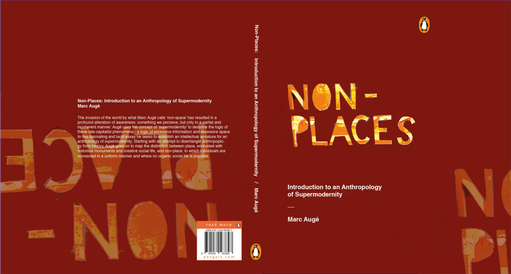
This is a saturated and posterised version of the stencil. I placed it as the cover, then colour-picked the background and repeated the design at lower opacity on the back cover and inside flaps.

I really liked this design, but I feel it falls a little short on the overall atmosphere of non-places. The warm browns and reds almost feel like a cosy fireplace, whereas the colour scheme of non-places would be less saturated and cooler in tone. That’s why this was a useful, yet not final, draft.

I preferred this cover in terms of actually meeting the brief. The dusty window and grey-heavy colour palette give off quite a sad, isolated feeling. It distances the viewer from reality by placing the reader behind a literal window.

Was this research useful? Yes! After a day’s worth experimenting heavily with the stencil, I feel quite confident that it will feature on my final draft (whichever I choose it to be at the end). I feel like the sudden inspiration to work with hand-cut lettering came from reading Hand Job, a catalog of hand lettering I took out of the library. The introduction of the book highlighted the importance of unique lettering, and this use of paper stencil gives a really interesting, handmade feeling to the type.

Where will I take this now? The project comes to an end next Monday. If the printers decide to come back into action (god, please… I have so much work I can’t even do right now because the whole printing system is down…), I will print off the final design at the correct size. I will photograph it around the book and create a final presentation sheet to show the culmination of the process in the final result.

Non-Places: Day Two

Non-Places: Day Two

Yesterday was the second taught day of our graphics project.

The morning consisted of printing off our pictures and collaging them into potential abstract book cover designs. As (and hopefully WHEN) I make it into university today, I’ll take and attach a photo of the worksheet I created full of collaged designs.

In the afternoon, we had a photoshop tutorial with Neil. I’m not going to lie, the fact that I didn’t have a mac to work on because the class sizes aren’t correctly managed did make me angry. I had about an hour at the end of the day to get my practical work done, though, and I’m really pleased with what came of it!

What was successful about the day? I would say that, after a lot of moping, my morning collages came out really well. I’ll be using them as inspiration in my photoshop endeavours. It was Danny, continually encouraging us to be quick and not to think too hard, that allowed me to create the work I did. He kept saying “it’s an instinctive exercise, not an intellectual one.” After about the fifth time, I was coming up on exasperation because I do everything the intellectual way. But he was right, of course.

I also think that in my limited time (and incredibly limited temper), creating the book jacket draft that I did was impressive. I had to create the word “PLACES” in Photoshop with the pink branches as a clipping mask, then import it into InDesign and flip it.

Interestingly, my reading the book Type and Typography has actually influenced the way I’m thinking about type.

What still needs to be done? I need to go in for a little while longer and spend some time mocking up other drafts of book jackets. I’d also quite like to write a blog on what I’ve been learning in Type and Typography.

Non-Places: Day 1

Non-Places: Day 1

On Monday this week, I had my first day of the three-day graphic design project. The brief is to create a book jacket for Marc Auge’s Non Places: An Introduction to the Anthropology of Supermodernity.

The day was split in two: the first, a briefing and Adobe InDesign workshop with Neil. The second was pretty self-directed; finding photos and doing research for the book jacket.

This is a screengrab from the end of the InDesign walkthrough. We have a template of the correct measurements for the jacket, complete with the logos and text the brief requires. Now we can play with it without worrying!

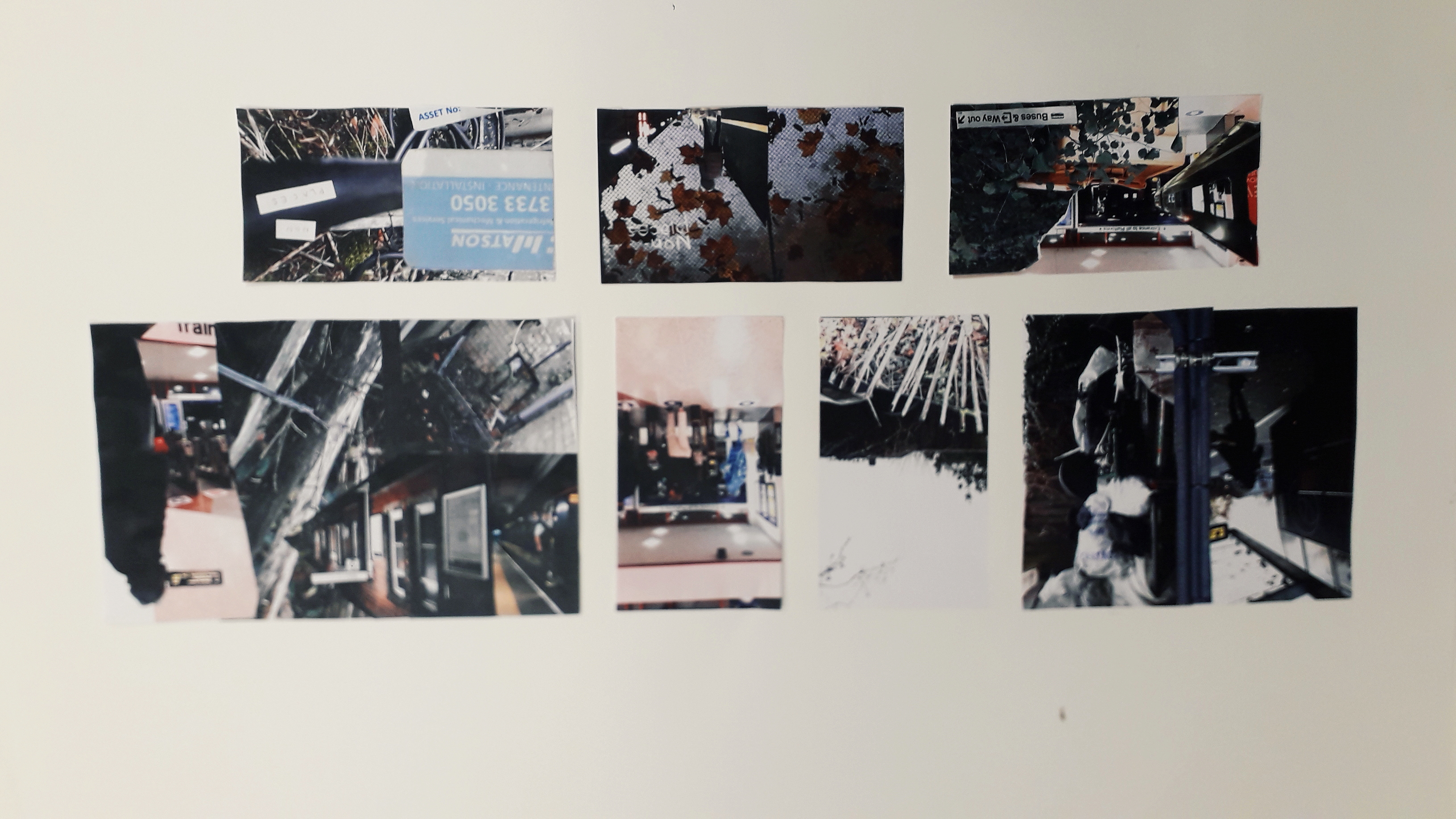
I also got a few photos inspired by Non-Places. I’ll include a couple of them.

This is the top of a bus shelter, although it might not be perfect because the viewer needs to KNOW what it is in order to create a coherent mental image of the term “non-places”.

Was the day purposeful? Yes! Having missed my InDesign induction workshop with Neil the first time, I really needed the tutoring. There were lots of little things I learned about creating guidelines and layers, etc. I have a working note on my phone with interesting advice I’ve been given about using InDesign.

Were the media and techniques I used successful? Why or why not? The photograph collecting is all done on my phone. It’s quite high quality, but I know it could be improved by booking out a serious camera and getting to grips with it, e.g. aperture, focus, etc. Otherwise, I’ve been taking photos when I see relevant places. I try and get landscape and portrait versions, on the off-chance that I might like one enough to do a complete wraparound of the jacket.

Where am I going to take it? Outside of class, I have assigned work to do. Apart from collecting more photos, I have to compile them together in a document and ensure they’re printed out for the next workshop. I might also experiment with colour digitally on a few of the images, see what I like and don’t like. Research-wise, I’ve checked out a ton of the recommended reading from the library… but I’ve already blogged about that, so you’ll know!

Non-Places Research: Artists: Andrzej Klimowski

Non-Places Research: Artists: Andrzej Klimowski

Klimowski’s parents were Polish emigres. Klimowski studied at St. Martin’s School of Art, but unexpectedly returned to Poland in 1973-80. “There he specialised in poster design and made films in a political climate where graphic communication was not merely oil for the wheels of capitalism, but a way of maintaining hope of a better future than Communism could provide.”

He had success creating book jackets for writer Milan Kundera, whose work was supporessed after the Russian invasion of Czechoslovakia in 1968. His collages are surreally inspired, often featuring bodies with the head obscured. This has relevance to the suppression of intelligence under an oppressive regime.

A quick google search on this book suggests that the Author set out to make the point that neither love nor art offer an escape from political background and conflict. The burning fire might suggest the intrusion of politics into the love stories within the book.
I like the inclusion of both photography and enlarged sections of engravings here. I’d like to make some sort of surrealist-inspired work, and this jacket really appeals to me. The starkest tonal difference is in the hand holding the puppet-strings, and therefore draws the eye there. The composition is balanced, with darkest patches in the upper left and lower right.

How is this relevant to my current practice? The graphic design brief specifies that our book jacket will be a photographic collage, and Klimowski’s works are just that. They have a “cut-and stick” feel to them that corresponds to the workshop’s activity of physically creating a collage.

Source:

Powers, A. (2001) Front Cover – Great Cover and Book Jacket Design, Mitchell Beazley, UK.

Non-Places Research: Front Cover – Great Cover and Book Jacket Design, A. Powers

Non-Places Research: Front Cover – Great Cover and Book Jacket Design, A. Powers

Among other recommended reading I checked out of the library, one book was Front Cover- Great Cover and Book Jacket Design by A. Powers. I spent a few hours reading it and taking notes to help me with my own book jacket design.

Book jackets first started appearing in the late nineteenth century. Before this, books tended to be bound plainly (with the logic that the content did not need to be “packaged” in order to be sold). One example of the earliest book jackets is The Yellow Book, an Illustrated Quarterly. It’s yellow and sweet, with affiliations to Oscar Wilde that damaged its reputation at the time (because he went to prison!)

After the First World War, there was a considerable growth in publishers and competition to sell books. The jacket was a natural evolution in marketing to appeal to potential consumers, whereas before the extra marketing wasn’t necessary. Publishers could commission artists to paint or create covers for them. “The cover sells the book” became the new ideology.

This is just a side – because I remember reading it and thought it was cool. While many artists created paintings for covers, it was difficult to convert these into block prints for mass book-jacket production. It was artists that had a better idea of the process of mass production that could manipulate it for the best effect.

See also Angus Hyland, a designer I kept running into throughout the book and need to save. His style was simplistic, and was monotone photography coupled with simple yet effective typography. He designed for both Canon publisher (“repackaging the bible” for 20th century readers) and Rebel Inc. publishers.

Penguin Books

Allen Lane released Penguin books in 1935. This was almost as revolutionary in the book selling industry as was the invention of the printing press. Penguin books released books in huge quantities and very cheaply, within a strict brand identity and tight cost restraint. It forced other publishers to keep up.

“The structure of the Penguin list still reflects series divisions which were established in the immediate post-war period, such as Penguin Classics and Penguin Modern Classics.”

Penguin’s brand identity has kept their brand afloat since 1935. An example of this is the formula of using modern or old master paintings in colour, combined with a simple title, first introduced by Germano Facetti in the 1970s. It provides a valuable piece of authentic visual context to accompany the text, as well as broadening the visual education of readers.

Practical Jacket-designing information

“The design of book covers helps to make a book something more than mere “information”, something that, even though it may have many thousands of identical siblings, still demands a relationship, something that when given, defines the values of the giver and recipient. The best book covers possess a form of hidden eroticism, connecting with some undefended part of the personality in order to say “take me, I am yours”.”

This quote really got me thinking. How are we, conscious individuals, supposed to guess at what will tap into the subconscious and what it wants? I know I’ve found myself becoming incredibly attached to certain book jackets, or pieces of art in general, but replicating that on purpose sounds impossible. I think that’s why Powers also states that designing book jackets is famously flaky and fluke-y, regardless of how professional or experienced designers are.

“Book designers, however, now have a new challenge: jacket legibility in a thumbnail icon on a website is almost as much a requirement as legibility across a crowded shop.”

This certainly wasn’t on our brief, but let’s think about it. Non-Places is an academic essay at a very advanced level. I wouldn’t be surprised, reading its summary, if its main audience were students at MA level or academics. They may well be searching for this book online with other academic texts. I think there’s something really sexy about the term “non-places”; I know I want to make these words the most important copy on the front cover (and probably even spine). The rest of the title is confounding and potentially drowns out the poignancy of Non-Places. I want people to register “non-places” subconsciously, as a vague and intriguing concept, before seeing any other information.

Relevant examples of successful book jacket designing

“A good example of Pentagram (the designer)’s style of visual synechdoche, in which a detail stands for the whole atmosphere of the story.” (And I’m not going to pretend I didn’t have to google synechdoche.)
As far as my memory takes me, I believe this book is actually about the chance meeting of two gamblers. I chose it because it’s relevant to the cut-and-stick theme of the brief, and to me it’s effective. I like the darkness of the face and the white illustration on top. I might consider having a block colour in the background.
I believe this book took a dystopian view on machines taking over our lives. I love the retro, screen-printed feeling of the main image and the brightness that reminds me almost of a pulp fiction book cover from the 60’s. (This was from the 90’s or thereabouts). Again, it’s a photographic collage.
I include this simply because I like the distressed lettering. I know we’re going to be experimenting with distressed hand lettering in-class next week, so I thought I’d collect this as a reference.

What have I actually learned, in summary?

I’ve given myself a pretty quick history of the book-jacket: when and how it started, why it caught on, and some of the physical processes of printing when it first emerged as an art.

I’ve read into the histories and origins of a few different publishers, e.g. Faber and Faber, Penguin books (detail included here because my assigned book is a Penguin book), Canon publisher, Rebel Inc., etc.

I’ve learned the importance of a house style in establishing a brand, and how understated simplicity can be.

I’ve analysed a few different examples of Photographic Collage book jackets in the hopes that the knowledge will help me in completing my own brief.