Letterpress Workshop Reflective

Letterpress Workshop Reflective

I signed onto the letterpress workshop with Ruth today. It was really interesting, especially seeing it alongside reading Type & Typography so I could place it historically into context.

We worked with a Galley Press (I think that’s what it was called!). This involved setting type into a metal tray using “furniture”, which includes all the pieces of metal like leading used to space and hold type in place. The type we worked with today was wooden blocks.

This is an example of how you’d set the type. The metal to the far left of the picture is actually a strong magnet that held the word “writing” in place. Ideally, I’d have used more magnets in setting the type but Ruth only had 8 in the whole studio… and there were 8 students.
This is an experimental piece. When these have dried, I’ll stick the white paper onto the off-white back sheet with “RAVEN” printed on it.
This is printing and shadow printing (printing again, offset, without re-inking) onto a scrap piece of paper full of mechanical diagrams. I like this a lot for how busy it is.

How was the workshop useful? I took letterpress because I was so interested in it and have been for years; I hope to be able to use it in personal projects or when my art brief becomes appropriate. I have to book in with Ruth a couple of days in advance if I plan to be in the printing room – but I’m just so glad I have the resource available now.

I also learned a lot about the practicalities of letterpress printing with this method. I know how to clean my hands correctly to remove the oil paint (that is, rub vegetable oil in followed by a gritty soap paste by the sink). I also know why letterpress requires oil-based type, and is one of the only printing forms that has not been replaced by water-based ink. (It’s because water would interfere with the wooden type, and would print slightly less well.)

Where am I going to take this? I can’t say I have any practical ideas in my head right now, except maybe for typesetting a poem or something smaller scale as experimentation. I’ll stick some of my experimentation into my sketchbook, and maybe mount the rest onto a complete worksheet. When the right brief comes along, I’ll definitely book in again!
Type & Typography Notes

Type & Typography Notes

I’ve been reading Type & Typography by Phil Baines and Andrew Haslam for about a week now. It’s dense, but already I think it’s changing the way I look at typography.

I can’t remember or make notes on everything I’ve read, so I’ll just include a couple of highlights (if anything to prove I’ve actually read the book!).

“Lexicographers record these patterns of change, continually collecting words, cataloguing them and preserving them in dictionaries, glossaries and thesauruses.”

“If writing were architecture, then books would be buildings, pages floors, paragraphs rooms, sentences walls, words furniture, letterforms bricks, phonemes clay and grammar mortar.”

In reference to Grammar

I learned that the origin of the idiom “a square meal” is actually from the Navy, where for some reason they had square plates.

I also learned that the Phoenicians were one of the very first cultures to create an alphabet, and that theirs had 22 letters. E.g. “Aleph”, meaning Ox, was similar to a small pictogram of a bull with horns.

The Greeks took many of the Phoenicians’ letters and changed them to suit their own culture. Aleph was flipped so the “horns” of the ox faced downwards, and was renamed “Alpha” – or, of course, “A”. It really interested me that the evolution of language is that traceable!

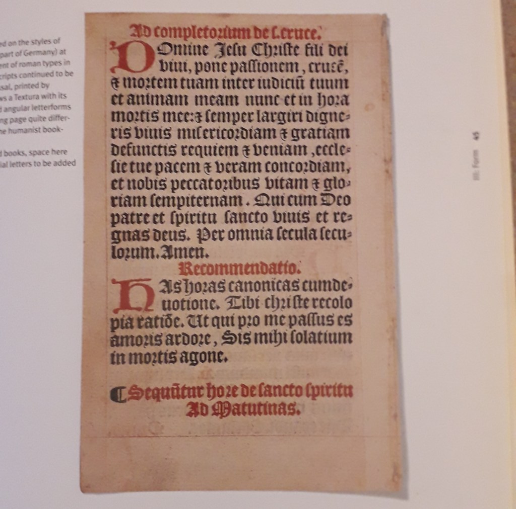
I’ve learned about the evolution of printing from its very origin in the fifteenth Century when the fist type was printed. I’ve also learned of many examples where the circumstances dictate the style and source of certain typefaces. For example, “Broken Script” or Textura (you might know it as Gothic), was amongst the first typefaces to be printed but in order to be accepted as an invention it closely mimicked handwriting at the time.

Many typefaces, in fact, mimic handwriting either implicitly or explicitly. E.g. Copperplate fonts mimic brushstrokes made by a calligrapher’s pen.

The move from metal cut letterpress printing and typesetting to Phototypesetters was revolutionary, and then again to typewriters. Each new invention speeds up – and reduces the cost of – reproducing type for mass production.

“The Intertype Fotosetter was the first Photosetting machine to prove its worth in a commercial environment.”