Photobooth: Experimentation and Evaluation

Photobooth: Experimentation and Evaluation

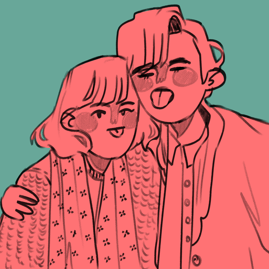
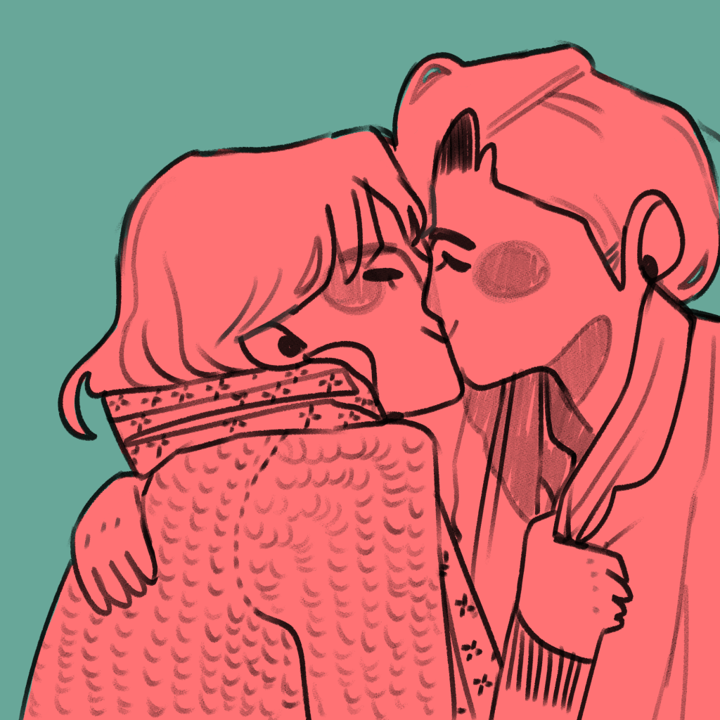
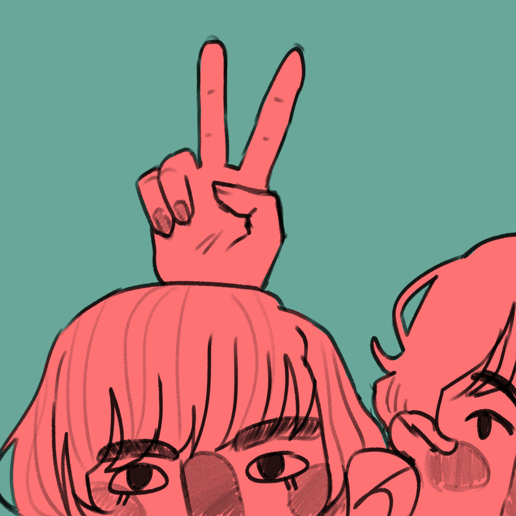
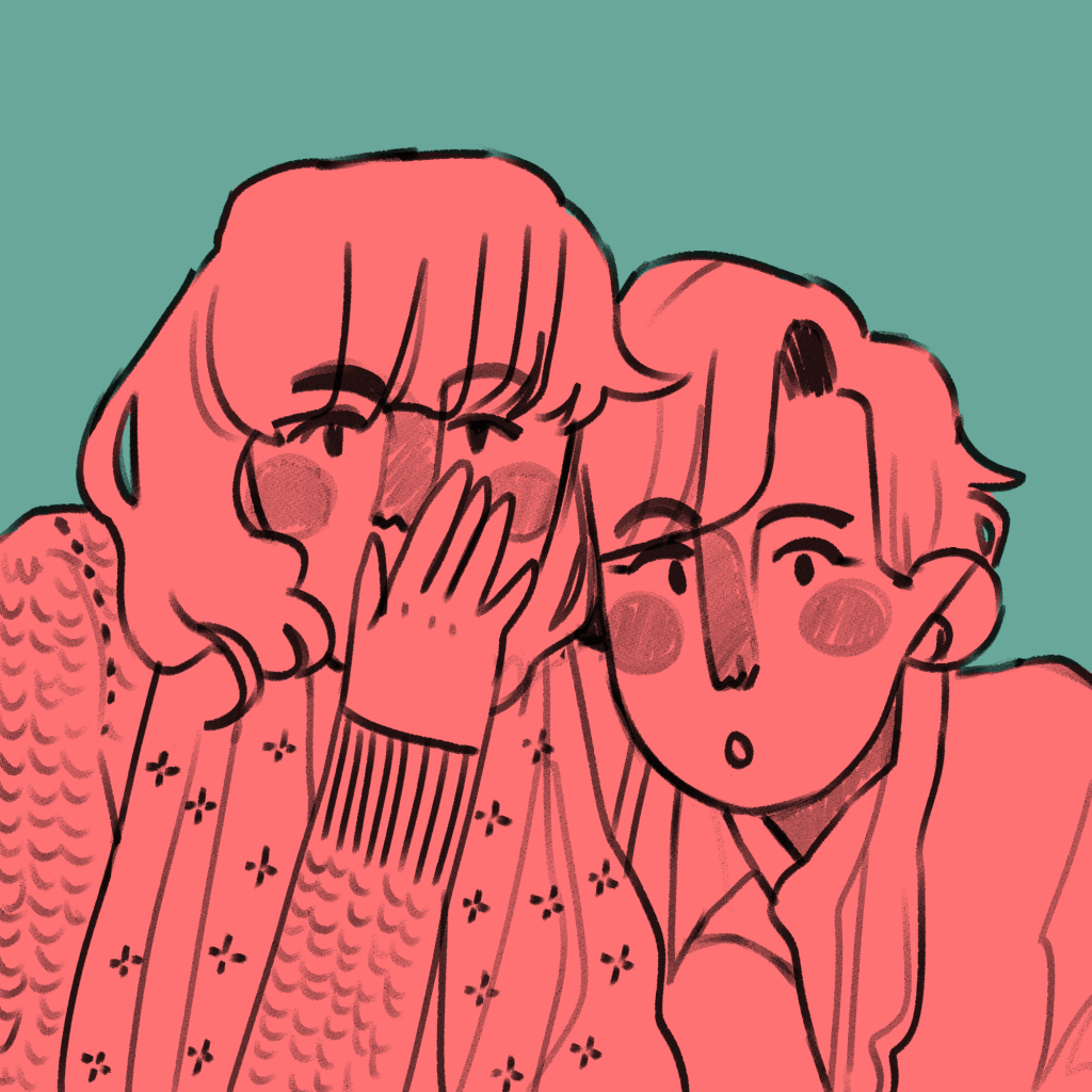
I was about to start writing up some new research, but I realised I’ve been putting off writing up my first experimental piece of finished work in FMP.

I am using illustration to explore the concepts of friendships, relationships and closeness. In doing this, I illustrated an everyday encounter between Antonia and Mitzi – mucking around in a photobooth. I had the intention to bind it into a mini-zine, an instant book I’d found out how to make in my research.
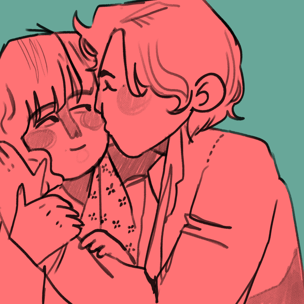
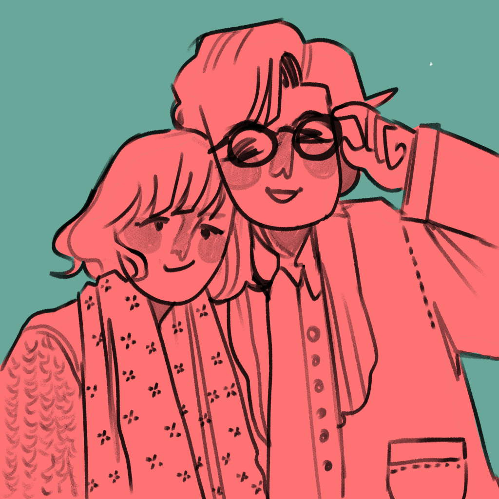
The illustrations I created came from a variety of different pieces of research. These were all mentioned in my Pecha Kucha, but overall I think they were a huge success.

This is the final result. You can see I experimented with different inks and paper types, including black and white versions. (This is because traditionally, instant zines were printed cheaply in B&W on office photocopiers to be shared and I like the historical aspect of that!).

Evaluation

Was my research purposeful? I would say so! All of the research I do affects my work somehow, because it sticks in my brain like velcro. In this case, though, studying artists like early manga artists and artists that inspire me allowed me to work comfortably in a style I like but to work in a more self aware way, and I think it’s improved the look overall as a result of the research.

Did I develop my ideas thoroughly? The short answer to this is no. Because it was just a response to research and was very experimental, I consider this successful nevertheless. Interestingly, I could focus on the form of the book I bind reflecting the content within the book in future projects. E.g. I could have had these images in a concertina style strip, similar to an actual photostrip that might come from a photobooth.

Where am I going to take this? I’d like to work in the area of “meetings” for a bit – I’ll probably chose one specific meeting and illustrate it in a couple of different ways. I need an experimental week, and to do that I need an image or scene I can experiment with. My thinkinig is circling around Drake meeting Mitzi, Ludwig and Techo. In terms of importance to the entire narrative, I have to say honestly I think this is the most important happenstance in all of the character’s development.
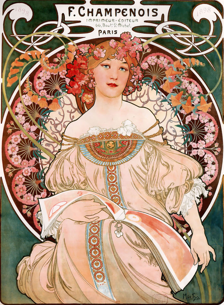
Research: Art Noveau – Alphonse Mucha and Will H. Bradley

Research: Art Noveau – Alphonse Mucha and Will H. Bradley

In one of the books I’ve been reading called Greetings From – Retro Design, I carried out some research on Art Noveau as a movement.

It was an artistic response to the rapid technological increases in the 1800’s, for example advancements in electricity and machinery. Artists showed the aesthetically pleasing elements of living in a city around this time. It was a holistic art movement in that the ideology could be applied to almost anything: architecture, furniture, advertisements, etc.

It is defined in the illustrations I’ve researched by a few specific conventions. These are:

  • Flat, densely detailed illustration
  • A central female figure – often lewd, or suggestive
  • Natural and organic detail filling up as much negative space as possible.
  • Pastel, muted colour pallettes.

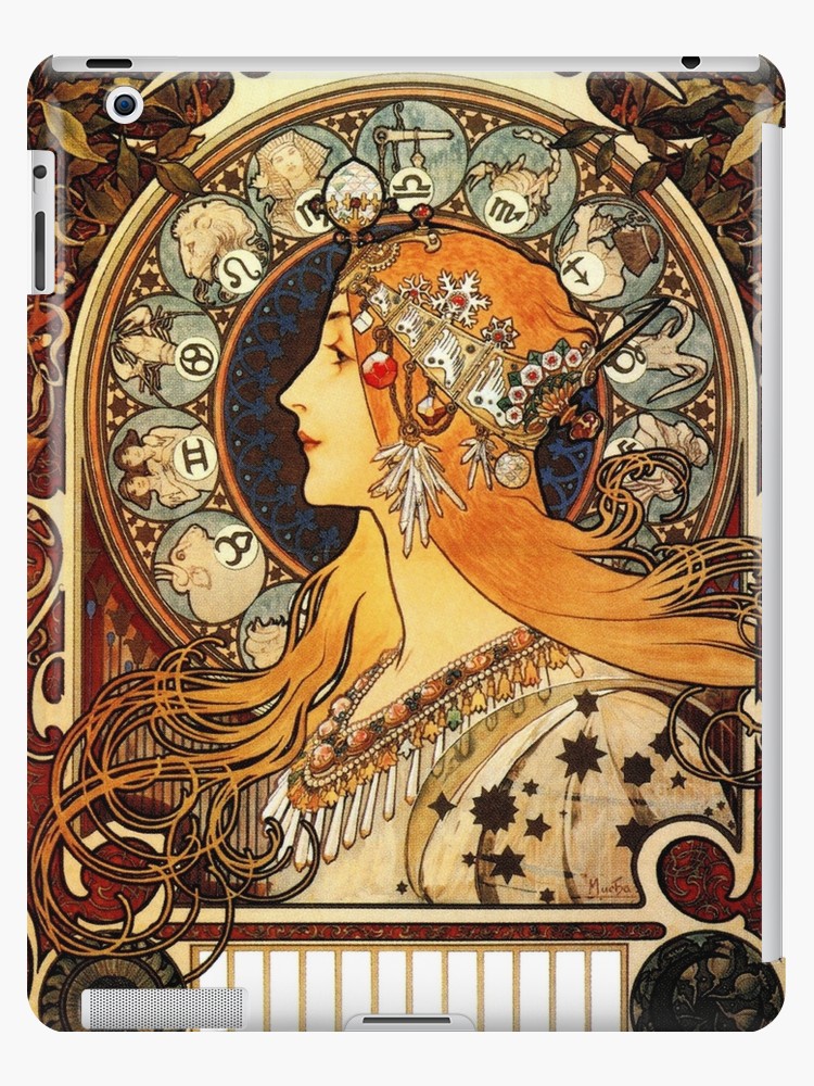
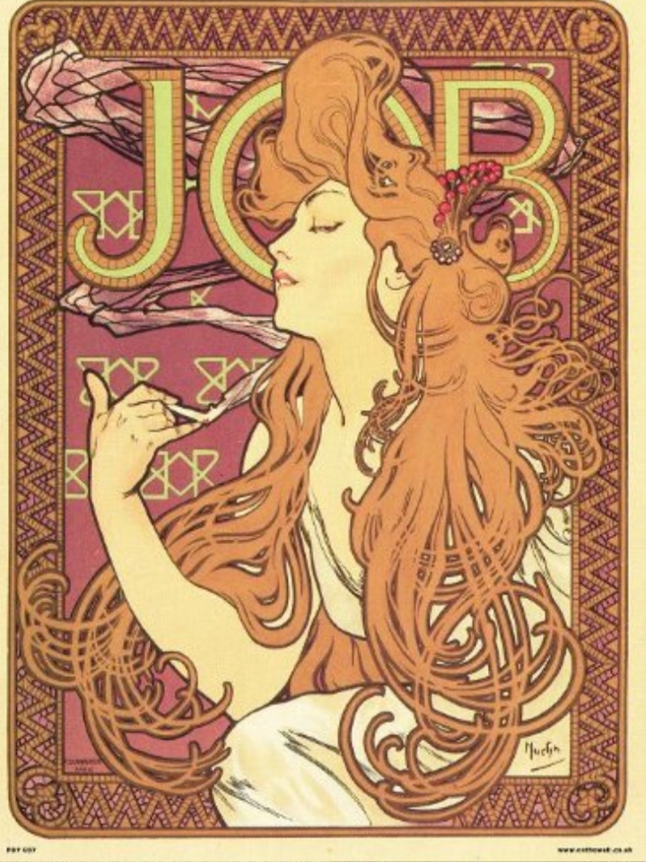
Alphonse Mucha is typical of this art movement. His works are some of the most famous of the time.

I’m inspired by Mucha because of how beautiful his illustrations are. I’m really attracted to the shapes he creates in the images – the circles, the loops and natural curves and how they interact.

I will likely take inspiration from Mucha in terms of my colour schemes. The pale pinks, light browns and beiges are all colours I enjoy wokring with.

I like the way the hair is drawn and how it crosses over itself in a hundred intersections. The fact that it’s in block colour and only the outsides are lined attracts me.

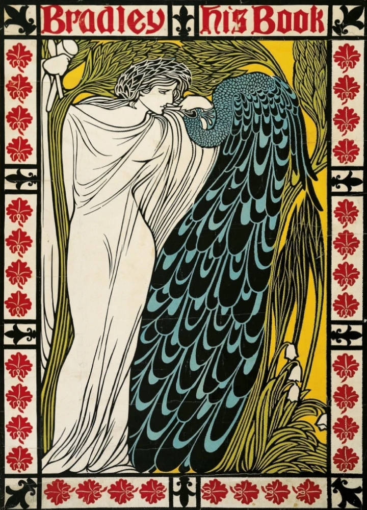
Another artist famous in Art Noveau is Will H. Bradley.

You can see similarities in Bradley’s work, but his work was slightly more progressive in that there’s more negative space than traditional art noveau illustrations. There are larger expanses of flat colour here. Bradley was also famous for designing the covers of Chap Book, a publication that ran through the time of Art Noveau.

I’ve made some work in response to Mucha and Bradley and their working styles.

I couldn’t help but notice that an artist I’ve been inspired by for a long time, KomunHorangi, is clearly influenced by the flowing style of Art Noveau. You can see similarities to Mucha’s work in the way she draws hair.

Although you can clearly tell that she’s been influenced by Japanese manga and animation style (see the huge eyes and facial proportions), you can also see an obvious stylistic similarity in the way the hair is drawn.
Future of the Body: Week Four

Future of the Body: Week Four

The group crit from last week left me in a good position. Since then, I’ve been creating illustrated packaging for Spaceoline.

The illustrations are a massive mixture of all of my research up to this point and a lot of new picture references, which I have saved to my drive. I’ll collage them in my sketchbook when I get the time… which it looks like won’t be for a little while. Yikes.

This is the finished jacket for a small pill pot. The limited colour scheme is inspired by one of my favourite images by Bruno Mangyoku. The textures within it are pretty directly inspired by my texture and experimental work from the previous worksheets.

What do I feel was successful? I was really happy with this pot. I feel like the checked effect worked well, as well as the automaton hand. The limited colour scheme worked very well too – so I took it into the next piece of packaging.

This is the front cover of the Spaceoline pill packet net in production.

I had to do some pretty intense problem solving here, so I thought I’d mention it. When I started to add the black watercolour in, when I was painting crisp lines next to previously coloured spaces it bled into the watercolour pigment. This was ugly and a huge issue because I was working so small. See the top image: I realised quickly that I couldn’t continue to paint,

I thought about it, and ended up using a black fineliner to outline any coloured work to create a barrier between the colours. This worked pretty well, and staved off disaster! I used the knowledge with the back side of the pill packet, which came out far more crisply in terms of rendering the design.

What do I feel was successful? I reused the check design, coming out of a rocket just like in one of my early worksheets. I love the font I ended up deciding on for the word Spaceoline, and the phrase “When in doubt, Space out!”

You can see here that it’s a far clearer piece of work than the front, simply because I bought all of the knowledge and problem solving through with me to create this piece.

Here, I really liked the space hostess. I based her outfit pretty directly from the ones in PanAm: a show I haven’t watched and an airline I don’t know much about, but do like the glamorous, vintage hostess feeling. Like the ladies from Fifth Element on the cruise ship to Floston Paradise.

Where am I going to take this?

I plan to scan these pill packet nets in to keep the design safe and high quality. Then I’ll use the scanned designs to make up some actual packets, which I’m looking forward to!

The project is actually finishing this week, and assessment is next week. Furthermore, I have a terribly busy week with two interviews to prepare for just before the assessment.

Future of the Body: Week Three

Future of the Body: Week Three

This week I had the chance to get more work done on my Futures project, having successfully uploaded my e-portfolio and sent it to Brighton.

I finished off the worksheet with all of the photo references I’d been saving along the way. You can see where I’ve used them in generating initial ideas here.

I re-read a couple of Asimov’s short stories and stumbled across a drug called Spaceoline. It makes space hops easier – which are usually associated with feelings of free-fall and terror, and can be quite traumatic mentally.

Here I experimented with the product’s branding and form. I looked at American gas station logos and Americanised product branding. Then, I speculated on what form the drugs would actually take – but I’m pretty settled on powder pressed into pills.
This was a hastily concieved idea of a Spaceoline jar, for the purpose of experimenting with all sorts of media. I have become enamoured with this piece, even though it’s just a concept sheet. Shown above is: Embroidery, collage, pen, pencil, marker, concertina paper, rings of paper glued on and weaving through the paper.

What has been successful this week? I particularly like the row of pill bottles with collaged insides on the first worksheet. The pill bottle made of concertina paper was actually an accident, but I’m really pleased I kept it: the shape is pleasing and I like that it stands off the page.

The woven paper in the second sheet became the trail for a rocket launching, which I LOVE. I might have to use it again, or use the texture as inspiration. I was told that the blue watercolour puddle was successful as well, so might incorporate that in further work.

Where am I going to take this?

The next steps for the project have been worked out through a group crit we had on Monday, which is a blessing as it makes me confident in where I’m going. I’m going to design and make some brand packaging for Spaceoline. Since it’s a fantasy world and not an actual graphic design project, I can go absolutely goofy with it and have all the fun designing this in the world. Into week four!

Artist Research: Jonny Hannah

Artist Research: Jonny Hannah

A particularly groovy illustrator I found in an Illustrator Journal from 2003 is Jonny Hannah. I’m hoping to make some work inspired by him in my Futures project as I continue it.

Jonny’s illustrations are excitingly busy; the longer you look at them, the more detail you see. He also has a passion for hand typography, which you may know I’m quite passionate about. His work is blocky and stylised and he uses a mix of drawing and printing in creating his works. I like that he had a long phase of liking 1950’s paraphernalia and style: this lends itself well to my retrofuturistic work in Futures of 50’s American advertising.

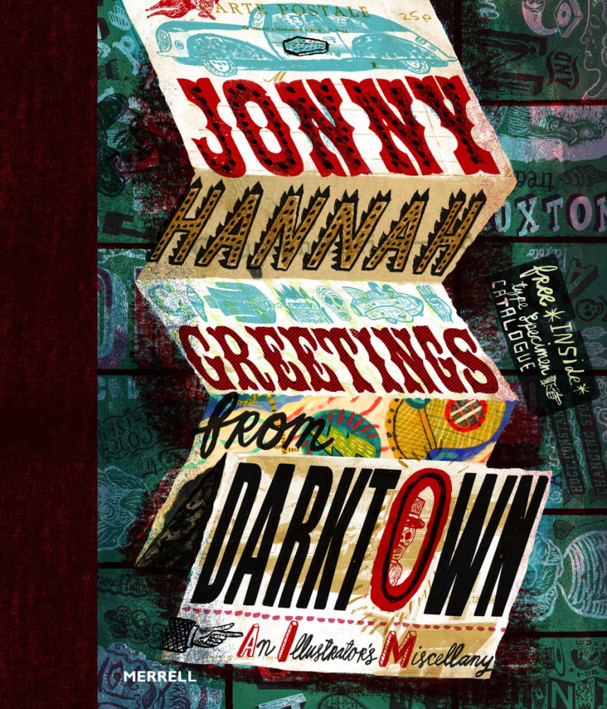
He released a book called Greetings from Darktown in 2014. Inside he has created his own world. In this image, I love the composition of the folded up sheet. It reminds me of bookbinding.

I’ve just had a thought… I know I’m going to be creating some brand packaging for Spaceoline. What if I also made a wonderful fold-out instruction / information leaflet like you get inside some medicine boxes? I know usually they’re just packed with boring text, but I could make this one beautiful.

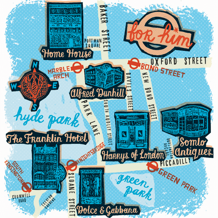
I have been drawn like a moth to a flame by this limited colour pallette. You can see that this is partially printed, with lino cut shop fronts. Maps really interest me – especially ones that use creative license. I also really like the handwriting here, and might have to magpie it, as my primary school teachers might have said.
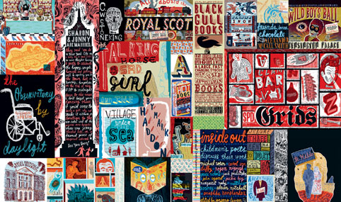
This is just a mental hodge-podge of images and typography. I love stuff like this. Ideas upon ideas upon ideas.
Artist Research: Bruno Mangyoku

Artist Research: Bruno Mangyoku

An illustrator I am very inspired by is Bruno Mangyoku. He is trained as an animator but works as an illustrator, and has picked up commissions from large companies such as Wired, Red Bull and Monocle.

He describes his work as “character driven” – because he “can’t envision a piece without focusing first on the characters.” I really like this, because it reflects my own interests. I love drawing people and giving them personalities.

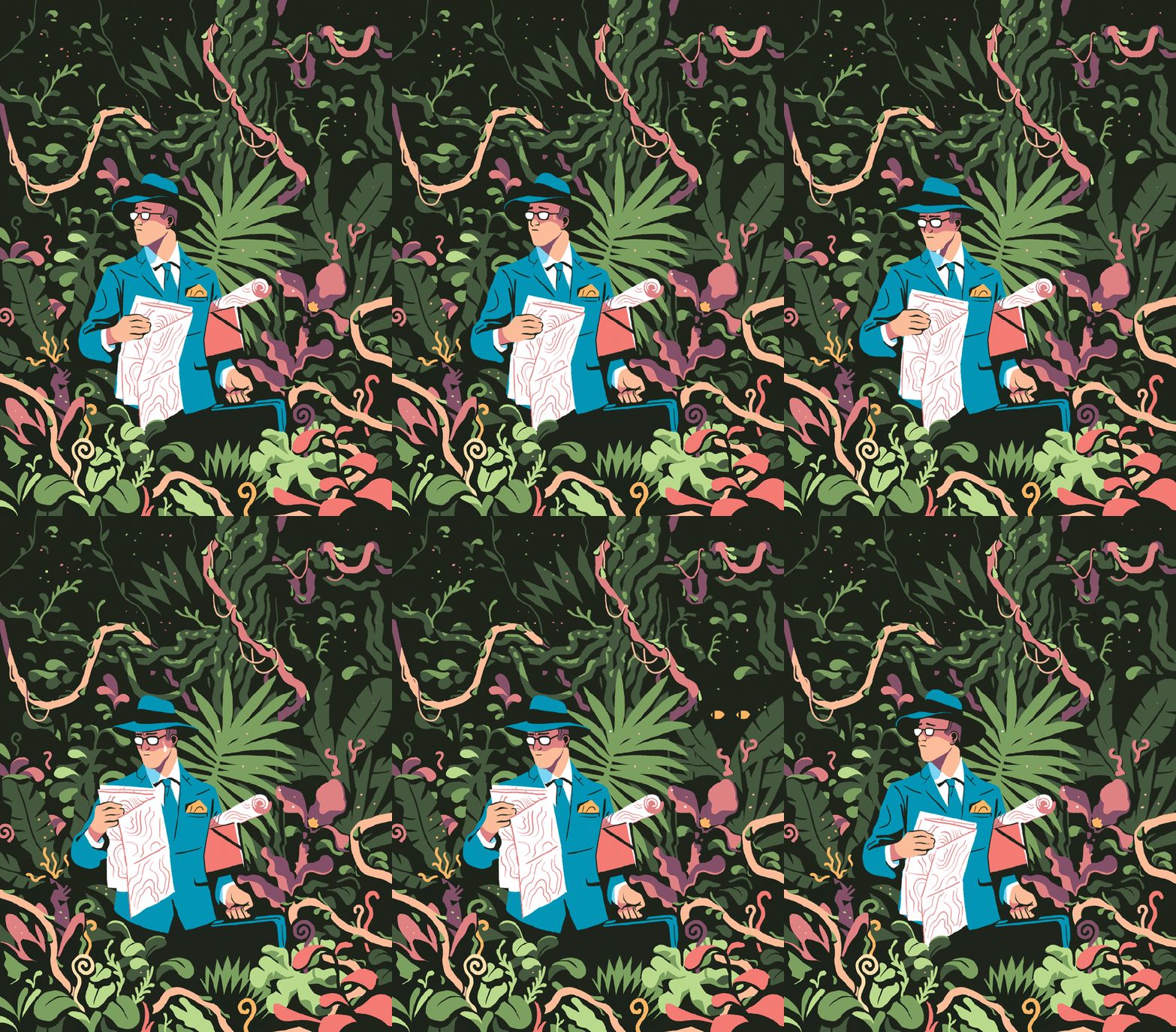
My favourite thing about this piece is the colour scheme, followed closely by the man’s face and posture. I think I’ll have to borrow this colour scheme for one of my Futures illustration pieces. Don’t let me forget! It’s very limited, but that’s what makes it lovely. It’s got an almost vintage feeling about it.
I love nature, so I’m tempted to steal the shapes and colours of some of the fauna here. Bless this guy… Looks like he made a really bad wrong turn somewhere.
Another good example of a successful limited colour pallette. It reminds me of a scren print or a lino print, where you’re keeping it simple with limited colours. The composition is even, e.g. the tan coat being reflected in the leftmost woman’s ginger hair. It’s cut-out, sharp shading makes it feel very graphic, which I like.

Although his work is digital, I will try to recreate the feeling traditionally. I love working digitally, but right now it always pushes me into the same routine and style, which isn’t what I need. I like to manipulate media physically at the moment.

Future of the Body: Week Two

Future of the Body: Week Two

I started a worksheet for week two. I’d been very excited about working in my sketchbook, but I thought that for experimentation’s sake, I’d work larger.

I had a one-to-one chat with Emma. She said her favourite work of mine was the drawing-heavy women with bio-luminescent body alterations. She also suggested that I continue drawing and brainstorming products for a future sci-fi type audience, since I’d done plenty enough research and context.

Wahoo! I couldn’t have asked for a more affirming conversation, since that’s what I really enjoyed doing. I had recently found some other inspiring illustrators, so I began drawing.

You can see media used ranges from watercolour to collage and marker.

Where am I going to take this next?

I’m going to fill the space up with drawings and keep my judgement suspended until then. After that, I’ll either complete another whole experimental sheet or run some self evaluation before I complete any more work. Once I’ve identified what I like a lot, it will allow me to refine the ideas and create more sophisticated work.

I feel I should mention that because Brighton have required an e-portfolio from me on next Tuesday, this project will run slowly until then. After that, I have an interview and will need to design a portfolio for that too. I’m juggling my time and this isn’t my priority right now!

Future of the Body: Week One

Future of the Body: Week One

This project is the first one in which we are really given free reign over what we do. I’ve been drawn to sci-fi and futuristic, creative body alterations or modifications.

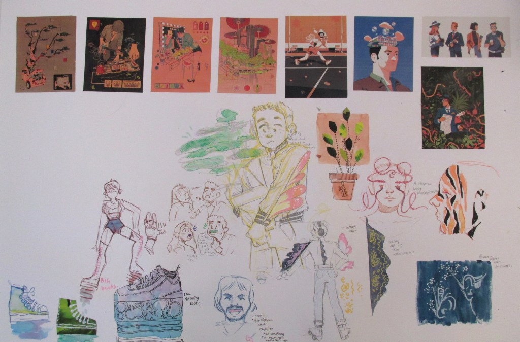
All of my scribbled ideas and pathways are in my sketchbook, in mind maps or where I can find space – but what I’m documenting is the ideas I’ve taken a little further – to thumbnailing and experimenting visually.

This was an idea for bioluminescent body alterations, a new beauty standard that exists in the future. I saw an interesting article about futuristic body modification in a fashion show called A.Human, which inspired a lot of these images. I collected a range of bioluminescent animal photo references in order to be inspired here.

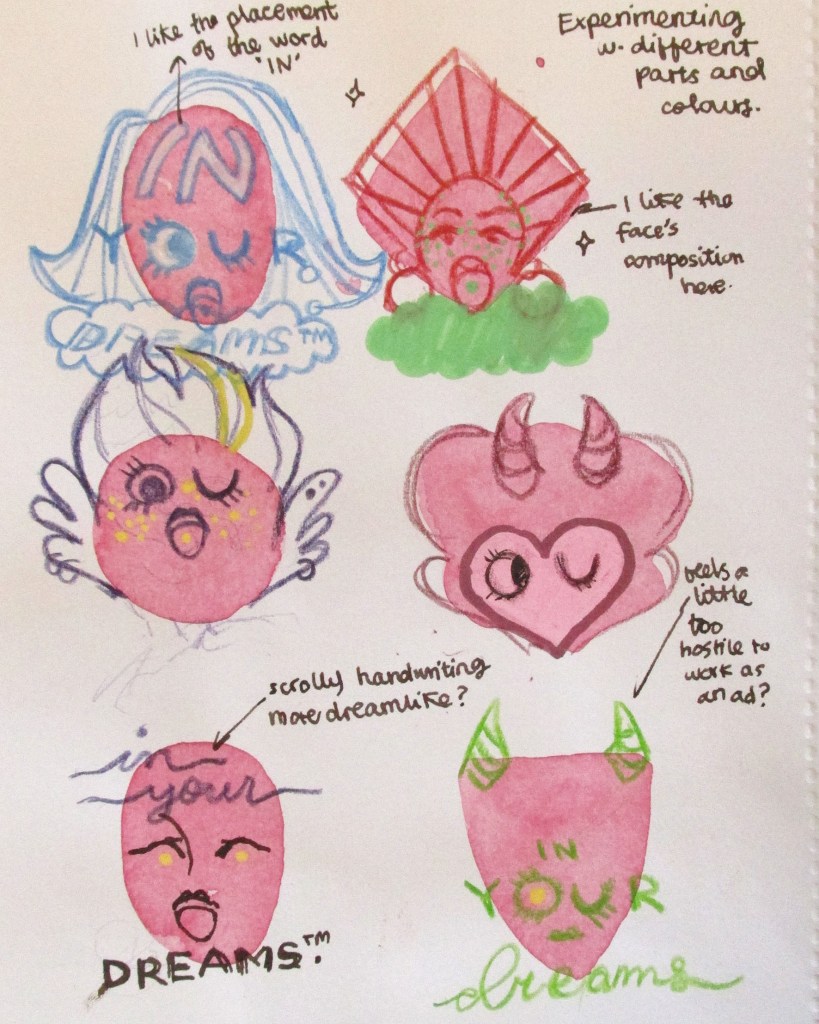
You can see the beginning of an idea here. The concept is a pill that you can take which contains a script for a dream that has been pre-recorded. When the user falls asleep, they will experience that pleasant dream. I imagine they’d range from adventures to friendships to romantic and sexual exploits. You can see I play with words for possible brand names – find In Your Dreams – and then immediately thumbnail a possible logo.

This concept was directly inspired by one of Issac Asimov’s short stories, in which a corporation sells dreams and employs creative thinkers to imagine and “record” for them.

On this page you can see I develop the logo so that it has a graphic elegance – an eye winking. I moved away from the realism I’d been sketching before to experiment with bright colours. I continually evaluate the designs with notes to the side.

This page was a fun one to do. I started by laying down the basic watercolor shapes to force myself to include variation. I was happy I did this, because the top right design really spoke to me – so I took it further.

This is where I am currently with this train of thought. You can see some possible brand poster thumbnails – but I’m also considering actually creating the brand packaging for the pills too.

What do I need to do next?

I’m aware that I’ve gone quite specific quite early with this train of thought. I actually plan to do some collage work, create another mind map and widen all of my thinking back out again. With all of my research into sci-fi and notes I’ve taken, I’ll find another path of interest to liaise with for the next week.

Artist Research: David Klein: Future

Artist Research: David Klein: Future

David Klein is an artist that worked from the 1930s through his life to the end of the 20th Century. He was an illustrator that worked widely and across multiple media, but his hallmark work was for TWA travel agency in the 50’s and 60’s.

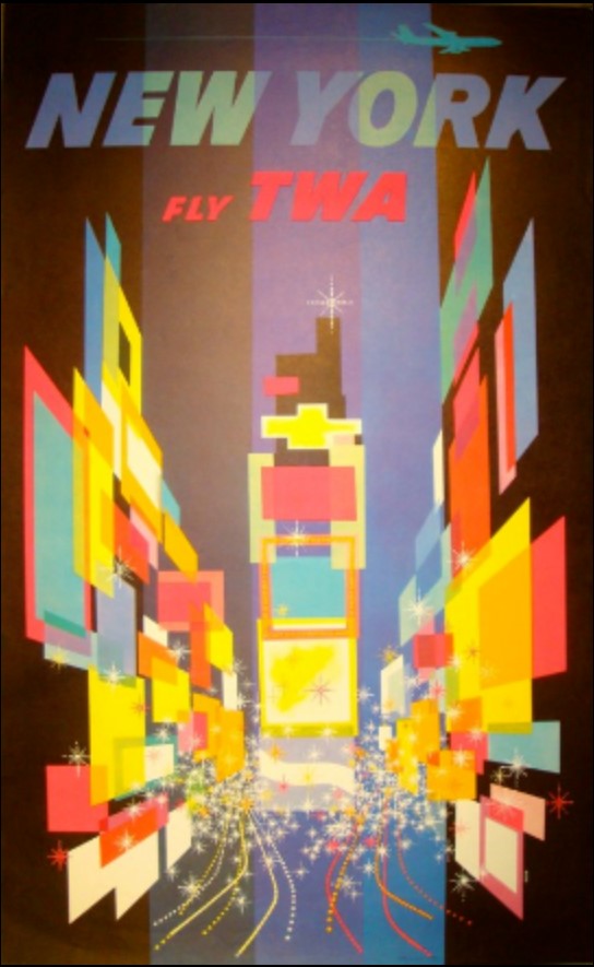
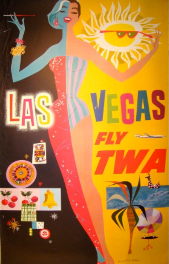
His abstract, brightly coloured representations of places and landmarks set the tone for a lot of poster art at the time. I’ve included a couple of my favourite images here.

Here’s a sneak peek at my thought process: after a long Christmas of thought, I’ve slowly gravitated towards the idea of futuristic advertisements – and more specifically, products from the future and adverts for them. These products, I want them to be mental and fun. I’ve been brainstorming with some boys in my life who play a lot of video games set in alternate futures, or like sci-fi.

This came from reading a book I got for Christmas about Pop Art and the history of Pop Art. I really like the kind of enthusiastic, hyperbolic and miracle-selling tone that 50’s and 60’s advertisements get across. I want to apply those conventions and feelings in my futuristic art.

Thus, I’ve started taking a lazy look at some of the famous advertisement artists of that time, to get inspiration for colours, compositions and feelings. David Klein’s work appeals to me a lot! The pieces make me feel good.

The reds, oranges and yellows in this piece are really vibrant. I like the repeated image of the birds and the triangles that create the sun. The way the bells are drawn is also quite freehand, like my own style. I might use the simple triangle and diamond shapes in my own work.
The brightness of the colours here is lovely. Using squares and rectangles to create perspective and a sense of depth is very clever, and something I might use in a background of a piece.
I can’t resist art of pretty ladies. Her long legs make me happy! I want to be including pretty women in my product ads, to emanate that “50’s housewife glam” feeling of vintage ads.
This is one of Klein’s other illustrations. I like the bright colours and textures; almost feels like crayon or wax resist. Bright colours and bright, simple shapes.
I’ve been thinking about some kind of instant food – a powder, probably, that has “just add water” to make it a full and complete meal! So maybe I’ll use this composition as inspiration for that. These look like lino cuts. I never considered lino cutting for this project…. interesting….

Source: David Klein, Illustrator, viewed 05/01/2020, http://www.davidkleinart.com/Home.html