Future of the Body: Week Four

Future of the Body: Week Four

The group crit from last week left me in a good position. Since then, I’ve been creating illustrated packaging for Spaceoline.

The illustrations are a massive mixture of all of my research up to this point and a lot of new picture references, which I have saved to my drive. I’ll collage them in my sketchbook when I get the time… which it looks like won’t be for a little while. Yikes.

This is the finished jacket for a small pill pot. The limited colour scheme is inspired by one of my favourite images by Bruno Mangyoku. The textures within it are pretty directly inspired by my texture and experimental work from the previous worksheets.

What do I feel was successful? I was really happy with this pot. I feel like the checked effect worked well, as well as the automaton hand. The limited colour scheme worked very well too – so I took it into the next piece of packaging.

This is the front cover of the Spaceoline pill packet net in production.

I had to do some pretty intense problem solving here, so I thought I’d mention it. When I started to add the black watercolour in, when I was painting crisp lines next to previously coloured spaces it bled into the watercolour pigment. This was ugly and a huge issue because I was working so small. See the top image: I realised quickly that I couldn’t continue to paint,

I thought about it, and ended up using a black fineliner to outline any coloured work to create a barrier between the colours. This worked pretty well, and staved off disaster! I used the knowledge with the back side of the pill packet, which came out far more crisply in terms of rendering the design.

What do I feel was successful? I reused the check design, coming out of a rocket just like in one of my early worksheets. I love the font I ended up deciding on for the word Spaceoline, and the phrase “When in doubt, Space out!”

You can see here that it’s a far clearer piece of work than the front, simply because I bought all of the knowledge and problem solving through with me to create this piece.

Here, I really liked the space hostess. I based her outfit pretty directly from the ones in PanAm: a show I haven’t watched and an airline I don’t know much about, but do like the glamorous, vintage hostess feeling. Like the ladies from Fifth Element on the cruise ship to Floston Paradise.

Where am I going to take this?

I plan to scan these pill packet nets in to keep the design safe and high quality. Then I’ll use the scanned designs to make up some actual packets, which I’m looking forward to!

The project is actually finishing this week, and assessment is next week. Furthermore, I have a terribly busy week with two interviews to prepare for just before the assessment.

It Feels Like We Only Go Backwards – Personal Research

It Feels Like We Only Go Backwards – Personal Research

Inspired by Lucy’s colour theory workshop, I experimented with colour in creating a watercolour illustration. In creating the work, I also learned a lot of other things.

The inspiration behind the illustration was personal: a couple of weeks ago, I was in Pebworth with Freddie, Jamie and Lily. Lily and Freddie smoked out of his window, and we were having such a good time I wanted to illustrate it. I worked almost entirely from memory.

Lucy encouraged us to use images as inspiration for colour schemes. I started by quickly drawing out the bright outfit I remember her wearing that night, because that was the statement image I wanted to base the whole illustration around. In further colour bar practice, you can see I added a few different colours – like a yellow for her bleached hair, or a pink and peach.
Here you can see I copied out a sketchy thumbnail 4 times and experimented with colour. I started by religiously using colours from the scheme before, but it wasn’t making me so happy. Establishing tones in a greyscale version was me trying to think outside the box. You can see it’s quite different to the top two and I preferred it.
This is a progress picture. One of the biggest problems to solve was in using my masking fluid: it’s in an annoying bottle and every time I use a brush with it, it PERMANENTLY ruins the brush with all the scraps that roll up deep inside the bristles. Here, I used a dip pen with a wide nib. I’d seen an illustrator on Instagram (Sibylline Meynet) do it.

In lining and subsequently using the masking fluid, I learned a few things.

  • The dip pen was a little unpredictable and difficult to use. You can see it bleeds large blobs of fluid sometimes, and sometimes runs too thin.
  • The Windsor and Newton Sepia lining ink I use to line bled underneath it, which is a big issue. I might want to try using Indian ink next time … but I’ve fallen in love with the sepia ink and its water insolubility. I might just be more careful or precise next time.
This is the final illustration. Colours referenced from the thumbnails. You can see I changed the picture frame to the left into a music poster because I thought it was more interesting, and Freddie really does have it in his room so it resonated with me.

I chose the brightest red for Lily’s coat, coupled with very pale skin, in the hopes that that’s where the eye will naturally fall.

Colouring the piece presented fewer difficulties than using the masking fluid did – simply because I’ve watercolored so many hundreds of things that I’ve pretty much trialed-and-errored my way into a practice I’m happy with.

Something I would like to try is stretched paper! Working with such wet medium means it does warp a little. I dream of that really thick, fibrous, cold-pressed watercolour paper that’s really expensive in art shops.

Fashion Browsing and Joana Vasconcelos

Fashion Browsing and Joana Vasconcelos

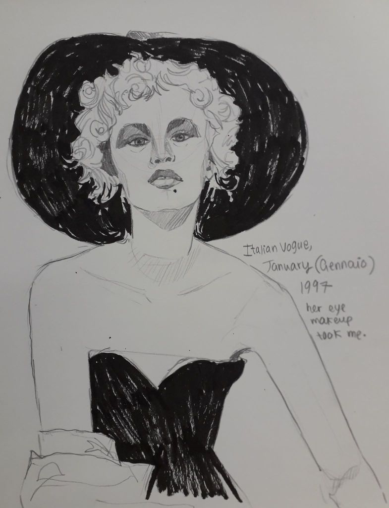
To alleviate some boredom today after Jamie’s morning departure, I headed to the University Library and looked through some old Italian Vogue and other fashion publications. In the last half an hour before the bus home was due, I found an artist called Vasconcelos in the latest issue of Craft, and it would be a shame not to get brownie points for so-called artist research so I’m blogging about her.

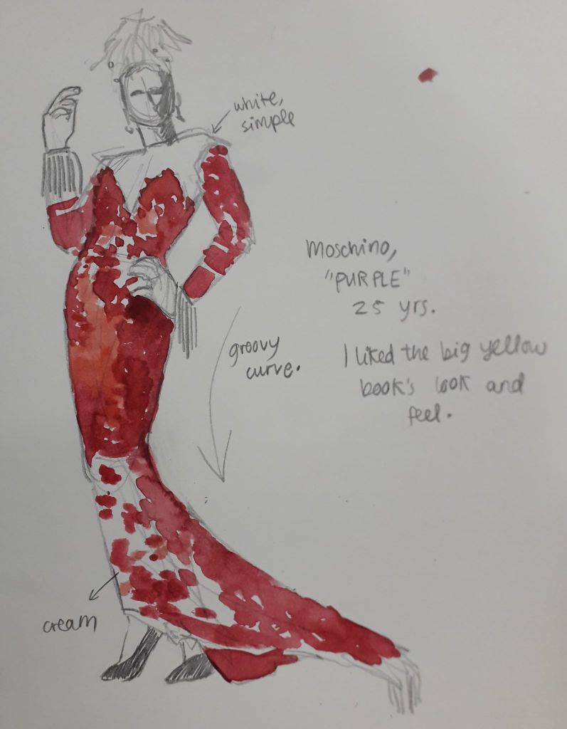
Firstly, I will upload the two sketches I made from the Library’s journal archives. I might have been more productive, but I was overdue a call from Mum which took me half an hour – and the basement lights just occasionally switched off because I was sitting still and alone! I had to partake in some comedic arm flailing followed by resigned power walks around the department to get it to realise there was indeed life down there.

I liked the contrast in this black and white photo. The woman had a little more contempt in her eyes than I managed to convey here, which I regret!
This was a quick figure sketch that took my eye because of the ridiculous curvature of the whole composition. The draping fabric and the lean meant the model has a very satisfying overall curve, which was clearly intentional.
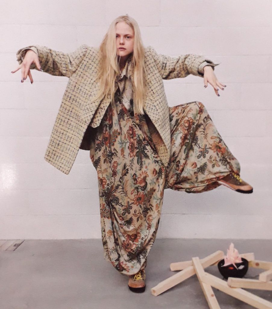
I didn’t get the chance to draw this mad lass but I did take a picture just to save her! I like the big shapes this pose creates, and the unusual patterns.

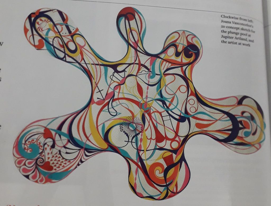
Finally – Vasconcelos. This was an artist who was commissioned to make a year-long, permanent piece of art to sit in a gallery-esque area called Jupiter (or something similar; excuse my memory). She created a 9-metre diameter pool full of 11,500 unique tiles that all created a design.

The pool itself doesn’t really resonate with me, but I though it would be worth writing about because Vasconcelos’ ideas were interesting. The installation (called “Gateway”) was described as “A joyful, optimistic work with a theatrical element.” Now, I like that. Joyful and optimistic is the ideology I can get behind!

Vasconcelos also talks about ley lines and connecting with the energy of the land. The icons and images within the design all have meaning; specifically to Bonnington, Scotland, where the installation resides. There are also astrological and spiritual aspects to the design. I’m not saying I believe in any of that stuff particularly strongly, but the careful thought behind the installation gave me a real respect for it. I suppose it’s the whole process shaping the outcome idea.

That being said, every ceramic tile had to be painted and fired individually. That’s 11,500 tiles. The use of ceramic in Edinburgh is apparently not as developed as Vasconcelos’ own practice, so it was also an exercise in sharing knowledge between cities and expanding Vasconcelos’ horizons in terms of scale.

Anyhoops, I liked her after I read the article. Knowing the artist and the thought behind her work has also led to me really liking the installation as well, despite it originally evoking no real reaction at all.

Survival kit, And Life

Survival kit, And Life

I’ve not updated in a little while because I spent Monday to Thursday last week up in Cardiff with Jamie on a mini holiday… then after 24 hours back home, I had to come back up with my siblings for the bank holiday weekend!

Now I’m up with them it’s a lot less intense than the holiday with Jamie, so I’ve had a chance to work on my art properly.

With Jamie, we went into Cardiff Central, Cardiff Bay, round cocktail bars with Dad and Rachael and then out to a nightclub (for the first time for me! It was fun!)

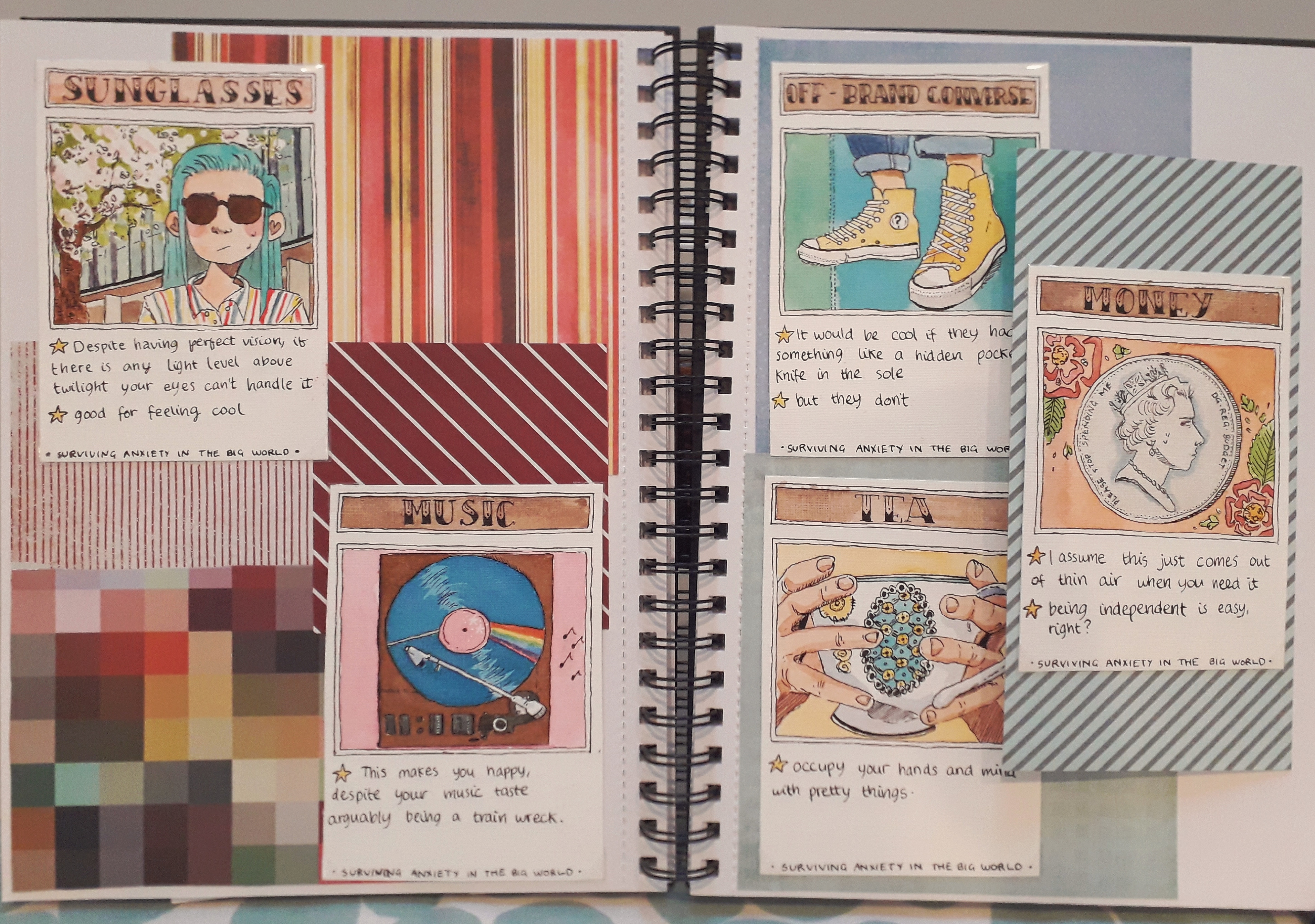
I finished up the five cards in my survival kit and arranged them on a double page spread. I’m really proud of them; each took a long time of planning, sketching, lining and then colouring.

It may seem a little small. Hopefully you can zoom in if you want to look closer – it’s a good enough quality photo.

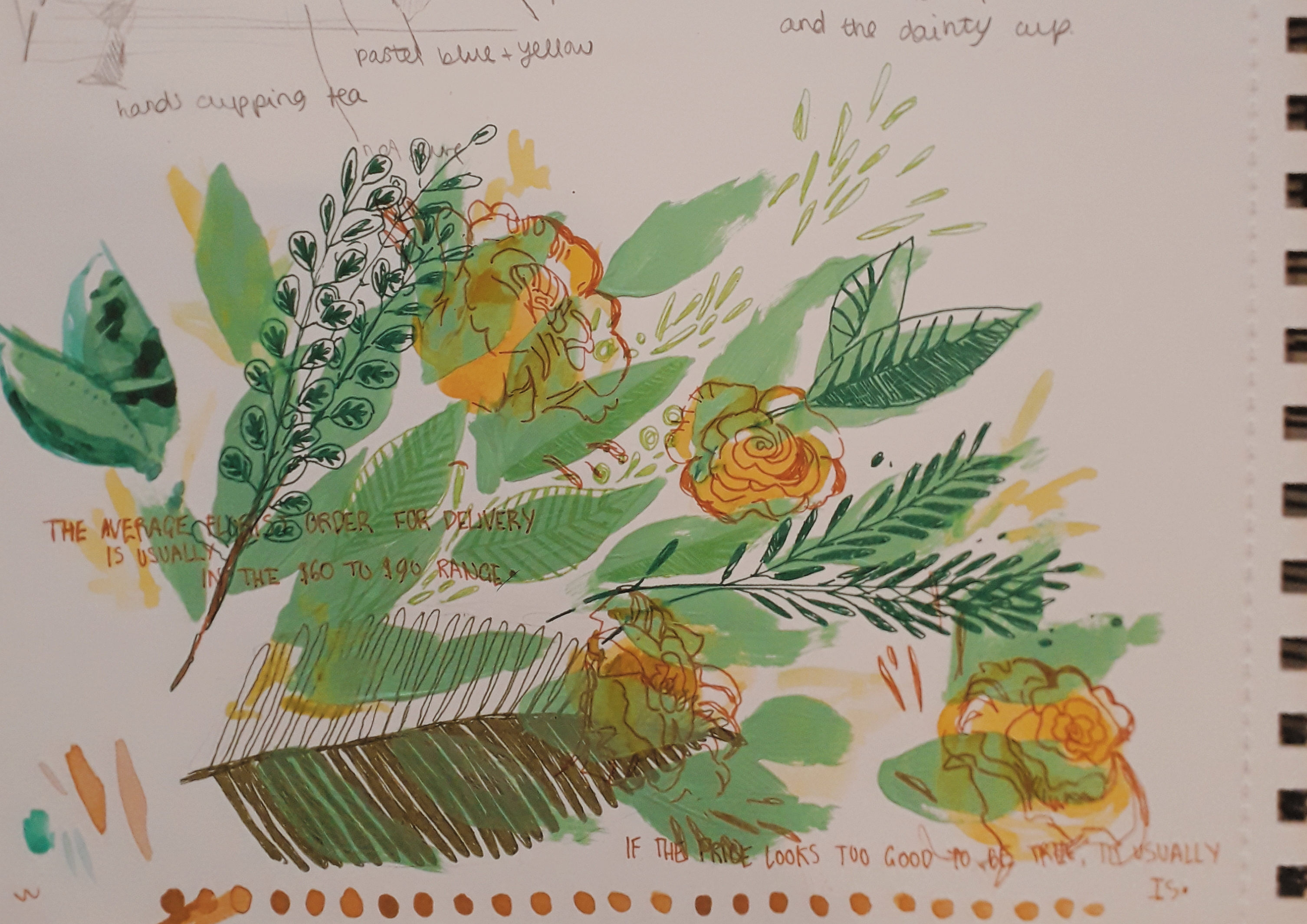
I also painted a little half page of flora and leaves, just as an experiment in using different media. I’m pretty happy with how it turned out.

I’ve filled in about eight thousand info pages on myself and applied for all sorts of basic things. My accomodation is confirmed and I’ve paid some important fees for the beginning of the course.

Seems like no matter how nervous you can be, time will slowly drag things into place. No amount of convincing could have told me that a month ago, though.

Art From Crete

Art From Crete

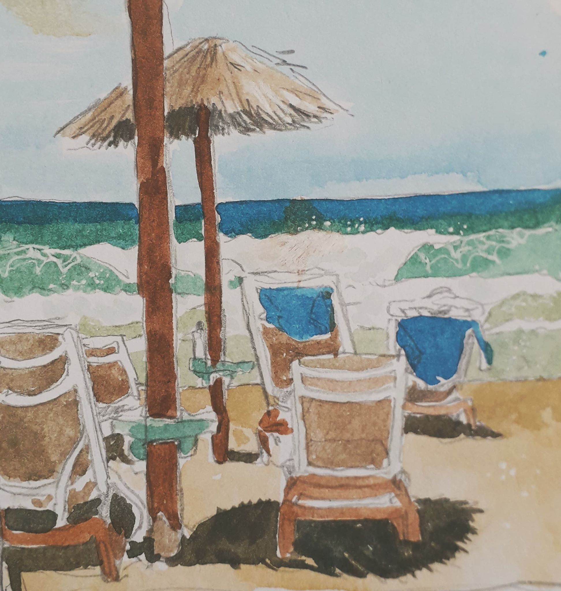
During my time in Crete, I tried to paint from life (or at least sketch) every day. I also wrote a couple of notes on dated paintings about what I’d been up to, almost in the style of a diary. The format keeps me going.

Here, in no particular order (except of my preference!) are the pieces of work from that week.

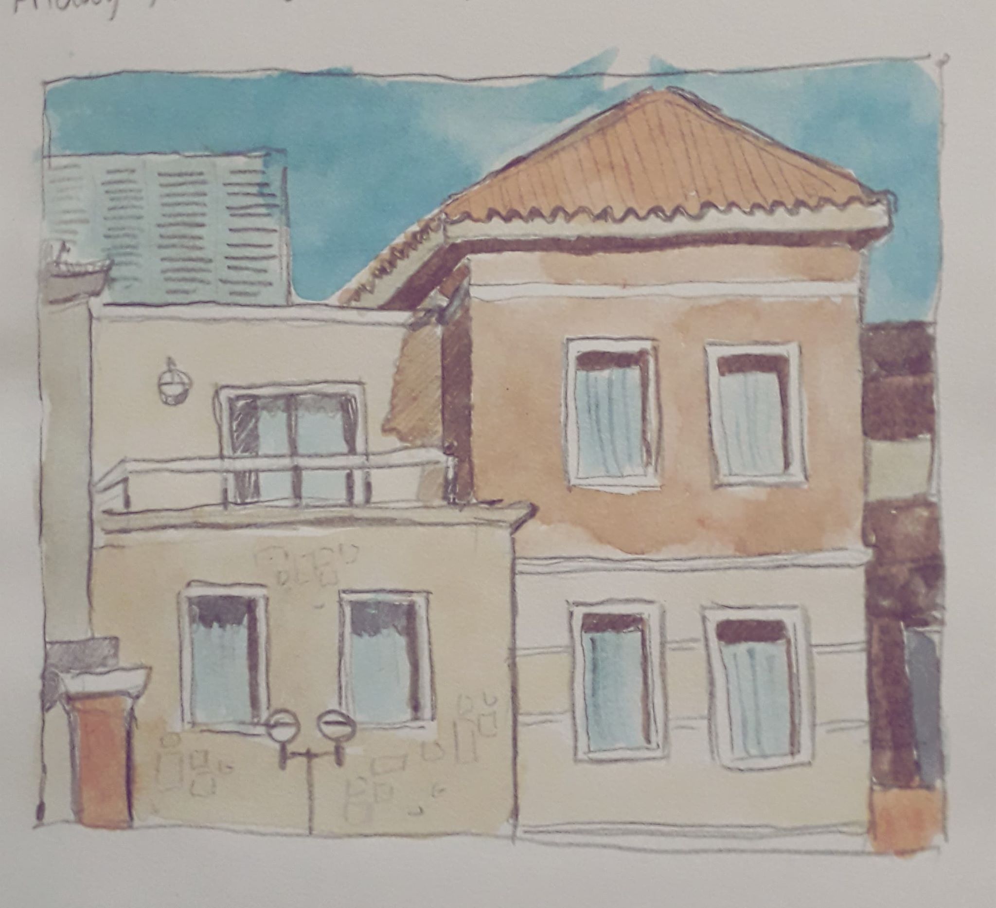
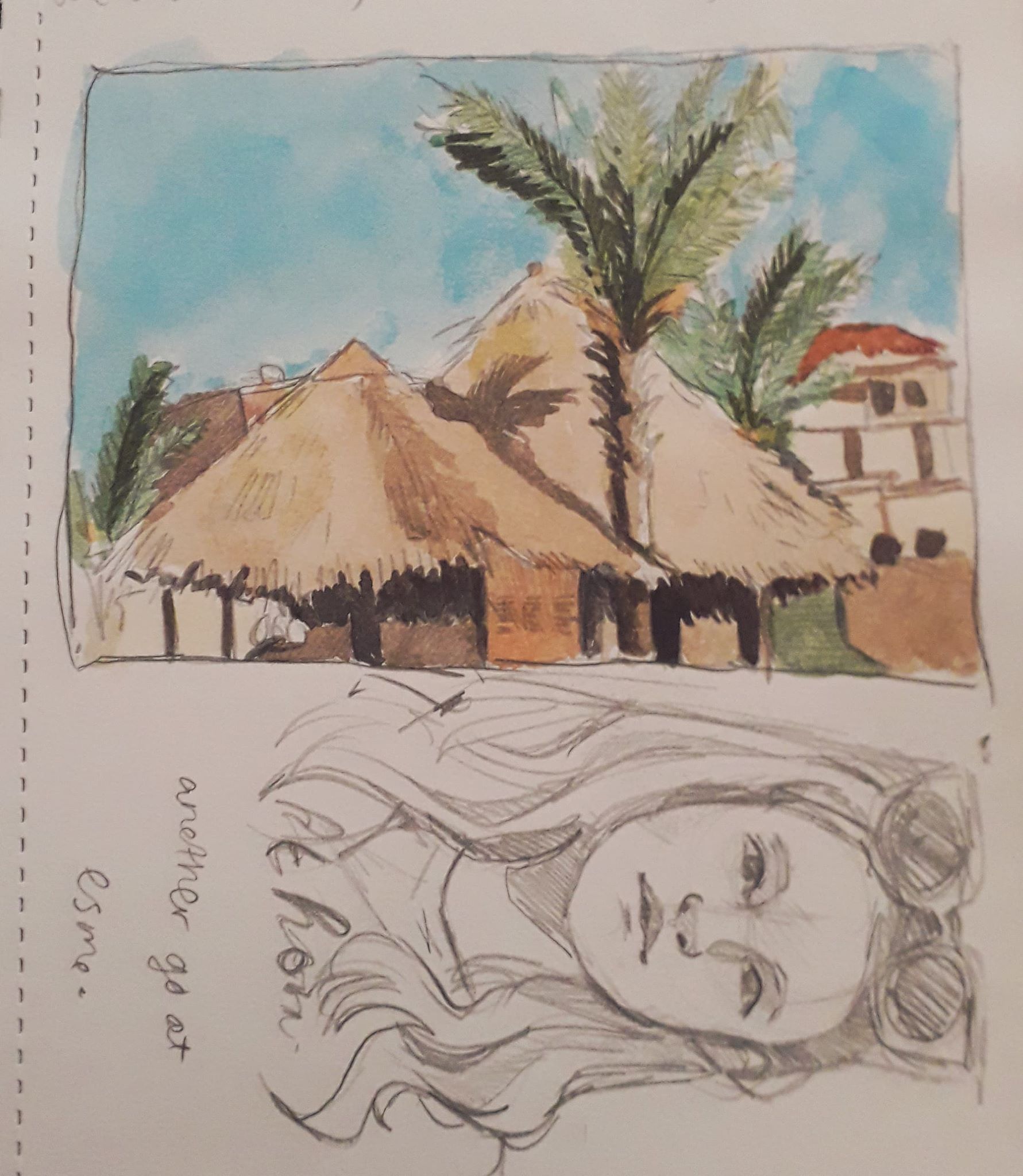
I saw these buildings while playing catch with Esme. I grew so distracted I had to get out of the pool and draw them – to her annoyance… but wasn’t it worth it!
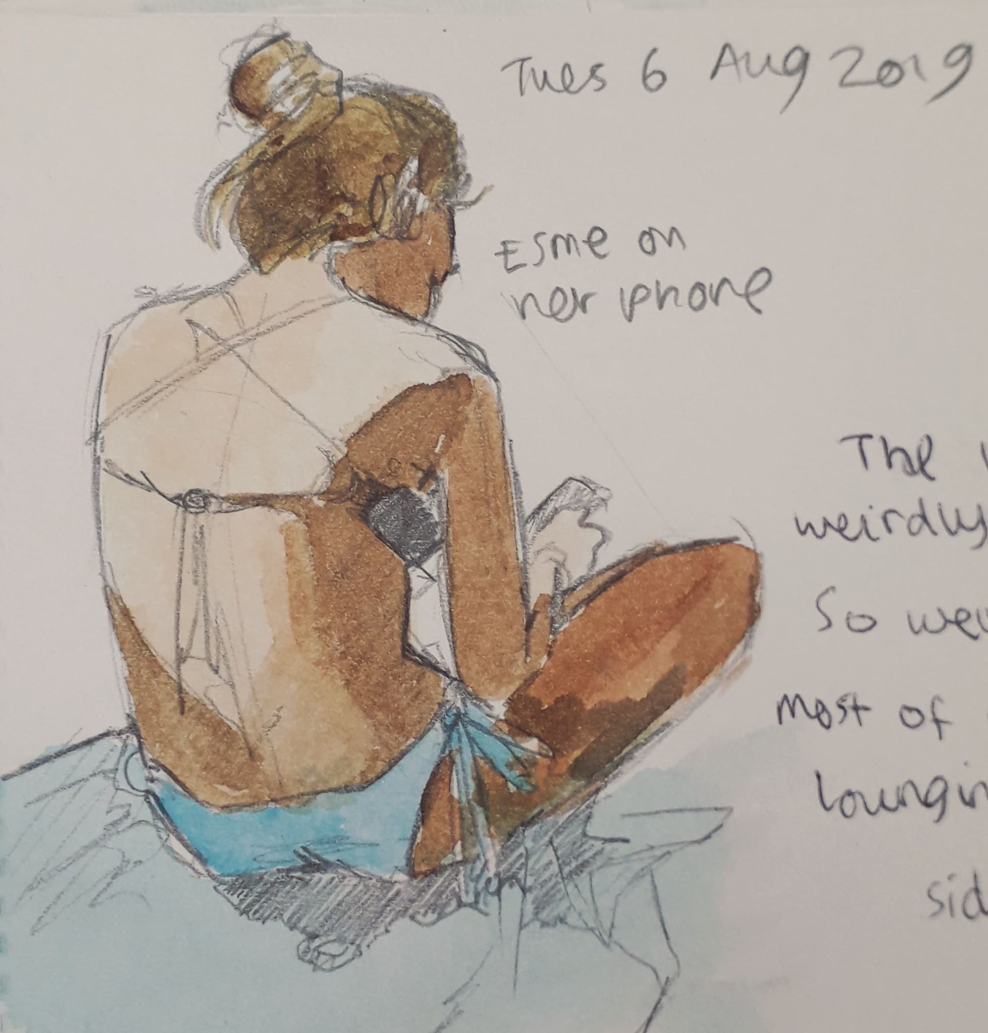
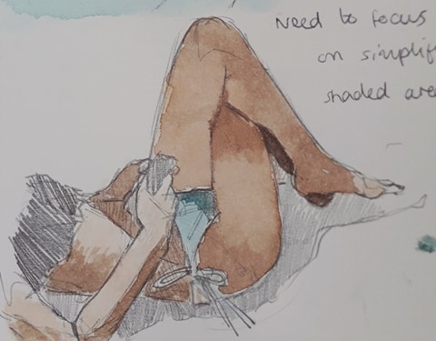
Esme has a nice body to draw. She’s very kind and usually stays still if I mention I’d like to draw her.
These were the roofs of a bar called the Guru Bar. Good cocktails.
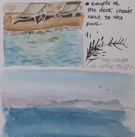
Not so proud of these, but mistakes have to be made!

I’m proud of the fact that I’m determinedly drawing backgrounds and inanimate objects, as these things are out of my comfort zone (people being my Thing*tm*). The sense of space and proportion is different and I like to think the practice is helping.

My colour theory is also improving; with a determinism to record scenes properly comes a compulsion to add colour to make it a little more lifelike. Desaturated colours are interesting especially.

Being back has been nice. I’d missed Jamie and it was beginning to feel a little shitey, despite the Greek sun and the beautiful beach. I’d forgotten how comfortable cardigans could be!