Exquisite Corpse Reflective

Exquisite Corpse Reflective

The point of this lesson was to imitate a parlour game from the 17th Century called Corpus Exquis, or Exquisite Corpse. This involves cutting up and collaging images to create figurative characters. They are just recognisable as human but have a surreal or creepy feeling to them.

The head our group created in the first workshop.

The first exercise was collaborative. We created a head as a trio, and other groups created bodies and legs. These were placed together.
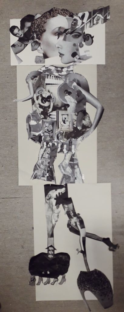
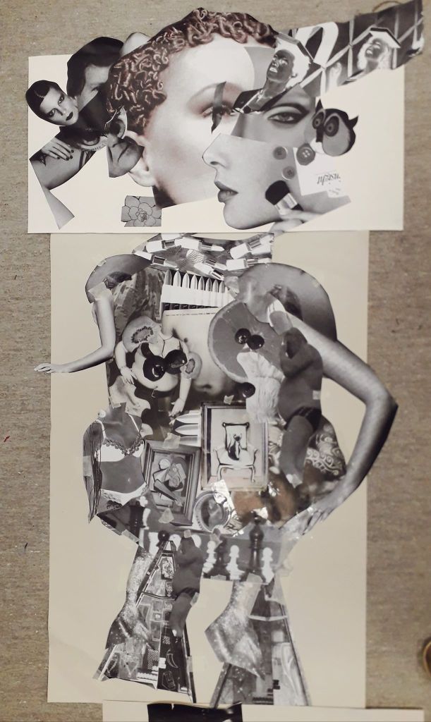
This was the entire body. I have to say I prefer the top two units compositionally.

What I was really happy with in this exercise was the collaboration. The strip of eye over an existing eye delighted me, and I would never have thought to do it. The diagonal row of faces leading out from the center of our head was Martha’s idea, and that again became one of my favourite parts.

Another really useful element was learning how to use the photocopier and scaling things up or down as well as playing with colour. This I will definitely use in my work outside of classes, to create iterations of characters or ideas.
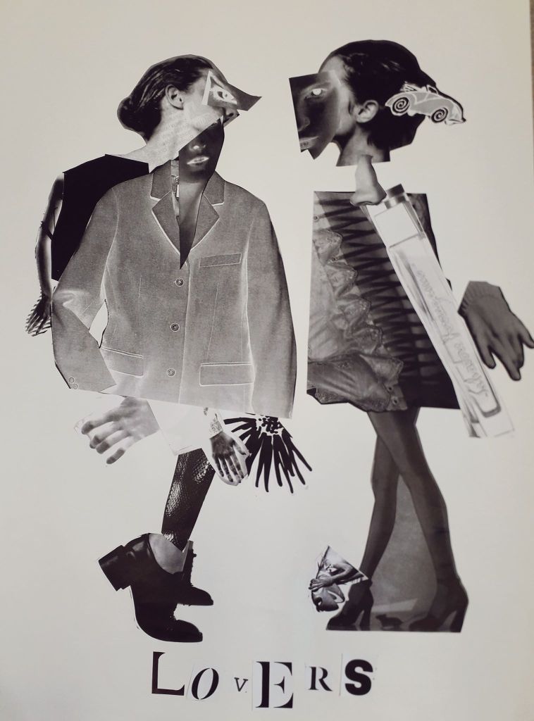
“Lovers” – the final half of the day was a solo project creating characters similarly to the morning’s.

I was very pleased with how Lovers came out. I didn’t start off with any idea in mind except with all of the sheets full of images that took my fancy. A pair of heads on one sheet looking at each other became the base of the two faces, with other features stuck on top.

Even though this project was on my own, I ended up using a large jacket that Martha didn’t want to clothe my left Lover after having nothing the right shape myself. So it still wouldn’t have looked like it does, had I been working alone outside the studio.

How could I take this further? I have a Vogue magazine now which I think I will use to repeat this exercise at some point; if not the exact same then on a slightly smaller scale (to save my printer money!). I will also place Lovers into Clip Studio Paint and experiment with layer effects to create a series.

The Unconventional Body Reflective

The Unconventional Body Reflective

The first half of the morning – dressing the mannequin – I have to admit I really didn’t enjoy.

Despite the fact that we took essentially a whole day out to gather materials, Martha and I didn’t have anything to create really striking shapes. Martha ended up constructing cool shoulder-pad things out of cardboard, but I just couldn’t get myself passionate about it.

Our finished mannequin. I liked the tape, but the morning was too stressful to really enjoy.
Some of our other collected objects.
There was a smaller mannequin I might well have enjoyed working on. I didn’t really get the chance to experiment for myself because of course it was a teamwork project.
The fold-out sketchbook I’ve since compiled in my normal sketchbook. The quality isn’t great, but it’s all in my sketchbook so I feel the reflective doesn’t suffer too much.

The drawing element during the second half of the day lifted my mood considerably. I finally got a real look inside my Artway box (I go NUTS over new art supplies!). I really enjoy fast-paced drawing because I know it’s good for me, even though I rarely practice it on my own. I feel like the course making me do drawing exercises is the equivalent to my mum forcing me to eat vegetables just to get something nutritious in me.

What could I have improved? I could have bought something huge to create an initial shape on my mannequin. It would have saved time and energy. It was bad luck that we live in halls and were the first group doing it, as every other group had free use of all our bought materials as well.

I feel like I didn’t work particularly well with Martha. We were both in a weird headspace that day and neither of us were talkative, but I felt like neither of us were confident enough with our own ideas to really make a statement on the final mannequin. There wasn’t any bad vibes, just a stressful and uninspired morning.

How will I take it further? I probably won’t work on full size mannequins again. I will use the drawing techniques to work quickly, and the paper collaging element – especially on the human body – helps me produce ideas in a freer sense.

Fashion Browsing and Joana Vasconcelos

Fashion Browsing and Joana Vasconcelos

To alleviate some boredom today after Jamie’s morning departure, I headed to the University Library and looked through some old Italian Vogue and other fashion publications. In the last half an hour before the bus home was due, I found an artist called Vasconcelos in the latest issue of Craft, and it would be a shame not to get brownie points for so-called artist research so I’m blogging about her.

Firstly, I will upload the two sketches I made from the Library’s journal archives. I might have been more productive, but I was overdue a call from Mum which took me half an hour – and the basement lights just occasionally switched off because I was sitting still and alone! I had to partake in some comedic arm flailing followed by resigned power walks around the department to get it to realise there was indeed life down there.

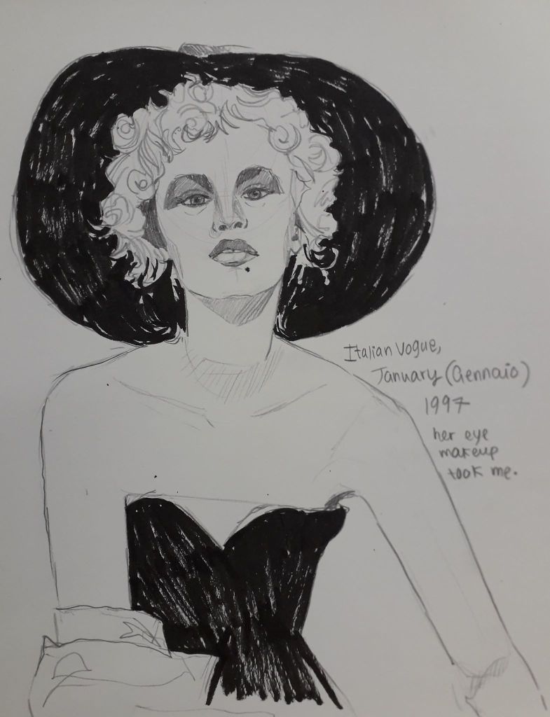
I liked the contrast in this black and white photo. The woman had a little more contempt in her eyes than I managed to convey here, which I regret!
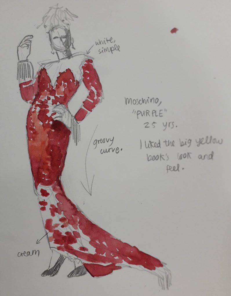
This was a quick figure sketch that took my eye because of the ridiculous curvature of the whole composition. The draping fabric and the lean meant the model has a very satisfying overall curve, which was clearly intentional.
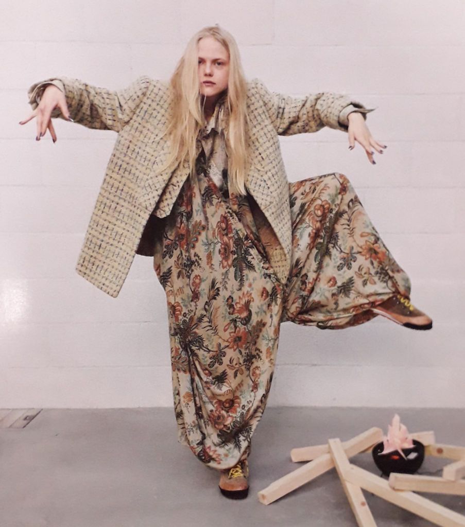
I didn’t get the chance to draw this mad lass but I did take a picture just to save her! I like the big shapes this pose creates, and the unusual patterns.

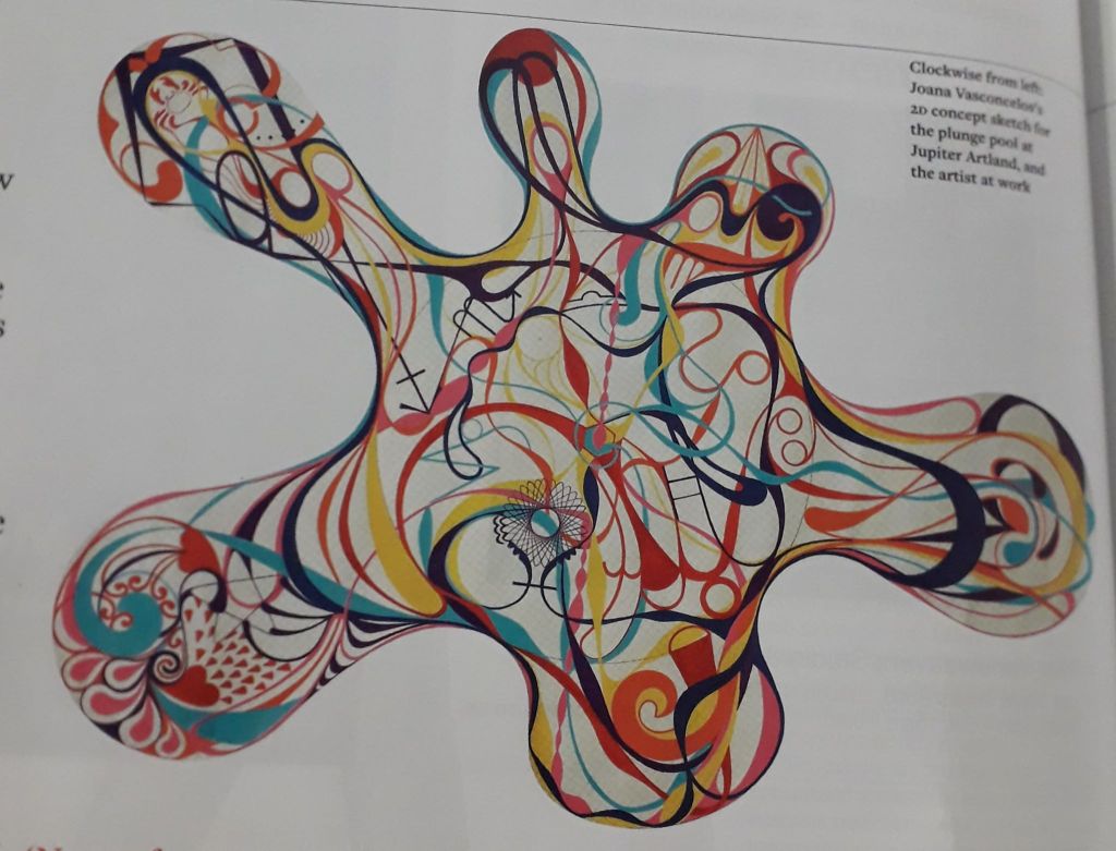
Finally – Vasconcelos. This was an artist who was commissioned to make a year-long, permanent piece of art to sit in a gallery-esque area called Jupiter (or something similar; excuse my memory). She created a 9-metre diameter pool full of 11,500 unique tiles that all created a design.

The pool itself doesn’t really resonate with me, but I though it would be worth writing about because Vasconcelos’ ideas were interesting. The installation (called “Gateway”) was described as “A joyful, optimistic work with a theatrical element.” Now, I like that. Joyful and optimistic is the ideology I can get behind!

Vasconcelos also talks about ley lines and connecting with the energy of the land. The icons and images within the design all have meaning; specifically to Bonnington, Scotland, where the installation resides. There are also astrological and spiritual aspects to the design. I’m not saying I believe in any of that stuff particularly strongly, but the careful thought behind the installation gave me a real respect for it. I suppose it’s the whole process shaping the outcome idea.

That being said, every ceramic tile had to be painted and fired individually. That’s 11,500 tiles. The use of ceramic in Edinburgh is apparently not as developed as Vasconcelos’ own practice, so it was also an exercise in sharing knowledge between cities and expanding Vasconcelos’ horizons in terms of scale.

Anyhoops, I liked her after I read the article. Knowing the artist and the thought behind her work has also led to me really liking the installation as well, despite it originally evoking no real reaction at all.