It Feels Like We Only Go Backwards – Personal Research

It Feels Like We Only Go Backwards – Personal Research

Inspired by Lucy’s colour theory workshop, I experimented with colour in creating a watercolour illustration. In creating the work, I also learned a lot of other things.

The inspiration behind the illustration was personal: a couple of weeks ago, I was in Pebworth with Freddie, Jamie and Lily. Lily and Freddie smoked out of his window, and we were having such a good time I wanted to illustrate it. I worked almost entirely from memory.

Lucy encouraged us to use images as inspiration for colour schemes. I started by quickly drawing out the bright outfit I remember her wearing that night, because that was the statement image I wanted to base the whole illustration around. In further colour bar practice, you can see I added a few different colours – like a yellow for her bleached hair, or a pink and peach.
Here you can see I copied out a sketchy thumbnail 4 times and experimented with colour. I started by religiously using colours from the scheme before, but it wasn’t making me so happy. Establishing tones in a greyscale version was me trying to think outside the box. You can see it’s quite different to the top two and I preferred it.
This is a progress picture. One of the biggest problems to solve was in using my masking fluid: it’s in an annoying bottle and every time I use a brush with it, it PERMANENTLY ruins the brush with all the scraps that roll up deep inside the bristles. Here, I used a dip pen with a wide nib. I’d seen an illustrator on Instagram (Sibylline Meynet) do it.

In lining and subsequently using the masking fluid, I learned a few things.

  • The dip pen was a little unpredictable and difficult to use. You can see it bleeds large blobs of fluid sometimes, and sometimes runs too thin.
  • The Windsor and Newton Sepia lining ink I use to line bled underneath it, which is a big issue. I might want to try using Indian ink next time … but I’ve fallen in love with the sepia ink and its water insolubility. I might just be more careful or precise next time.
This is the final illustration. Colours referenced from the thumbnails. You can see I changed the picture frame to the left into a music poster because I thought it was more interesting, and Freddie really does have it in his room so it resonated with me.

I chose the brightest red for Lily’s coat, coupled with very pale skin, in the hopes that that’s where the eye will naturally fall.

Colouring the piece presented fewer difficulties than using the masking fluid did – simply because I’ve watercolored so many hundreds of things that I’ve pretty much trialed-and-errored my way into a practice I’m happy with.

Something I would like to try is stretched paper! Working with such wet medium means it does warp a little. I dream of that really thick, fibrous, cold-pressed watercolour paper that’s really expensive in art shops.
Mapping Ox Brookes

Mapping Ox Brookes

Everybody got a small brief to create a personal map of the area around them (i.e., ox brookes), to orientate themselves and to show a personal style. I’ve taken pictures of a few maps that really spoke to me, but I have to start with my own.

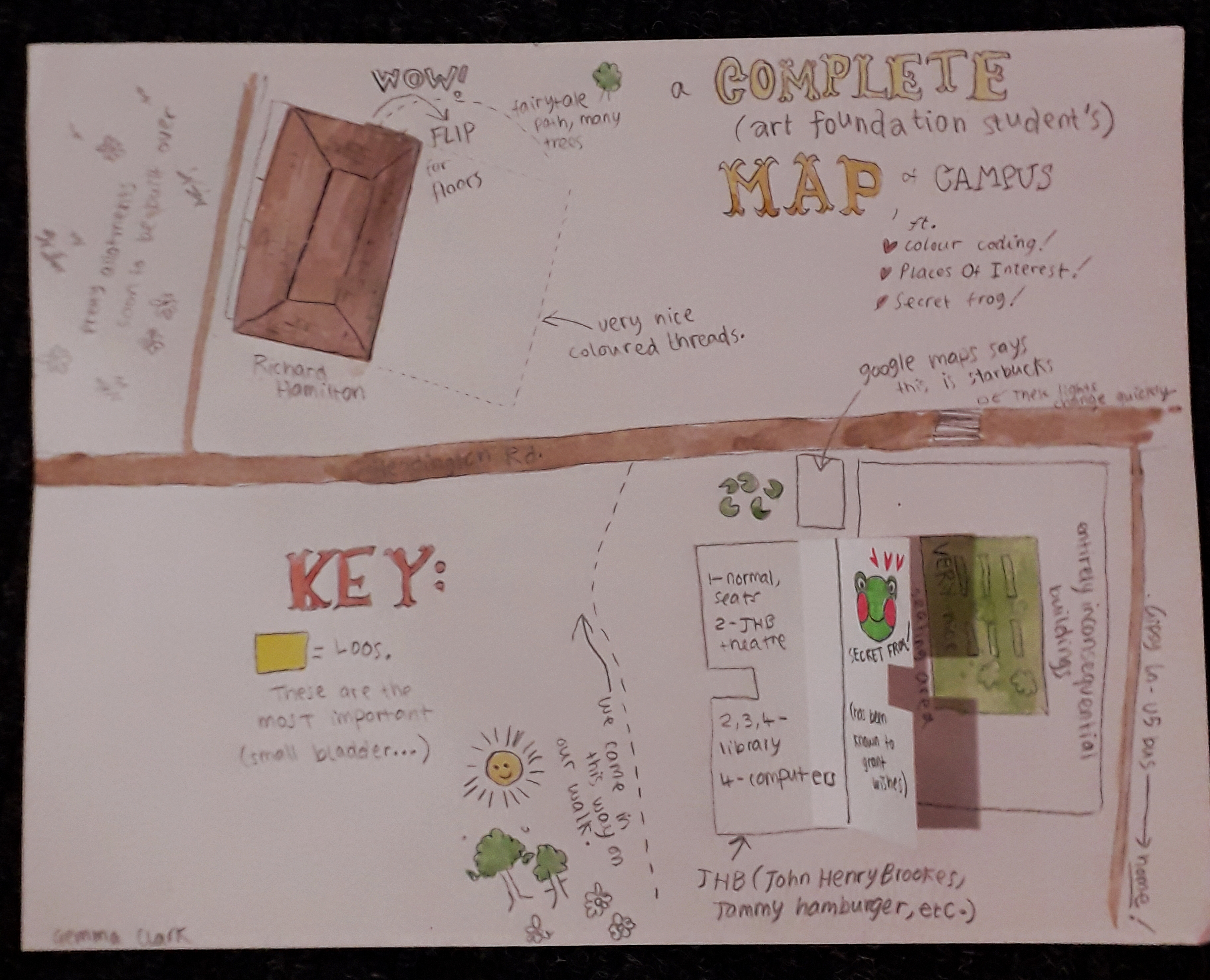
This one is my map. Just smaller than A4.

My map was illustratory and maybe childish in nature; I wrote it excitedly and mapped on things I’d thought at the time of seeing them. I view the area slightly differently now, but I like this because it really is archetypal of my style and brain and it’s documented my first impressions quite sweetly.

The flaps were the main interactive element (secret frog admittedly being a flash of enlightened creativity). The other thing I think was different from most other maps is that mine was bloody wordy – a real stream of consciousness. Other students gave a very personal insight in other ways, which really struck me.

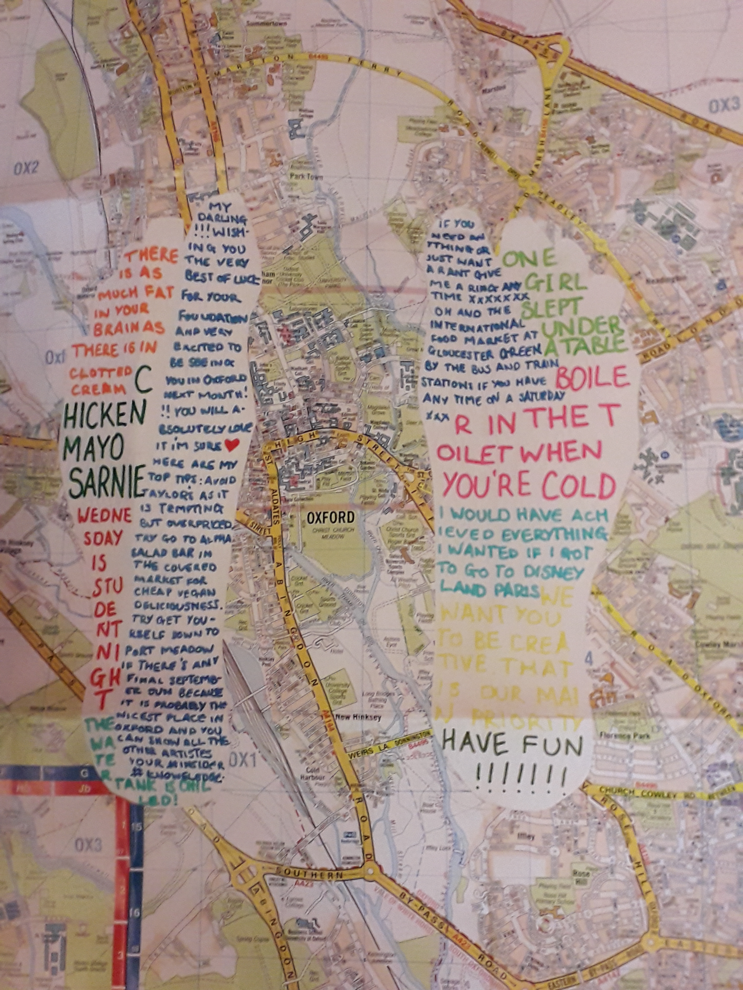
This was an OS map that has been altered.

The OS map with white feet cut into them contained snippets of conversation, presumably from the past week. I recognised a couple from lectures. This is probably my favourite… in seeing what the student has remembered, you see into their mind but totally indirectly. I can’t really overstate how much I like this one – it’s the one that felt the most personal to me.

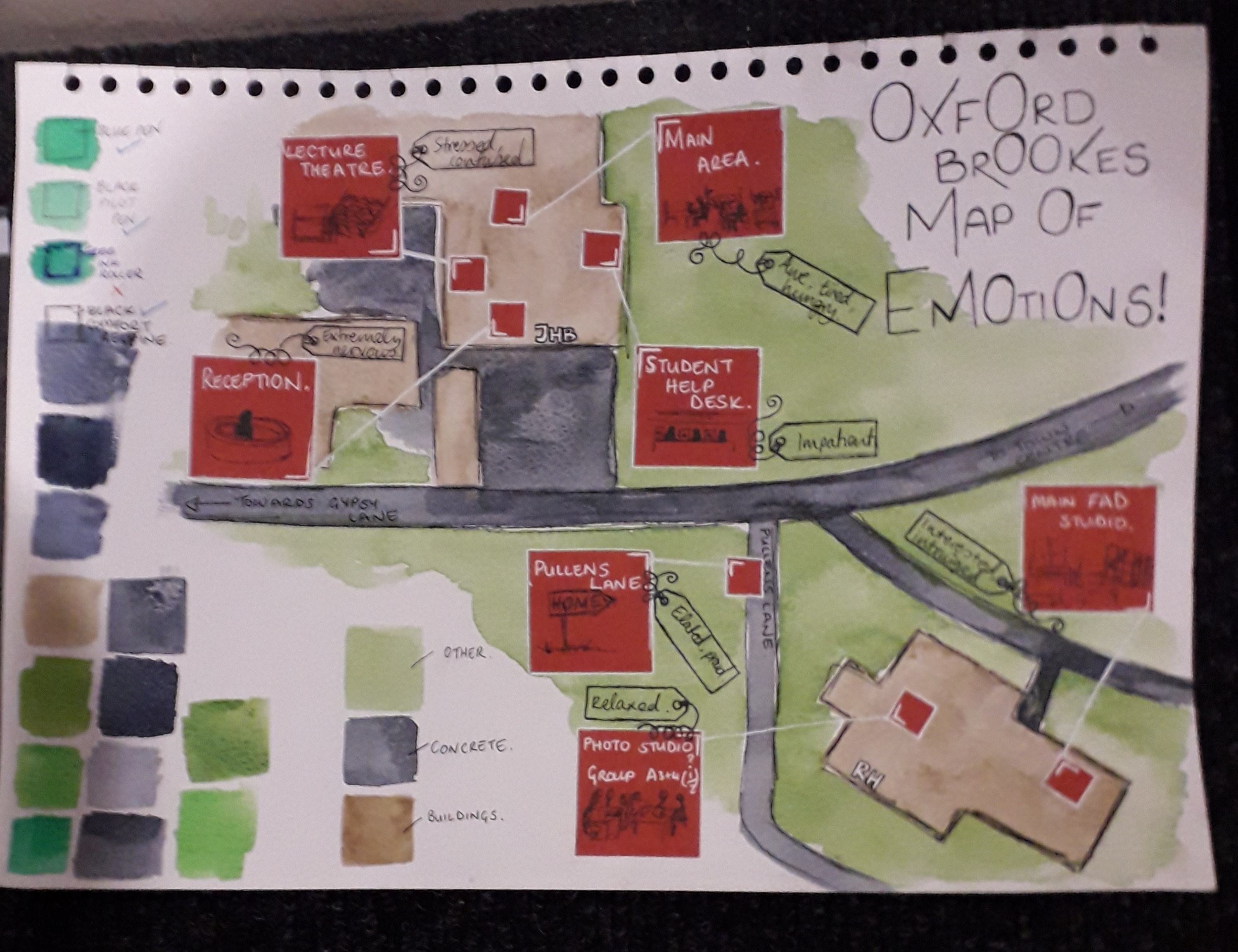
A map – but with emotions. I liked the colour swatching, too.

The map of emotions also hit quite close to my own heart because I remembered feeling most of these things too. It’s maps that are revealing of someone’s inner thoughts that it looks like I’ve gravitated towards. The colours and shapes are pleasant and well thought out as well, with close-ups of red areas filling negative space.

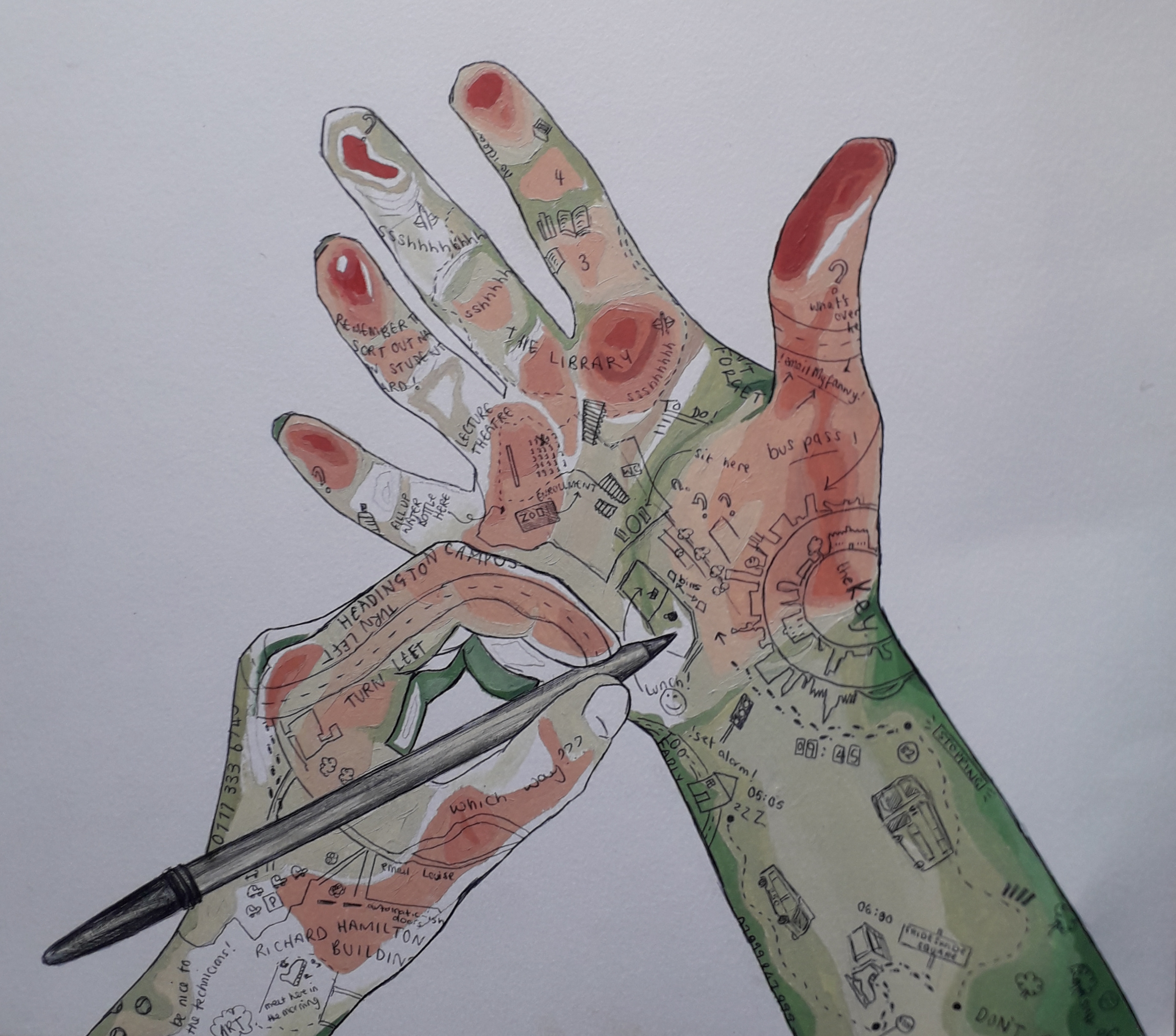
This image speaks for itself – the quality is incredibly high. The artist managed to show depth as if it were a contour map, and I have respect for the cleanliness and detail as well as composition. Not to mention the fact that this artist also included little idiosyncratic quotes theyd remembered.

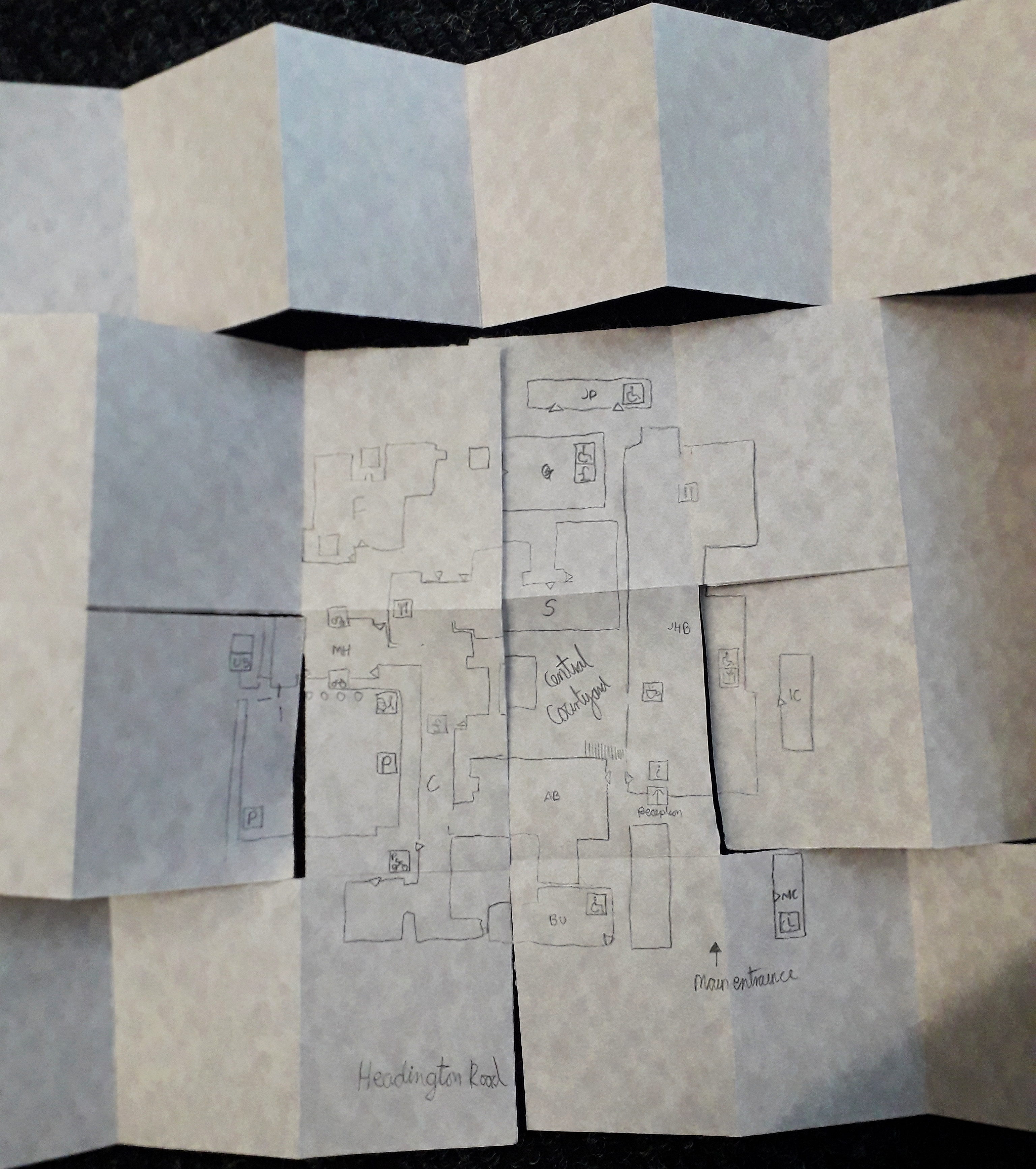
This map has to be included because it took me so to figure it out. It was presented as a folded mess, and I had to smooth it out flat. I like to think that that was intended to be interactive, and not just a lazy student dropping it onto the floor(!).

This was many pages long. I know Maeve was the artist of this!

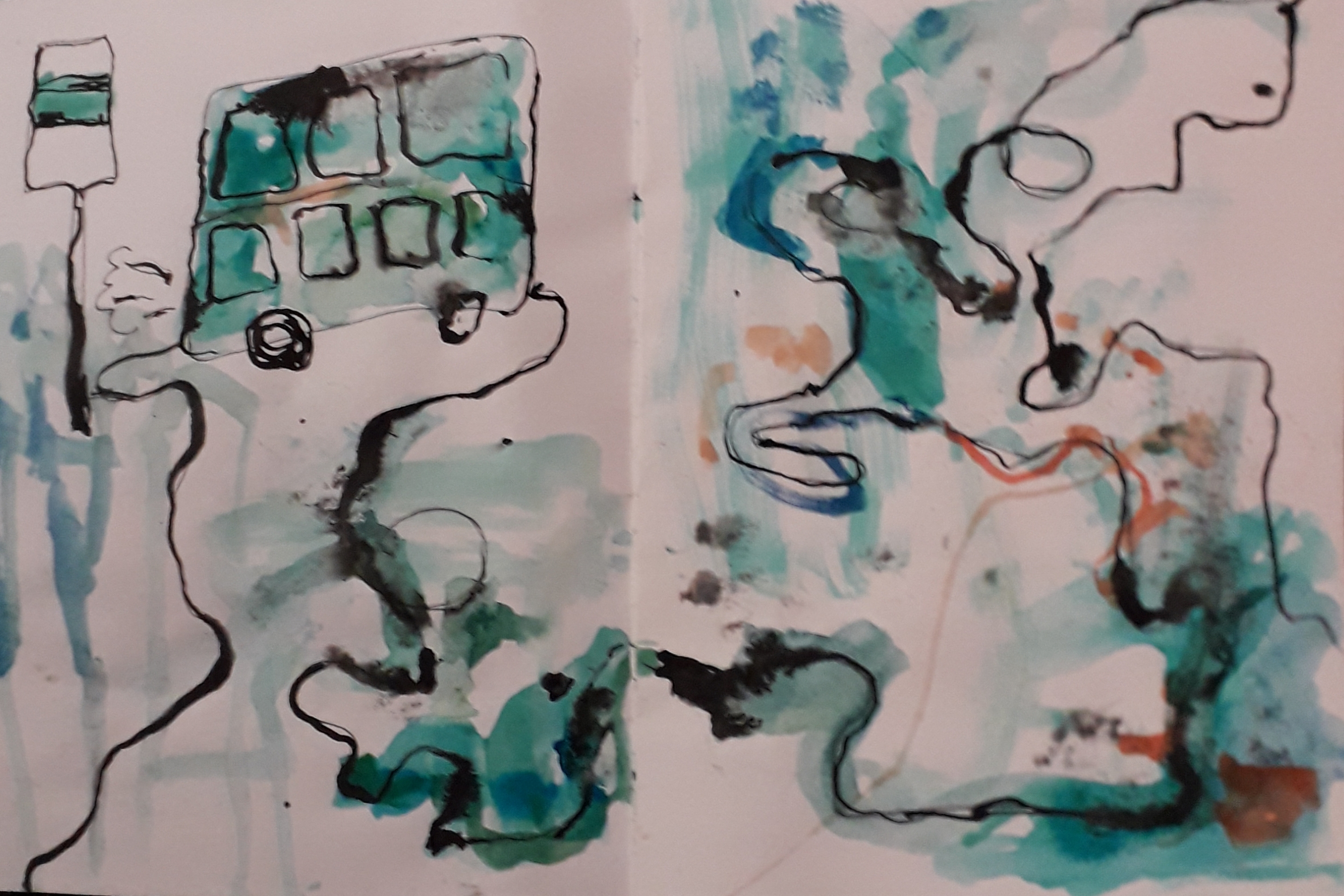
Honourable mention to this beautiful watercolour and ink abstract map. The colours took me, and it was unlike any of the other maps. This felt a lot more emotional, although I understood it slightly less than worded maps.

Survival kit, And Life

Survival kit, And Life

I’ve not updated in a little while because I spent Monday to Thursday last week up in Cardiff with Jamie on a mini holiday… then after 24 hours back home, I had to come back up with my siblings for the bank holiday weekend!

Now I’m up with them it’s a lot less intense than the holiday with Jamie, so I’ve had a chance to work on my art properly.

With Jamie, we went into Cardiff Central, Cardiff Bay, round cocktail bars with Dad and Rachael and then out to a nightclub (for the first time for me! It was fun!)

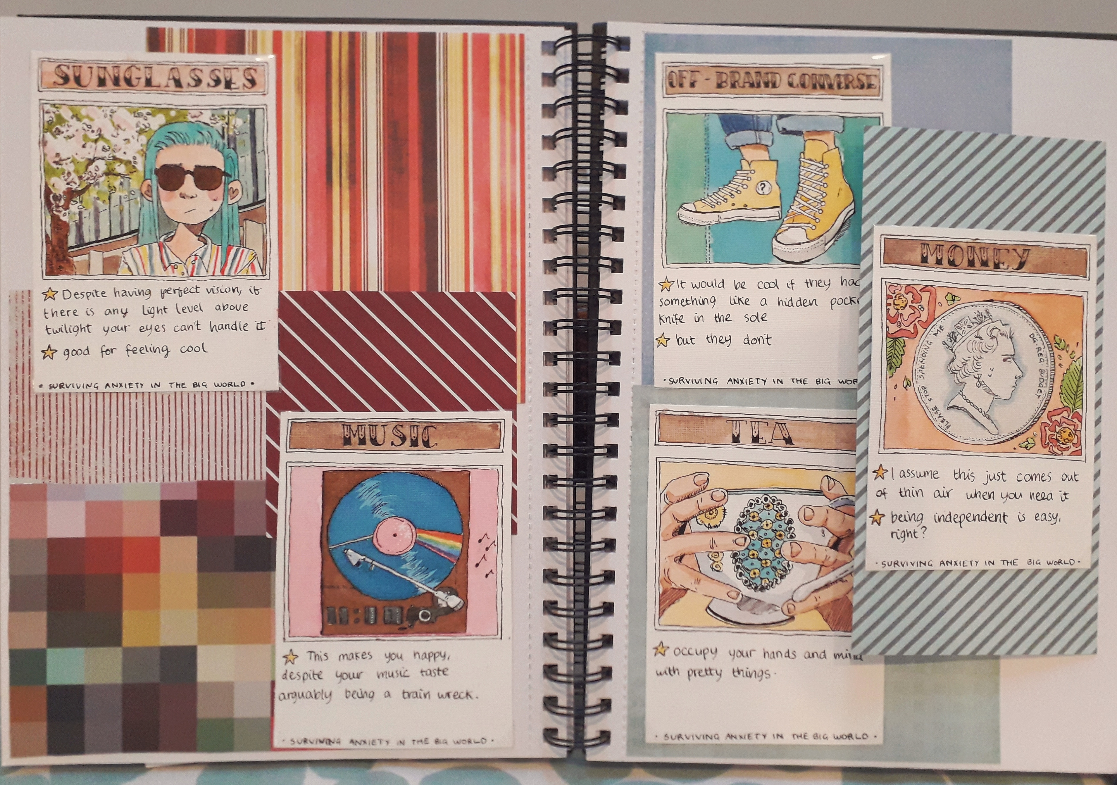
I finished up the five cards in my survival kit and arranged them on a double page spread. I’m really proud of them; each took a long time of planning, sketching, lining and then colouring.

It may seem a little small. Hopefully you can zoom in if you want to look closer – it’s a good enough quality photo.

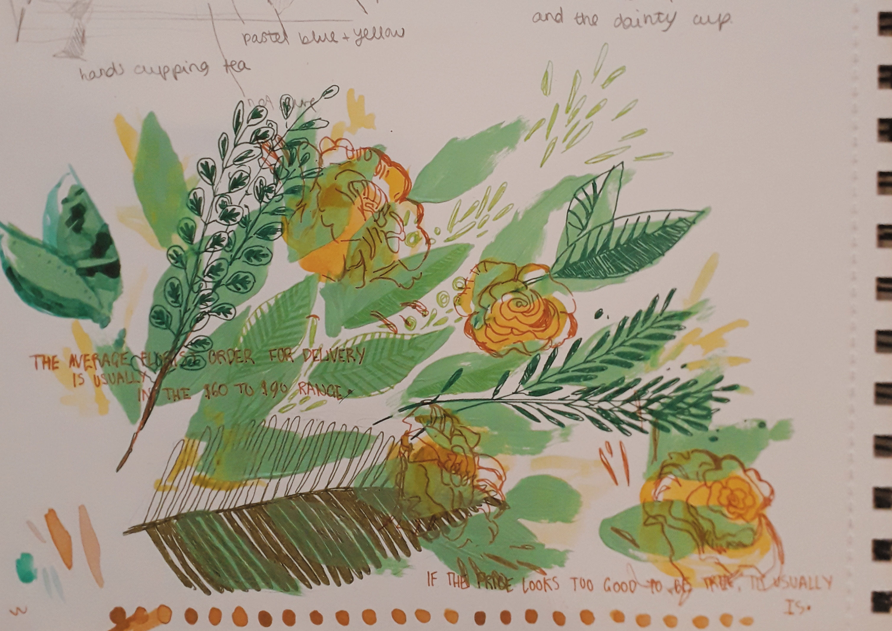
I also painted a little half page of flora and leaves, just as an experiment in using different media. I’m pretty happy with how it turned out.

I’ve filled in about eight thousand info pages on myself and applied for all sorts of basic things. My accomodation is confirmed and I’ve paid some important fees for the beginning of the course.

Seems like no matter how nervous you can be, time will slowly drag things into place. No amount of convincing could have told me that a month ago, though.

Survival Badges

Survival Badges

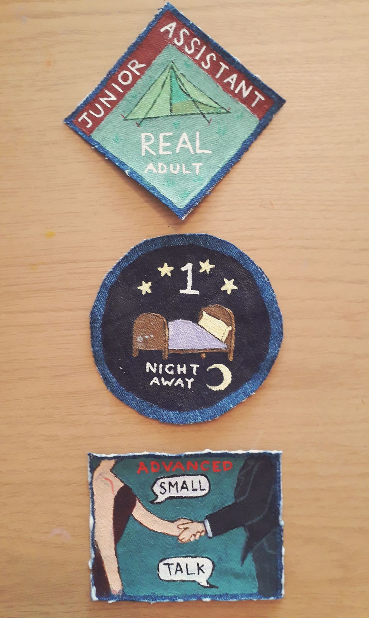
One of my ideas for the Survival kit was to design and paint some fabric patches in the style of Boy Scout achievement badges, but of course on-theme with modern grown-up achievements, e.g. “Advanced Small Talk”.

It’s one of the things I’m using to sew on and decorate the white backpack that will eventually hold my survival kit. This will fulfill the area of the brief that states it would be best if the student had some contribution to the container (rather than just, say, buying one and using it as is).

The Small Talk badge is still wet with PVA glue I use to help stop fraying. The other two have long dried.

Picking colours was quite difficult for this, since scout badges are quite busy and often have garish colours so text stands out. I think the one I’m most proud of is Junior Assistant Real Adult because of the strong shapes (triangles and hard edged squares) and contrast in colours. I might have done better using a lighter colour on the Small Talk badge in retrospect, since it ended up quite a dark badge. But pastels can also look sickly so even that might not have worked.

Just as an aside, I think the uni might be pleased that I’m upcycling some old charity shop jeans to make these badges. They’re on a very heavy sustainability kick and it’s a good coincidence it’s showing in my work!

I would say that the next step for me in the project would be to create some more item cards that correspond to the items in the kit, e.g. Teapot, Music, etc. This is also required in the brief as somehow listing or drawing your items, so before I go on another design tangent I think it’d be in my best interests to hit the brief first.

Art From Crete

Art From Crete

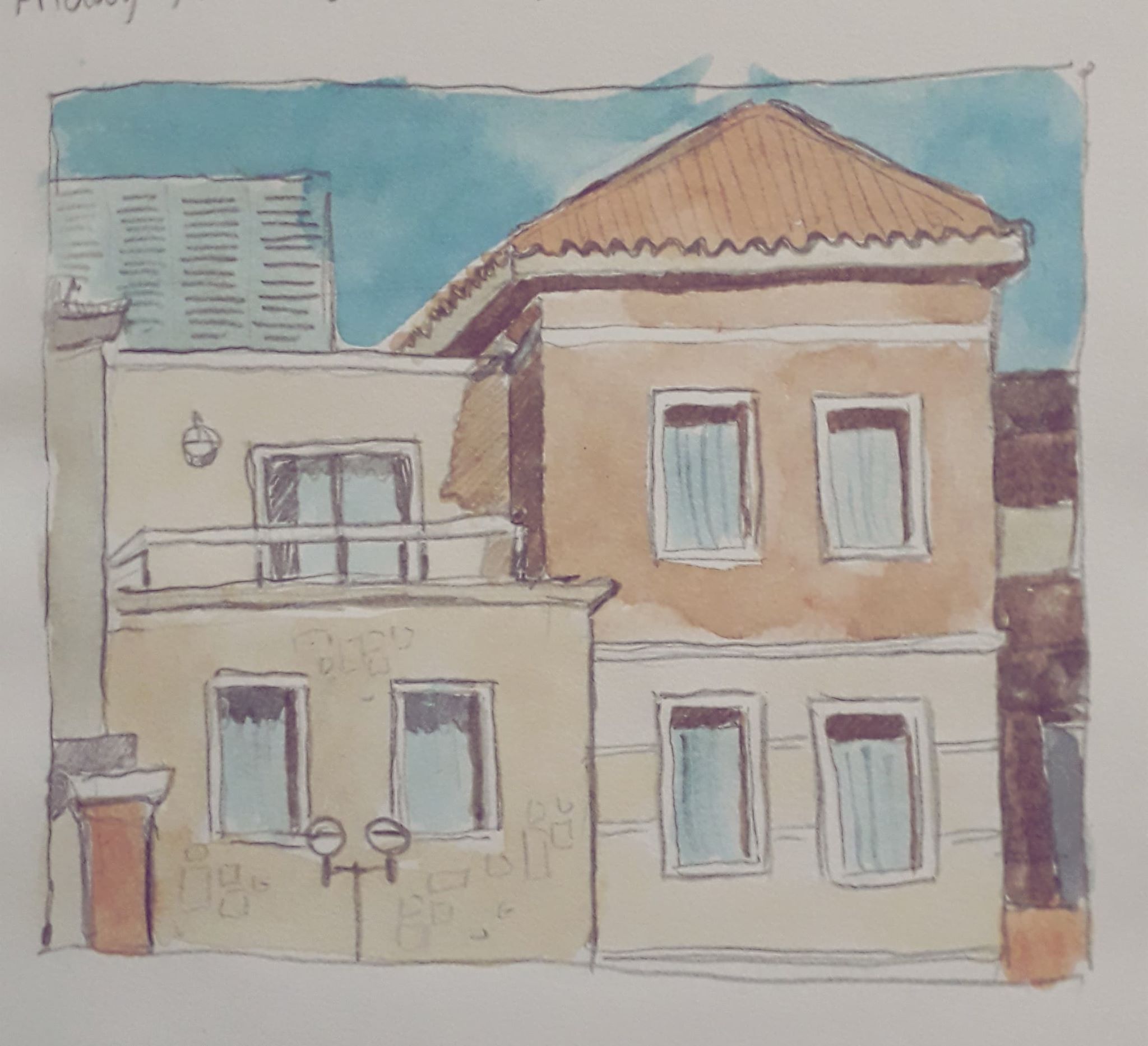
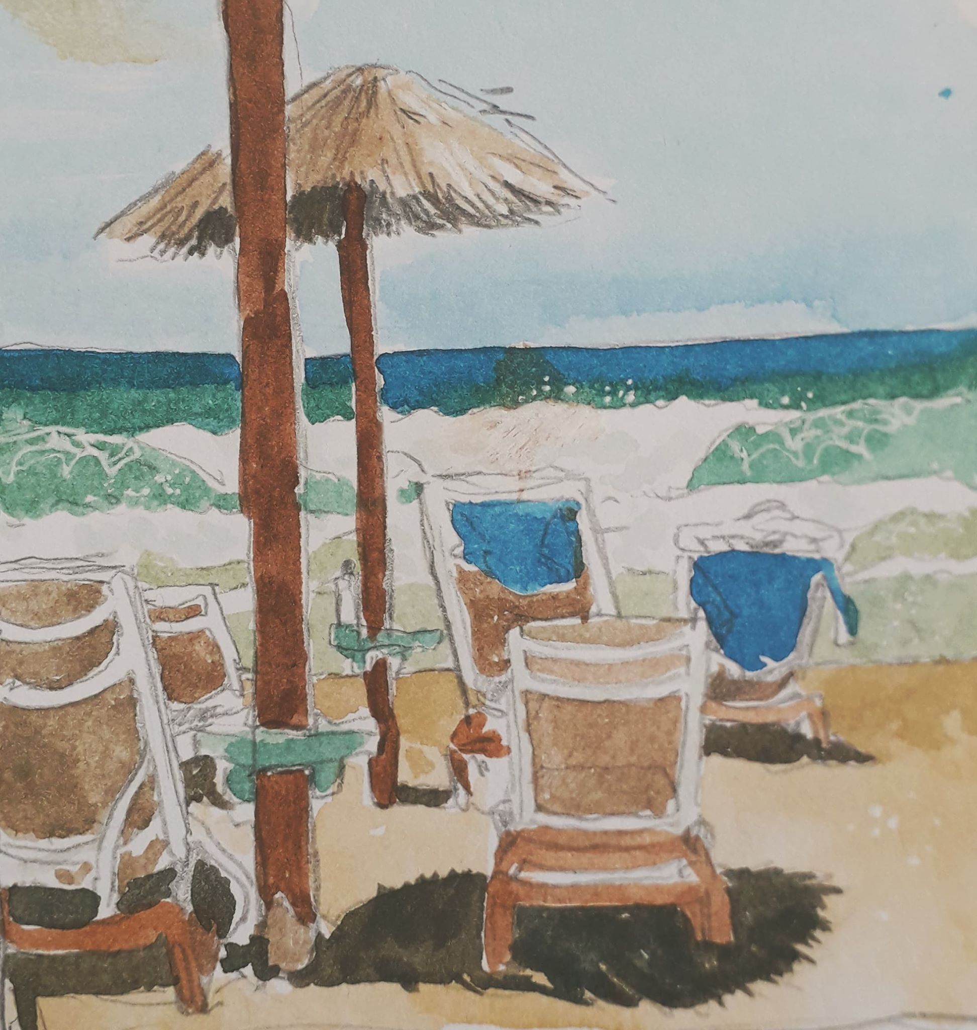
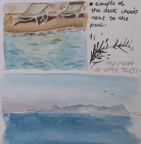
During my time in Crete, I tried to paint from life (or at least sketch) every day. I also wrote a couple of notes on dated paintings about what I’d been up to, almost in the style of a diary. The format keeps me going.

Here, in no particular order (except of my preference!) are the pieces of work from that week.

I saw these buildings while playing catch with Esme. I grew so distracted I had to get out of the pool and draw them – to her annoyance… but wasn’t it worth it!
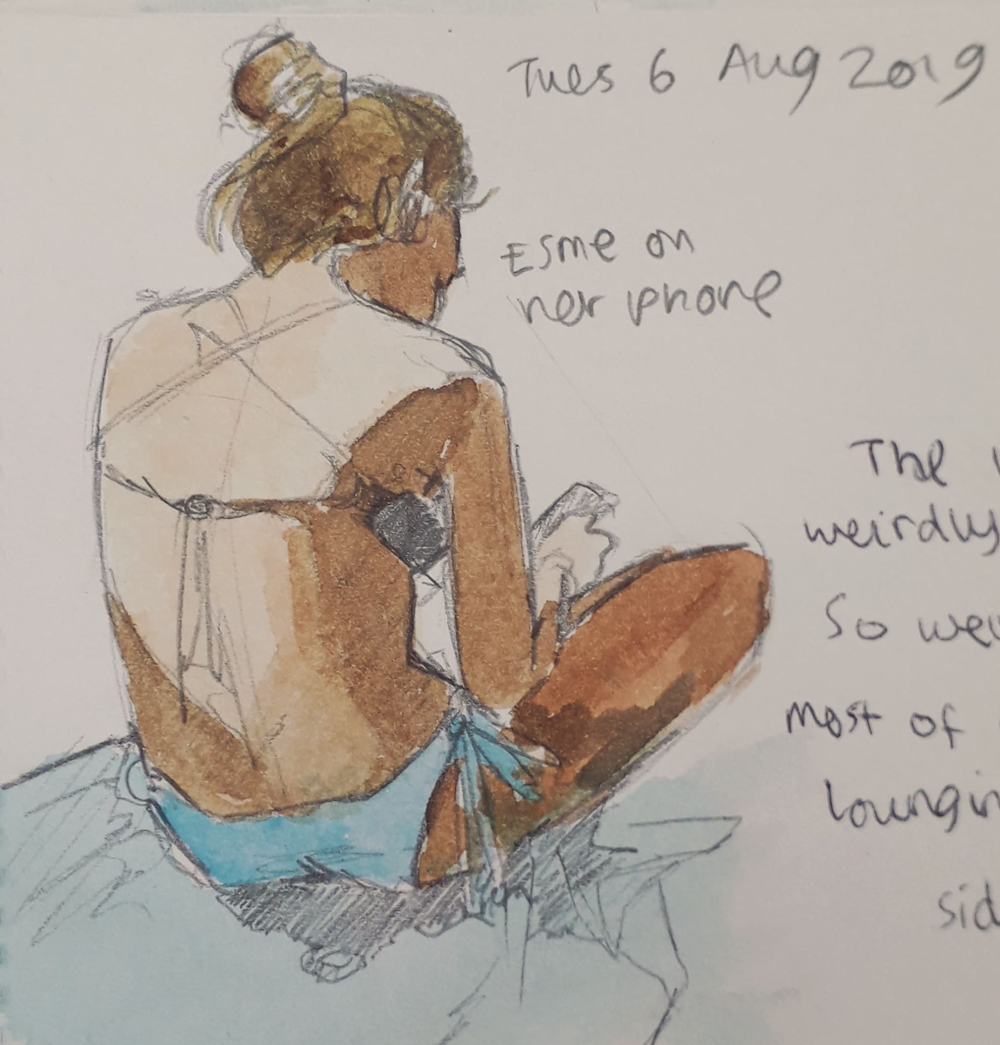
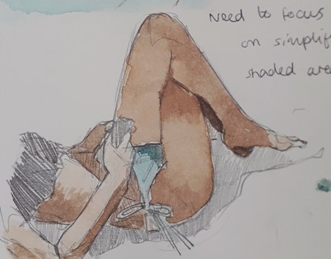
Esme has a nice body to draw. She’s very kind and usually stays still if I mention I’d like to draw her.
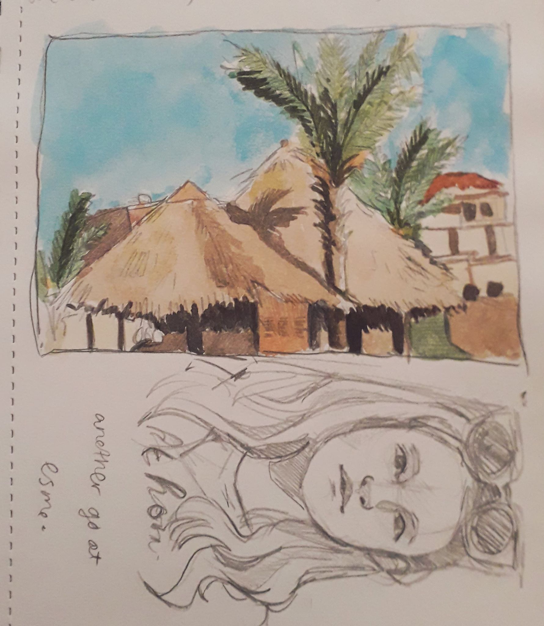
These were the roofs of a bar called the Guru Bar. Good cocktails.
Not so proud of these, but mistakes have to be made!

I’m proud of the fact that I’m determinedly drawing backgrounds and inanimate objects, as these things are out of my comfort zone (people being my Thing*tm*). The sense of space and proportion is different and I like to think the practice is helping.

My colour theory is also improving; with a determinism to record scenes properly comes a compulsion to add colour to make it a little more lifelike. Desaturated colours are interesting especially.

Being back has been nice. I’d missed Jamie and it was beginning to feel a little shitey, despite the Greek sun and the beautiful beach. I’d forgotten how comfortable cardigans could be!