Everybody got a small brief to create a personal map of the area around them (i.e., ox brookes), to orientate themselves and to show a personal style. I’ve taken pictures of a few maps that really spoke to me, but I have to start with my own.
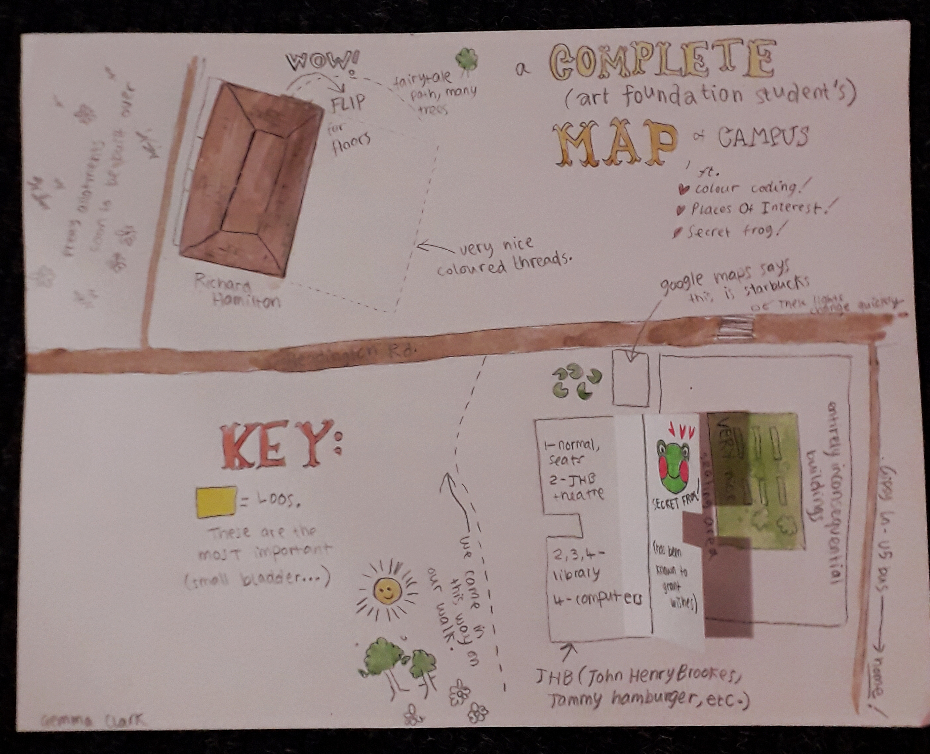
My map was illustratory and maybe childish in nature; I wrote it excitedly and mapped on things I’d thought at the time of seeing them. I view the area slightly differently now, but I like this because it really is archetypal of my style and brain and it’s documented my first impressions quite sweetly.
The flaps were the main interactive element (secret frog admittedly being a flash of enlightened creativity). The other thing I think was different from most other maps is that mine was bloody wordy – a real stream of consciousness. Other students gave a very personal insight in other ways, which really struck me.
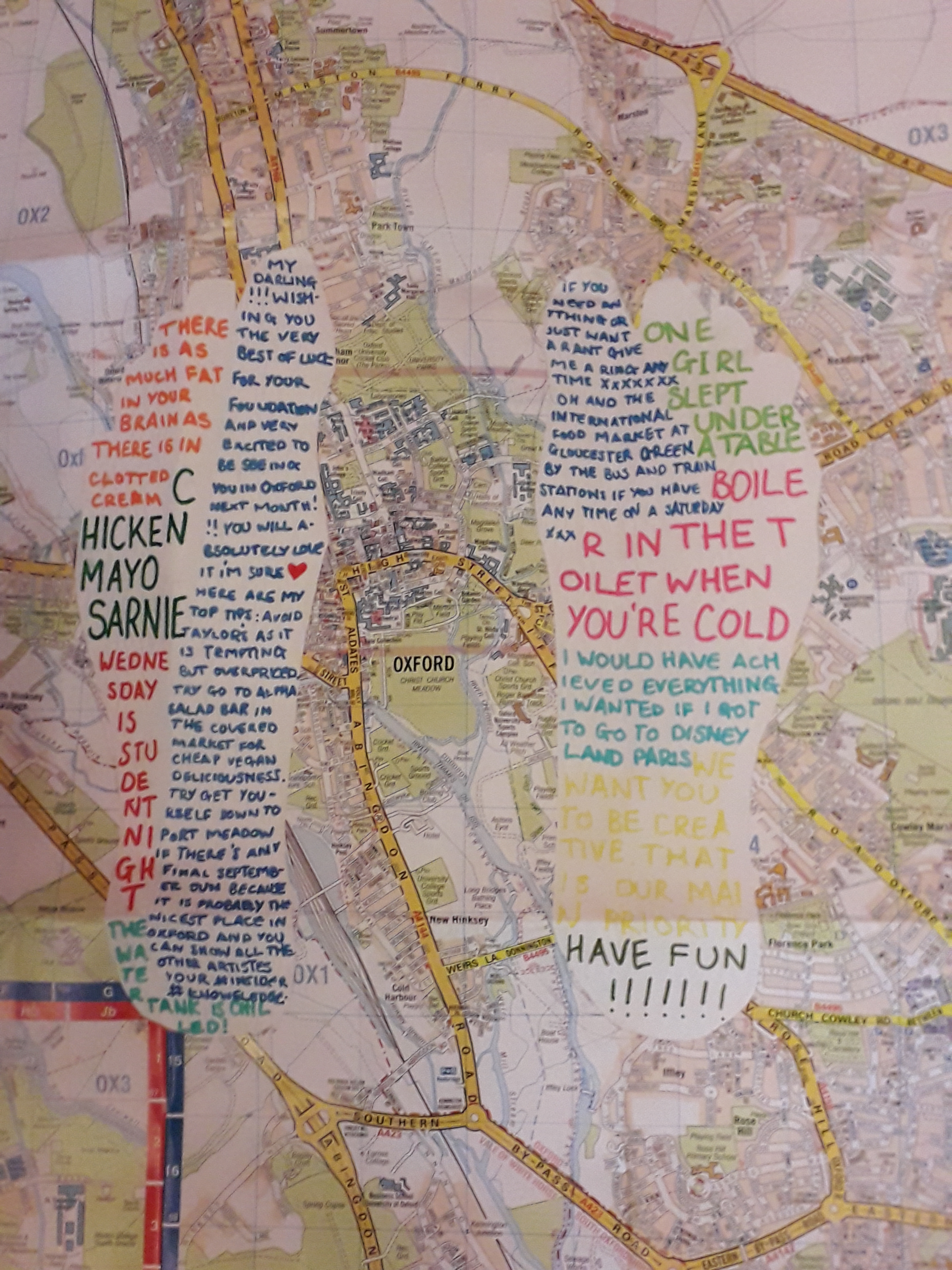
The OS map with white feet cut into them contained snippets of conversation, presumably from the past week. I recognised a couple from lectures. This is probably my favourite… in seeing what the student has remembered, you see into their mind but totally indirectly. I can’t really overstate how much I like this one – it’s the one that felt the most personal to me.
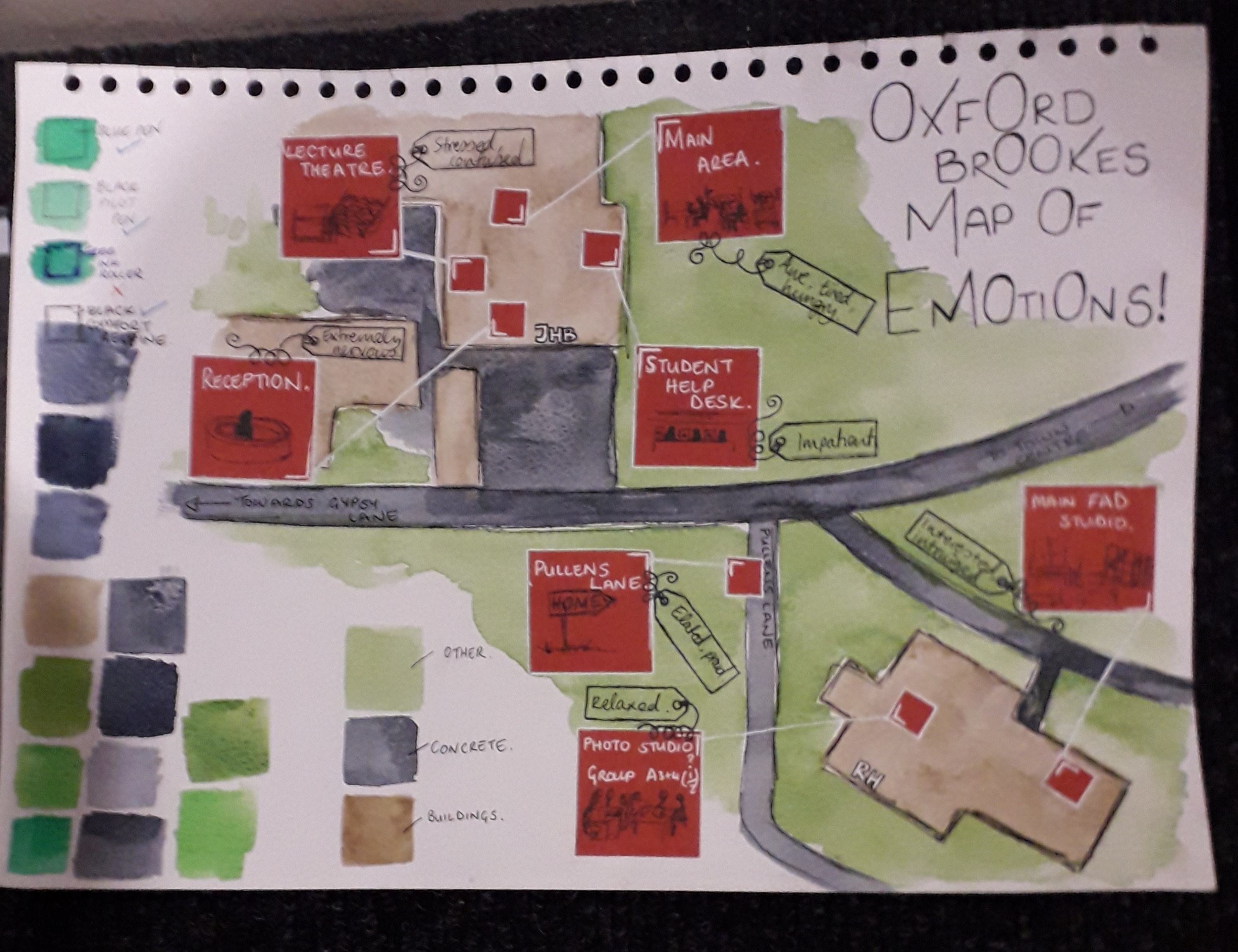
The map of emotions also hit quite close to my own heart because I remembered feeling most of these things too. It’s maps that are revealing of someone’s inner thoughts that it looks like I’ve gravitated towards. The colours and shapes are pleasant and well thought out as well, with close-ups of red areas filling negative space.
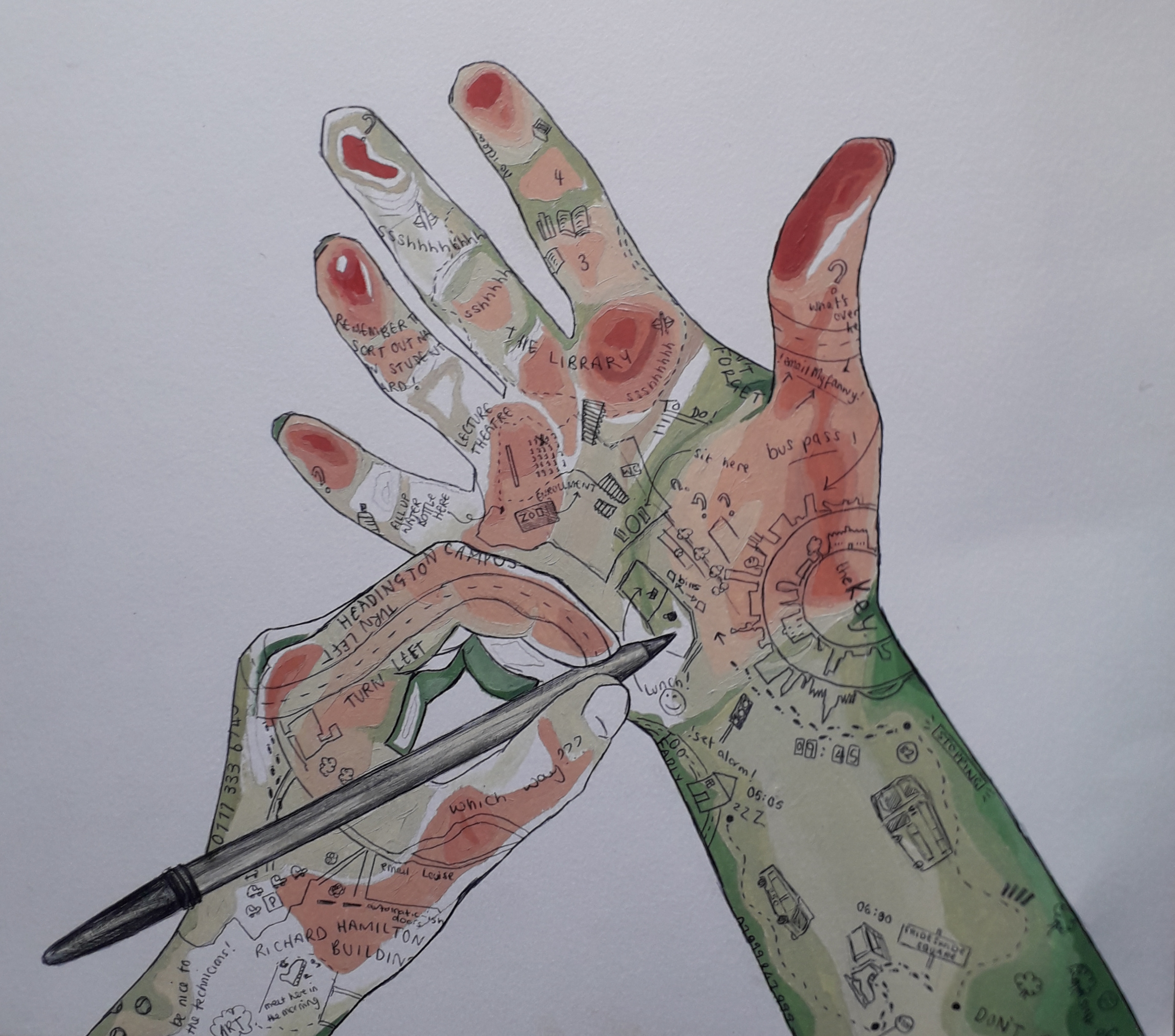
This image speaks for itself – the quality is incredibly high. The artist managed to show depth as if it were a contour map, and I have respect for the cleanliness and detail as well as composition. Not to mention the fact that this artist also included little idiosyncratic quotes theyd remembered.
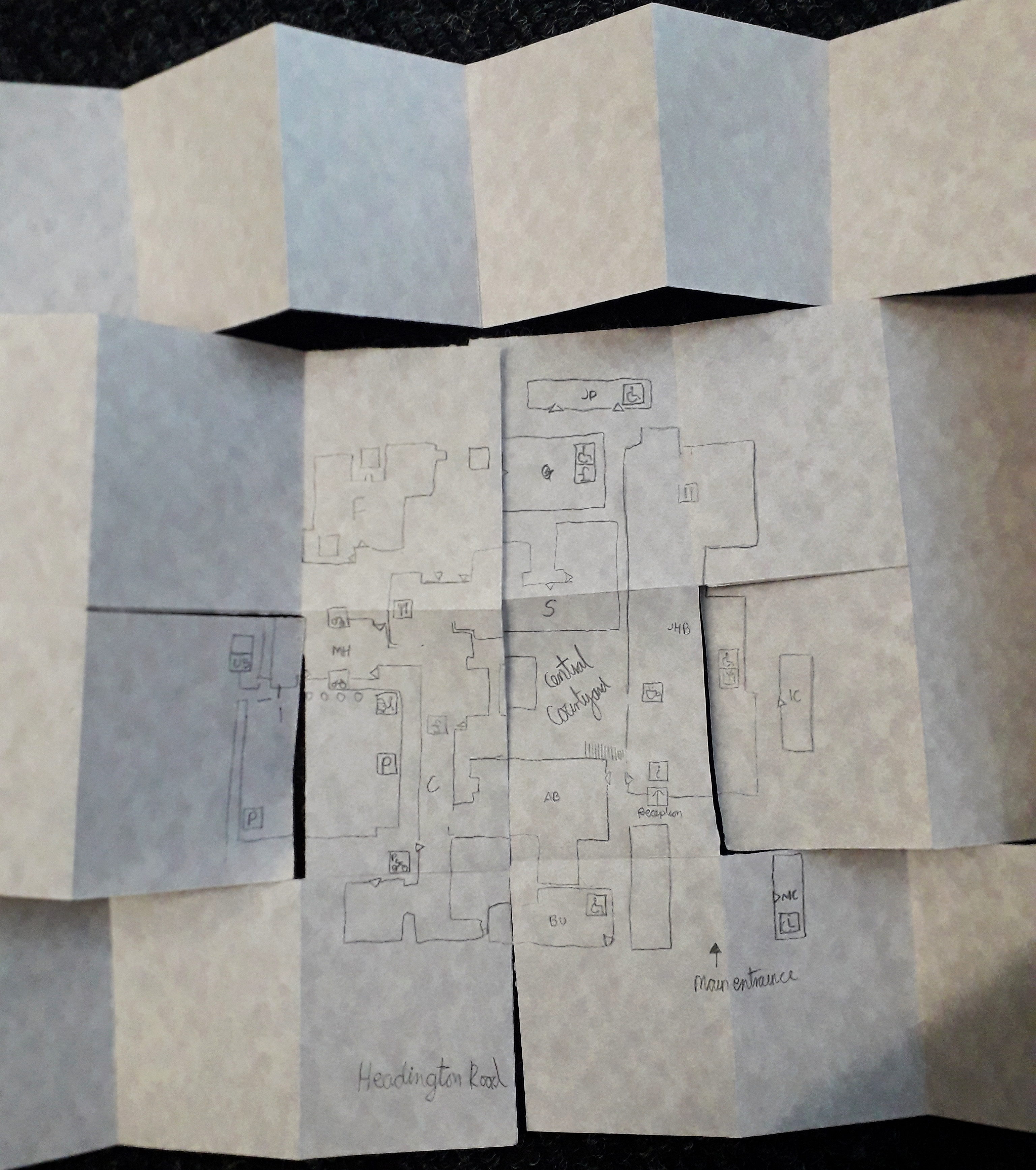
This map has to be included because it took me so to figure it out. It was presented as a folded mess, and I had to smooth it out flat. I like to think that that was intended to be interactive, and not just a lazy student dropping it onto the floor(!).
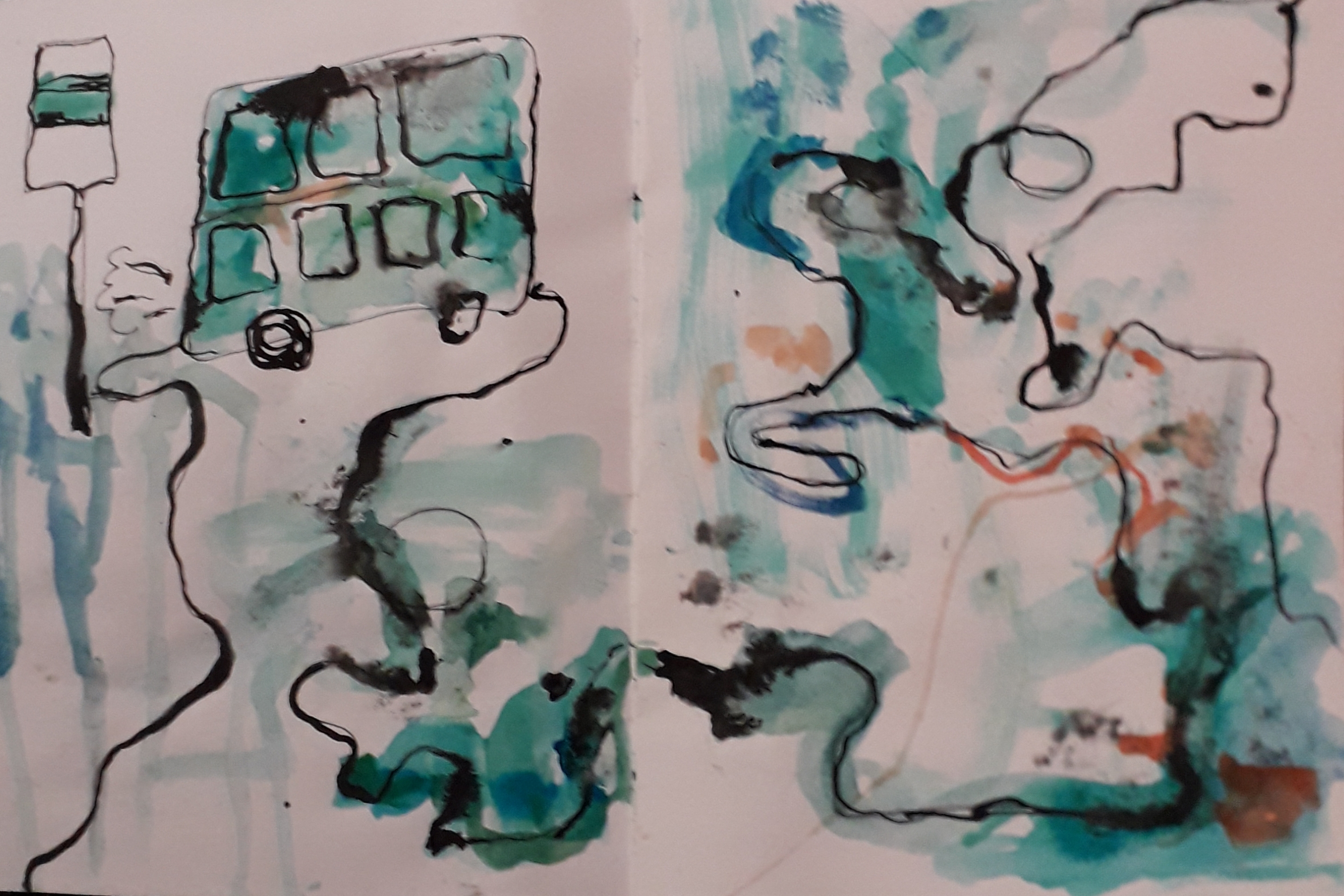
Honourable mention to this beautiful watercolour and ink abstract map. The colours took me, and it was unlike any of the other maps. This felt a lot more emotional, although I understood it slightly less than worded maps.

