Today has been the last day of our illustration project; I’ve created a final outcome and finished it!
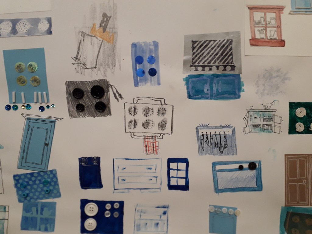
I’ve taken the little oven and its notebook counterpart from day four and finished the notebook up. This meant cutting out a rubber stamp of an oven, and I created a rectangle block stamp to act as a block colour background to make it a two-part image.
I printed this a number of times and in a number of different ways throughout my hand-bound notebook, completing the book.
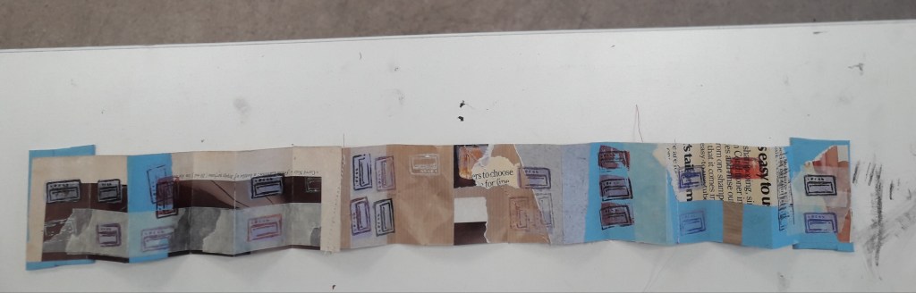
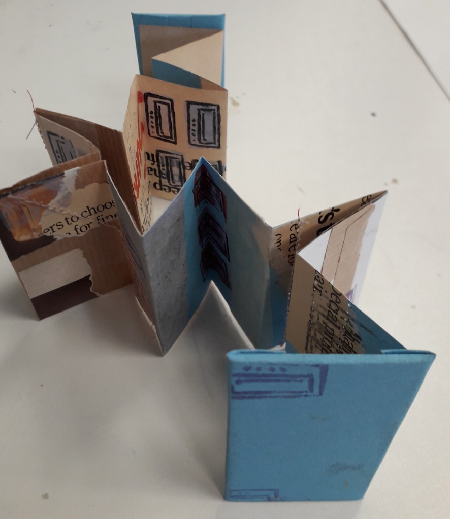
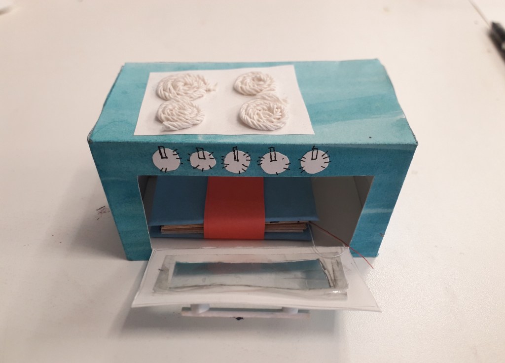
I took a higher quality image of the notebook in the oven for the sake of the final worksheet as well.
What do I feel was successful in the project?
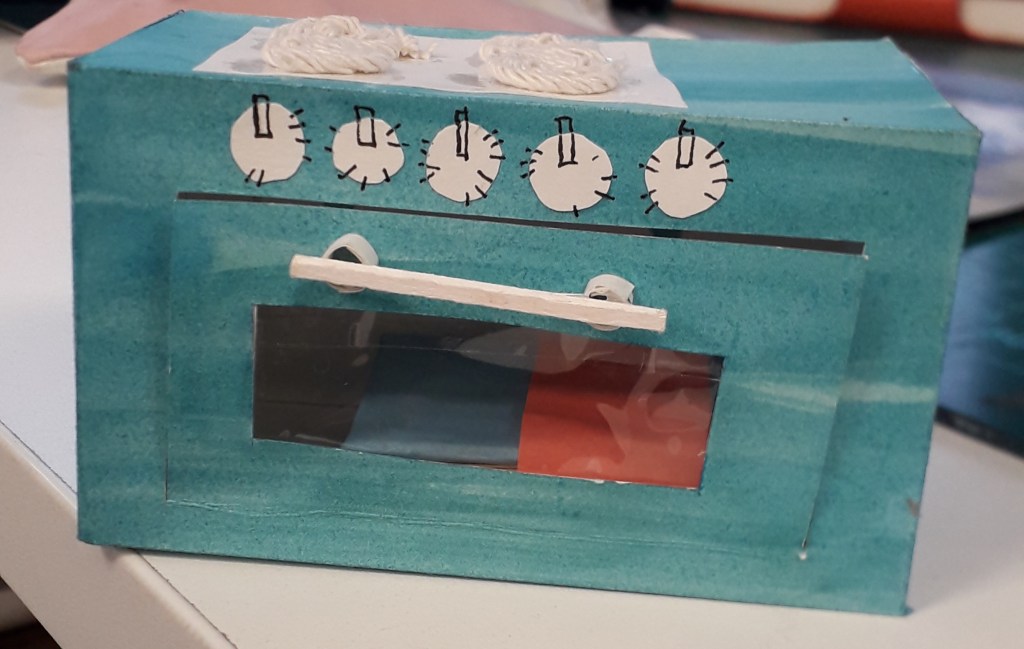
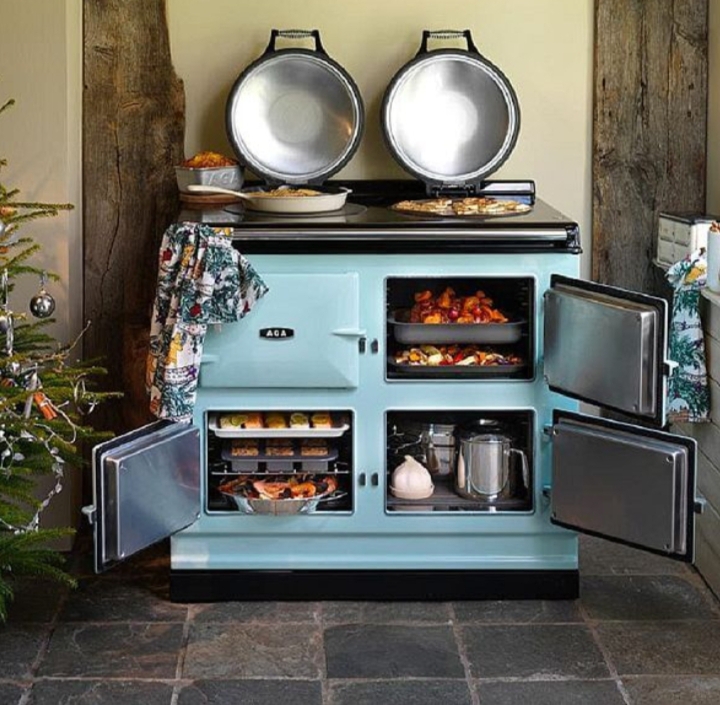
I have to say I’m incredibly pleased with the way this project took me. I like the whole of the final notebook, with its eclectic colours and torn newsprint making it busy but aesthetically pleasing. The fact that some of the pages were sewn through gives the viewer another material to interact with and I feel it lends it a homier feeling. I like the look of the oven, with the string hobs inspired by my media experimentation in week two. I like the colour of it and the watercolour surface makes it interesting.
What do I feel was less successful?
The inside of the oven wasn’t particularly developed. You can still see pencil outlines for the net shape, and the bottom panel has “BOTTOM” in pencil across it (me trying to orient myself when I was still at net-stage). It was also quite flimsy, a problem I’ve already identified. If I’d settled on making the oven, I should have invested in a sheet of cardstock rather than wrestling with layers of damp watercoloured paper!
Did I develop my ideas thoroughly? Why or why not?
Interestingly, I feel as though I developed my initial ideas quite a lot. The process’ movement from a flat illustration through to a 3-D, interactive piece was one of considerable experimentation and research.
Of course, there will always be other ways I could have developed my ideas. I could have worked with other media, e.g. wool, food, metal, etc. Some of this is bordering unrealistic considering the time and material limitations, but in an ideal situation I could have gone on and on with experimentation.
I could have done more research into colour. My work always just fell into blues and turquoise during this project, because to me it felt bright and also reminiscent of a kitchen. I had a little colour inspiration (see Simon Costin’s studio work) but it never made its way into the spotlight of consideration.











You must be logged in to post a comment.