It Feels Like We Only Go Backwards – Personal Research

It Feels Like We Only Go Backwards – Personal Research

Inspired by Lucy’s colour theory workshop, I experimented with colour in creating a watercolour illustration. In creating the work, I also learned a lot of other things.

The inspiration behind the illustration was personal: a couple of weeks ago, I was in Pebworth with Freddie, Jamie and Lily. Lily and Freddie smoked out of his window, and we were having such a good time I wanted to illustrate it. I worked almost entirely from memory.

Lucy encouraged us to use images as inspiration for colour schemes. I started by quickly drawing out the bright outfit I remember her wearing that night, because that was the statement image I wanted to base the whole illustration around. In further colour bar practice, you can see I added a few different colours – like a yellow for her bleached hair, or a pink and peach.
Here you can see I copied out a sketchy thumbnail 4 times and experimented with colour. I started by religiously using colours from the scheme before, but it wasn’t making me so happy. Establishing tones in a greyscale version was me trying to think outside the box. You can see it’s quite different to the top two and I preferred it.
This is a progress picture. One of the biggest problems to solve was in using my masking fluid: it’s in an annoying bottle and every time I use a brush with it, it PERMANENTLY ruins the brush with all the scraps that roll up deep inside the bristles. Here, I used a dip pen with a wide nib. I’d seen an illustrator on Instagram (Sibylline Meynet) do it.

In lining and subsequently using the masking fluid, I learned a few things.

  • The dip pen was a little unpredictable and difficult to use. You can see it bleeds large blobs of fluid sometimes, and sometimes runs too thin.
  • The Windsor and Newton Sepia lining ink I use to line bled underneath it, which is a big issue. I might want to try using Indian ink next time … but I’ve fallen in love with the sepia ink and its water insolubility. I might just be more careful or precise next time.
This is the final illustration. Colours referenced from the thumbnails. You can see I changed the picture frame to the left into a music poster because I thought it was more interesting, and Freddie really does have it in his room so it resonated with me.

I chose the brightest red for Lily’s coat, coupled with very pale skin, in the hopes that that’s where the eye will naturally fall.

Colouring the piece presented fewer difficulties than using the masking fluid did – simply because I’ve watercolored so many hundreds of things that I’ve pretty much trialed-and-errored my way into a practice I’m happy with.

Something I would like to try is stretched paper! Working with such wet medium means it does warp a little. I dream of that really thick, fibrous, cold-pressed watercolour paper that’s really expensive in art shops.

Exquisite Corpse Reflective

Exquisite Corpse Reflective

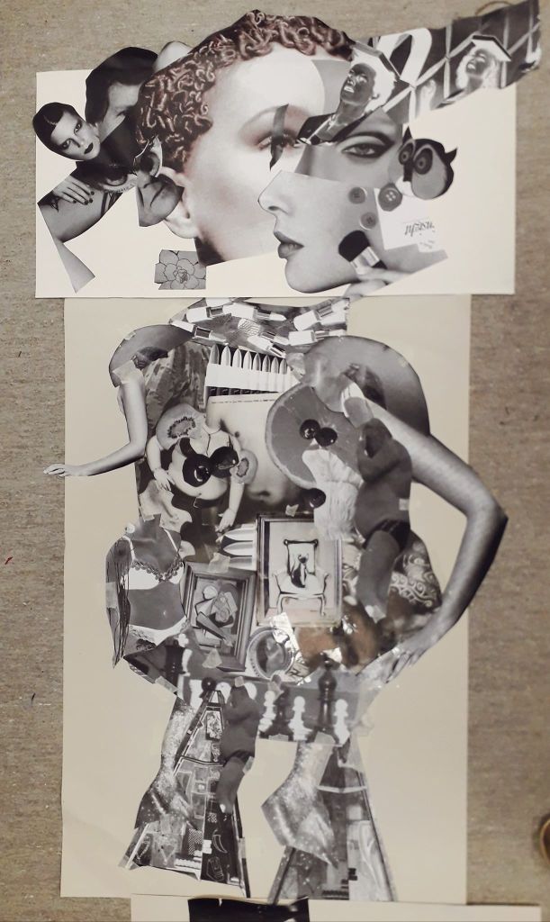
The point of this lesson was to imitate a parlour game from the 17th Century called Corpus Exquis, or Exquisite Corpse. This involves cutting up and collaging images to create figurative characters. They are just recognisable as human but have a surreal or creepy feeling to them.

The head our group created in the first workshop.

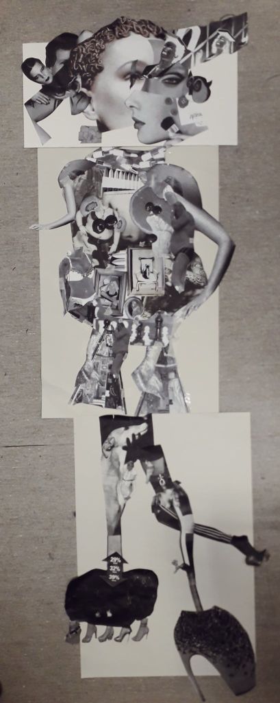
The first exercise was collaborative. We created a head as a trio, and other groups created bodies and legs. These were placed together.

This was the entire body. I have to say I prefer the top two units compositionally.

What I was really happy with in this exercise was the collaboration. The strip of eye over an existing eye delighted me, and I would never have thought to do it. The diagonal row of faces leading out from the center of our head was Martha’s idea, and that again became one of my favourite parts.

Another really useful element was learning how to use the photocopier and scaling things up or down as well as playing with colour. This I will definitely use in my work outside of classes, to create iterations of characters or ideas.

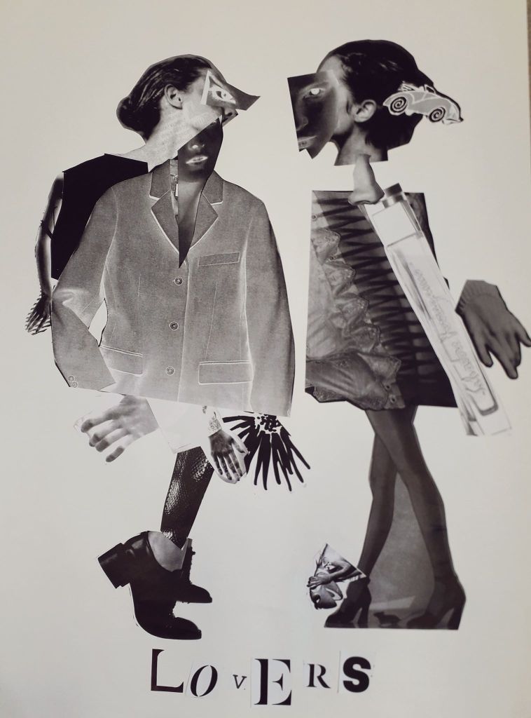
“Lovers” – the final half of the day was a solo project creating characters similarly to the morning’s.

I was very pleased with how Lovers came out. I didn’t start off with any idea in mind except with all of the sheets full of images that took my fancy. A pair of heads on one sheet looking at each other became the base of the two faces, with other features stuck on top.

Even though this project was on my own, I ended up using a large jacket that Martha didn’t want to clothe my left Lover after having nothing the right shape myself. So it still wouldn’t have looked like it does, had I been working alone outside the studio.

How could I take this further? I have a Vogue magazine now which I think I will use to repeat this exercise at some point; if not the exact same then on a slightly smaller scale (to save my printer money!). I will also place Lovers into Clip Studio Paint and experiment with layer effects to create a series.