Formative Assessment: Unit 2

Formative Assessment: Unit 2

We spent about an hour completing peer review before returning to our own work and self-assessing. I found three students whose work I was particularly drawn to.

Alice

Her work was full of strengths, and it was lovely flipping through her sketchbook to feel all the textures and experiments. She’s successfully developed her own creative practice and used lots and lots of different media in her work.

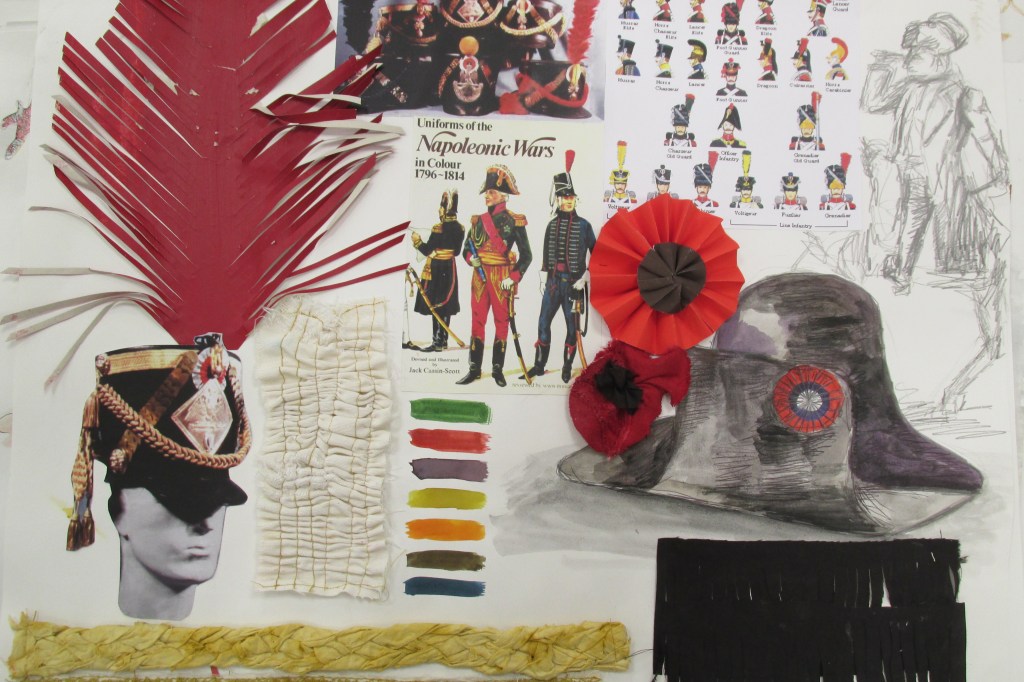
The only thing she was weaker on was contextualising her textiles work in the professional environment it would exist in. While there was historical research, there was a lack of named working artists or work relating it to the current fashion and textiles industry.

An example of media experimentation.
An example of historical research in fashion.

Letty

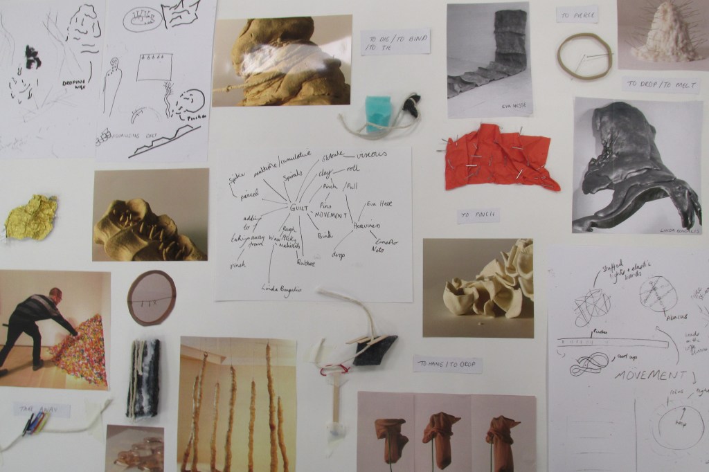
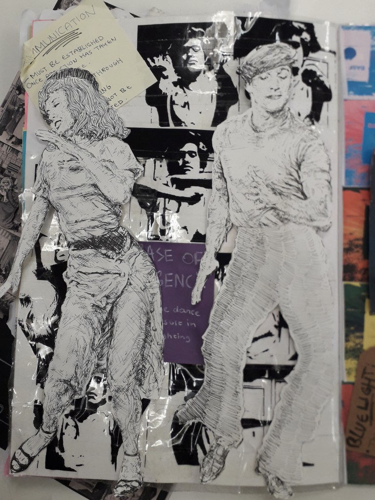
Letty’s main piece of work was her little A6 sketchbook, absolutely packed with things: textures, experiments, printed photos and a ton of annotations. Her strengths lay in experimentation, evaluation and research into contemporary artists – thus contextualising her work as well. You can see how she’s followed through on ideas page by page.

Her main weakness was that outside of the sketchbook, there weren’t many finished presentation sheets at all – I think I counted four, each with a few photographs on them. This might just be how she works, but it leaves her body of work very informal and possibly a bit incoherent.

Carys (I do hope I’ve remembered her name right!)

Carys’ body of work was one of the largest and most broad in terms of content I saw the whole day. It wasn’t really relevant to my work, but I really enjoyed looking through it. Personal research was a huge strength, with her documenting certain information about herself to manipulate into graphs etc. over multiple days. Her photographs were very high quality and clearly printed somewhere professionally. I also like the textures she creates through experimentation, e.g. creating a stencil for lettering on top of a painted background.

I can’t say I saw written personal reflection, but there’s a good chance it’s either on her blog (which I had no access to) or I simply missed it.

Here’s all of the graphs she created using data she collected about herself.

Finally, as I left I had to photograph Marco’s work because I kept seeing illustration ideas in his hardened orange peel sculptures.

Here, I see two dragons or snakes’ necks and heads rearing back.
Here, including the red pipecleaners, I see a pair of really mental, curly thigh-high boots.

Self-assessment

When I returned to my desk I saw some comments people had written about my work, and have since added my own.

Strengths:

  • Bright colour and confidence
  • Experimentation of media
  • Good development from 2D to 3D work
  • Contextualised in the world of illustration
  • “Good, stylised use of penmanship”

Weaknesses:

  • Could include more little models (considering I only just moved to 3D experiments)
  • BETTER QUALITY PHOTOS. These will finally be possible since over Christmas, I have bought a small Canon camera that is vastly better than my mobile camera.
  • Generate more textures in my work – I like having fun, bright backgrounds and I want to see if I can push materials to make new combinations and patterns.
Formative Review Highlights

Formative Review Highlights

We were asked to take notes and review four people’s work we liked.

Zoe Brown: Her art was really interesting.

The colours and ideas behind this fashion design really took me. The circular shapes and the use of old records are pleasing, and I like that they get larger below the waist to create the overall shape of the garment.
The rest of the records have been used here. You can see the waist shape and the tailored top half of the dress. It borderlines abstract, but you can clearly see a garment in the shapes.
Her sketchbook had lots of collage work like this. It was very experimental and she took things to quite a depth.

In relation to my work: Zoe’s work is a little more experimental than mine. While she seems to prefer fashion, I gravitate to illustration, but the lesson learned is the same. I’d like to collage a bit more, if only to generate ideas.

Sharon Bradford

Her reflective journal is teeming with life!
Her sketchbook is filled with brightly coloured work like this. Here, the circles and curved lines give the illustration an organic feeling I love. It feels like plants are bursting out of the circles.

In relation to my work: her work is quite similar in feel to mine – that is, bright colours and an illustrative quality. Her stream of consciousness and the quality of documentation in her reflective journal is definitely something I’ll try to learn from. The fold-out parts of her journal made me smile: I can’t resist something physically interactive.

Zaina Abbas

In my notes, I’ve described her work as something that reminds me of a Hammer Horror film, or Rocky Horror. The nauseously busy and bright colours are almost flamboyant, and I love the style.
Look at the layering here! I feel like I need to attach her brain to my brain, because I honestly can’t compute creating something like this.

In relation to my work: What I really need to do is start working with other material that already exists. This idea of layering things and mixing original art with photographs and prints is something I’ve been needlessly reluctant to try out. In addition, you can’t help but see Zaina in these pages. This style is wonderfully personal.

Katherine Hughes

The bright, blocky yellow with black liner over it works incredibly well here.
Katherine clearly has an advance perspective on shapes. The teal brushstrokes and the idiosyncrasy of the black doodles on top are really pleasing to look at.
Her “Miniature people” house.

In relation to my work: What I was most impressed with was the amount of imagination that went into Katherine’s Miniature People survival kit project. She’d created a whole world and I am COMPLETELY taken by it. It’s the kind of imagination you’d see in a writer.

I do love genuinely inspired ideas like this. If I’m passionate about something, I make good work. Maybe I should e-mail her and see if she wouldn’t mind taking the idea a little further with me…

I’ll leave you with a quote I can’t stop thinking about from another student’s work. Unfortunately, I don’t have the source.

“A designer knows he has achieved perfection not when there is nothing left to add, but when there is nothing left to take away.”