We were asked to take notes and review four people’s work we liked.
Zoe Brown: Her art was really interesting.

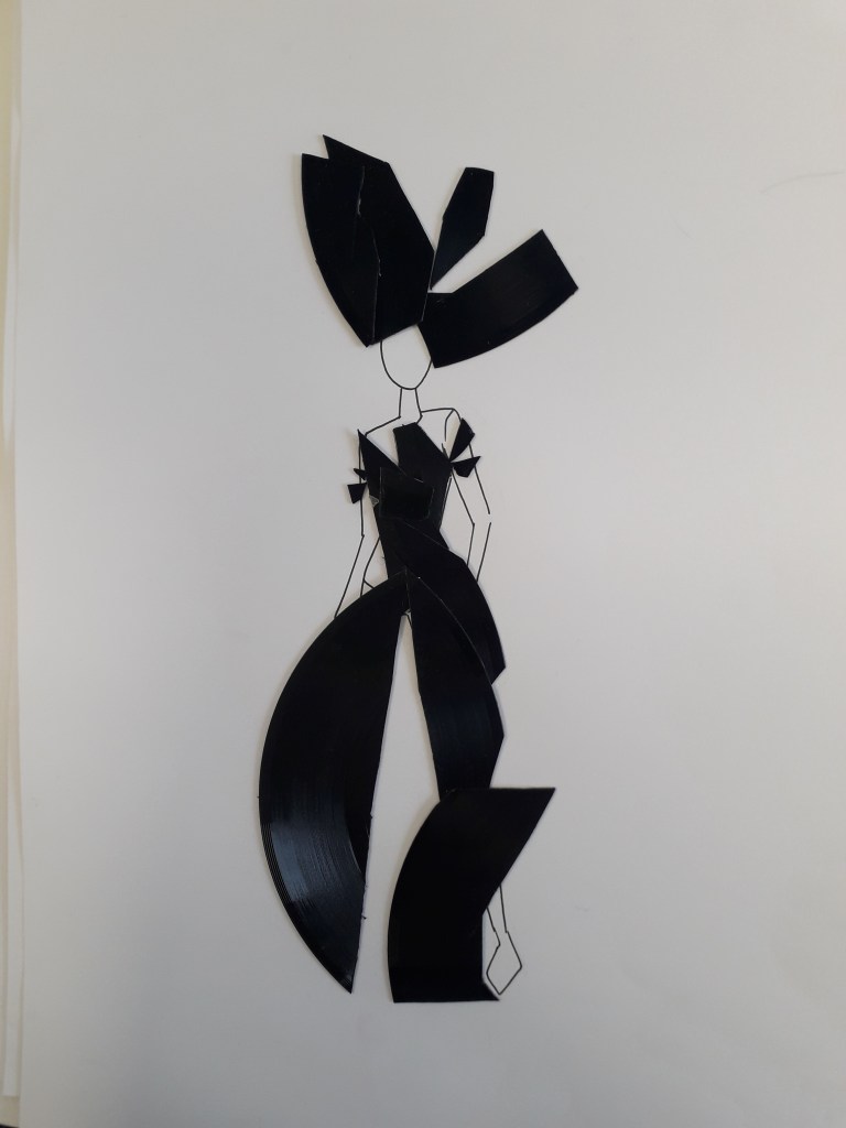
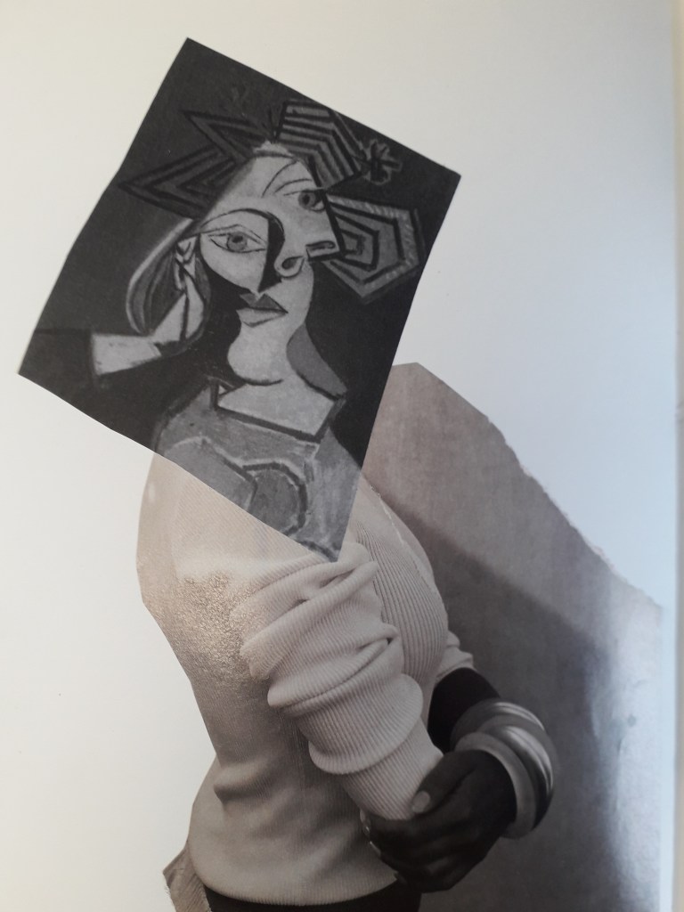
In relation to my work: Zoe’s work is a little more experimental than mine. While she seems to prefer fashion, I gravitate to illustration, but the lesson learned is the same. I’d like to collage a bit more, if only to generate ideas.
Sharon Bradford


In relation to my work: her work is quite similar in feel to mine – that is, bright colours and an illustrative quality. Her stream of consciousness and the quality of documentation in her reflective journal is definitely something I’ll try to learn from. The fold-out parts of her journal made me smile: I can’t resist something physically interactive.
Zaina Abbas

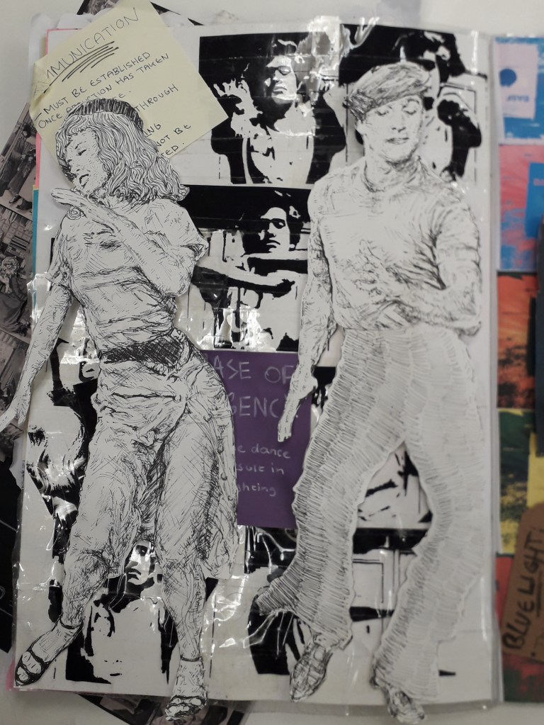
In relation to my work: What I really need to do is start working with other material that already exists. This idea of layering things and mixing original art with photographs and prints is something I’ve been needlessly reluctant to try out. In addition, you can’t help but see Zaina in these pages. This style is wonderfully personal.
Katherine Hughes
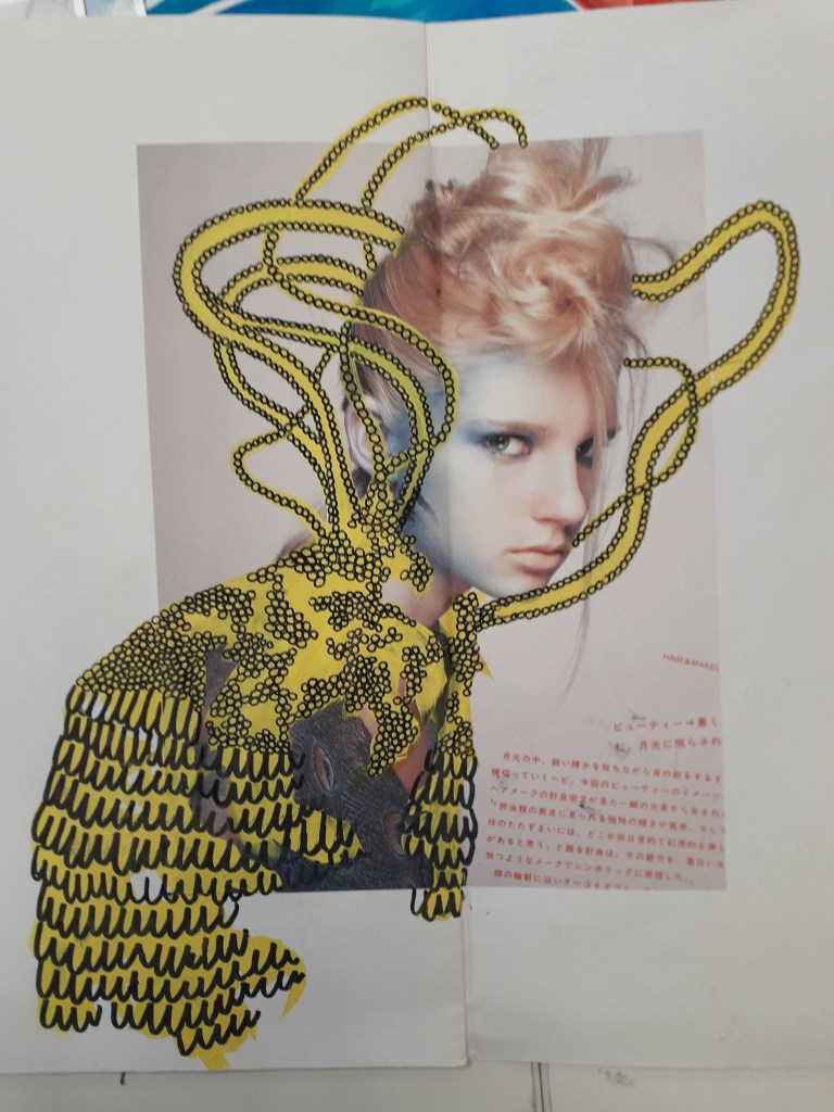


In relation to my work: What I was most impressed with was the amount of imagination that went into Katherine’s Miniature People survival kit project. She’d created a whole world and I am COMPLETELY taken by it. It’s the kind of imagination you’d see in a writer.
I do love genuinely inspired ideas like this. If I’m passionate about something, I make good work. Maybe I should e-mail her and see if she wouldn’t mind taking the idea a little further with me…
I’ll leave you with a quote I can’t stop thinking about from another student’s work. Unfortunately, I don’t have the source.
“A designer knows he has achieved perfection not when there is nothing left to add, but when there is nothing left to take away.”

