Utensia: Day Three and Research: Samuel Shumway and Simon Costin

Utensia: Day Three and Research: Samuel Shumway and Simon Costin

In the morning, Louise held a group evaluation in which we put out all our work and, in pairs, appraised each other’s work so far. I worked with Will and took notes on what he said after taking a look at my work.

What we decided I needed to work on was:

  1. Filling up the white spaces on my media experimentation worksheet. Hopefully, I will create a papercraft oven and some of this exploration will fill up the rest of the sheet.
  2. Researching more deeply into where my work is going. In the time since last Thursday, I have completed some research and will finish this blog post with it.

Louise mentioned my experimentation sheet was very door-heavy. This was things like cupboard doors, ovens and hobs, kitchen cabinets etc. She suggested that maybe I look into doors more closely, and their deeper meaning. I looked around online for a while and compiled a list along with images of famous doors in pop culture history – that is, books and film. Those will be collaged in my sketchbook over some pages as visual inspiration.

I also collected a few images relating to the papercraft route I might potentially take. I really like the idea of having a small interactive oven, with little doors that open. My research took me to an illustrator that really interested me – Samuel Shumway.

Shumway is a stop motion animator and prop designer as well as illustrator. The works that interested me were his small papercraft creations.

I like the bright colours and the uplifting feeling of his work and the way he photographs it.
The square feeling of this lasagne is what I’ll hopefully go for with my little oven, but a but simpler…

My research into Shumway helped me get an idea of the overall feeling I’d like my work to communicate. The use of paper and his way of working is one I’d like to try out in my project.

My research also took me to another artist: Simon Costin.

Costin is a set designer, but his work is so varied that he’s incredibly hard to define. I found some of his work from the Museum of London interesting.

You can see the busyness of this layout, and how Costin has created a three-dimentional scene with an incredibly illustrative feeling to it.
Photographing in different lighting is something I’ll have to keep in mind. His artwork kind of reminds me of the illustrations by Chris Riddell, e.g. Ottoline and the Yellow Cat.
These lino cuts are totally different to the work shown above. I like these for the brightness of colour and how they make me feel. The blues and greens are saturated and uplifting, and the print itself is bold. I might try a colour scheme like this when creating my little paper oven.

Critically, Costin’s work has helped me think about where to take the project practically. He’s given me ideas in terms of colour pallette, and I might take inspiration for texture and shape in this or future projects. E.g. the lines of wooden buildings or the brick textures, or the wooden paneling of the tudor-esque houses.

Artist Research: Emma Green

Artist Research: Emma Green

Emma Green is a part-time illustrator who did a degree and master’s at Bournemouth University. She currently works at Oxford Brookes and acts as a sort of teaching assistant to some of the classes. I’d never really seen her until recently, and today she gave us a short lecture on her education and current profession.

This is the piece of her work that really attracted me. I talked to her after the lecture and found out that it’s some of her older work, and that it was created on Photoshop.

I liked the colour scheme a lot, and the cut-and-stick feel of the buildings really attracted me. It turns out she uploaded the sketch into Photoshop, then used the polygonal lasso tool to fill in the buildings with colour.

Colour wise, you can see layers of red, then of blue, then red again. She’s interspersed blue details into red buildings, e.g. the windows at the very front, and vice versa. This makes the piece feel bustling and natural.

Texture wise, I like the white crayon-pencil brush she’s used to add details. E.g. the curls and lines on the bottom left blue building, or the bumps that look a little like bunting or terracing running along walls. Using a mixture of details lighter than the surroundings and darker than the surroundings balances out the piece.

How has this impacted my work? This piece has a similar feel to the busyness I’d like to portray in Utensia. I might use blocks of painted colour to try and mimic the aesthetic Emma has created. I may also use a white detailing pen alongside a dark one like Emma has here, to create a little more interest.

Letterpress Workshop Reflective

Letterpress Workshop Reflective

I signed onto the letterpress workshop with Ruth today. It was really interesting, especially seeing it alongside reading Type & Typography so I could place it historically into context.

We worked with a Galley Press (I think that’s what it was called!). This involved setting type into a metal tray using “furniture”, which includes all the pieces of metal like leading used to space and hold type in place. The type we worked with today was wooden blocks.

This is an example of how you’d set the type. The metal to the far left of the picture is actually a strong magnet that held the word “writing” in place. Ideally, I’d have used more magnets in setting the type but Ruth only had 8 in the whole studio… and there were 8 students.
This is an experimental piece. When these have dried, I’ll stick the white paper onto the off-white back sheet with “RAVEN” printed on it.
This is printing and shadow printing (printing again, offset, without re-inking) onto a scrap piece of paper full of mechanical diagrams. I like this a lot for how busy it is.

How was the workshop useful? I took letterpress because I was so interested in it and have been for years; I hope to be able to use it in personal projects or when my art brief becomes appropriate. I have to book in with Ruth a couple of days in advance if I plan to be in the printing room – but I’m just so glad I have the resource available now.

I also learned a lot about the practicalities of letterpress printing with this method. I know how to clean my hands correctly to remove the oil paint (that is, rub vegetable oil in followed by a gritty soap paste by the sink). I also know why letterpress requires oil-based type, and is one of the only printing forms that has not been replaced by water-based ink. (It’s because water would interfere with the wooden type, and would print slightly less well.)

Where am I going to take this? I can’t say I have any practical ideas in my head right now, except maybe for typesetting a poem or something smaller scale as experimentation. I’ll stick some of my experimentation into my sketchbook, and maybe mount the rest onto a complete worksheet. When the right brief comes along, I’ll definitely book in again!

Non-Places: Day Two

Non-Places: Day Two

Yesterday was the second taught day of our graphics project.

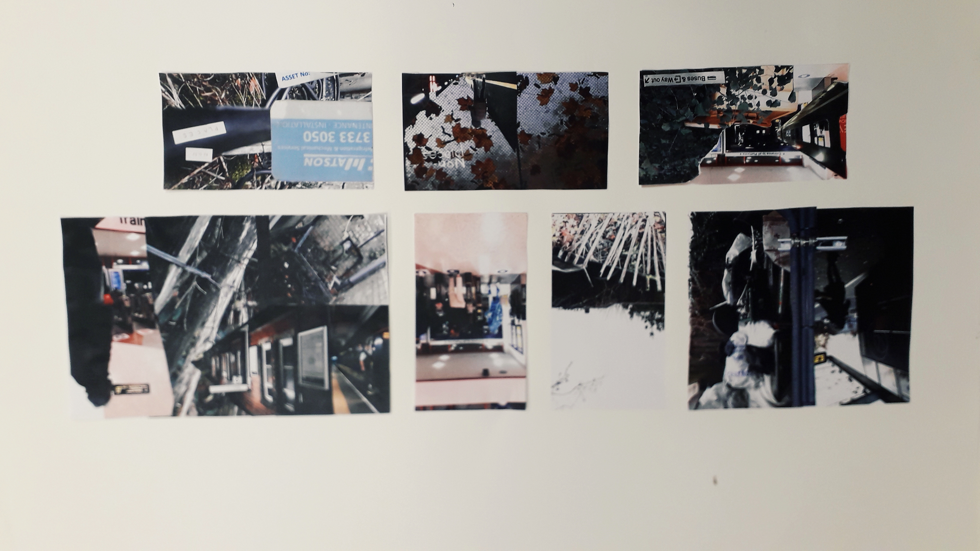
The morning consisted of printing off our pictures and collaging them into potential abstract book cover designs. As (and hopefully WHEN) I make it into university today, I’ll take and attach a photo of the worksheet I created full of collaged designs.

In the afternoon, we had a photoshop tutorial with Neil. I’m not going to lie, the fact that I didn’t have a mac to work on because the class sizes aren’t correctly managed did make me angry. I had about an hour at the end of the day to get my practical work done, though, and I’m really pleased with what came of it!

What was successful about the day? I would say that, after a lot of moping, my morning collages came out really well. I’ll be using them as inspiration in my photoshop endeavours. It was Danny, continually encouraging us to be quick and not to think too hard, that allowed me to create the work I did. He kept saying “it’s an instinctive exercise, not an intellectual one.” After about the fifth time, I was coming up on exasperation because I do everything the intellectual way. But he was right, of course.

I also think that in my limited time (and incredibly limited temper), creating the book jacket draft that I did was impressive. I had to create the word “PLACES” in Photoshop with the pink branches as a clipping mask, then import it into InDesign and flip it.

Interestingly, my reading the book Type and Typography has actually influenced the way I’m thinking about type.

What still needs to be done? I need to go in for a little while longer and spend some time mocking up other drafts of book jackets. I’d also quite like to write a blog on what I’ve been learning in Type and Typography.

Utensia: Day One

Utensia: Day One

Last Thursday, we started the illustration project. I picked an extract from the Wizard of Oz about a kingdom full of kitchen cabinets and equipment to illustrate.

The three week project is going to consist of experimentation and a lot of research.

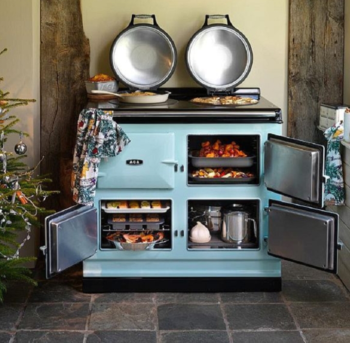
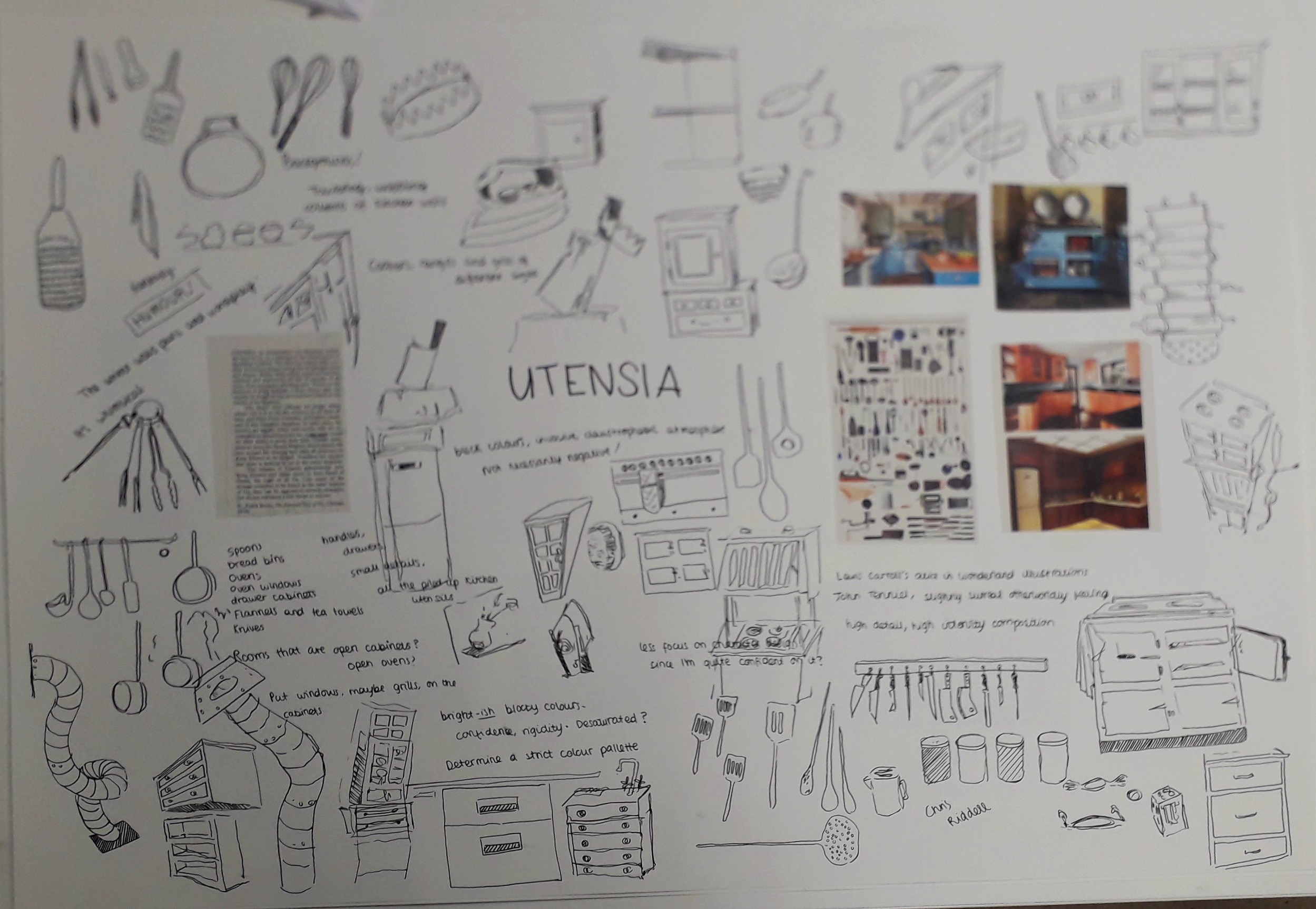
Here are some examples of picture references I used to create an initial ideas sheet:

If I end up making it into university today, I’ll take and attach a photo of the finished initial ideas sheet.

What was successful about the day? I liked that Louise encouraged us to work quickly, and make as many scratchy doodles as we could. I felt like I couldn’t make any mistakes, no matter how crappy the drawings looked.

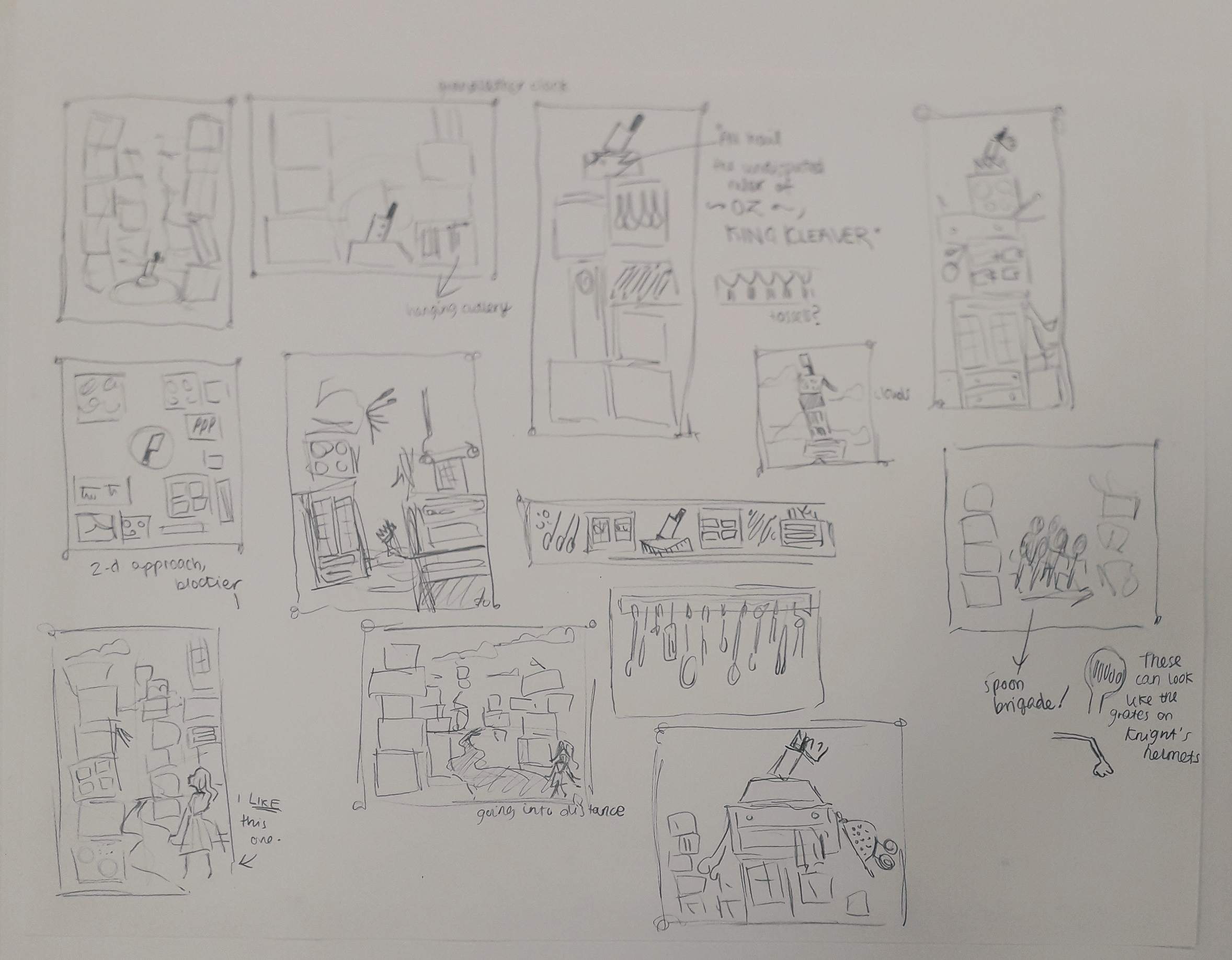
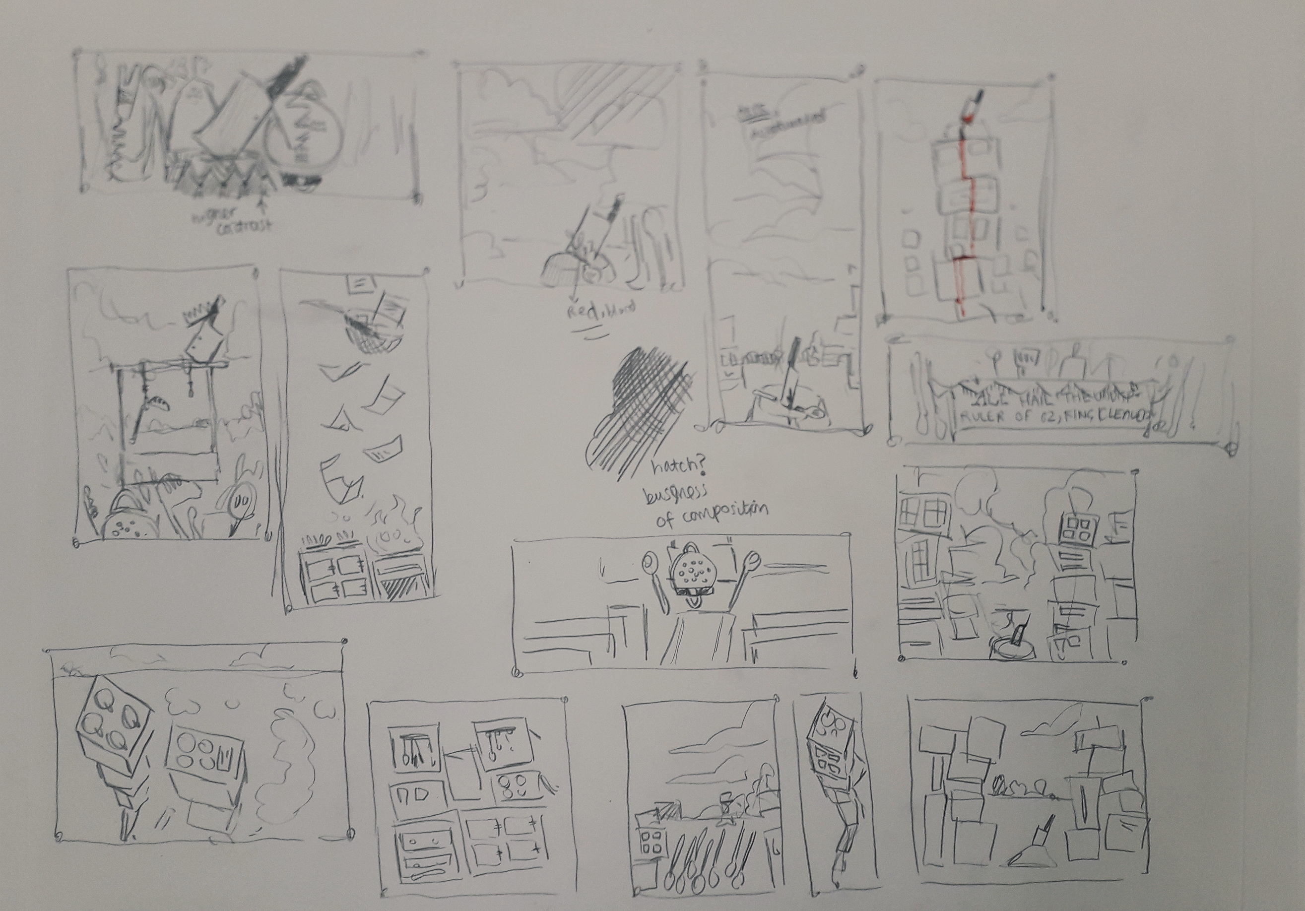
What will I do to continue the project? Ideally, I’ll research a relevant illustrator or two. In terms of physical work, I’m creating a ton of thumbnails for potential compositions; this Thursday we’ll be experimenting with a lot of different media. Then I can combine the best media with my favourite thumbnail to produce the finished illustration!


These are thumbnails produced for the next week in my self-directed time. I will ask friends which they prefer and I have a few preferences myself!
Personal Growth: Hospital Walls Brief

Personal Growth: Hospital Walls Brief

I had a little spare time the other day, and looked at Peepshow.org.uk for some successful illustration projects in the professional world for inspiration.

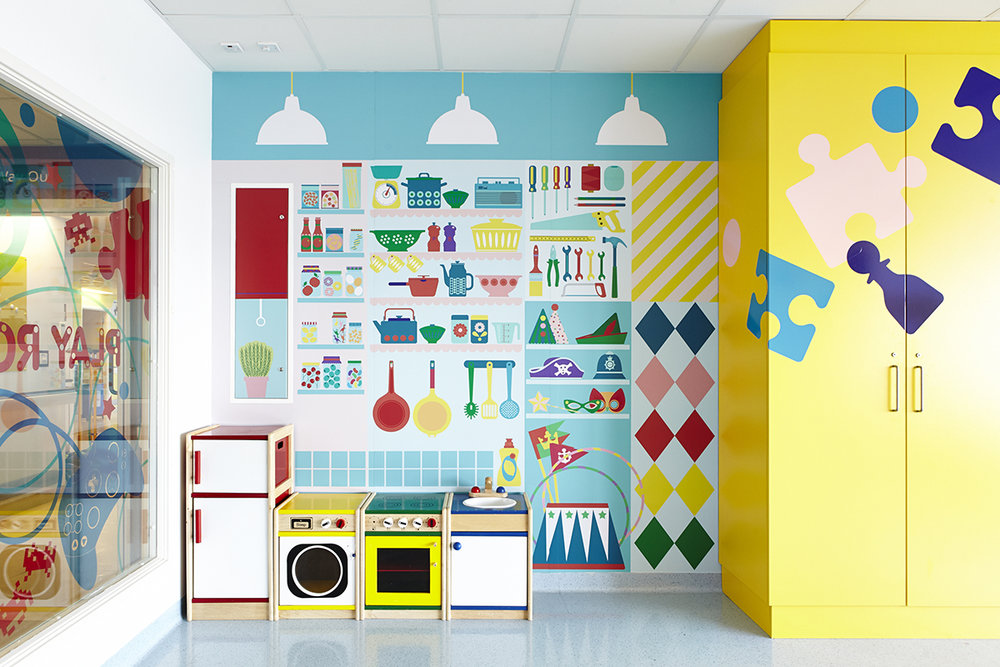
I found http://www.peepshow.org.uk/illustration#/university-college-hospital/ – this is a project done by the organisation to brighten up the University College Hospital in London. The walls in several areas of the building were printed with bright, uplifting illustrations.

It wasn’t in my style, but I thought that that was exactly why it would be good to try and fulfil the brief in a similar way.

This is an example of some of the work in the hospital.

I established visual motifs in the art across all of the walls. This included things like:

  • Bright colours (hues, primary, secondary colours)
  • Blocky, print-like designs
  • Themes that children might relate to
  • Basic, bold shapes and silhouettes
This is the page of my reflective journal that illustrates my thinking process.

I created an illustration in Clip Studio Paint that attempted to fulfil the brief.

This was designed to fit a jutting piece of wall, e.g. one hiding pipeworks or something similar.

What do I believe was successful? I like the darker green wave over the green hill. It’s like stylised shading I stumbled across while experimenting. I also love the pink cactus-like plant in the background, and the white flowers on it.

What didn’t work, and how might I improve in another attempt? I feel like the teal and the purple just didn’t sit right together. I was married to those colours, and should have tried more out instead of being stubborn. It’s just a bit too much of a wacky colour scheme for how simple the image is: imagine it were more complex, I could have a purple creature in the top corner that tied in with the low purple hill and created a better composition. As it stands, it’s a bit naive and jarring.

If I’d had more time, I’d have created multiple illustrations exploring different aspects of the brief. But there’s a bit of a limitation on my time now I’m doing uni-set briefs; I just thought I’d include a post about this so it doesn’t get lost.

Non-Places: Day 1

Non-Places: Day 1

On Monday this week, I had my first day of the three-day graphic design project. The brief is to create a book jacket for Marc Auge’s Non Places: An Introduction to the Anthropology of Supermodernity.

The day was split in two: the first, a briefing and Adobe InDesign workshop with Neil. The second was pretty self-directed; finding photos and doing research for the book jacket.

This is a screengrab from the end of the InDesign walkthrough. We have a template of the correct measurements for the jacket, complete with the logos and text the brief requires. Now we can play with it without worrying!

I also got a few photos inspired by Non-Places. I’ll include a couple of them.

This is the top of a bus shelter, although it might not be perfect because the viewer needs to KNOW what it is in order to create a coherent mental image of the term “non-places”.

Was the day purposeful? Yes! Having missed my InDesign induction workshop with Neil the first time, I really needed the tutoring. There were lots of little things I learned about creating guidelines and layers, etc. I have a working note on my phone with interesting advice I’ve been given about using InDesign.

Were the media and techniques I used successful? Why or why not? The photograph collecting is all done on my phone. It’s quite high quality, but I know it could be improved by booking out a serious camera and getting to grips with it, e.g. aperture, focus, etc. Otherwise, I’ve been taking photos when I see relevant places. I try and get landscape and portrait versions, on the off-chance that I might like one enough to do a complete wraparound of the jacket.

Where am I going to take it? Outside of class, I have assigned work to do. Apart from collecting more photos, I have to compile them together in a document and ensure they’re printed out for the next workshop. I might also experiment with colour digitally on a few of the images, see what I like and don’t like. Research-wise, I’ve checked out a ton of the recommended reading from the library… but I’ve already blogged about that, so you’ll know!

Pulled Receipts: Bookbinding Project

Pulled Receipts: Bookbinding Project

Over the past few weeks, I’ve had a personal project in mind. I’ve always been interested in bookbinding – especially the idea that I could bind loose items into a notebook that wouldn’t usually be pages, e.g. small paper pockets or envelopes, or different types of paper.

I wanted something quite simple to bind that wouldn’t overshadow the focus on binding itself. In the last half of October, I collected most of the receipts I encountered from myself, friends and family to mount and bind into a book.

I bought all the paper and materials at Broad Canvas in Oxford. Here is a progress picture of the stitching I learned from a YouTube video by SeaLemon.
Here is a final image of the stitching. The lower two stitches are far neater because I realised halfway through that my looping method was slightly wrong. You live and you learn!
This is the front cover. I created a card stencil to sponge paint through which reoccurs throughout the book on pages without receipts.
This envelope was collected. It’s actually bound in upside-down, which was a mistake, but I don’t mind.

Below are a few more example pages I feel are interesting.

Overall, there were a lot of decisions to be made in terms of colour scheme, paper size, what to include, etc. I’m really happy with how the experimental book turned out. It feels nice to hold and turn the pages of, and the envelopes full of offcuts make it a little interactive and interesting.

The idea behind collecting receipts from a certain period of time makes this book almost like a diary. I have dated and captioned every receipt in the book. The main events that this covers is visiting my granddad and a week I spent in Reading with Jamie and his housemates.

What would I do differently / what did I learn? I made a few mistakes, considering it was my first bookbind. Some of the stitching was slightly too loose and some slightly too tight, meaning I had to do some serious page wiggling to make certain pages lay flat. I missed one stitch on an envelope by accident (but tied a thread round the hole to make it look like I didn’t!) That and my mistake in the first stitches, but I fixed that with the last stitches.

How will I take this further? I could take the idea of receipts further, in terms of illustration. I could work with coloured paper and illustrate some conceptual receipts – maybe a diary of my day with items on the receipt corresponding with events. I also thought about lino cutting a shop title, like Sainsbury’s, and creating a small series of receipts – or creating a clay tile receipt and stamping it with the lino cut to create an indented title.

Sadly these are all conceptual for now, along with the next bookbinding project; tomorrow I start my three-day projects which will be completely different briefs. I’d like to place my focus in those so I don’t stretch myself too thin, but you may see me coming back to these ideas yet!

Design Process Reflective

Design Process Reflective

On the last Friday before half term, we were placed into groups and asked to research an assigned colour in order to put the Design Process into practice.

Our colour was gold, which was a pretty cool one! We separated ourselves into different tasks and reconvened about an hour later to brainstorm and see what ideas we liked.

We created two finished things: a large golden collage full of positive things associated with gold – that is, abundance, gold in nature, authenticity, holiness, etc.

I apologise for the quality of this picture. Usually I take a lot of pride in nice photographs, but this was sent to me by a teammate who was kind enough to stay behind and take pictures.

We also created a smaller cardboard box entirely collaged in gold as well, but dull and empty on the inside. This related to mankind’s hubris and greed in relation to gold. For example, King Midas suffering as he turned everything he touched into gold, or the Spanish Conquistadors committing mass murder in the pursuit of gold.

Unfortunately, I don’t have an image of this! The presentations ran over early and although I didn’t bail out and leave, I was running late for a train and booked it out of the campus before taking a picture. If I can grab it in the studios, I will attach a picture soon. However, it was more about the process than the finished result.

How did I find it? Well, team is a bit of a four letter word to me. I find working with other people to be very stressful and in a way this was no different. Often in a group and faced with a big task, people will flounder a little. I took charge and asked who wanted which task so everyone had a purpose. I also suggested the time to meet up again and discuss ideas, and time management for most of the afternoon. This is somewhat a coping mechanism for me, so I feel a little in control, but I continually worried that I was coming off too strong or bossy.

Was it purposeful? I want to say yes… any practice in collaboration is good practice. I get in my own head so often, I know collaboration is a good way to yank me out of it.

3D Workshop Reflective

3D Workshop Reflective

In the 3D workshop, we were inducted first into ceramics and then into resistant materials (that’s wood, metal, acrylic – anything you need a terrifying moving blade to cut).

In ceramics we were given a chunk of clay. We cut it into a square tile and created an abstract take on our cardboard sculpture from the first 3D workshop.

This is the clay after de-moulding. I’ve lost some of the features, but they show in the plaster cast below.

Next, we created clay walls and poured plaster in to take a mould.

Things to remember about the method in ceramics and plaster moulding:

  • Use a cloth underneath your clay, lest it basically fuse with the plastic table.
  • Use a wooden block when creating clay walls for your tile.
  • When mixing plaster, use the green flexible rubber containers.
  • Fill about a third full with water and try to saturate it with plaster until it’s like thick single cream.
  • Mix with your hand and try to work out any lumps for about five minutes.

Was the research purposeful? Getting inducted into ceramics is incredibly useful. I hope I’ll head back in soon and make some of my own work. I like the idea of making small, sweet things. Maybe I should research some ceramic jewellery makers.

How could I have developed ideas differently? I feel like I did all I could this session because of time limitations, but I certainly could have developed further. I could have tried some more textures. If I did this again, I would have tried more textures pressed into the clay, so the plaster cast had more bumps rather than dents.

This is the result of the resistant materials session. I wanted a kind of dome shape, like Willie’s middle. That got expressed with the dome-like side of this sculpture. I wanted lots of thin strips to show the corrugated cardboard texture, but they ended up getting nailed on in an interesting shape all around the base.

Things to remember about the resistant materials space:

  • The big scary blade is called the band saw (I think). Turn on the dust extractors first. Use the push sticks if your hands are even THINKING about getting near to that blade. If you can see the teeth of the blade, it’s not moving and is safe. If you can’t – it’s moving.
  • The smaller blade is easier to work with. Don’t go past 1cm thickness wood when you use it. The blade is known to snap, but if you don’t turn too tightly you should be okay.
  • Turn on the dust extractor for the sanding machine before using it. Always sand on an area moving downwards.

How can I use what I learned? While woodwork isn’t really my forte, I like to think I’ll use the resource while I have it. Maybe making something to fortify an illustration… or if I ever learn bookmaking, I could cut a very thin slice of wood to be an actual functioning page in it!

Did I develop my ideas thoroughly? I was limited again by time and resources. The smaller saw was pretty much constantly in use. I really like the idea of using free scraps of material to make something pretty, though. I could make something that hangs with the kind of elegance of the smaller wooden sticks.

What didn’t work? I originally had a grand old plan to cut multiple semicircles of wood and somehow sand them into a 3D object. It just wasn’t practical, so those scraps got abandoned. I moved onto something slightly different which formed the final work.