Photography and Darkroom Reflective

Photography and Darkroom Reflective

Yesterday, my group was inducted into the Darkroom to learn how to create photograms.

To create a photogram, you must learn how to use an Enlarger. For our intents and purposes, the enlargers are just projectors of light. (However, they also enlarge film strip negatives, hence their name.)

To set these up properly, you have to check three things: Height, Focus and Aperture. I immediately logged this into my brain files with the mnemonic Hairy Fat Arse. I’m not happy about this either, but it cannot be changed and is incredibly helpful.

Height: Make sure the enlarger is high enough that the rectangle of light it produces is generous. You don’t want to accidentally place photosensitive paper outside its edge, because you’ll expose it incorrectly and bugger up your photo. The large handle on the side of the enlarger allows you to first unlock, and then change, the height.

Focus: There’s a knob to change the focus on the side of the enlarger. When the edges of the light are crisp, you know it’s focused.

Aperture: A twisty circle inside the enlarger allows you to change the aperture. We were recommended that we move to the highest brightness, then down three settings, as our default aperture.

Creating the photograms is easy: place objects over the photosensitive paper and expose them to light for anything between one and, say, ten seconds. Light doesn’t pass through solid objects and you end up with some exposed areas and some protected areas.

Pass the paper through three chemical baths: Developer, Stopper and Fixative. There are instructions about timings above each bath.

Here is my final print along with two test strips! (I got a little avant-garde with my developing in the top strip and needless to say it didn’t work at all. Oops.)

How can I take this further? The photograms were really fun. I will look online to see if I can get reasonably priced photosensitive paper, but I have a bad feeling that wherever I look they’ll be really expensive. If I invested in another pack for myself, I’d see if I could expand the work into an illustrative style. Maybe use card cutouts and more found objects, or work collages into my illustrations.

Life Drawing 1

Life Drawing 1

Last Thursday I was lucky enough to grab a place in the weekly life drawing session after classes. The model was a middle-aged man called Peter, which was admittedly a challenge. In the sessions I’d attended in summer, I’d only ever drawn female models.

My placement in the room was to the side, which meant I got a LOT of foreshortened poses. No complaining, though – it’s the perfect storm of challenges that help me improve.

These were two five-minute poses. You can see I realised I had to loosen up after the first, and opted for charcoal instead. I learned that with a pose as short as this, there’s really no point measuring because you’re going for a gesture and a dynamic feeling.
Above are ten two-minute poses, each immediately after the other. Honestly, I felt like I’d run a marathon after this was over. This was invaluable for my eye, but I remember looking at everyone else in the room and exchanging mutually exhausted glances.
Here I was lent a thick brown graphite stick. It was water-soluble, and loads of fun to play with. This was a 15-minute pose, and Peter was heavily foreshortened. My eye was clearly in it this time – I’m pleased with this drawing.
After a short break, the final pose was 25 minutes long. I found measuring this quite difficult, but the foreshortening was again a good challenge.

The practice that the two-hour session afforded me was so useful. It’s quite an awkward time of the evening, at 4:30 to 6:30pm – because staying in from class can be exhausting and it makes for a very long day. I’ll definitely try to attend again, though.

Lovers’ Experiments

Lovers’ Experiments

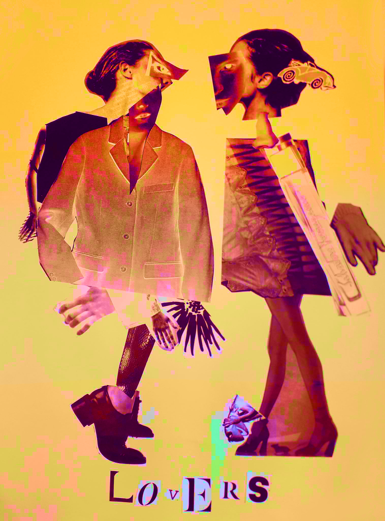
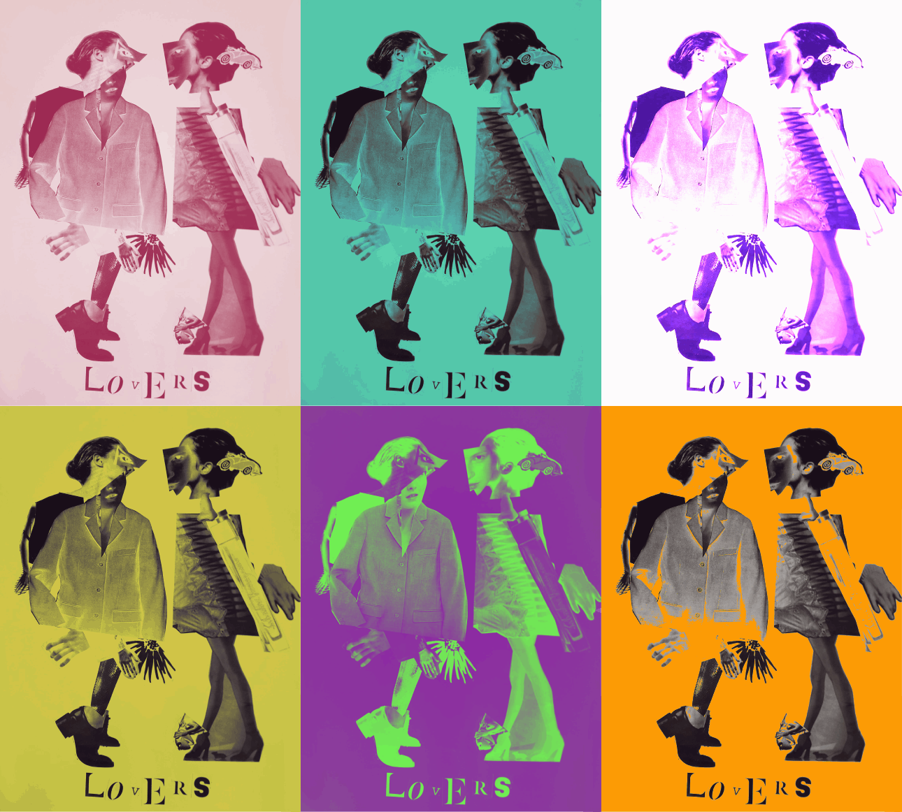
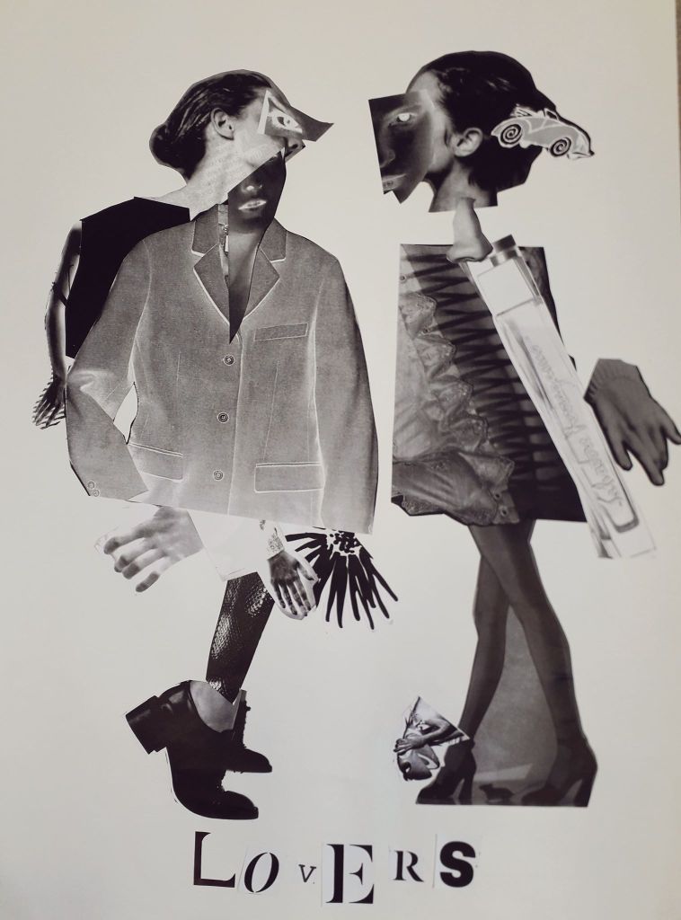
I took the best quality image I could of the Lovers, the final product of the Exquisite Corpse workshop. I uploaded it into Clip Studio Paint and messed around with layer effects and learned the basic animation timeline feature by creating a gif showcasing some of the effects.

Above were all experiments with the Darken layer effect. In only affecting the background, I can create bright images that still allow for the contrast of the black figures.
This was the saturation layer. It’s the crudest filter, but I really liked the colour skew in the worst affected areas like Kermit.
This is the exported .gif file. Here I’ve experimented with darken, lighten, soft and hard light – but my favourite layer to play with was Exclusion. Exclusion actually reversed what was dark, so in the original workshop when I printed off inverted sheets you catch a glimpse of the original values.

The main thing I learned was the animation timeline, and how to export as a .gif. I already knew about all of the layer effects, but having the freedom to showcase them all meant I discovered Exclusion.

Video Workshop Reflective

Video Workshop Reflective

Yesterday was the first technical workshop of the block – video with Kate. We were required in groups to shoot and edit a short video featuring “matching graphical cuts”, e.g. the circular part of an eye fading out to a moon in a sky. The shape, form or colour matches between shots and creates a tangible link between otherwise unrelated scenes.

A short storyboard.

One of the biggest difficulties was space and technology. Due to booking issues, we were in a very small edit suite with macs (my burning hatred for apple macs is stoked every single time I sit down at one of their shiny emotionless screens). Our mac was so confused we ended up working on Kate’s laptop.

If I were to take this further on my own, I can rest easy in the knowledge that I might have room to edit properly once there’s not a whole workshop in the room.

Here is the finished video. I have made this private, but just ask me if you’d really like to see it.

What was I pleased with? The group work went smoothly on this one. We had a good time, and everyone got their respective shots onto Google Drive and shared them with me. Importing the shots was probably the hardest thing because it needed so much collating.

I’m happy with this video as a whole. The shot passing the notebook across the table was edited very smoothly.; I feel like we hit the brief exactly with it. Kate seemed over the moon too!

What would I improve? In terms of the video, I’d ideally shorten the length of time the screen is entirely white (between the paper and the sky). It gets a little arduous watching that, and loses some of its energy.

Where can I take this? If I’d had a little more time in the edit suite alone, I could have played with PremierPro for quite a long time. I’ll need to think of a small project or something, just so I have something to edit.

I could talk to Kate or Louise about the possibility of animating over a video on some kind of transparent layer. Think Who Framed Roger Rabbit. I’m not sure whether I’d be using Adobe Animate or Premier Pro or what there.

Exquisite Corpse Reflective

Exquisite Corpse Reflective

The point of this lesson was to imitate a parlour game from the 17th Century called Corpus Exquis, or Exquisite Corpse. This involves cutting up and collaging images to create figurative characters. They are just recognisable as human but have a surreal or creepy feeling to them.

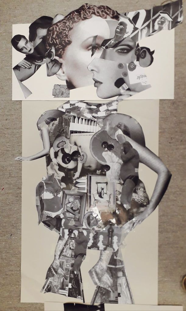
The head our group created in the first workshop.

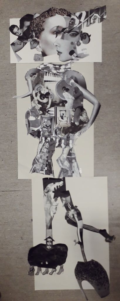
The first exercise was collaborative. We created a head as a trio, and other groups created bodies and legs. These were placed together.

This was the entire body. I have to say I prefer the top two units compositionally.

What I was really happy with in this exercise was the collaboration. The strip of eye over an existing eye delighted me, and I would never have thought to do it. The diagonal row of faces leading out from the center of our head was Martha’s idea, and that again became one of my favourite parts.

Another really useful element was learning how to use the photocopier and scaling things up or down as well as playing with colour. This I will definitely use in my work outside of classes, to create iterations of characters or ideas.

“Lovers” – the final half of the day was a solo project creating characters similarly to the morning’s.

I was very pleased with how Lovers came out. I didn’t start off with any idea in mind except with all of the sheets full of images that took my fancy. A pair of heads on one sheet looking at each other became the base of the two faces, with other features stuck on top.

Even though this project was on my own, I ended up using a large jacket that Martha didn’t want to clothe my left Lover after having nothing the right shape myself. So it still wouldn’t have looked like it does, had I been working alone outside the studio.

How could I take this further? I have a Vogue magazine now which I think I will use to repeat this exercise at some point; if not the exact same then on a slightly smaller scale (to save my printer money!). I will also place Lovers into Clip Studio Paint and experiment with layer effects to create a series.

Chance and Sequence Reflective

Chance and Sequence Reflective

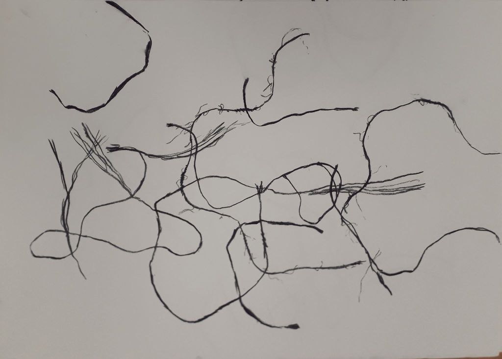
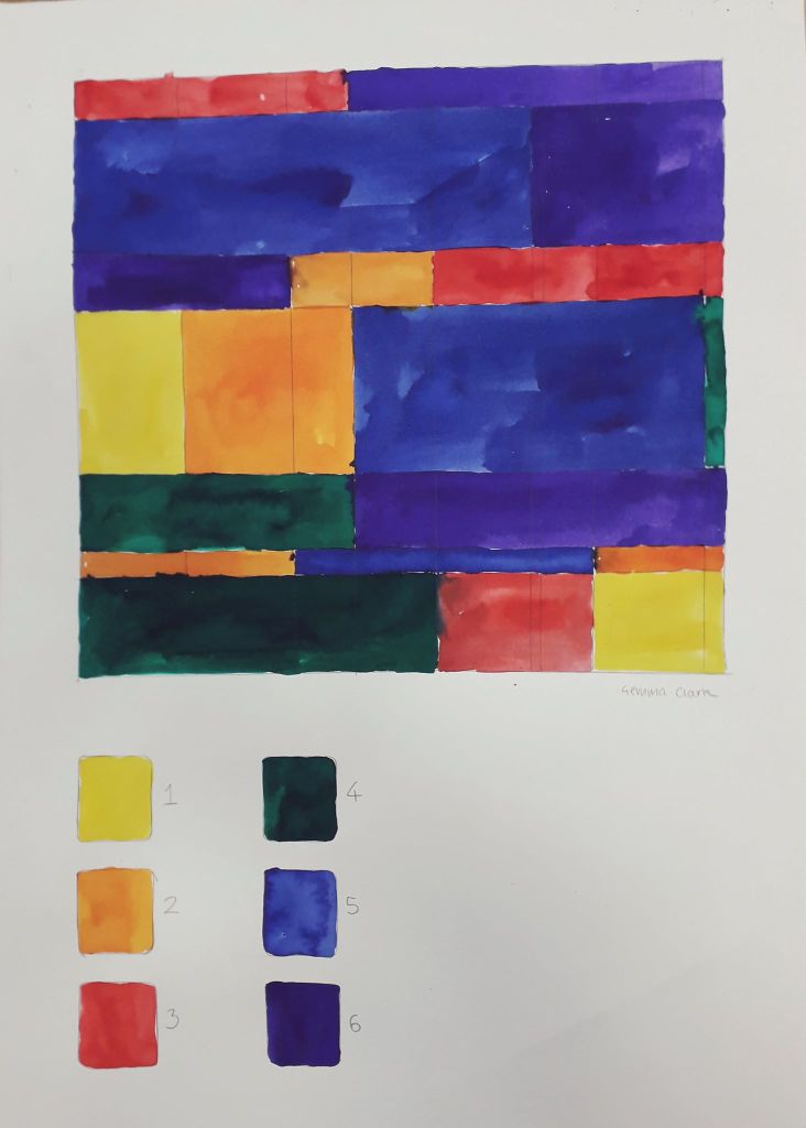
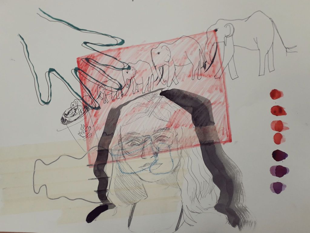
This project was all about creating fine and abstract art based on the laws of chance. We took part in four activities. I’ve detailed exactly what we did in my reflective journal, so I’ll just upload pictures and critically reflect here.

String drop felt like quite a silly activity. In reality, I like what I created with it a lot.

How could I take this further? I could use the activity of “dropping” paper shapes onto magazine images to select images and shapes to collage with. This would force me to randomly select textures rather than carefully cutting out images I found appealing. I thought that if I coloured in the spaces in blocks, it could create quite an appealing background to another illustration or drawing. I could simply repeat the exercise with grass, straw, leaves or other natural material.

This was geometric randomness. I don’t really like this as a piece of art on its own.

How could I take it further? I thought I could do this with more limited colours, e.g. blue, purple and pink, to create a random piece of art that was slightly more aesthetically pleasing.

This was the collaborative, instructional drawing. I had a blast actually doing this exercise. I’m getting to quite like letting go of control in collaborative exercises. (And I never thought I’d hear myself saying that!) Things happen that would never have happened if I’d worked on my own.

How can I take this further? I could collaborate again with friends – e-mailing or swapping drawings to work on for each other.

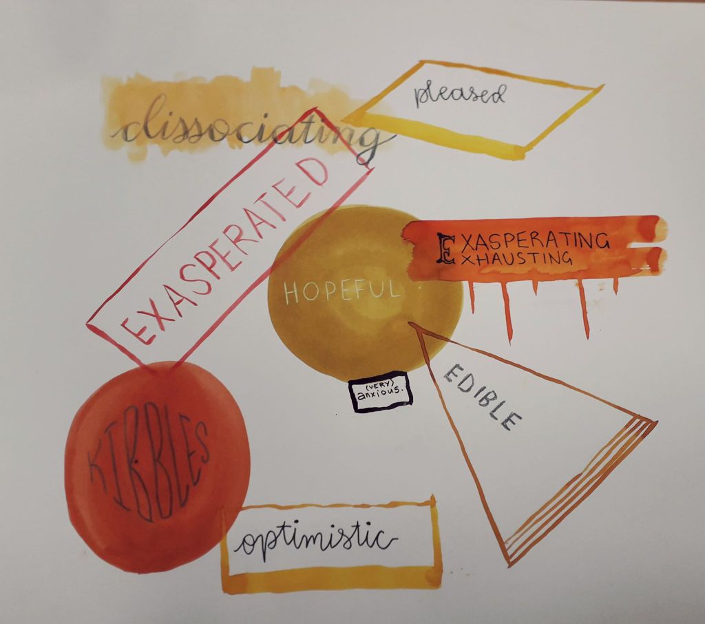
The conceptual emotional drawing was fun again, because I jump at any opportunity to introspect and write about what I’m feeling. I like the composition of this a lot, and the stricter colour scheme made me feel better from the earlier drawings.

How could I take this further? Well, I actually made Jamie complete an identical exercise that night. I have his art and I might turn it into a larger piece, so that they could exist in a series.

Finally, I created some random poems using dice and newspaper clippings which you can see in my sketchbook. These really were nonsensical at times… I don’t know why, but I suppose I thought I’d create something super edgy and deep! They were still fun. I might create a few for my reflective journal or put a twist on them for something fun to do.

I do hope I’ll do some more work related to chance, even if just a small aspect of something else. It’s nice to leave the thinking to the laws of physics and probability!

Gained in Translation Reflective

Gained in Translation Reflective

Gained in Translation was about how we interpreted description in drawing, and then interpreting drawing in a 3D model made of cardboard. The art and personal element came in the gaps of interpretation between words and paper, and 2D drawing and 3D model.

I enjoyed drawing from Said’s description. I was lucky that the object he described seemed to have a face, as I have a habit of anthropomorphising – and then becoming attached to – things.

I know Willie is a rude name, but I can’t get it out of my head for the little guy.

Below is what I found out the description was actually of, right at the end of the day.

A chipmunk type thing… this item doesn’t have a formal use. I’m told it was a ceramic student’s old work.

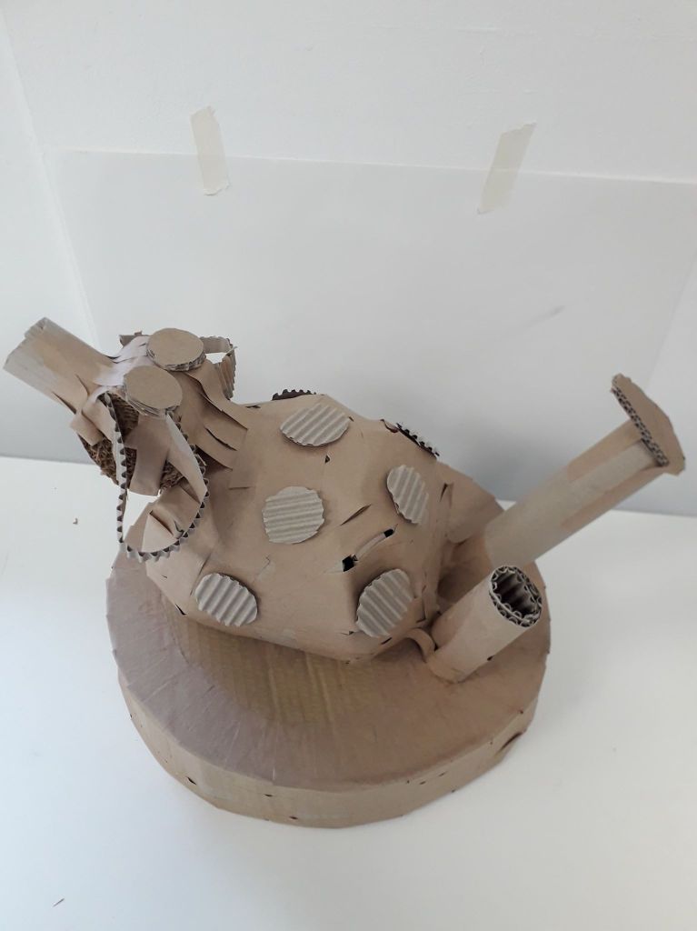
I translated this into a 3D model as best I could.

I thought that by chance, this cardboard model has a lot of personality. Far more so than the original (rather creepy) drawing.

Methods:

For the base, I used two circular pieces of durable cardboard and cut one length of flexible (one-side-corrugated) cardboard for the middle piece. I would secure an area a few inches wide with gummed tape, then work through the area with more individual pieces of tape until it was completely secure and uniform. I did this right the way around both sides.

For the (relatively) spherical body, I created a kind of guideline using two hoops of flexible cardboard arranged like two interlocking bangles. I then worked around it with long eye-shaped pieces, similar to how they stick maps on globes.

What could have been improved? I feel like this session went very well overall, actually. A little longer to work might have been nice – but I understand that the time constraints were kind of part of the project. I managed to finish him. Similarly, other materials like paper or tape might have been useful, but the fact that we were only allowed gummed tape was part of the project too.

Where can I take this? Well, funny I should ask that – I’ve already taken it a little further with a couple of character design exercises. I might make a separate blog about it when I finish it, but what I’m doing with the model is using it as a starting point to design a sweet little character. I feel like I’d be doing him dirty if I just forgot about him. He wants to come to life!

For that, I’ve drawn the model a couple of times quickly to get a feel of it before printing off a couple of pictures for inspiration. I’ve also painted some ink silhouettes that I’ll line a few iterations of his character onto.

I might well be tempted to using cardboard to generate ideas again. Considering that I have some issues with varying body shapes in my art, something that forces me to make shapes like this might help kick start that process.

Performing Chance Reflective

Performing Chance Reflective

Yesterday we completed the Performing Chance workshop with Kate. I wasn’t particularly looking forward to or resenting this one, because I really had no idea what was going to happen.

The initial lecture consisted of a brief history of chance being used to influence art. This included Dada, Surrealism, Abstract Expressionism and Fluxus (which is still running to the present).

The first task after the lecture was a lot of fun. Everyone went into the studio for 30 seconds and could do whatever they wanted to a table full of objects. This was filmed and played back afterwards. I flipped the whole table over. I liked it; I liked doing something radical that nobody had thought of up to that point.

I’ll try to find a screenshot or two from moodle, but so far it doesn’t look like it’s been uploaded.

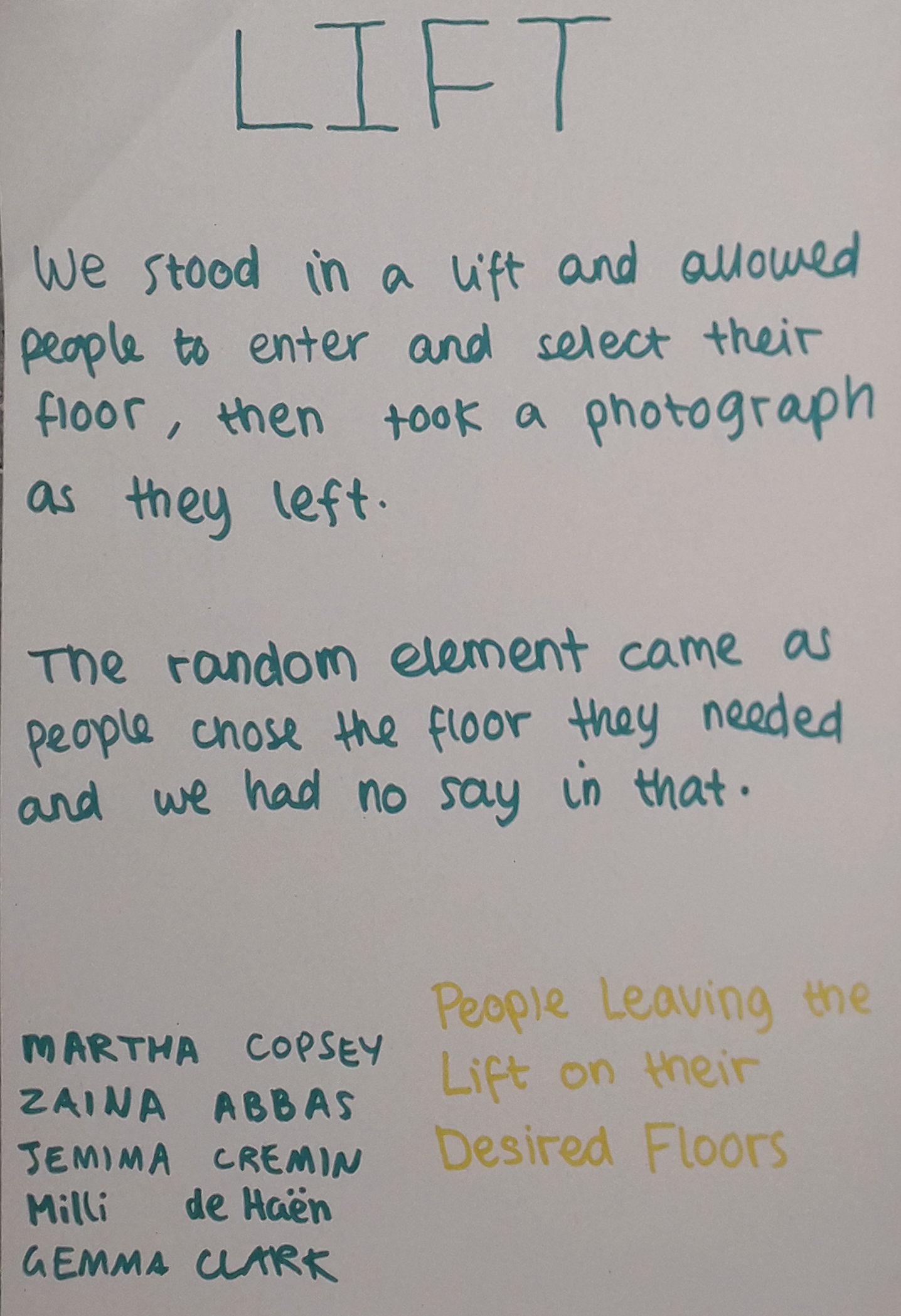
The conceptual photography element was fun. The workshop being based around random chance, we had to create a framework as artists and allow for chance to alter the final work.

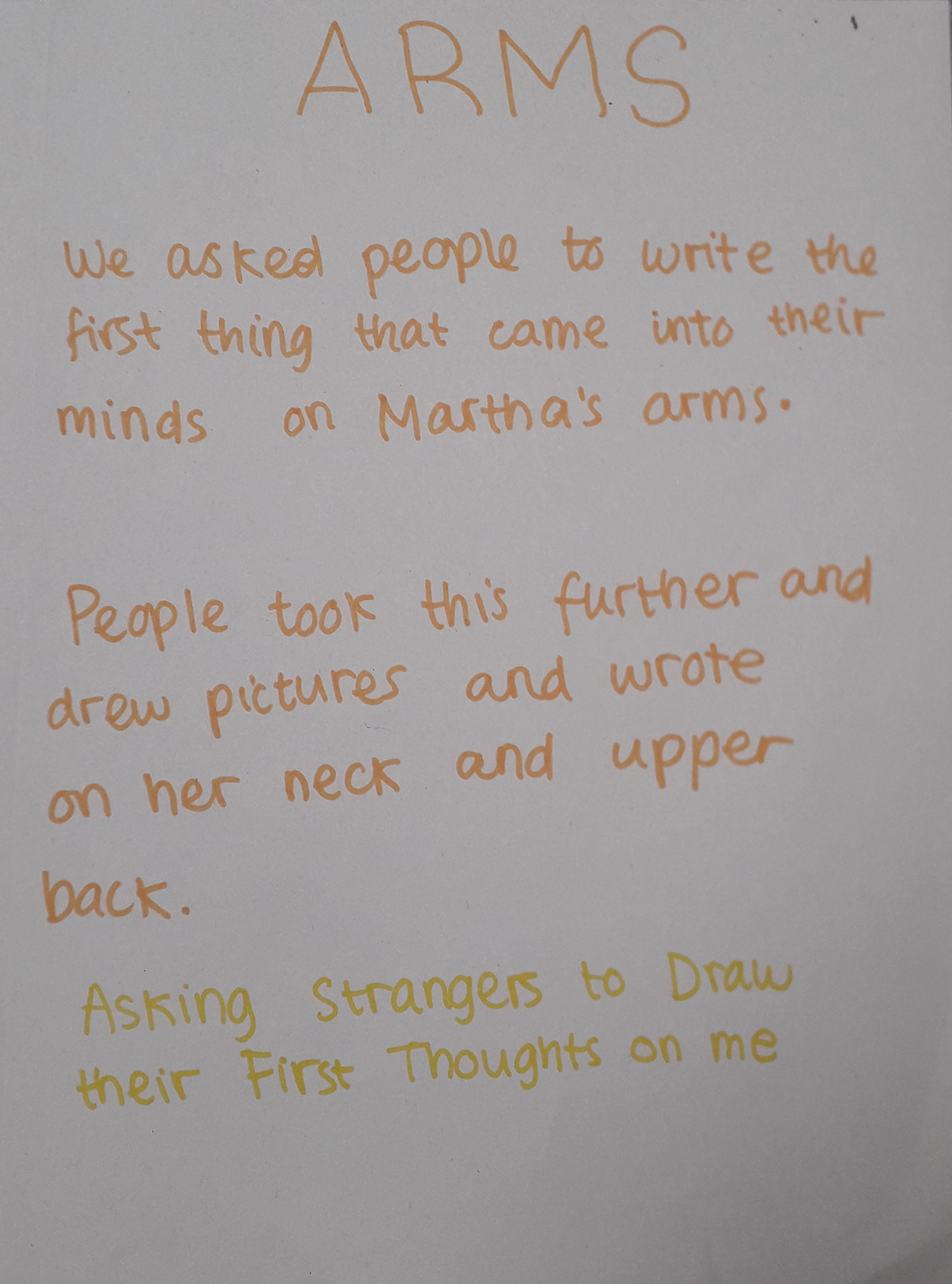
Our group projects.

I might use this kind of conceptual photography in my work. It can portray an idea in a way that makes you focus on the idea, not the art.

If I could have improved anything, the photos would have been completely candid, with no knowledge they were being taken as the person left the lift. Of course this wasn’t possible. Maybe in a way, there will be an uncertainty in the gestures of the people leaving knowing we were taking a picture of them.

One thing I thought was good about the work I made was the human element. The pictures aren’t just pictures – they capture a decision made by each individual person.

Mind mapping as a team of five was fun, but I know I’m not very good at group work. The nature of the ideas forced us apart for the afternoon in a pair and a trio. I did make some concessions and they turned out really well in Martha’s side of the project!

I learned that it takes a lot of thought to carry out this kind of photography, even if pressing the shutter itself doesn’t take much effort. It was a new way of working.

First Real Day at University

First Real Day at University

The last few days have been a really stressful, REALLY exciting time for me. I moved into dorms on Saturday and have been settling in quickly… that means meeting all my flatmates, locating and visiting the nearest Wetherspoons and generally staying alive and healthy in lieu of my mammy doing everything for me back home.

I’m here to talk about the art, though! After icebreakers, everybody settled into small groups and looked through our survival kits.

The first task was to draw “instructional” diagrams of your (or another) survival kit, communicating each item’s use without using any written language. Think IKEA construction booklets.

Then we were tasked with mixing up our kits as a small group and creating a new survival kit, which in the process of naming image files on the laptop I dubbed “frankensurvival”.

The idea was really to push the limits of our creativity and we had free reign to do what we wanted, pretty much. Said, Zaina, Martha, Jemima and I made a small Bob Ross shrine and a small pile of potential weapons to beat enemies with, illustrated on the common public enemy of Alvin and the Chipmunks. Below are images from today.

This was our “Peace” shrine. See calming things… such as Bob Ross and “music” – charmingly represented by the only single I own, a cover of Under the Boardwalk by Bruce Willis bought for my 18th as a joke by mum.
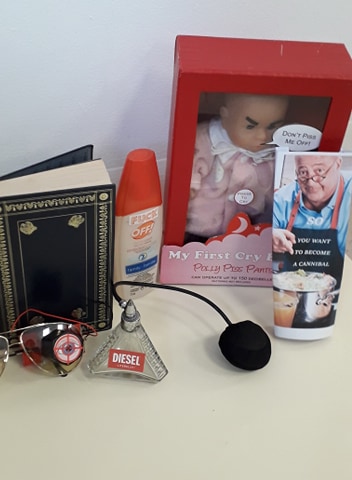
This was our “war” area. Special mention to Polly PissPants and “So: You Want To Become a Cannibal”.
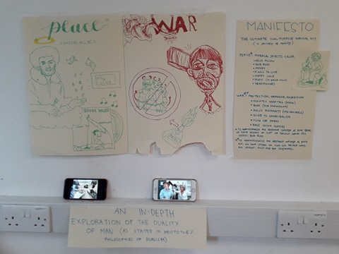
See our installation setup here – a visual recreation of the below installations. I was particularly proud of my sharpie Alvin and the Chipmunks art.
Some informational images depicting the intended use of our objects. Volume of War And Peace – for Smackdown (or a spot of light reading).
Headphones and Mood Meter glasses to detect nearby infants close to tantrum.
Special cameo made by me on the right – 3 worshiping Bob Ross.

Overall, it was a fun day. Our final survival kit was easily one of the most comically inclined of all of those students made. Well over half of them were quite depressing, really. VERY heavy on the climate change and anti-political, environmentalist-dystopian views. I have to say there was one kit that made a point on having a positive, conscientious outlook on the future and was generally a very pretty kit; I hold respect for the group that created that amongst such an existential crowd.