On Monday this week, I had my first day of the three-day graphic design project. The brief is to create a book jacket for Marc Auge’s Non Places: An Introduction to the Anthropology of Supermodernity.
The day was split in two: the first, a briefing and Adobe InDesign workshop with Neil. The second was pretty self-directed; finding photos and doing research for the book jacket.
This is a screengrab from the end of the InDesign walkthrough. We have a template of the correct measurements for the jacket, complete with the logos and text the brief requires. Now we can play with it without worrying!
I also got a few photos inspired by Non-Places. I’ll include a couple of them.
This is the top of a bus shelter, although it might not be perfect because the viewer needs to KNOW what it is in order to create a coherent mental image of the term “non-places”.
Was the day purposeful? Yes! Having missed my InDesign induction workshop with Neil the first time, I really needed the tutoring. There were lots of little things I learned about creating guidelines and layers, etc. I have a working note on my phone with interesting advice I’ve been given about using InDesign.
Were the media and techniques I used successful? Why or why not? The photograph collecting is all done on my phone. It’s quite high quality, but I know it could be improved by booking out a serious camera and getting to grips with it, e.g. aperture, focus, etc. Otherwise, I’ve been taking photos when I see relevant places. I try and get landscape and portrait versions, on the off-chance that I might like one enough to do a complete wraparound of the jacket.
Where am I going to take it? Outside of class, I have assigned work to do. Apart from collecting more photos, I have to compile them together in a document and ensure they’re printed out for the next workshop. I might also experiment with colour digitally on a few of the images, see what I like and don’t like. Research-wise, I’ve checked out a ton of the recommended reading from the library… but I’ve already blogged about that, so you’ll know!
Klimowski’s parents were Polish emigres. Klimowski studied at St. Martin’s School of Art, but unexpectedly returned to Poland in 1973-80. “There he specialised in poster design and made films in a political climate where graphic communication was not merely oil for the wheels of capitalism, but a way of maintaining hope of a better future than Communism could provide.”
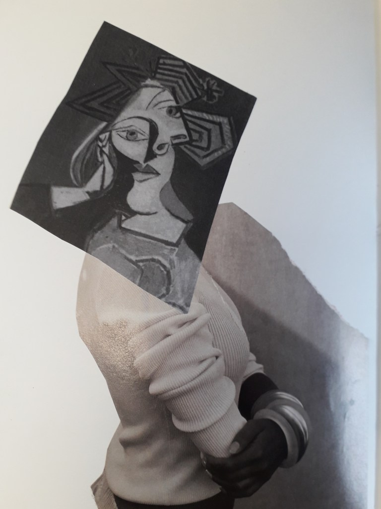
He had success creating book jackets for writer Milan Kundera, whose work was supporessed after the Russian invasion of Czechoslovakia in 1968. His collages are surreally inspired, often featuring bodies with the head obscured. This has relevance to the suppression of intelligence under an oppressive regime.
A quick google search on this book suggests that the Author set out to make the point that neither love nor art offer an escape from political background and conflict. The burning fire might suggest the intrusion of politics into the love stories within the book. I like the inclusion of both photography and enlarged sections of engravings here. I’d like to make some sort of surrealist-inspired work, and this jacket really appeals to me. The starkest tonal difference is in the hand holding the puppet-strings, and therefore draws the eye there. The composition is balanced, with darkest patches in the upper left and lower right.
How is this relevant to my current practice? The graphic design brief specifies that our book jacket will be a photographic collage, and Klimowski’s works are just that. They have a “cut-and stick” feel to them that corresponds to the workshop’s activity of physically creating a collage.
Source:
Powers, A. (2001) Front Cover – Great Cover and Book Jacket Design, Mitchell Beazley, UK.
Among other recommended reading I checked out of the library, one book was Front Cover- Great Cover and Book Jacket Design by A. Powers. I spent a few hours reading it and taking notes to help me with my own book jacket design.
Book jackets first started appearing in the late nineteenth century. Before this, books tended to be bound plainly (with the logic that the content did not need to be “packaged” in order to be sold). One example of the earliest book jackets is The Yellow Book, an Illustrated Quarterly. It’s yellow and sweet, with affiliations to Oscar Wilde that damaged its reputation at the time (because he went to prison!)
After the First World War, there was a considerable growth in publishers and competition to sell books. The jacket was a natural evolution in marketing to appeal to potential consumers, whereas before the extra marketing wasn’t necessary. Publishers could commission artists to paint or create covers for them. “The cover sells the book” became the new ideology.
This is just a side – because I remember reading it and thought it was cool. While many artists created paintings for covers, it was difficult to convert these into block prints for mass book-jacket production. It was artists that had a better idea of the process of mass production that could manipulate it for the best effect.
See also Angus Hyland, a designer I kept running into throughout the book and need to save. His style was simplistic, and was monotone photography coupled with simple yet effective typography. He designed for both Canon publisher (“repackaging the bible” for 20th century readers) and Rebel Inc. publishers.
Penguin Books
Allen Lane released Penguin books in 1935. This was almost as revolutionary in the book selling industry as was the invention of the printing press. Penguin books released books in huge quantities and very cheaply, within a strict brand identity and tight cost restraint. It forced other publishers to keep up.
“The structure of the Penguin list still reflects series divisions which were established in the immediate post-war period, such as Penguin Classics and Penguin Modern Classics.”
Penguin’s brand identity has kept their brand afloat since 1935. An example of this is the formula of using modern or old master paintings in colour, combined with a simple title, first introduced by Germano Facetti in the 1970s. It provides a valuable piece of authentic visual context to accompany the text, as well as broadening the visual education of readers.
Practical Jacket-designing information
“The design of book covers helps to make a book something more than mere “information”, something that, even though it may have many thousands of identical siblings, still demands a relationship, something that when given, defines the values of the giver and recipient. The best book covers possess a form of hidden eroticism, connecting with some undefended part of the personality in order to say “take me, I am yours”.”
This quote really got me thinking. How are we, conscious individuals, supposed to guess at what will tap into the subconscious and what it wants? I know I’ve found myself becoming incredibly attached to certain book jackets, or pieces of art in general, but replicating that on purpose sounds impossible. I think that’s why Powers also states that designing book jackets is famously flaky and fluke-y, regardless of how professional or experienced designers are.
“Book designers, however, now have a new challenge: jacket legibility in a thumbnail icon on a website is almost as much a requirement as legibility across a crowded shop.”
This certainly wasn’t on our brief, but let’s think about it. Non-Places is an academic essay at a very advanced level. I wouldn’t be surprised, reading its summary, if its main audience were students at MA level or academics. They may well be searching for this book online with other academic texts. I think there’s something really sexy about the term “non-places”; I know I want to make these words the most important copy on the front cover (and probably even spine). The rest of the title is confounding and potentially drowns out the poignancy of Non-Places. I want people to register “non-places” subconsciously, as a vague and intriguing concept, before seeing any other information.
Relevant examples of successful book jacket designing
“A good example of Pentagram (the designer)’s style of visual synechdoche, in which a detail stands for the whole atmosphere of the story.” (And I’m not going to pretend I didn’t have to google synechdoche.)As far as my memory takes me, I believe this book is actually about the chance meeting of two gamblers. I chose it because it’s relevant to the cut-and-stick theme of the brief, and to me it’s effective. I like the darkness of the face and the white illustration on top. I might consider having a block colour in the background. I believe this book took a dystopian view on machines taking over our lives. I love the retro, screen-printed feeling of the main image and the brightness that reminds me almost of a pulp fiction book cover from the 60’s. (This was from the 90’s or thereabouts). Again, it’s a photographic collage. I include this simply because I like the distressed lettering. I know we’re going to be experimenting with distressed hand lettering in-class next week, so I thought I’d collect this as a reference.
What have I actually learned, in summary?
I’ve given myself a pretty quick history of the book-jacket: when and how it started, why it caught on, and some of the physical processes of printing when it first emerged as an art.
I’ve read into the histories and origins of a few different publishers, e.g. Faber and Faber, Penguin books (detail included here because my assigned book is a Penguin book), Canon publisher, Rebel Inc., etc.
I’ve learned the importance of a house style in establishing a brand, and how understated simplicity can be.
I’ve analysed a few different examples of Photographic Collage book jackets in the hopes that the knowledge will help me in completing my own brief.
On the last Friday before half term, we were placed into groups and asked to research an assigned colour in order to put the Design Process into practice.
Our colour was gold, which was a pretty cool one! We separated ourselves into different tasks and reconvened about an hour later to brainstorm and see what ideas we liked.
We created two finished things: a large golden collage full of positive things associated with gold – that is, abundance, gold in nature, authenticity, holiness, etc.
I apologise for the quality of this picture. Usually I take a lot of pride in nice photographs, but this was sent to me by a teammate who was kind enough to stay behind and take pictures.
We also created a smaller cardboard box entirely collaged in gold as well, but dull and empty on the inside. This related to mankind’s hubris and greed in relation to gold. For example, King Midas suffering as he turned everything he touched into gold, or the Spanish Conquistadors committing mass murder in the pursuit of gold.
Unfortunately, I don’t have an image of this! The presentations ran over early and although I didn’t bail out and leave, I was running late for a train and booked it out of the campus before taking a picture. If I can grab it in the studios, I will attach a picture soon. However, it was more about the process than the finished result.
How did I find it? Well, team is a bit of a four letter word to me. I find working with other people to be very stressful and in a way this was no different. Often in a group and faced with a big task, people will flounder a little. I took charge and asked who wanted which task so everyone had a purpose. I also suggested the time to meet up again and discuss ideas, and time management for most of the afternoon. This is somewhat a coping mechanism for me, so I feel a little in control, but I continually worried that I was coming off too strong or bossy.
Was it purposeful? I want to say yes… any practice in collaboration is good practice. I get in my own head so often, I know collaboration is a good way to yank me out of it.
Today, Louise led an illustration workshop working heavily with coloured paper. We had to make some geometric cut paper work and some torn work as well as a little (merciful) drawing. We had to create 12 variations of the same concept: I chose “chaos and order”.
Below are the 10 illustrations I made in class, ordered chronologically as I made them.
I feel inclined to give you a break here… there’s an awful lot of pictures. Allow me to insert a hastily googled one liner joke to entertain you.
I recently decided to sell my vacuum cleaner … all it was doing was gathering dust. (peak comedy.) Continue scrolling if you please.
A6 square, torn.A6 square, cut.A6 square, cut. I liked this one a lot. It was made once Louise said I could make the “order” more ordered, and the “chaos” even more chaotic. This looks like an album cover! A5, drawn. This is Antonia sleeping soundly and straight, and Mitzi (a legally certified Mess) spread-eagled over the whole bed. I don’t think this is actually how they’d sleep most nights, but I do like how tolerant Antonia seems of Mitzi’s absolute tosspottery. A5, drawn. This is Techo’s desk opposed to Mitzi’s desk. It makes me happy… I got to think about what Mitzi would have on her desk properly! It bought her back to life for me a little.
Was my exploration purposeful? Yes! Although it wasn’t my dream workshop (which would have been drawing-centric), I understand the point of it. Working to one concept so many times really pushed me… artistically and emotionally. It helped me look at new ways of doing the same thing and forced different thoughts into my head.
Were the media and techniques I explored successful? I would say so, simply because they were a new way of working. I’m keeping some of the ideas from today in my illustration extension (see below), because some of the colouring ideas will likely be very blocky (a la paper underneath drawing look).
The restrictions of the rules Louise set were frustrating. I hear other groups were far heavier on the drawing side, and I feel I would have enjoyed that more. I might actually have gotten more out of this workshop though, considering all I ever bleeding do is draw!
How am I going to take this further? I’m going to open my drawn illustrations in Clip Studio Paint and line them. I want to line them a couple of ways and colour them a few different ways as well. E.g. with my normal pencil tool and style, or with slightly offset colours, or more abstracted blocks of colour behind the lines highlighting the most important shapes. I’ll cut these out and make a full design sheet. Stay tuned for a second edition of this bloggie!
In the 3D workshop, we were inducted first into ceramics and then into resistant materials (that’s wood, metal, acrylic – anything you need a terrifying moving blade to cut).
In ceramics we were given a chunk of clay. We cut it into a square tile and created an abstract take on our cardboard sculpture from the first 3D workshop.
This is the clay after de-moulding. I’ve lost some of the features, but they show in the plaster cast below.
Next, we created clay walls and poured plaster in to take a mould.
Things to remember about the method in ceramics and plaster moulding:
Use a cloth underneath your clay, lest it basically fuse with the plastic table.
Use a wooden block when creating clay walls for your tile.
When mixing plaster, use the green flexible rubber containers.
Fill about a third full with water and try to saturate it with plaster until it’s like thick single cream.
Mix with your hand and try to work out any lumps for about five minutes.
Was the research purposeful? Getting inducted into ceramics is incredibly useful. I hope I’ll head back in soon and make some of my own work. I like the idea of making small, sweet things. Maybe I should research some ceramic jewellery makers.
How could I have developed ideas differently? I feel like I did all I could this session because of time limitations, but I certainly could have developed further. I could have tried some more textures. If I did this again, I would have tried more textures pressed into the clay, so the plaster cast had more bumps rather than dents.
This is the result of the resistant materials session. I wanted a kind of dome shape, like Willie’s middle. That got expressed with the dome-like side of this sculpture. I wanted lots of thin strips to show the corrugated cardboard texture, but they ended up getting nailed on in an interesting shape all around the base.
Things to remember about the resistant materials space:
The big scary blade is called the band saw (I think). Turn on the dust extractors first. Use the push sticks if your hands are even THINKING about getting near to that blade. If you can see the teeth of the blade, it’s not moving and is safe. If you can’t – it’s moving.
The smaller blade is easier to work with. Don’t go past 1cm thickness wood when you use it. The blade is known to snap, but if you don’t turn too tightly you should be okay.
Turn on the dust extractor for the sanding machine before using it. Always sand on an area moving downwards.
How can I use what I learned? While woodwork isn’t really my forte, I like to think I’ll use the resource while I have it. Maybe making something to fortify an illustration… or if I ever learn bookmaking, I could cut a very thin slice of wood to be an actual functioning page in it!
Did I develop my ideas thoroughly? I was limited again by time and resources. The smaller saw was pretty much constantly in use. I really like the idea of using free scraps of material to make something pretty, though. I could make something that hangs with the kind of elegance of the smaller wooden sticks.
Whatdidn’t work? I originally had a grand old plan to cut multiple semicircles of wood and somehow sand them into a 3D object. It just wasn’t practical, so those scraps got abandoned. I moved onto something slightly different which formed the final work.
Yesterday, my group was inducted into the Darkroom to learn how to create photograms.
To create a photogram, you must learn how to use an Enlarger. For our intents and purposes, the enlargers are just projectors of light. (However, they also enlarge film strip negatives, hence their name.)
To set these up properly, you have to check three things: Height, Focus and Aperture. I immediately logged this into my brain files with the mnemonic Hairy Fat Arse. I’m not happy about this either, but it cannot be changed and is incredibly helpful.
Height: Make sure the enlarger is high enough that the rectangle of light it produces is generous. You don’t want to accidentally place photosensitive paper outside its edge, because you’ll expose it incorrectly and bugger up your photo. The large handle on the side of the enlarger allows you to first unlock, and then change, the height.
Focus: There’s a knob to change the focus on the side of the enlarger. When the edges of the light are crisp, you know it’s focused.
Aperture: A twisty circle inside the enlarger allows you to change the aperture. We were recommended that we move to the highest brightness, then down three settings, as our default aperture.
Creating the photograms is easy: place objects over the photosensitive paper and expose them to light for anything between one and, say, ten seconds. Light doesn’t pass through solid objects and you end up with some exposed areas and some protected areas.
Pass the paper through three chemical baths: Developer, Stopper and Fixative. There are instructions about timings above each bath.
Here is my final print along with two test strips! (I got a little avant-garde with my developing in the top strip and needless to say it didn’t work at all. Oops.)
How can I take this further? The photograms were really fun. I will look online to see if I can get reasonably priced photosensitive paper, but I have a bad feeling that wherever I look they’ll be really expensive. If I invested in another pack for myself, I’d see if I could expand the work into an illustrative style. Maybe use card cutouts and more found objects, or work collages into my illustrations.
Last Thursday I was lucky enough to grab a place in the weekly life drawing session after classes. The model was a middle-aged man called Peter, which was admittedly a challenge. In the sessions I’d attended in summer, I’d only ever drawn female models.
My placement in the room was to the side, which meant I got a LOT of foreshortened poses. No complaining, though – it’s the perfect storm of challenges that help me improve.
These were two five-minute poses. You can see I realised I had to loosen up after the first, and opted for charcoal instead. I learned that with a pose as short as this, there’s really no point measuring because you’re going for a gesture and a dynamic feeling.Above are ten two-minute poses, each immediately after the other. Honestly, I felt like I’d run a marathon after this was over. This was invaluable for my eye, but I remember looking at everyone else in the room and exchanging mutually exhausted glances.Here I was lent a thick brown graphite stick. It was water-soluble, and loads of fun to play with. This was a 15-minute pose, and Peter was heavily foreshortened. My eye was clearly in it this time – I’m pleased with this drawing. After a short break, the final pose was 25 minutes long. I found measuring this quite difficult, but the foreshortening was again a good challenge.
The practice that the two-hour session afforded me was so useful. It’s quite an awkward time of the evening, at 4:30 to 6:30pm – because staying in from class can be exhausting and it makes for a very long day. I’ll definitely try to attend again, though.
The aim of the workshop was to take inspiration from architecture to create our own textiles. Examples of architects we took inspiration from included Zaha Hadid, Frank Gehry and Santiago Calatrava.
The morning focused on creating samples of textiles and learning basic techniques.
This is a zigzag pencil pleated fabric. It is created by folding two sheets of paper into this shape and sandwiching fabric between as a type of mould. Applying heat sets the fabric to the same shape. This is the process to create a box pleat. We offset the other side’s pleats to create a twisted box pleat. The final result can be seen in the photo of my completed work.This is a twisted pencil pleat. The samples were finished that afternoon by sewing a straight line across the pins on a sewing machine. I created this myself. I quite like how organic it is; it reminds me of a beehive or maybe holes that decay causes in wood. The finished work.
In terms of what I enjoyed or found useful, being taught how to use the department’s sewing machines will be invaluable. Since I enjoy embroidery, I could use the sewing machine to create bags or pockets from the material I embroider on – or to work on garments that already exist, like shirts.
The day of the workshop, I was in a very bad headspace. My heart wasn’t entirely in the second half of the day, so I could have made more of the time I was given.
In taking this further, I will probably focus on applied textiles rather than constructed textiles. It resonates more closely with my illustration-based art.
We were asked to take notes and review four people’s work we liked.
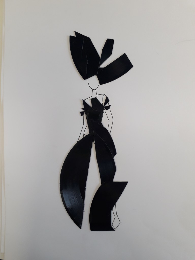
Zoe Brown: Her art was really interesting.
The colours and ideas behind this fashion design really took me. The circular shapes and the use of old records are pleasing, and I like that they get larger below the waist to create the overall shape of the garment. The rest of the records have been used here. You can see the waist shape and the tailored top half of the dress. It borderlines abstract, but you can clearly see a garment in the shapes. Her sketchbook had lots of collage work like this. It was very experimental and she took things to quite a depth.
In relation to my work: Zoe’s work is a little more experimental than mine. While she seems to prefer fashion, I gravitate to illustration, but the lesson learned is the same. I’d like to collage a bit more, if only to generate ideas.
Sharon Bradford
Her reflective journal is teeming with life! Her sketchbook is filled with brightly coloured work like this. Here, the circles and curved lines give the illustration an organic feeling I love. It feels like plants are bursting out of the circles.
In relation to my work: her work is quite similar in feel to mine – that is, bright colours and an illustrative quality. Her stream of consciousness and the quality of documentation in her reflective journal is definitely something I’ll try to learn from. The fold-out parts of her journal made me smile: I can’t resist something physically interactive.
Zaina Abbas
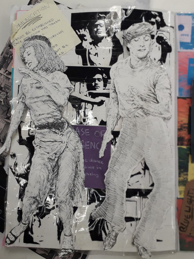
In my notes, I’ve described her work as something that reminds me of a Hammer Horror film, or Rocky Horror. The nauseously busy and bright colours are almost flamboyant, and I love the style. Look at the layering here! I feel like I need to attach her brain to my brain, because I honestly can’t compute creating something like this.
In relation to my work: What I really need to do is start working with other material that already exists. This idea of layering things and mixing original art with photographs and prints is something I’ve been needlessly reluctant to try out. In addition, you can’t help but see Zaina in these pages. This style is wonderfully personal.
Katherine Hughes
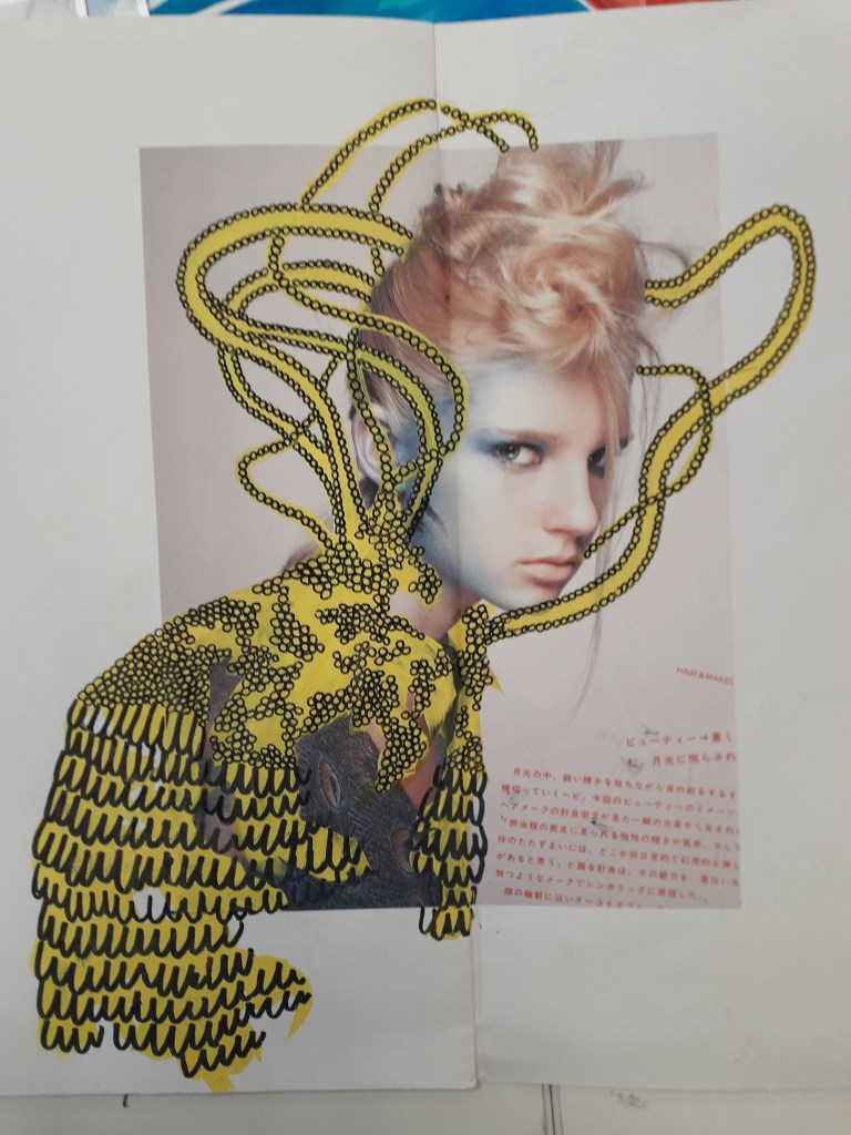
The bright, blocky yellow with black liner over it works incredibly well here. Katherine clearly has an advance perspective on shapes. The teal brushstrokes and the idiosyncrasy of the black doodles on top are really pleasing to look at. Her “Miniature people” house.
In relation to my work: What I was most impressed with was the amount of imagination that went into Katherine’s Miniature People survival kit project. She’d created a whole world and I am COMPLETELY taken by it. It’s the kind of imagination you’d see in a writer.
I do love genuinely inspired ideas like this. If I’m passionate about something, I make good work. Maybe I should e-mail her and see if she wouldn’t mind taking the idea a little further with me…
I’ll leave you with a quote I can’t stop thinking about from another student’s work. Unfortunately, I don’t have the source.
“A designer knows he has achieved perfection not when there is nothing left to add, but when there is nothing left to take away.”






You must be logged in to post a comment.