Non-Places: Day Four

Non-Places: Day Four

On Monday, it was the fourth day of the graphic design project. I realised that I was quite behind in terms of producing hand-lettering or typography work, despite my sheet full of artist research.

To respond to the brief, I created a stencil out of which I cut the title “NON-PLACES”, and held it up against potential relevant backgrounds.

This is an example of an unedited picture with the stencil.

A problem the stencil presented me with was that the glue used to stick it to the cardboard backing wrinkled the paper quite severely. To solve this problem, I later edited the images with the clone stamp tool in Photoshop. (After taking a tutorial on it!)

I then adjusted the images I liked the most a little in different experimental ways before placing them into InDesign and fitting them as jacket covers.
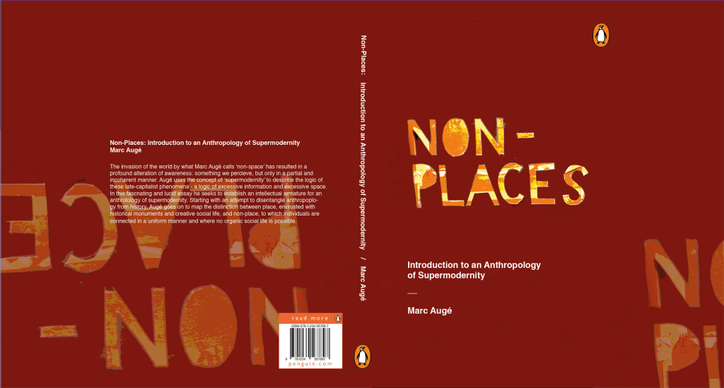
This is a saturated and posterised version of the stencil. I placed it as the cover, then colour-picked the background and repeated the design at lower opacity on the back cover and inside flaps.

I really liked this design, but I feel it falls a little short on the overall atmosphere of non-places. The warm browns and reds almost feel like a cosy fireplace, whereas the colour scheme of non-places would be less saturated and cooler in tone. That’s why this was a useful, yet not final, draft.

I preferred this cover in terms of actually meeting the brief. The dusty window and grey-heavy colour palette give off quite a sad, isolated feeling. It distances the viewer from reality by placing the reader behind a literal window.

Was this research useful? Yes! After a day’s worth experimenting heavily with the stencil, I feel quite confident that it will feature on my final draft (whichever I choose it to be at the end). I feel like the sudden inspiration to work with hand-cut lettering came from reading Hand Job, a catalog of hand lettering I took out of the library. The introduction of the book highlighted the importance of unique lettering, and this use of paper stencil gives a really interesting, handmade feeling to the type.

Where will I take this now? The project comes to an end next Monday. If the printers decide to come back into action (god, please… I have so much work I can’t even do right now because the whole printing system is down…), I will print off the final design at the correct size. I will photograph it around the book and create a final presentation sheet to show the culmination of the process in the final result.

Workshop: Monoprinting

Workshop: Monoprinting

Last Wednesday, I signed up to a monoprinting workshop with Caroline.

We were taught how to use the huge press to create prints and how to use newsprint to create interesting stencils to ink up. After that, we were pretty much left to experiment!

The key to using the press safely and correctly is to ensure the print has newsprint paper on both sides, to protect the blankets and press from any ink as it rolls through. Wet paper prints best for the first run through (but after that, you can’t wet it again as the ink runs!). Place the blankets over the print flat, and turn the wheel to run your print through the roller once forwards and back.
This is an example of a stencil I used in my printing. I experimented with crumpled paper, because ink would roll heavily onto some areas and miss others to create an interesting texture. I liked the idea of juxtaposing sharp cut squares against the organic crumpled folds.
This wasn’t put through the press, but here’s an example of using a stencil (a question mark) and inking around it.
I monoprinted with some leaves, but in my experimenting I found I actually liked the pink and yellow leaves more than the prints they produced! I’ve since put them through the photocopier to preserve how they look forever.
These last two images were things I thought were just too pretty to lose.

How has this research helped me? The main advantage I’ve gained from taking this workshop is that now I can book in with Caroline and use the resources freely when I need them. Monoprinting is useful for creating basic textures and interesting, unique backgrounds. If I monoprint onto newsprint, I could collage with it and know that what I was creating was wonderfully unique.

Utensia: Day Two

Utensia: Day Two

I realised suddenly that I’d not made a post summarising the second day of the illustration project! Although it’s out of order, I think it was an important enough day to include.

The second day focused entirely on media experimentation. As a class, we made a list of lots of possible media we could use – anything from paints and pens to food and rubbish – all of the extremes that could be experimented with in illustration.

I broke out of my usual style completely and got really stuck into the experimentation. Louise was pleased to see that I’d not clung to my old ways.

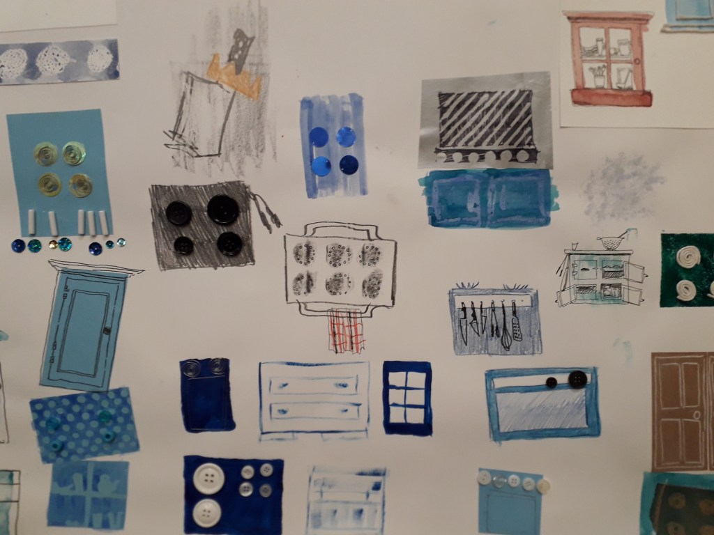
This is a portion of the worksheet I created. You can see examples of wire, buttons, coloured pencils, string, watercolour, acrylic, cut paper, beads, sequins, pencil, crayon, candle, pen, white charcoal pencil, etc.

What did I get out of the day? The day really freed up my mind, and I created totally non-judgementally. I was really proud of how it turned out just because I worked so freely! It’s a feeling and an ability I want to keep. Armed with new research from the past week, I’m hopeful that I can take the experimenting spirit and work in such a varied way again.

Artist Research: Emma Green

Artist Research: Emma Green

Emma Green is a part-time illustrator who did a degree and master’s at Bournemouth University. She currently works at Oxford Brookes and acts as a sort of teaching assistant to some of the classes. I’d never really seen her until recently, and today she gave us a short lecture on her education and current profession.

This is the piece of her work that really attracted me. I talked to her after the lecture and found out that it’s some of her older work, and that it was created on Photoshop.

I liked the colour scheme a lot, and the cut-and-stick feel of the buildings really attracted me. It turns out she uploaded the sketch into Photoshop, then used the polygonal lasso tool to fill in the buildings with colour.

Colour wise, you can see layers of red, then of blue, then red again. She’s interspersed blue details into red buildings, e.g. the windows at the very front, and vice versa. This makes the piece feel bustling and natural.

Texture wise, I like the white crayon-pencil brush she’s used to add details. E.g. the curls and lines on the bottom left blue building, or the bumps that look a little like bunting or terracing running along walls. Using a mixture of details lighter than the surroundings and darker than the surroundings balances out the piece.

How has this impacted my work? This piece has a similar feel to the busyness I’d like to portray in Utensia. I might use blocks of painted colour to try and mimic the aesthetic Emma has created. I may also use a white detailing pen alongside a dark one like Emma has here, to create a little more interest.

Non-Places: Day Two

Non-Places: Day Two

Yesterday was the second taught day of our graphics project.

The morning consisted of printing off our pictures and collaging them into potential abstract book cover designs. As (and hopefully WHEN) I make it into university today, I’ll take and attach a photo of the worksheet I created full of collaged designs.

In the afternoon, we had a photoshop tutorial with Neil. I’m not going to lie, the fact that I didn’t have a mac to work on because the class sizes aren’t correctly managed did make me angry. I had about an hour at the end of the day to get my practical work done, though, and I’m really pleased with what came of it!

What was successful about the day? I would say that, after a lot of moping, my morning collages came out really well. I’ll be using them as inspiration in my photoshop endeavours. It was Danny, continually encouraging us to be quick and not to think too hard, that allowed me to create the work I did. He kept saying “it’s an instinctive exercise, not an intellectual one.” After about the fifth time, I was coming up on exasperation because I do everything the intellectual way. But he was right, of course.

I also think that in my limited time (and incredibly limited temper), creating the book jacket draft that I did was impressive. I had to create the word “PLACES” in Photoshop with the pink branches as a clipping mask, then import it into InDesign and flip it.

Interestingly, my reading the book Type and Typography has actually influenced the way I’m thinking about type.

What still needs to be done? I need to go in for a little while longer and spend some time mocking up other drafts of book jackets. I’d also quite like to write a blog on what I’ve been learning in Type and Typography.

Utensia: Day One

Utensia: Day One

Last Thursday, we started the illustration project. I picked an extract from the Wizard of Oz about a kingdom full of kitchen cabinets and equipment to illustrate.

The three week project is going to consist of experimentation and a lot of research.

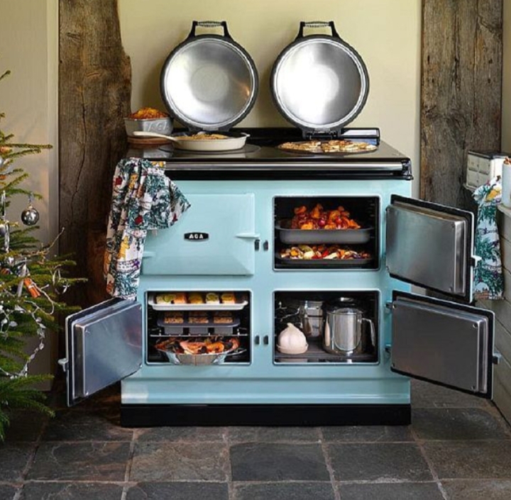
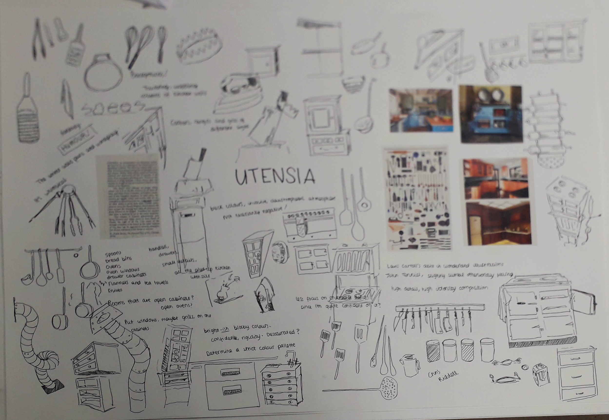
Here are some examples of picture references I used to create an initial ideas sheet:

If I end up making it into university today, I’ll take and attach a photo of the finished initial ideas sheet.

What was successful about the day? I liked that Louise encouraged us to work quickly, and make as many scratchy doodles as we could. I felt like I couldn’t make any mistakes, no matter how crappy the drawings looked.

What will I do to continue the project? Ideally, I’ll research a relevant illustrator or two. In terms of physical work, I’m creating a ton of thumbnails for potential compositions; this Thursday we’ll be experimenting with a lot of different media. Then I can combine the best media with my favourite thumbnail to produce the finished illustration!


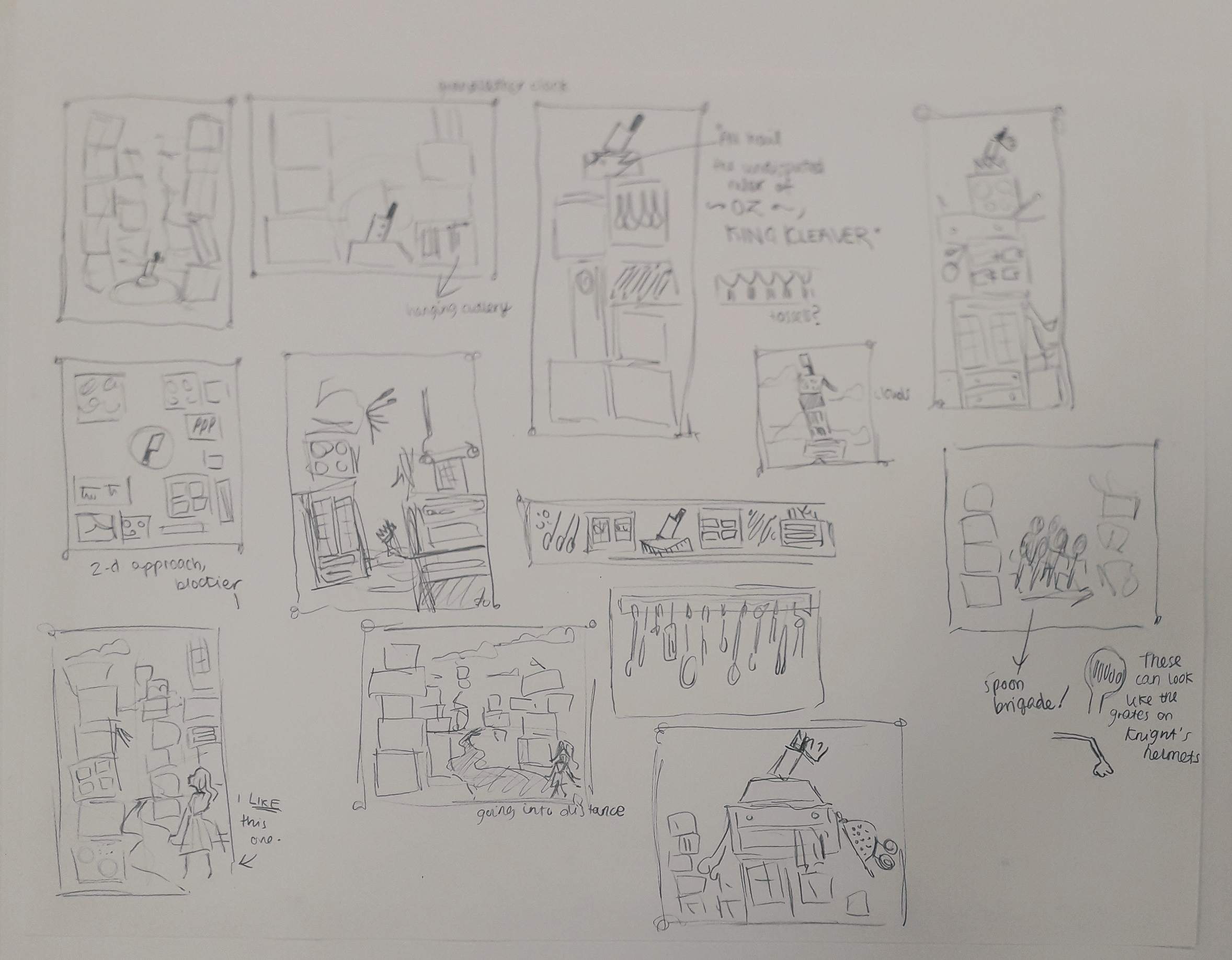
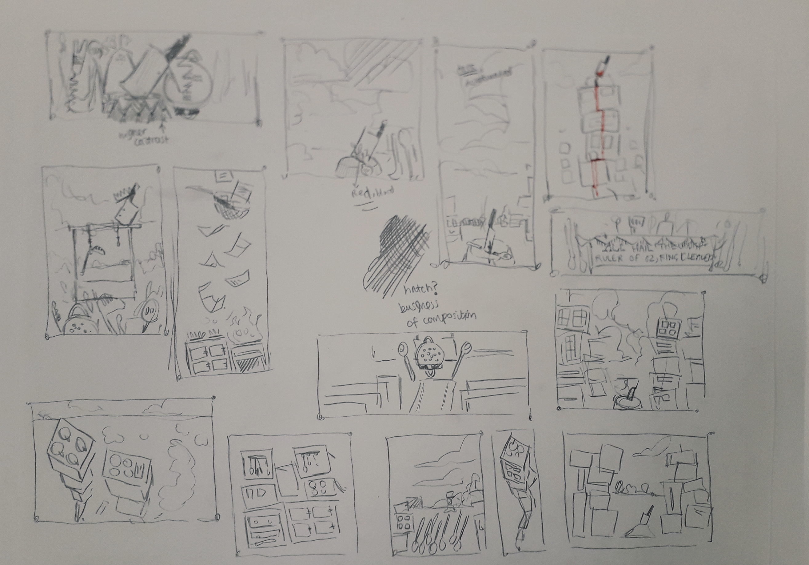
These are thumbnails produced for the next week in my self-directed time. I will ask friends which they prefer and I have a few preferences myself!
Non-Places: Day 1

Non-Places: Day 1

On Monday this week, I had my first day of the three-day graphic design project. The brief is to create a book jacket for Marc Auge’s Non Places: An Introduction to the Anthropology of Supermodernity.

The day was split in two: the first, a briefing and Adobe InDesign workshop with Neil. The second was pretty self-directed; finding photos and doing research for the book jacket.

This is a screengrab from the end of the InDesign walkthrough. We have a template of the correct measurements for the jacket, complete with the logos and text the brief requires. Now we can play with it without worrying!

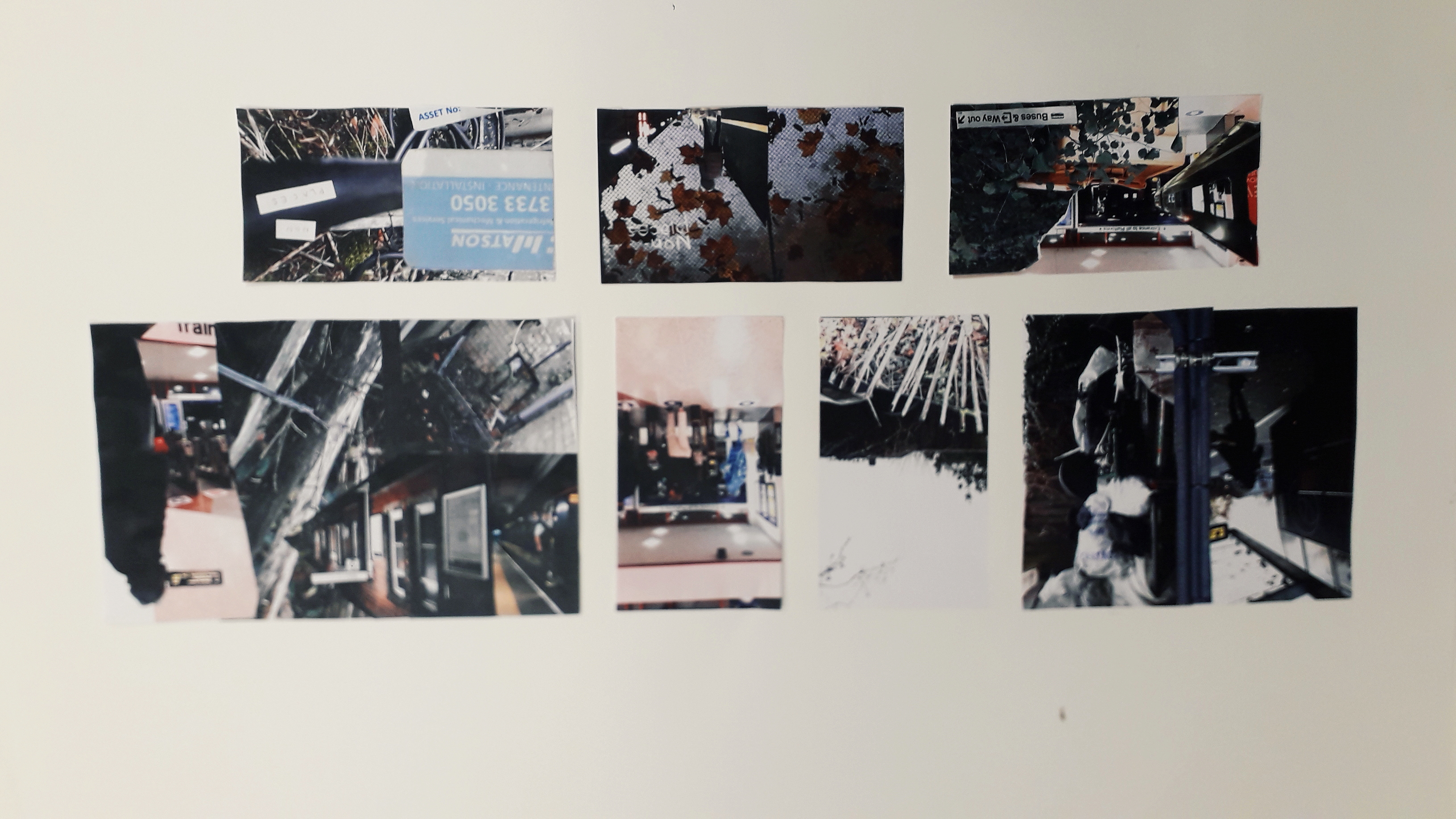
I also got a few photos inspired by Non-Places. I’ll include a couple of them.

This is the top of a bus shelter, although it might not be perfect because the viewer needs to KNOW what it is in order to create a coherent mental image of the term “non-places”.

Was the day purposeful? Yes! Having missed my InDesign induction workshop with Neil the first time, I really needed the tutoring. There were lots of little things I learned about creating guidelines and layers, etc. I have a working note on my phone with interesting advice I’ve been given about using InDesign.

Were the media and techniques I used successful? Why or why not? The photograph collecting is all done on my phone. It’s quite high quality, but I know it could be improved by booking out a serious camera and getting to grips with it, e.g. aperture, focus, etc. Otherwise, I’ve been taking photos when I see relevant places. I try and get landscape and portrait versions, on the off-chance that I might like one enough to do a complete wraparound of the jacket.

Where am I going to take it? Outside of class, I have assigned work to do. Apart from collecting more photos, I have to compile them together in a document and ensure they’re printed out for the next workshop. I might also experiment with colour digitally on a few of the images, see what I like and don’t like. Research-wise, I’ve checked out a ton of the recommended reading from the library… but I’ve already blogged about that, so you’ll know!

Illustration Extension: Order and Chaos

Illustration Extension: Order and Chaos

I really liked one of the sketches I’d created during the illustration workshop with Louise. I uploaded the sketch onto Clip Studio Paint and lined it digitally.

I then went online and did a little snoop around some colour palettes. I found one I liked that was quite muted and cool; this attracted me because I sit quite comfortably in warm colour palettes for illustration. I copied it in and used the five colours (and slight shades) to colour the illustration.

Other minor changes I made after that was to place a texture over the colour layers, change it to an orange and set the layer effect to multiply, then reduce the opacity a lot. I like a little bit of texture over my art.

I also took the whole (merged) colour layer and moved it very slightly to the left, then corrected any shaky lines. The slight skew appeals to me. I think this is a little inspired by Quentin Blake, who colours messily to a successful end.

This was the original.

I then experimented with layer effects to create some other versions of the illustration. This step is always fun for me!

This is with a Difference layer effect over the whole illustration. I can’t remember what colour I used to get this warmer palette, but I admit this version is my favourite. The other illustration just feels a little lifeless. Ines said she thinks this one feels like an early morning!
This is with the Exclusion layer effect. This one is great, because it makes me feel like it’s actually night time. I like that dark patches appear light and vice versa.

Overall, I’m happy with the illustration. The final one I would personally present is the orange one; the definition is clear and it gives off some cool vibes.

I’ve been having a think about what could push my style. I think I need more background work, or a larger basis of reference for backgrounds. I practice drawing backgrounds when I can in my sketchbook. I also need more practice drawing different body types. Some bodies, no matter how well drawn, are less aesthetically pleasing than others in terms of curves and how dynamic I can make them. I’m working to rectify that.

Design Process Reflective

Design Process Reflective

On the last Friday before half term, we were placed into groups and asked to research an assigned colour in order to put the Design Process into practice.

Our colour was gold, which was a pretty cool one! We separated ourselves into different tasks and reconvened about an hour later to brainstorm and see what ideas we liked.

We created two finished things: a large golden collage full of positive things associated with gold – that is, abundance, gold in nature, authenticity, holiness, etc.

I apologise for the quality of this picture. Usually I take a lot of pride in nice photographs, but this was sent to me by a teammate who was kind enough to stay behind and take pictures.

We also created a smaller cardboard box entirely collaged in gold as well, but dull and empty on the inside. This related to mankind’s hubris and greed in relation to gold. For example, King Midas suffering as he turned everything he touched into gold, or the Spanish Conquistadors committing mass murder in the pursuit of gold.

Unfortunately, I don’t have an image of this! The presentations ran over early and although I didn’t bail out and leave, I was running late for a train and booked it out of the campus before taking a picture. If I can grab it in the studios, I will attach a picture soon. However, it was more about the process than the finished result.

How did I find it? Well, team is a bit of a four letter word to me. I find working with other people to be very stressful and in a way this was no different. Often in a group and faced with a big task, people will flounder a little. I took charge and asked who wanted which task so everyone had a purpose. I also suggested the time to meet up again and discuss ideas, and time management for most of the afternoon. This is somewhat a coping mechanism for me, so I feel a little in control, but I continually worried that I was coming off too strong or bossy.

Was it purposeful? I want to say yes… any practice in collaboration is good practice. I get in my own head so often, I know collaboration is a good way to yank me out of it.

Illustration Paperwork Reflective

Illustration Paperwork Reflective

Today, Louise led an illustration workshop working heavily with coloured paper. We had to make some geometric cut paper work and some torn work as well as a little (merciful) drawing. We had to create 12 variations of the same concept: I chose “chaos and order”.

Below are the 10 illustrations I made in class, ordered chronologically as I made them.

A4, torn.
30×10.5cm Landscape, torn.
A5, cut.
A6 square, cut.
A6 square, torn.

I feel inclined to give you a break here… there’s an awful lot of pictures. Allow me to insert a hastily googled one liner joke to entertain you.

I recently decided to sell my vacuum cleaner … all it was doing was gathering dust. (peak comedy.) Continue scrolling if you please.

A6 square, torn.
A6 square, cut.
A6 square, cut. I liked this one a lot. It was made once Louise said I could make the “order” more ordered, and the “chaos” even more chaotic. This looks like an album cover!
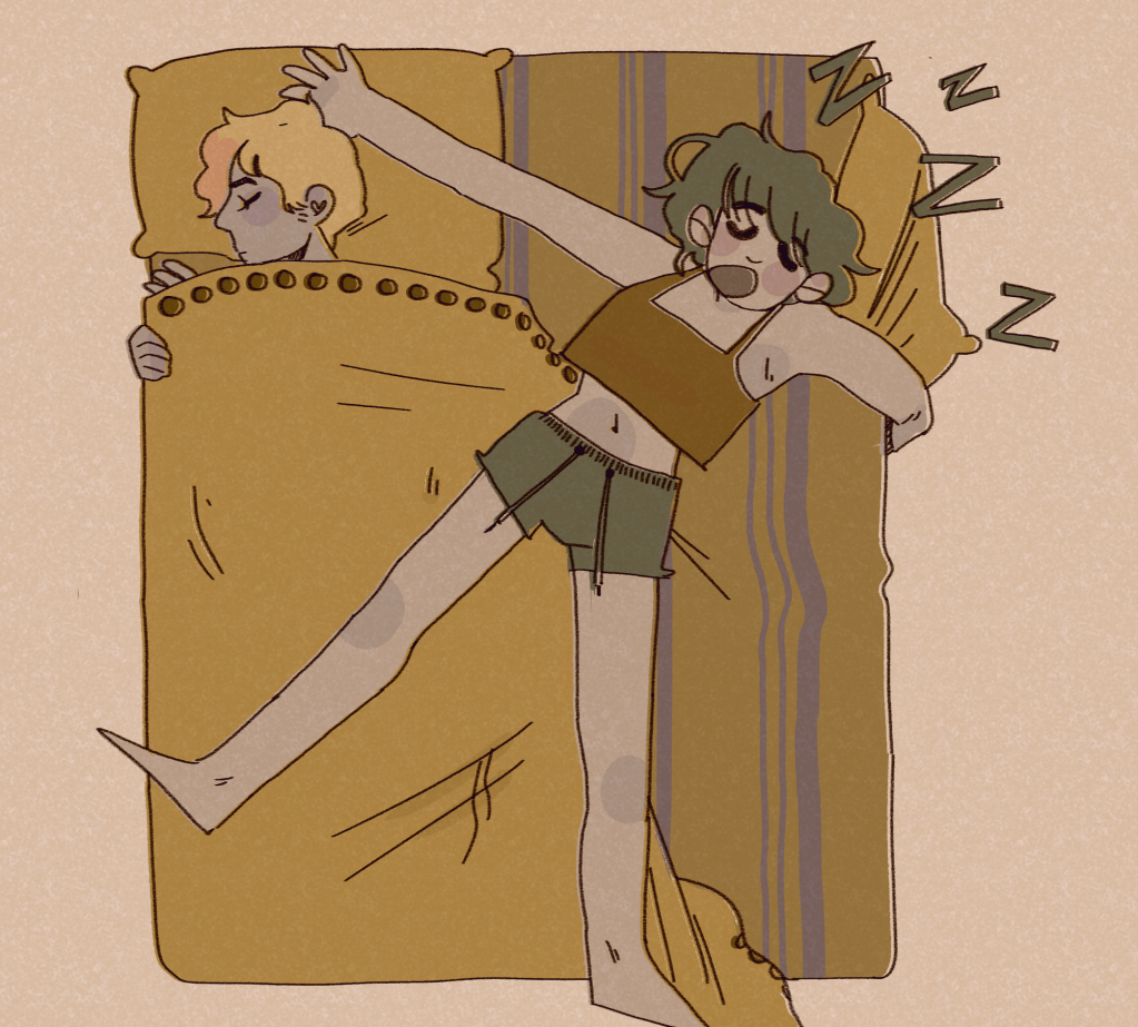
A5, drawn. This is Antonia sleeping soundly and straight, and Mitzi (a legally certified Mess) spread-eagled over the whole bed. I don’t think this is actually how they’d sleep most nights, but I do like how tolerant Antonia seems of Mitzi’s absolute tosspottery.
A5, drawn. This is Techo’s desk opposed to Mitzi’s desk. It makes me happy… I got to think about what Mitzi would have on her desk properly! It bought her back to life for me a little.

Was my exploration purposeful? Yes! Although it wasn’t my dream workshop (which would have been drawing-centric), I understand the point of it. Working to one concept so many times really pushed me… artistically and emotionally. It helped me look at new ways of doing the same thing and forced different thoughts into my head.

Were the media and techniques I explored successful? I would say so, simply because they were a new way of working. I’m keeping some of the ideas from today in my illustration extension (see below), because some of the colouring ideas will likely be very blocky (a la paper underneath drawing look).

The restrictions of the rules Louise set were frustrating. I hear other groups were far heavier on the drawing side, and I feel I would have enjoyed that more. I might actually have gotten more out of this workshop though, considering all I ever bleeding do is draw!

How am I going to take this further? I’m going to open my drawn illustrations in Clip Studio Paint and line them. I want to line them a couple of ways and colour them a few different ways as well. E.g. with my normal pencil tool and style, or with slightly offset colours, or more abstracted blocks of colour behind the lines highlighting the most important shapes. I’ll cut these out and make a full design sheet. Stay tuned for a second edition of this bloggie!