3D Workshop Reflective

3D Workshop Reflective

In the 3D workshop, we were inducted first into ceramics and then into resistant materials (that’s wood, metal, acrylic – anything you need a terrifying moving blade to cut).

In ceramics we were given a chunk of clay. We cut it into a square tile and created an abstract take on our cardboard sculpture from the first 3D workshop.

This is the clay after de-moulding. I’ve lost some of the features, but they show in the plaster cast below.

Next, we created clay walls and poured plaster in to take a mould.

Things to remember about the method in ceramics and plaster moulding:

  • Use a cloth underneath your clay, lest it basically fuse with the plastic table.
  • Use a wooden block when creating clay walls for your tile.
  • When mixing plaster, use the green flexible rubber containers.
  • Fill about a third full with water and try to saturate it with plaster until it’s like thick single cream.
  • Mix with your hand and try to work out any lumps for about five minutes.

Was the research purposeful? Getting inducted into ceramics is incredibly useful. I hope I’ll head back in soon and make some of my own work. I like the idea of making small, sweet things. Maybe I should research some ceramic jewellery makers.

How could I have developed ideas differently? I feel like I did all I could this session because of time limitations, but I certainly could have developed further. I could have tried some more textures. If I did this again, I would have tried more textures pressed into the clay, so the plaster cast had more bumps rather than dents.

This is the result of the resistant materials session. I wanted a kind of dome shape, like Willie’s middle. That got expressed with the dome-like side of this sculpture. I wanted lots of thin strips to show the corrugated cardboard texture, but they ended up getting nailed on in an interesting shape all around the base.

Things to remember about the resistant materials space:

  • The big scary blade is called the band saw (I think). Turn on the dust extractors first. Use the push sticks if your hands are even THINKING about getting near to that blade. If you can see the teeth of the blade, it’s not moving and is safe. If you can’t – it’s moving.
  • The smaller blade is easier to work with. Don’t go past 1cm thickness wood when you use it. The blade is known to snap, but if you don’t turn too tightly you should be okay.
  • Turn on the dust extractor for the sanding machine before using it. Always sand on an area moving downwards.

How can I use what I learned? While woodwork isn’t really my forte, I like to think I’ll use the resource while I have it. Maybe making something to fortify an illustration… or if I ever learn bookmaking, I could cut a very thin slice of wood to be an actual functioning page in it!

Did I develop my ideas thoroughly? I was limited again by time and resources. The smaller saw was pretty much constantly in use. I really like the idea of using free scraps of material to make something pretty, though. I could make something that hangs with the kind of elegance of the smaller wooden sticks.

What didn’t work? I originally had a grand old plan to cut multiple semicircles of wood and somehow sand them into a 3D object. It just wasn’t practical, so those scraps got abandoned. I moved onto something slightly different which formed the final work.

Photography and Darkroom Reflective

Photography and Darkroom Reflective

Yesterday, my group was inducted into the Darkroom to learn how to create photograms.

To create a photogram, you must learn how to use an Enlarger. For our intents and purposes, the enlargers are just projectors of light. (However, they also enlarge film strip negatives, hence their name.)

To set these up properly, you have to check three things: Height, Focus and Aperture. I immediately logged this into my brain files with the mnemonic Hairy Fat Arse. I’m not happy about this either, but it cannot be changed and is incredibly helpful.

Height: Make sure the enlarger is high enough that the rectangle of light it produces is generous. You don’t want to accidentally place photosensitive paper outside its edge, because you’ll expose it incorrectly and bugger up your photo. The large handle on the side of the enlarger allows you to first unlock, and then change, the height.

Focus: There’s a knob to change the focus on the side of the enlarger. When the edges of the light are crisp, you know it’s focused.

Aperture: A twisty circle inside the enlarger allows you to change the aperture. We were recommended that we move to the highest brightness, then down three settings, as our default aperture.

Creating the photograms is easy: place objects over the photosensitive paper and expose them to light for anything between one and, say, ten seconds. Light doesn’t pass through solid objects and you end up with some exposed areas and some protected areas.

Pass the paper through three chemical baths: Developer, Stopper and Fixative. There are instructions about timings above each bath.

Here is my final print along with two test strips! (I got a little avant-garde with my developing in the top strip and needless to say it didn’t work at all. Oops.)

How can I take this further? The photograms were really fun. I will look online to see if I can get reasonably priced photosensitive paper, but I have a bad feeling that wherever I look they’ll be really expensive. If I invested in another pack for myself, I’d see if I could expand the work into an illustrative style. Maybe use card cutouts and more found objects, or work collages into my illustrations.

Life Drawing 1

Life Drawing 1

Last Thursday I was lucky enough to grab a place in the weekly life drawing session after classes. The model was a middle-aged man called Peter, which was admittedly a challenge. In the sessions I’d attended in summer, I’d only ever drawn female models.

My placement in the room was to the side, which meant I got a LOT of foreshortened poses. No complaining, though – it’s the perfect storm of challenges that help me improve.

These were two five-minute poses. You can see I realised I had to loosen up after the first, and opted for charcoal instead. I learned that with a pose as short as this, there’s really no point measuring because you’re going for a gesture and a dynamic feeling.
Above are ten two-minute poses, each immediately after the other. Honestly, I felt like I’d run a marathon after this was over. This was invaluable for my eye, but I remember looking at everyone else in the room and exchanging mutually exhausted glances.
Here I was lent a thick brown graphite stick. It was water-soluble, and loads of fun to play with. This was a 15-minute pose, and Peter was heavily foreshortened. My eye was clearly in it this time – I’m pleased with this drawing.
After a short break, the final pose was 25 minutes long. I found measuring this quite difficult, but the foreshortening was again a good challenge.

The practice that the two-hour session afforded me was so useful. It’s quite an awkward time of the evening, at 4:30 to 6:30pm – because staying in from class can be exhausting and it makes for a very long day. I’ll definitely try to attend again, though.

Formative Review Highlights

Formative Review Highlights

We were asked to take notes and review four people’s work we liked.

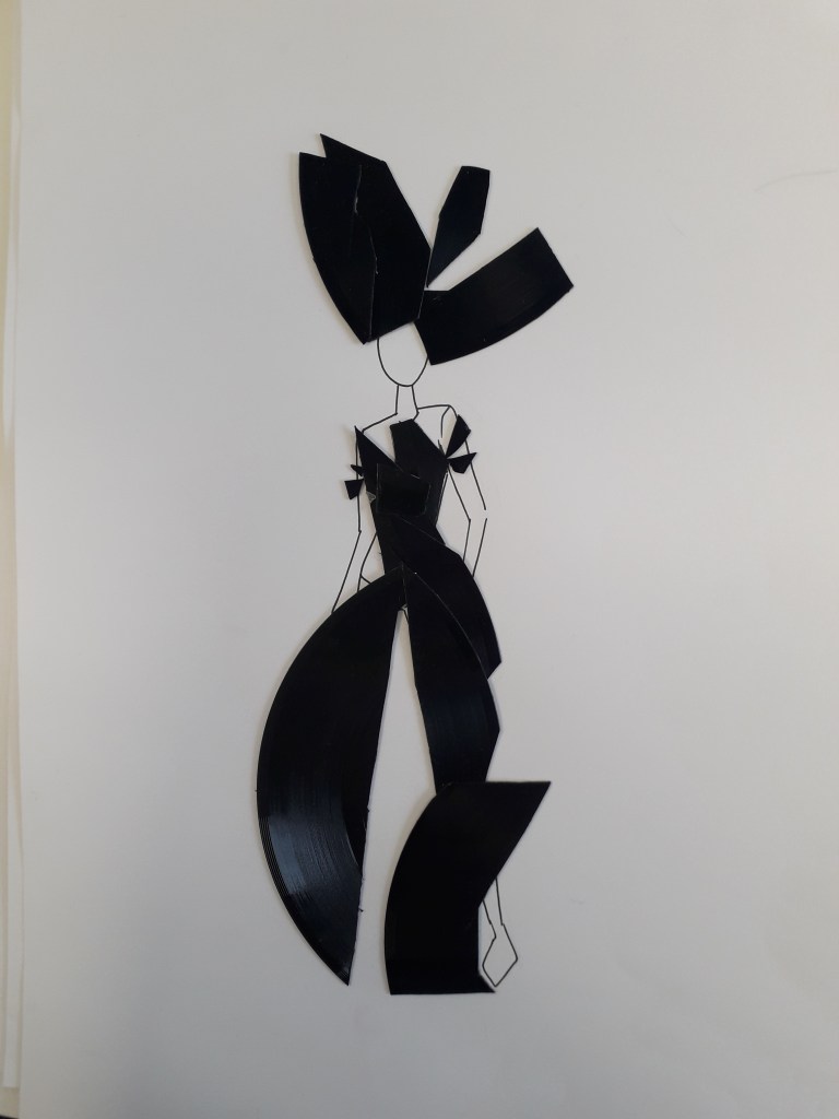
Zoe Brown: Her art was really interesting.

The colours and ideas behind this fashion design really took me. The circular shapes and the use of old records are pleasing, and I like that they get larger below the waist to create the overall shape of the garment.
The rest of the records have been used here. You can see the waist shape and the tailored top half of the dress. It borderlines abstract, but you can clearly see a garment in the shapes.
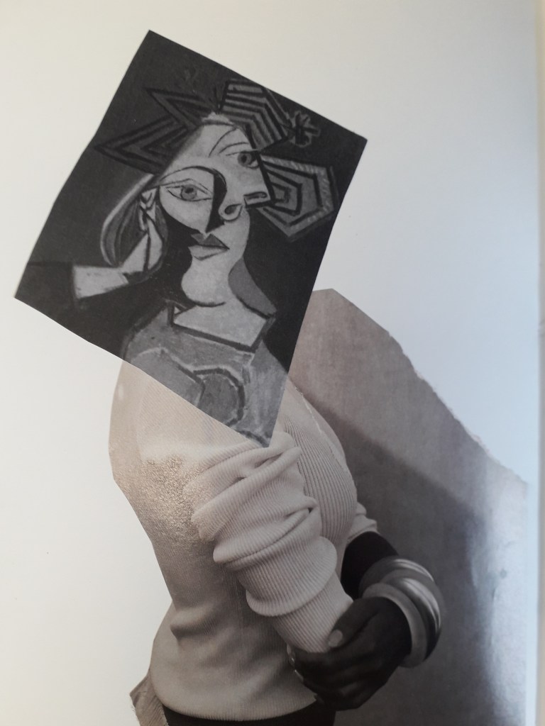
Her sketchbook had lots of collage work like this. It was very experimental and she took things to quite a depth.

In relation to my work: Zoe’s work is a little more experimental than mine. While she seems to prefer fashion, I gravitate to illustration, but the lesson learned is the same. I’d like to collage a bit more, if only to generate ideas.

Sharon Bradford

Her reflective journal is teeming with life!
Her sketchbook is filled with brightly coloured work like this. Here, the circles and curved lines give the illustration an organic feeling I love. It feels like plants are bursting out of the circles.

In relation to my work: her work is quite similar in feel to mine – that is, bright colours and an illustrative quality. Her stream of consciousness and the quality of documentation in her reflective journal is definitely something I’ll try to learn from. The fold-out parts of her journal made me smile: I can’t resist something physically interactive.

Zaina Abbas

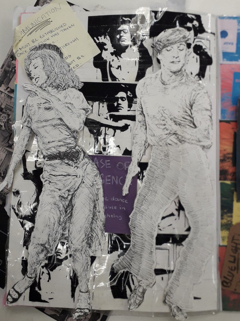
In my notes, I’ve described her work as something that reminds me of a Hammer Horror film, or Rocky Horror. The nauseously busy and bright colours are almost flamboyant, and I love the style.
Look at the layering here! I feel like I need to attach her brain to my brain, because I honestly can’t compute creating something like this.

In relation to my work: What I really need to do is start working with other material that already exists. This idea of layering things and mixing original art with photographs and prints is something I’ve been needlessly reluctant to try out. In addition, you can’t help but see Zaina in these pages. This style is wonderfully personal.

Katherine Hughes

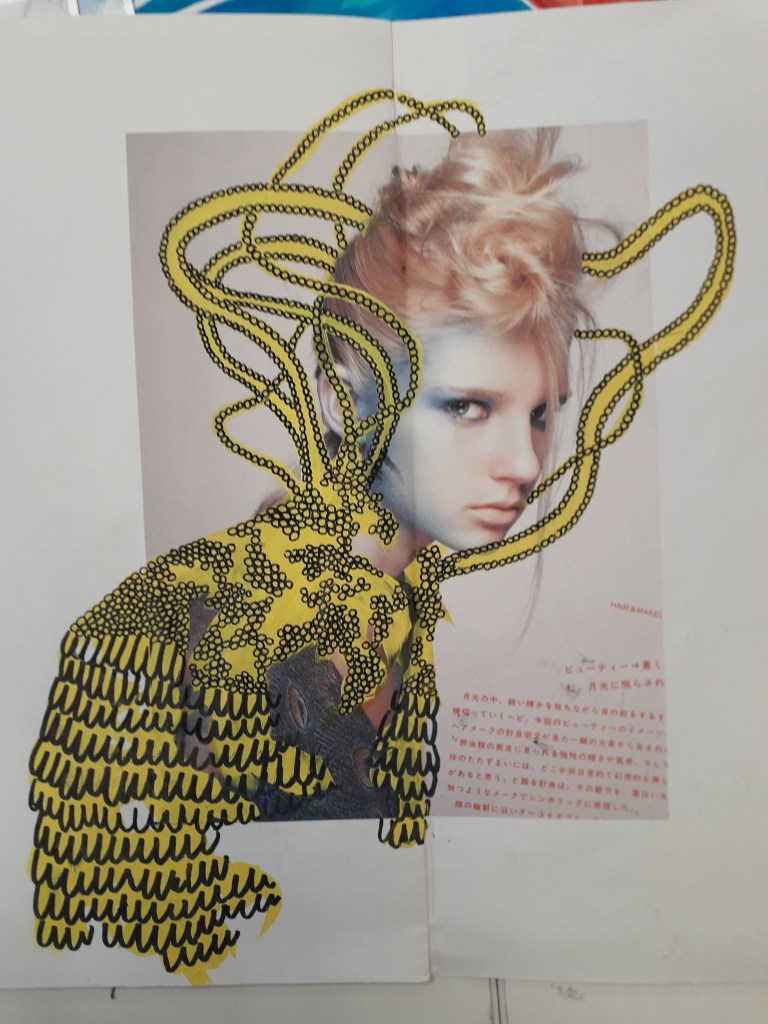
The bright, blocky yellow with black liner over it works incredibly well here.
Katherine clearly has an advance perspective on shapes. The teal brushstrokes and the idiosyncrasy of the black doodles on top are really pleasing to look at.
Her “Miniature people” house.

In relation to my work: What I was most impressed with was the amount of imagination that went into Katherine’s Miniature People survival kit project. She’d created a whole world and I am COMPLETELY taken by it. It’s the kind of imagination you’d see in a writer.

I do love genuinely inspired ideas like this. If I’m passionate about something, I make good work. Maybe I should e-mail her and see if she wouldn’t mind taking the idea a little further with me…

I’ll leave you with a quote I can’t stop thinking about from another student’s work. Unfortunately, I don’t have the source.

“A designer knows he has achieved perfection not when there is nothing left to add, but when there is nothing left to take away.”

Lovers’ Experiments

Lovers’ Experiments

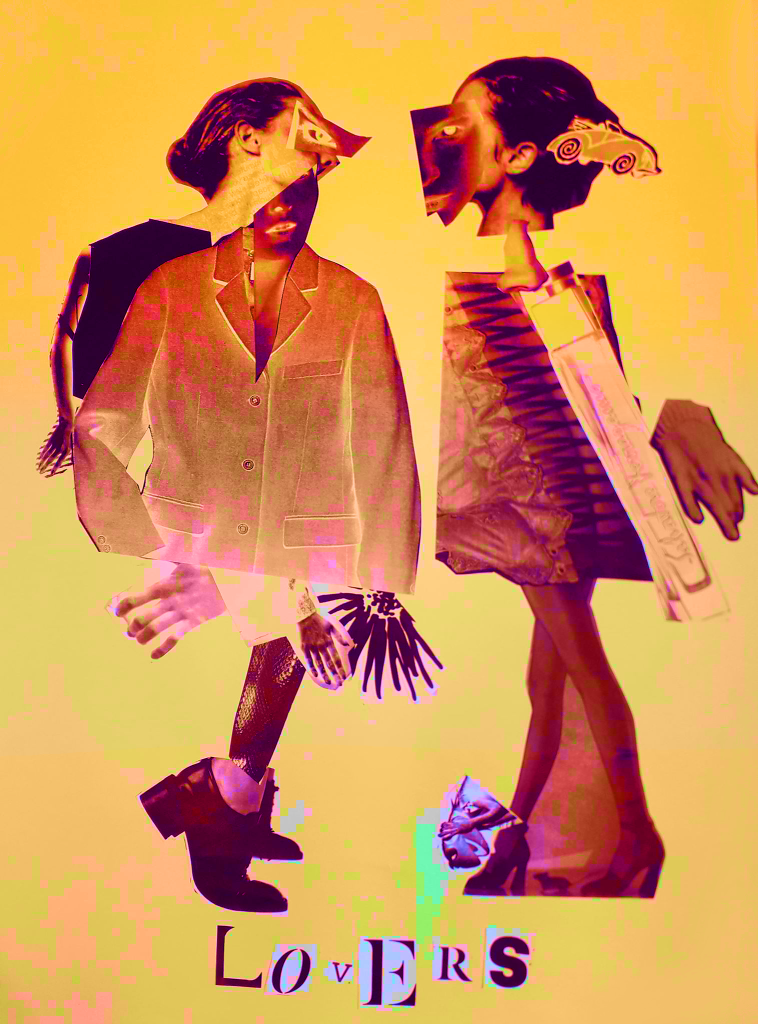
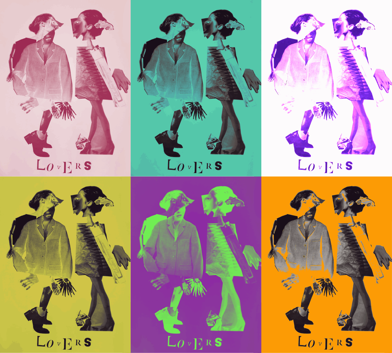
I took the best quality image I could of the Lovers, the final product of the Exquisite Corpse workshop. I uploaded it into Clip Studio Paint and messed around with layer effects and learned the basic animation timeline feature by creating a gif showcasing some of the effects.

Above were all experiments with the Darken layer effect. In only affecting the background, I can create bright images that still allow for the contrast of the black figures.
This was the saturation layer. It’s the crudest filter, but I really liked the colour skew in the worst affected areas like Kermit.
This is the exported .gif file. Here I’ve experimented with darken, lighten, soft and hard light – but my favourite layer to play with was Exclusion. Exclusion actually reversed what was dark, so in the original workshop when I printed off inverted sheets you catch a glimpse of the original values.

The main thing I learned was the animation timeline, and how to export as a .gif. I already knew about all of the layer effects, but having the freedom to showcase them all meant I discovered Exclusion.

Video Workshop Reflective

Video Workshop Reflective

Yesterday was the first technical workshop of the block – video with Kate. We were required in groups to shoot and edit a short video featuring “matching graphical cuts”, e.g. the circular part of an eye fading out to a moon in a sky. The shape, form or colour matches between shots and creates a tangible link between otherwise unrelated scenes.

A short storyboard.

One of the biggest difficulties was space and technology. Due to booking issues, we were in a very small edit suite with macs (my burning hatred for apple macs is stoked every single time I sit down at one of their shiny emotionless screens). Our mac was so confused we ended up working on Kate’s laptop.

If I were to take this further on my own, I can rest easy in the knowledge that I might have room to edit properly once there’s not a whole workshop in the room.

Here is the finished video. I have made this private, but just ask me if you’d really like to see it.

What was I pleased with? The group work went smoothly on this one. We had a good time, and everyone got their respective shots onto Google Drive and shared them with me. Importing the shots was probably the hardest thing because it needed so much collating.

I’m happy with this video as a whole. The shot passing the notebook across the table was edited very smoothly.; I feel like we hit the brief exactly with it. Kate seemed over the moon too!

What would I improve? In terms of the video, I’d ideally shorten the length of time the screen is entirely white (between the paper and the sky). It gets a little arduous watching that, and loses some of its energy.

Where can I take this? If I’d had a little more time in the edit suite alone, I could have played with PremierPro for quite a long time. I’ll need to think of a small project or something, just so I have something to edit.

I could talk to Kate or Louise about the possibility of animating over a video on some kind of transparent layer. Think Who Framed Roger Rabbit. I’m not sure whether I’d be using Adobe Animate or Premier Pro or what there.

Chance and Sequence Reflective

Chance and Sequence Reflective

This project was all about creating fine and abstract art based on the laws of chance. We took part in four activities. I’ve detailed exactly what we did in my reflective journal, so I’ll just upload pictures and critically reflect here.

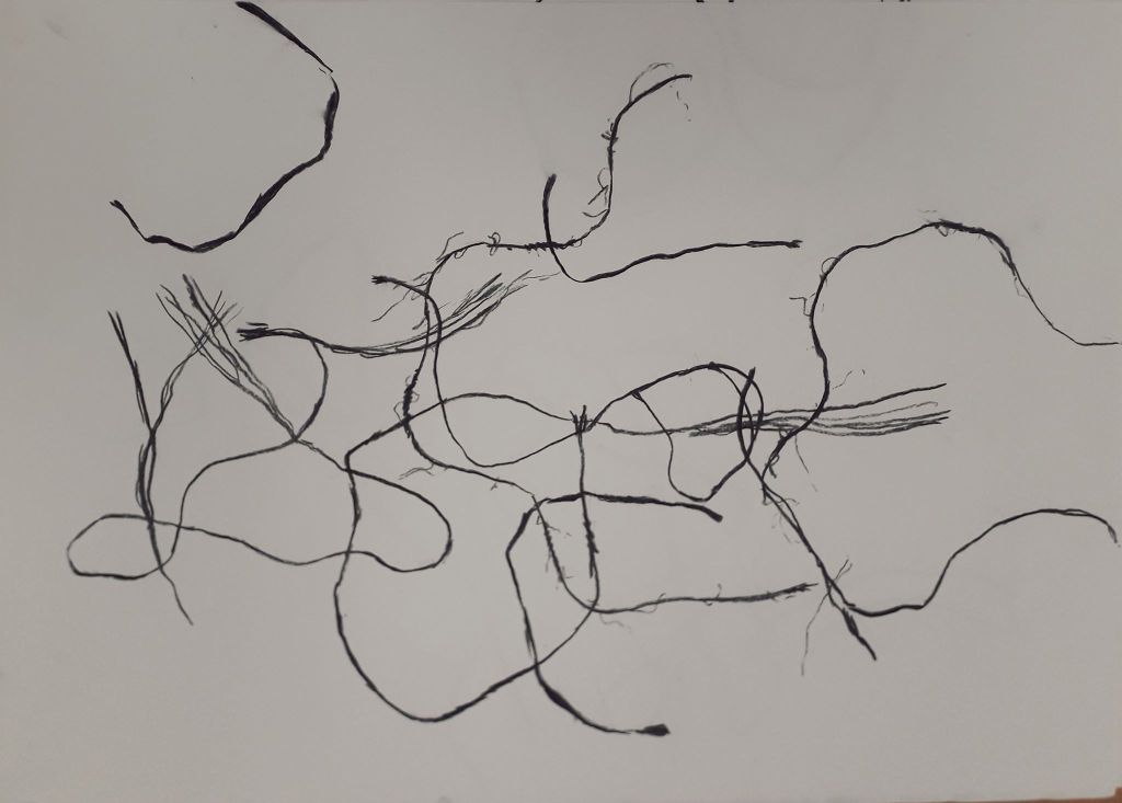
String drop felt like quite a silly activity. In reality, I like what I created with it a lot.

How could I take this further? I could use the activity of “dropping” paper shapes onto magazine images to select images and shapes to collage with. This would force me to randomly select textures rather than carefully cutting out images I found appealing. I thought that if I coloured in the spaces in blocks, it could create quite an appealing background to another illustration or drawing. I could simply repeat the exercise with grass, straw, leaves or other natural material.

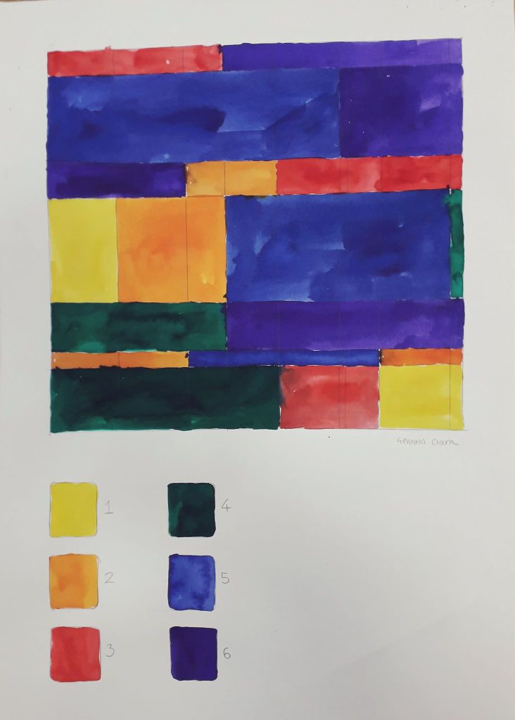
This was geometric randomness. I don’t really like this as a piece of art on its own.

How could I take it further? I thought I could do this with more limited colours, e.g. blue, purple and pink, to create a random piece of art that was slightly more aesthetically pleasing.

This was the collaborative, instructional drawing. I had a blast actually doing this exercise. I’m getting to quite like letting go of control in collaborative exercises. (And I never thought I’d hear myself saying that!) Things happen that would never have happened if I’d worked on my own.

How can I take this further? I could collaborate again with friends – e-mailing or swapping drawings to work on for each other.

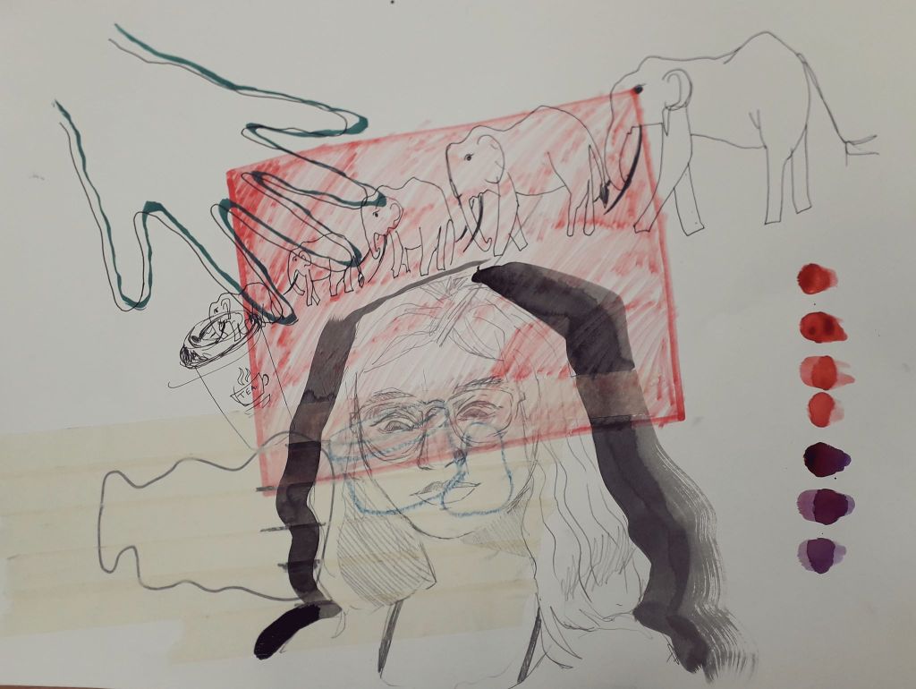
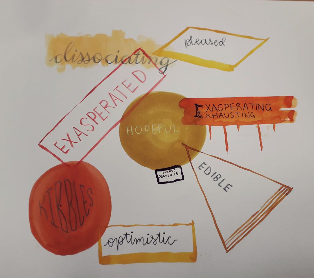
The conceptual emotional drawing was fun again, because I jump at any opportunity to introspect and write about what I’m feeling. I like the composition of this a lot, and the stricter colour scheme made me feel better from the earlier drawings.

How could I take this further? Well, I actually made Jamie complete an identical exercise that night. I have his art and I might turn it into a larger piece, so that they could exist in a series.

Finally, I created some random poems using dice and newspaper clippings which you can see in my sketchbook. These really were nonsensical at times… I don’t know why, but I suppose I thought I’d create something super edgy and deep! They were still fun. I might create a few for my reflective journal or put a twist on them for something fun to do.

I do hope I’ll do some more work related to chance, even if just a small aspect of something else. It’s nice to leave the thinking to the laws of physics and probability!

The Unconventional Body Reflective

The Unconventional Body Reflective

The first half of the morning – dressing the mannequin – I have to admit I really didn’t enjoy.

Despite the fact that we took essentially a whole day out to gather materials, Martha and I didn’t have anything to create really striking shapes. Martha ended up constructing cool shoulder-pad things out of cardboard, but I just couldn’t get myself passionate about it.

Our finished mannequin. I liked the tape, but the morning was too stressful to really enjoy.
Some of our other collected objects.
There was a smaller mannequin I might well have enjoyed working on. I didn’t really get the chance to experiment for myself because of course it was a teamwork project.
The fold-out sketchbook I’ve since compiled in my normal sketchbook. The quality isn’t great, but it’s all in my sketchbook so I feel the reflective doesn’t suffer too much.

The drawing element during the second half of the day lifted my mood considerably. I finally got a real look inside my Artway box (I go NUTS over new art supplies!). I really enjoy fast-paced drawing because I know it’s good for me, even though I rarely practice it on my own. I feel like the course making me do drawing exercises is the equivalent to my mum forcing me to eat vegetables just to get something nutritious in me.

What could I have improved? I could have bought something huge to create an initial shape on my mannequin. It would have saved time and energy. It was bad luck that we live in halls and were the first group doing it, as every other group had free use of all our bought materials as well.

I feel like I didn’t work particularly well with Martha. We were both in a weird headspace that day and neither of us were talkative, but I felt like neither of us were confident enough with our own ideas to really make a statement on the final mannequin. There wasn’t any bad vibes, just a stressful and uninspired morning.

How will I take it further? I probably won’t work on full size mannequins again. I will use the drawing techniques to work quickly, and the paper collaging element – especially on the human body – helps me produce ideas in a freer sense.