Non-Places: Day Two

Non-Places: Day Two

Yesterday was the second taught day of our graphics project.

The morning consisted of printing off our pictures and collaging them into potential abstract book cover designs. As (and hopefully WHEN) I make it into university today, I’ll take and attach a photo of the worksheet I created full of collaged designs.
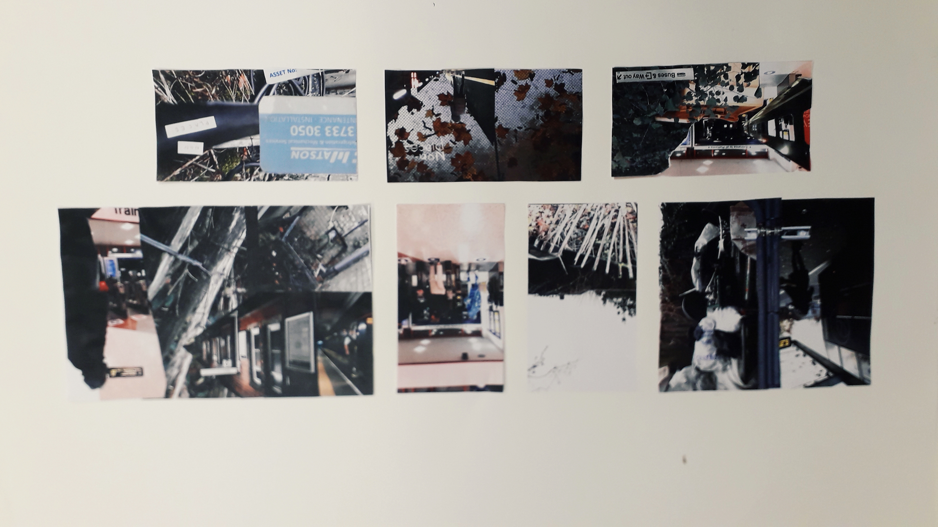
In the afternoon, we had a photoshop tutorial with Neil. I’m not going to lie, the fact that I didn’t have a mac to work on because the class sizes aren’t correctly managed did make me angry. I had about an hour at the end of the day to get my practical work done, though, and I’m really pleased with what came of it!

What was successful about the day? I would say that, after a lot of moping, my morning collages came out really well. I’ll be using them as inspiration in my photoshop endeavours. It was Danny, continually encouraging us to be quick and not to think too hard, that allowed me to create the work I did. He kept saying “it’s an instinctive exercise, not an intellectual one.” After about the fifth time, I was coming up on exasperation because I do everything the intellectual way. But he was right, of course.

I also think that in my limited time (and incredibly limited temper), creating the book jacket draft that I did was impressive. I had to create the word “PLACES” in Photoshop with the pink branches as a clipping mask, then import it into InDesign and flip it.

Interestingly, my reading the book Type and Typography has actually influenced the way I’m thinking about type.

What still needs to be done? I need to go in for a little while longer and spend some time mocking up other drafts of book jackets. I’d also quite like to write a blog on what I’ve been learning in Type and Typography.

Utensia: Day One

Utensia: Day One

Last Thursday, we started the illustration project. I picked an extract from the Wizard of Oz about a kingdom full of kitchen cabinets and equipment to illustrate.

The three week project is going to consist of experimentation and a lot of research.

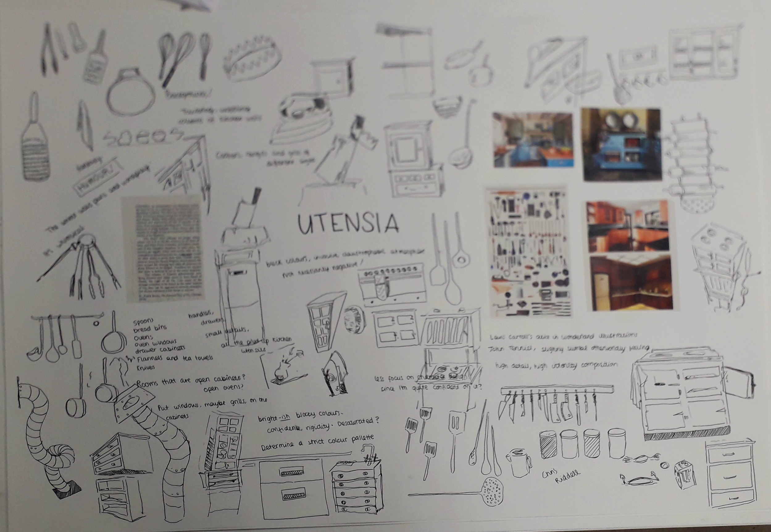
Here are some examples of picture references I used to create an initial ideas sheet:

If I end up making it into university today, I’ll take and attach a photo of the finished initial ideas sheet.

What was successful about the day? I liked that Louise encouraged us to work quickly, and make as many scratchy doodles as we could. I felt like I couldn’t make any mistakes, no matter how crappy the drawings looked.

What will I do to continue the project? Ideally, I’ll research a relevant illustrator or two. In terms of physical work, I’m creating a ton of thumbnails for potential compositions; this Thursday we’ll be experimenting with a lot of different media. Then I can combine the best media with my favourite thumbnail to produce the finished illustration!


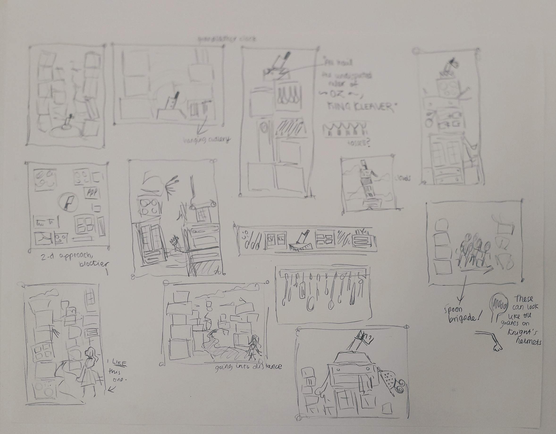
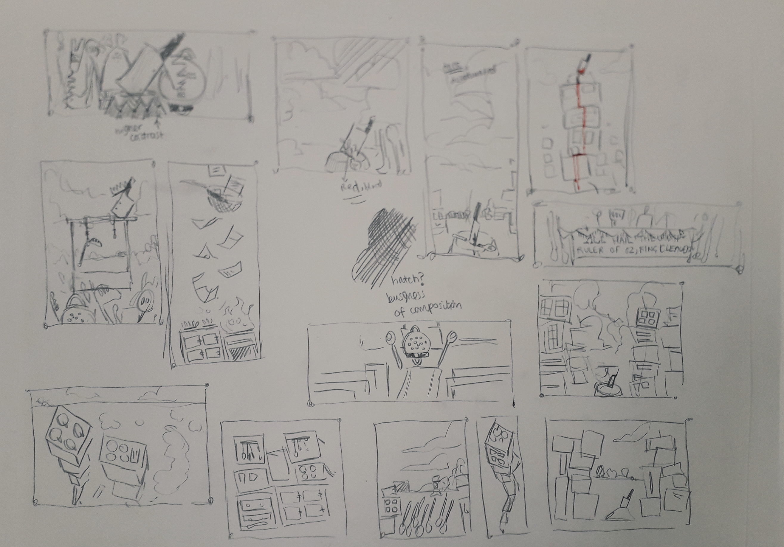
These are thumbnails produced for the next week in my self-directed time. I will ask friends which they prefer and I have a few preferences myself!
Personal Growth: Hospital Walls Brief

Personal Growth: Hospital Walls Brief

I had a little spare time the other day, and looked at Peepshow.org.uk for some successful illustration projects in the professional world for inspiration.

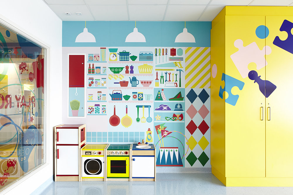
I found http://www.peepshow.org.uk/illustration#/university-college-hospital/ – this is a project done by the organisation to brighten up the University College Hospital in London. The walls in several areas of the building were printed with bright, uplifting illustrations.

It wasn’t in my style, but I thought that that was exactly why it would be good to try and fulfil the brief in a similar way.

This is an example of some of the work in the hospital.

I established visual motifs in the art across all of the walls. This included things like:

  • Bright colours (hues, primary, secondary colours)
  • Blocky, print-like designs
  • Themes that children might relate to
  • Basic, bold shapes and silhouettes
This is the page of my reflective journal that illustrates my thinking process.

I created an illustration in Clip Studio Paint that attempted to fulfil the brief.

This was designed to fit a jutting piece of wall, e.g. one hiding pipeworks or something similar.

What do I believe was successful? I like the darker green wave over the green hill. It’s like stylised shading I stumbled across while experimenting. I also love the pink cactus-like plant in the background, and the white flowers on it.

What didn’t work, and how might I improve in another attempt? I feel like the teal and the purple just didn’t sit right together. I was married to those colours, and should have tried more out instead of being stubborn. It’s just a bit too much of a wacky colour scheme for how simple the image is: imagine it were more complex, I could have a purple creature in the top corner that tied in with the low purple hill and created a better composition. As it stands, it’s a bit naive and jarring.

If I’d had more time, I’d have created multiple illustrations exploring different aspects of the brief. But there’s a bit of a limitation on my time now I’m doing uni-set briefs; I just thought I’d include a post about this so it doesn’t get lost.

Non-Places: Day 1

Non-Places: Day 1

On Monday this week, I had my first day of the three-day graphic design project. The brief is to create a book jacket for Marc Auge’s Non Places: An Introduction to the Anthropology of Supermodernity.

The day was split in two: the first, a briefing and Adobe InDesign workshop with Neil. The second was pretty self-directed; finding photos and doing research for the book jacket.

This is a screengrab from the end of the InDesign walkthrough. We have a template of the correct measurements for the jacket, complete with the logos and text the brief requires. Now we can play with it without worrying!

I also got a few photos inspired by Non-Places. I’ll include a couple of them.

This is the top of a bus shelter, although it might not be perfect because the viewer needs to KNOW what it is in order to create a coherent mental image of the term “non-places”.

Was the day purposeful? Yes! Having missed my InDesign induction workshop with Neil the first time, I really needed the tutoring. There were lots of little things I learned about creating guidelines and layers, etc. I have a working note on my phone with interesting advice I’ve been given about using InDesign.

Were the media and techniques I used successful? Why or why not? The photograph collecting is all done on my phone. It’s quite high quality, but I know it could be improved by booking out a serious camera and getting to grips with it, e.g. aperture, focus, etc. Otherwise, I’ve been taking photos when I see relevant places. I try and get landscape and portrait versions, on the off-chance that I might like one enough to do a complete wraparound of the jacket.

Where am I going to take it? Outside of class, I have assigned work to do. Apart from collecting more photos, I have to compile them together in a document and ensure they’re printed out for the next workshop. I might also experiment with colour digitally on a few of the images, see what I like and don’t like. Research-wise, I’ve checked out a ton of the recommended reading from the library… but I’ve already blogged about that, so you’ll know!

Pulled Receipts: Bookbinding Project

Pulled Receipts: Bookbinding Project

Over the past few weeks, I’ve had a personal project in mind. I’ve always been interested in bookbinding – especially the idea that I could bind loose items into a notebook that wouldn’t usually be pages, e.g. small paper pockets or envelopes, or different types of paper.

I wanted something quite simple to bind that wouldn’t overshadow the focus on binding itself. In the last half of October, I collected most of the receipts I encountered from myself, friends and family to mount and bind into a book.

I bought all the paper and materials at Broad Canvas in Oxford. Here is a progress picture of the stitching I learned from a YouTube video by SeaLemon.
Here is a final image of the stitching. The lower two stitches are far neater because I realised halfway through that my looping method was slightly wrong. You live and you learn!
This is the front cover. I created a card stencil to sponge paint through which reoccurs throughout the book on pages without receipts.
This envelope was collected. It’s actually bound in upside-down, which was a mistake, but I don’t mind.

Below are a few more example pages I feel are interesting.

Overall, there were a lot of decisions to be made in terms of colour scheme, paper size, what to include, etc. I’m really happy with how the experimental book turned out. It feels nice to hold and turn the pages of, and the envelopes full of offcuts make it a little interactive and interesting.

The idea behind collecting receipts from a certain period of time makes this book almost like a diary. I have dated and captioned every receipt in the book. The main events that this covers is visiting my granddad and a week I spent in Reading with Jamie and his housemates.

What would I do differently / what did I learn? I made a few mistakes, considering it was my first bookbind. Some of the stitching was slightly too loose and some slightly too tight, meaning I had to do some serious page wiggling to make certain pages lay flat. I missed one stitch on an envelope by accident (but tied a thread round the hole to make it look like I didn’t!) That and my mistake in the first stitches, but I fixed that with the last stitches.

How will I take this further? I could take the idea of receipts further, in terms of illustration. I could work with coloured paper and illustrate some conceptual receipts – maybe a diary of my day with items on the receipt corresponding with events. I also thought about lino cutting a shop title, like Sainsbury’s, and creating a small series of receipts – or creating a clay tile receipt and stamping it with the lino cut to create an indented title.

Sadly these are all conceptual for now, along with the next bookbinding project; tomorrow I start my three-day projects which will be completely different briefs. I’d like to place my focus in those so I don’t stretch myself too thin, but you may see me coming back to these ideas yet!

Design Process Reflective

Design Process Reflective

On the last Friday before half term, we were placed into groups and asked to research an assigned colour in order to put the Design Process into practice.

Our colour was gold, which was a pretty cool one! We separated ourselves into different tasks and reconvened about an hour later to brainstorm and see what ideas we liked.

We created two finished things: a large golden collage full of positive things associated with gold – that is, abundance, gold in nature, authenticity, holiness, etc.

I apologise for the quality of this picture. Usually I take a lot of pride in nice photographs, but this was sent to me by a teammate who was kind enough to stay behind and take pictures.

We also created a smaller cardboard box entirely collaged in gold as well, but dull and empty on the inside. This related to mankind’s hubris and greed in relation to gold. For example, King Midas suffering as he turned everything he touched into gold, or the Spanish Conquistadors committing mass murder in the pursuit of gold.

Unfortunately, I don’t have an image of this! The presentations ran over early and although I didn’t bail out and leave, I was running late for a train and booked it out of the campus before taking a picture. If I can grab it in the studios, I will attach a picture soon. However, it was more about the process than the finished result.

How did I find it? Well, team is a bit of a four letter word to me. I find working with other people to be very stressful and in a way this was no different. Often in a group and faced with a big task, people will flounder a little. I took charge and asked who wanted which task so everyone had a purpose. I also suggested the time to meet up again and discuss ideas, and time management for most of the afternoon. This is somewhat a coping mechanism for me, so I feel a little in control, but I continually worried that I was coming off too strong or bossy.

Was it purposeful? I want to say yes… any practice in collaboration is good practice. I get in my own head so often, I know collaboration is a good way to yank me out of it.

Photography and Darkroom Reflective

Photography and Darkroom Reflective

Yesterday, my group was inducted into the Darkroom to learn how to create photograms.

To create a photogram, you must learn how to use an Enlarger. For our intents and purposes, the enlargers are just projectors of light. (However, they also enlarge film strip negatives, hence their name.)

To set these up properly, you have to check three things: Height, Focus and Aperture. I immediately logged this into my brain files with the mnemonic Hairy Fat Arse. I’m not happy about this either, but it cannot be changed and is incredibly helpful.

Height: Make sure the enlarger is high enough that the rectangle of light it produces is generous. You don’t want to accidentally place photosensitive paper outside its edge, because you’ll expose it incorrectly and bugger up your photo. The large handle on the side of the enlarger allows you to first unlock, and then change, the height.

Focus: There’s a knob to change the focus on the side of the enlarger. When the edges of the light are crisp, you know it’s focused.

Aperture: A twisty circle inside the enlarger allows you to change the aperture. We were recommended that we move to the highest brightness, then down three settings, as our default aperture.

Creating the photograms is easy: place objects over the photosensitive paper and expose them to light for anything between one and, say, ten seconds. Light doesn’t pass through solid objects and you end up with some exposed areas and some protected areas.

Pass the paper through three chemical baths: Developer, Stopper and Fixative. There are instructions about timings above each bath.

Here is my final print along with two test strips! (I got a little avant-garde with my developing in the top strip and needless to say it didn’t work at all. Oops.)

How can I take this further? The photograms were really fun. I will look online to see if I can get reasonably priced photosensitive paper, but I have a bad feeling that wherever I look they’ll be really expensive. If I invested in another pack for myself, I’d see if I could expand the work into an illustrative style. Maybe use card cutouts and more found objects, or work collages into my illustrations.

Life Drawing 1

Life Drawing 1

Last Thursday I was lucky enough to grab a place in the weekly life drawing session after classes. The model was a middle-aged man called Peter, which was admittedly a challenge. In the sessions I’d attended in summer, I’d only ever drawn female models.

My placement in the room was to the side, which meant I got a LOT of foreshortened poses. No complaining, though – it’s the perfect storm of challenges that help me improve.

These were two five-minute poses. You can see I realised I had to loosen up after the first, and opted for charcoal instead. I learned that with a pose as short as this, there’s really no point measuring because you’re going for a gesture and a dynamic feeling.
Above are ten two-minute poses, each immediately after the other. Honestly, I felt like I’d run a marathon after this was over. This was invaluable for my eye, but I remember looking at everyone else in the room and exchanging mutually exhausted glances.
Here I was lent a thick brown graphite stick. It was water-soluble, and loads of fun to play with. This was a 15-minute pose, and Peter was heavily foreshortened. My eye was clearly in it this time – I’m pleased with this drawing.
After a short break, the final pose was 25 minutes long. I found measuring this quite difficult, but the foreshortening was again a good challenge.

The practice that the two-hour session afforded me was so useful. It’s quite an awkward time of the evening, at 4:30 to 6:30pm – because staying in from class can be exhausting and it makes for a very long day. I’ll definitely try to attend again, though.

Lovers’ Experiments

Lovers’ Experiments

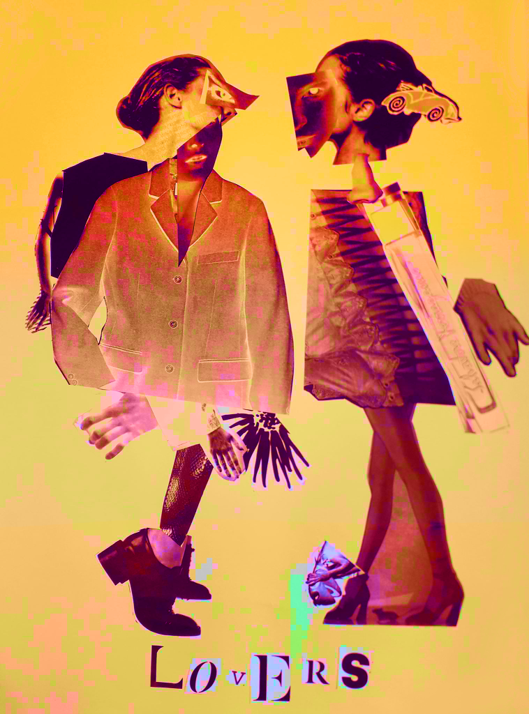
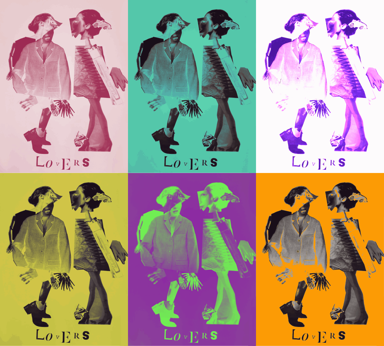
I took the best quality image I could of the Lovers, the final product of the Exquisite Corpse workshop. I uploaded it into Clip Studio Paint and messed around with layer effects and learned the basic animation timeline feature by creating a gif showcasing some of the effects.

Above were all experiments with the Darken layer effect. In only affecting the background, I can create bright images that still allow for the contrast of the black figures.
This was the saturation layer. It’s the crudest filter, but I really liked the colour skew in the worst affected areas like Kermit.
This is the exported .gif file. Here I’ve experimented with darken, lighten, soft and hard light – but my favourite layer to play with was Exclusion. Exclusion actually reversed what was dark, so in the original workshop when I printed off inverted sheets you catch a glimpse of the original values.

The main thing I learned was the animation timeline, and how to export as a .gif. I already knew about all of the layer effects, but having the freedom to showcase them all meant I discovered Exclusion.

Gained in Translation Reflective

Gained in Translation Reflective

Gained in Translation was about how we interpreted description in drawing, and then interpreting drawing in a 3D model made of cardboard. The art and personal element came in the gaps of interpretation between words and paper, and 2D drawing and 3D model.

I enjoyed drawing from Said’s description. I was lucky that the object he described seemed to have a face, as I have a habit of anthropomorphising – and then becoming attached to – things.

I know Willie is a rude name, but I can’t get it out of my head for the little guy.

Below is what I found out the description was actually of, right at the end of the day.

A chipmunk type thing… this item doesn’t have a formal use. I’m told it was a ceramic student’s old work.

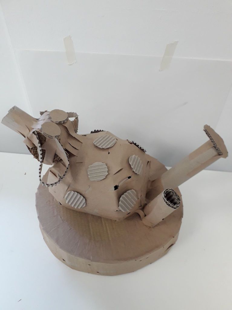
I translated this into a 3D model as best I could.

I thought that by chance, this cardboard model has a lot of personality. Far more so than the original (rather creepy) drawing.

Methods:

For the base, I used two circular pieces of durable cardboard and cut one length of flexible (one-side-corrugated) cardboard for the middle piece. I would secure an area a few inches wide with gummed tape, then work through the area with more individual pieces of tape until it was completely secure and uniform. I did this right the way around both sides.

For the (relatively) spherical body, I created a kind of guideline using two hoops of flexible cardboard arranged like two interlocking bangles. I then worked around it with long eye-shaped pieces, similar to how they stick maps on globes.

What could have been improved? I feel like this session went very well overall, actually. A little longer to work might have been nice – but I understand that the time constraints were kind of part of the project. I managed to finish him. Similarly, other materials like paper or tape might have been useful, but the fact that we were only allowed gummed tape was part of the project too.

Where can I take this? Well, funny I should ask that – I’ve already taken it a little further with a couple of character design exercises. I might make a separate blog about it when I finish it, but what I’m doing with the model is using it as a starting point to design a sweet little character. I feel like I’d be doing him dirty if I just forgot about him. He wants to come to life!

For that, I’ve drawn the model a couple of times quickly to get a feel of it before printing off a couple of pictures for inspiration. I’ve also painted some ink silhouettes that I’ll line a few iterations of his character onto.

I might well be tempted to using cardboard to generate ideas again. Considering that I have some issues with varying body shapes in my art, something that forces me to make shapes like this might help kick start that process.