The Unconventional Body Reflective

The Unconventional Body Reflective

The first half of the morning – dressing the mannequin – I have to admit I really didn’t enjoy.

Despite the fact that we took essentially a whole day out to gather materials, Martha and I didn’t have anything to create really striking shapes. Martha ended up constructing cool shoulder-pad things out of cardboard, but I just couldn’t get myself passionate about it.

Our finished mannequin. I liked the tape, but the morning was too stressful to really enjoy.
Some of our other collected objects.
There was a smaller mannequin I might well have enjoyed working on. I didn’t really get the chance to experiment for myself because of course it was a teamwork project.
The fold-out sketchbook I’ve since compiled in my normal sketchbook. The quality isn’t great, but it’s all in my sketchbook so I feel the reflective doesn’t suffer too much.

The drawing element during the second half of the day lifted my mood considerably. I finally got a real look inside my Artway box (I go NUTS over new art supplies!). I really enjoy fast-paced drawing because I know it’s good for me, even though I rarely practice it on my own. I feel like the course making me do drawing exercises is the equivalent to my mum forcing me to eat vegetables just to get something nutritious in me.

What could I have improved? I could have bought something huge to create an initial shape on my mannequin. It would have saved time and energy. It was bad luck that we live in halls and were the first group doing it, as every other group had free use of all our bought materials as well.

I feel like I didn’t work particularly well with Martha. We were both in a weird headspace that day and neither of us were talkative, but I felt like neither of us were confident enough with our own ideas to really make a statement on the final mannequin. There wasn’t any bad vibes, just a stressful and uninspired morning.

How will I take it further? I probably won’t work on full size mannequins again. I will use the drawing techniques to work quickly, and the paper collaging element – especially on the human body – helps me produce ideas in a freer sense.
Performing Chance Reflective

Performing Chance Reflective

Yesterday we completed the Performing Chance workshop with Kate. I wasn’t particularly looking forward to or resenting this one, because I really had no idea what was going to happen.

The initial lecture consisted of a brief history of chance being used to influence art. This included Dada, Surrealism, Abstract Expressionism and Fluxus (which is still running to the present).

The first task after the lecture was a lot of fun. Everyone went into the studio for 30 seconds and could do whatever they wanted to a table full of objects. This was filmed and played back afterwards. I flipped the whole table over. I liked it; I liked doing something radical that nobody had thought of up to that point.

I’ll try to find a screenshot or two from moodle, but so far it doesn’t look like it’s been uploaded.

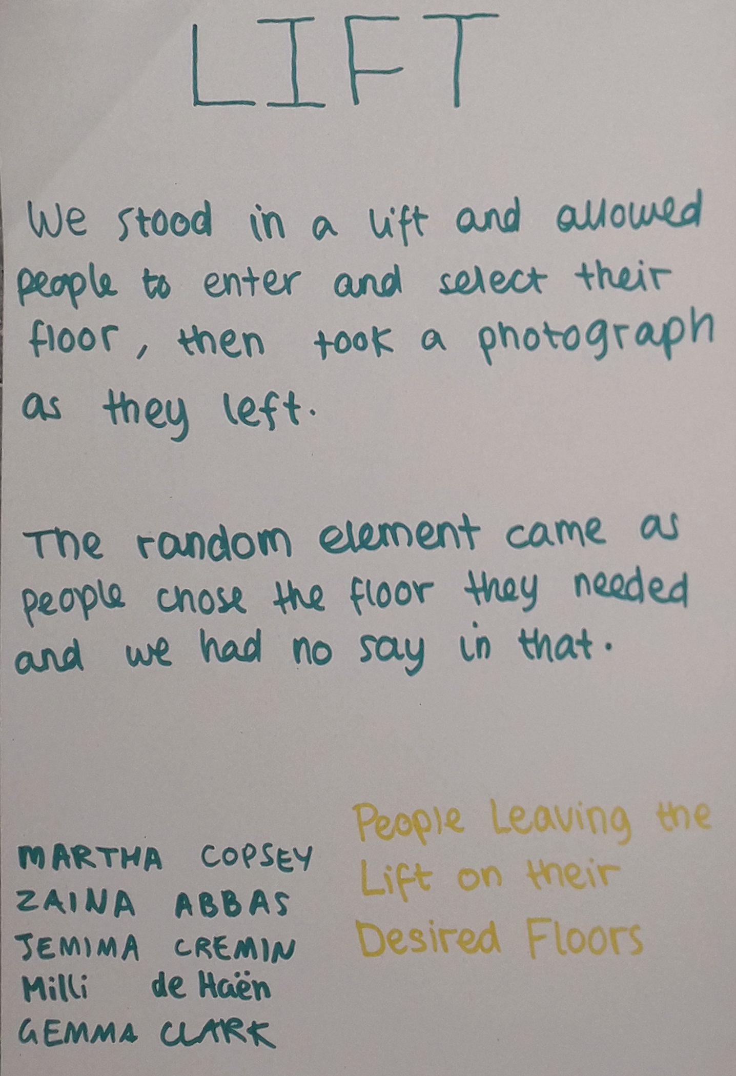
The conceptual photography element was fun. The workshop being based around random chance, we had to create a framework as artists and allow for chance to alter the final work.

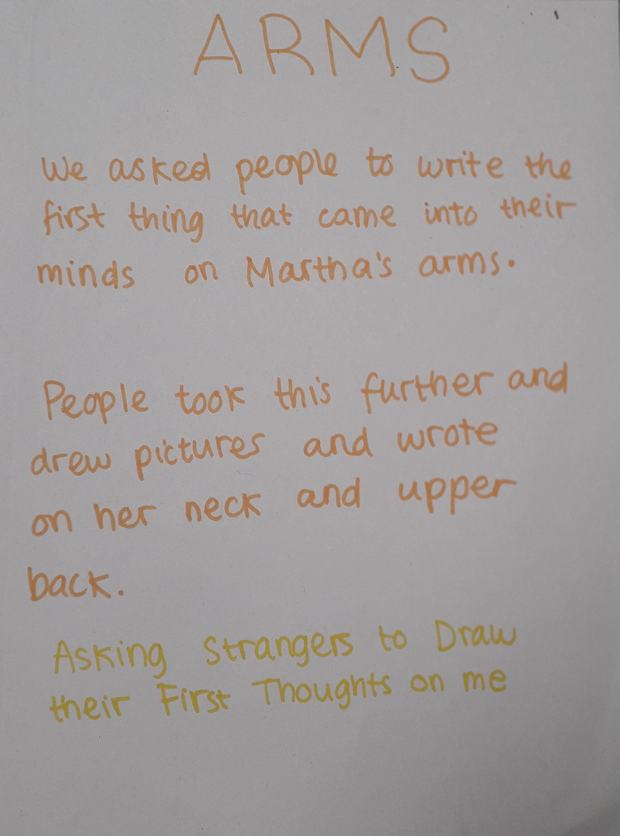
Our group projects.

I might use this kind of conceptual photography in my work. It can portray an idea in a way that makes you focus on the idea, not the art.

If I could have improved anything, the photos would have been completely candid, with no knowledge they were being taken as the person left the lift. Of course this wasn’t possible. Maybe in a way, there will be an uncertainty in the gestures of the people leaving knowing we were taking a picture of them.

One thing I thought was good about the work I made was the human element. The pictures aren’t just pictures – they capture a decision made by each individual person.

Mind mapping as a team of five was fun, but I know I’m not very good at group work. The nature of the ideas forced us apart for the afternoon in a pair and a trio. I did make some concessions and they turned out really well in Martha’s side of the project!

I learned that it takes a lot of thought to carry out this kind of photography, even if pressing the shutter itself doesn’t take much effort. It was a new way of working.

Fashion Browsing and Joana Vasconcelos

Fashion Browsing and Joana Vasconcelos

To alleviate some boredom today after Jamie’s morning departure, I headed to the University Library and looked through some old Italian Vogue and other fashion publications. In the last half an hour before the bus home was due, I found an artist called Vasconcelos in the latest issue of Craft, and it would be a shame not to get brownie points for so-called artist research so I’m blogging about her.

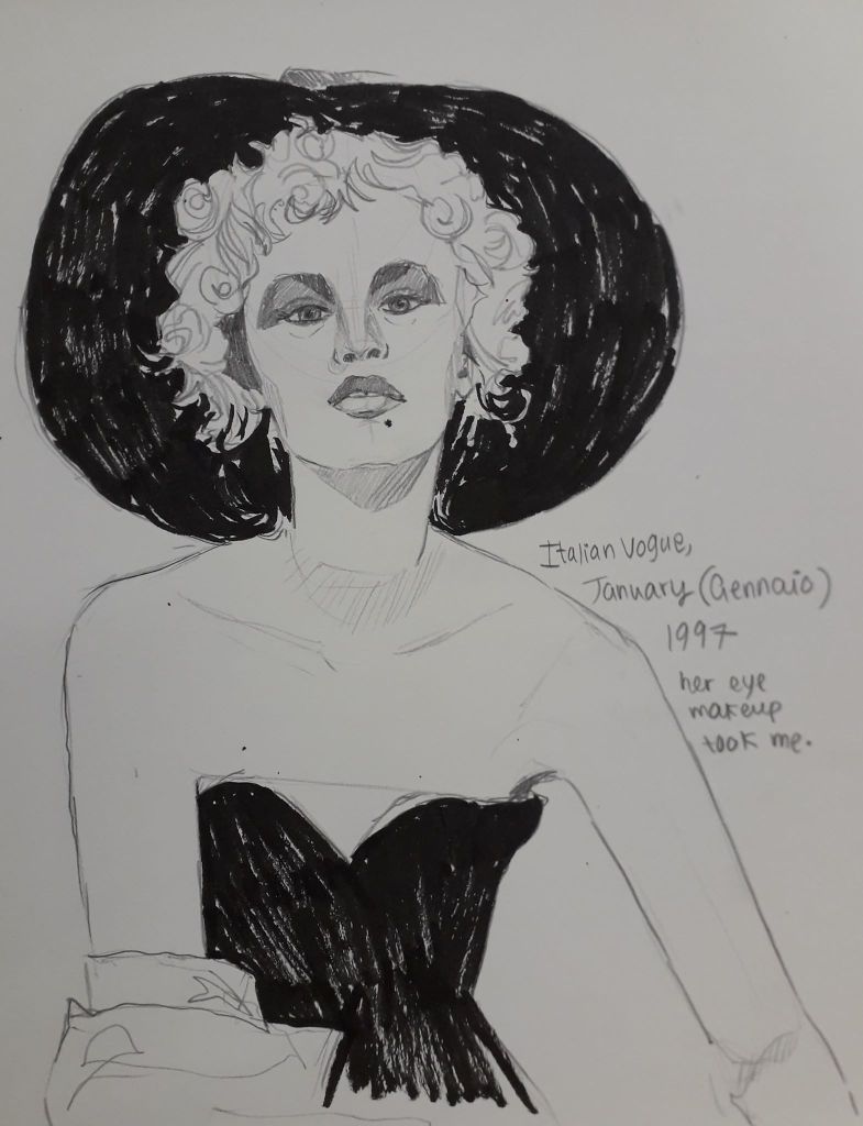
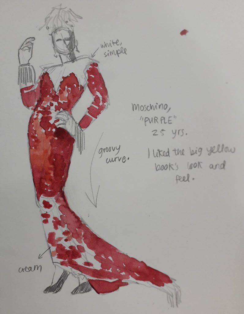
Firstly, I will upload the two sketches I made from the Library’s journal archives. I might have been more productive, but I was overdue a call from Mum which took me half an hour – and the basement lights just occasionally switched off because I was sitting still and alone! I had to partake in some comedic arm flailing followed by resigned power walks around the department to get it to realise there was indeed life down there.

I liked the contrast in this black and white photo. The woman had a little more contempt in her eyes than I managed to convey here, which I regret!
This was a quick figure sketch that took my eye because of the ridiculous curvature of the whole composition. The draping fabric and the lean meant the model has a very satisfying overall curve, which was clearly intentional.
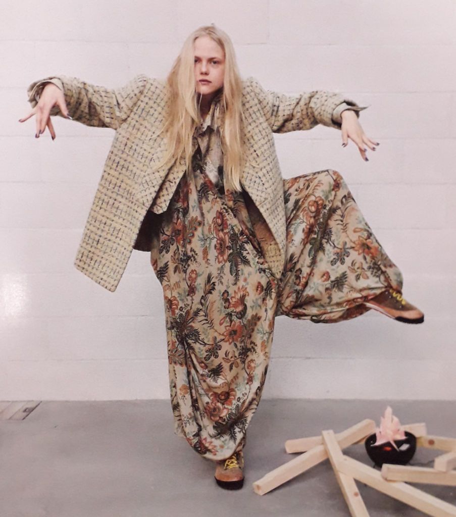
I didn’t get the chance to draw this mad lass but I did take a picture just to save her! I like the big shapes this pose creates, and the unusual patterns.

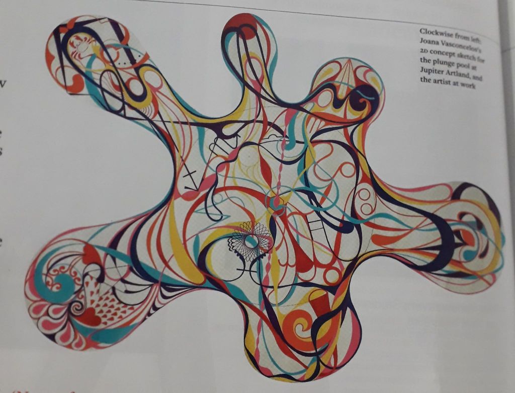
Finally – Vasconcelos. This was an artist who was commissioned to make a year-long, permanent piece of art to sit in a gallery-esque area called Jupiter (or something similar; excuse my memory). She created a 9-metre diameter pool full of 11,500 unique tiles that all created a design.

The pool itself doesn’t really resonate with me, but I though it would be worth writing about because Vasconcelos’ ideas were interesting. The installation (called “Gateway”) was described as “A joyful, optimistic work with a theatrical element.” Now, I like that. Joyful and optimistic is the ideology I can get behind!

Vasconcelos also talks about ley lines and connecting with the energy of the land. The icons and images within the design all have meaning; specifically to Bonnington, Scotland, where the installation resides. There are also astrological and spiritual aspects to the design. I’m not saying I believe in any of that stuff particularly strongly, but the careful thought behind the installation gave me a real respect for it. I suppose it’s the whole process shaping the outcome idea.

That being said, every ceramic tile had to be painted and fired individually. That’s 11,500 tiles. The use of ceramic in Edinburgh is apparently not as developed as Vasconcelos’ own practice, so it was also an exercise in sharing knowledge between cities and expanding Vasconcelos’ horizons in terms of scale.

Anyhoops, I liked her after I read the article. Knowing the artist and the thought behind her work has also led to me really liking the installation as well, despite it originally evoking no real reaction at all.

Mapping Ox Brookes

Mapping Ox Brookes

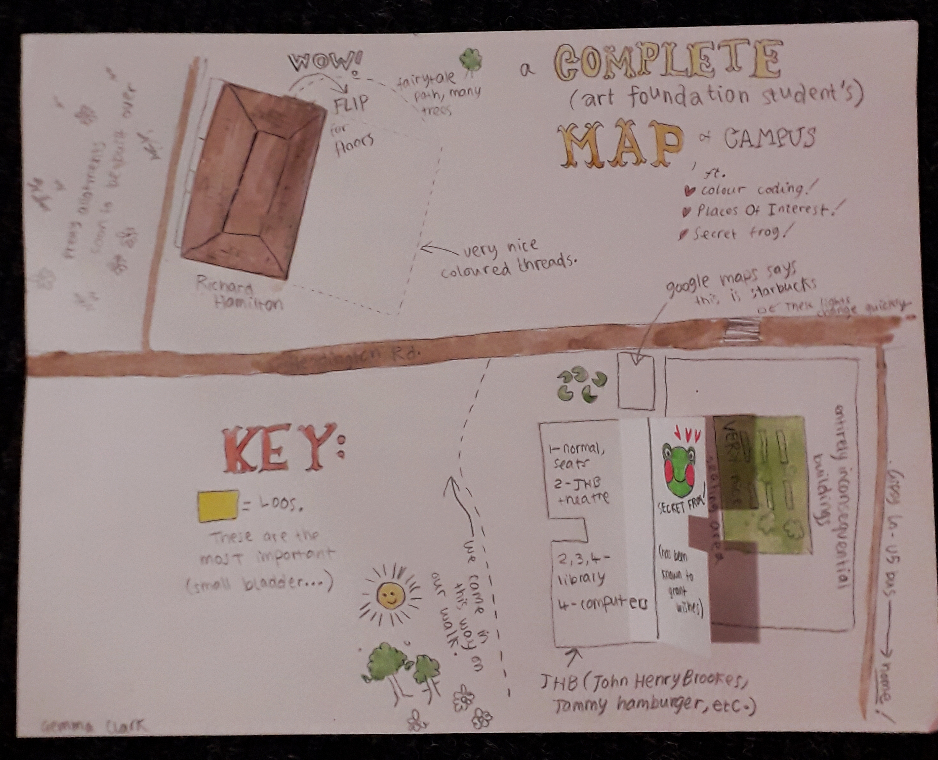
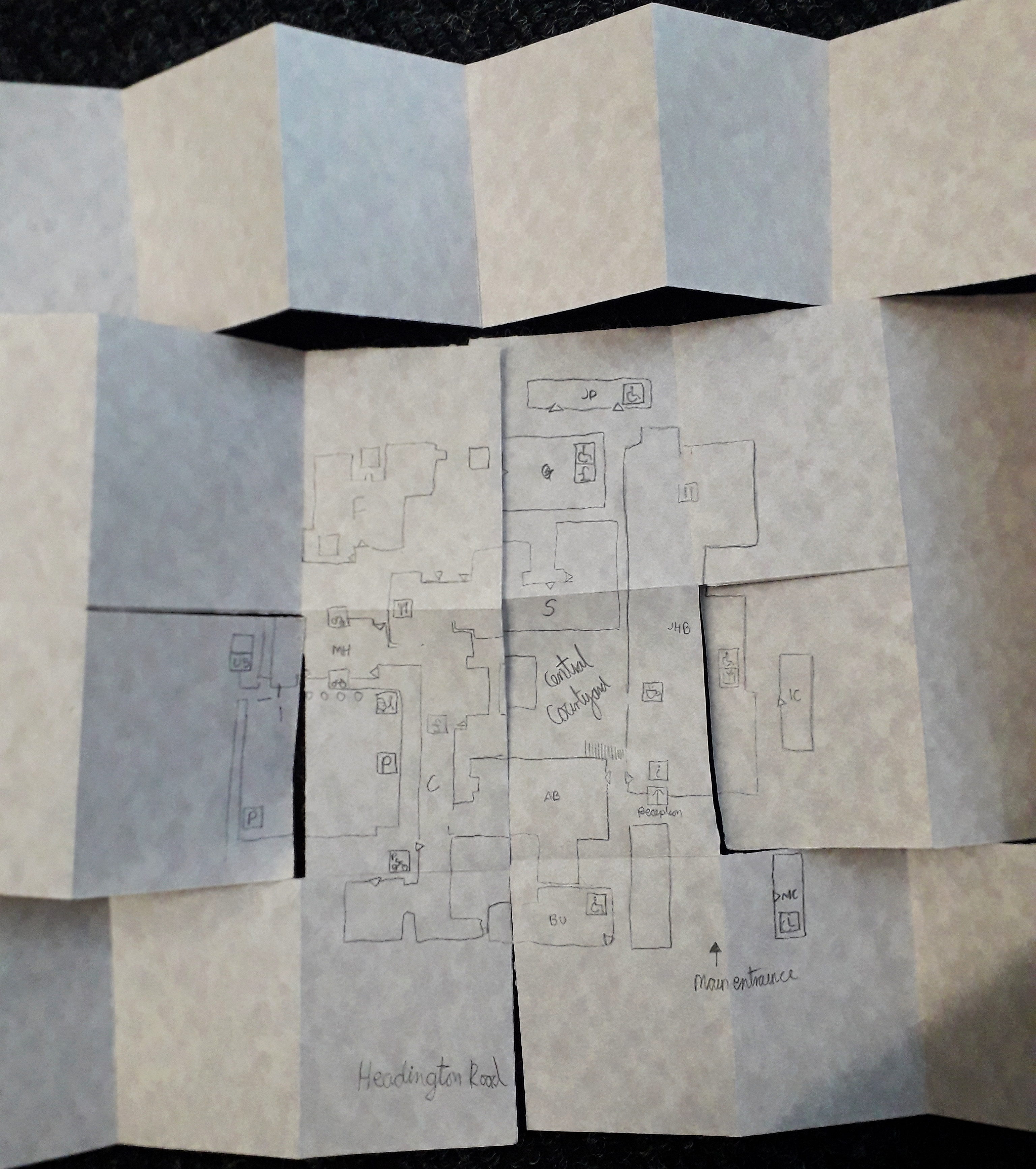
Everybody got a small brief to create a personal map of the area around them (i.e., ox brookes), to orientate themselves and to show a personal style. I’ve taken pictures of a few maps that really spoke to me, but I have to start with my own.

This one is my map. Just smaller than A4.

My map was illustratory and maybe childish in nature; I wrote it excitedly and mapped on things I’d thought at the time of seeing them. I view the area slightly differently now, but I like this because it really is archetypal of my style and brain and it’s documented my first impressions quite sweetly.

The flaps were the main interactive element (secret frog admittedly being a flash of enlightened creativity). The other thing I think was different from most other maps is that mine was bloody wordy – a real stream of consciousness. Other students gave a very personal insight in other ways, which really struck me.

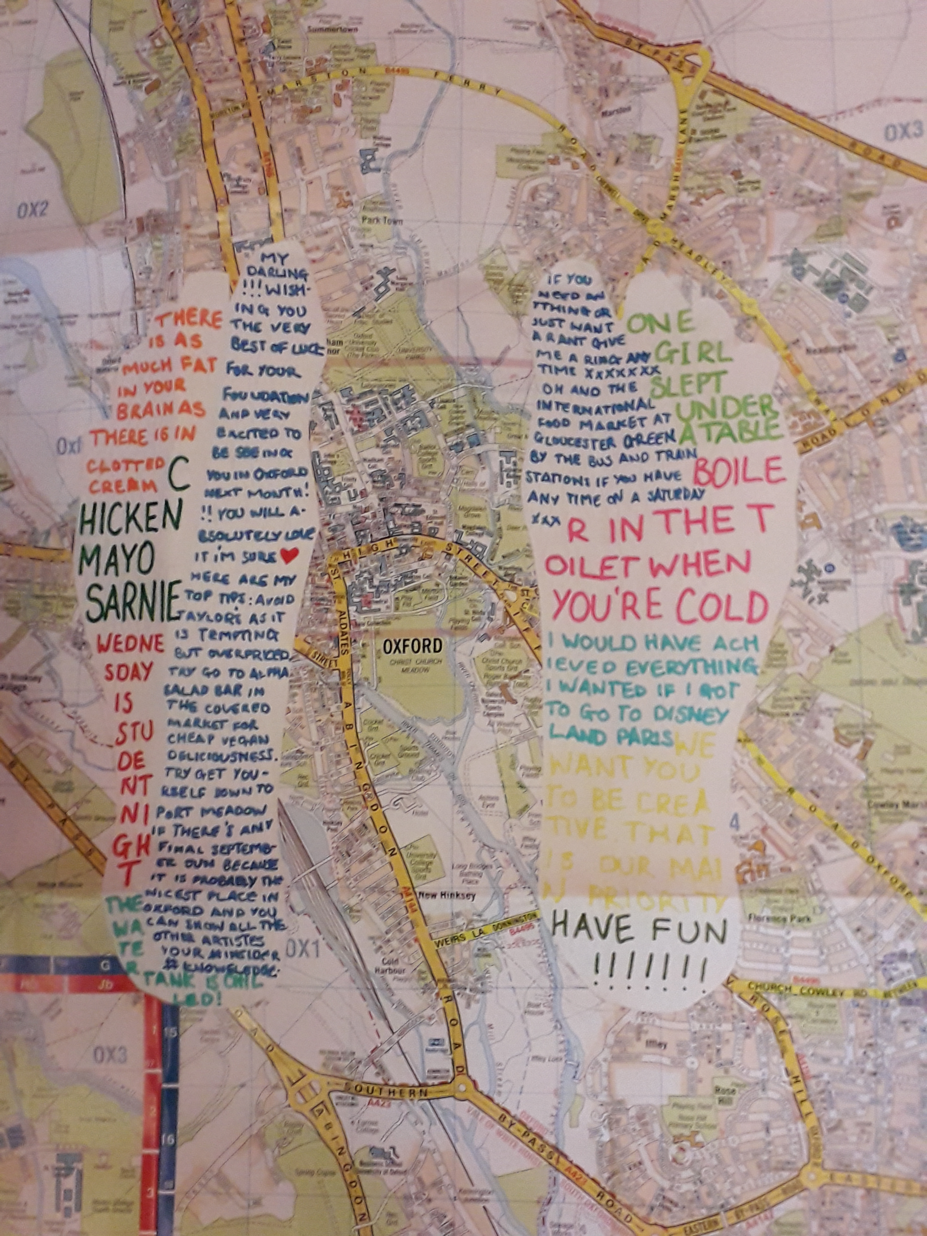
This was an OS map that has been altered.

The OS map with white feet cut into them contained snippets of conversation, presumably from the past week. I recognised a couple from lectures. This is probably my favourite… in seeing what the student has remembered, you see into their mind but totally indirectly. I can’t really overstate how much I like this one – it’s the one that felt the most personal to me.

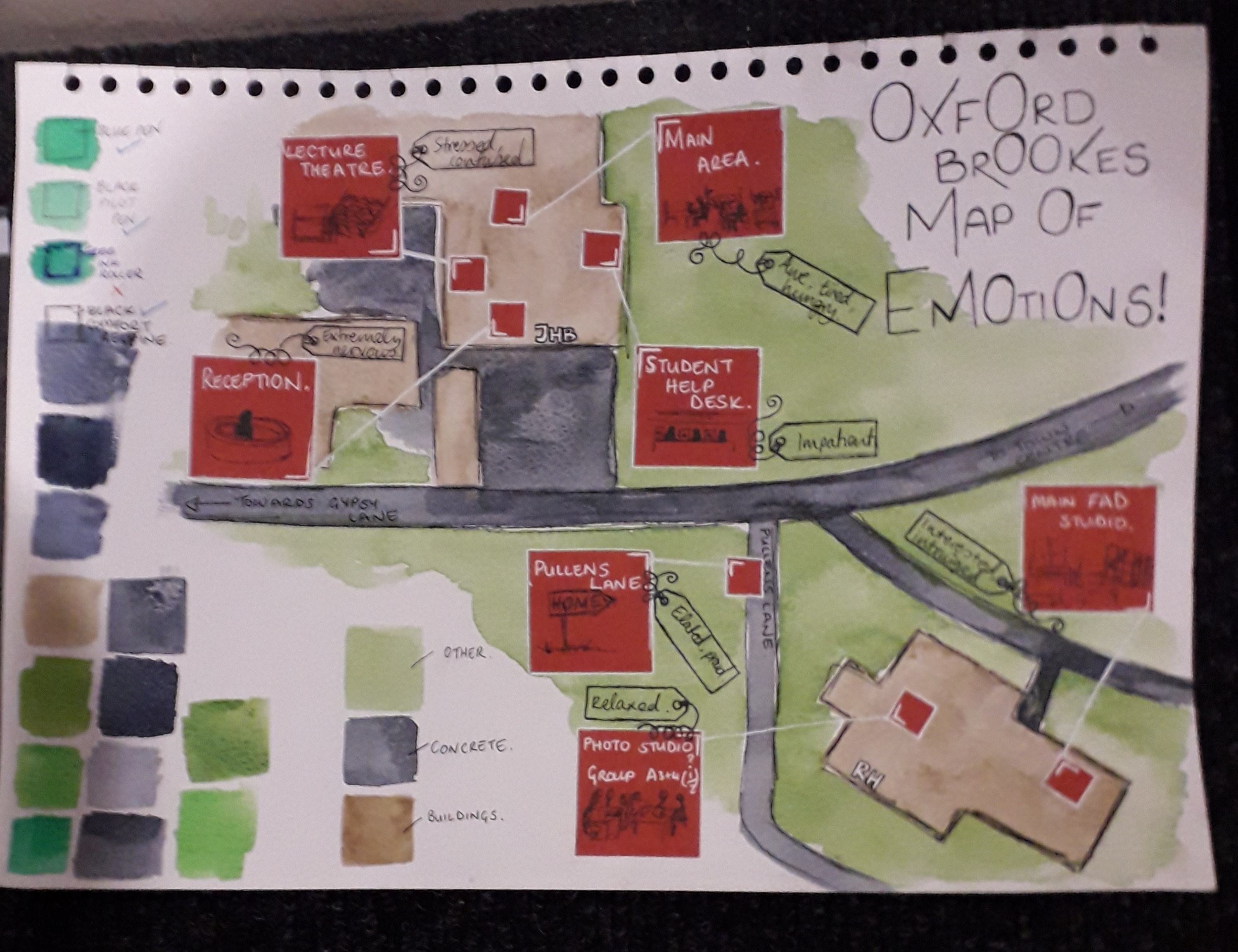
A map – but with emotions. I liked the colour swatching, too.

The map of emotions also hit quite close to my own heart because I remembered feeling most of these things too. It’s maps that are revealing of someone’s inner thoughts that it looks like I’ve gravitated towards. The colours and shapes are pleasant and well thought out as well, with close-ups of red areas filling negative space.

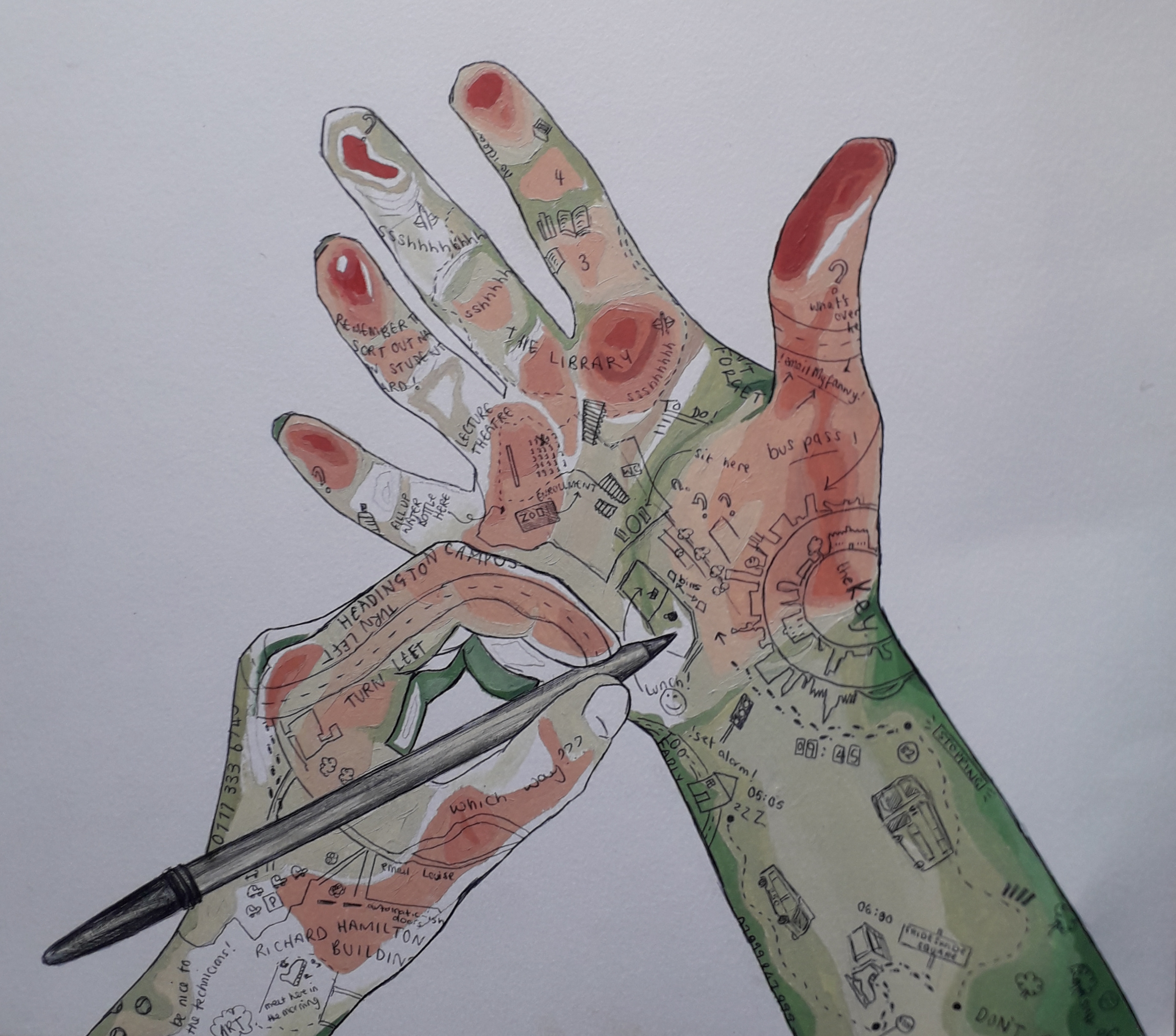
This image speaks for itself – the quality is incredibly high. The artist managed to show depth as if it were a contour map, and I have respect for the cleanliness and detail as well as composition. Not to mention the fact that this artist also included little idiosyncratic quotes theyd remembered.

This map has to be included because it took me so to figure it out. It was presented as a folded mess, and I had to smooth it out flat. I like to think that that was intended to be interactive, and not just a lazy student dropping it onto the floor(!).

This was many pages long. I know Maeve was the artist of this!

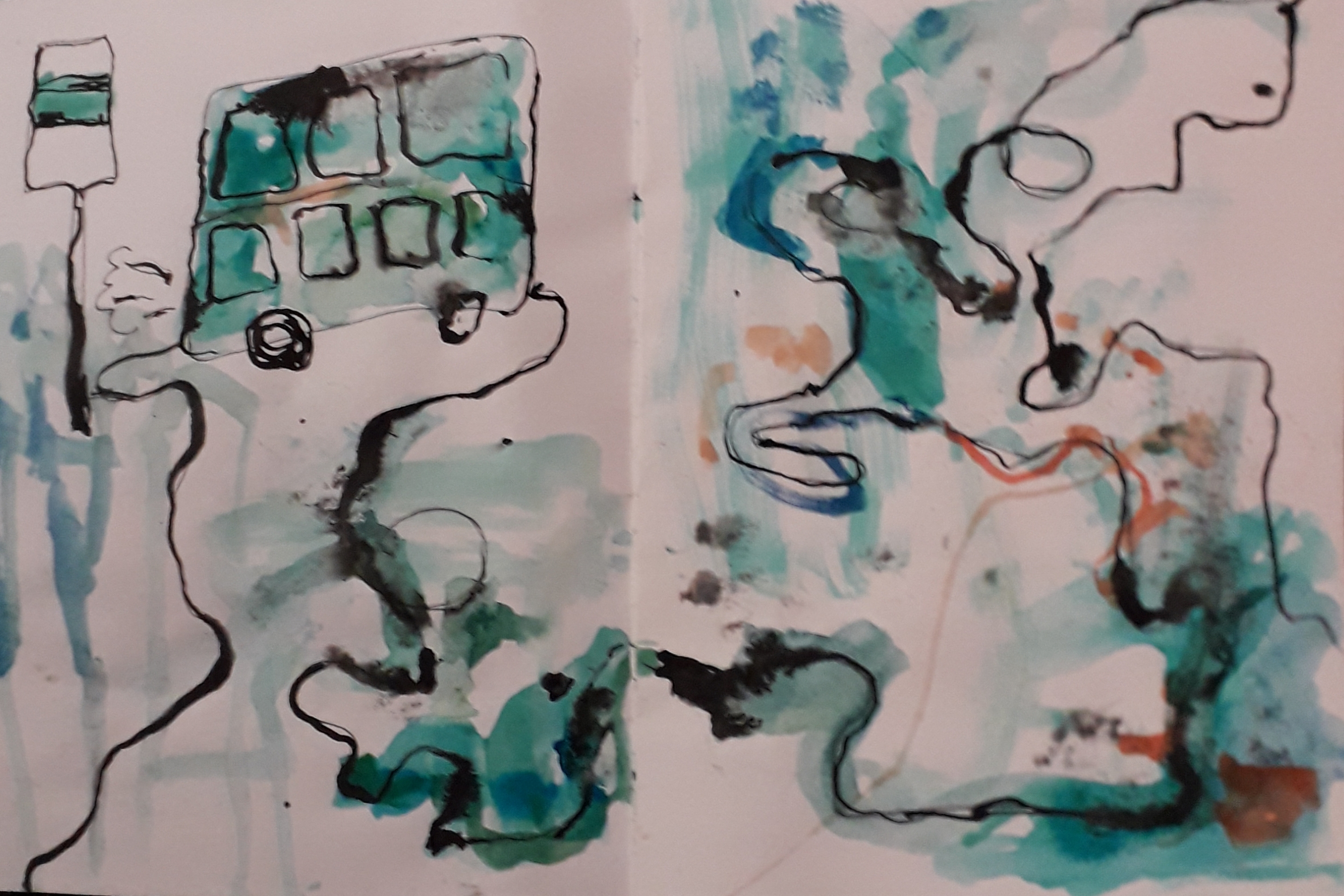
Honourable mention to this beautiful watercolour and ink abstract map. The colours took me, and it was unlike any of the other maps. This felt a lot more emotional, although I understood it slightly less than worded maps.

First Real Day at University

First Real Day at University

The last few days have been a really stressful, REALLY exciting time for me. I moved into dorms on Saturday and have been settling in quickly… that means meeting all my flatmates, locating and visiting the nearest Wetherspoons and generally staying alive and healthy in lieu of my mammy doing everything for me back home.

I’m here to talk about the art, though! After icebreakers, everybody settled into small groups and looked through our survival kits.

The first task was to draw “instructional” diagrams of your (or another) survival kit, communicating each item’s use without using any written language. Think IKEA construction booklets.

Then we were tasked with mixing up our kits as a small group and creating a new survival kit, which in the process of naming image files on the laptop I dubbed “frankensurvival”.

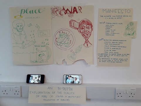
The idea was really to push the limits of our creativity and we had free reign to do what we wanted, pretty much. Said, Zaina, Martha, Jemima and I made a small Bob Ross shrine and a small pile of potential weapons to beat enemies with, illustrated on the common public enemy of Alvin and the Chipmunks. Below are images from today.

This was our “Peace” shrine. See calming things… such as Bob Ross and “music” – charmingly represented by the only single I own, a cover of Under the Boardwalk by Bruce Willis bought for my 18th as a joke by mum.
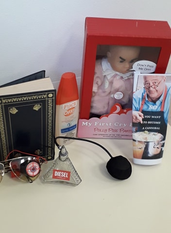
This was our “war” area. Special mention to Polly PissPants and “So: You Want To Become a Cannibal”.
See our installation setup here – a visual recreation of the below installations. I was particularly proud of my sharpie Alvin and the Chipmunks art.
Some informational images depicting the intended use of our objects. Volume of War And Peace – for Smackdown (or a spot of light reading).
Headphones and Mood Meter glasses to detect nearby infants close to tantrum.
Special cameo made by me on the right – 3 worshiping Bob Ross.

Overall, it was a fun day. Our final survival kit was easily one of the most comically inclined of all of those students made. Well over half of them were quite depressing, really. VERY heavy on the climate change and anti-political, environmentalist-dystopian views. I have to say there was one kit that made a point on having a positive, conscientious outlook on the future and was generally a very pretty kit; I hold respect for the group that created that amongst such an existential crowd.

Survival kit, And Life

Survival kit, And Life

I’ve not updated in a little while because I spent Monday to Thursday last week up in Cardiff with Jamie on a mini holiday… then after 24 hours back home, I had to come back up with my siblings for the bank holiday weekend!

Now I’m up with them it’s a lot less intense than the holiday with Jamie, so I’ve had a chance to work on my art properly.

With Jamie, we went into Cardiff Central, Cardiff Bay, round cocktail bars with Dad and Rachael and then out to a nightclub (for the first time for me! It was fun!)

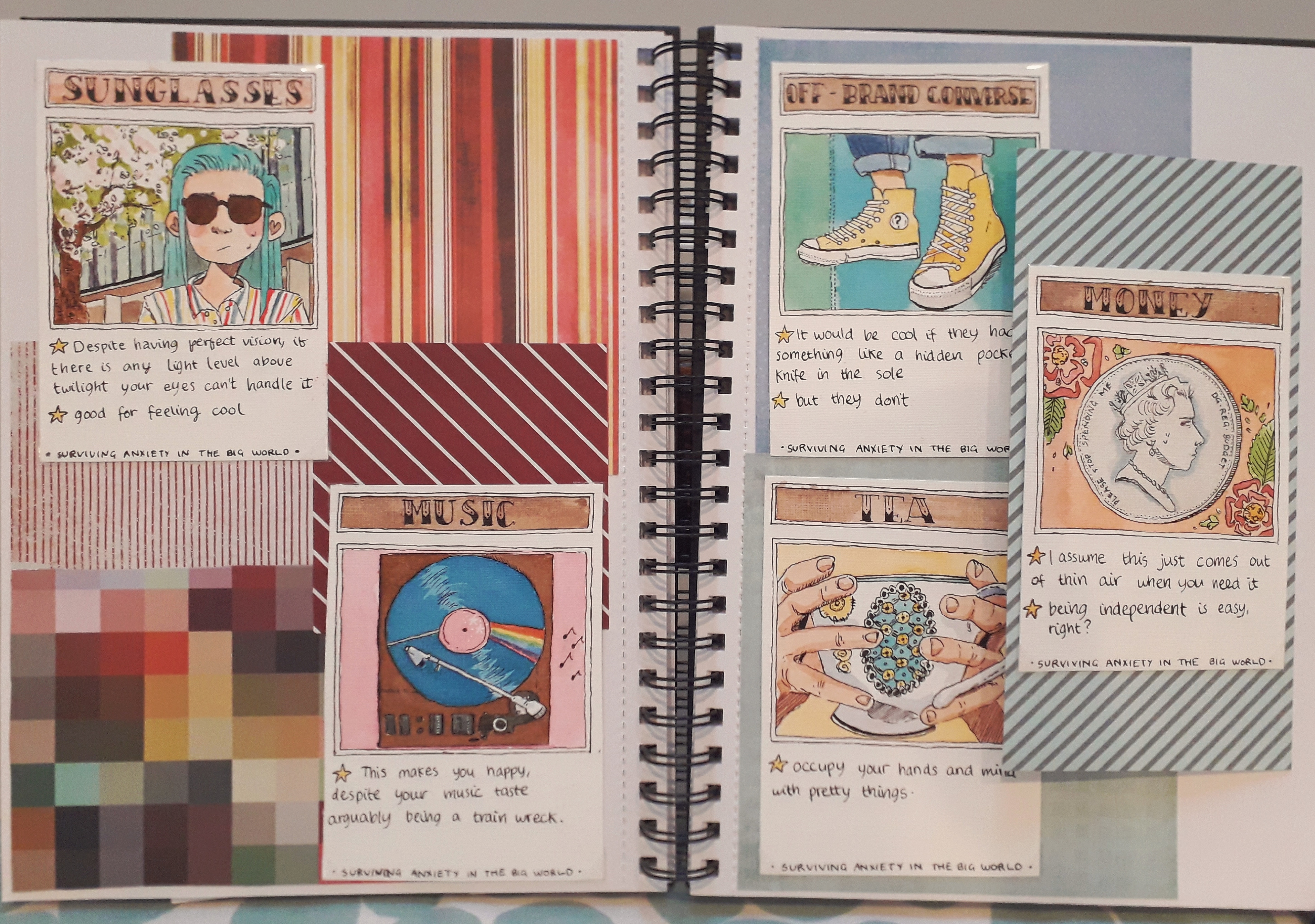
I finished up the five cards in my survival kit and arranged them on a double page spread. I’m really proud of them; each took a long time of planning, sketching, lining and then colouring.

It may seem a little small. Hopefully you can zoom in if you want to look closer – it’s a good enough quality photo.

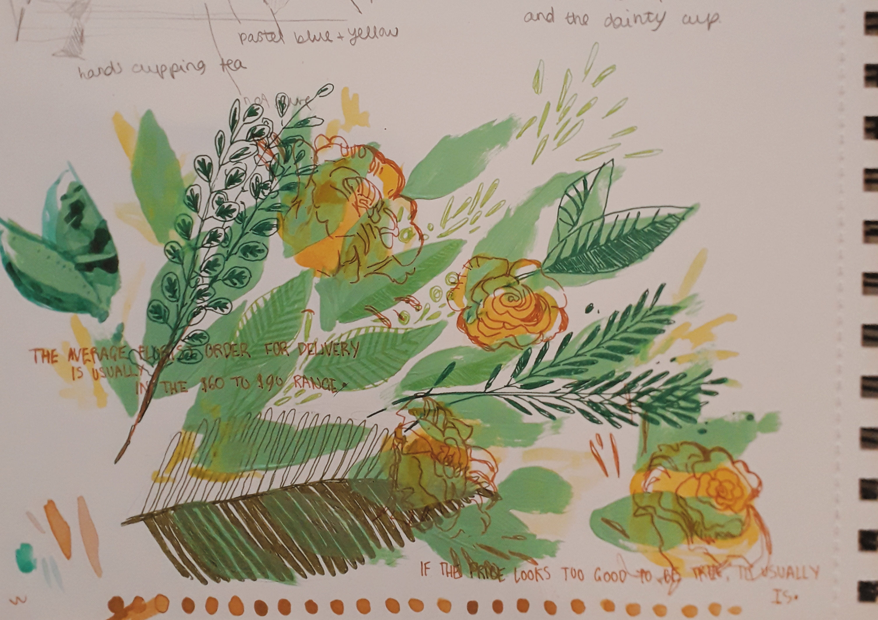
I also painted a little half page of flora and leaves, just as an experiment in using different media. I’m pretty happy with how it turned out.

I’ve filled in about eight thousand info pages on myself and applied for all sorts of basic things. My accomodation is confirmed and I’ve paid some important fees for the beginning of the course.

Seems like no matter how nervous you can be, time will slowly drag things into place. No amount of convincing could have told me that a month ago, though.

Art From Crete

Art From Crete

During my time in Crete, I tried to paint from life (or at least sketch) every day. I also wrote a couple of notes on dated paintings about what I’d been up to, almost in the style of a diary. The format keeps me going.

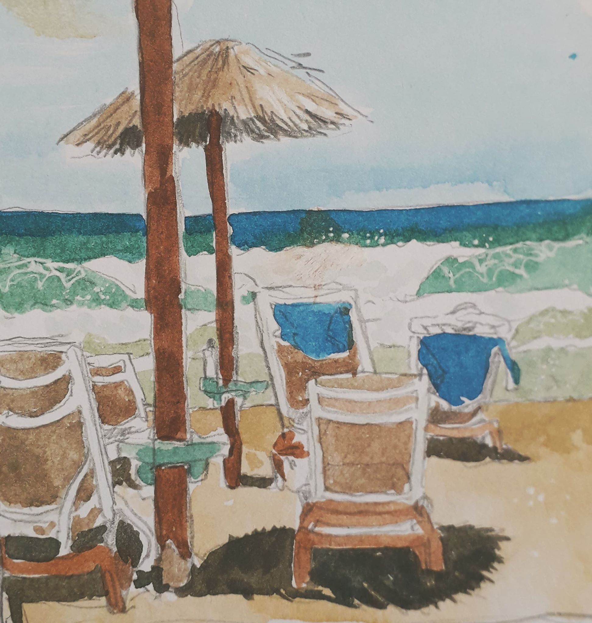
Here, in no particular order (except of my preference!) are the pieces of work from that week.

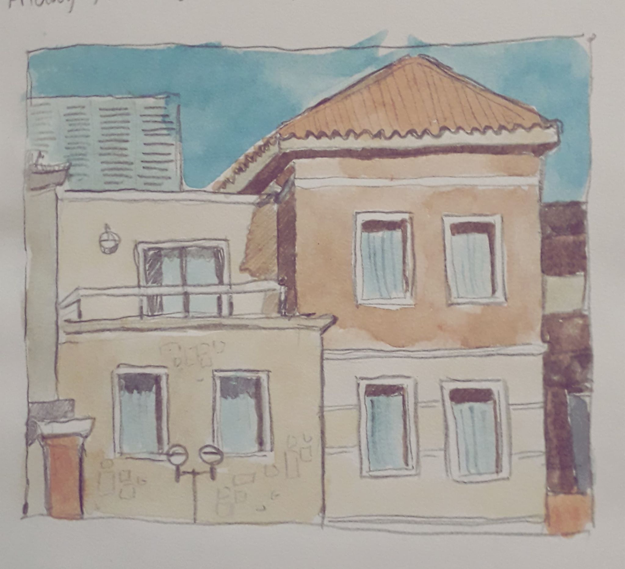
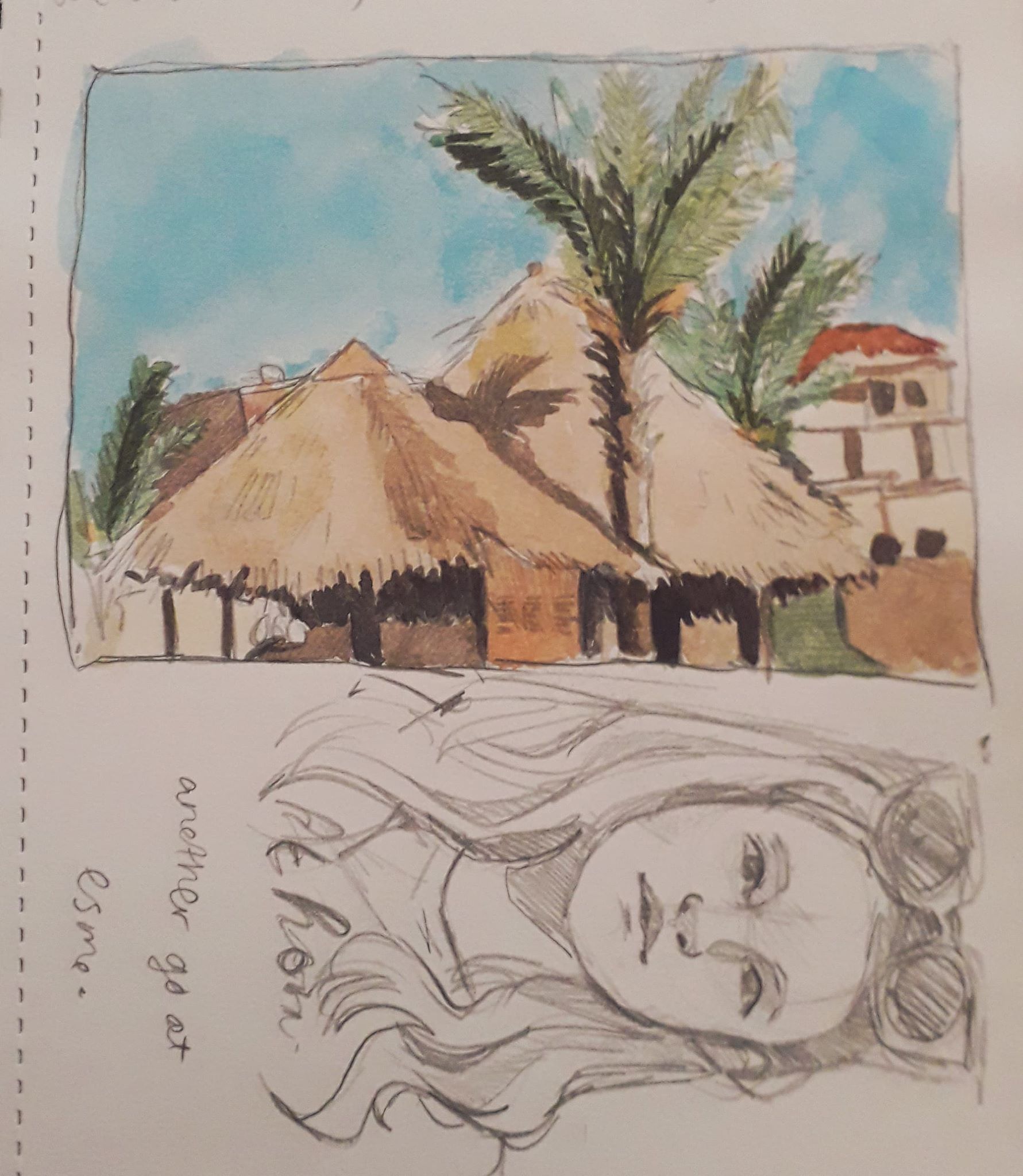
I saw these buildings while playing catch with Esme. I grew so distracted I had to get out of the pool and draw them – to her annoyance… but wasn’t it worth it!
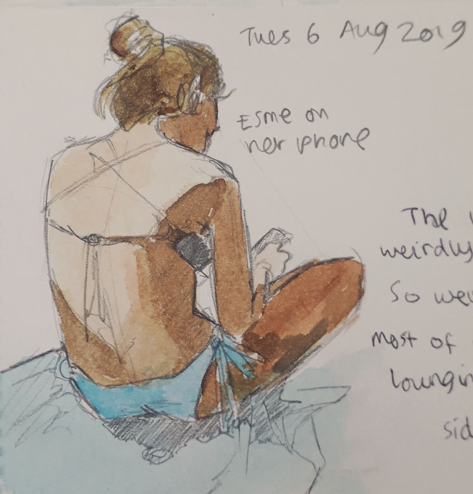
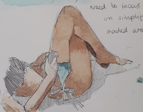
Esme has a nice body to draw. She’s very kind and usually stays still if I mention I’d like to draw her.
These were the roofs of a bar called the Guru Bar. Good cocktails.
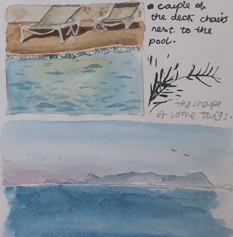
Not so proud of these, but mistakes have to be made!

I’m proud of the fact that I’m determinedly drawing backgrounds and inanimate objects, as these things are out of my comfort zone (people being my Thing*tm*). The sense of space and proportion is different and I like to think the practice is helping.

My colour theory is also improving; with a determinism to record scenes properly comes a compulsion to add colour to make it a little more lifelike. Desaturated colours are interesting especially.

Being back has been nice. I’d missed Jamie and it was beginning to feel a little shitey, despite the Greek sun and the beautiful beach. I’d forgotten how comfortable cardigans could be!